218 search results
(0.028 seconds)
- FF Vortex by FontFont,
$41.99 Dutch type designer Max Kisman created this display FontFont in 1990. The font is ideally suited for advertising and packaging and poster and billboards. FF Vortex provides advanced typographical support with features such as ligatures and case-sensitive forms. It comes with proportional oldstyle figures.
 - FF Scratch by FontFont,
$41.99 Dutch type designer Max Kisman created this display FontFont in 1990. The family contains 2 weights and is ideally suited for poster and billboards and sports. FF Scratch provides advanced typographical support with features such as ligatures and case-sensitive forms. It comes with proportional lining figures.
 - FF Network by FontFont,
$41.99 Dutch type designer Max Kisman created this display FontFont in 1991. The font is ideally suited for logo, branding and creative industries and music and nightlife. FF Network provides advanced typographical support with features such as ligatures and case-sensitive forms. It comes with proportional oldstyle figures.
 - Blizes by Negara Studio,
$19.00 Introducing BLAZES Typeface is a solid brush font written with a brush and slightly thick ink. written slowly so that it produces a solid brush. Then they are scanned and drawn one by one until they become vector format. BLAZES are perfect for branding project designs, Logo designs, product packaging, Quotes - or simply as a stylish text overlay on any background image BLAZES Features: -Uppercase -Lowercase -Numeral -Multilingual Support -Punctuation Thanks a lot regards, Anugerah Negara
 - Lil Milton AEF by Altered Ego,
$45.00Lil Milton is full of energy and excitement, like the blues legend that inspired its name. Irregular counters (and irregular outlines!) creates a dissonant harmony of form and function. Stretch it, but don't condense it for a righteous look. Lil Milton is the perfect companion to Adobe Myriad Tilt. - Hymers JNL by Jeff Levine,
$29.00 Born on May 8, 1892 in Reno Nevada, Lewis Franklin (“Lew” ) Hymers left an indelible mark as a caricaturist, cartoonist and graphic artist. At the age of twenty [in 1912] he worked for the San Francisco Chronicle. During World War I he worked for the Washington Post. He even was employed for a time by Walt Disney as an animator - but most of his life was spent in either Tujunga, California or his birthplace of Reno, Nevada as a self-employed illustrator. Hymers inked a feature for the Nevada State Journal called “Seen About Town”, which was published during the 1930s and 1940s. In this panel, he caricaturized many of the familiar faces around Reno. He also designed signs, logos, post cards and numerous other commercial illustrations for clients, but what has endeared him to a number of fans was his vast library of stock cuts (the predecessor to paper and electronic clip art) which feature his humorous characters in various professions and life situations. So popular is his work amongst those “in the know” that a clip art book collection of over seven hundred of his drawings that was issued by Dover Publications [but long out of print] commands asking prices ranging from just under $15 to well over $100 for a single copy. Lew Hymers passed away on February 5, 1953 just a few months shy of his 61st birthday. Although his artwork depicts the 1930s and 1940s lifestyles, equipment and conveniences, more than sixty years after his death they stand up amazingly well as cheerful pieces of nostalgia. The twenty-seven images (and some variants) in Hymers JNL were painstakingly re-drawn from scans of one of his catalogs and is but just a tiny fraction of the hundreds upon hundreds of illustrations from the pen of this prolific artist.
 - FF Cutout by FontFont,
$41.99 Dutch type designer Max Kisman created this display FontFont in 1990. The font is ideally suited for advertising and packaging, editorial and publishing as well as poster and billboards. FF Cutout provides advanced typographical support with features such as ligatures and case-sensitive forms. It comes with proportional lining figures.
 - Musee by DSType,
$26.00First inspired in a leaf from Missale Romanum ex Decreto Sanctrosancti Concilii Tridentinii Restitutum, printed by the Plantin Workshop at Antwerp in 1642, Musee was designed for booktext purposes and is very elegant and highly readable even in small sizes. Includes plenty of OpenType features, like SmallCaps, Alternates and Swashes. - Delisha by Nissa Nana,
$20.00 Delisha is a beautiful script font. It has a classy, elegant, and modern look which can be used for logos, branding, invitations, stationary, wedding designs, social media posts, and every other design which needs a handwritten touch. What's included: Delisha OTF Numeral and Punctuation Stylistic Alternates , Ligatures, and Swashes International Language Works on PC & Mac Simple installations Accessible in Adobe Illustrator, Adobe Photoshop, Adobe InDesign, even works on Microsoft Word. Thank you for your purchase! Hope you enjoy with our font! Best Regards, Nissa Studio
 - Breakfast by PizzaDude.dk,
$15.00 This is close to insane! My Breakfast font has got 8 (yes EIGHT!) different versions using contextual alternates! They cycle nice and easy AS you type! How cool is that?! Ofcourse, the font is also loaded with diacritics!
 - FF Fudoni by FontFont,
$41.99 Dutch type designer Max Kisman created this display FontFont in 1991. The family contains 3 weights and is ideally suited for festive occasions, film and tv, music and nightlife as well as poster and billboards. FF Fudoni provides advanced typographical support with features such as ligatures and case-sensitive forms. It comes with proportional lining figures.
 - Ornata C by Wiescher Design,
$39.50 Ornata C is the third of a series of old ornaments that I am trying to save from oblivion. I am not just scanning these, I am completely redesigning the ornaments from scratch, thereby eliminating imperfections. These ornaments have been first designed by a designer named Ben Sussan. The designs date back to about 1910. Your digitizing type-designing savior, Gert Wiescher
 - Sticky Brash by PizzaDude.dk,
$15.00 Sticky Brash is my laid back kids comic book font - suitable for anything that needs a fresh and quirky attitude, and super legible at the same time. Originally handdrawn, and then manually traced digitally, in order to make those insane clean curves and lines!
 - FF Rosetta by FontFont,
$41.99 Dutch type designer Max Kisman created this display FontFont in 1991. The family contains 4 weights: Regular, Italic, Bold, and Bold Italic and is ideally suited for advertising and packaging, logo, branding and creative industries, poster and billboards, software and gaming as well as sports. FF Rosetta provides advanced typographical support with features such as ligatures and case-sensitive forms. It comes with proportional lining figures.
 - Dic Sans by CAST,
$70.00 DicSans is a square sans-serif typeface, inspired by Aldo Novarese’s Eurostile, it was meant as a sort of contemporary "open" Eurostile. It is a semi-custom font, designed and expanded according to costumers’ requests, since 2004 up to 2013. For this reason it has many glyph variants (up to three variants per lowercase glyphs and numbers, special smallcaps etc.) and wide language coverage.
 - Lempicka by Molly Suber Thorpe,
$17.99 Lempicka is a ligature-rich typeface duo with support for Latin and Greek. Lempicka Display and Small Caps are a pair of light, clean fonts with strong Art Deco character. Lempicka Display has over 150 ligatures and alternates (in Greek, too!), so it's extremely customizable and versatile. Lempicka Small Caps is Display's little sister: the perfect complement for creating hierarchy in a layout.⠀ This is a beautiful typeface for wedding invitations and personal stationery, as well as unique logo design and branding projects. The name of this type family is an homage to Art Deco painter Tamara de Lempicka.
 - Scirocco by Wiescher Design,
$39.50 Scirocco is a hot and humid wind that blows from the Sahara over to France and Italy. It crosses the mediterranean sea and carries lots of fine desert dust with it. Once it hits the coast of Provençe one can feel it grinding ones teeth and see it as fine dust covering every car. It makes people go nuts! Scirocco, the typeface has that same hot moving character and the finer hairlines giving it a kind of Arabic touch. If you use it too much, it will make you go nuts. Your pretty crazy Gert Wiescher
 - Grimmig by Schriftlabor,
$40.00 Grimmig draws inspiration from solid and angular blackletter shapes and the idea of cutting letters out of paper. The interaction between curves, sharp edges, and partially unconventional serif placement makes it an excellent typeface for impactful headlines. The vivid details fade into the background in smaller sizes and provide an enjoyable reading experience for continuous text. Open counters and a large x-height contribute to Grimmig’s legibility in text sizes. It was developed as part of the MA Typeface Design in the University of Reading but had started before as a graduation project for Tamara Pilz.
 - Grimmig Variable by Schriftlabor,
$200.00 Grimmig draws inspiration from solid and angular blackletter shapes and the idea of cutting letters out of paper. The interaction between curves, sharp edges, and partially unconventional serif placement makes it an excellent typeface for impactful headlines. The vivid details fade into the background in smaller sizes and provide an enjoyable reading experience for continuous text. Open counters and a large x-height contribute to Grimmig’s legibility in text sizes. It was developed as part of the MA Typeface Design in the University of Reading but had started before as a graduation project for Tamara Pilz.
 - Xaloc by Vanarchiv,
$20.50 Xaloc was designed for editorial use in books, magazines and newspapers. This typeface family contains different font versions for different optical sizes; Caption, Text, Subhead and Display, all of them with different x-height proportions and contrast. Its serifs are asymmetrical and its letterforms have geometric modulated strokes that emulate the calligraphic variations. Its design approach enhances text flow and continuous reading. Xaloc was based on Ricado Santos’ Tramuntana, which has the same skeleton, proportions and serifs with a more mechanical design. Xaloc is the Catalonian name from the Mediterranean wind that comes from the Sahara and reaches hurricane speeds in North Africa and Southern Europe.
 - Badinjal by Issam Type,
$14.00 Badinjal – Modern Serif Font By Issam Type Badinjal serif font can be used for many project such as: book, magazines, logo, branding, photography, crafts, quotes, blog header, poster, advertisements, and much more. What’s Included? Uppercase & lowercase letters, numbers, punctuation Multilingual support If you have any questions, please feel free to get in touch. Thank you
 - Bogosa by Issam Type,
$14.00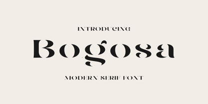 Bogosa – Modern Serif Font By Issam Type Bogosa serif font can be used for many project such as: book, magazines, logo, branding, photography, quotes, blog header, poster, advertisements, and much more. What’s Included? Uppercase & lowercase letters, numbers, punctuation Multilingual support If you have any questions, please feel free to get in touch. Thank you
 - Ring Quad by Ochakov,
$9.00 Ring Quad is brave and confident from thin to black. A cleaner, geometrical and professional aesthetic. Ring Quad is a modern & minimalist font. It’s perfect for branding, logos, quotes, posters, name card, stationary, and every other design that needs a striking typeface. Now, Ring font family prepared for any insane adventure life throws our way!
 - Kundalini by Hanoded,
$20.00 Kundalini means 'coiled'. In yoga it is used to describe an energy or force which lies at the base of the spine and, when awakened, results in deep meditation or even enlightenment. Aaahhh… Now zoom back to earth: Kundalini font is a great curly typeface with a bit of rough here and there. It is feminine, happy, kind of esoteric, unusual but very useful. Kundalini will even enlighten those who speak tongues other than English, as it comes with Nirvanic language support.
 - Muisca by JVB Fonts,
$25.00 Muisca, that in its early edition was named as «Muisca Sans», was developed in mid-1997 and based on the graphic concept of pre-Columbian characteristics figures within some of the very few visual elements recovered from the Muisca culture. This ancient pre-Columbian tribe disappeared since the arrival of the Spanish 500 years ago, in what is now the center of Colombia. In fact, the name of the capital Bogotá goes back to Bacatá as primary or village downtown of what was once the imperial capital of the Muisca tribe. This typographic project was submitted as my work for the degree in Graphic Design, obtained in September of that year (at the Universidad Nacional de Colombia), under the creative concept of vindicating the ancient culture and identity through a functional typeface, into a fact without precedent in the country. Muisca was recently edited, arranged and completed, including multilingual diacritic glyphs to be versatile in several languages. Related and inspired by Latin America, Ethnic, Native, Tribal, Mysthical, Handmade, Aboriginal, Pre-Hispanic, Pre-Columbian, Textured, Fantasy. Ideal to be used in logos, display text & titles, games and other design applications that reminds of the Pre-Hispanic art.
 - Traveller by Holland Fonts,
$30.00A geometric design, published in Rick Poynor’s Typography Now 1 (Booth-Clibborn Editions, London UK,1991). Discussing these kinds of angular styles, the critic Rick Poynor noted that "fate has overtaken the angular post-constructivist type design of Neville Brody, Zuzana Licko and Max Kisman". Poynor described a process by which typefaces, once “fresh, unexpected, precisely attuned to the moment”, get used increasingly often in less and less appropriate contexts and end up looking "irredeemably passé". (Poynor, Rick, ‘American Gothic’ in Eye Magazine, 6/1992) - Azero by Mysterylab,
$15.00 Azero is a extra heavy sans serif font with four style variations. The uppercase alphabet in particular is stylized to feature a wavy baseline on many of the characters, for a unique look that's just enough to add some unusual vibe and uniqueness. When your layout calls for heavy type with a wide (but not too wide) look, Azero is a strong choice. Great for bold headlines, logos, branding, wide horizontal banners, themes with a Hispanic flair, fitness products, food packaging, or retro poster styles.
 - Drone by Barnbrook Fonts,
$30.00 Drone is a deliberately misproportioned typeface, inspired by hand-drawn lettering found in Spanish/Hispanic Catholic churches in the Philippines and Los Angeles. These naive letterforms appeared to be ‘copies of copies’ – and in aiming to recreate the beauty of the Vatican and the Sistine Chapel they instead created something unique with its own charm and beauty. As a curious aside, the forms are reminiscent of those found in 16th century English calligraphy too. Drone is available in two styles: No.666 and No.90210.
 - Albrecht Pfister by Proportional Lime,
$14.99 Herr Pfister was a printer in the city of Bamberg Bavaria. He is known to have published nine works. And it has been contentiously argued that he printed the “36 line Bible.” He was responsible for two innovations. The first was printing in his native German language and the second was the use of woodblock prints to add illustrations to the text. These were both first with the use of movable type. He was heavily influenced by Gutenberg’s typefaces but there are a range of notable and also subtle differences between the two men’s output. He was known to be active in the industry from about 1460 to his death in 1466. This font was specifically based on his "Biblia Paperum."
 - Joane by W Type Foundry,
$25.00 Joane mixes the elegancy of French didones, calligraphic endings and glyphic serifs, thus its features convey a warm unique style. Moreover, its curves have been beautifully designed, and it also comes with both and engraved and deco versions, which add more versatility to the way it can be used. Joanes is perfectly suited for magazines, branding, advertising, labels, web and packaging. Joane is my first typeface to be published worldwide. To achieve this goal, I received essential help from W team and friends. I personally want to say thanks to Diego Aravena for the patience, good will and learning; for the friendship and support to Franco Jonas and Raúl Meza. Because of their help I could find the treasures at the end of the process. Ale Navarro
 - Trade Gothic by Linotype,
$42.99 The first cuts of Trade Gothic were designed by Jackson Burke in 1948. He continued to work on further weights and styles until 1960 while he was director of type development for Mergenthaler-Linotype in the USA. Trade Gothic does not display as much unifying family structure as other popular sans serif font families, but this dissonance adds a bit of earthy naturalism to its appeal. Trade Gothic is often seen in advertising and multimedia in combination with roman text fonts, and the condensed versions are popular in the newspaper industry for headlines.
 - Trade Gothic Paneuropean by Linotype,
$42.99The first cuts of Trade Gothic were designed by Jackson Burke in 1948. He continued to work on further weights and styles until 1960 while he was director of type development for Mergenthaler-Linotype in the USA. Trade Gothic does not display as much unifying family structure as other popular sans serif font families, but this dissonance adds a bit of earthy naturalism to its appeal. Trade Gothic is often seen in advertising and multimedia in combination with roman text fonts, and the condensed versions are popular in the newspaper industry for headlines. - East Village JNL by Jeff Levine,
$29.00 The Federal Art Project division of the WPA (Works Progress Administration) employed numerous artists, musicians, actors and other creative sorts in a effort to help many survive the Great Depression of the 1930s. One of the posters created by this project was for a "Card Party and Barter Benefit" with proceeds going toward the Nassau Art Teachers Benefit Fund - taking place at the Coca-Cola plant in Rockville Centre, New York. East Village JNL was derived from this poster, and is available in both regular and oblique versions.
 - Tropicano JNL by Jeff Levine,
$29.00 Before 1959, in pre-Castro Havana, Cuba, the preeminent nightclub was the Tropicana. During the regime of Fulgencio Batista, Cuba was resplendent with nightclubs and gambling casinos catering to [mostly] the North American tourists; which brought it the title of the Monte Carlo of the Americas. Although Cuba (and the world as a whole) has changed vastly over the decades, the hand-lettered logo of the Tropicana Night Club has survived, and has been reproduced as a complete digital font called Tropicano JNL (a slight twist to the club's name). At first the font seems to be awkward, crude and amateurish, but in taking a second look, there's a playful charm to it. Additionally, this font can double as a "spooky" font for the Halloween season, monster parties and in other similar themes.
 - Driver Gothic by Canada Type,
$29.95 Driver Gothic is based on the typeface used for Ontario license plates. Although unique among Canadian provincial license plates, this face is very similar to, if not outright identical with, the face used on car plates in 22 American states: Arizona, Connecticut, Florida, Illinois, Iowa, Kentucky, Louisiana, Maine, Michigan, Mississippi, Missouri, Montana, Nebraska, Nevada, New Hampshire, New Mexico, Ohio, Oklahoma, Vermont, Washington, and West Virginia. Driver Gothic is available in all popular font formats, and is comprised of a very extended character set (over 750 characters) covering a wide range of languages, including Central and Eastern European languages, Greek, Cyrillic, Esperanto, Turkish, Baltic and Celtic/Welsh. Driver Gothic Pro, the OpenType version, contains class-based kerning and push-button stylistic alternates for use with apps that support advanced typography. Buckle up!
 - Duc de Berry by Linotype,
$29.99Duc de Berry is a part of the 1990 program Type before Gutenberg, which included the work of twelve contemporary font designers and represented styles from across the ages. Linotype offers a package including all these fonts on its web page, www.fonts.de. The design of Duc de Berry was influenced by those of typefaces created between the 13th and 16th centuries. The font was named after Duc de Berry, whose beautiful missals inspired typefaces of the 15th century. The capital letters are especially elegant and can be used either as initials or as contrast to the much more reserved lower case letters. - Vtg Stencil Germany No.101 by astype,
$31.00 Vtg Stencil Germany No.101 is modeled after historic stencil plates from Bavaria. The design is a blackletter chancery, a romantic reprise of a style that was common in German writing offices from the 14th to the 16th century. The flourishes stylistically quote the Baroque period. A talented mind, perhaps around 1890, has transformed the textura shapes into a modular stencil system. Many elements are repeated throughout the glyph set - see for example the initial swashes on the letters A, B, U etc. Overall, this decorative blackletter doesn’t look like a stencil design. Maybe it was originally used by a sign painter, and all the typical stencil bridges would have been painted over in the final work. If you’re looking for a decorative blackletter font with a unique touch and a romantic feel, you will love Germany No.101.
 - JAVATA, conceived by Multype Studio, represents a remarkable fusion between modern design aesthetics and traditional typographic principles. It stands out as a versatile typeface, designed to meet th...
- Ridiculous PB by Pink Broccoli,
$16.00 Ridiculous is a complete whack-a-doodle sans-serif font inspired by the titling sequence from the 1964 film, "Yours, Mine, and Ours". Fun and full of personality, it is a lettering style that is completely insane. With ligatures enabled, the font will auto-substitute between cases for an even more random appearance. With a pseudo unicase character set, and offbeat letter weighting, Ridiculous is pure lunacy to typeset with, with ligature combinations that are quirky surprises. You’ll find this font will live up to it's name.
 - Hobi by Scholtz Fonts,
$17.00Hobi was influenced by Spaza. In it I tried to highlight the dissonance between the irregular outlines of the characters and the formality suggested by the serifs of the characters. Differences from Spaza are: -- character heights from the baseline; -- the presence of serifs; and -- variations in the character outlines to accomodate the different balance that the characters require in terms of the presence of serifs. Hobi is loose, funky and quite contemporary. The font can be used with great effect in a great variety of applications such as advertisements, flyers, posters, magazine pages and in movie credits. Hobi contains a full character set with all upper and lower case characters, numerals, symbols, accented characters and it has been carefully spaced and kerned.