10,000 search results
(0.065 seconds)
- Nimbus Sans Novus by URW Type Foundry,
$89.99 The first versions of Nimbus Sans have been designed and digitized in the 1980s for the URW SIGNUS sign-making system. Highest precision of all characters (1/100 mm accuracy) as well as spacing and kerning were required because the fonts should be cut in any size in vinyl or other material used for sign-making. During this period three size ranges were created for text (T), the display (D) and poster (P) for small, medium and very large font sizes. In addition, we produced a so-called L-version that was compatible to Adobe’s PostScript version of Helvetica. Nimbus was also the product name of a URW-proprietary renderer for high quality and fast rasterization of outline fonts, a software provided to the developers of PostScript clone RIPs (Hyphen, Harlequin, etc.) back then. Also in the 80s, a new, improved version of the Nimbus Sans, namely Nimbus Sans Novus was designed. Nimbus Sans Novus was conceptually developed entirely with URW’s IKARUS system, i.e. all styles harmonize perfectly with each other in terms of line width, weight, proportions, etc. On top of that, Nimbus Sans Novus contains more styles than Nimbus Sans.
 - Nimbus Sans by URW Type Foundry,
$35.00 The first versions of Nimbus Sans have been designed and digitized in the 1980s for the URW SIGNUS sign-making system. Highest precision of all characters (1/100 mm accuracy) as well as spacing and kerning were required because the fonts should be cut in any size in vinyl or other material used for sign-making. During this period three size ranges were created for text (T), the display (D) and poster (P) for small, medium and very large font sizes. In addition, we produced a so-called L-version that was compatible to Adobe’s PostScript version of Helvetica. Nimbus was also the product name of a URW-proprietary renderer for high quality and fast rasterization of outline fonts, a software provided to the developers of PostScript clone RIPs (Hyphen, Harlequin, etc.) back then. Also in the 80s, a new, improved version of the Nimbus Sans, namely Nimbus Sans Novus was designed. Nimbus Sans Novus was conceptually developed entirely with URW’s IKARUS system, i.e. all styles harmonize perfectly with each other in terms of line width, weight, proportions, etc. On top of that, Nimbus Sans Novus contains more styles than Nimbus Sans. Now, Nimbus Sans is also available as Round (like the popular URW fonts Futura Round and Eurostile Round). The Round versions are intended to facilitate the work of designers and typographers. The fonts can be used directly, without further preparatory work in graphic programs as finished, high-quality Rounds.
 - Limbus Sans by Luker Type,
$19.00 Limbus Sans Double Vision is a psychedelic approach on the Limbus Sans Regular created in 2023 by Lukas Gerber of LukerType.
 - Nimbus Sans L by URW Type Foundry,
$89.99The first versions of Nimbus Sans have been designed and digitized in the 1980s for the URW SIGNUS sign-making system. Highest precision of all characters (1/100 mm accuracy) as well as spacing and kerning were required because the fonts should be cut in any size in vinyl or other material used for sign-making. During this period three size ranges were created for text (T), the display (D) and poster (P) for small, medium and very large font sizes. In addition, we produced a so-called L-version that was compatible to Adobe’s PostScript version of Helvetica. Nimbus was also the product name of a URW-proprietary renderer for high quality and fast rasterization of outline fonts, a software provided to the developers of PostScript clone RIPs (Hyphen, Harlequin, etc.) back then. - Nimbus Sans Thai by URW Type Foundry,
$49.99 The Nimbus Sans Thai has been designed contemporarily and fittingly to the Latin Nimbus Sans family. It includes four upright and three cursive styles and the necessary OTF language features. Nimbus Sans Thai also covers the full Latin character range. Both scripts are perfectly combinable. Nimbus Sans is one of the best supported and most favored URW fonts ever. It is available as a Global Font in 4 weights and contains up to 65.000 characters per font.
 - Nimbus Sans Japanese by URW Type Foundry,
$99.99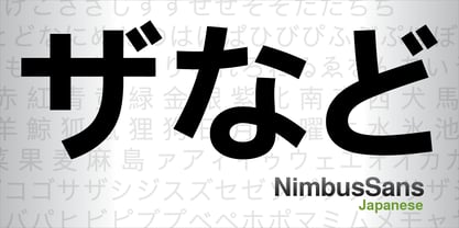
- Nimbus Sans Round by URW Type Foundry,
$35.99 The first versions of Nimbus Sans have been designed and digitized in the 1980s for the URW SIGNUS sign-making system. Highest precision of all characters (1/100 mm accuracy) as well as spacing and kerning were required because the fonts should be cut in any size in vinyl or other material used for sign-making. During this period three size ranges were created for text (T), the display (D) and poster (P) for small, medium and very large font sizes. In addition, we produced a so-called L-version that was compatible to Adobe’s PostScript version of Helvetica. Nimbus was also the product name of a URW-proprietary renderer for high quality and fast rasterization of outline fonts, a software provided to the developers of PostScript clone RIPs (Hyphen, Harlequin, etc.) back then. Also in the 80s, a new, improved version of the Nimbus Sans, namely Nimbus Sans Novus was designed. Nimbus Sans Novus was conceptually developed entirely with URW’s IKARUS system, i.e. all styles harmonize perfectly with each other in terms of line width, weight, proportions, etc. On top of that, Nimbus Sans Novus contains more styles than Nimbus Sans. Now, Nimbus Sans is also available as Round (like the popular URW fonts Futura Round and Eurostile Round). The Round versions are intended to facilitate the work of designers and typographers. The fonts can be used directly, without further preparatory work in graphic programs as finished, high-quality Rounds.
 - Nimbus Sans Arabic by URW Type Foundry,
$35.99 Nimbus Sans ME is the expansion within the Nimbus Sans family for the Middle East range: Arabic (incl. Farsi) and Hebrew. Volker Schnebel has designed both scripts, which each include five upright and five cursive styles. The design is contemporary and fits the Latin Nimbus Sans. Besides the basis characters, the Arabic also includes the presentation forms: the variations for initial, medial and final letters. The correspondent OTF features are included in the fonts. All three scripts are perfectly combinable. Nimbus Sans is one of the best supported and most favored URW fonts ever. It is available as a Global Font in 4 weights and contains up to 65.000 characters per font.
 - Core Sans D by S-Core,
$20.00 Core Sans D is a modern interpretation of condensed sans-serif typeface designed by S-Core and the whole family consists of 2 widths (Condensed, Normal), 7 weights (Thin, Light, Regular, Medium, Bold, Heavy, Black) with their corresponding italics. Core Sans D features a condensed geometric construction and has a large x-height which enhances legibility. The family is ideal for signage, headline as well as body text. Core Sans D is a part of the Core Sans Series such as Core Sans N SC, Core Sans N, Core Sans N NR, Core Sans M, Core Sans G and Core Sans A. Letterform in this type family is simple, clean and highly readable. The spaces between individual letter forms are precisely adjusted to create the perfect typesetting. Core Sans D supports complete Basic Latin, Cyrillic, Central European, Turkish, Baltic character sets. Each font includes proportional figures, tabular figures, numerators, denominators, superscript, scientific inferiors, subscript, fractions and case features.
 - Nova Sans by This is Not Typography,
$29.00 NovaSans is a modern geometric sans-serif font which captures the spirit of Bossa Nova, a noble Brazilian music style. Music and typography presents several things in commom, so the idea behind the font is show some of bossa nova’s characteristics, like melody, cadence, softness, metric, simplicity, waves, subtleties. Some gaps in representing the source of irregular alignment scores. NovaSans also was selected for Tipos Latinos Bienal, in the Display faces category. NovaSans was built with a modular system. Its whole set offers almost 280 glyphs with alternates, dingbats and ornaments. Conceived to be used as a display typeface, NovaSans is recommended for use at large sizes.
 - Novus by Sixty8seventy,
$25.00 Novus, meaning new, is a contemporary slab serif that introduces soft curves throughout, creating a typeface that conveys a softer tone while retaining the robust feel of a great slab serif. Novus is an ideal choice for headlines, branding, advertising, websites, social media and packaging. It also works well for short and medium-length text. Novus supports Central, Eastern as well as Western European languages and comes in seven weights. Opentype features include; ligatures, subscript, superscript, numerators, denominators and fractions.
 - Nimbus Sans Chinese Simplified by URW Type Foundry,
$99.99
- Nimbus Sans No. 5 by URW Type Foundry,
$89.99 - SAA Series D by URW Type Foundry,
$35.00 - Nimba by Pedroglifos,
$12.00 Inspired by the magic in the clouds, this part paintbrush, part san serif, Nimba is a hybrid display typeface that brings swiftness and joy to any project. Ideal for projects that require a sans type without sacrificing personality. This family contains true italic members, providing a stronger sense of motion and speed. Elegant, yet Vivid, this typeface will make your project stand out from the sans dominated design world.
 - Nimble by Twinletter,
$14.00 Nimble carries a strong, unique, cute, elegant, and formal character theme with a different touch, giving a new impression. beautiful, harmonious, relaxed but still formal. This font is rich in uniqueness in various characters in each letter, especially uppercase letters. you can alternate calls in each uppercase letter to create a new and captivating look in writing a name or trademark or something else. This font is perfect for strong text with displays for a wide variety of branding, advertising, posters, banners, packaging, news headlines, magazines, websites, logo design, and more.
 - Night Light Neon by Wing's Art Studio,
$24.00 Night Light is a specially created collection of seven neon inspired fonts giving designers the power to replicate traditionally hand-made lettering from the comfort of their own computer. Choose from the selection of script, sans serif and outline fonts to set your text. Then apply our custom graphic styles for a life giving jolt of electricity! The appeal of neon lettering lives in its power to display a message in a functional, eye-catching and timelessly cool way. How many times have you stopped in the street to admire a bar sign or shop front blazing with neon colors? It's aesthetic works equally well for a Hot Dog stand or high-end fashion brand, providing a tried and tested technique for grabbing customer attention. I've designed these fonts to make the power of neon accessible to all, investing time to research real neon signs and how they are made, paying attention to their human imperfections and inherent limitations (all of which makes them). This research has been distilled into these essential styles; Script, Outline, Inline, Square and Compressed. These seven core fonts give designers a new opportunity to take advantage of realistic neon lettering in their print and online projects, perfect for music promotion, film titles, YouTube tutorials and gig posters. Ready to be moulded to any requirement, the power of neon is in your hands. Neon Graphic Style Presets Available Here The link above provides access to the graphic styles seen in the visuals with support for Adobe Photoshop, Adobe Illustrator, Adobe After Effects. Simply download and follow the instructions provided.
 - Nimbus Roman by URW Type Foundry,
$89.99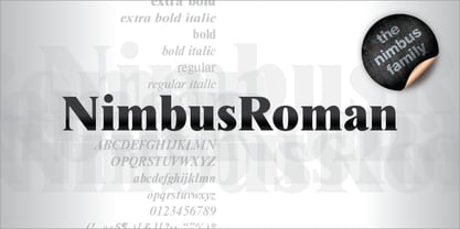
- Nimbus Stencil by URW Type Foundry,
$35.99 - Nimbus Mono by URW Type Foundry,
$89.99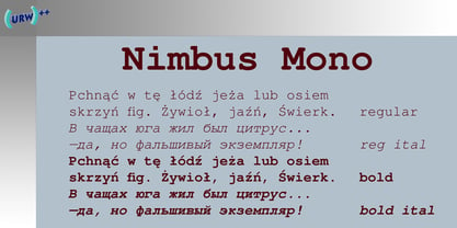
- Am Sans light - Unknown license

- Wade Sans Light by ITC,
$29.99Wade Sans Light was designed by Paul Hickson and Key Characters and appeared in the ITC library in 1990. The basic forms of the font are those of a constructed sans serif, as seen in the circular O and triangular A. The low x-height of the lower case letters make this font particularly reserved and graceful and the high ascenders give it a certain elegance. The high, wide capitals need a lot of space and dominate the overall look of this font. Wade Sans Light is reminiscent of the elegant cabarets of the 1920s and 30s. - SYN Nova by Borutta Group,
$- SYN NOVA is a digitisation project of SYN – futuristic typeface designed by Wojeciech Freudenreich, famous polish graphic designer. Our concept, besides giving it a digital form, was to expand the character set, design minuscule and opentype features for the typeface. Together with Wojciech Freudenreich we created 4 new weights. The complete family (5 styles & Variable Font Version) is distributed under open and free font license. Subsidised by the National Centre for Culture under the programme Kultura w sieci
 - Gill Sans Nova by Monotype,
$61.99 The Gill Sans® Nova typeface, by Monotype Studio designer George Ryan, expands the much-loved Gill Sans family from 18 to 43 fonts and features a coordinated range of roman and condensed designs. Several new display fonts are available, including a suite of six inline weights, shadowed outline fonts that were never digitized and Gill Sans Nova Deco that was previously withdrawn from the Monotype library. A variety of OpenType® features are supported that make it possible to include experimental characters from different points in Gill Sans’s long history, including pointed diagonals on ‘A’, ‘V’ and ‘W’ and alternatives for ‘b’, ‘d’, ‘p’ and ‘q.’ Proportional figures are also available as an alternative to the tabular designs. The Gill Sans Nova family has a large character set that supports Latin, Greek and Cyrillic languages. The display weights support Latin only. “Gill Sans was fast to strike a chord with people after its initial 1928 release and quickly became popular,” explains Ryan. “It’s been adapted for every publishing technology, from mechanical typesetting to digital imaging – always receiving the best treatment from Monotype in each iteration. This is especially true with all that we’ve added to the new series, while still retaining the familiarity of Gill Sans. My goal was to ensure clarity across digital environments, add missing weights, and bring more personality to the family with new display fonts, as well as Gill-inspired alternate characters.” The Gill Sans Nova typeface family is part of the new Eric Gill Series, drawing on Monotype's heritage to remaster and expand and revitalize Eric Gill’s body of work, with more weights, more characters and more languages to meet a wide range of design requirements. The Series also brings to life new elements inspired by some of Gill’s unreleased work, recently discovered in Monotype’s archive of original typeface drawings, designer correspondence and documents from the last century.
 - Berling Nova Sans by Linotype,
$40.99Berling Nova Sans Pro is the companion famous Berling Nova type family. Made by Pangea design, the sans family consists of seven fonts: Light, Regular, and Bold - all with true italics - and the additional weight of Extra Bold for real impact. The original Berling spirit was transfered into this sans design so it functions well as a pairing with its serifed counterpart. Useful for anything from text through display sizes, this clear and modern humanist design is sure to add just the right amount of personality to your project. For more information on this extended type system, be sure to check out the Berling Nova family! - Rogue Sans Nova by Device,
$39.00 Originally commissioned by magazine publisher IPC, Rogue has proved to be one of the most popular Device releases. Now extended and updated as Rogue Nova, it sports additional weights, East European language support and reengineered spacing and kerning. It is now a versatile 30-font family, with five weights and three widths, all with italics. Powerful and authoritative, sharp-edged and contemporary.
 - Joanna Sans Nova by Monotype,
$50.99 The Joanna® Sans Nova family is the only typeface in the Eric Gill Series that was not initially designed by Gill. Created by Monotype Studio designer Terrance Weinzierl over a three-year period with digital applications at the forefront of the design criteria, Joanna Sans Nova is a humanist sans serif based primarily on Gill’s original Joanna. The design comprises 16 fonts, from thin to black, each with a complementary italic. Joanna Sans Nova has a larger x-height to ensure high levels of legibility – even on small digital screens. Due to its inherent humanist proportions, Joanna Sans Nova is surprisingly comfortable for longer form reading. Its low contrast in character stroke weights also improves imaging in a variety of environments. In addition, the calligraphic and fluid details enable the roman and italic designs to shine in headlines and other display uses. Joanna Sans features a robust range of OpenType features for fine typography, including small caps, old style figures, proportional figures, ligatures, superscript and subscript figures and support for fractions. With over 1000 glyphs per font, Joanna Sans supports more than 50 languages – in Latin, Greek and Cyrillic scripts. “I've always been a fan of Gill’s work, explains Weinzierl, and found the simple, humanist qualities of Joanna really fitting for a sans serif design. I wanted to make something with Gill flavor, but with more harmony in the extreme weights than Gill Sans – and with my twist on it. I went through six or seven different italic designs before landing on the current direction.” “The original Joanna had a very distinct italic, Weinzierl continues. “It’s very condensed, and has a very shallow angle. I wanted to have an italic that stood out, but in a different way. I took a cursive direction for the italic details, which are wider and slanted more, both improving character legibility.” The Joanna Sans Nova typeface family is part of the new Eric Gill series, drawing on Monotype’s heritage to remaster and expand and revitalize Eric Gill’s body of work, with more weights, more characters and more languages to meet a wide range of design requirements. The series also brings to life new elements inspired by some of Gill’s unreleased work, discovered in Monotype’s archive of original typeface drawings and materials of the last century.
 - TypographerGotisch D - Personal use only

- Tricky D by URW Type Foundry,
$39.99 Tricky is a modern and dynamic design which is enhanced and supplemented by Tricky Tracky following soon.
 - [D]ONLINE by Don Citarella,
$20.00 [D]ONLINE is the first font family designed by Don Citarella for his blog, [D]ONLINE, and was created to provide a signature feel for its namesake. It combines a strong, medium stroke with arching end caps to embue the typeface with a futuristic curvilinear feel. This display font is best used for headlines, identities, wordmarks and other instances involving minimal copy and maximal whitespace The typeface includes 300 characters, including 45 accented glyphs and 30 ligatures.
 - Project D by DM Founts,
$22.00 Project D is the fourth typeface released by DM Founts. It was inspired by the infamous graffiti atop the former Heygate Estate in South London, which I had passed by numerous times on the overground train years ago. Heygate Estate has since been replaced by soulless luxury flats, as per the gentrification agenda. The letters don't entirely match the graffiti as they were created from memory, but I thought such a profound statement should be honoured. Project D is best used for impact at large sizes, although it should scale well. Use it for computer interfaces, retro headings and anything involving defiance, espionage, infiltration and spy games.
 - Doyen-D by Substance,
$12.00 A distorted, broken & cracked typeface. Doyen-D.ScreenRegular uses the same letter forms as the rest of the Doyen-D family, however the letters have gone through a halftone screen print process, resulting in even further distortion of the typeface.
 - Ornata D by Wiescher Design,
$39.50 Ornata D is the fourth of a series of old ornaments that I am trying to save from oblivion. I am completely redesigning the ornaments from scratch, trying in this one to keep the rough "letterpress" character. These ornaments have been first designed by Auriol around 1910. This set is perfect to design a great number of frames. Your digitizing type-designing savior, Gert Wiescher
 - Drei D by Volcano Type,
$19.00 - D Hanna by W Type Foundry,
$29.00
- Corner D by CarnokyType,
$20.00 Corner D is a part of Corner type family. This subfamily is designed with inverse rounded shapes in the corners. The concept of the typeface Corner is based on variation of corner shapes in font characters, from what is also its name derived. The basis is a bitmap modular principle, to which by simple addition of “the missing pixels” in corners of the characters ( Corner A ) to the shape of diagonal ( Corner B ), curvature ( Corner C ), or inversion curvature (Corner D), three more font variations are created. The basic monolinear bitmap weight is supplemented by two more extreme thicknesses – hairline and fat weight. The character set supports the complete Latin, while the x-height of lowercase is drawn at the same height as in the uppercase characters. Corner is a strong display typeface, which allows you to easily experiment and to combine it with its mutual font variations.
 - D Blues by W Type Foundry,
$29.00 D Blues its a sans serif typefamily of 9 weights plus matching italics. It is inspired by the neo humanist typefaces with a mix of 20st grotesque sans typeface. D Blues serve very well in web & print design areas, body text, excellent web-font legibility etc… D Blues is equipped with a complete set of opentype features including alternative glyphs, fractions, ligatures and many more. It is perfectly suited for highlighting lettering, magazines, web, interaction design, advertising & logotypes.
 - Litera D by URW Type Foundry,
$35.99 - Lightness by Arendxstudio,
$15.00 Lightness - Bold Signature Font that has a distinctive character that is very thick and elegant to use Lightness is a relaxed and flowing Handwritten Font. Incredibly versatile, this font fits a wide pool of designs, elevating them to the highest levels. Add this font to your favorite creative ideas and notice how it makes them come alive! Features : • Character Set A-Z • Numerals & Punctuations (OpenType Standard) • Accents (Multilingual characters) • Ligature Multilingual Support : Afrikaans, Albanian, Asu, Basque, Bemba, Bena, Catalan, Chiga, Cornish, Danish, English, Estonian, Faroese, Filipino, Finnish, French, Friulian, Galician, German, Gusii, Icelandic, Indonesian, Irish, Italian, Kabuverdianu, Kalenjin, Kinyarwanda, Low German, Luo, Luxembourgish, Luyia, Machame, Makhuwa-Meetto, Makonde, Malagasy, Malay, Manx, Morisyen, North Ndebele, Norwegian Bokmål, Norwegian Nynorsk, Nyankole, Oromo, Portuguese, Romansh, Rombo, Rundi, Rwa, Samburu, Sango, Sangu, Scottish Gaelic, Sena, Shambala, Shona, Soga, Somali, Spanish, Swahili, Swedish, Swiss German, Taita, Teso, Vunjo, Zulu There it is! I really hope you enjoy it !
 - Sana Sans by Latinotype,
$29.00 Sana Sans is a humanist functional typeface with a modern feel. It is intended to be a face well-suited for multiple purposes, especially in publishing. Sana Sans looks perfectly legible and clean in long texts, and neat and simple in headlines. Thanks to its versatility, this font is also ideal for both screen and print usage. Sana Sans consists of 32 styles and 8 weights—ranging from Thin to Heavy—italics, small caps and an alternative family. The alternative family offers slight variants in many glyphs, some of which include the lowercase a, e, l, q, y and uppercase G, L, and Q. Sana Sans was designed by Felipe Sanzana, under the supervision of Latinotype Team.


Page 1 of 250Next page