10,000 search results (0.03 seconds)
  1. Log Jam by Fonthead Design, $12.00
  2. Yuletide Log by Comicraft, $29.00
    Sleigh bells ring... are you listenin'? In the lane, snow is glistenin'. It's a beautiful sight, we're happy tonight... Features: One font with upper and lower case characters plus Western European international characters.
  3. Neo Neo by ITC, $29.99
    Neo Neo is the work of British designer Timothy Donaldson, a type style straight out of a 1950s time capsule. It can be set in all caps or a mixture of capitals and lowercase. The casual, slightly condensed forms with their smooth, soft lines are reminiscent of highway diners and motel ads of the time and convey a bright, inviting mood.
  4. Work Or Spoon - Unknown license
  5. Nouveau Work JNL by Jeff Levine, $29.00
    Based on the sheet music title lettering for Al Jolson's 1920 song "Grieving for You", the casual style of Nouveau Work JNL is available in both regular and oblique versions.
  6. West Fork JNL by Jeff Levine, $29.00
    West Fork JNL is based on the classic wood type Latin Extended (Hamilton, 1888) and is available in both regular and oblique versions.
  7. Fork Brush Vector by Nirmana Visual, $22.00
    Fork Brush inspired by realistic dry brush. all-caps font was hand-drawn with a real acrylic ink, Fork Brush offers beautiful typographic harmony for a diversity of design projects, including logos & branding, social media posts, advertisements & product designs.
  8. Work Force JNL by Jeff Levine, $29.00
    Work Force JNL is lettering based on a set of self-adhesive letters and numbers used for home or mailbox identification.
  9. Sign Work JNL by Jeff Levine, $29.00
    The 1951 sheet music of "I Like the Wide Open Spaces" has the cover title set in a casual type design that emulates the "one stroke" or "speed letter" style so popular with sign painters in that decade. Taking the lettering on the sheet music and expanding the character set with a new interpretation, the result is Sign Work JNL which is available in both regular and oblique versions.
  10. Road Work JNL by Jeff Levine, $29.00
    The October 5, 1935 issue of “Universal Weekly” (a publication detailing current film releases from Universal) was promoting the film “Remember Last Night”. Hand lettering used for this advertisement was an ultra-bold sans serif design with chamfered corners and some stylized characters. This is now available digitally as Road Work JNL in both regular and oblique versions.
  11. Stencil Work JNL by Jeff Levine, $29.00
    Stencil Work JNL was re-drawn from a vintage paper stencil with one inch high Roman letters and numbers, often found in stationery, drug and variety stores in the 1950s through the 1980s.
  12. Along Slab Work by Brenners Template, $19.00
    Along Slab WORK is a elegant Slab Serif font family, which designed by Ryuld Davidson of the Brenners Template. It retains the skeleton of the Along Sans S2(https://www.myfonts.com/fonts/brenners-template/along-sans) Especially, all italic styles were rhythmically redesigned for inspiration of glyphs. This font family has a unique personality for each style and will help a designer's choice.
  13. Work Yard Stencil by Jeff Levine, $29.00
    The image of a set of vintage French tin stencils spotted online was the starting point in designing Freight Yard Stencil JNL. A more traditional ‘B’ and ‘R’ replaces the original characters (which looked kind of awkward due to extra ‘stencil breaks’ within the letters). However, there are a few interesting variants in other characters to set the design apart from similar stencil fonts. Work Yard Stencil JNL is available in both regular and oblique versions.
  14. MC Hork Beans by Maulana Creative, $22.00
    Hork Beans is a simply casual handwritten font. With medium low contrast stroke, fun character with a bit of ligatures and alternates. To give you an extra creative work. Hork Beans font support multilingual more than 100+ language. This font is good for logo design, Social media, Movie Titles, Books Titles, a short text even a long text letter and good for your secondary text font with sans or serif. Make a stunning work with Hork Beans font. Cheers, Maulana Creative
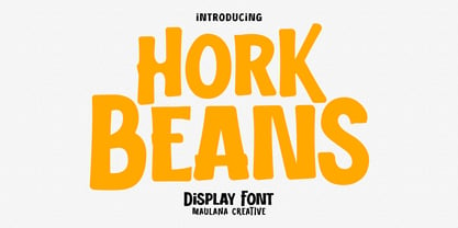
  15. Pen Work JNL by Jeff Levine, $29.00
    The 1938 sheet music for "(The Dwarves Marching Song) Heigh-Ho" from Walt Disney's "Snow White" had the part of the title in parenthesis hand lettered with a round nib ink pen. This lettering became the inspiration for Pen Work JNL, and is available in both regular and oblique versions.
  16. Public Works JNL by Jeff Levine, $29.00
    Public Works JNL emulates the hand-made lettering found on older signs printed by silk screen for local governments.
  17. Work In Progress by StereoType Fonts, $39.00
    Work In Progress is a smooth script font with a very specific style of connected curves. It brings a unique curly style with the possibility to create dynamic dancing words with it's ligatures and alternates.
  18. Office Work JNL by Jeff Levine, $29.00
    The 1965 film “Mirage” had its titles and credits hand lettered in a simple, thin sans serif with rounded corners and an overall square design. This is now available digitally as Office Work JNL, in both regular and oblique versions.
  19. NEWYEARS - Unknown license
  20. The Rio Lobo - Unknown license
  21. KG Lego House - Personal use only
  22. El Rio Lobo - Unknown license
  23. El Abogado Loco - Unknown license
  24. KG Lego House by Kimberly Geswein, $5.00
    Neat handwriting perfect for teachers. This font includes extra math symbols for teachers. Just enough personality while still being perfectly neat.
  25. NEC - Unknown license
  26. NewDeli - Unknown license
  27. Dew by ParaType, $25.00
    Dew is a script font with blobs on the stems that according to author’s imagination resemble dew drops on the caules. It gives an impression of fragrance and freshness and thus can be used for informal headings and short advertising texts for perfumes and cosmetics. The font was developed by Ekaterina Pulenko and released by ParaType in 2009.
  28. Ned by Linotype, $29.99
    Ned Std. is part of a series of typographic experiments from the young Swiss designer Michael Parson. Using a wide, horizontal hexagonal grid, Parson created the system of letters that make up this font. Text set in Ned Regular takes on a modular, honeycomb-like appearance. For an interesting effect, try overlapping individual letters, or use a few letters together as elements in a logo. A great companion face to Ned Std. is Linotype's Hexatype Bold. Both Ned Std. and Hexatype Bold have been included in the Take Type 5 collection, along with eight further constructions from Parson."
  29. Brush Hand New - Personal use only
  30. Times New Romance - Unknown license
  31. New Gothic Style - Unknown license
  32. brand new burn - Unknown license
  33. The New Metropolitan - Personal use only
  34. Tom's New Roman - Unknown license
  35. New Gothic Textura - Personal use only
  36. New World Vibes - Unknown license
  37. New Land Contour - Unknown license
  38. Brand New Heavies - Unknown license
  39. SF New Republic - Unknown license
  40. times new vespasian - Unknown license
Looking for more fonts? Check out our New, Sans, Script, Handwriting fonts or Categories
abstract fontscontact usprivacy policyweb font generator
Processing