10,000 search results
(0.103 seconds)
- MultiType Lines by Cyanotype,
$- MultiType Lines, an all caps typeface focused in display purposes. 36 styles with retro gaming vibes. This is the septh release of an expanding multiverse of mixable fonts. The whole family of typefaces has been designed to work at big sizes and display purposes such as branding, headlines, thumbnails, posters and animations. You can swap between the three additional alternate sets through all the styles to add diversity to your composition, even in Cyrillic. MultiType Lines is inspired by video games and arcades. Have fun mixing all the styles in your projects.
 - MultiType Maze by Cyanotype,
$- MultiType Maze, an all caps typeface focused in display purposes. 9 styles with an intricate look. This is the fourth release of an expanding multiverse of mixable fonts. The whole family of typefaces has been designed to work at big sizes and display purposes such as branding, headlines, thumbnails, posters and animations. You can swap between the three additional alternate sets through all the styles to add diversity to your composition, even in Cyrillic. MultiType Maze is inspired in labyrinths and geometric patterns. Have fun mixing all the styles in your projects.
 - Lemondrop - Personal use only

- Sunday Monday - Personal use only

- HiTone by Scholtz Fonts,
$19.00 HiTone emulates a natural hand-lettered typeface that provides exceptional legibility with a quirky style. It comes in three widths, the narrowest of which enables text to be placed compactly within a limited space. The widest, on the other hand, increases readability while maintaining the same stroke weight. In addition, each width comes in two weights, regular and black, enabling the user to provide emphasis or headline display without changing the essential style of writing. The font is most useful as a stylish text font. The font has all the features of a fully professional typeface. Language support includes all European character sets.
 - Better Valentina by madjack.font,
$10.00 Better Valentina Font Duo is a hand brush font created with brush and ink. Better Valentina Font Duo This typeface is ideal for use in bold watercolor designs or handwritten styles, such as blog titles, posters, wedding elements, t-shirts, clothing, book covers, business cards, greeting cards, branding, cafe / restaurant signs. merchandise, etc. Contains the complete set: - Uppercase - Lowercase - alternative - fasteners - Punctuation - number - Multilingual support. How to access all alternative characters, using the Windows Character Map with Photoshop: - https://www.youtube.com/watch?v=Go9vacoYmBw How to access all alternative characters using Adobe Illustrator: - https://www.youtube.com/watch?v=XzwjMkbB-wQ Thank you!
 - Manualist by Invasi Studio,
$19.00 Meet Manulist, your new go-to font for a natural hand-drawn look full of charm! With its all-caps style and big uppercase letters, this font exudes a classic elegant look. But wait, there's more! Manulist also comes with elegant alternates, adding a touch of sophistication to your designs. And that's not all - this font supports multilingual characters, so you can spread the fun and creativity in any language you desire. Plus, every character in Manulist has a delightful imperfect shape, giving your designs a unique and organic feel. It's like having your own personal hand-drawn masterpiece in every letter!
 - Unleash by Gassstype,
$23.00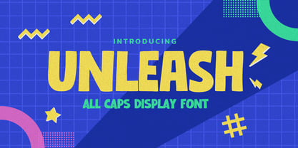 Hello Everyone, introduce our new product UNLEASH is All Caps Display Font with a natural feel. This handmade font will make your design has a beautiful natural touch for each details. It is perfect for any design project as Invitation,logo, book cover, craft or any design purposes. UNLEASH is Inspired by Food Logo style and combination with Unique Craft style. that will fulfill your design needs for quotes,sporty theme, logotype, wordmark, etc. This has many opentype features and support multi language. This font is PUA encoded which means you can access all of the magical glyphs with ease!
 - Maves by Prestigetype Studio,
$18.00 Maves is a modern and elegant font designed with a unique futuristic touch. Perfect use for classy visual brand identities such as logos, headlines, titles, labels, websites, stationery, business cards, or any advertising purposes. Maves includes: Modern all caps fonts Numbers and punctuation Multilingual Opentype features We highly recommend using a program that supports OpenType features and Glyphs panels like many Adobe apps and Corel Draw so you can see and access all Glyph variations. We hope you enjoy our font - please do let us know by emailing us at info@prestigetype.com or prestigetypestudio@gmail.com if you need something!
 - Jack Pirate by Mans Greback,
$59.00 Jack Pirate is a hand-drawn blackletter typeface, created by Måns Grebäck during 2019. It is a genuine medieval font with fraktur-inspired letter forms, Gothic decorations and a mysterious undertone. Use it for projects relating to the Middle Ages, or in modern contexts such as tattoo or storefront graphics. It contains an alternate alphabet, to be used as a stand-alone font or to give decoration and variation to the regular style. The font is multilingual and has an extensive range of glyphs; it supports all Latin-based European languages, contains numbers as well as all symbols and characters you'll ever need.
 - Kaipara by Gleb Guralnyk,
$14.00 Presenting originally designed decorative font named Kaipara. The main goal of this font is a pattern that flows between the characters. Each letter has six variations that switches automatically to create a solid pattern feeling. Check out that "context alternates" OpenType feature is activated to achieve neccessery result. Also a simple supporting font is available here. Note: Please note that full pattern effect is working only with english alphabet and numbers. All other characters has only one variation. Note: Check out that all of your letters has the same case (lowercase or uppercase) to make the effect work properly.
 - Zentenar Fraktur by RMU,
$25.00 The name of this blackletter font was chosen due to the centennial of the Bauer Foundry, Frankfurt am Mai, in 1937. Ernst Schneidler probably created then the most beautiful of all fraktur fonts. They are the fruit of countless calligraphic drawings and of many years of professional experiences. Zentenar Fraktur became in its time the workhorse among German blackletter fonts. To access all ligatures in both styles, it is recommended to activate Standard and Discretionary Ligatures. The round s can be reached by typing the # key, and the combination N-o-period plus the OT feature Ordinals gives you the Numero sign.
 - Avantime by Supfonts,
$16.00 Charming 80's retro inspired typeface with wonderful versatility given it includes 30 fonts. This is a perfect for any project Inspired by magazine adverts from the 70's and 80's - this family fit right in with bringing retro back into the 21st century. Super-versatile - have a scroll through all the preview to see the very wide range of variety the Avantime back can manifest the possibilities are really quite endless :) Avantime Font Features: 30 fonts Full Set of standard alphabet and punctuation PUA Encoded - no special software needed to access extra characters Language support: All European languages Multilingual Characters
 - Clarendon Wide by Canada Type,
$24.95 By overwhelming popular demand, this is the wide display companion to Canada Type's Clarendon Text family. It comes in ten styles: regular, medium, bold, with small caps and oldstyle Figures counterparts, as well as stencil and sketch versions of the regular and the bold. All the fonts come equipped with superscripts/numerators, denominators, and scientific inferiors. The OpenType fonts also contain automatic fractions and class-based kerning. The Clarendon Wide fonts are available in all popular formats. Language support includes Western, Central and Eastern European character sets, as well as Baltic, Esperanto, Maltese, Turkish, and Celtic/Welsh languages.
 - Dear Penpal Script by Giaimefontz,
$6.00 This is a fully connected script font, not calligraphic, but entirely designed to follow handwritten cursive ligatures rules as teached in schools. In order to correctly visualize it, you have to enable OpenType features (Contextual Alternates, Discretionary Ligatures, Standard Ligatues and Kerning). Trying to write All Capitals will generate Block Letters writings, since cursive style doesn't allow more than the first uppercase per word, however this font is not meant to be a Block Letters font. Using specific type combinations will generate special glyphs. All of these features are intended to reproduce a classic schoolboy or schoolgirl notebook.
 - Rovey by Craft Supply Co,
$15.00 Rovey is an all caps handwritten serif font. It can be used to create almost all types of design projects like print materials. Just use your imagination and some graphic design set in Extras and your project will become more alive and look greater than ever with Rovey. You want to make a greeting card or a package design, or even a brand identity, craft design, any DIY project, book title, wedding font, pop vintage design, retro design or any purpose to make your art / design project look pretty and trendy? Feel free to play with this fonts!
 - Swiss Folk Ornaments by Gerald Gallo,
$20.00 Swiss Folk Ornaments were inspired by old Swiss embroidery designs. Swiss Folk Ornaments - Critters & Things is composed of critters (animals) and other things, hearts, pitchers, and a basket. In the character set all critters face to the left. In the shift+character set, under each respective key, all critters face to the right. There are a total of 72 ornaments in this font. Swiss Folk Ornaments - Floral is composed of floral designs. There are a total of 56 ornaments in this font. Swiss Folk Ornaments - Geometric is composed of symmetrical geometric designs. There are a total of 42 ornaments in this font.
 - Semilla by Sudtipos,
$79.00 I spend a lot of time following two obsessions: packaging and hand lettering. Alongside a few other minor obsessions, those two have been my major ones for so many years now, I've finally reached the point where I can actually claim them as “obsessions” without getting a dramatic reaction from the little voice in the back of my head. When you spend so much time researching and studying a subject, you become very focused, directionally and objectively. But of course some of the research material you run into turns out to be tangential to whatever your focus happens to be at the time, so you absorb what you can from it, then shelf it — like the celebrity bobblehead that amused you for a while, but is now an almost invisible ornament eating dust and feathers somewhere in your environment. And just like the bobblehead may fall off the shelf one day to remind you of its existence, some of my lettering research material unveiled itself in my head one day for no particular reason. Hand lettering is now mostly perceived as an American art. Someone with my historical knowledge about lettering may be snooty enough to go as far as pointing out the British origins of almost everything American, including lettering — but for the most part, the contemporary perspective associates great lettering with America. The same perspective also associates blackletter, gothics and sans serifs with Germany. So you can imagine my simultaneous surprise and impatience when, in my research for one of my American lettering-based fonts, I ran into a German lettering book from 1953, by an artist called Bentele. It was no use for me because it didn't propel my focus at that particular time, but a few months ago I was marveling at what we take for granted — the sky is blue, blackletter is German, lettering is American — and found myself flipping through the pages of that book again. The lettering in that book is upbeat and casual sign making stuff, but it has a slightly strange and youthful experimentation at its heart. I suppose I find it strange because it deviates a lot from the American stuff I'm used to working with for so long now. To make a long story short, what’s inside that German book served as the semilla, which is Spanish for seed, for the typeface you see all over these pages. With Semilla, my normal routine went out the window. My life for a while was all Bezier all the time. No special analog or digital brushes or pens were used in drawing these forms. They're the product of a true Bezier process, all starting with a point creating a curve to another point, which draws a curve to another point, and so on. It’s a very time-consuming process, but at the end I am satisfied that it can get to pretty much the same results easier and more traditional methods accomplish. And as usual with my fonts, the OpenType is plenty and a lot of fun. Experimenting with substitution and automation is still a great pleasure for me. It is the OpenType that always saves me from the seemingly endless work hours every type designer must inevitably have to face at one point in his career. The artful photos used in this booklet are by French photographer and designer Stéphane Giner. He is very deserving of your patronage, so please keep an eye out for his marvelous work. I hope you like Semilla and enjoy using it. I have a feeling that it marks a transition to a more curious and flexible period in my career, but only time will tell.
 - Cyan Sans by Wilton Foundry,
$29.00The design of Cyan was inspired by features found in classic Roman and styles like Trajan and Bodebeck. The characters stay true to the same features as the capitals, resulting in an unusually distinctive style. The Capitals version contains Roman numerals. Cyan's weight is similar to Trajan's but the horizontal strokes are slightly bolder resulting in better legibility for small sizes, especially for lowercase characters. Cyan Sans evolved out of the hugely successful Cyan Serif family. Cyan Sans retains the same geometric Roman proportions with open centers in B,P,R b, d, p . This helps create a thick and thin stroke illusion since the actual strokes don't vary much. There are many subtle details in Cyan Sans that become more interesting in larger sizes. The beauty of Cyan Sans is that it has no features that "jar" the eye. The result is a very pleasing and distinctive sans that scales well. Cyan Sans is a robust font that will exceed expectations in areas never explored before. The name is inspired by the Greek word cyan, meaning "blue". Blue as a primary color that has many hues and uses. Cyan the font, we hope will be seen in a similar light. Obviously Cyan Sans is a perfect companion to the Cyan Serif family. - Evoque by Monotype,
$40.00 Evoque is a humanist serif type family designed for both text and display purposes. Its appearance is crisp and modern while echoing a classical Garamond heritage. The inspiration for Evoque came after reminiscing over Apple’s advertising of the eighties and nineties that utilised incredibly tightly-spaced headlines set in Apple Garamond. I wanted to create a typeface that evoked nostalgia of those times and that distinctive typographic style. A number of swash alternates and discretionary ligatures enhance Evoque, giving you the opportunity to add more flair and personality to your title and branding designs. Simply activate Stylistic Sets to start adding these flourishes to your typography. Other useful features include Small Caps at the click of a button, and Old Style Figures are an option to the default proportional figure style. There are 36 fonts altogether, with 6 weights in roman and italic from Thin to Heavy weights across Condensed, Narrow, and Regular widths. Evoque has an extensive character set (900+ glyphs) that covers every Latin European language. Please also take a look at Evoque Text which is specifically designed for the publishing sector. Key features: 6 weights in both roman and italic 3 widths – Regular, Narrow, Condensed 80 Alternates 26 Ligatures Small Caps Full European character set (Latin only) 900+ glyphs per font.
 - Better Times by Set Sail Studios,
$16.00 Introducing Better Times, a handmade brush font! This bold, free-flowing and confident brush font is designed to be easily customisable with 2 sets of each letter and a bonus set of 20 swashes! Oh, and not to mention it looks great in both all-caps as well as lowercase - all of this together providing you with a huge range of layout options. Better Times is a brush font which you can use and enjoy again and again, for anything from promotional material and handwritten quotes, to product packaging, merchandise and branding projects. The Better Times family consists of 3 fonts; 1. Better Times • A handwritten brush font containing upper & lowercase characters, numerals and a large range of punctuation. 2. Better Times Alt • This is a second version of Better Times, with a completely new set of lowercase and uppercase characters. If you wanted to avoid letters looking the same each time to recreate a custom-made style, or try a different word shape, simply switch to this font for an additional layout option. 3. Better Times Swash • A set of 20 hand-drawn swashes, the perfect finishing touch to underline your Better Times text. Simply install this as a separate font, select it from your font menu and type any A-U character to create a swash. Fonts include multilingual support for the following languages; English, French, Italian, Spanish, Portuguese, German, Swedish, Norweigen, Danish, Dutch, Finnish, Polish, Indonesian, Filipino, Malay
 - ITC Ozwald by ITC,
$29.99ITC Ozwald was designed by David Farey and is a revival of a little-known typeface of American type designer Oswald Cooper called Cooper Fullface. The original was intended to be a modernized version of Bodoni and Farey captured all the charm, wit and creativity of the original in ITC Ozwald. - Getho Semi Sans by deFharo,
$12.00 Getho is a Semi Sans family of geometric construction with 6 weights plus the italic versions all include small letters, the symbol of Bitcoin and other monetary symbols. It is an exclusive typography with neo-grotesque modulations and maximum readability in any size. The typeface has alternative letters and numbers, small caps and advanced OpenType functions. The complete Pack includes versions of the Variable Fonts type. The drawn of the vectors is meticulous to obtain smooth curves of elegant aspect to which also contributes the subtle rounding of the corners, the thicker versions have of traps of ink in the knots of the unions to be able to use them in small sizes. The Metric and the Kerning of all the versions I have reviewed individually to obtain a fluent reading in any type of text and size.
 - Surfinta Mars - Unknown license

- Simply Sweet by Nicky Laatz,
$18.00 Say hello to the SIMPLY SWEET Font Duo! - Two delicious new companion fonts that go together like milk and cookies. Flamboyant and curvaceous, the playful script includes a large selection of alternate characters to choose from as well as natural looking ligatures to add to the authenticity of the lettering. A collection of whimsical end and beginning swashes are also included to add a finishing touch or fill design space in your type designs. Complimenting it, is a cute little wonky all caps serif font , with double letter ligatures for a natural look. Simply Sweet Script makes custom lettering designs a dream thanks to all the little extra decorative options you can include for a pretty and unique customisation - swashes, endings, alternate letters and ligatures, all make her the prettiest little thing since tutus and tiaras.
 - The Queen Marker by Azetype,
$19.00 Presenting The Queen Marker! A Brush Marker Font with a stylistic alternate. This font is made with the perfect combination of each character. You can type by Mix & Match to get a unique combination. It looks original and can be used for all your project needs. Each glyph has its own uniqueness and when meeting with others will provide dynamic and pleasing proximity. This font can be used at any time and on any project. You can see in the presentation picture above, The Queen Marker looks stunning on design projects. So, The Queen Marker can't wait to give its touch to all your design projects such as quotes, poster design, personal branding, promotional materials, logotype, product packaging, etc. Besides that, The Queen Marker also has some underline swashes. Just type c_1 until c_10 to feature all. Happy Creating www.azetypestudios.com
 - Lacosta by Mans Greback,
$59.00 Lacosta is a decorative script typeface, drawn and created by Måns Grebäck during 2020. Perfect for company or product logotypes, or any typographic art that requires that classic custom look. Included in the family is the Lacosta Line typeface, a swash underlined variation of the original font. In addition to being a beautiful, ornamental lettering, it also has a lot of decorative and swash options: Use the symbols [ ] { } _ to create connections, swashes and decorations. Example: Extra[ Sweet] The font contains multiple OpenType functions, and is filled with alternates; stylistic alternates to give extra personality, and contextual alternates to make the letters flow with one another smoothly -- just as a custom logo. Lacosta has a very extensive lingual support, covering all European Latin scripts. The font contains all characters you'll ever need, including all punctuation and numbers.
 - Blustella by Alfaraby Studio,
$18.00Blustella a fonts of stylish calligraphy that have a varied base line, fine lines, classic and elegant touches. Can be used for various purposes. Such as title, signature, logo, wedding invitation, t-shirt, letterhead, nameplate, label, news, poster, badge etc. Blustella displays stylish calligraphy alternate characters. Includes initial letters and terminals, alternatives, ligatures and multiple language support. The Features of this fonts is: * Standart ligatures * Stylistic Alternates * PUA Unicode (Private Use Areas) * Swash Programs that support in this font is a Adobe Photo Shop, Adobe Illustrator, Adobe Indesign, Corel Draw and Microsoft Office. OpenType features can be accessed by using OpenType smart programs such as Adobe Photo Shop, Adobe Illustrator, Adobe Indesign, Corel Draw and Microsoft Office. can also be accessed through the character map. Special greetings for all, all of us all smoothly in running the routin. Thank you for your purchase!. - Antiquary by DimitriAna,
$22.00 The Antiquary font collection was designed and illustrated, to reanimate the art of vintage advertising design. The fonts are inspired by the old ad posters and product labels, as well as the art of sign-making. The 4 typographic styles are combined with shapes and ornaments to create a variety of designs. They are ideal for logos, packaging, branding and all kinds of advertisements. Typographic styles: Antiquary: Old fashioned, serif, with 2 styles (Regular and Outline), stylistic alternates and ligatures. Antiquary Wide: All caps, bold, serif, vintage, with 3 styles: Regular, Inline and Outline. Antiquary Script: Modern brush calligraphy with terminal forms, contextual alternates, stylistic alternates and ligatures. Antiquary Thin: All caps, minimal, old fashioned. Antiquary Elements: 52 symbols, ribbons, frames and ornaments. The font collection supports Western, Central, Eastern, European, Baltic, Turkish and Greek languages.
 - Lexington by Canada Type,
$24.95A revival and major expansion of a 1926 Ludwig Wagner Schriftgiesserei typeface called Titanic, Lexington is the ultimate art deco expression of the high times of signage and theater during the first half of the twentieth century. Big feminine caps and cozy direct minuscules make for a unique combination rarely found in other deco faces. Topped off with the humorous and quite suave tall and pointy ascenders and descenders of the alternates, Lexington makes for a versatile and uniquely eye-catching display face beneficial to poster art, book covers, classy menus, product packaging and music paraphernalia. The original specimen Hans van Maanen worked from showed the majuscules, minuscules, figures, and 4 alternates of some ascending minuscules. This new digital version includes all of the above, plus many more additions: - Plenty more alternates, for some caps as well as for all the ascending and descending lowercase. - Three different size variations for the comma and the period. - Oldstyle figures. - A full complement of accented characters to support more Latin-based languages than ever, including Baltic, Celtic, Turkish, and Central/Eastern European languages. - A Handtooled style variation that covers both the main character set and the alternates. Lexington was named after Manhattan's Lexington Avenue, home of the some of the most famous and polished art deco architecture of the 1920s and 1930s. Lexington and Lexington Handtooled come in all popular font formats. The OpenType versions combine their respective alternates with the main character sets, for ease of use within OpenType-savvy applications. - Winsel Variable by insigne,
$129.99 At this pivotal juncture, where every choice casts long shadows, the imperative of pinpointing the archetype of typefaces is of paramount importance. One mere oversight, and the soul of your endeavor risks being lost in the mists of time. Yet, amidst these crossroads, "Winsel" emerges as the North Star in your typographical odyssey. Birthed in the revered sanctums of insigne design, this typeface is a magnum opus, echoing the artistic brilliance of British poster craft from epochs of golden jazz to times of renaissance. Winsel, in its sheer magnificence, stands as a testament to artistry, each stroke demanding undivided reverence. Be it the valiant weights reminiscent of a guardian sentinel or the graceful finesse mirroring a maestro's touch, Winsel is an unparalleled behemoth. Imbued with the finesse of OpenType, it's poised to embrace the multifaceted European Latin tapestry, while its Small Caps and Titling Caps take pride of place across its grand suite of nine weights. Sculpted with precision, Winsel is the beacon that challenges the ordinary and pledges to be an immortal testament. Seldom has the cosmos aligned to present such an illustrious moment. Fortified with Winsel, you stand on the precipice of legend. Carve your tales into the annals of perpetuity, voice your ethos with unyielding conviction, and let each letter be a symphony of undying commitment. In this epoch, in this narrative, Winsel beckons you to etch history.
 - LiebeLotte Swell by LiebeFonts,
$29.90 Have you heard? It’s in the stars: next July we collide with Mars! But until then, there are plenty of good reasons to treat yourself to this swell typeface. LiebeLotte Swell is a great investment for letter lovers who design beautiful things for their friends and family and also for designers who love their clients: Your next birthday invitation? Check. That photo album you’re making for your mom? Check. The business cards you’re designing for your friend who runs a deli? Check. There are so many nice things that want to be designed, and LiebeLotte Swell wants to be your assistant in the old-fashioned way: polite and friendly. Just like her monolinear siblings in the LiebeLotte family, charming LiebeLotte Swell knows how to impress with her perfectly drawn curves and her perfectly connected loopy letterforms. Of course LiebeLotte Swell comes with a state-of-the-art character set. She also sports a variety of ligatures and alternative forms, available through OpenType features. (Please make sure your software supports ligatures for the letter connections and OpenType if you wish to use the advanced features.) Advanced designers, check out the complete LiebeLotte family with six weights of monolinear loopiness. You may also want to take a look at our best-sellers LiebeErika and LiebeKlara, they get along great with LiebeLotte Swell.
 - FS Irwin by Fontsmith,
$80.00 New York vibes FS Irwin was born in New York while Senior Designer, Fernando Mello, was studying an intensive 5 week typeface design course at the Cooper Union. His brief was to design a perfectly clear typeface that could communicate well, without loud or overtly mannered design features. Fernando was influenced by the subway font in New York: ‘It is very in your face and clear, always in bold. It doesn’t shout much but at the same time is very present and unique. The design is completely different but it was this spirit I wanted to capture for FS Irwin.’ And the vibe of the city: ‘In a similar way to London, New York is so mixed and so cosmopolitan. I was amazed by the different styles and identities I saw there, and tried to encapsulate this essence to create something new, relevant and very now.’ Incisive quality Rather than focusing on quirks or distinctive characteristics, the key to FS Irwin is the quality of its design and spirit of simplicity. The design, proportions and details are usable and authentic and it is suitable for countless situations, without running the risk of being instantaneously noticeable. Families like this can be used on nearly anything, from more playful designs to serious corporate IDs. ‘Extensively tested and precisely drawn text-oriented typefaces are what I enjoy designing the most. There is a beauty and a different approach, a different way of making them interesting, sellable and usable rather than adding flicks or unexpected details.’ Inscriptions and calligraphy FS Irwin’s origin lies in Fernando’s studies in inscriptional lettering and writing-calligraphic exercises at the Cooper Union. Mello started the process by digitising his explorations and adapting them into a more workable sans serif structure. The traditional forms of writing which gave the basis to Latin type as we know it today were the perfect place to start. This influence can be seen in the proportion of the capitals and in slight writing-calligraphic details in the lowercase, such as the slightly angled, chiselled spurs and their open terminals.
 - Roos by Canada Type,
$24.95 The Roos family is a digitization and expansion of the last typeface designed by Sjoerd Hendrik De Roos, called De Roos Romein (and Cursief). It was designed and produced during the years of the second World War, and unveiled in the summer of 1947 to celebrate De Roos's 70th birthday. In 1948, the first fonts produced were used for a special edition of the Dutch Constitution on which Juliana took the oath during her inauguration as the Queen of the Netherlands. To this day this typeface is widely regarded as De Roos's best design, with one of the most beautiful italics ever drawn. In contrast with all his previous roman faces, which were based on the Jenson model, De Roos's last type recalls the letter forms of the Renaissance, specifically those of Claude Garamont from around 1530, but with a much refined and elegant treatment, with stems sloping towards the ascending, slightly cupped serifs, a tall and distinguished lowercase, and an economic width that really shines in the spectacular italic, which harmonizes extremely well with its roman partner. The Roos family contains romans, italics and small caps in regular, semibold and display weights, as well as a magnificent set of initial caps. All the fonts contain extended language support, surpassing the usual Western Latin codepages to include characters for Central and Eastern European languages, as well as Baltic, Celtic/Welsh, Esperanto, Maltese, and Turkish.
 - All Over Again, a captivating font created by the talented David Kerkhoff, stands out as a distinguished member of the handwritten font family. David Kerkhoff, known for his ability to infuse persona...
- Pea Little-Ducky - Unknown license

- Pea Cara in TX - Unknown license

- Pea Glo-Girl - Unknown license

- Malira by Subectype,
$18.00 Introducing the new "Malira" font, a monoline script font. For those of you who are needing a touch of clean monoline handwritten Font, chic and modernity for your designs, this font was created for you! Malira was built with beautiful alternate ending. and It has an extensive lingual support, covering all European Latin scripts.
 - Bintan by Rezastudio,
$9.00 Bintan is a dazzling script font. This font is neatly crafted and highly detailed. Whatever the topic, this font will be a wonderful asset to your font library, as it has the potential to enhance any creation. Bintan is PUA encoded which means you can access all of the glyphs and swashes with ease!


