10,000 search results
(0.066 seconds)
- Aplikazia MF by Masterfont,
$59.00 A practical font family with 11 weights for all your needs: headlines, body text, signage etc. This font family is a working horse with high legibility at small sizes. OpenType Pro Excellent support for Niqqud. All marks are programmed to fit each glyph's shape and width. OpenType Pro includes new advanced features like Dagesh Hazak, ShevaNa, etc and wide letters. Best used with Adobe InDesign CC that support complex Hebrew text. Please check these advanced features in this link: tinyurl.com/2fbkuy95
 - Jazzy Croquette by Art Grootfontein,
$19.00 Jazzy Croquette is a friendly handwritten all-caps family made for jazzing up your designs! It was initially designed by illustrator Art Grootfontein for lettering his speech bubbles. Some cool Opentype ligatures give its distinctive organic jazzy feel. Jazzy Croquette is a professional tool designed to support Central and Eastern European as well as Western European languages. This font would be honored to be used on comic book, games, press, food products, advertising and all kind of stationery! Caps only Fonts.
 - Darker Marker by Hanoded,
$15.00 Darker Marker is just what the name suggests: I found a very big fat marker in a local stationary store, bought it, came home and went to work on this font. Darker Marker is a very clear, very easy to read marker font. It is all caps, but upper and lower case differ and can be interchanged. Darth Vader would have said: “come to the dark side” and I believe you should. Darker Marker comes preloaded with all the diacritics you need.
 - Bellisa Script by Matra Creative,
$10.00 Bellisa Sript is inspired by classic typography and brings its own unique style to every design project. This fantastic script font is best suited for headers of all sizes, and for blocks of text that have maximum and minimum variations. Be it for the web, printing, moving images or whatever - Bellisa Sript will look spectacular. This font is PUA encoded which means you can access all the funny glyphs and swash easily! It also has many special features including alternative glyphs and ornaments.
 - Darling Emily NF by Nick's Fonts,
$10.00The typeface Weiner Grotesk, designed by Rudolf Geyer for the H. Berthold AG foundry of Berlin in 1912, provides the pattern for this classic Jugendstil font. The design is very versatile: used as all caps, you can create elegant, compact headlines; and, as upper and lower, you can create subheads with decidedly dramatic contrast. Either way, this one is a "Weiner". All versions of this font include the Unicode 1250 Central European character set in addition to the standard Unicode 1252 Latin set. - Quenione Unico by WNGSTD,
$10.00 Quenione Unico - Unique sans serif is a playful and modern font. featuring a lightweight, it offers support for all characters. standard punctuation glyphs are included. Quenione Unico - Unique sans serif is perfectly suited for traditional media and the web. great for the crafter and graphic artists. compatible with all tools. its playfulness makes it great for creative project., be inspirational wall poster, or for communicating your brand. This font can be used for any variety of purposes. FEATURES : uppercase lowercase symbol & number
 - TT Travels by TypeType,
$35.00 TT Travels useful links: Specimen | Graphic presentation | Customization options About TT Travels: TT Travels is a geometric grotesque with wide proportions and peculiar shapes of circles and brackets. TT Travels incorporates two stylistic sets which add completely different characters to the type family. The first set ss01 (aka salt) makes the font more humanistic, thanks to the ductal and smooth design of the characters defining the style. And if you want to work with the futuristic version of TT Travels, we recommend that you enable the second set (ss02). In this set, most of the characters defining the style change to characters possessing experimental forms of graphemes. For the convenience of the TT Travels font family use and for working within a complex text hierarchy, we've created 9 weights (Thin, X-Light, Light, Regular, Medium, DemiBold, Bold, X-Bold, Black) and added 9 true Italics. TT Travels also implements standard and discretionary ligatures, oldstyle figures, slashed zero, and much more. The full list of OpenType features used in TT Travels is: ordn, sups, sinf, numr, dnom, onum, tnum, pnum, liga, dlig, salt, ss01, ss02, case, frac, zero. TT Travels language support: Acehnese, Afar, Albanian, Alsatian, Aragonese, Arumanian, Asu, Aymara, Banjar, Basque, Belarusian (cyr), Bemba, Bena, Betawi, Bislama, Boholano, Bosnian (cyr), Bosnian (lat), Breton, Bulgarian (cyr), Cebuano, Chamorro, Chiga, Colognian, Cornish, Corsican, Cree, Croatian, Czech, Danish, Embu, English, Erzya, Estonian, Faroese, Fijian, Filipino, Finnish, French, Friulian, Gaelic, Gagauz (lat), Galician, German, Gusii, Haitian Creole, Hawaiian, Hiri Motu, Hungarian, Icelandic, Ilocano, Indonesian, Innu-aimun, Interlingua, Irish, Italian, Javanese, Judaeo-Spanish, Judaeo-Spanish, Kalenjin, Karachay-Balkar (lat), Karaim (lat), Karakalpak (lat), Kashubian, Khasi, Khvarshi, Kinyarwanda, Kirundi, Kongo, Kumyk, Kurdish (lat), Ladin, Latvian, Laz, Leonese, Lithuanian, Luganda, Luo, Luxembourgish, Luyia, Macedonian, Machame, Makhuwa-Meetto, Makonde, Malay, Manx, Maori, Mauritian Creole, Minangkabau, Moldavian (lat), Montenegrin (lat), Mordvin-moksha, Morisyen, Nahuatl, Nauruan, Ndebele, Nias, Nogai, Norwegian, Nyankole, Occitan, Oromo, Palauan, Polish, Portuguese, Quechua, Rheto-Romance, Rohingya, Romanian, Romansh, Rombo, Rundi, Russian, Rusyn, Rwa, Salar, Samburu, Samoan, Sango, Sangu, Scots, Sena, Serbian (cyr), Serbian (lat), Seychellois Creole, Shambala, Shona, Slovak, Slovenian, Soga, Somali, Sorbian, Sotho, Spanish, Sundanese, Swahili, Swazi, Swedish, Swiss German, Swiss German, Tagalog, Tahitian, Taita, Tatar, Tetum, Tok Pisin, Tongan, Tsonga, Tswana, Turkish, Turkmen (lat), Ukrainian, Uyghur, Vepsian, Volapük, Võro, Vunjo, Xhosa, Zaza, Zulu.
 - Divina Proportione by Intellecta Design,
$29.00 Divina Proportione is based from the original studies from Luca Pacioli. Luca Pacioli was born in 1446 or 1447 in Sansepolcro (Tuscany) where he received an abbaco education. Luca Pacioli was born in 1446 or 1447 in Sansepolcro (Tuscany) where he received an abbaco education. [This was education in the vernacular (i.e. the local tongue) rather than Latin and focused on the knowledge required of merchants.] He moved to Venice around 1464 where he continued his own education while working as a tutor to the three sons of a merchant. It was during this period that he wrote his first book -- a treatise on arithmetic for the three boys he was tutoring. Between 1472 and 1475, he became a Franciscan friar. In 1475, he started teaching in Perugia and wrote a comprehensive abbaco textbook in the vernacular for his students during 1477 and 1478. It is thought that he then started teaching university mathematics (rather than abbaco) and he did so in a number of Italian universities, including Perugia, holding the first chair in mathematics in two of them. He also continued to work as a private abbaco tutor of mathematics and was, in fact, instructed to stop teaching at this level in Sansepolcro in 1491. In 1494, his first book to be printed, Summa de arithmetica, geometria, proportioni et proportionalita, was published in Venice. In 1497, he accepted an invitation from Lodovico Sforza ("Il Moro") to work in Milan. There he met, collaborated with, lived with, and taught mathematics to Leonardo da Vinci. In 1499, Pacioli and Leonardo were forced to flee Milan when Louis XII of France seized the city and drove their patron out. Their paths appear to have finally separated around 1506. Pacioli died aged 70 in 1517, most likely in Sansepolcro where it is thought he had spent much of his final years. De divina proportione (written in Milan in 1496–98, published in Venice in 1509). Two versions of the original manuscript are extant, one in the Biblioteca Ambrosiana in Milan, the other in the Bibliothèque Publique et Universitaire in Geneva. The subject was mathematical and artistic proportion, especially the mathematics of the golden ratio and its application in architecture. Leonardo da Vinci drew the illustrations of the regular solids in De divina proportione while he lived with and took mathematics lessons from Pacioli. Leonardo's drawings are probably the first illustrations of skeletonic solids, an easy distinction between front and back. The work also discusses the use of perspective by painters such as Piero della Francesca, Melozzo da Forlì, and Marco Palmezzano. As a side note, the "M" logo used by the Metropolitan Museum of Art in New York City is taken from De divina proportione. “ The Ancients, having taken into consideration the rigorous construction of the human body, elaborated all their works, as especially their holy temples, according to these proportions; for they found here the two principal figures without which no project is possible: the perfection of the circle, the principle of all regular bodies, and the equilateral square. ” —De divina proportione
 - Generis Slab by Linotype,
$29.00The idea for the Generis type system came to Erik Faulhaber while he was traveling in the USA. Seeing typefaces mixed together in a business district motivated him to create a new type system with interrelated forms. The first design scheme came about in 1997, following the space saving model of these American Gothics. Faulhaber then examined the demands of legibility and various communications media before finally developing the plan behind this type system. Generis’s design includes two individually designed styles; each of with is available with and without serifs, giving the type system four separate families. Each includes at least four basic weights: Light, Regular, Medium, and Bold. Further weights, small caps, old style figures, and true italics were added to each family where needed. The Generis type system is designed to meet both optical criteria and the highest possible measure of technical precision. Harmony, rhythm, legibility, and formal restraint make up the foreground. Generis combines aesthetic, technical, and economic advantages, which purposefully and efficiently cover the whole range of corporate communication needs. The unified basic form and the individual peculiarity of the styles lead to Generis’ systematic, total-package concept. The clear formal language of the Generis type system resides beneath the information, bringing appropriate typographic expression to high-level corporate identity systems, both in print and on screen. The condensed and aspiring nature of the letterforms allows for the efficient setting of body copy, and the economic use of the page. A range of accented characters allows text to be set in 48 Latin-based languages, offering maximal typographic free range. This previously unknown level of technical and design execution helps create higher quality typography in all areas of corporate communication. Optimal combinations within the type system: Generis Serif or Generis Slab with Generis Sans or Generis Simple. - Generis Serif by Linotype,
$29.00The idea for the Generis type system came to Erik Faulhaber while he was traveling in the USA. Seeing typefaces mixed together in a business district motivated him to create a new type system with interrelated forms. The first design scheme came about in 1997, following the space saving model of these American Gothics. Faulhaber then examined the demands of legibility and various communications media before finally developing the plan behind this type system. Generis’s design includes two individually designed styles; each of with is available with and without serifs, giving the type system four separate families. Each includes at least four basic weights: Light, Regular, Medium, and Bold. Further weights, small caps, old style figures, and true italics were added to each family where needed. The Generis type system is designed to meet both optical criteria and the highest possible measure of technical precision. Harmony, rhythm, legibility, and formal restraint make up the foreground. Generis combines aesthetic, technical, and economic advantages, which purposefully and efficiently cover the whole range of corporate communication needs. The unified basic form and the individual peculiarity of the styles lead to Generis’ systematic, total-package concept. The clear formal language of the Generis type system resides beneath the information, bringing appropriate typographic expression to high-level corporate identity systems, both in print and on screen. The condensed and aspiring nature of the letterforms allows for the efficient setting of body copy, and the economic use of the page. A range of accented characters allows text to be set in 48 Latin-based languages, offering maximal typographic free range. This previously unknown level of technical and design execution helps create higher quality typography in all areas of corporate communication. Optimal combinations within the type system: Generis Serif or Generis Slab with Generis Sans or Generis Simple. - Generis Simple by Linotype,
$39.00The idea for the Generis type system came to Erik Faulhaber while he was traveling in the USA. Seeing typefaces mixed together in a business district motivated him to create a new type system with interrelated forms. The first design scheme came about in 1997, following the space saving model of these American Gothics. Faulhaber then examined the demands of legibility and various communications media before finally developing the plan behind this type system. Generis’s design includes two individually designed styles; each of with is available with and without serifs, giving the type system four separate families. Each includes at least four basic weights: Light, Regular, Medium, and Bold. Further weights, small caps, old style figures, and true italics were added to each family where needed. The Generis type system is designed to meet both optical criteria and the highest possible measure of technical precision. Harmony, rhythm, legibility, and formal restraint make up the foreground. Generis combines aesthetic, technical, and economic advantages, which purposefully and efficiently cover the whole range of corporate communication needs. The unified basic form and the individual peculiarity of the styles lead to Generis’ systematic, total-package concept. The clear formal language of the Generis type system resides beneath the information, bringing appropriate typographic expression to high-level corporate identity systems, both in print and on screen. The condensed and aspiring nature of the letterforms allows for the efficient setting of body copy, and the economic use of the page. A range of accented characters allows text to be set in 48 Latin-based languages, offering maximal typographic free range. This previously unknown level of technical and design execution helps create higher quality typography in all areas of corporate communication. Optimal combinations within the type system: Generis Serif or Generis Slab with Generis Sans or Generis Simple. - Generis Sans by Linotype,
$29.00The idea for the Generis type system came to Erik Faulhaber while he was traveling in the USA. Seeing typefaces mixed together in a business district motivated him to create a new type system with interrelated forms. The first design scheme came about in 1997, following the space saving model of these American Gothics. Faulhaber then examined the demands of legibility and various communications media before finally developing the plan behind this type system. Generis’s design includes two individually designed styles; each of with is available with and without serifs, giving the type system four separate families. Each includes at least four basic weights: Light, Regular, Medium, and Bold. Further weights, small caps, old style figures, and true italics were added to each family where needed. The Generis type system is designed to meet both optical criteria and the highest possible measure of technical precision. Harmony, rhythm, legibility, and formal restraint make up the foreground. Generis combines aesthetic, technical, and economic advantages, which purposefully and efficiently cover the whole range of corporate communication needs. The unified basic form and the individual peculiarity of the styles lead to Generis’ systematic, total-package concept. The clear formal language of the Generis type system resides beneath the information, bringing appropriate typographic expression to high-level corporate identity systems, both in print and on screen. The condensed and aspiring nature of the letterforms allows for the efficient setting of body copy, and the economic use of the page. A range of accented characters allows text to be set in 48 Latin-based languages, offering maximal typographic free range. This previously unknown level of technical and design execution helps create higher quality typography in all areas of corporate communication. Optimal combinations within the type system: Generis Serif or Generis Slab with Generis Sans or Generis Simple. - ‘DragonForcE’ - 100% free

- Symphony Script - personal use - Personal use only

- Anastasia - Unknown license

- BIRTH OF A HERO - Unknown license

- Systeme Robraille - Unknown license

- Cocaine Nosejob - 100% free

- You Wish You Were a Shirley - Unknown license

- karabinE. - Personal use only

- BIRTH OF A HERO - Unknown license

- Tasmin - Unknown license

- Doggie Doodie - Unknown license

- ComixHeavy - Unknown license

- SwissCheese - Unknown license

- Faraco Hand - Unknown license

- Kremlin Menshevik - Unknown license

- i-hearts - Unknown license

- Vital Formations - Unknown license

- Kremlin Premier - Unknown license

- Gilke 3000 - Unknown license

- Cybernaut by Studio K,
$45.00 Cybernaut is a bold, distinctive display font with a futuristic feel. It is ideal for all branding, advertising and publishing projects, and particularly well suited to science and science-fiction based applications. It boldly goes where no font has gone before!
 - Strash by Sesa Grafika,
$15.00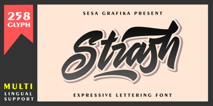 Strash is is designed with a natural expressive handwriting style. This font is perfect for Logo Branding, tshirt design, posters and so much more! Remember that the font is PUA encoded, meaning you can access all delightful glyphs and swashes effortlessly.
 - Bohemian Hunter by Hustle Supply Co,
$14.00 Bohemian Hunter Bohemian Hunter is an All-Caps contemporary display / spur serif typeface. It comes packed with 9 different font files including 3 weights. What's included? 9 Font Files Light, Regular, Bold Clean, Rough, Stamp Versions Western European Characters Included
 - Autumn Ceria by AEN Creative Studio,
$16.00 Autumn Ceria is a simple and adaptable handlettered font. This font is PUA encoded which means you can access all glyphs and swashes with ease! Add it confidently to your favorite creations and let yourself be amazed by the outcome generated.
 - Akakios by Nantia.co,
$12.00 Akakios uppercase font is an adorable hand-made typeface with a lot of charisma. From “hand-written” quotes to product packaging, merchandise, and branding projects, this font is so versatile that it can cover them all. Greek character set included.
 - Thanks Lovely by Yoga Letter,
$15.00 "Thanks Lovely" is a modern handwritten font, featuring a decorated heart on each character. It's perfect for Valentine's Day, Christmas, Thanksgiving, weddings, invitations and more. This font is PUA coded which means you can find all glyphs and glyphs easily!
 - Valerose by Selvia Design,
$15.00 "Valerose" is a very unique and elegant handwritten display font. This font is decorated with roses in alternate letters. Uppercase, lowercase, swashes, titling, uppercase alternates, multilingual support, numerals, and punctuation are all included. Ideal for logos, weddings, valentines, and other occasions.
 - Mantilda by Letterena Studios,
$9.00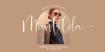 Mantilda is a stylish, refined script font that emanates sophistication and elegance. Its stylish alternates and ligatures make this font the perfect match for any project. Mantilda is PUA encoded which means you can access all glyphs and swashes with ease!
 - Silk Display by Luhop Creative,
$18.00 Silk Display is a serif retro and bold display font. This font is PUA encoded which means you can access all of the glyphs and alternates with ease! It would look great on headlines, magazines, logos, branding and so much more!


