10,000 search results
(0.036 seconds)
- Dark Fox by Pedro Teixeira,
$16.00 Dark Fox is a cute, high-contrast versatile font, good for logos and all display needs.
 - Dark Sider by Sipanji21,
$18.00 Hello, this is Dark Sider- Natural Handwritten Graffiti Tag Font! This font designed so that users can use it more easily and make graffiti designs easier. Dark Sider is very suitable for use in various media such as; packaging, logos, labels, posters, shirt designs, bulletins, typography, and many other media, especially with graffiti look.
 - Poetically Dark by Pitt's Hand,
$10.00 Poetically Dark is a font created to recall a certain type of dark and romantic writing from another century. Well-groomed letters, but written instinctively, as if in the throes of a creative frenzy. In a clash between the refined taste of the past and the ever-present speed of communication.
 - Roster by Fenotype,
$35.00 Roster is a strong brush script family of two weights, caps and a set of ornaments. Roster is great for any kind display use from advertising to packaging and from online to branding. Roster is clear and legible even in smaller sizes and works for longer texts too, but is at it’s best when used for shorter sentences or even just for one or two word display or logo use. Roster is equipped with plenty of Ligatures and Contextual alternates that are automatically activated as long as you keep Standard Ligatures feature on. These features help to maintain the flow and add on some variation when writing with Roster. If you need more than that there is at least three Alternates for each basic character: click on Swash, Stylistic or Titling Alternates in any OpentType savvy program or check out for even more alternates from the Glyph Palette. Since uppercase letters in Roster are mainly designed as initials I made Roster Caps for an all caps version of the capital letters. Roster Caps can be used on it’s own or to support Roster Script. Roster Ornaments is a set of swashes and brush strokes designed to support the font.
 - Boster by Rhd Studio,
$20.00 Boster is a stylish modern calligraphy font with a chic casual style. It's perfect for branding, wedding invitations and cards, and maybe for red wine labels. The booster includes a beautiful full set of upper and lower case letters, numbers, assorted punctuation marks. All lowercase letters include start and end strokes, providing a realistic handwriting style. What did you get, honey? To use beautiful strokes, you need a program that supports OpenType features such as Adobe Illustrator CS, Adobe Photoshop CC, Adobe Indesign, and Corel Draw. but if your software doesn't have Glyphs panel, you can install additional font swash file: Thank you and have a nice day, Gulya
 - Powters by Maulana Creative,
$13.00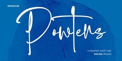 Powters is an ink'ish casual modern script font. With light contrast stroke, fun character with a bit of ligatures and alternates. To give you an extra creative work. Powters font support multilingual more than 100+ language. This font is good for logo design, Social media, Movie Titles, Books Titles, a short text even a long text letter and good for your secondary text font with sans or serif. Make a stunning work with Powters font. Cheers, Maulana Creative
 - Postea by TypeTogether,
$47.00 The Postea font family is Veronika Burian and José Scaglione’s take on German geometric typefaces, reshaped with the right attributes for setting paragraphs and headings, and perfect for branding and text use. Some typefaces are a rough tool, like a pumice rock: abrasive to the senses, unforgiving, and unhelpful for most reading situations. Postea is an obsidian: smooth and classy, with attractive nuances in any light. The classic curves and purposeful details keep its individuality intact while allowing it to fit an incredible range of geometric font needs. Because of these qualities, Postea makes normal reading in paragraphs a cinch and your branding memorable. Compared to midcentury attributes of restraint and a sparse appearance, Postea’s deliberate play between character widths injects life and distinctiveness into its personality. The default ‘t, f’ have lyrical doses akin to a robust evening drink and are rounded out with a serpentine ‘s’ and rotund ‘o, g, b’. Another nice surprise awaits: spacing for the Hairline weight is tighter for optimal use in large headings and titles, while the regular weights have the expected, slightly looser spacing for text. Setting the test word ‘bogarts’ brings all this together nicely, invoking a balance between a constructed and human feel while brushing away the dust from a century of derivatives. Postea is opinionated and its modern stylistic sets allow it to be accommodating with softer, specially-designed alternative characters. SS01 replaces ‘b, f, M, m, t’, while SS02 changes only the lowercase ‘a’ to the round style, and SS03 swaps out the angled ‘y’ for a straight version. The fourth and sixth stylistic sets are packed with wallpaper-worthy geometric patterns, ornaments, arrows, and symbols aplenty. Postea’s 14 styles (seven upright and italic) and two variable fonts are accompanied by an all-new family of icons in three weights, which we developed a new, easy way to activate. Simply bookend the desired icon name with colons (:arrowUp: :chargingStation: :aid: :firstAid:), making sure to capitalise each word after the first word, then highlight and activate SS05. Icons include wayfinding, social interface, sanitary precautions like face masks, thermometers, and hand washing, and much more. Postea is resilient in the number of ways the family can be used, and its recognisable characters make it a prime selection for branding, signage, corporate typefaces, and magazines. Beginning with midcentury virtues, Postea is the rational response for text — a lyrical take on geometric sans serifs.
 - Print Shop Relics JNL by Jeff Levine,
$29.00 Pointing hands, floral embellishments, a World War II "Victory" emblem and an old telephone are but a few of the classic images redrawn from vintage source material for Print Shop Relics JNL. Lovers of pre-digital clip art from the letterpress era will find these embellishments useful, charming and helpful.
 - Relic Forest Island 3 by Jehansyah,
$9.00 Relic forest island III, This is the newest font from the previous generation, Relic island I and Relic Island II, this design comes with a more detailed touch with very charming carvings, comes with several families that you can make your best design choice for later this year and in the future, with several monograms and families that you can choose according to your design, this design will add inspiration to your project, and see, how it will work for you, and make this font your best choice thank you very much
 - Moby - Unknown license

- Moby - Unknown license

- Mories by MlkWsn,
$15.00 Mories is an elegant display serif with unique letter shapes to complete any designs, especially in fashion, branding, and for logos.
 - Moby by Beware of the moose,
$15.99 Moby is based on a grid of squares and has four different variations – from sharp corners to rounded with two steps in between. The letter is playful despite its grid and has the most common punctuation marks making the moby usable in most western european languages ... and even usable for Icelandic texts. The letter is named after my dog, the cutest Barbet (French water dog) in the world.
 - Moris by Katatrad,
$29.00 Moris™ is a family of modern sans serif typeface with simple and condensed proportions. Moris is recommended for publication, screen and Corporate use. This new font family includes nine weights with true italics, numeric tabular function and Opentype features.
 - Moki by FaceType,
$25.00 The seven ways of Moki. Moki comes in seven different styles: Base, Cut, Dust, Lean, Mono, Soft and Uni. Moki is a display expert – with a wide range of languages covered, the family offers a style for every purpose. You are a SciFi movie director and are looking for an alternative to the inevitable Eurostile? Now you have!
 - Mark - 100% free

- Varking by Runsell Type,
$16.00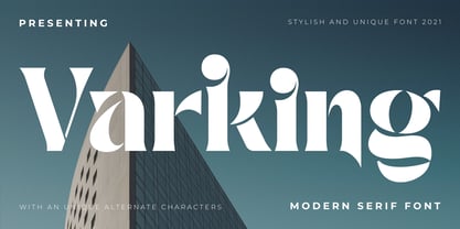 Varking font is perfect for many of your projects like logos & branding, photography, invitations, watermarks, advertisements, product designs, stationery, wedding designs, labels, product packaging, special events and much more.
 - Darka by Sudtipos,
$49.00 Darka is a splendid, mysterious dark lady reincarnated in digital vectors as an original blackletter font. Her gothic, medieval, nocturnal attributes take the form of sharp terminals, seductive curves, calligraphic flair and complex character. Darka blends the balance of Textura, the flow of Fraktur and the elegant lowercase-to-uppercase ratio of Bâtarde into a stylish, inventive typeface with a Mexican soul. Starting as a personal, calligraphic hand, Darka slowly evolved into digital type, developing alternate glyphs, flourishes and special signs to preserve its hand-written origins and delicate tension, making it an excellent display typeface and, surprisingly, even a distinctive, crisp font for short texts. Darka received an Award of Excellence at the Type Directors Club of New York annual competition.
 - Dare by Device,
$39.00 Dare is a bold, single-weight titling font in capitals only. It is built from flat-pen strokes, with looping bowls and sharp, incised darts. It borrows a pinch of the hand-drawn swagger of Bauer's Cartoon (designed in 1936 by H. A. Trafton), used as Dan Dare's signature logo in the British boy's comic Eagle, and also the upward-pointing serifs of machine-moderne typefaces such as Dynamo (designed by K. Sommer for Ludwig & Mayer in 1930). Suitable for book covers, magazines, branding, packaging – any place where an impactful, contemporary statement is required, but still with an undertone of 20th century tradition.
 - Garked by Linecreative,
$16.00 Garked is a font typeface inspired by ancient nordic runes, you want to customize a logo, brand or other design with ethnic or tribal style, this font is perfect for your choice. What you get, you will get: 1. Garked – Clean San serif font including Uppercase & Lowercase (ALL CAPS) characters, 2. Numbers and Punctuation 3. Support Multi language (Western Europe Latin)
 - Lark by Shana Hu,
$20.00 Lark is a modern calligraphic sans inspired by a rich history of broad-edge and translation contrast calligraphy. By combining its sharp geometry with flared curves, Lark exhibits a nice warmth as a display face. Lark was initially conceived as a final project as part of the Type@Cooper West Extended Program's post-graduate certificate program in typeface design, so its journey has benefitted from routine feedback from experienced typeface designers. Comes in Bold, Medium, Regular, and Light weights for both roman and italic, and supports multiple languages including Danish, Dutch, English, French, German, Italian, Portuguese, Spanish, Swedish, and more.
 - Darek by La Boîte Graphique,
$16.00 A hand made font ideal for your graphic project : packaging, posters, children's books… and many other media !
 - darling by Justi,
$30.00 darling is a display font, with medium contrast, designed to be used in the composition of titles, letterings, visual id's and short texts such as illustrated books or magazines for children. it has 738 characters and a lot of opentype features that allows the composition of titles and/or words in a very different ways. otherwise, when applied with no features, it produces a homogeneous amount of text.
 - Dara by Naghi Naghachian,
$88.00 Dara is a sans-serif sigle weight font designed by Naghi Naghashian. It is extremely legible even in very small size. This font is The contribution to modernisation of Arabic typography, gives the font design of Arabic letters real typographic arrangement und provides more typographic flexibility. Dara supports Arabic, Persian ( Farsi ) and Urdu. It also includes proportional and tabular numerals for the supported languages. Dara design fulfills the following needs: A Explicitly crafted for use in electronic media fulfills the demands of electronic communication. B Suitability for multiple applications. Gives the widest potential acceptability. C Extreme legibility not only in small sizes, but also when the type is filtered or skewed, e.g., in Photoshop or Illustrator. Dara’s simplified forms may be artificial oblilqued in InDesign or Illustrator, without any loss in quality for the effected text. D An attractive typographic image. Dara was developed for multiple languages and writing conventions. Dara supports Arabic, Persian and Urdu. It also includes proportional and tabular numerals for the supported languages. E The highest degree of calligraphic grace and the clarity of geometric typography.
 - Postre by Fenotype,
$25.00 Tasty and sweet, Postre is a sleek high contrast serif type with certain Art Nouveau influence. Postre is excellent for headlines, packaging, posters and any other display use conveying an elegant impression. Postre is equipped with a selection of 50 alternate characters set in Swash, Stylistic and Titling Alternates, as well as standard ligatures.
 - Zabatana Poster - 100% free

- DS Poster - Unknown license

- RaveParty Poster - Unknown license

- HVD Poster - Unknown license

- Roller Poster by HiH,
$12.00 Roller Poster is named after Alfred Roller. In 1902, Roller created a poster to advertise the 16th exhibit of Austrian Artists and Sculptures Association, representing the Vienna Secession movement. The exhibit was to take place in Vienna during January & February 1903. The location is not mentioned because everyone in Vienna knew it would be held at the exhibit hall in the Secession Building at Friedrichstraþe 12, a few blocks south of the Opernring, near the Naschmarkt. Designed by Joseph Maria Olbrich in 1897, the buiilding has been restored and stands today as one finest of the many fine examples of Art Nouveau architecture in Vienna (see vienna_secession_bldg.jpg). Because of its dome, it is called “the golden cabbage.” The poster itself is unique. The word “secession” is in one type style and takes up two-thirds of the elongated poster. At the bottom of the poster are the details in a different lettering style. It is this second style at the bottom that is the basis for the font Roller Poster. In keeping with our regular naming conventions, we were going to call it Roller Gezeichnete (hand-drawn), but the wonderful play on both words and the shape of the three S’s in secession was too compelling. In November 1965 there was an exhibit of Jugendstil and Expressionist art at the University of California. Alfred Roller’s Secession Poster was part of that exhibit. Wes Wilson was designing promotional material at Contact Printing in San Francisco. Among their clients was a rock promoter named Bill Graham, staging dance-concerts at Fillmore Auditorium. Wilson saw the catalog from the UC exhibit and Roller’s lettering. Wilson adapted Roller’s letter forms to his own fluid style. The result was the poster for the August 12-13, 1966 Jefferson Airplane/Grateful Dead concert at Fillmore put on by Graham (BG23-1). Wilson continued to use Roller’s letter forms on most of the posters he did for Graham through May 1967, when he stopped working for Graham. The posters were extremely successful and the lettering style along with Roller’s letter forms were picked up by other artists, including Bonnie MacLean, Clifford Charles Seeley, James Gardner, and others. The Secession poster and the Fillmore posters have inspired a number of fonts in addition to ours. Among them are JONAH BLACK (& WHITE) by Rececca Alaccari, LOVE SOLID by Leslie Carbarga and MOJO by Jim Parkinson. Each is different and yet each clearly shows its bloodlines. Our font differs in two ways: 1) the general differences in the interpretation of the letter forms and 2) the modification of the basic letter form to incorporate the diacriticals within the implied frame of the letter, after the manner of the original design by Roller. We borrowed Carbarga’s solution to the slashed O and used it, in a modified form, for other characters as well to accomplish the same purpose. We recommend that you buy ours and at least one of the other three. According to Alaccari, a version called URBAN was released by Franklin Lettering in the 70’s (and is shown on page 51 of The Solotype Catalog). For comparison of our font to original design, see image files roller_poster_2s.jpg of original poster and roller_poster_2sx.jpg showing reconstruction using our font for the lower portion (recontructed area indicated by blue bar). Please note the consistency of character width. In the lower case, 23 of the basic 26 letters are 1/2 EM Square wide. The ‘i’ is an eighth narrower, while the ‘m’& ‘w’ are one quarter wider. All the Upper Case letters are 1/8 EM wider than the lower case. This is to make it easier to fill a geometrical shape like a rectangle, allowing you to capture a little of the flavor of Wes Wilson’s Fillmore West poster using only a word processor. We have also included a number of shapes for use as spacers and endcaps. If you have a drawing program that allows you to edit an ‘envelope’ around the letters to distort their shape, you can really get creative. I used Corel Draw for the gallary images, but there are other programs that can accomplish the same thing. The image file “roller_poster_keys.jpg” shows the complete character set with the keystrokes required for each character (see “HiH_Font_readme.txt” for instruction on inserting the non-keyboard characters). The file “roller_poster_widths.jpg” shows the exact width of each character in EM units (based on 1000 units per EM square). You will notice that the font is set wide for readability. However, most programs will allow you to tighten up on the character spacing after the manner of Roller & Wilson. In MS Word, for example, go to the FORMAT menu > FONT > CHARACTER SPACING. Go to the second Drop-Down Menu, labeled ‘Spacing’ and select "condensed' and then set the amount that you want to condense ‘by’ (key on the little arrows); two points (2.0) is a godd place to start. Let your motto be EXPLORE & EXPERIMENT. Art Nouveau has always been one of my favorite movements in art -- I grew up in a home with a couple of Mucha prints hanging on the living room wall. Perhaps because of that and because I lived through the sixties, I have enjoyed researching and designing this font more than any other I have worked on. Let’s face it (pardon the pun), Roller Poster is a FUN font. You owe it to yourself to have fun using it.
 - Quase Poster by DSType,
$40.00 Quase is a very free interpretation of the types found in the “Specimen of Printing Types” by William Caslon from 1785. We didn’t want to follow any of the models introduced in the Specimens, but rather gather a series of typographic aspects that we found useful and interesting from the several sizes and styles available and then give them consistency and new proportions so they could fit our very own purpose. We wanted to start with Caslon and then transform it into an editorial typeface, hence the increase of the x-height and the radical reduction of the ascenders and descenders. Despite the Display, Headline and Text fonts we also wanted to make a single weight Poster version with, inspired by the mechanical script introduced in the Double-Pica Script, to be used in magazines or as a complementary display typeface.
 - Poster Paint by Canada Type,
$24.95 Poster Paint is a fun shocard alphabet which came about from Jim Rimmer’s admiration of Goudy Stout, a design he liked in spite of the fact that Goudy himself claimed to detest it. Extremely eye-catching and humourous to a fault, Poster Paint is an ideal fit for fun environments like theme parks, concession stands, cofee and juice bars, and in print design for children books and fun food packaging. Poster Paint was updated and remastered for the latest technologies in 2012. It comes with a glyphset of over 375 characters, and supports the majority of Latin-based languges. 20% of this font’s revenues will be donated to a GDC scholarship fund, supporting higher typography education in Canada.
 - Poster Hand by HouseOfBurvo,
$9.99 Poster Hand is an informal, casual script that echoes the hand lettering of those ubiquitous signs found all around us. From market stalls to menu boards, we are surrounded by the work of the unknown sign writer. The font comes in three styles, Regular, Italic and Reverse Italic and contains OpenType ligatures and kerning. Latin Extended A supports all western and eastern european latin languages.
 - Couturier Poster by Latinotype,
$29.00 Elegance flows through Couturier Poster soul. The new cousin of early launched Couturier, brings higher contrast and an extended family, perfect for big sizes. Inspired by the didones from the 18th century, its design its heavily influenced by contemporary ideas makes it suitable to use for almost anything you can think of. Equipped with swashes, ligatures, small caps and alternates, this typography is very versatile and allows you to set a big range of compositions with discretion or personality. Couturier Poster comes in six weights and matching true italics, from thin to black. It's a good choice to pair with Couturier for smaller sizes and Couturier Poster for the big titles. It has a set of 1248 characters that cover more than 200 languages derived from latin.
 - Acta Poster by DSType,
$40.00 First designed for Chilean newspaper La Tercera in 2010, Acta family is a clean and fresh type system, while conservative enough for newspaper setting. The complete Acta Type System contains Acta and Acta Display, both with six weights with matching italics, Acta Symbols with an amazing collection of symbols specially designed for newspapers and magazines, and Acta Poster, a heavyweight version, elegant and eye-catching in three styles with plenty of ligatures and alternates.
 - Poster Bodoni by Bitstream,
$29.99A slightly more refined revival of the Fat Face, as supervised by Chauncey Griffith at Mergenthaler one year after ATF’s Ultra Bodoni. - Poster Gothic by GroupType,
$19.00 Poster Gothic was inspired by showcard lettering samples featured in the book,""Commercial Art of Show Card Lettering"" by James Eisenberg, published by D. Van Nostrand Company in 1945.
 - Sweep Poster by Estudio Calderon,
$30.00 A new font by Calderon A typeface with a contemporary aesthetic, a mix of geometric and organic shapes that give each letter a special and unexpected design. The conceptual process was developed by making a re-interpretation of the Caslon styles making different explorations by using a calligraphic nib pen in order to find a new personality to each letter. The result is a modern, elegant and experimental serif typeface. Delicate in its Extra Light version and impressive in the Bolder style. The sweep design hides harmonic adjustments based on geometric strokes that generate a unique and attractive texture. For a better experience we recommend you to use it in headlines instead of body text. Includes: + 8 weights + 1 variable font + OTF features + Character set that supports Western, Central and Southeastern European languages. + Script: latin
 - Branca Poster by UFF,
$39.00 Branca Poster is a heavy font with triangular serifs and with three versions of horizontal contrast. It was inspired by the Romantic fonts of vertical axis, with small openings and pronounced contrasts. Specially designed for posters, it has a wider characters map, with some Ligatures, Stylistic Alternates and Swashes, providing greater versatility to the user.
 - Broadway Poster by GroupType,
$15.00 Originally designed by Morris Fuller Benton in 1925, FontHaus's 1995 revival is based on a design named "Novelty Broadway". Characters were referenced from "Commercial Art of Show Card Lettering" by James Eisenberg, published by D. Van Nostrand Company in 1945. This Broadway is classic Broadway but with some charming differences such as a slanted lower case "f" a remarkable lower case "g" and a high-waisted upper case case "R", as only a few examples. It was named "Novelty" because the alphabet incorporated a concave design feature in the tops and bottoms of each letter. These differences allow this version to possess much more personality than that of all other Broadway designs on the market. It looks almost hand brushed, has soft edges and is no where near as sterile looking as all the other digital versions. It feels very 1925!


