10,000 search results
(0.026 seconds)
- Classic Cassette by Putracetol,
$22.00 Classic Cassette - Classic Display Font. This font is inspired by the classic style and well display curves. Classic Cassette font makes for more fun, trendy and more lively. Classic Cassette has a surprise from alternate that will make your work even more beautiful. Classic Cassette is perfect for a professional touch which makes it even more unique display and classic themes. But Classic Cassette is also suitable for logos, branding, greeting cards, invitation cards, advertisements, titles, healines, book titles, stickers, packaging, quotes, posters, t-shirts/apparel, billboards and others. The alternative characters were divided into several Open Type features such as Swash, Stylistic Sets, Stylistic Alternates, Contextual Alternates, and Ligature. The Open Type features can be accessed by using Open Type savvy programs such as Adobe Illustrator, Adobe InDesign, Adobe Photoshop Corel Draw X version, And Microsoft Word. Classic Cassette is also support multi language.
 - Classic Story by RahagitaType,
$15.00 Classic Story is a suitable font for quotes that match love, affection and hope. In addition, you can use it as a headline on a poster, banner, name card, wedding invitation, and more.
 - Classic Blody by Zeenesia Studio,
$12.00 Classic Blody, The font that has 2 Style with beauty script make your design to be perfect. Classic Blody perfect for large design project like Tshirt, Advertising, bags, book cover, quotes, food, logo , poster, fashion, custom sticker, magazine, and many others. It completed with numbers and punctuation. Multilingual support, and came with PUA encoded. and you will get free editable vector bonus for compliting your project. enjoy :)
 - CLASSIC Line by WAP Type,
$25.00 frontline classic font Font a stylish Font. It’s useful for any Design project. Decal, card, e-card, Good for Logos & Headlines, Poster,Tag design, Newspaper & Magazine Ad Design and many more. True type and Open type font files
 - Graffiti Classic by Robert Arnow,
$25.00 Graffiti Classic is a graffiti font that blends the improvisational urban quality of graffiti with the smoothness and regularity of a typeface. Growing up in Brooklyn, graffiti appeared to me as an explosion of expression and color in a sea of concrete. Inspired, I became a graffiti artist and practiced in both notebooks and subway tunnels. While I moved on to somewhat more traditional art forms in future years, with Graffiti Classic I pay homage to my artistic roots in a calligraphy marker/tag font. Like my other fonts, the entire Graffiti Classic font is spaced letter to individual letter so that the spacing will work smoothly, in spite of the expressiveness and irregularity of the forms. The Graffiti Classic family also includes an ornaments font, “Taglets,” which has clouds, underlines, arrows, crowns, halos and more to add flavor to your designs.
 - Encorpada Classic by dooType,
$20.00 Encorpada classic brings the best features of the Didone genre, but with a 21st century look and feel. With smooth details Encorpada Classic is a elegant choice for your type library. The Encorpada family began in 2011 with the release of Encorpada Black. After that instant success, in 2012, dooType brought to us Encorpada PRO. Encorpada Classic retains the main look and feel of his predecessors, but is designed with more functional considerations. With 14 styles, Encorpada Classic is a fine choice.
 - Classical Romance by Ardyanatypes,
$10.00 Voila! This is it . . Classical Romance Decorative Serif Family Classic serif with 125 stylistic alternates for a uniquely vintage, yet modern feel. Each letterform has a slightly rough exterior that works beautifully to enhance Classical Romance’s soft, conventional details. This versatile display typeface has enough character for logos and branding, as well as headlines, apparel, alcohol labels, poster, online magazine, automotive, and much more. Keep it classic, or get decorative with ornate alternates for both uppercase and lowercase glyphs! This Classical Romance font was handwritten under the inspiration of traditional calligraphy and the wonderful magical vibe of Bali Island. Classical Romance brings more lovely old day vibes with 12 weights to matchmaking with your own style and it has Multilingual support (Western European characters) and works with the following languages: English, Danish, Dutch, Estonian, Faroese, Filipino, Finnish, French, German, Hungarian, Icelandic, Irish, Italian, Norwegian, Polish, Portuguese, Spanish, Swedish. Immerse more your arts in the classic feel with Classical Romance, and be classy! A guide to accessing all alternatives can be read at: http://adobe.ly/1m1fn4Y Features: A-Z Character Set a-z Characters set Numerals & Punctuations (OpenType Standard) Multilingual Thank you and have a nice day
 - Classic Heritage by Gleb Guralnyk,
$15.00 This vintage typeface named "Classic Heritage" has a steampunk look and was inspired by old-school lettering styles. The 13 stylistic alternate letters can help you to create a unique and interesting text composition.
 - Nathan Classic by IM Studio,
$12.00 Nathan Classic is a sweet and unique design. This font is very suitable for products, logos, invitation letters and many others.
 - Alons Classic by BA Graphics,
$45.00A spurred Roman classic design. Great Headline Font if you are looking for that Bold Statement. - Diotima Classic by Linotype,
$29.99Diotima Classic is a total upheaval for the 21st century of Gudrun Zapf von Hesse's mid-20th-century Diotima, one of the most beautiful types ever cast in metal. Its roots lay in a calligraphic sheet written by Gudrun Zapf von Hesse. The text was the Hyperion to Diotima" by Friedrich Hölderlin; Diotima is the name of a Greek priestess in Plato's dialogue about love. In the philosopher's imagination, she should appear slim and beautiful. In 1948, Gudrun Zapf von Hesse finished the typeface's Roman. The Diotima family was released as a metal typeface for hand setting by D. Stempel AG in 1951-53. This original Diotima is a festive design particularly suited to invitations, programs, and poems. The delicate Italic drew attention to text passages that should be emphasized. Linotype's previous digital Diotima only had one weight, which looked great in display sizes, but was too thin for text setting. Diotima Classic has four weights. The new Regular has more robust serifs and thicker hairlines, making it more appropriate for text sizes. The Diotima variation with finer serif remains under the name Light. Gudrun Zapf von Hesse also took the opportunity in 2008 to add an extremely heavy weight to the family. In comparison to the old Diotima, letterforms of the Diotima Classic are more harmonious and balanced. The rhythm of the Italic letters in Diotima Classic is more consistent. The lining figures of the Diotima Classic align with caps, and the letter spacing of the tabular lining figures in Diotima Classic is significantly better. The forms of the figures have been improved as well." - Carnegie Classic by Wilton Foundry,
$59.00 Carnegie Classic differs from Carnegie 1 & 2 in that the capital letters are larger in height; several connecting strokes and letter shapes have also been refined. Classic also has many more ligatures and is only available in Open Type. Like Carnegie 1 & 2, Classic is a based on my own functional hand lettered calligraphy. Characters are disciplined yet fluid and spontaneous, creating a unique overall texture that is visually very pleasing. Carnegie Classic is ideally suited for wedding and event invitations, certificates, maps, menus, place cards, announcements, memorial documents, titles, testimonials, birth and death certificates, etc. In the gallery is a an image with all the ligatures available in Open Type.
 - Classic Grotesque by Monotype,
$40.99 Classic Grotesque by Rod McDonald: a traditional font with a modern face. The growing popularity of grotesque typefaces meant that many new sans serif analogues were published in the early 20th century. Setting machines were not compatible with each other but all foundries wanted to offer up-to-date fonts, and as a result numerous different typeface families appeared that seem almost identical at first glance and yet go their separate ways with regard to details. One of the first fonts created with automatic typesetting in mind was Monotype Grotesque®. Although this typeface that was designed and published by Frank Hinman Pierpont in 1926 has since been digitalised, it has never achieved the status of other grotesque fonts of this period. But Monotype Grotesque was always one of designer Rod McDonald’s favourites, and he was overjoyed when he finally got the go-ahead from Monotype in 2008 to update this “hidden treasure”. The design process lasted four years, with regular interruptions due to the need to complete projects for other clients. In retrospect, McDonald admits that he had no idea at the beginning of just how challenging and complex a task it would be to create Classic Grotesque™. It took him considerable time before he found the right approach. In his initial drafts, he tried to develop Monotype Grotesque only to find that the result was almost identical with Arial®, a typeface that is also derived in many respects from Monotype Grotesque. It was only when he went back a stage, and incorporated elements of Bauer Font’s Venus™ and Ideal Grotesk by the Julius Klinkhardt foundry into the design process, that he found the way forward. Both these typefaces had served as the original inspiration for Monotype Grotesque. The name says it all: Classic Grotesque has all the attributes of the early grotesque fonts of the 20th century: The slightly artificial nature gives the characters a formal appearance. There are very few and only minor variations in line width. The tittles of the ‘i’ and ‘j’, the umlaut diacritic and other diacritic marks are rectangular. Interestingly, it is among the uppercase letters that certain variations from the standard pattern can be found, and it is these that enliven the typeface. Hence the horizontal bars of the “E”, “F” and “L” have bevelled terminals. The chamfered terminal of the bow of the “J” has a particular flamboyance, while the slightly curved descender of the “Q” provides for additional dynamism. The character alternatives available through the OpenType option provide the designer with a wealth of opportunities. These include a closed “a”, a double-counter “g” and an “e” in which the transverse bar deviates slightly from the horizontal. The seven different weights also extend the scope of uses of Classic Grotesque. These range from the delicate Light to the super thick Extrabold. There are genuine italic versions of each weight; these are not only slightly narrower than their counterparts, but also have variant shapes. The “a” is closed, the “f” has a semi-descender while the “e” is rounded. Its neutral appearance and excellent features mean that Classic Grotesque is suitable for use in nearly all imaginable applications. Even during the design phase, McDonald used his new font to set books and in promotional projects. However, he would be pleased to learn of possible applications that he himself has not yet considered. Classic Grotesque, which has its own individual character despite its neutral and restrained appearance, is the ideal partner for your print and web project.
 - Classic Ribbon by Putracetol,
$28.00 Introducing a new Display Typeface called "Classic Ribbon". Inspired from music poster, carnival, typography and tatto from classic culture with inline style. This Inline style font works great as a headline for music promotion, film titles, Youtube tutorials and gig posters, and when combined with the included graphic presets and achieves a truly realistic classic look. This font is suitable for your projects such as logos, wedding invitations, branding, landing pages, apparel, posters, headlines, greeting cards, invitation cards, social media, crafting, quote and more. This font can be used and supported in various programs and OS, such as procreate, cricut, windows, macOS and others. This font is also support multi language.
 - OBO Classic by Juri Zaech,
$19.00 OBO Classic is the second installment of the OBO series, a type collection based on a square. Every character is mapped on a 1x1 ratio which allows for horizontal and vertical settings alike. Or mixed, like crosswords. OBO Classic is a display interpretation of a traditional Old-style Serif. The “distortion” which maps each character to a square creates unusual proportions to what we are used to from classic serif typefaces. The result is a monospaced font. While each individual letter feels conventional on its own, when brought together in words the result feels contemporary. Thanks to the square base vertical and horizontal – and mixed – settings are possible and easy to apply. There are a few exceptions for certain punctuation and special characters that are half the width for better spacing; and the word space’s width can easily be adjusted through OpenType stylistic sets. Talking about spacing, for strictly horizontal typesetting there is the option to turn on kerning for a number of characters to create a cleaner texture across words and phrases. OBO Classic is best set in large sizes and is most comfortable in editorial and display settings. A series of icons complete the character set. A selection comes as pixel graphics which adds further contrast to the traditional legacy of the typeface.
 - Susan Classic by ParaType,
$30.00 An original text and display type family was designed for ParaType in 2008 by Manvel Shmavonyan to be used together with Susan, earlier released sans by the same author. This is a low-contrast slabserif font with open letterforms. Its shape is distinguished by one- and two-sided rounded serifs. Susan Classic is well suited for short and middle range text composing as well as for use in advertising and display typography.
 - Revalo Classic by Identikal Collection,
$23.00 - Classical Melody by Putracetol,
$28.00 Classical Melody - Vintage Display Font. Classical Melody is a family Sans Serif font designed with vintage handcrafted, Classical Melody is a tall and skinny font perfect for your home decor and display designs Classical Melody inspired by music design, Classical Melody is a vintage font that is perfect for story books, illustrations, comic books, t-shirts, posters, greeting cards, logos, branding, stickers, svg, crafting and all for display purposes. The alternative characters were divided into several Open Type features such as Swash, Stylistic Sets, Stylistic Alternates, Contextual Alternates, and Ligature. The Open Type features can be accessed by using Open Type savvy programs such as Adobe Illustrator, Adobe InDesign, Adobe Photoshop Corel Draw X version, And Microsoft Word. This font is also support multi language.
 - Classic Marker by Illushvara,
$18.00 Hello, Classic Marker is a display brush font with handwritten consept inspired with classic marker line. The strokes alternates make this font outstanding and looks like grunge line classic very great for logotypes. This type of font perfectly made to be applied especially in headline, logo, food packaging, fashion magazine, labels or any type of advertising purpose. This font support Multilingual Languages. FEATURES : Uppercase Lowercase Number Punctuation Multilingual PUA Encode Opentype Alternates Ligatures If you have any question, don’t hesitate to contact me. Happy Designing !!! Thank You, Illushvara Design
 - Radio Classic by Ronin Design,
$12.00 Radio Classic is a retro handwriting font, the soft design makes it friendly to anyone, this font is the perfect choice for each of your designs.
 - Classic Cool by Celebrity Fontz,
$19.99An original calligraphic typeface blending the penmanship of French royalty with smooth, modern strokes. The result is a classical flowing design. Includes many accented characters from the Latin-1 Supplement set and others as well as kerning pairs for a tighter look in applications such as Word for Windows that support font kerning. - Classic Christmas by Hatftype,
$15.00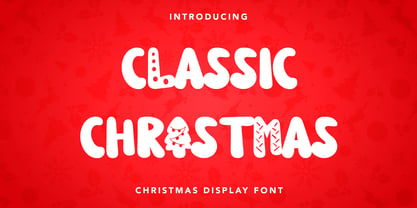 Classic Christmas - Christmas Display Font is a font with distinctive handwritten characters perfect for branding projects, logos, wedding designs, media posts, advertisements, product packaging, product designs, labels, photography, watermarks, invitations, stationery, and any project who need handwritten dishes. Features : • Character Set A-Z • Numerals & Punctuations (OpenType Standard) • Accents (Multilingual characters) • Ligature Multilingual Support : Afrikaans, Albanian, Asu, Basque, Bemba, Bena, Catalan, Chiga, Cornish, Danish, English, Estonian, Faroese, Filipino, Finnish, French, Friulian, Galician, German, Gusii, Icelandic, Indonesian, Irish, Italian, Kabuverdianu, Kalenjin, Kinyarwanda, Low German, Luo, Luxembourgish, Luyia, Machame, Makhuwa-Meetto, Makonde, Malagasy, Malay, Manx, Morisyen, North Ndebele, Norwegian Bokmål, Norwegian Nynorsk, Nyankole, Oromo, Portuguese, Romansh, Rombo, Rundi, Rwa, Samburu, Sango, Sangu, Scottish Gaelic, Sena, Shambala, Shona, Soga, Somali, Spanish, Swahili, Swedish, Swiss German, Taita, Teso, Vunjo, Zulu There it is! I really hope you enjoy it
 - Classical Diary by Letterhend,
$17.00 Classical Diary is a sophisticated serif typeface. Perfectly to be applied to the other various formal forms such as invitations, labels, logos, magazines, books, greeting / wedding cards, packaging, fashion, make up, stationery, novels, labels or any type of advertising purpose. Features : Regular & Italic style lowercase uppercase numbers and punctuation multilingual alternates PUA encoded We highly recommend using a program that supports OpenType features and Glyphs panels like many of Adobe apps and Corel Draw, so you can see and access all Glyph variations.
 - Cairoli Classic by Italiantype,
$39.00 Cairoli was originally cast by Italian foundry Nebiolo in 1928, as a license of a design by Wagner & Schmidt, known as Neue moderne Grotesk. Its solid grotesque design (later developed as Aurora by Weber and Akzidenz-Grotesk by Haas) was extremely successful: it anticipated the versatility of sans serif superfamilies thanks to its range of weights and widths, while still retaining some eccentricities from end-of the century lead and wood type. In 2020 the Italiantype team directed by Cosimo Lorenzo Pancini and Mario De Libero decided to produce a revival of Cairoli, extending the original weight and width range and developing both a faithful Classic version and a Now variant. The Cairoli Classic family keeps the original low x-height range, very display-oriented, and normalizes the design while emphasizing the original peculiarities like the hook cuts in curved letters, the high-waisted uppercase R and the squared ovals of the letterforms. Cairoli Now is developed with an higher x-height, more suited for text and digital use, and adds to the original design deeper ink-traps and round punctuation, while slightly correcting the curves for a more contemporary look. Born as an exercise in subtlety and love for lost letterforms, Cairoli stands, like its lead ancestor from a century ago, at the crossroads between artsy craftsmanship and industrial needs. Its deviations from the norm are small enough to give it personality without affecting readability, and the expanded weight and width range make it into a workhorse superfamily with open type features (alternates, stylistic sets, positional numbers) and coverage of over two hundred languages using the latin extended alphabet.
 - Virtuosa Classic by Linotype,
$29.99 Virtuosa Classicis the 21st century OpenType re-release of a classic Hermann Zapf design, his very first script typeface, Virtuosa. Based on the same sketches that would inspire Zapfino 50 years later, Hermann Zapf developed Virtuosa in 1948-49. It was originally released in metal in 1952. Virtuosa nova is an English copperplate script with character. The font includes two form variants for each capital letter, and there are a number of lowercase alternates and ligatures, too.
 - Cocogoose Classic by Zetafonts,
$39.00 Download PDF Specimen Created as a display typeface in 2012 by Cosimo Lorenzo Pancini, Cocogoose is one of Zetafonts most loved typefaces. A sans serif typeface of geometric proportions, with very low contrast and slightly rounded corners, it was the first typeface to be produced in the Coco series, an ongoing research on the design variation in gothic typefaces through the ages. Cocogoose extreme x-height and ultrabold weight (with regular being comparable to heavy weights of other typefaces), have since then made it very popular for effective display and logo use, also thanks to decorative versions like Cocogoose Letterpress. Since 2016, Andrea Tartarelli has been improving the typeface expanding the original glyph set to include cyrillic and greek and adding extra weights, widths, and italics to the original family range, and bringing Cocogoose to an impressive count of 52 variants. In 2019, Francesco Canovaro has teamed with Andrea Tartarelli and Cosimo Lorenzo Pancini to create a new variant subfamily: Cocogoose Classic, featuring 8 weights and matching italics. Cocogoose Classic keeps the original design for uppercase characters while developing a new design for lowercase, with a smaller x-height, round dots and expanded open-type features, including positional numerals, alternate forms, and extended ligatures and bringing the glyph count to over 1000 characters.
 - Astoria Classic by Alan Meeks,
$45.00 The latest addition to the Astoria Range, Astoria Classic has the same basic characteristics as Astoria but with vertical stress. The characteristic subtle top left serif which makes it not quite a Roman and not quite a sans has been retained. Unlike Astoria, the Italics in form are old style yet have a modern look. This is designed specifically as a text face, however it still works very well as a headline font.
 - Galano Classic by René Bieder,
$30.00 Galano Classic is the display companion of the Galano Grotesque family. Like the Grotesque family, it also pays tribute to the geometric shapes of Futura, Avant Garde, Avenir and the like. However, instead of that family’s modern interpretation of the geometric genre, Galano Classic prefers to stay in the past, a tendency characterized by a moderate x-height and details like the long stretched leg of uppercase “R”, as well as the traditional shaped lowercase “g”, to mention only a few details. Galano Classic, compared to Galano Grotesque, includes lots of redesigned glyphs and consequently adjusted kerning pairs, an extended number of alternative characters, ligatures and opentype features to match a great many design applications. It comes in 10 different weights with matching italics containing 555 glpyhs per font. Although Galano Classic was planned to be the display version of Galano Grotesque, it feels great in small sizes and long text passages, too.
 - British Classical by TypeClassHeroes,
$19.00 Really excited to introduce British Classical and British Classical Neue is a Classic serif family. It's clean and smooth with 9 variable weight combining the regular and italic and much alternative inside. Suitable to create any branding, product packaging, invitation, quotes, t-shirt, label, poster, logo etc. If you need anything else just shoot me on email at: Suandana_Ipandemade@hotmail.com Hope you enjoy it.
 - Classic Roman by Monotype,
$40.99. - Classical Moment by Hatftype,
$17.00 Classical Moment - Groovy Typeface Font is a font with distinctive handwritten characters perfect for branding projects, logos, wedding designs, media posts, advertisements, product packaging, product designs, labels, photography, watermarks, invitations, stationery, and any project who need handwritten dishes. Features : • Character Set A-Z • Numerals & Punctuations (OpenType Standard) • Accents (Multilingual characters) • Ligature Multilingual Support : Afrikaans, Albanian, Asu, Basque, Bemba, Bena, Catalan, Chiga, Cornish, Danish, English, Estonian, Faroese, Filipino, Finnish, French, Friulian, Galician, German, Gusii, Icelandic, Indonesian, Irish, Italian, Kabuverdianu, Kalenjin, Kinyarwanda, Low German, Luo, Luxembourgish, Luyia, Machame, Makhuwa-Meetto, Makonde, Malagasy, Malay, Manx, Morisyen, North Ndebele, Norwegian Bokmål, Norwegian Nynorsk, Nyankole, Oromo, Portuguese, Romansh, Rombo, Rundi, Rwa, Samburu, Sango, Sangu, Scottish Gaelic, Sena, Shambala, Shona, Soga, Somali, Spanish, Swahili, Swedish, Swiss German, Taita, Teso, Vunjo, Zulu There it is. I really hope you enjoy it.
 - Bodoni Classic by Wiescher Design,
$55.00 I became interested in designing Bodoni Classic because of a lazy graphic designer at Jacques Damase publishing house. He had to change a single letter on a bookcover about J. B. BODONI. The French call him Jean Baptiste instead of Giambattista! And that unknown graphic designer just took any old “J” from some newly cut Bodoni. All the new Bodoni cuts have square serifs, whereas the originals had rounded serifs and slightly concave feet. The single letter “J” with the squared off serif was for me like a road sign to start redesigning the entire Bodoni family. That’s exactly what I started in 1993 and a dozen years later I am finished. Okay, I am still adding new Bodoni Classics, but those are my personal additions. Recently I designed a family of seven »Bodonian Script« fonts, that can be mixed with most of my Bodonis. Yours very retro, Gert Wiescher
 - Classical Calligraphy by HKL Studio,
$19.00 Classical Calligraphy Script With Ornament Is a calligraphy Vintage script font that comes with beautiful alternate characters. copper plate mix calligraphy with handlettering style. to show its performance. Classical Calligraphy is attractive as a typeface that is smooth, clean, feminine, sensual, glamorous, simple and very easy to read. Classical Calligraphy Script comes with a Clean and Aged version, beautifully binding upper and lower case, binding and loved by many finishes. It has Multilingual support (Western European characters) and works with the following languages: English, Danish, Dutch, Estonian, Finnish, French, German, Hungarian, Icelandic, Norwegian, Polish, Portuguese, Spanish, Swedish. In my example I show how this script can be used. It's perfect for logos, wedding invitations, alcohol labels, romantic cards, and more. Products include: Classical Calligraphy Script, Classical Calligraphy Extras Ornament Alternate Upper & Lower Case Style Binding, as well as a touch of ornament make this font look elegant. Recommended for use in Adobe Illustrator or Photoshop. Special features don't work in Microsoft Word. How to access all alternative characters using Adobe Illustrator: https://www.youtube.com/watch?v=XzwjMkbB-wQ How to use font style set in Microsoft Word 2010 or later version: https://www.youtube.com/watch?v=NVJlZQ3EZU0 There are additional ways to access the alternative/swash, using the Character Map (Windows), Nexus Font (Windows) Font Book (Mac) or a software program such as PopChar (for Windows and Mac). How to access all alternative characters, using Windows Character Map with Photoshop: https://www.youtube.com/watch?v=Go9vacoYmBw If you need any help or suggestions please contact me via email: creativescaleup@gmail.com
 - Gromlaith Classic by Sipanji21,
$16.00 This blackletter font is inspired by the classical Gaelic script that was used from the 16th until mid 18th Century. Featured with beautiful lines and bold accents, this font is good for decorative type settings such as headlines, traditional newspapers, pub signs, greetings cards, and advertising purposes. You can even use this typeface for your unique logotype. With your amazing creative idea, you can use this font to make it even more outstanding and cool!
 - Classic XtraRound by Durotype,
$49.00 Classic XtraRound is a companion typeface to Classic Round, designed by Ben Blom. Although Classic Round has a lot of roundness, Classic XtraRound has more. Classic XtraRound has maximum roundness — no sharp corners, anywhere. Classic XtraRound has maximum roundness — and is still legible. It can be used as an interesting workhorse in small text sizes. It makes eye-catching headlines in big display sizes. Classic XtraRound can be combined in any way with Classic Round, to create an interesting variation and sameness within the same document, brochure, catalog, advertisement, etc. For more information about Classic XtraRound, download the PDF Specimen Manual.
 - Clasica by Latinotype,
$26.00 The font family "Clasica" is ideal to cover every design need. Excellent for titles, paragraphs, magazines, books, editorials and logos. The particularity and identity of this font is found in the thinness of its vertical strokes and symmetrical serif. Inspired by the "Optima" font but with a serif that gives a different and new feel. "Clasica" counts with glyphs for the letters: a, e, f, g, r and y. This font family comes with 9 different weights with their respective italics.
 - Classist by Sohel Studio,
$10.00 Classist sans serif is a bold font style with a classic and modern touch . There are 4 different styles that you can apply in your design projects. This font is designed with a curved and bold style so it is very perfect for branding projects, logos, business cards, t-shirts, clothing, magazines, product branding, advertisements, posters, quotes etc. Classist Features: · 4 Weights font (Regular,Italic,Bold,Outline) · Uppercase · Numerals & Punctuation · Accented characters · Multilingual Support Thanks and have a wonderful day
 - Scary Movie Gallery - Personal use only

- SF Movie Poster - Unknown license

- Movie Poster Condensed - Unknown license


