9,073 search results
(0.019 seconds)
- Archive Black Title by Archive Type,
$19.95Heavy blackletter display typeface. - JAF Domus Titling by Just Another Foundry,
$42.00 JAF Domus Titling is a rounded typeface with classical Roman proportions. It is unique in that it was designed as an all-caps sans from the beginning. The fonts range from Extralight to Extrabold and include a large number of accented characters as well as small caps and alternates.
 - Movie Usher JNL by Jeff Levine,
$29.00 Decorative, Display, Headline, Serif, 1920s, Hand Lettered, Engraved, Incised, Bold, Extra Bold, Retro, Vintage, Nostalgic An ad in the July 27, 1928 issue of The Film Daily for FBO Pictures was an encouragement to all theaters to accept the emergence of 'talking pictures' and "Don't be Panicked by Sound". The headline text was hand lettered in an extra bold serif type face with engraved [incised] lines. The lettering has been redrawn as the digital type face Movie Usher JNL, and is available in both regular and oblique versions.
 - Movie Musical JNL by Jeff Levine,
$29.00 A lobby card for the 1929 movie musical “Broadway Melody” features the bulk of the film’s title hand lettered in a playful sans serif style. This design is now available as Movie Musical JNL, which is available in both regular and oblique versions.
 - Movie Classic JNL by Jeff Levine,
$29.00 The hand lettered title card from the 1935 melodrama “Magnificent Obsession” inspired the digital revival Movie Classic JNL; available in both regular and oblique versions.
 - Movie Night JNL by Jeff Levine,
$29.00 Movie Night JNL was modeled from one of a number of ceramic home movie titling kits on the market that were popular during the 1950s and 1960s. The camera buff would set up the letters against a colored background and photograph clever titles to describe their 8mm home movies of vacations, sightseeing or their darling children (or grandchildren).
 - Movie Screen JNL by Jeff Levine,
$29.00 The hand lettered opening titles from the 1944 Laurel and Hardy comedy “The Big Noise” served as the inspiration for Movie Screen JNL, which is available in both regular and oblique versions.
 - LD Horror Movie by Illustration Ink,
$3.00 - Movie Matinee JNL by Jeff Levine,
$29.00 A 1926 trade ad for the silent comedy “The Nut-Cracker” starring Edward Everett Horton has the film’s title hand lettered in a decorative bold sans serif design complete with highlight lines and accent dots. This festive type face is now available digitally as Movie Matinee JNL in both regular and oblique versions.
 - Archive Harlem Title by Archive Type,
$19.95Blackletter display typeface. - Title Gothic Light by BA Graphics,
$45.00A very thin light line gothic, great headline face. - Movie Arts JNL by Jeff Levine,
$29.00 In the June 18, 1929 issue of “The Film Daily”, the curvy and casual hand lettering found within the ad for the movie “Such Men are Dangerous” belies that this was actually a pre-code drama. Digitally redrawn as Movie Arts JNL, it is available in both regular and oblique versions.
 - Movie Producer JNL by Jeff Levine,
$29.00 The Nov. 13, 1915 and Nov. 27, 1915 issues of Moving Picture World carried ads for Jesse L. Lasky Productions in which the titles of the upcoming films were hand lettered in an elegant Art Nouveau spurred serif style. This stylish alphabet is now available digitally as Movie Producer JNL in both regular and oblique versions.
 - Home Movies JNL by Jeff Levine,
$29.00 A set of cling vinyl letters and numbers for titling home movies or slides is the basis for Home Movies JNL. The set was made by the Clingtite Letters Company of Chicago and retailed for $2.95. It was advertised in many photographic publications of the 1950s.
 - Breve Sans Title by DSType,
$50.00 Breve was designed for use in editorial projects. Simple but with enough personality to stand by is own, in a quest for a more forceful and contemporary appearance. All the fonts in Breve superfamily, share the same exact structure, both in terms of anatomy and functionality. The Text versions provide a softer and warm feel to the typographic palette and is intended for use in much longer passages of text, while the Title versions are distinguished by non-descending letterforms, making the titles and headlines much more uniform and interesting. The News version is more classic, with ball terminals and classic proportions, while the Display is, somehow, the set of fonts we had to design: extra-black, ultra-contrasted, proud-display fonts.
 - FB Titling Gothic by Font Bureau,
$40.00Titling Gothic FB is an immense series of nearly fifty styles inspired by that century-old favorite ATF Railroad Gothic. Led by the Los Angeles Times and Gentleman’s Quarterly, U.S. publications are using David Berlow’s series to unify the structure of headlines from its wide spectrum of options. Titling Gothic FB started as a relative of Berlow’s Rhode family, but took its own direction; FB 2005 - Movie Set JNL by Jeff Levine,
$29.00 The hand lettered title on the poster for the 1929 film comedy “Why Leave Home?” inspired Movie Set JNL, which is available in both regular and oblique versions. A classic “thick-and-thin” design with early Art Deco influences, this condensed typeface is perfect for any period projects.
 - Movie House JNL by Jeff Levine,
$29.00 Double Feature JNL reworks the classic Huxley Vertical into an elegant trilinear Art Deco display face.
 - B-Movie Splatter by Die Typonauten,
$19.00
- The Love Movies by Putracetol,
$18.00 The Love Movies is a quirky love font with 7 different versions of the font, the difference between each version is in the shape of the heart decoration. This font is basically soft and fun, and coupled with heart decorations of various shapes and choices, will make this font suitable for the projects you are working on, especially those themed on love, valentine, children, babies, weddings, etc. In addition, this font is also suitable for invitation cards, greeting cards, logos, branding, posters, crafting, stickers, social media, packaging, headers, merchandise and others. This font is also support multi language.
 - Nouveau Titling JNL by Jeff Levine,
$29.00 Sheet music for 1907's "Just A Little Fond Affection" had the song title hand lettered in a simple sans serif design with influences from the then-current Art Nouveau movement. This is now available as Nouveau Titling JNL; available in both regular and oblique versions.
 - Movie Nouveau JNL by Jeff Levine,
$29.00 A 1920s magazine featuring behind-the-scenes stories about the motion picture industry had its name [“Shadowland”] lettered in an Art Nouveau sans serif style. This has been recreated digitally as Movie Nouveau JNL, and is available in both regular and oblique versions.
 - LTC Forum Title by Lanston Type Co.,
$24.95 Forum Title was originally designed by Frederic Goudy in 1911. It was intended to be the heading font used for a book set in Kennerley. Based on inscriptional Roman stone cut capitals, this face is true to the early Roman forms which did not have a lower case. Forum exemplifies the classic Roman letterform at its finest. If a lower case were desired, Forum Title can be paired with Goudy Oldstyle for a harmonious hybrid font.
 - LTC Record Title by Lanston Type Co.,
$24.95 Record Title was designed by Frederic Goudy in 1927 as a proprietary commission for the Architectural Record magazine. Based on classic Roman letter proportions, Goudy considered this one of his most successful commissions ever. It is an all caps titling face originally digitized by Jim Rimmer for Lanston in 2001. It was remastered in early 2007.
 - Movie Show JNL by Jeff Levine,
$29.00 A 1911 movie poster for a film called “How Bella Was Won” from the Edison studios had the name “Edison” hand lettered in a bold, spurred sans serif design. These few letters became the basis for Movie Show JNL, which is available in both regular and oblique versions.
 - Le Havre Titling by insigne,
$24.00 Throughout time, history’s architects have incorporated some of the finest illustrations of type into their great works--cuneiform on Mesopotamian ziggurats; Greek etched into the temples of the gods; inscriptions marking the monuments of mighty Rome. From these Roman inscriptions specifically, we take our capital letters of today; and while we've lost the need for serifs over time, our current characters maintain the classical foundations, even after being distilled to their simplistic forms. Here’s where we have the basis for Le Havre Titling. This updated face is a carefully optimized version of Le Havre that uses purely capital lettering. Originally inspired by the golden period of the passenger ship and the French port that bid a rich bon voyage to so many famed, luxurious ocean liners of the Roaring Twenties and Thirties, the typeface includes an exciting array of ligatures that brings it into the present day and gives designers a tremendous amount of versatility in their work. With its seven weights, Titling looks equally at home on the side of a building as it does in a finely crafted invitation. With over five hundred glyphs, Le Havre Titling offers a multiplicity of options for your projects. Combine ligatures, play around with two sets of art deco forms, use original caps, and more; every one of these is obtainable with the OpenType functionality. The new design also shares five weights with the original Le Havre, allowing you to maximize your potential through its interchangeability. Titling’s Thin weights are delicate but not too fragile, and its geometric forms give each individual composition you create an exquisite and beautiful sense of emotion. Without a doubt, this fresh, fashionable take on the classical forms offers your reader refined, yet unanticipated approach as he or she travels through your text.
 - OL Forum Titling by Dennis Ortiz-Lopez,
$40.00 - Skaryna 2017 Title by Koval TF,
$9.98 Skaryna 2017 Title is a revival of the original typeface designed and cut by Francisk Skaryna in 1517–1519. Skaryna 2017 Title is designed to celebrate the 500th anniversary of the original work by Francisk Skaryna (lat. Franciscus Scorina de Poloczko) — scientist and educator from Polotsk (current Belarus). The original designs contain only Cyrillic characters. So Latin and additional characters were added to make the legacy of Francisk available for the World. The revival was designed to stay close to the original and remain a little bit inaccurate as early Renaissance printing technologies were. This project was sponsored by Anton Bryl.
 - Averes Title Roman by Reserves,
$49.00 Averes Title Roman is a high contrast sans titling typeface available in three weights. It features an array of stylistic discretionary ligatures with corresponding accented variants supporting numerous languages. Features include: Discretionary ligature feature Romanian s accent language feature Dutch IJ language feature Polish kreska language feature Slashed zero Ordinals feature Language: Afrikaans, Albanian, Asu, Basque, Bemba, Bena, Catalan, Chiga, Congo Swahili, Cornish, Danish, Embu, English, Esperanto, Faroese, Filipino, French, Galician, Ganda, German, Gusii, Hungarian, Icelandic, Indonesian, Irish, Italian, Jola-Fonyi, Kabuverdianu, Kalaallisut, Kalenjin, Kamba, Kikuyu, Kinyarwanda, Luo, Luyia, Machame, Makhuwa-Meetto, Makonde, Malagasy, Malay, Maltese, Manx, Meru, Morisyen, North Ndebele, Norwegian Bokmål, Norwegian Nynorsk, Nyankole, Oromo, Polish, Portuguese, Romanian, Romansh, Rombo, Rundi, Rwa, Samburu, Sango, Sangu, Sena, Shambala, Shona, Soga, Somali, Spanish, Swahili, Swedish, Swiss German, Taita, Teso, Turkmen, Vunjo, Welsh, Zulu *Requires an application with OpenType and/or Unicode support.
 - Decennie JY Titling by JY&A,
$39.00 - Crane Titling NF by Nick's Fonts,
$10.00This multipurpose display alphabet combines medieval-inspired uppercase letters drawn by famed book illustrator Walter Crane with charming, if somewhat quirky, lowercase letters by J. W. Weekes. The net effect is a typeface which can add style and warmth to any project. Both versions of this font include the complete Unicode 1252 Latin and Unicode 1250 Central European character sets. - B-Movie Retro by Die Typonauten,
$19.00
- Movie Palace JNL by Jeff Levine,
$29.10 Decorative, Display, Headline, Sans Serif, 1930s, Hand Lettered, Monoline, Retro, Vintage, Nostalgic, Stylized, Elegant Some beautiful and stylized Art Deco hand lettering found in the Jan. 6, 1934 issue of the British movie fan publication Picturegoer Weekly inspired Movie Palace JNL, which is now available in both regular and oblique versions. This monoline design adds a touch of elegance to any retro projects.
 - Midnite Movie JNL by Jeff Levine,
$29.00 Midnite Movie JNL was inspired by the hand lettered title credits from the 1961 Hammer Pictures film "Curse of the Werewolf" and is available in both regular and oblique versions.
 - Movie Production JNL by Jeff Levine,
$29.00 Inside the pages of the August, 1930 issue of “The New Movie Magazine” is an ad for Warner Brothers-First National Pictures – hand lettered in a bold Art Deco sans. This was the basis for Movie Production JNL, which is available in both regular and oblique versions.
 - Monster Movies JNL by Jeff Levine,
$29.00 A 1967 ad for Aurora “Monster Scenes Custom Builder Kits” featured the drippy, gooey hand lettering long associated with science fiction and horror movies. The letters in the ad were auto-scanned and additional characters were completed with the end result being a horror-themed font with sharper angles and lines instead of drips. This is now available as Monster Movies JNL, which is available in both regular and oblique versions.
 - Titling Gothic FB by Font Bureau,
$40.00 Titling Gothic FB is an immense series of nearly fifty styles inspired by that century-old favorite ATF Railroad Gothic. Led by the Los Angeles Times and Gentleman’s Quarterly, U.S. publications are using David Berlow’s series to unify the structure of headlines from its wide spectrum of options. Titling Gothic FB started as a relative of Berlow’s Rhode family, but took its own direction; FB 2005
 - Breve Slab Title by DSType,
$50.00 Breve was designed for use in editorial projects. Simple but with enough personality to stand by is own, in a quest for a more forceful and contemporary appearance. All the fonts in Breve superfamily, share the same exact structure, both in terms of anatomy and functionality. The Text versions provide a softer and warm feel to the typographic palette and is intended for use in much longer passages of text, while the Title versions are distinguished by non-descending letterforms, making the titles and headlines much more uniform and interesting. The News version is more classic, with ball terminals and classic proportions, while the Display is, somehow, the set of fonts we had to design: extra-black, ultra-contrasted, proud-display fonts.
 - Nyctalopia tilt - Unknown license

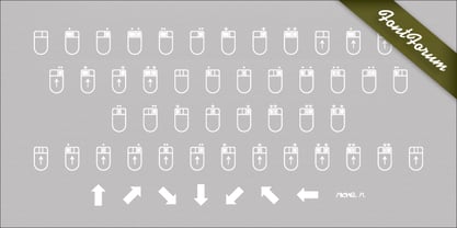
- Moving Mouse by URW Type Foundry,
$39.99