10,000 search results
(0.023 seconds)
- AT Move Nath! by André Toet Design,
$75.00 NATH !* Is a peculiar typeface. It’s design came by the fascination of Optical Illusions and 3D on a flat surface, like with Holborn and Powerplay. The typeface is named after a girlfriend of André Toet. *Made in the UK, 1974, London (Central School of Art & Design). (Redesigned 2013 by André Toet / Jasper Terra). Concept/Art Direction/Design: André Toet © 2017
 - AT Move Decoupe by André Toet Design,
$39.95 Découpé Based on a French children’s play from 1906. In a car boot sale André Toet found a funny looking box containing a lot of cut out cardboard figures, in fact it looked a bit like a geometric puzzle! He played around a bit and succeeded to create a workable typeface with it ! The interesting thing about this particular font is, that in fact it’s organized chaos. The 26 letters of the alphabet are a mix between caps and lowercases, so within one word caps and lowercases will be used next to each other. It’s a very useful font for different projects. Concept/Art Direction/Design: André Toet © 2017
 - AT Move Specx by André Toet Design,
$39.95 SPECX This is my #11/12 Font a slabserif typeface. In fact it’s a very, very basic and extreme strong typeface! We gave this new Font a special touch by adding an extra family-member: a stencil-version of the SPECX. My inspiration for the SPECX is based on the cover of a 1955 French School-Notebook. Concept/Art Direction/Design: André Toet © 2017
 - AT Move Frutta by André Toet Design,
$39.95 FRUTTA (Fruit) is a new typeface made with the ever expanding food industry in mind. But don’t let that deter you from using our font on the cover of the forthcoming cd of the Black Keys or Beady Eye or Damon Albarn or Paul Weller or Daft Punk or Whatever... Concept/Art Direction/Design: André Toet © 2017
 - AT Move Straw by André Toet Design,
$39.95 STRAW The inspiration for this capital alphabet came from those beautiful haystacks you see in summer and the old fashioned Mikado game! We wanted to create a light, fragile and airy typeface with an optical effect. And here it is ... it’s just STRAW ! Concept/Art Direction/Design: André Toet © 2017
 - AT Move Wolfszn by André Toet Design,
$39.95 WOLFSZN Anniversary! WOLFSZN is the tenth Font of André Toet. The inspiration for this capital alphabet came from the trails of an agricultural machine (think tractor) leaves in the soil after working the land. But it’s not meant to be ‘like a heavy workload’, in fact to us it seems like a very useful Font for headings, logotypes, advertising or films. We hope WOLFSZN will be happily and wisely used by my dear colleagues. Concept/Art Direction/Design: André Toet © 2017
 - AT Move Bulky by André Toet Design,
$39.95 BULKY is the 19th Font of André Toet. It’s Unusual, it’s Heavy, it’s Irregular, it’s Rough, it’s Stripy, it’s Angular, it’s BULKY. But it has character and extremely useful for headings, posters and even logotypes. Just-Use-It! Concept/Art Direction/Design: André Toet © 2017
 - AT Move PiPi by André Toet Design,
$39.95 PiPi is named after a happy Italian cat with a remarkable pattern, color and attitude. Designed by Andre Toet in 2011. Every letter is a different expression in itself although it has an identical base. It gives a joyful feeling to use this font in all your designs whether they be graphic or digital. M E O O O W ! Concept/Art Direction/Design: André Toet © 2017
 - Moving Headlines JNL by Jeff Levine,
$29.00 For decades, visitors to Times Square could look up and read the up-to-the-minute news flashes that moved across a giant electric sign on the face of the old New York Times Building (now known simply as One Times Square). According to Wikipedia's article on OneTimes Square: "On November 6, 1928, an electronic news ticker known as the Motograph News Bulletin (colloquially known as the "zipper") was introduced near the base of the building. The zipper originally consisted of 14,800 light bulbs and a chain conveyor system; individual letter elements (a form of movable type) were loaded into frames to spell out news headlines. As the frames moved along the conveyor, the letters themselves triggered electrical contacts which lit the external bulbs (the zipper has since been upgraded to use modern LED technology)." An example of this was seen in the 1933 Warner Bothers film "Picture Snatcher" starring James Cagney. This example inspired Moving Headlines JNL.
 - AT Move Holborn by André Toet Design,
$39.95 HOLBORN Aptly named after ‘High Holborn’, a high-street in London where the Central School of Art & Design was based. A font, just in capitals, based on the original design and the earlier sketches (1976) by André Toet. The strong optical illusion in this alphabet makes it an outstanding typeface. Concept/Art Direction/Design: André Toet © 2017
 - AT Move MMM by André Toet Design,
$75.00 MMM is a sturdy Typeface, the design is based on a old Soap-Powder advertisement. MMM is very useful for headings and/or logotypes. André Toet his 17th Font Caps, Lowercase. With Numbers, Glyphs and the normal Punctuation. Use this Font well, it’s made with the greatest care. Concept/Art Direction: André Toet © 2017 - Design: André Toet / Jasper Terra
 - AT Move Quipo by André Toet Design,
$39.95 QUIPO is a typeface based on my recent survey (Freeflow) on hand drawn logotypes used by American and English pop groups in the 60-70s. We thought it an interesting project and a free flow exercise to design this particular font just in capitals and well... yes it’s rather ‘bulky’. Needless to say it comes with numbers and the normal punctuations ! Concept/Art Direction/Design: André Toet © 2017
 - AT Move Billiard by André Toet Design,
$39.95 BILLIARD was born from the numerous sketches André Toet did for the design of a series of postage stamps in 2011. It’s a capital monospaced and ‘fun’ alphabet, based on the classic billiard play with two white and one red ball. Actually snooker and pool were derived from this rather old sport! In Europe it used to be a sport played by elderly people, practiced in traditional bars, including the smell of beer and the at that time prevalent smell of cigarettes and cigars. These days billiard, snooker and pool are quite popular once again with young people. Hopefully our new font will get the same attention the ‘old sport’ deserves and who knows it might even be used in a sportive way. Concept/Art Direction/Design: André Toet © 2017
 - AT Move Strano by André Toet Design,
$39.95 STRANO Like the name indicates it’s a strange typeface. Just capitals (including punctuation marks and numbers), composed from early sketches for a corporate identity in 2005 by André Toet. The complete font was restyled and translated to a Monospaced version. It’s a quite versatile font: it can be used in a lot of different cases, not only in print but also in architecture and street furniture. Think about lettering on benches, bridges, buildings. Concept/Art Direction/Design: André Toet © 2017
 - AT Move Artu by André Toet Design,
$39.95 Artù ! Strano ma vero, strange but true. A beautiful, intelligent and lively Italian dog and a great friend, unfortunately no longer among us ... but his memory lingers. A typeface designed in Rosennano (Tuscany), its Italian, but executed in Amsterdam. This monospace typeface might prove to be extremely useful for household products like washing powder or any anything like that. Just use it in your designs, let it live! Concept/Art Direction/Design: André Toet © 2017
 - AT Move Tremelo by André Toet Design,
$39.95 TREMELO a typeface based on a logotype (Microtel). We designed it as a complete capital alphabet. The original idea for the logotype font came from the products the firm produced. They provided the parts that go into hearing-aids. We thought the type should have some visual tremor in it. Concept/Art Direction/Design: André Toet © 2017
 - Tipo Movin CDMX by Ixipcalli,
$- La versión propuesta por la SEMOVI (Secretaria de Movilidad) es un estilo más angosto y ortográfico, creadó con la finalidad de aligerar las aplicaciones tipográficas del sistema. Se emplea oficialmente en todas las aplicaciones del sistema de Movilidad Integrada de la Ciudad de México. El creador de la tipografía es Lance Wyman. En esta edición, los tipos minúsculas son una adaptación “no oficial” para el Tipo Movin CDMX, enriqueciendo la tipografía a un estilo visual de altas y bajas, por lo que se prescinde del diseño base como trabajo propio para enfatizar los tipos minúsculas exclusivamente, además de que se han añadido algunos caracteres de acentuación extendiendo su uso a otros lenguajes. Los tipos son una nueva propuesta por Ixipcalli en el presente año 2023. The version proposed by SEMOVI (Secretary of Mobility) is a narrower and more orthographic style, created with the purpose of lightening the typographic applications of the system. It is officially used in all the applications of the Integrated Mobility system of Mexico City. The creator of the typeface is Lance Wyman. In this edition, the lowercase types are an “unofficial” adaptation for the Tipo Movin CDMX, enriching the typography to a visual style of highs and lows, so the base design is dispensed with as my own work to emphasize the lowercase types exclusively, In addition, some accentuation characters have been added, extending their use to other languages. The types are a new proposal by Ixipcalli in the current year 2023.
 - Moving Van JNL by Jeff Levine,
$29.00Moving Van JNL is a classic sign painter's block Roman with angled [instead of rounded] corners and slab serifs. This style of lettering was most popular in the 1920s and 1930s. - AT Move Bloggy by André Toet Design,
$39.95 BLOGGY designed in 2010 by André Toet. In the series of typefaces that were created by our team, BLOGGY stands out as a rough typeface based on a grid. Within this square grid the typeface is enlarged and reduced in size in order to create a dazzling font. A complete ‘extra alphabet’ was added to the font by cutting the letters diagonally. To us typedesign doesn't only mean designing fonts for books but also advertising, posters, film or digital use. We hope that BLOGGY will do the trick ! Concept/Art Direction/Design: André Toet © 2017
 - AT Move Herengracht by André Toet Design,
$39.95 HERENGRACHT (Patricians' Canal or Lord’s Canal) is the first of the three major canals in the city centre of Amsterdam. The canal is named after the heren regeerders who governed the city in the 16th and 17th century. The most fashionable part is called the Golden Bend, with many double wide mansions, inner gardens and coach houses on Keizersgracht. Former bureau of André Toet (SO)Design was situated there for over 32 years, it was about time to name one of our fonts to: HERENGRACHT. Concept/Art Direction/Design: André Toet © 2017
 - Street Cred - Unknown license

- Plain Cred - Unknown license

- Midnight Edition by Up Up Creative,
$15.00 Midnight Edition is a stylish, modern serif font family that gives traditional serif design elements a modern feel, making it ideal for body text, headlines, and calls to action. Its clean lines, generous curves, and crisp details make it suitable for a wide range of design projects. The Midnight Edition complete font family includes 14 fonts (7 weights, each with an upright and an italic version). Each weight and style includes over 400 glyphs — including 10 standard ligatures and a smattering of character variants — and supports over 200 languages. The OpenType features can be very easily accessed by using OpenType-savvy programs such as Adobe Illustrator and Adobe InDesign. (To access these features in Microsoft Word, you'll need to get comfortable with the advanced tab of Word's font menu.)
 - Limited Edition by KA Designs,
$10.00 If you are looking for a versatile modern retro font, look no further! Limited Edition was designed to bring together modern design and that popular 1960's retro style that everyone loves. This font includes interlocking letter pairs that are sure to make all of your designs stand out! There are three styles available - Regular, Outline and Shadow. Layer all three to create your own custom design! Limited Edition is perfect for branding, logos, editorial, magazines, signs, print, t-shirt design, stickers and more!
 - Trekbats - Unknown license

- HeiT ASC Traditional Chinese by Ascender,
$523.99The HeiT ASC Font family contains 3 Traditional Chinese fonts with Big 5 support. HeiT ASC Font Family features a sans serif style with consistent strokes. HeiT ASC Bold Font Family character Set: Latin-1, Traditional Chinese (code page 950). - SteelTongs - Unknown license

- Moi Non Plus by Hanoded,
$15.00 Moi Non Plus is a wonderful, handwritten font. It has a somewhat chaotic look, but is stylish nonetheless. The name was taken from a famous Serge Gainsbourg song called 'Je t'aime - moi non plus', which caused a bit of a scandal when it was released in the '60's, due to its overtly sexual content.
 - HU Mois KR by Heummdesign,
$25.00 HU Mois KR is a calligraphy typeface with a sense of speed and a naturally slanted feel as if writing. It also gave a sense of free rhythm of handwriting. Includes Korean from the existing 'HU Mois' font.
 - AT Move Specx Stncl by André Toet Design,
$39.95 SPECX Stencil This is my #11/12 Font a slabserif typeface. In fact it’s a very, very basic and extreme strong typeface! We gave this new Font a special touch by adding an extra family-member: a stencil-version of the SPECX. My inspiration for the SPECX is based on the cover of a 1955 French School-Notebook. Concept/Art Direction/Design: André Toet © 2017
 - the Incredibles - Unknown license

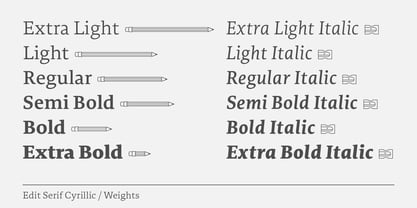
- Edit Serif Pro by Atlas Font Foundry,
$49.00 The Edit Collection is a brand new super family designed to create multi-platform brand and editorial typography. The Renaissance construction allows the typeface to handle long texts in small, medium and large sizes, balancing its astonishing and recognisable details with high legibility. The Edit Collection with its rational, clean aesthetics and great versatility is best suited for complex typography programs. Edit Serif Pro is a modern multilingual multi purpose typeface and the first release of Atlas’ next super family. Its humanist contrast combined with modern details makes Edit Serif Pro suitable for headlines and texts that need to distinguish themselves — while still expressing rational and clean aesthetics. Each style comes with 1.540 glyphs, many features and alternative character sets. As the well known Heimat Collection and Novel Collection already are, Edit will soon become a huge superfamily like all typefaces published by Atlas Font Foundry. Designed by Christoph Dunst for Atlas Font Foundry between 2012 and 2017.
 - Stencil Edition JNL by Jeff Levine,
$29.00 The cover title for a 1950s British glamour magazine called “Beauty Parade” was the inspiration and model for Stencil Edition JNL, which is available in both regular and oblique versions.
 - Cosima Core Edition by TypeThis!Studio,
$50.00Cosima is a sans serif workhorse with a touch of pointy elegance, designed by Anita Jürgeleit. Launching your new brand or creating a new user interface for your mobile devices – selecting characteristic typefaces is important, whether you’re creating app design, magazine or editorial – typography is always the essential part. www.typethis.studio Thank you for checking Cosima. If you have any questions, please send an email to hello@typethis.studio - We are looking forward to hearing from you. - Early Edition JNL by Jeff Levine,
$29.00 A bold, classic wood type newspaper headline was the inspiration for Early Edition JNL. The source of the type design was actually a dummy newspaper with the headline “Thursby and Archer Murders Linked” [which was used in the 1941 film noir classic “The Maltese Falcon” featuring an all-star cast headed by Humphrey Bogart, Mary Astor, Peter Lorre and Sidney Greenstreet]. Early Edition JNL is available in both regular and oblique versions.
 - Famosa Core Edition by TypeThis!Studio,
$50.00 Modern aesthetic meets classy handmade elegance. Famosa is designed for all your stylish fashion magazines, clothing brands, and logos as well as your elegant blogger themes. The highlights are for sure the beautiful ligatures, such as sh, ct, fb and more. If you need more features like small caps, special symbols, extensive language support like Vietnamese, please visit: https://typethis.studio -- Famosa is well known from Netlix' Series 'Sweet Magnolias'
 - Headlines Core Edition by TypeThis!Studio,
$45.00Headlines font family was designed for optimised headline settings. The condensed letters are designed for clear and straight headlines and also allow longer words and headlines to find the space they need for a well-composed headline. Typeface Features 265 Characters 8 Styles, including Italics Western European Language Support Numbers Symbols Punctuation www.typethis.studio Thank you for checking out Headlines Font Family. If you have any questions, please send an email to hello@typethis.studio - Edit Serif Arabic by Atlas Font Foundry,
$89.00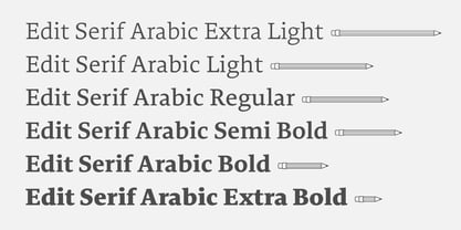
- Deco Edition JNL by Jeff Levine,
$29.00 Deco Edition JNL gets its inspiration from the hand lettered title of a 1943 anthology of musical compositions for schools entitled "Junior Laurel Songs - Teacher's Edition", and is available in both regular and oblique versions.
 - Edit Serif Cyrillic by Atlas Font Foundry,
$49.00