10,000 search results
(0.14 seconds)
- Heldustry by URW Type Foundry,
$35.99 Heldustry is a sans serif design with letterforms partway between Helvetica and Eurostile. The Heldustry font family has a large x-height and wide characters, making it ideal for situations where there is not much copy but pages must be filled.
 - Magista Brush by Sronstudio,
$18.00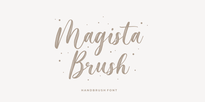 Magista Brush - Handbrush Font perfect for branding, invitation, stationery, wedding designs, social media posts, advertisements, product packaging, product designs, label, photography, watermark, special events, and more. Features: Uppercase and lowercase letters Multilingual symbols, numerals, and punctuation Follow Instagram: @sronstudio Thank You!
 - Matchings by Fontysia,
$20.00 Matching is a beautiful, casual script adds a custom and organic feel to any design you need! Use this font for: Branding, Invitations, Stationery, Logos, Print Materials, Watermark, Label, Wedding designs, Social media posts, Products, Desktop Programs, Canva , Websites and more.
 - Blapuhy by Sealoung,
$10.00 Blapuhy is a lovely handwritten font, designed with the help of a brush pen. Fall in love with its authentic feel and use it to create gorgeous wedding invitations, beautiful stationary art, eye-catching social media posts, and cute greeting cards.
 - Relaxa by ahweproject,
$10.00 Relaxa is a fun, retro-style script display font that is ready to take your designs to the next level. Add it to your vintage-inspired posters, stickers, apparel, or social media posts and you will definitely impress your audience.
 - Dinalee by Arendxstudio,
$12.00 Introducing our newest Dinalee Stylish Signature Font. Dinalee Signature font is made as elegant as possible for the use in a variety of design projects, including logos & amps, branding, wedding designs, social media posts, advertisements, product designs, magazines and more.
 - Anonymous Pro - 100% free

- Pirouette by Linotype,
$40.99Pirouette is based on a logo that Japanese designer Ryuichi Tateno created for a packaging design project in 1999 (a shampoo container!). Tateno's logo experimented with complex, overlapped swash letterforms. He continued to develop these outside of the initial packaging project, until they took on a life of their own. Eventually, Tateno designed a full typeface out of the logo, Pirouette, which was the first place display face in Linotype's 2003 International Type Design Contest. The Pirouette typeface contains six different fonts. The basic font is Pirouette Regular. This is an engraver's italic lowercase paired with elaborate swash capitals. The swash capitals have two visual elements in their forms: thick strokes and thin strokes. Pirouette Text includes the same lowercase as Pirouette Regular, but the uppercase letters are much shorter and simpler. This "text" font can be used to set longer amounts of copy. Pirouette Alternate contains different lowercase glyphs and additional ligatures, which can be used as substitutes for the lowercase forms in the Pirouette Regular and Pirouette Text fonts. Pirouette Ornaments contains swashes and other knick-knacks that can either be added onto the end of a letter, or used as separate decorative elements or swooshes (accolades) on a page. Pirouette Separate 1 and Pirouette Separate 2 are two fonts that can be layered over top of one another in software applications that support layering (e.g., most Adobe and Macromedia applications, as well as QuarkXPress). Pirouette Separate 1 contains the thick stroke elements from Pirouette Regular's uppercase letters, as well as the same lowercase glyphs that can be found in Pirouette Regular and Pirouette Text. Pirouette Separate 2 contains only the thin stroke elements from Pirouette Regular's uppercase letters. By layering Pirouette Separate 1 and Pirouette Separate 2 over one another, you can give the uppercase letter's thick and thin stroke elements different colors and create unique, more calligraphic designs. The Pirouette family, Tanteno's first commercial typeface, was greatly influenced by the calligraphic and typographic work of the master German designer, Prof. Hermann Zapf, especially his Zapfino typeface. - Diary Amily by MrLetters,
$15.00 I would like to present a font that I named after "Amily's Diary". This font was inspired by the handwriting in a beautiful woman's diary. So don't hesitate to use this font for a loving design! Diary Amily Script is perfect for branding, wedding invitations, magazines, mugs, business cards, quotes, posters, and many more that you can use on your big project will be very beautiful. Diary Amily Script is equipped with the OpenType features and has many glyphs. With so many glyphs, you will be able to choose letters to your liking. There are lots of variations and choices for each letter, so you can customize your design choices and also support other languages. This font is very suitable for use with programs that support OpenType features such as Adobe Photoshop Cs / Adobe Photoshop CC, Adobe Illustrator CS / Adobe Illustrator CC, Adobe Indesign, and Corel Draw and many more programs that support OpenType. If you have any questions, don't hesitate to contact me via email: hello.mrletters@gmail.com
 - Times Eighteen by Linotype,
$29.00In 1931, The Times of London commissioned a new text type design from Stanley Morison and the Monotype Corporation, after Morison had written an article criticizing The Times for being badly printed and typographically behind the times. The new design was supervised by Stanley Morison and drawn by Victor Lardent, an artist from the advertising department of The Times. Morison used an older typeface, Plantin, as the basis for his design, but made revisions for legibility and economy of space (always important concerns for newspapers). As the old type used by the newspaper had been called Times Old Roman," Morison's revision became "Times New Roman." The Times of London debuted the new typeface in October 1932, and after one year the design was released for commercial sale. The Linotype version, called simply "Times," was optimized for line-casting technology, though the differences in the basic design are subtle. The typeface was very successful for the Times of London, which used a higher grade of newsprint than most newspapers. The better, whiter paper enhanced the new typeface's high degree of contrast and sharp serifs, and created a sparkling, modern look. In 1972, Walter Tracy designed Times Europa for The Times of London. This was a sturdier version, and it was needed to hold up to the newest demands of newspaper printing: faster presses and cheaper paper. In the United States, the Times font family has enjoyed popularity as a magazine and book type since the 1940s. Times continues to be very popular around the world because of its versatility and readability. And because it is a standard font on most computers and digital printers, it has become universally familiar as the office workhorse. Times™, Times™ Europa, and Times New Roman™ are sure bets for proposals, annual reports, office correspondence, magazines, and newspapers. Linotype offers many versions of this font: Times™ is the universal version of Times, used formerly as the matrices for the Linotype hot metal line-casting machines. The basic four weights of roman, italic, bold and bold italic are standard fonts on most printers. There are also small caps, Old style Figures, phonetic characters, and Central European characters. Times™ Ten is the version specially designed for smaller text (12 point and below); its characters are wider and the hairlines are a little stronger. Times Ten has many weights for Latin typography, as well as several weights for Central European, Cyrillic, and Greek typesetting. Times™ Eighteen is the headline version, ideal for point sizes of 18 and larger. The characters are subtly condensed and the hairlines are finer. Times™ Europa is the Walter Tracy re-design of 1972, its sturdier characters and open counterspaces maintain readability in rougher printing conditions. Times New Roman™ is the historic font version first drawn by Victor Lardent and Stanley Morison for the Monotype hot metal caster." - Times Europa LT by Linotype,
$29.99In 1931, The Times of London commissioned a new text type design from Stanley Morison and the Monotype Corporation, after Morison had written an article criticizing The Times for being badly printed and typographically behind the times. The new design was supervised by Stanley Morison and drawn by Victor Lardent, an artist from the advertising department of The Times. Morison used an older typeface, Plantin, as the basis for his design, but made revisions for legibility and economy of space (always important concerns for newspapers). As the old type used by the newspaper had been called Times Old Roman," Morison's revision became "Times New Roman." The Times of London debuted the new typeface in October 1932, and after one year the design was released for commercial sale. The Linotype version, called simply "Times," was optimized for line-casting technology, though the differences in the basic design are subtle. The typeface was very successful for the Times of London, which used a higher grade of newsprint than most newspapers. The better, whiter paper enhanced the new typeface's high degree of contrast and sharp serifs, and created a sparkling, modern look. In 1972, Walter Tracy designed Times Europa for The Times of London. This was a sturdier version, and it was needed to hold up to the newest demands of newspaper printing: faster presses and cheaper paper. In the United States, the Times font family has enjoyed popularity as a magazine and book type since the 1940s. Times continues to be very popular around the world because of its versatility and readability. And because it is a standard font on most computers and digital printers, it has become universally familiar as the office workhorse. Times™, Times™ Europa, and Times New Roman™ are sure bets for proposals, annual reports, office correspondence, magazines, and newspapers. Linotype offers many versions of this font: Times™ is the universal version of Times, used formerly as the matrices for the Linotype hot metal line-casting machines. The basic four weights of roman, italic, bold and bold italic are standard fonts on most printers. There are also small caps, Old style Figures, phonetic characters, and Central European characters. Times™ Ten is the version specially designed for smaller text (12 point and below); its characters are wider and the hairlines are a little stronger. Times Ten has many weights for Latin typography, as well as several weights for Central European, Cyrillic, and Greek typesetting. Times™ Eighteen is the headline version, ideal for point sizes of 18 and larger. The characters are subtly condensed and the hairlines are finer. Times™ Europa is the Walter Tracy re-design of 1972, its sturdier characters and open counterspaces maintain readability in rougher printing conditions. Times New Roman™ is the historic font version first drawn by Victor Lardent and Stanley Morison for the Monotype hot metal caster." - Times Ten by Linotype,
$40.99In 1931, The Times of London commissioned a new text type design from Stanley Morison and the Monotype Corporation, after Morison had written an article criticizing The Times for being badly printed and typographically behind the times. The new design was supervised by Stanley Morison and drawn by Victor Lardent, an artist from the advertising department of The Times. Morison used an older typeface, Plantin, as the basis for his design, but made revisions for legibility and economy of space (always important concerns for newspapers). As the old type used by the newspaper had been called Times Old Roman," Morison's revision became "Times New Roman." The Times of London debuted the new typeface in October 1932, and after one year the design was released for commercial sale. The Linotype version, called simply "Times," was optimized for line-casting technology, though the differences in the basic design are subtle. The typeface was very successful for the Times of London, which used a higher grade of newsprint than most newspapers. The better, whiter paper enhanced the new typeface's high degree of contrast and sharp serifs, and created a sparkling, modern look. In 1972, Walter Tracy designed Times Europa for The Times of London. This was a sturdier version, and it was needed to hold up to the newest demands of newspaper printing: faster presses and cheaper paper. In the United States, the Times font family has enjoyed popularity as a magazine and book type since the 1940s. Times continues to be very popular around the world because of its versatility and readability. And because it is a standard font on most computers and digital printers, it has become universally familiar as the office workhorse. Times™, Times™ Europa, and Times New Roman™ are sure bets for proposals, annual reports, office correspondence, magazines, and newspapers. Linotype offers many versions of this font: Times™ is the universal version of Times, used formerly as the matrices for the Linotype hot metal line-casting machines. The basic four weights of roman, italic, bold and bold italic are standard fonts on most printers. There are also small caps, Old style Figures, phonetic characters, and Central European characters. Times™ Ten is the version specially designed for smaller text (12 point and below); its characters are wider and the hairlines are a little stronger. Times Ten has many weights for Latin typography, as well as several weights for Central European, Cyrillic, and Greek typesetting. Times™ Eighteen is the headline version, ideal for point sizes of 18 and larger. The characters are subtly condensed and the hairlines are finer. Times™ Europa is the Walter Tracy re-design of 1972, its sturdier characters and open counterspaces maintain readability in rougher printing conditions. Times New Roman™ is the historic font version first drawn by Victor Lardent and Stanley Morison for the Monotype hot metal caster." - Times Ten Paneuropean by Linotype,
$92.99In 1931, The Times of London commissioned a new text type design from Stanley Morison and the Monotype Corporation, after Morison had written an article criticizing The Times for being badly printed and typographically behind the times. The new design was supervised by Stanley Morison and drawn by Victor Lardent, an artist from the advertising department of The Times. Morison used an older typeface, Plantin, as the basis for his design, but made revisions for legibility and economy of space (always important concerns for newspapers). As the old type used by the newspaper had been called Times Old Roman," Morison's revision became "Times New Roman." The Times of London debuted the new typeface in October 1932, and after one year the design was released for commercial sale. The Linotype version, called simply "Times," was optimized for line-casting technology, though the differences in the basic design are subtle. The typeface was very successful for the Times of London, which used a higher grade of newsprint than most newspapers. The better, whiter paper enhanced the new typeface's high degree of contrast and sharp serifs, and created a sparkling, modern look. In 1972, Walter Tracy designed Times Europa for The Times of London. This was a sturdier version, and it was needed to hold up to the newest demands of newspaper printing: faster presses and cheaper paper. In the United States, the Times font family has enjoyed popularity as a magazine and book type since the 1940s. Times continues to be very popular around the world because of its versatility and readability. And because it is a standard font on most computers and digital printers, it has become universally familiar as the office workhorse. Times™, Times™ Europa, and Times New Roman™ are sure bets for proposals, annual reports, office correspondence, magazines, and newspapers. Linotype offers many versions of this font: Times™ is the universal version of Times, used formerly as the matrices for the Linotype hot metal line-casting machines. The basic four weights of roman, italic, bold and bold italic are standard fonts on most printers. There are also small caps, Old style Figures, phonetic characters, and Central European characters. Times™ Ten is the version specially designed for smaller text (12 point and below); its characters are wider and the hairlines are a little stronger. Times Ten has many weights for Latin typography, as well as several weights for Central European, Cyrillic, and Greek typesetting. Times™ Eighteen is the headline version, ideal for point sizes of 18 and larger. The characters are subtly condensed and the hairlines are finer. Times™ Europa is the Walter Tracy re-design of 1972, its sturdier characters and open counterspaces maintain readability in rougher printing conditions. Times New Roman™ is the historic font version first drawn by Victor Lardent and Stanley Morison for the Monotype hot metal caster." - Times by Linotype,
$40.99In 1931, The Times of London commissioned a new text type design from Stanley Morison and the Monotype Corporation, after Morison had written an article criticizing The Times for being badly printed and typographically behind the times. The new design was supervised by Stanley Morison and drawn by Victor Lardent, an artist from the advertising department of The Times. Morison used an older typeface, Plantin, as the basis for his design, but made revisions for legibility and economy of space (always important concerns for newspapers). As the old type used by the newspaper had been called Times Old Roman," Morison's revision became "Times New Roman." The Times of London debuted the new typeface in October 1932, and after one year the design was released for commercial sale. The Linotype version, called simply "Times," was optimized for line-casting technology, though the differences in the basic design are subtle. The typeface was very successful for the Times of London, which used a higher grade of newsprint than most newspapers. The better, whiter paper enhanced the new typeface's high degree of contrast and sharp serifs, and created a sparkling, modern look. In 1972, Walter Tracy designed Times Europa for The Times of London. This was a sturdier version, and it was needed to hold up to the newest demands of newspaper printing: faster presses and cheaper paper. In the United States, the Times font family has enjoyed popularity as a magazine and book type since the 1940s. Times continues to be very popular around the world because of its versatility and readability. And because it is a standard font on most computers and digital printers, it has become universally familiar as the office workhorse. Times™, Times™ Europa, and Times New Roman™ are sure bets for proposals, annual reports, office correspondence, magazines, and newspapers. Linotype offers many versions of this font: Times™ is the universal version of Times, used formerly as the matrices for the Linotype hot metal line-casting machines. The basic four weights of roman, italic, bold and bold italic are standard fonts on most printers. There are also small caps, Old style Figures, phonetic characters, and Central European characters. Times™ Ten is the version specially designed for smaller text (12 point and below); its characters are wider and the hairlines are a little stronger. Times Ten has many weights for Latin typography, as well as several weights for Central European, Cyrillic, and Greek typesetting. Times™ Eighteen is the headline version, ideal for point sizes of 18 and larger. The characters are subtly condensed and the hairlines are finer. Times™ Europa is the Walter Tracy re-design of 1972, its sturdier characters and open counterspaces maintain readability in rougher printing conditions. Times New Roman™ is the historic font version first drawn by Victor Lardent and Stanley Morison for the Monotype hot metal caster." - Coolvetica by Typodermic,
$11.95 Coolvetica is a sans-serif typeface, inspired by logotypes from the 1970s. This was an era where everyone was modifying Helvetica—not only logo designers but even font designers were into outlandish Helvetica mods. Phototype catalogs were loaded with playful variations of the already ubiquitous typeface. Coolvetica recreates that retro custom display lettering style with extra-tight kerning and funky curls. But don’t let the vintage feel fool you—Coolvetica is a true display typeface that’s ready to make a statement. Condensed, compressed, and crammed styles all use a flat-sided approach, an old-school strategy that’s rarely seen today. And with mathematical symbols, OpenType fractions, and numeric ordinals, this typeface is as versatile as it is stylish. So why settle for a dull typeface when you can stand out with Coolvetica? Try it out for your next project and see the difference a little typographical flair can make. Most Latin-based European, Vietnamese, Greek, and most Cyrillic-based writing systems are supported, including the following languages. Afaan Oromo, Afar, Afrikaans, Albanian, Alsatian, Aromanian, Aymara, Azerbaijani, Bashkir, Bashkir (Latin), Basque, Belarusian, Belarusian (Latin), Bemba, Bikol, Bosnian, Breton, Bulgarian, Buryat, Cape Verdean, Creole, Catalan, Cebuano, Chamorro, Chavacano, Chichewa, Crimean Tatar (Latin), Croatian, Czech, Danish, Dawan, Dholuo, Dungan, Dutch, English, Estonian, Faroese, Fijian, Filipino, Finnish, French, Frisian, Friulian, Gagauz (Latin), Galician, Ganda, Genoese, German, Gikuyu, Greenlandic, Guadeloupean Creole, Haitian Creole, Hawaiian, Hiligaynon, Hungarian, Icelandic, Igbo, Ilocano, Indonesian, Irish, Italian, Jamaican, Kaingang, Khalkha, Kalmyk, Kanuri, Kaqchikel, Karakalpak (Latin), Kashubian, Kazakh, Kikongo, Kinyarwanda, Kirundi, Komi-Permyak, Kurdish, Kurdish (Latin), Kyrgyz, Latvian, Lithuanian, Lombard, Low Saxon, Luxembourgish, Maasai, Macedonian, Makhuwa, Malay, Maltese, Māori, Moldovan, Montenegrin, Nahuatl, Ndebele, Neapolitan, Norwegian, Novial, Occitan, Ossetian, Ossetian (Latin), Papiamento, Piedmontese, Polish, Portuguese, Quechua, Rarotongan, Romanian, Romansh, Russian, Rusyn, Sami, Sango, Saramaccan, Sardinian, Scottish Gaelic, Serbian, Serbian (Latin), Shona, Sicilian, Silesian, Slovak, Slovenian, Somali, Sorbian, Sotho, Spanish, Swahili, Swazi, Swedish, Tagalog, Tahitian, Tajik, Tatar, Tetum, Tongan, Tshiluba, Tsonga, Tswana, Tumbuka, Turkish, Turkmen (Latin), Tuvaluan, Ukrainian, Uzbek, Uzbek (Latin), Venda, Venetian, Vepsian, Vietnamese, Võro, Walloon, Waray-Waray, Wayuu, Welsh, Wolof, Xavante, Xhosa, Yapese, Zapotec, Zarma, Zazaki, Zulu and Zuni.
 - Gymkhana by Typodermic,
$11.95 Introducing Gymkhana, a clean and simple sans-serif typeface that brings a touch of architectural elegance to your design. Inspired by twentieth-century American lettering, Gymkhana is the perfect typeface for your next project. Gymkhana’s clarity is immediately evident in its design. The typeface’s large x-height and generous width make it incredibly easy to read, even at small sizes. With its clear lines and easy-to-read characters, Gymkhana adds a feeling of solemn clarity and friendly professionalism to any message. But Gymkhana isn’t just easy to read; it’s also versatile. With old-style numerals, tabular (monospaced) numerals, and old-style tabular numerals in OpenType-capable applications, you can customize the typeface to suit your needs. Gymkhana comes in six weights and italics, so you can choose the perfect style for your project. Whether you’re designing a logo, a website, or a printed document, Gymkhana has you covered. So why wait? Try Gymkhana today and experience the power of clear, clean typography in your design. Most Latin-based European, Vietnamese, Greek, and most Cyrillic-based writing systems are supported, including the following languages. Afaan Oromo, Afar, Afrikaans, Albanian, Alsatian, Aromanian, Aymara, Azerbaijani, Bashkir, Bashkir (Latin), Basque, Belarusian, Belarusian (Latin), Bemba, Bikol, Bosnian, Breton, Bulgarian, Buryat, Cape Verdean, Creole, Catalan, Cebuano, Chamorro, Chavacano, Chichewa, Crimean Tatar (Latin), Croatian, Czech, Danish, Dawan, Dholuo, Dungan, Dutch, English, Estonian, Faroese, Fijian, Filipino, Finnish, French, Frisian, Friulian, Gagauz (Latin), Galician, Ganda, Genoese, German, Gikuyu, Greenlandic, Guadeloupean Creole, Haitian Creole, Hawaiian, Hiligaynon, Hungarian, Icelandic, Igbo, Ilocano, Indonesian, Irish, Italian, Jamaican, Kaingang, Khalkha, Kalmyk, Kanuri, Kaqchikel, Karakalpak (Latin), Kashubian, Kazakh, Kikongo, Kinyarwanda, Kirundi, Komi-Permyak, Kurdish, Kurdish (Latin), Kyrgyz, Latvian, Lithuanian, Lombard, Low Saxon, Luxembourgish, Maasai, Macedonian, Makhuwa, Malay, Maltese, Māori, Moldovan, Montenegrin, Nahuatl, Ndebele, Neapolitan, Norwegian, Novial, Occitan, Ossetian, Ossetian (Latin), Papiamento, Piedmontese, Polish, Portuguese, Quechua, Rarotongan, Romanian, Romansh, Russian, Rusyn, Sami, Sango, Saramaccan, Sardinian, Scottish Gaelic, Serbian, Serbian (Latin), Shona, Sicilian, Silesian, Slovak, Slovenian, Somali, Sorbian, Sotho, Spanish, Swahili, Swazi, Swedish, Tagalog, Tahitian, Tajik, Tatar, Tetum, Tongan, Tshiluba, Tsonga, Tswana, Tumbuka, Turkish, Turkmen (Latin), Tuvaluan, Ukrainian, Uzbek, Uzbek (Latin), Venda, Venetian, Vepsian, Vietnamese, Võro, Walloon, Waray-Waray, Wayuu, Welsh, Wolof, Xavante, Xhosa, Yapese, Zapotec, Zarma, Zazaki, Zulu and Zuni.
 - Rolexa by Storictype,
$19.00 Rolexa is a new carefully crafted serif fonts. The Ideas of this fonts are from wide range of reference, from classic, until the modern era. So the looks of this fonts must be in the wide range of the reference above. It’s Versatile and Luxury feel that you get in Rolexa Typefaces. Immerse your design in the world of elegance and refinement with our premium serif luxury typeface, designed to bring a sense of grandeur to your creative endeavors. Experience the epitome of luxury in typography with our meticulously crafted serif typeface, exuding timeless beauty and grace for your high-end designs. As you can see our creation on the display such as Branding, Header, Logotype, Poster, Magazine, Packaging, Wedding Invitation with art deco style, and etc. It shows that Rolexa can accommodate various design style. Features : - Character Set A-Z - Numerals & Punctuations (OpenType Standard) - Disrectionary Ligatures - Accents (Multilingual characters) Thank You
 - Vintage Round by Din Studio,
$20.00 Want to transport your audience to a world of gorgeous, versatile, but still have the retro touch? Looking for a font that makes your projects spark happiness? Then, you go on the right path. Introducing Vintage Round- A RetroScript Font This vintage font features thick and angular letters. With its strong outlines and fat strokes, this is the font you need when you want to create that classic bubble font look. This font becomes more special with extruding version option. This font can be used for a host of different content needs and projects. Create gorgeous printed quotes, standout packaging, or beautiful t-shirts! You can even use it to create amazing headings, logos, menus, and social media graphics. Our font always includes Multilingual Support to make your branding reach a global audience. Features: Stylistic Set Swashes Multilingual Support PUA Encoded Numerals and Punctuation Thank you for downloading premium fonts from Din Studio
 - Monoline Fighter by Nathatype,
$29.00 Are you looking for a way to enhance your copy? Looking for a way to stand out from your competition? Maybe you are missing that “something”. Monoline Fighter-A Script Font Monoline Fighter was fully thought out to easily meld inside your designs. These fonts make a good foundation of what you want it to be! Discover the beauty in your own imagination while this font gives you a quick kickstart to what it can be. Wait no more, this beautiful font can be yours right now! This custom made font was specifically designed to fit whatever you need! Perfect for social media posts and ads, printed quotes, t-shirt designs, packaging, or even as a modern text overlay to any background image. Monoline Fighter includes Multilingual Options to make your branding globally acceptable Features: Stylistic Sets Swashes Bonus Ornament PUA Encoded Numerals and Punctuation Thank you for downloading premium fonts from Nathatype
 - Interzone by MYSTERIAN,
$9.00 This type crept up the sense that it was made in Eastern Europe by poorly trained urbanites from a crippled nation, or that it is the remains of a contemporary gothic (like Eckmann) stencil. The choice of what this type signifies is up to the public. Lately I like the idea of 'putting on' (in McLuhan's sense) a genre of idea that is somewhat different from my tradition's beliefs, and fitting a core category of that toward a teleological/eschatological advantage. Therefore postmodernist/apocalyptic carelessness (which I may 'put on' by using this type) is how I abstain from the cravings of immortality, or more so that wanting it is pointless. It’s stands as memento morí; that I will have to die someday. I have to become less, He must become more. Of course, Interzone may signify a classic Joy Division track from Unknown Pleasures as well as the Cold Warish ongoings of conflicted eastern European life. I considered naming this Lunik 9.
 - Fitriyah by Din Studio,
$29.00 Are you looking for a way to enhance your copy? Looking for a way to stand out from your competition? Maybe you are missing that “something”. Introducing Fitriyah-A Display Font Fitriyah was fully thought out to easily meld inside your designs. These fonts make a good foundation of what you want it to be! Discover the beauty in your own imagination while this font gives you a quick kickstart to what it can be. Wait no more, this beautiful font can be yours right now! This custom made font was specifically designed to fit whatever you need! Perfect for social media posts and ads, printed quotes, t-shirt designs, packaging, or even as a modern text overlay to any background image. Fitriyah includes Multilingual Options to make your branding globally acceptable. Features: Standard Ligatures Alternates Stylistic Sets Swashes Multilingual Support PUA Encoded Numerals and Punctuation Thank you for downloading premium fonts from Din Studio
 - Topsy Turvy by Krafted,
$10.00 Looking for a fun and versatile font to captivate your audience, clients, or guests? Trying to create the perfect contrast between your titles/headings and body copy? Maybe you’re a Beauty Influencer, Interior Designer, or run a Cooking YouTube channel - looking for a way to stand out from your competition. Maybe you feel like your birthday e-cards are missing that “something”. If you can say “yes” to any of these then hold on to your seats and get ready for a modern, fun, and delightful experience! Introducing Topsy-Turvy - A Modern Calligraphy Font. This gorgeous, fun, and elegant font can be used for a host of different content needs and projects. Use it for your headings, logos, business cards, printed quotes, invitations, packaging, resumes, and even your website or social media branding. Delight your audience, clients, or guests with this versatile, elegant font. What you’ll get: - Multilingual & Ligature Support - Full sets of Punctuation and Numerals Compatible with: - Adobe Suite - Microsoft Office - KeyNote - Pages
 - Big River by Ana's Fonts,
$15.00 Big River is an elegant sans serif and handwritten font duo with lots of extras. It includes: - A wide sans serif font in three weights (with caps and small caps); - A handwritten font with a regular and slant version, and bonus swashes to give your designs a more natural look. Each font includes: - A-Z, a-z, 0-9, accents, punctuation and symbols - Contextual alternates (script) - Ligatures (script) This font duo makes it so easy to achieve beautiful and eye-catching designs, and is perfect for both short and longer texts. It can be used for making postcards and notes, creating logotypes, social media posts, branding and packaging, etc. Please note: No special software is needed in order to access the extras, as they are in a different font file. You can simply access them directly in your font bar (a-z for terminals in regular, A-Z for terminals in italic, and 0-1 for squiggles).
 - Dulcian by insigne,
$- Inspired by the Appalachian culture of the Southeastern United States, the finely tuned forms of Dulcian strike a clear, empowering chord with your audience. This energetic and fresh sans serif flows fast and smooth with its simple lines and slight hand-written character. All total, there are six weights, with complementary italics and three different widths. Dulcian supports OpenType features and is packaged with unicase alternates, unconnected alternates, ligatures, old-fashioned figures, fractions, titling and small caps. Preview any and all of these features in the interactive PDF manual. The Dulcian family of fonts also includes glyphs for 72 languages, providing you with more than 600 glyphs per font. While designed especially for pull quotes, this display typeface can be used for a variety of applications. Dulcian is an excellent choice for websites as well as flyers and packaging. Other uses include coffee, menus, awards, certificates where a touch of humanity and personalization is needed.
 - Intelo by Kastelov,
$25.00 Intelo was created with the single idea of redefining what makes a functional grotesque typeface nowadays. Its large x-height and letterforms with subtle elliptical finish create a distinctive look that can help brands cater to an increasingly design savvy audience. To top it off, Intelo comes in two versions - an attention-grabbing original cut and an additional version with flat endings for a more streamlined effect. The family weights range from thin to extrabold with matching italics making it a versatile choice and perfectly suited for digital applications including web and interaction design as well as printed media such as editorial and corporate materials. When it comes to Opentype features, Intelo is loaded with stylistic alternates, tabular figures, fractions, ligatures, and more. In addition, the font family has an extended language support featuring Western, Eastern and Central European languages. To sum it up, the friendly and inviting letterforms of Intelo came as a solution to the need for more human fonts in our technology-oriented environment.
 - Flefixx by Sun Young Oh,
$54.00 Flefixx is a typeface designed to support a project "Flefixx", an idiosyncratic visual language and typeface system that unfolds narratives based on common combinations of letters. In this visual language, just as individual letters come together like puzzle pieces to form different meanings or words based on combinations, the typeface is also constructed from fragmentary elements, each playing a distinct role as if they are individual pieces. The intentional exposure of the intersections of these fragments emphasizes the typeface's creation through interconnected elements. Furthermore, diacritics and dots are strategically positioned as ornaments, enhancing their presence within the gaps between letters. This concept aligns with the theme of composition and connectivity among fragments, allowing strong rhythmic patterns to emerge as letters and symbols blend in a paragraph. Additionally, the prominent and bold punctuation marks serve to provide pauses and clarity within sentences that incorporate both letters and the visual language. They contribute to articulating sentence structure amidst the dynamic flow of sentences with combined characters and visuals.
 - Bhuyin by Twinletter,
$17.00 "Welcome to the world of one-of-a-kind typography!" Bhuyin is a display typeface with a totally unique sense of design. Bhuyin is the ideal choice if you need a bold and distinct style for a wide range of visual design tasks. What distinguishes Bhuyin from others? Its attributes are fantastic. With ligatures and alternatives available, Bhuyin allows you to express yourself in an infinite number of ways. You can quickly construct one-of-a-kind letter combinations to lend a particular, personalized touch to any project. Because we understand the value of interacting with a worldwide audience, Bhuyin supports several languages. Your message will be clearly and successfully delivered to individuals all around the world. Are you ready to take your design to the next level? Bhuyin is ready to take your projects to the next level. Get this font now and see how Bhuyin turns every design into an unforgettable work of art.
 - The Oaxaqueña Tall font, designed by Spanish typeface designer Fernando Haro (deFharo), is a captivating and elegantly structured font that radiates a unique charm and sophistication. Inspired by the...
- Al Eriega by Aluyeah Studio,
$120.00 Inspired by the many emerging tech startups, we wanted to create a font that can play to give the impression of technology but still fit into various design areas. Eriega gives the impression of modern and technology as a movement for change for the better. Eriega is a modern tech display typeface that unites the enthusiasm and technology. A simple, modern, futuristic font that can be applied to many areas of design. Coming with 90+ stunning and super easy to use alternates and ligatures. Very suitable for apps, magazine, headline, website, ads, product package and all type of design project you have. Features: OpenType support Multilingual support (15 languages) PUA Encoded Super Easy to Use alternates - It's OpenType support but you can easily call alternates character using special combination like A.2 S.2 a.r r.i etc. To get results like the preview just type Er.iega
 - Scorno by Rosario Nocera,
$22.99 Scorno is a geometric sans serif that offers a high legibility also in the lighter weights. Scorno is ideal for sports and technology. The shape of its letters makes it different from most geometric fonts, making it suitable for branding, magazines, catalogues and much more. Scorno is available in nine weights, from thin to heavy plus matching italics and it comes with open type features like old style and lining figures, ligatures, numerator, denominator, scientific figures, and fractions. What’s more, it also features the bitcoin symbol in the currencies set.
 - Kotadaila by Gatype,
$17.00 Kotadaila is a script font that includes a complete set of uppercase and lowercase letters, multilingual symbols, numbers, punctuation, alternatives and ligatures. This font has a Modern Elegant Style, perfect for branding, logos, invitations, masterheads and more. Kotadaila features OpenType style alternatives, International binders and support for most Western Languages included. To enable the OpenType Stylistic alternative, you need a program that supports OpenType features such as Adobe Illustrator CS, Adobe Indesign & CorelDraw X6-X7, Microsoft Word 2010 or later. Thank you very much for viewing and Enjoying it.
 - Laughing Gull by Atlantic Fonts,
$26.00 Distinctive with a sense of humor, Laughing Gull is a fun interlocking font that will fill your project with swirling energy, but won’t snatch your lunch. Handsome straight up, or switch on discretionary ligatures to find a fresh array of interlocks. Most of the ligatures are for lower case, some for upper/lower, and a few are for all-caps. Play around by turning some on and others off and feel free to mix up upper/lower whenever you need a laugh. Laughing Gull posters also feature Atlantic Fonts' Digby and Atlantic Doodles.
 - SK Eliz by Shriftovik,
$10.00 SK Eliz is an eight-bit old-school geometric font based on pixels. Despite the old school, the font looks modern and simple. The font is built on a clear geometric grid, verified to the last pixel. It is ideal for design works in the old style, illustrations and for game design. This font also contains a set of pixel icons for more convenient operation. There are also paired styles of numbers. The font comes in one weight but it has 850 glyphs which supports classical Latin, Cyrillic and most European languages.
 - Diamond Ring by Dharma Type,
$24.99 Diamond Ring is an Art Deco font inspired by Japanese designs for cosmetic packaging and posters used from the end of the 19th century to the early 20th. The most distinguishing characteristic is the diagonal parts of the glyphs. All diagonals have the same degree of the angle. By this elements, whole design of this font and typography with this font look like the shining of diamond ring during total solar eclipse. When you prefer more humanly letter form, please try our Yasashii that used in La La Land.
 - Sambo Briliant by Gian Studio,
$10.00 Brilliant Sambo Featuring Slab Serif totality and elegance. One of my most recent first releases, naturally drawn with pinpoint accuracy. Sambo Brilliant has the perfect amount of simplicity and subtlety for your next project. It perfectly represents the retro and vintage aesthetic. I recommend this font for your next logo, invitation, and home decor project that needs a succinct alternative combination touch! Sambo Brilliant appears with strong characters available: Get inspired by the image above and feel free to share with me what you get by using this font.
 - Architype Catalogue Outline by The Foundry,
$99.00 Architype Crouwel is a collection of typefaces created in collaboration with Wim Crouwel, following his agreement with The Foundry, to recreate his experimental alphabets as digital fonts. Crouwel's most recognized work was for the Van Abbe and Stedelijk museums (1954 –72) where he established his reputation for radical, grid-based design. Architype Catalogue originates from Wim Crouwel’s Stedelijk Museum exhibition catalogue for sculptor Claes Oldenburg, 1970. The cover’s soft ‘padded’ letterforms evoke the artist’s work. Oldenburg was so taken with the design, that he asked Crouwel to complete the alphabet.
 - Sadness by Floodfonts,
$29.00 Sadness is based on some experiments during Felix Braden’s stay at the Trier College of Design: "I played around with Fontographer’s blendfonts-feature (a type design tool to interpolate fonts and to minimize effort and expenditure of large families) with some files from a close designer. Since the basic elements derived from extremely varied fonts without any similarities, the concluding shapes first turned out to be rather fragmentary. From those fragments I chose the most characteristic elements and drew a whole new font." For a detailed type specimen have a look at: http://on.be.net/1CdAZlC
 - Module 4-4 by Sébastien Truchet,
$40.00 Sébastien Truchet designed a modular typographic system during his last year in the School of Fine Arts of Besançon. The system is made of a unique grid and 6 modules which are the components to build several typefaces. The most radical is the "2-2". The last one is the "10-12". This is the 4-4. It is built into a square grid. Four modules in width and in height. This font proposes to you two appearances : the caps are blackest and the small letters are more open.
 - Fun Time Nouveau JNL by Jeff Levine,
$29.00 “One Hundred Alphabets for the Show Card Writer” was published in 1919 to afford sign artists the ability to create signs and show cards in then-contemporary lettering styles. One such alphabet was big, bold and representative of the Art Nouveau stylings popular in the early part of the 20th Century. Most likely it was applied to store sales and public events that were casual and informal, for its letter forms are free of any constraints. This design is now available as Fun Time Nouveau JNL in both regular and oblique versions.
 - Heraldica Script by Sudtipos,
$79.00 Ornamented scripts are a Koziupa/Paul specialty, and Heraldica is one of their most expressive. It attains the very definition of deluxe by conjoining the classic thin-and-thick script treatment with thin-only counterpart strokes, then it goes the extra mile with a varied complement of overlaid flourishes. The usual assortment of multiple alternates and ending forms pushes it even further in class and versatility. Monograms, logos, jewelry packaging and book covers are only a few of the possibilities with such a high-end script. Crafted Koziupa and digitized by Ale Paul.
