10,000 search results
(0.109 seconds)
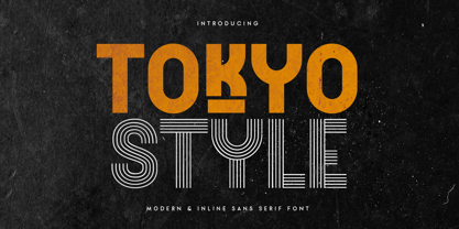
- Tokyo Style by Sensatype Studio,
$15.00Tokyo Style is a Modern sans serif display font that special created for Modern needs with unique style. A New Display font that we created special for Unique branding needs, with weird style that ready to add value of your brand. It's so nice to leverage designer or product owner that need solutions to make their design look more unique and urban. Tokyo Style Unique Sans Serif font ready with: All Uppercase characters Numbers and Punctuations Preview as a inspirations that you can do with Tokyo Style font Available for PC and Mac Wish you enjoy our font. :) - Ginger Style by Sensatype Studio,
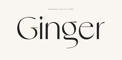
$15.00Ginger is a Modern Stylish Font. In a new generations, we analyze that any designer or brand owner need to make their brand standout. As our focus that analyze any typeface that helps to leverage any logo design to look more modern and unique. We prepared this font with any unique characters to help you create unlimited variations for your creative needs. Ginger font ready with: Any options to get creative variations with unique letters Preview as a inspirations that you can do with Ginger font Ready with Lowercase and Uppercase characters Wish you enjoy our font. :) - Helenium by Greater Albion Typefounders,
$14.95Informal does not have to mean aggressively modern or casual. Helenium is inspired by some hand drawn capitals that I found added to a 19th century map. It's a great font for informal titles and headings that still keep an air or regularity and ever so slightly period elegance. It manages to be formal and casual all at once, as well as classical and modern. Helenium's range of different weights and drop shadow effects make it useful for hierarchical titles and headings. Helenium miniscule adds greater flexibility by extending the family with a fun range of rounded lower case forms. - Roscha by Luhop Creative,
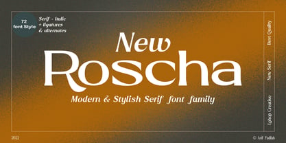
$14.00Roscha is a fully reconsidered high contrast transitional serif, which is perfectly adapted to modern realities and requirements. When starting this project, we wanted to try to draw a modern serif with the precisely verified shapes, high contrast and detailed elaboration of each character. Roscha is perfect for use in magazines, in the fashion industry, in the branding of premium goods and services. Roscha is quite versatile and suitable for use both in headings and in text arrays. In addition, we have done manual hinting in the typeface, and now it can be used with a clear conscience in the web and applications. - Floral Bouquet by Balpirick,
$15.00Floral Bouquet - a modern calligraphy that's clean, elegant and perfect for a range of design projects! With its smooth, effortless lines and understated sophistication, this font is the perfect choice for those who want a modern look that's still timeless in its appeal. Crafted with precision and care, this font is incredibly versatile and can be used for a range of design projects, including logos, branding, invitations, packaging, and more. With its simple yet refined aesthetic, it's sure to make a lasting impression on anyone who sees it. - also multilingual support Enjoy the font! Feel free to comment or feedback! Thank you! - Dantene by Grezline Studio,
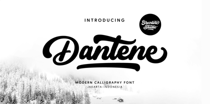
$23.00Hello world! I'm very excited to introduce you, my latest font creation called Dantene! Dantene is a modern calligraphy script font that I crafted carefully. It is a perfect use for logotype, typography design, product packaging, t-shirt design, label poster, headings, letterhead, signage, and anything that need modern taste. You can also mix and pair it with other fonts to provide a unique and fresh looks to your design projects. Feature : - Ligature & Alternate glyphs - Multilingual Language - Works on PC & Mac - Simple installations - Accessible in the Adobe Illustrator, Adobe Photoshop, Adobe InDesign, even works on Microsoft Word. Thank You - Fd Vienna by Fortunes Co,
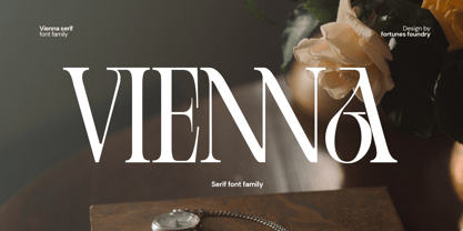
$9.00Vienna is Modern Serif is a font style that blends traditional and modern design elements to create a distinct, stylish look. This typeface is characterized by serifs, or small lines added to the end of a stroke, that give it a classic and sophisticated feel. The font is often used in high-end fashion magazines and advertisements to evoke a sense of luxury and elegance. Fashion serif typeface is versatile and can be used for various purposes, from headings and titles to body text. Overall, this typeface is a perfect choice for designers looking to create a high-end, fashionable aesthetic. - Esthetic Boots by Balpirick,
$15.00Esthetic Boots - a modern handwritten that's clean, elegant and perfect for a range of design projects! With its smooth, effortless lines and understated sophistication, this font is the perfect choice for those who want a modern look that's still timeless in its appeal. Crafted with precision and care, this font is incredibly versatile and can be used for a range of design projects, including logos, branding, invitations, packaging, and more. With its simple yet refined aesthetic, it's sure to make a lasting impression on anyone who sees it. - also multilingual support Enjoy the font! Feel free to comment or feedback! Thank you! - Flamboyan Style by Sensatype Studio,
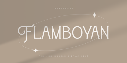
$15.00An unique font for unique feminine branding needs, with extra alternates in unique shape will be ready to add value of your brand. It so nice to leverage designer or product owner that need solutions to make their design look more unique and modern. And specially for this font, We prepared any alternate characters to help you create unlimited variations for your creative needs. Flamboyan Feminine Modern Display Font ready with: Any options to get creative variations (combination of Alternates) Preview as a inspirations that you can do with this font Ready with Lowercase and Uppercase characters Wish you enjoy our font. :) - Creamy Dough by Balpirick,
$14.00Creamy Dough - a Modern Handdrawn that's clean, elegant and perfect for a range of design projects! With its smooth, effortless lines and understated sophistication, this font is the perfect choice for those who want a modern look that's still timeless in its appeal. Crafted with precision and care, this font is incredibly versatile and can be used for a range of design projects, including logos, branding, invitations, packaging, and more. With its simple yet refined aesthetic, it's sure to make a lasting impression on anyone who sees it. - also multilingual support Enjoy the font! Feel free to comment or feedback! Thank you! - Jaguar Style by Sensatype Studio,
$15.00Jaguar is a Sports Futuristic Tech Font that special created for Sport and Technology design needs with Modern style. A New Sport font that we created special for Modern branding needs, with Futuristic style that ready to add value of your brand. It's so nice to leverage designer or product owner that need solutions to make their design look more unique and sporty. Jaguar Sports Futuristic Tech Font ready with: Uppercase and Lowercase characters Numbers and Punctuations Each Style (Regular and Outline) Preview as a inspirations that you can do with Jaguar font Available for PC and Mac Wish you enjoy our font. :) - Beverly by Pen Culture,
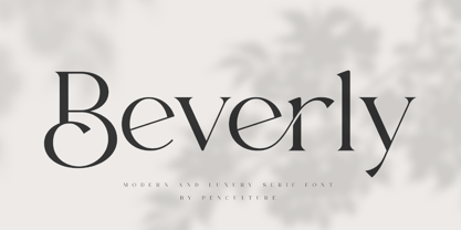
$17.00Proudly present the new "Beverly - Modern & Luxury Serif Font" Beverly is modern and luxury serif font. Beverly come with elegant stylistic alternate and ligature that perfect for any purpose like branding, logo design, poster, magazine, and many more. this font also has natural and elegant shape, so you can easily to customize it to your needs. I really hope you enjoy it – please do let me know what you think, comments & likes are always hugely welcomed and appreciated. More importantly, please don’t hesitate to drop me a message if you have any issues or queries. Thank you - Vignettic by Allmo Studio,
$19.00Vignettic font comes with a retro, modern, and vintage touch. Inspired by the dynamic culture, sign, and badges design. Vignettic Script comes with uppercase, lowercase, numerals, punctuations and so many variations on each character include OpenType alternates. This font is great for your creative project such as logos, posters. invitations cards, packaging, badges, logotype, apparel design, and labels. But don't let us restrain your imagination of course. Work well on both vintage and modern designs. You can see our design implementation on preview images to check the resulting sample. Vignettic Font looks Perfect for use in anything from Branding, Web, Packaging, Etc. - Phanter Black by Sipanji21,
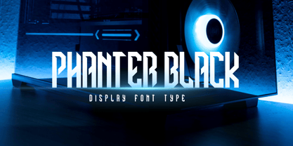
$21.00"Phanter Black" is a display font with a modern, space, and futuristic theme. This font reflects elements of technology, strength, and a futuristic aesthetic often associated with modern design. The space theme adds an element of exploration and the unknown in the universe to your design. "Phanter Black" is well-suited for various design projects that aim to emphasize these aspects, including space-related designs, advanced technology, advertisements for futuristic products, and more. With "Phanter Black," you can create designs that convey durability, strength, and a bold vision of the future, while infusing a futuristic touch into your projects. - Rogmans by Letterhend,
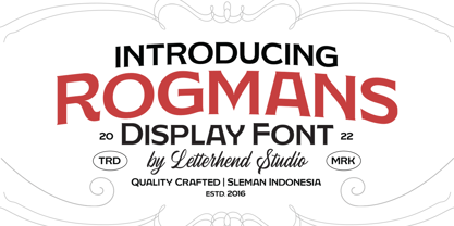
$19.00Rogmans is a display font which looks great for modern theme but still has classy feel. Very suitable for for headline, logotype, apparel, invitation, branding, packaging, advertising etc with old school / vintage as well as modern theme. It comes in uppercase, lowercase, punctuations, symbols & numerals, stylistic set alternate, ligatures, etc also support multilingual and already PUA encoded. Features : - uppercase and lowercase - numbers and punctuation - multilingual - alternates and ligatures - PUA encoded We highly recommend using a program that supports OpenType features and Glyphs panels like many of Adobe apps and Corel Draw, so you can see and access all Glyph variations. - Rhode White by Cititype,
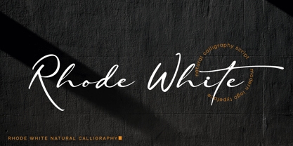
$16.00'Rhode White' is a natural calligraphy font. We created this font for modern brands. branding and branding only. The soft, unique and natural touch gives a different impression, it invites attention to take a closer look at your brand. This is a font favoured by agencies who like modern branding, you can make a large number of logos with one font because this font is suitable for use in web logos, personal signatures, portfolios, prints, header, magazine, book cover, t-shirt print, craft, and cosmetic packaging. Again, this is a font worthy of your collection. Thank you, - 1565 Renaissance by GLC,
$20.00This set of initial letters was inspired from French renaissance decorated letters. It is a typical pattern, one among dozen quite similar, but this one was in use in Paris, unchanged, for centuries, and was still in use in the beginning of 1900s. This explains the difference between I and J, U and V. These characters were engraved years after the original set. Our font was inspired from a late 1800s publication. It can be used as well with Humane fonts (like our 1543 Humane Janson or 1592 GLC Garamond) as with modern fonts like our 1820 Modern or 1906 French News. - Valorica by Keristyper Studio,
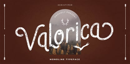
$14.00Valorica is a modern design with a vintage feel. A monoline display font that combines classic & modern styles. This font is good for logo design, Social media, Movie Titles, Books Titles, short text even long text letters, and good for your secondary text font with sans or serif. Featured: OTF Standard Uppercase & Lowercase Numeral & Punctuation Multilingual : ä ö ü Ä Ö Ü ß ¿ ¡ Alternate & Ligature PUA encoded We recommend programs that support the OpenType feature and the Glyphs panel such as Adobe applications or Corel Draw. so you can use all the variations of the glyphs. Hope you enjoy our fonts! - Arshila by Bykineks,
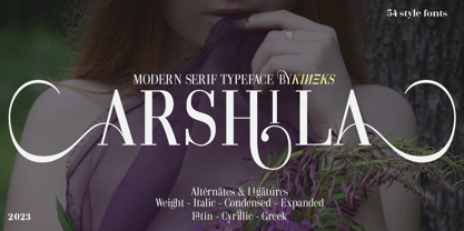
$12.00Introducing Arshila Typeface the Modern Serif Bykineks, designed by Dede Kurniawan, the newest typeface family with 54 font styles! With over 700 glyph options and a multilingual, Cyrillic, Greek writing system, this typeface offers a complete typography. easily adaptable to designs in the fashion industry such as magazines, logotypes, wedding invitations, label tags, posters, and many more. gives you a modern, professional and unique style. with various features such as ligatures, alternative characters, numerator, and denominator. You can create a completely unique design that is sure to stand out from the rest. Get creative with arshila typeface, and bring your designs to life! - Romantic SS by Sensatype Studio,
$15.00Romantic is a Modern Beauty Sans Serif A Sans Serif font that we created special for branding needs with classy shape to add value of your brand. It's so nice to leverage designer or product owner that need solutions to make their design look more classy and fashionable. And specially for Romantic font, We prepared any characters with Elegant shape to help you create classy style of your design. Romantic Modern Beauty sans serif font ready with: Lowercase and Uppercase characters Numbers and Punctuations Preview as a inspirations that you can do with Romantic font Wish you enjoy our font. - Michaela Script by Dhan Studio,
$19.00Michaela Script is modern hand brushed script with an organic, fun and dancing baseline. It includes different alternates and swashes for all lowercase characters. It features 328 glyphs, with OpenType features and stylistic sets, as well as international support for most Western Languages. This fonts can be used for various purposes such as headings, signature, logos, wedding invitations, t-shirts, letterhead, signage, labels, news, posters, badges, and more. Michaela Script can be used for both Commercial and Personal projects. - Rensor by Smartfont,
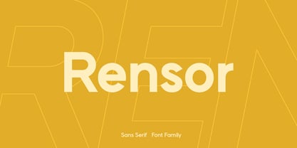
$25.00Rensor is an three weight modern geometric typeface, designed to be an easy go-to for branding, web, and print design projects. Each form is pared down to its essentials, so it's extremely versatile and can blend in or stand out as much as you choose. With it, you can create logos, labels, use in advertising, branding, packaging, magazines and book covers, posters, banners, headings, descriptions and much more. This font is easy to use has OpenType features. - Bemore Serif by Asenbayu,
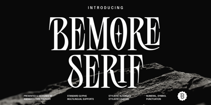
$15.00Bemore Serif is a decorative serif font that has a distinctive serif shape. This font has sleek and tall condensed letter proportions so it can give an attractive and elegant impression. You can use this font in both modern and vintage designs. This font is suitable for attractive packaging label designs, unique desired logos, trendy poster designs, fashion and many more. Bemore Serif font features: standard glyphs, stylistic alternates, stylistic ligatures, symbol, punctuation and multiple languages supported. - Effendi by NJ Studio,
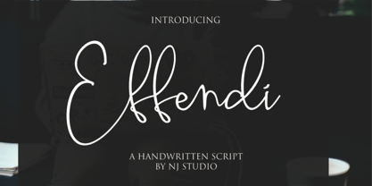
$19.00Hi...Thank for your visit :) Effendi Modern Calligraphy Fonts are font designs that are made for various vector designs, printing such as digital wedding invitations, blogs, online shops, social media, while printing can be used in the field of product clothing, accessories, bags, pins, logos, business cards, watermarks and many others ... Effendi is equipped with complete alternates and very beautiful ligature, so it can make your product look elegant and attractive, and also Multilingual support!!! Happy design ... - Brohoney by Alit Design,
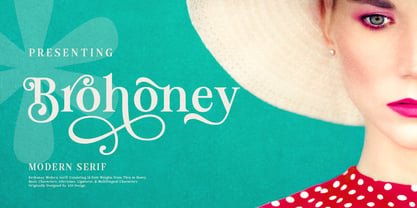
$9.00The Brohoney font is inspired by an elegant serif styled font made with elegant swash and limp curves that make any design unique and elegant. Brohoney has many alternative characters that you can choose easily by using an application that supports opentype glyphs, besides that Brohoney also has 14 families from thin to heavy that you can use for body text or header text. Brohoney is very suitable for making designs with elegant, luxurious, modern and simple concepts. - Space Boards by Sarid Ezra,
$15.00Introducing, Space Boards, a sci-fi logo font! Space Boards is a sans based font with unique lowercase & uppercase that will make your design looks futuristic and modern. You can use this font for any purpose, especially to make hi-tech logotype. This font is also suitable for science-fiction movie poster. You can mix and match the uppercase and lowercase to make your logo more unique and stand-out. This font also support multi language. - Rollcake by NJ Studio,
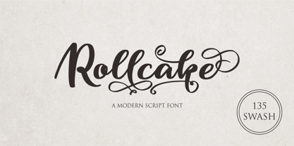
$19.00Hi...Thank for your visit :) Rollcake Modern Script Fonts are font designs that are made for various vector designs, printing such as digital wedding invitations, blogs, online shops, social media, while printing can be used in the field of product clothing, accessories, bags, pins, logos, business cards, watermarks and many others ... Rollcake is equipped with complete alternates and very beautiful ligature, so it can make your product look elegant and attractive, and also Multilingual support!!! Happy design ... - Wolves by Eotype,
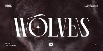
$12.00The Wolves font is a serif condense font with a sleek and elegant appearance. This font is created as a unique professional multipurpose font that you can use in your projects. You can use it in modern and fancy designs. This font is perfect for a variety of projects, such as branding, poster displays, logo designs, magazine covers, product labels, clothing and more. This font contain ligatures and alternative styles. This font provides a great experience! - Coppint by Ridtype,
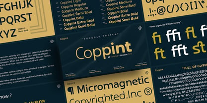
$25.00Coppint is a font formed with serenity and imagery in patterns that refer to warmth and harmony. Even so, this font also gives each letter an elegant and semi-modern impression. When this font was created, Ridwan Fadilah, the designer, said that this font must race in a contextual and basic fundamental hierarchy. Thus, this font also provides stylistic weight, from smallest to largest. So that it can become a unit that can be used in optical text. - Sunbunny by NJ Studio,
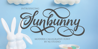
$19.00Hi...Thank for your visit :) Sunbunny Modern Calligraphy Fonts are font designs that are made for various vector designs, printing such as digital wedding invitations, blogs, online shops, social media, while printing can be used in the field of product clothing, accessories, bags, pins, logos, business cards, watermarks and many others ... Sunbunny is equipped with complete alternates and very beautiful ligature, so it can make your product look elegant and attractive, and also Multilingual support!!! Happy design ... - Angolla by Letterafandi Studio,
$14.00Angolla is a fabulous, elegant, and modern display font that’ll engage your audience and make your branding stand out. This stylish font can be used for a host of different content needs and projects. Perfect for social media branding projects, fashion designs, printed quotes, or even as a stylish text overlay to any background image and many more! This font is PUA encoded which means you can access all of the glyphs and swashes with ease! - Habibie by NJ Studio,
$19.00Hi...Thank for your visit :) Habibie Modern Script Fonts are font designs that are made for various vector designs, printing such as digital wedding invitations, blogs, online shops, social media, while printing can be used in the field of product clothing, accessories, bags, pins, logos, business cards, watermarks and many others ... Habibie is equipped with complete alternates and very beautiful ligature, so it can make your product look elegant and attractive, and also Multilingual support!!! Happy design ... - Lalalo by Cuda Wianki,
$25.00Lalalo is a casual, modern sans-serif font family based on hand-lettering. It's oval letter shapes provide soft and friendly appearance. Lalalo font is very legible with a warm touch perfectly suited for children books. Lalalo family consists of 6 weights ( Extra Light, Light, Regular, Semibold, Bold, ExtraBold). You can use it with normal fill or outlined. You can mix various colors and stroke widths to gain interesting results. There is also a set of nice frames available. - Margaretha by Mozatype,
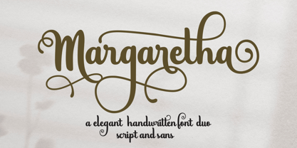
$13.00Margaretha is an elegant script font with a contemporary atmosphere and impeccable form, inspired by timeless classic calligraphy. It is an incredibly unique handwritten font. This font is ideal for crafting, branding, and decorates your any project. This font is perfect for wedding invitations or your blog. Also with their help, you can create a logo or beautiful frame for your home. Or use it for your business, book covers, stationery, marketing, magazines, and more. It is PUA encoded which means you can access all of the glyphs and swashes with ease! Fall in love with its incredibly versatile style and use it to create spectacular designs! Use this font for any crafting project that requires a personalized look! What’s Included : - Easy to use ( Installations ) - Compatibility Windows, Apple, Linux, Cricut, Silhouette, and Other cutting machines Thank you for purchasing this font. Please appreciate, if you like this. ENJOY it :) - Servus Slab by Dada Studio,
$29.00This family is very special to me. I started working on it right after my first son was born. I decided to name the typeface "Servus" which means "Hello" in my country. The whole idea of the family symbolizes a child’s growth. It starts with Thin and Narrow weights - just like a newborn baby - then it slowly grows to Black and Wide. As You can guess, my son is quite chubby now! And I can assure You that I put all my love into details. Servus consists of 9 weights which gives us 18 fonts with matching italics. Lights and Bolds, due to their strong personality, are perfect for display uses. At the same time, Regulars create a harmonious structure that provides good legibility in long texts. Servus covers all latin languages. It contains a wide set of numerals, small capitals, fractions, ligatures and other OpenType goodies. - Echo Soul by Set Sail Studios,
$14.00Introducing Echo Soul; a free-flowing and carefree brush font duo, hand painted with love. Echo Soul speaks from the heart and doesn't hold back. With elongated brush strokes and a natural flow, it's the perfect choice for handwritten quotes, product packaging, and logo designs with a personal and affectionate touch. The Echo Soul family consists of; 1. Echo Soul • A handwritten script font containing upper & lowercase characters, numerals and a large range of punctuation. 2. Echo Soul Alt • This is a second version of Echo Soul, with a completely new set of lowercase characters. If you wanted to avoid letters looking the same each time to recreate a custom-made style, or try a different word shape, simply switch to this font for an additional layout option. 3. Echo Soul Sans • An all-caps font containing uppercase-only characters, perfect for supporting text to compliment the Echo Soul Script font. Also includes numerals and a large range of punctuation. Stylistic Alternates • Are also available for several lowercase characters - these have elongated tails and look great when placed at the end of a word. These can be used by turning on 'Stylistic Alternates' in OpenType capable software, or accessing via a Glyphs panel. - FS Ostro by Fontsmith,
$80.00Cosmopolitan Elegance Named after a southerly wind that blows over the Mediterranean Sea, FS Ostro breathes warmth into letterforms with their roots in colder, stark Modern typefaces. FS Ostro is a typeface imbued with balanced and sophisticated elegance. It’s discerning and sensitive, self-assured but understated. One for the well-travelled reader. Thoughtful contrast FS Ostro draws inspiration from a wide range of sources, such as 19th century British Scotch Roman designs, Italian modern style typefaces and highly contrasted display Spanish examples. Its text version offers a consistent rhythm and robust texture that is easy on the eye. This elegant, cosmopolitan typeface is characterised by its thoughtfully modulated contrasts between thick and thin, sharp angles, and sophisticated curves. Exaggerated touches in display “What is more restrained and sober in text, becomes purposefully prominent and more detailed in display,” says Fontsmith designer Alessia Mazzarella. These exaggerated details for the display version can be seen in the letter terminals, such as those in the ‘a’ and ‘g’ and the tail of the ‘Q’, as well as in the set of numerals, fractions, arrows, borders and ornaments, which can be used to build decorative framing elements. Fluid italics The less rigid and curvaceous italics of modern style typefaces were the inspiration for FS Ostro’s own subtle, flowing italic styles. The letterforms are confident and fluid, creating an overall sense of refinement and modernity. - FS Ostro Variable by Fontsmith,
$119.99Cosmopolitan Elegance Named after a southerly wind that blows over the Mediterranean Sea, FS Ostro breathes warmth into letterforms with their roots in colder, stark Modern typefaces. FS Ostro is a typeface imbued with balanced and sophisticated elegance. It’s discerning and sensitive, self-assured but understated. One for the well-travelled reader. Thoughtful contrast FS Ostro draws inspiration from a wide range of sources, such as 19th century British Scotch Roman designs, Italian modern style typefaces and highly contrasted display Spanish examples. Its text version offers a consistent rhythm and robust texture that is easy on the eye. This elegant, cosmopolitan typeface is characterised by its thoughtfully modulated contrasts between thick and thin, sharp angles, and sophisticated curves. Exaggerated touches in display “What is more restrained and sober in text, becomes purposefully prominent and more detailed in display,” says Fontsmith designer Alessia Mazzarella. These exaggerated details for the display version can be seen in the letter terminals, such as those in the ‘a’ and ‘g’ and the tail of the ‘Q’, as well as in the set of numerals, fractions, arrows, borders and ornaments, which can be used to build decorative framing elements. Fluid italics The less rigid and curvaceous italics of modern style typefaces were the inspiration for FS Ostro’s own subtle, flowing italic styles. The letterforms are confident and fluid, creating an overall sense of refinement and modernity. - Badinjal by Issam Type,
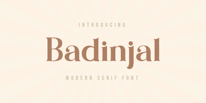
$14.00Badinjal – Modern Serif Font By Issam Type Badinjal serif font can be used for many project such as: book, magazines, logo, branding, photography, crafts, quotes, blog header, poster, advertisements, and much more. What’s Included? Uppercase & lowercase letters, numbers, punctuation Multilingual support If you have any questions, please feel free to get in touch. Thank you - Bellissa by Letterara,
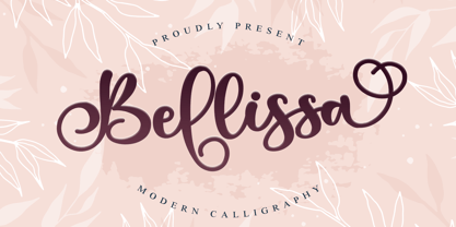
$12.00Bellissa is a beautiful Calligraphy font designed with an incredibly modern feel. This font is PUA encoded which means you can access all of the glyphs and swashes with ease! It features a varying baseline, gorgeous glyphs and stunning Swash. Use this gorgeous and unique Calligraphy font to bring any DIY project to life!
