10,000 search results
(0.059 seconds)
- Piedmont by 38-lineart,
$17.00Hello good people. introducing our new font 'Piedmond' This time we wanted to create a gallant signature font. Inspired by men's hand strokes, with a decisive pattern, each glyph is formed through the pressing of the pen, the orientation of the shape is almost constant with the direction of the pattern that continues to point forward and ends with a strong pressing of the pen. We call it the masculine signature type, reflecting a confident attitude, a definite decision and full confidence. We design this font for modern product branding, not only for men, but women also love this masculine side. This font is equipped with swashes, alternates and additional ligatures for the lowercase. By using this font, it will give your brand more confidence to appear wider. Thanks - Ragata by Arterfak Project,
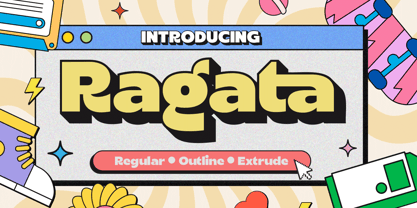
$17.00Ragata is a bold and playful display font that draws inspiration from retro sans serif and vintage logo design. With its elegant yet lively character, Ragata is perfect for creating eye-catching headlines, labels, badges, logos, stickers, motion graphics, posters, and more. The font family comes in three styles: Regular, Outline, and Extrude, which can be combined to create a unique 3D effect. In addition, Ragata is equipped with stylistic alternates and ligatures, giving you even more creative control. Ragata also has multilingual support, making it a versatile choice for designers and creatives from all around the world. Whether you're creating a bold, retro-inspired design or something more modern and playful, Ragata is a versatile and stylish font that is sure to impress. What you'll get : Ragata - Regular Ragata - Outline Ragata - Extrude Uppercase & Lowercase Numbers & Symbols Stylistic alternates & ligatures Multilingual support Thank you for visiting! - Melamine by Haniefart,
$14.00 - Lucky Dream by Mindtype Co.,
$25.00 - Benhard by Holis.Mjd,
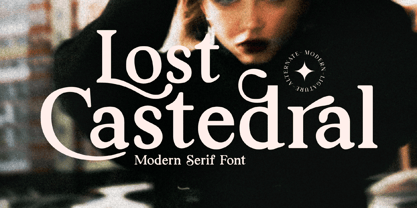
$14.00 - Lost Castedral by Letterena Studios,
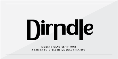
$17.00 - Dirndle by Muksal Creatives,
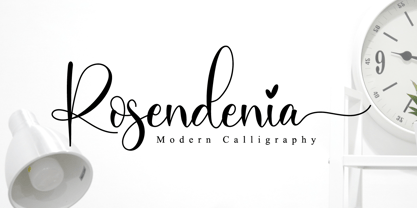
$12.00 - Rosendenia by Nissa Nana,
$23.00 - Tenebrous by Muksal Creatives,
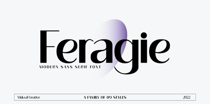
$10.00 - Feragie by Muksal Creatives,
$12.00 - Andora Ardelion by Gittype,
$18.00 - Benaya by Muksal Creatives,
$13.00 - Shalleh by Akifatype,
$14.00 - Katarine by Suitcase Type Foundry,
$75.00From today's point of view Katarine has a rather unusual origin. Initially an all-caps display face, what was to become the Medium weight of the family was augmented with a lower case, then the character set was completed by adding all the missing glyphs. The next step was the creation of the Light and the Bold weights with matching Italics. This working method compromised the relationships between the characters across the different weights After some consideration the decision was made to start over and draw the complete family from scratch. This time the "conventional" process was followed — first the Light and Bold weights were designed. Those extremes were used to interpolate the Regular, Medium and Semibold weights. When compared to the original, the glyphs of the new fonts are slightly wider. The construction of the letters is sturdy, with an x-height that varies from the heaviest to the lightest weights. The relationship of the stem weight between the horizontal and vertical strokes is carefully balanced. Characters are open and firm; the italics have room to breathe. The original fonts included two sets of small caps — Small Caps and Petite Caps. However neither set were suited for emphasis, with the Small Caps being too tall and the Petite Caps too short. We decided to replace them both with one set of traditional small caps, slightly taller than the x-height, perfectly suited for emphasis in text usage. The original version of Katarine was partly incorporated into the new OpenType versions. Thus most of the original arrows, frames and boxes can be found in the new Katarine. Each individual weight now contains 830 glyphs, nine sets of numerals, small caps, numerous ligatures and fractions. An additional font named Numbers contains numerals in circles and squares, and is now augmented with accented caps and a number of terminal alternatives, which can easily be accessed through stylistic sets. We also added two extra variants, Experts Regular and Experts Black (in inverted form). Katarine Std preserves the solid construction and excellent legibility of the original family, but has now become a fully featured OpenType typeface. Katarine is suited for a broad range of applications, from simple layouts to intricate corporate systems. It is the typeface of choice where the cold, austere character of modern sans serifs are inappropriate, yet simple shapes and good legibility are required. - DT Squished Stuff by Dragon Tongue Foundry,
$15.00DT Squished Stuff is a font made for fun. This uneven simple blocky sans-serif font has wonky letters that adapt automatically and change shape to fit against their neighbours. Use with contextual ligatures turned on to allow Squished Stuff to operate correctly. If a particular letter decides to do something that you don’t want it to, turn ‘contextual ligatures’ off for that letter. But do remember to turn it back on afterwards. This font lives and breathes when ‘contextual ligatures’ are turned on. Also, there are easter eggs and quirky surprises hidden inside. Watch it squish and move to fit together. This is a wacky, crazy, fun, mad, party, toonified font. Enjoy - Eurostile by URW Type Foundry,
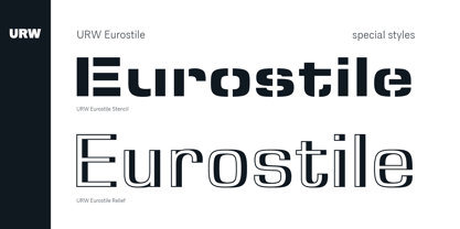
$89.99Eurostile Display Caps The Eurostile font family was designed (by Novarese and Butti in 1952) to complement the titling font, Microgramma, by offering a lowercase alphabet. Issued by the Nebiolo foundry, the rather square sans serif Eurostile became popular for display and advertising use. The linear nature of Eurostile suggests modern architecture, and its attraction is technical and functional. Eurostile is commonly misspelled Eurostyle. - Grose by Linecreative,
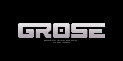
$16.00Grose is a modern san serif font that gives a clean, minimalist and futuristic impression,and Come with ligatures collection. It's Perfect for logo,branding,title, name card, magazin layout,poster, or large scale artwork. Grose offers you: 1. Grose- A clean San serif font including Upper & Lowercase characters(ALL CAPS) 2. Ligatures Character 3. Numbers and Punctuation and Supports Multi linguage (Latin Western Europe) - Obsypac by Fontdation,
$18.00Introducing Obsypac, our latest vintage serif. Inspired by the old lettering/signpainting, refined to make it relevant in this modern era. This all-caps font will give a strong and clean look on your design, make it work perfectly for headlines, logos/logotypes, labels and packagings, t-shirt designs, etc. If you're a fan of classic typography, make sure you add this font to your design toolbox. - Commuters Sans by Dharma Type,
$19.99Commuters Sans is a daily type. Classic but Modern. Very simple geometry and wide type with warm clearness. Useful for both body-text and titling by their minimal glyph shapes and slightly wide and eye-catching proportion. Consists of eight weights and their matching italics. Supporting almost all latin languages. All-caps text for one line or a few is as wonderful as normal mixed-case typesetting. - Blue Jay Way NF by Nick's Fonts,
$10.00Modern Caps—and lowercase, too—was how Ross George described the pattern for this typeface in his Speedball Text Book. Not surprisingly, the design was used on the Beatles' original Magical Mystery Tour album, which suggested the current name. Art Deco meets Psychedelia! Both versions include the complete Unicode Latin 1252, Central European 1250 and Turkish 1254 character sets, with localization for Moldovan and Romanian. - CCS Neue Rinjani by Creative Corner Studio,
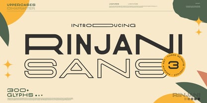
$29.00Neue Rinjani is a all-caps sans serif with Wide Stretch contemporary typographic, vintage futuristic art-deco touch Streamline influence of the 1930s and 1940s. A mix from the old Euro-American signage/advertising letters and modern clean sans serif, carefully mousecrafted to bring you the genuine feel of the era. If you're into classic/vintage letter designs, then this typeface suits best for you. - Asfire by Issam Type,
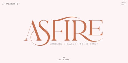
$14.00Asfire is an All Caps modern ligature serif typeface comes with joining ligatures that give it a fancy and unique style. This font perfect for branding, Headlines, logos, invitation, watermark and more. Asfire typeface comes with regular, bold and condensed font styles. Uppercase letters, numbers, punctuation, ligatures, alternates Multilingual support. If you have any questions, please feel free to get in touch. Thank you - Cold Cuts by Good Gravy Type Co,
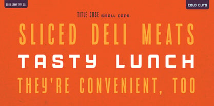
$12.00Cold Cuts is an assorted spread of delicious fonts pre cooked to perfection. This 10 weight font family is $30 for a limited time it is the perfect way to stock your font fridge. Cold Cuts a lean upright font family with a lowercase caps option to give you bonus typesetting choices. A sleek modern vintage style which has a wide variety of display uses. Bon Appétit! - Sunroll by HansCo,
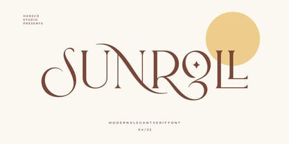
$15.00Sunroll is a modern and playful display serif typeface that had that sleek and luxury feel. This font is perfectly into those classy moodboards and logos. It comes with ALL CAPS with many alternatives and ligatures, helps to create stunning logos, quotes, posts, blog posts. branding projects, magazine imagery, wedding invitations, and much more. Tutorial how to Install & use Alternate / Special Character : https://hanscostudio.com/tutorial/ Enjoy! - Lab Sans Pro by Vanarchiv,
$25.00Lab Sans Pro is a geometric sans-serif typeface with a technological and minimalist look and is suitable for use in large sizes. It has eight versatile weights, (from Thin to Black) including true italics for each one, and a wide range of stylish alternate characters to improve its use in different graphic contexts. The name of this typeface was inspired by an experiment, mixing a structure with calligraphic influences and completely geometrical and structured drawings. Lab Sans Pro has a wide range of OpenType® features such as: small caps, old style/titling and small caps figures, fractions, superior and inferior scripts, scientific components and ligatures. Versatile but original, precise but lively, Lab Sans Pro is a carefully crafted technological typeface designed by Tiponautas. - Portheras by Identity Letters,
$39.00What does “smart casual” look like as a font? Try Portheras: a fairly wide, contemporary humanist sans with a laid-back attitude. Inspired by the fine Cornish beach of Portheras Cove, this typeface pays homage to British design tradition while incorporating an informal idiom. At ease both in flip-flops and silk blouses, in Bermudas and knit ties, Portheras sports a low x-height and comes with italics between “oblique“ and “true italic”. Despite its approachable look, the font family is equipped for heavy duty—you’ll get 16 styles with 780 glyphs each and OT features such as small caps, numerous figure sets (with old-style figures at mid-cap height), a bunch of arrows, three stylistic sets, and more. Portheras is as classy as relaxed gets. - Majesty by Monotype,
$25.99Majesty is a refined and elegant incised serif typeface designed to convey a sense of drama with any implementation of it. However, Majesty’s austerity is softened by the inherent familiarity of its letterforms. Having being inspired by classic engraved type, it has the echoes of familiar stone inscriptions over the centuries embodied within this 7-font type family. Majesty has a branding and titling focus, this is most apparent in the all cap letter combinations that are incorporated. Just activate Discretionary Ligatures and watch your type shape-shift on the fly to create interesting and appealing typography. There are a select number of Swash/Stylistic Alternates included that can also help you embellish your designs. Other features include Proportional, Tabular, and Old Style Figures, as well as Small Caps and Petite Caps, with the latter harmonising perfectly with the lowercase glyphs so that you can create unicase-style typography. You can find out more at majesty-font.com . Key features: • 5 text weights – Light to Black, plus Display and Poster weights • Small Caps, Petite Caps, Ligatures and Discretionary Ligatures • European Character Set – Latin Only • 840 glyphs per font. - Monogram kk sc - Personal use only
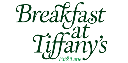
- Park Lane by Alan Meeks,
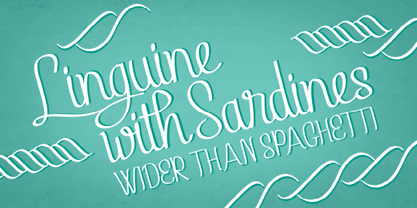
$45.00 - Linguine by Fenotype,
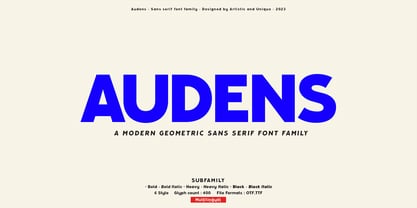
$19.95 - Audens by Artisticandunique,
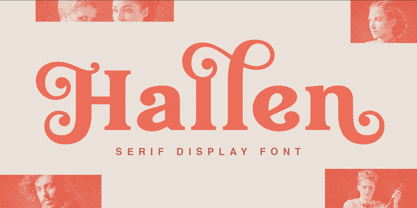
$20.00Audens - Sans Serif Font Family - Multilingual supports - 6 Styles Audens is a modern geometric sans serif font. Consisting of 6 styles designed for strong headlines, this font is suitable for use in different areas, from banners and posters, newspapers and magazines, logos and brand identities, to movie and game titles. If you are looking for a modern - geometric sans serif style that can be effective in branding, you can easily use this font. Whit these features, it will be effective in creating alternatives in your projects Ideal for posters, newspaper, movie title and magazines, magazine covers, editorials, headlines, websites, logos, branding, advertising and more. You can create your unique designs with this font. If you have a question, please contact me. Have a good time. - Hallen by Edignwn Type,
$12.00This font is called "Hallen" with modern classic themes, it represents a carefully serif display typeface. Hallen comes with unique swashes alternates and combines every character in good typography. Select regular and smooth style for modern theme, for classic theme you can select rough and texture style. You can type some words and then make yourself the best layout, it will look perfect for professional design taste. You also can use this font in some designs such as the logotype, magazine, poster, packaging, branding, website, quote, invitation and more custom design. Hallen includes : 4 style typefaces (regular, smooth, rough, and texture) Uppercase, lowercase, numeral, punctuation & symbol Ligature and Alternates (ss01 - ss06) Multilingual PUA encoded Thank you for your support and choosing us. - Aurelux by Andfonts,
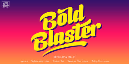
$16.00Just imagine, You are searching for the font that should be modern and elegant at the same time, which is not possible with typical sans or serif fonts. So, Aurelux is what You need. This font in your library can be with you for decades, because it is useful and It's open border to create graphic designs that require "modern but elegant touch". : cafe, bar, theatre, spa, hotels, overall entertainment industry, travel, vintage, retro signs. Font is gender neutral. But, when You see Bold and black styles You understand that this font can be in the design of some industrial companies, factories, construction companies that want to show that they have history and heritage. You can contact me if You need questions: andfontscontact@gmail.com - Boldblaster by Sign Studio,
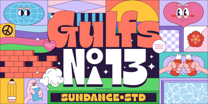
$12.00Boldblaster brings vintage themes into the modern era. Neatly arranged lowercase characters are needed for writing a brand or logo. With regular and italic styles, the Boldblaster family can be used together in one display and can support each other in your designs. Supporting font on preview : HEXI ( https://www.myfonts.com/fonts/sign-studio/hexi/ ) Thank You - Gulfs Display by Studio Sun,
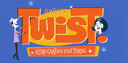
$10.00Gulfs Display Inspired by the 90's playful cartoon & comic books. This playful font comes in six widths; condensed, semi condensed, normal, semi expanded, expanded and extra expanded. This font can be used for modern and vintage designs, also can be easily paired with some graphic elements (Illustration, Photography) this font perfect for, Logotype, Branding, Title, and Packaging. - Fd Twist by Fortunes Co,
$9.00The Twist font is a bold typeface with a playful appearance. I tried to combine 2 fonts inspired by TV broadcasts, mid-century storybooks. It is suitable for broadcast, labels, logos, magazines, clothing and other commercial purposes. You can choose from three styles, regular, round, and rough, so you can get the retro/modern look you want - AT Nezue by Amera Type,
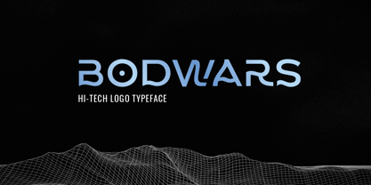
$10.00Nezue is our first font family consisting of neat and elegant lowercase and uppercase letters, comes with 9 styles (Thin, Extra Light, Light, Regular, Medium, Semi Bold, Bold, Extra Bold, and Black) Formed in a modern style that can help your visual branding look younger, detailed letterforms for optical contrast can make this font even more attractive - Bodwars by Sarid Ezra,
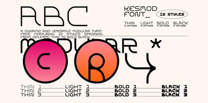
$17.00Bodwars is a sans based font with unique shape that will make your design looks hi-tech and modern. You can use this font for any purpose, especially to make logotype and sci-fi movie poster. You can mix and match the uppercase and lowercase to make your logo more stand out. This font also support multi language. - Kesmod Font by Softulka,
$10.00Kesmod is a clean display typeface that excels in urban posters, music covers, clothing print design, impactful headlines, large page headers, billboards, signs, bold headlines, modern acid typography, Brutal Bold design, and much more. This modular Sans Serif typeface features 12 styles spanning from delicate thin to bold black, which really can help in modern experimental design. You will receive: - 12+1 styles - including Uppercase Alphabet, numbers, punctuation, and common additional glyphs. - Arrear by Kirill Malykhin,
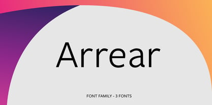
$15.00Arrear is a modern sans-serif font family. It includes three weights: regular, medium and bold. Has cut corners for lowercase letters. This is a versatile font that suits any project and is modern and easy to read. With it, you can create websites, logos, use in advertising, packaging, magazines and much more. This font will inspire you to create impressive designs that will amaze everyone! Multilingual support: extended latin and cyrillic.

