10,000 search results
(0.029 seconds)
- Ramesty by Twinletter,
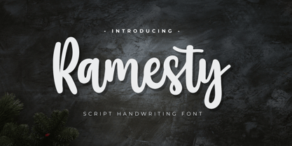
$12.00Ramesty is a handwriting bunch of fonts that are charming and elegant in each of their writings. very suitable for all designs that require a touch of handwriting, of course, using this font will make your design charming This font is designed with a natural touch of handwriting which is refined to create a portion and composition that suits your needs. So this font is suitable for craft, children's writing, adventure posters, food banner titles, wedding invitations, product packaging logos, quotes, social media page covers, furniture banner headlines, book covers, and much more. - Gabust by Twinletter,
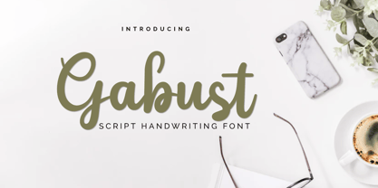
$12.00Gabust is a beautiful and elegant handwriting script font that has a feminine character and is sweet in its use, besides that this font is also very suitable for use in designs that require handwriting as well as others. This font is designed with a natural touch of handwriting which is refined to create a portion and composition that suits your needs. So this font is suitable for craft, children's writing, adventure posters, food banner titles, wedding invitations, product packaging logos, quotes, social media page covers, furniture banner headlines, book covers, and much more. - Goldest by Twinletter,
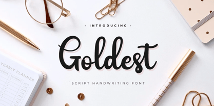
$12.00Introduces "Goldest" font which is created in detail to meet the needs of a charming, elegant and modern design. Using this font creates harmony and beauty in each of your designs, especially designs that require a touch of natural handwriting This font is designed with a natural touch of handwriting which is refined to create a portion and composition that suits your needs. So this font is suitable for craft, children's writing, adventure posters, food banner titles, wedding invitations, product packaging logos, quotes, social media page covers, furniture banner headlines, book covers, and much more. - SkinArt by Graffiti Fonts,
$14.99SkinArt has a hand-made appearance. The style is similar to vintage Tattoo lettering. The caps are in an outline style and the lowercase keys give you a flat, solid style, numbers, punctuation and flourishes are included in this typeface. This typeface includes 2 full tattoo style alphabets that can each be used alone or you can combine the 2 fonts to create fill and gradient effects. Add the included banner pieces or use this font along with your own banner and flag graphics to create realistic body art and classic tattoo style lettering. - Destain by Twinletter,
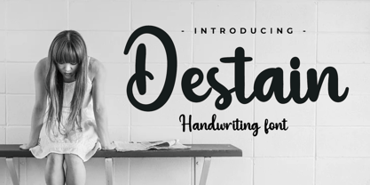
$12.00This beautiful font will be perfect to incorporate into your designs. with this family script making it suitable to be combined with other sans and serif letters. let's use this font to create your own extraordinary designs This font is designed with a natural touch of handwriting which is refined to create a portion and composition that suits your needs. So this font is suitable for craft, children's writing, adventure posters, food banner titles, wedding invitations, product packaging logos, quotes, social media page covers, furniture banner headlines, book covers, and much more. - Rahere Slab by ULGA Type,
$18.98Part of the extended Rahere typeface family, Rahere Slab is a humanist slab serif (or Egyptian) in six weights from light to extra bold with corresponding italics. Rahere Slab – like its sibling Rahere Sans – features subtle detailing, giving the typeface a distinctive, warm appearance without distracting the reader. Legible at large and small sizes, Rahere Slab is a versatile, workhorse typeface that is suitable for a wide range of applications such as information signage, packaging, annual reports, advertising, brochures, catalogues, screen text and visual identities. Slab serifs are ideal for projects that need to convey a sense of authority tempered with diplomacy or messages that just need some serious oomph – and Rahere is a great slab for the job. The italic lowercase is more cursive and expressive than the roman and when they’re used together it displays enough character to create emphasis without looking out of place while harmonising admirably. Set on its own (for example, pull-out quotes), the italic exudes a charm that draws attention to the text. The character set covers most European languages plus Vietnamese. Each weight contains lining & non-aligning numerals in both proportional & tabular spacing. The tabular numerals share the same width across all weights and styles (matching Rahere Sans too) – indispensable for financial tables in annual reports. If a companion sans serif is needed, Rahere Sans is the perfect partner. They are both part of the extended Rahere typeface family and have been designed to complement each other beautifully. The typeface is named after Rahere, a 12th-century Anglo-Norman priest, who founded the Priory of the Hospital of St Bartholomew, London in 1123. In 2007 I was successfully treated at Barts for relapsed testicular cancer so I’m indebted to all the doctors, nurses and support staff who work there. A special shout out to Orchid Cancer – a UK charity that helps men affected by cancer – who funded the research for my treatment. - ITC Isadora by ITC,
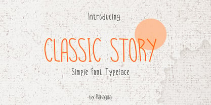
$29.99This calligraphic typeface, designed by Kris Holmes in 1989, manages to look both confident and relaxed, while showing great intricacy and beauty upon closer inspection; it is named after the dancer Isadora Duncan. - Classic Story by RahagitaType,
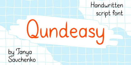
$15.00 - Qundeasy by Tanya Savchenko,
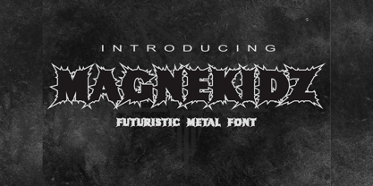
$12.00 - Magnekidz by Sipanji21,
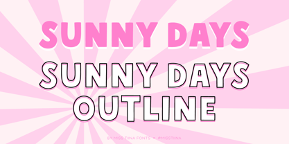
$15.00 - MTF Sunny Days by Miss Tiina Fonts,
$9.00 - New Year Poster by FontaZY,
$10.00 - Virus by Phat Phonts,
$20.00It began as a series of photographs of the rusty metal brand names on old tractors in a museum. When I scanned the photos and began to trace the letters, I found the rust and deterioration created a level of detail which gave my letters a psychotic anger which, as an art director in an advertising agency, I closely identified with. - NCO Potatoe by New Cat Orange,
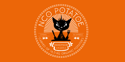
$12.50There is a very simple reason why the name of this font includes a potato. Or potatoe, if you prefer. It was carefully carved out of 14,5 kg of potatoes. Or 32.0 lb of potatos. Every single letter, every digit and every symbol. Manually, of course, and care-fully. It took a while. Longer than digitizing it, but since we love great quality, we put just as much care into this process. - Agile Jewelry by Nathatype,
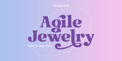
$29.00Agile Jewelry a stylish, modern display serif font to give you informal, modern impressions. The characteristics of this font are the extra hooks on the letters’ edges and some of the letters have curvy ending wipes. The thick and thin lines on every letter are clearly visible. For a legibility reason, apply this font for big-sized texts instead of the body texts. Features: Stylistic Sets Ligatures Multilingual Supports PUA Encoded Numerals and Punctuations Agile Jewelry fits for various design projects, such as posters, banners, logos, magazine covers, quotes, headings, printed products, merchandise, social media, etc. Find out more ways to use this font by taking a look at the font preview. Thanks for purchasing our fonts. Hopefully, you have a great experience using our font. Feel free to contact us if you require more information when you are dealing with a problem. Thank you. Happy designing. - Gelderland by Yoga Letter,
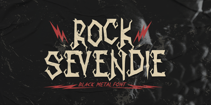
$20.00 - Rock Sevendie by Sipanji21,
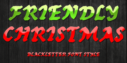
$16.00 - Friendly Christmas by Yoga Letter,
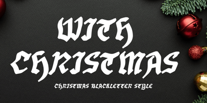
$18.00 - With Christmas by Yoga Letter,
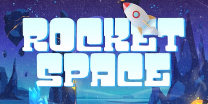
$18.00 - Rocket Space by Fargun Studio,
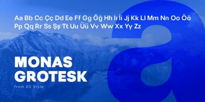
$13.00 - Monas Grotesk by Arodora Type,
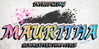
$30.00 - Mauritha by Selvia Design,
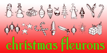
$15.00 - Christmas Fleurons by Greater Albion Typefounders,
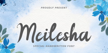
$5.00 - Meilesha by Selvia Design,
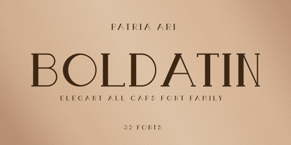
$13.00 - Boldatin by Patria Ari,
$10.00 - Vamp by Burghal Design,
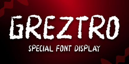
$29.00A quintet of remorseless homewreckers, each member of the Vamp family contains hypnotic dingbats to lure you into their web. The Vamp family consists of the bewitching Vamp, the bigger, brasher Vamp Bold, the dangerous, psychedelic Psycho Vamp, as well as the lean (but still mean!) Vamp Slim and Vamp Slim Oblique. The Vamp family's seductive art deco form and fiendishly geometric wiles will break your heart and steal your soul. - Greztro by Yoga Letter,
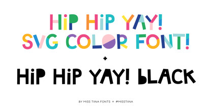
$17.00 - MTF Hip Hip Yay by Miss Tiina Fonts,
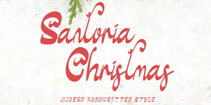
$10.00 - Santoria Christmas by Yoga Letter,
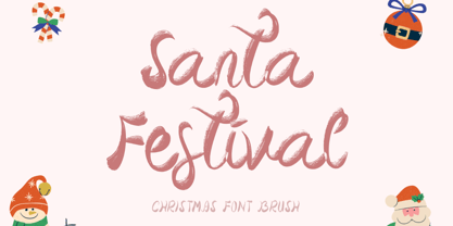
$18.00 - Santa Festival by Yoga Letter,
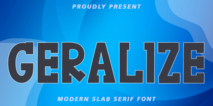
$15.00 - Geralize by Yoga Letter,
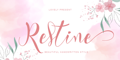
$15.00 - Restine by Yoga Letter,
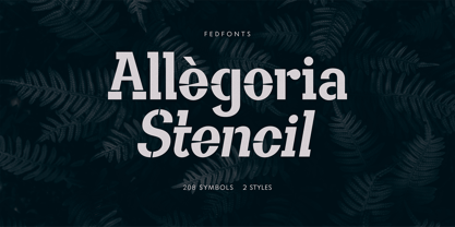
$18.00 - Allegoria by Fed Tunik,
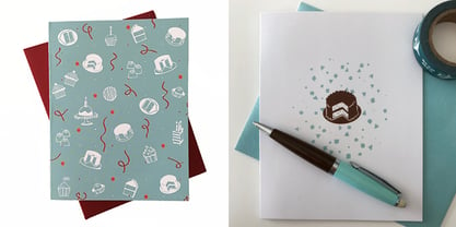
$15.00 - Birthday Doodles by Outside the Line,
$19.00 - Vagabundo by Juraj Chrastina,
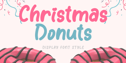
$39.00 - Christmas Donuts by Yoga Letter,
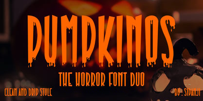
$18.00 - Pumpkinos Horror by Sipanji21,
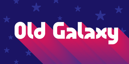
$12.00 - Old galaxy by Turto Studio,
$10.00 - Erasurehead by Aboutype,
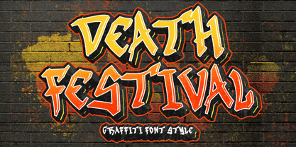
$24.99A decorative display face suitable for short headlines, drop caps or banners. Erasurehead was designed for all media and can be used in a wide range of point sizes. Erasurehead requires subjective display kerning and compensation. - Death Festival by Yoga Letter,
$18.00
