10,000 search results
(0.106 seconds)
- Creaky Frank - Personal use only

- Wolf's Bane Bold Shadow - Unknown license

- Arachnids - Personal use only

- Nemo Nightmares - Unknown license

- Liszthius-Alkimista - 100% free

- Punkstoric - Personal use only

- Motrhead - Unknown license

- VampyrishABC-Oblique - 100% free

- screamo - Unknown license

- Farquharson - Unknown license

- Living Hell - Unknown license

- Francis - Unknown license

- Serpents - Unknown license

- Pasión Acústica - Personal use only

- Belwe Gotisch - Personal use only

- Holitter Gothic - 100% free

- Fiddums Family - Unknown license

- Mellogothic - Personal use only

- Thirsty for Souls - Personal use only

- Ming Gothic JJCR - Personal use only

- DirtyDeco - Unknown license

- The Last Soundtrack - Unknown license

- DornspitzGrotesk - 100% free

- Uneasy - Unknown license

- Abiscuos - Unknown license

- Shoplifters unite - Unknown license

- MCF bad manners ww - 100% free

- Hairy Blood by Mvmet,
$18.00
- Revivalisem by Creative17studio,
$10.00
- Bloody Camp by Typefactory,
$14.00
- Nazzaric by Maulana Creative,
$15.00
- MC Embar Wisteh by Maulana Creative,
$15.00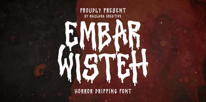
- Alterica Monchins by Maulana Creative,
$16.00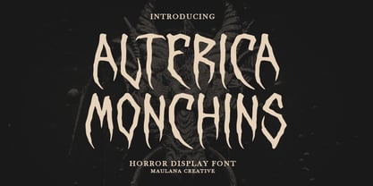
- Emoligons by Maulana Creative,
$15.00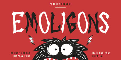
- MC Carnifun by Maulana Creative,
$18.00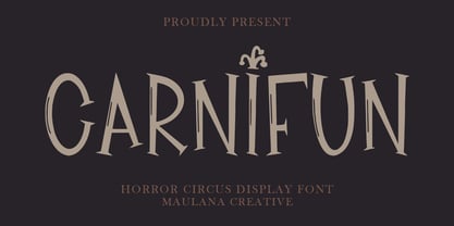
- Bisaya 1880 - Unknown license

- Creepy Face by Forberas Club,
$16.00
- Stressed by 4RM Font,
$14.00
- GretaDS by FontAle,
$9.00
- Cinema Macabre by Wing's Art Studio,
$10.00


