8,571 search results
(0.053 seconds)
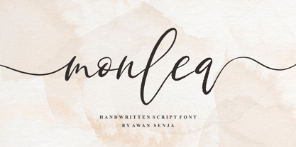
- Monlea by Awan Senja,
$14.00Monlea is a handwritten script font with an incredibly friendly feel. It features gorgeous swashes and ligatures that make this script incredibly versatile. This font is PUA encoded which means you can access all of the cute glyphs and swashes with ease! It also features a wealth of special features including alternate glyphs and ligatures. - Maghfirah Two by ARToni,
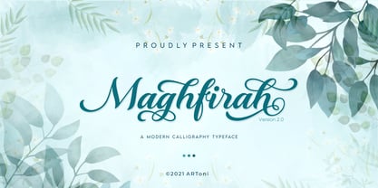
$36.00Maghfirah is a dazzling script font. This font is neatly crafted and highly detailed. Whatever the topic, this font will be a wonderful asset to your font library, as it has the potential to enhance any creation. This font is PUA encoded which means you can access all of the glyphs and swashes with ease! - Bridgeth by Tiny Hand Letter,
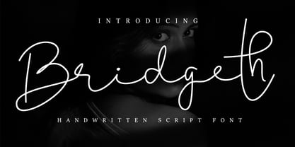
$12.00Bridgeth is a handwritten script font, with an elegant and beautiful look. It looks stunning on wedding invitations, thank you cards, quotes, greeting cards, logos, business cards and every other design which needs a handwritten touch. This font is PUA encoded which means you can access all of the glyphs and swashes with ease! - Girlia by TM Type,
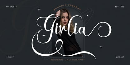
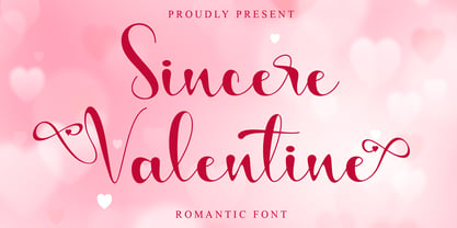
$15.00Girlia is an elegant script font with a contemporary atmosphere and impeccable form, inspired by timeless classic calligraphy. Not too thin and not too thick, balanced and varied, this font was designed to enhance the beauty of your projects. This font is PUA encoded which means you can access all glyphs and swashes with ease! - Sincere Valentine by Arkrist Letter,
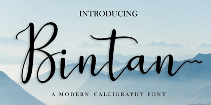
$14.00Sincere Valentine is a modern handwritten font made with sincerity and care to produce a font filled with love. Celebrate Valentine’s Day with Sincere Valentine, and make your day full of love with your loved ones! This font is PUA encoded, which means you can access all of the glyphs and swashes with ease! - Bintan by Rezastudio,
$9.00 - Hypherin by ahweproject,
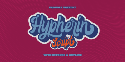
$9.00Hypherin is a gorgeous and bold handwritten font, crafted to give your headlines and logotype projects a stylish touch. This font reads as strong, confident, and dynamic and can add tons of nostalgic character to your designs. Hypherin is PUA encoded which means you can access all of the beautiful glyphs and swashes with ease! - Bartolomeus by Stefani Letter,
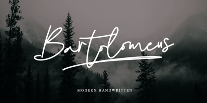
$12.00Bartolomeus is a stunning monoline-style script font with authentic and casual vibes. It looks beautiful on a variety of designs requiring a personalized style, such as wedding invitations, thank you cards, weddings, greeting cards, logos, and so on. Bartolomeus is PUA encoded which means you can access all of the glyphs with ease! - Captain Kangaroo by Letterara,
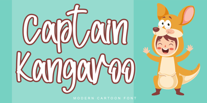
$16.00Captain Kangaroo is a cute and sweet handwritten font with an incredibly friendly feel. This font will turn any creative idea into a true piece of art! This font is PUA encoded which means you can access all of the cute glyphs with ease! It also features a wealth of special features including ligatures. - Aulletta by Nissa Nana,
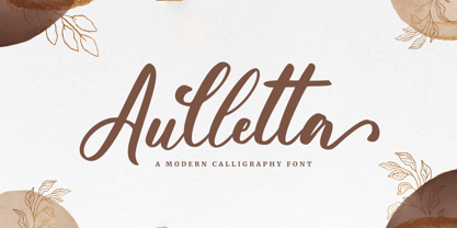
$25.00Aulletta is a beautiful and flowing script font. Its modern and classy look makes it the perfect font for creating outstanding DIY projects! This font is PUA encoded which means you can access all of the cute glyphs and swashes with ease! It also features a wealth of special features including alternate glyphs and ligatures. - Hoplight by Smith Hands,
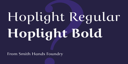
$20.00Hoplight is a friendly, curvy, hybrid. A fusion of the cool character of a roman, with the flow and informality of an italic. Throughout Hoplight, many sharp serifs have been replaced by dot style serifs, to allow the contours of the letters to flow seamlessly into the terminations. Hoplight embodies a sense of playful ease. - Bakiya by Qaratype,
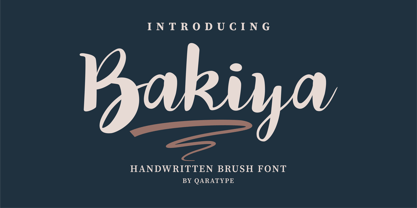
$14.00Bakiya is an enchanting handwritten font. This versatile script font has a wide spectrum of applications ranging from greeting cards to headlines and is guaranteed to add a romantic feel to your next project. This font is PUA encoded which means you can access all of the beautiful glyphs and beginning & ending swashes. with ease! - Bloody Night by LfarStudio,
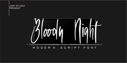
$17.00Halo! thank for your visit :) Bloody Night is a dark metal handwritten font with a horror feel and creepy impression. it looks stunning on movie title, book covers, photography, greeting cards, creepy quotes, and much more. This font is PUA encoded which means you can access all of the glyphs and swashes with ease! - Beloved Turtle by Rastype Studio,
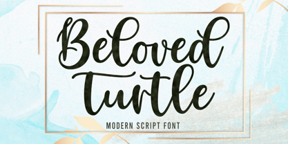
$18.00Beloved turtle are beautiful and romantic writing fonts. Looks amazing on wedding invitations, thank you cards, quotes, greeting cards, logos, business cards and any other design. This font is PUA encoded which means you can access all glyphs and swashes with ease! The font includes OpenType features with alternative styles, ligatures, and multiple language support. - Hudsson Romano by Letterafandi Studio,
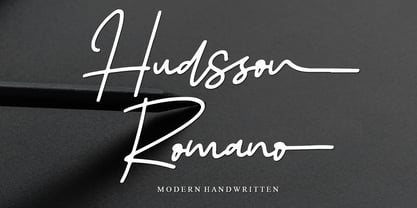
$16.00Hudsson Romano is a simple and quirky looking Signature handwritten font. It has a classy, elegant, and modern look that you can use for logos, branding, invitations, stationery, wedding designs, social media posts, and much more! This font is PUA encoded, which means you can access all of the glyphs and swashes with ease! - Spinat by Bogstav,
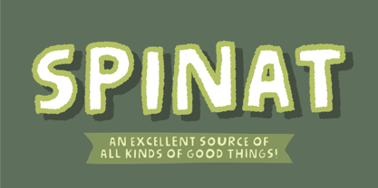
$16.00Spinat is spinach in danish. I like all kinds of things with spinach: salads, lasagne, fish, burgers and even with spinach! Yes, I love spinach so much I can eat it without anything else! :) I hope you too like spinach or even Spinat - it has 5 different versions of each letter and multilingual support. - Kind Heart by Subectype,
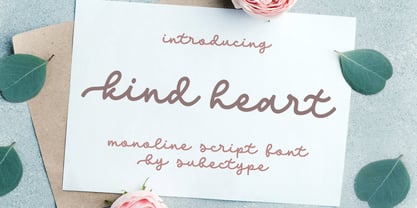
$18.00Kind Heart is a cute and fresh handwritten font. It is PUA encoded which means you can access all of the glyphs and swashes with ease! It features a varying baseline, smooth lines, gorgeous glyphs and stunning alternates. The simple and flowing style of Kind Heart, effortlessly adds a romantic look to any craft idea. - Meoowly by Stefani Letter,
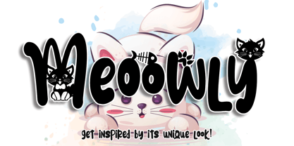
$12.00Meoowly is an amazing display font. It is the perfect choice for cat related and anything project! This display font is the perfect choice for making original and outstanding designs. This font is PUA encoded which means you can access all of the cute glyphs with ease! It also features a wealth of including ligatures. - Rouganeck by Heinzel Std,
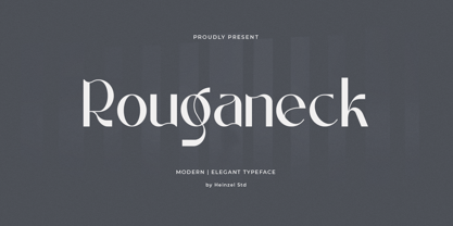
$13.00Rouganeck is an elegant and modern sans-serif font. Fall for its ravishing style and use it to create gorgeous wedding invitations, logos, branding, headlines, beautiful stationary art, eye-catching social media posts, websites, and much more! This font is PUA encoded which means you can access all of the amazing glyphs with ease! - Homade by Eko Bimantara,
$18.00Homade is sans font family that created in a way that give an ease-looking, close to casual typeface. It's fit for branding, product, food or culinaire theme and various others. Its consist of 5 styles from regular to extra bold with each matching italics. Its contain 388 glyphs that covered broad latin languages. - Storytail by Balpirick,
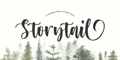
$15.00Storytail is a Handwritten Script Font. Storytail is a stylish and delicate script font. This font is PUA encoded which means you can access all of the glyphs and swashes with ease! - also multilingual support - Lowercase Ending Swash Enjoy the font, feel free to comment or feedback, send me PM or email. Thank you! - Warilah by Letterafandi Studio,
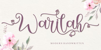
$16.00Warilah is a modern handwritten with characters that dance along the baseline. It can be used for various purposes such as logos, wedding invitations, headings, t-shirts, letterhead, signage, labels, news, posters, badges and so much more. This font is PUA encoded which means you can access all of the glyphs and swashes with ease! - Berlyna by Tertoecreative,
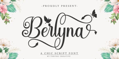
$14.00Berlyna is a magical script font carefully created with a touch of elegance. Whether you’re looking for fonts for Instagram or calligraphy scripts for DIY projects, this font will turn any creative idea into a true piece of art! This font is PUA encoded which means you can access all glyphs and swashes with ease! - Jhaneponto by Liartgraphic,
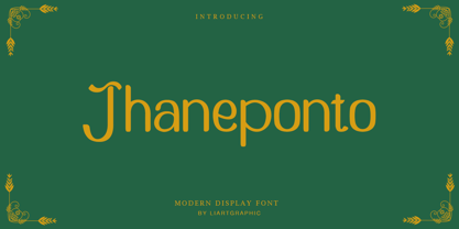
$18.00Jhaneponto is a display font with a hint of a modern blackletter style. Jhaneponto font is suitable to use for logos, titles, landing pages, leaflets, and others. With its shape and uniqueness, you will definitely like this font! This font is PUA encoded which means you can access the available glyphs and swashes with ease! - Heal The World by Letterara,
$12.00Heal The World is a cute and sweet handwritten font with an incredibly friendly feel. This font will turn any creative idea into a true piece of art! This font is PUA encoded which means you can access all of the cute glyphs with ease! It also features a wealth of special features including ligatures. - Kitchen Doodles by Outside the Line,
$19.00Julia Child said, "I didn't start cooking until I was 32: up until then I just ate". Whether you cook or eat, design menus or place cards or cookbooks this set of 30 fresh Kitchen Doodle illustrations makes the job easier. Baking, cooking, mixing, chopping, grating, this little font has it all. Bon Appétit! - Summer Peach by Sakha Design,
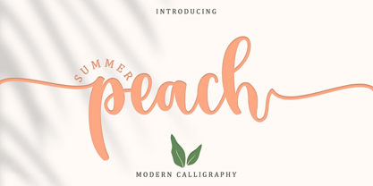
$10.00Summer Peach is a dazzling script font. This font is neatly crafted and highly detailed. Whatever the topic, this font will be a wonderful asset to your font library, as it has the potential to enhance any creation. This font is PUA encoded which means you can access all glyphs and swashes with ease! - Mechaniclove by ahweproject,
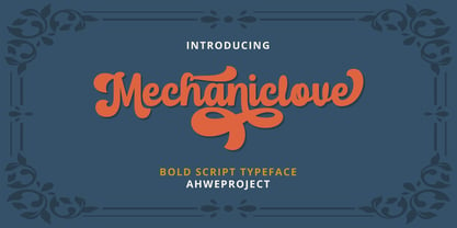
$14.00Mechaniclove is a gorgeous and bold handwritten font, crafted to give your headlines and logotype projects a retro touch. This font reads as strong, confident, and dynamic and can add tons of nostalgic character to your designs. This font is PUA encoded which means you can access all of the glyphs and swashes with ease! - Grayphene by ErlosDesign,
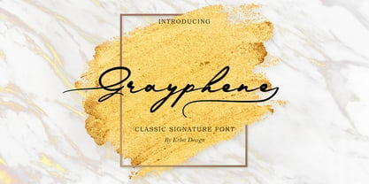
$19.00Grayphene is a romantic and sweet calligraphy typeface with characters that dance along the baseline. It has a casual, yet elegant touch. This font is PUA encoded which means you can access all of the glyphs and swashes with ease! The font has a smooth texture, so it would be perfect for your design. - Creamer by Creativework Studio,
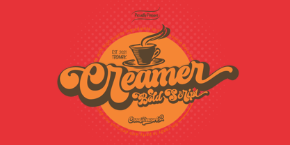
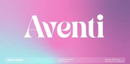
$14.00Creamer is a gorgeous and bold handwritten font, crafted to give your headlines and logotype projects a stylish touch. This font reads as strong, confident, and dynamic and can add tons of nostalgic character to your designs. Creamer is PUA encoded which means you can access all of the glyphs and swashes with ease. - Aventi by Sign Studio,
$15.00Aventi is an absolutely elegant serif font. This typeface includes stylistic alternates set (a, e, g, y) and discretionary ligatures. It will elevate a wide range of design ideas, from cards to branding, labels, and more. This font is PUA encoded, which means you can access all of the glyphs, alternate characters, ligatures with ease. - Seathera by Almarkha Type,
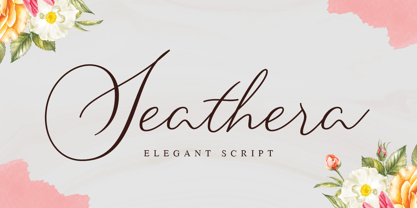
$35.00Seathera is a beautiful script that feels classy, elegant, and modern. It is perfectly suited for a wide variety of projects! This font is PUA encoded which means you can access all of the magical glyphs and swashes with ease! It also features a wealth of special features including alternate glyphs and ligatures. Thank you - Chellinda by Portograph Studio,
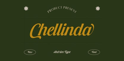
$20.00Chellinda Bold Script is a stylish and refined Script font. It looks beautiful on a variety of designs requiring a personalized style, such as wedding invitations, thank you cards, weddings, greeting cards, logos and so much more. This font is PUA encoded which means you can access all of the glyphs and swashes with ease! - Wonderblend by Sabrcreative,
$10.00Introducing Wonderblend Script with Swashes Ligatures Font, a stunning script font that combines elegance and versatility. With its flowing letterforms, enchanting swashes, and beautiful ligatures, this font is perfect for adding a touch of sophistication to your designs. Whether you're working on wedding invitations, branding materials, or creative projects, Wonderblend Script with Swashes Ligatures Font will elevate your work and leave a lasting impression. The uppercase and lowercase characters in Wonderblend Script with Swashes Ligatures Font offer a harmonious balance and allow for flexible and dynamic typography. The intricate swashes add an exquisite flair to the letterforms, providing an elegant and decorative touch. In addition, the font includes a wide range of ligatures, ensuring smooth and seamless connections between letters for a more natural and handwritten look. Not only is Wonderblend Script with Swashes Ligatures Font visually appealing, but it also offers functional features. It supports numbers and punctuations, enabling you to incorporate them seamlessly into your designs. Its multilingual capabilities allow you to communicate your message effectively across different languages and reach a global audience. With PUA encoding, Wonderblend Script with Swashes Ligatures Font provides easy access to alternate characters, giving you the freedom to experiment and create unique designs. The ligatures and alternates add variety and style, allowing you to customize your text and add a personalized touch. Enhance your designs with the elegance and versatility of Wonderblend Script with Swashes Ligatures Font. Let your creativity shine and bring a sense of sophistication to your projects. - Coranto 2 by TypeTogether,
$49.00Now available as Opentype font with extended character set, Coranto 2. It is originally based on Unger’s typeface Paradox, and arose from a desire to transfer the elegance and refinement of that type to newsprint. Coranto 2 has a larger x-height and in many places has been made more robust. Over the past 25 years newspaper production has seen spectacular improvements in paper and print quality, the introduction of colour printing, and vastly better register. Newspaper production still demands a lot of letter forms, but advanced printing brings out details better and makes typography more appealing to readers. For text type the newspaper is no longer an environment in which survival is the chief assignment. Today, newspapers are not merely a matter of cheap grey paper, thin ink and super-fast rotary printing, and type design no longer has to focus on surviving the mechanical technology and providing elementary legibility. Now there is also room to create an ambience, to give a paper a clearer identity of its own; there is scope for precision and refinement. One consequence of this is that newspaper designers can now look beyond the traditional group of newsfaces. Conversely, a newsface can be used outside the newspaper — not an uncommon occurrence. The update to this beautiful font family, Coranto 2, includes the addition of over 250 glyphs featuring full Latin A language support, new ligatures, 4 sets of numerals, arbitrary fractions and superiors/inferiors. Furthermore, kerning was added and fine tuned for better performance. - Xmas by Linotype,
$29.99Christmas cookies have already slowly crept onto your local supermarket's shelves -- the Linotype Xmas Fonts just can't wait any longer! Ravishingly friendly and universally applicable: Fuenfwerken -- a design studio from Wiesbaden, Germany -- is proud to present its latest Fun Font Family. Bringing variety to the dry Christmas card genre, these fonts can also be used on posters to spread holiday cheer at home. No limits are placed on your creativity here! The family has three different fonts, each with more than 60 symbols inside: Xmas Story includes the whole figure palette necessary for a classical Christmas story. From a cute little Baby Jesus to the Three Wise Men and woolly Aramaic sheep and everything that one needs to add special flair to a letter to grandma, or to set up a Nativity Scene at home for the kids is included. Customers who aren't searching for a biblical font should check out Xmas Essentials. This font contains typical non-denominational end-of-the-year holiday ornaments, such as snowflakes, decorated Christmas trees, nutcrackers, and stars. Last but not least is the Xmas Modern font. Just as global warming poses severe risks to snowmen, this font will make recipients of your holiday and New Year's cards melt. Glyphs such as Santa Claus riding on a Vespa -- complete with iPod -- speed away from normal, stuffy holiday seriousness, and signal that the Fun Generation has arrived! The best choice, of course, is to treat yourself to all three fonts this Christmas. Then you'll be prepared for every situation. Happy Holidays! - Dopelton by Variatype,
$22.00Introducing Dopelton, a signature font that transcends the ordinary, embodying the essence of personal style and sophistication. Crafted with meticulous attention to detail, Dopelton is more than a font; it’s a stroke of individuality, a visual symphony that transforms signatures into works of art. Each letter in Dopelton carries a distinctive flair, reminiscent of a signature penned by a hand writer. The fluid strokes seamlessly merge, creating a harmonious rhythm that captures the art of the handwritten with a contemporary twist. The balance between elegance and readability is finely tuned, making Dopelton versatile for various design purposes. Dopelton is not confined to the limits of static characters; it adapts to the natural flow of the hand, ensuring a unique signature experience every time. The font’s dynamic nature brings authenticity to digital signatures, providing a touch of human warmth in the digital realm. The details of Dopelton are a testament to its craftsmanship. Subtle curves, refined loops, and a tasteful interplay of thick and thin lines give each letter a signature-worthy personality. Whether used for branding, invitations, or personalized stationery, Dopelton adds a touch of refined charm to any project. This signature font is designed to make a statement—bold yet graceful, modern yet timeless. Dopelton is more than a font; it’s an extension of your identity, a signature that leaves a lasting impression. Elevate your designs with Dopelton and let your words carry the unmistakable touch of personalized elegance. FONT FEATURES Additional Accents 68 Languages Kerning Alternates Ligatures Swashes - Lorenzo by Canada Type,
$24.95The lifetime of Lorenzo de Medici (1449-1492) coincides with the rise of metal type as it displaced broad pen calligraphy for the production of books. This revolution marked the end of formal Western calligraphy, as the industry employed metalworkers who designed type according to geometric measurement while calligraphers were forced to become secretaries who practiced handwriting systems. Renaissance Florence should have witnessed the marriage of calligraphy and typography, just as all the other arts and sciences flourished as classical learning was applied to technical advances; but the metalworkers and geometricians measured, dissected and recast the calligraphic letters by crude indirect methods, and in the end took all the life out of them. Here they languished until digital type has made it possible to render the precise motion of the broad pen stroke into type. Lorenzo is a confluence of many strains from the Middle Ages, brought together within the classical harmony of the capitals. It attempts to bypass metal type, using calligraphic means to achieve the precision of type while retaining the life of the stroke: a classical font that would be familiar to Lorenzo himself as well as to the modern eye. The Lorenzo family comes in four weights, ranging from light to bold. Two sets of italics, one with swashed caps and ascenders, complement each weight. The family boasts extensive language support and an offering of over fifty calligraphic ornaments/flourishes included within the character set. - Andron MC by SIAS,
$99.00The font series Andron MC introduces a new feature to the repertoire of the Andron family: middlecase glyphs (intermediate between upper- and lowercase) – and uncial letters. Middlecase glyphs reach a medium height compared to full caps height and lowercase x-height. However, ‘uncial’ means the historic transitional lettershapes of the medieval ages which have gained no status in the bicameral typographic system of modern times. In all three of the Andron MC fonts middlecase (“MC”) glyphs dwell on the lowercase positions. These are coined in uncial fashion in the MC Uncial and MC Medieval fonts but appear as capital glyphs in MC Capital. The same variation occurs with the uppercase positions: whereas standard Roman/capital glyphs are there in MC Uncial and MC Capital, MC Medieval features uncial majuscules here instead. At the end that makes three different combinations of uncial and capital sorts. These fonts can be used for a great variety of purposes. The uncial sets are particularly well-suited for any typographic matter related to the middle ages. MC Capital is a worthwhile alternative choice when titling is to be possibly set in CAPITALS or Small caps. Andron MC adds a fascinating new aspect to the classical Andron fonts family. It enhances again the unique scope of typographical possibilities Andron is praised for since quite some time now. All three Andron MC fonts support full Latin, Greek (monotonic), Coptic and Gothic character ranges. Each font contains about 1000 glyphs. - Fundstueck by Ingo,
$12.00Inspired by a find a coarse but decorative font was created. "Fundstueck" ist the German term for it. Fonts can be so simple. That is what I was thinking as my attention was turned to this rusty piece of metal. Only a few centimeters in size, I couldn’t imagine which purpose it might truly serve. But my eyes also saw an E, even a well-proportioned E: a width to height ratio of approximately 2/3, black and fine strokes with a 1/2 proportion — could I create more characters on this basis? Thought it, did it. The form is based on a 5mm unit. The strikingly thick middle stroke of E suggests that the emphasis is not necessarily placed on the typical stroke, and likewise with the other characters. But if the font is going to be somewhat legible, then you cannot leave out slanted strokes completely. Eventually I found enough varying solutions for all letters of the alphabet and figures. A font designed in this way doesn’t really have to be extremely legible, which is why I forwent creating lower case letters. Nevertheless, Fundstueck still contains some diverse forms in the layout of upper and lower case letters. Thus, the typeface is a bit richer in variety. By the way — the “lower” letters with accents and umlauts stay between the baseline and cap height. And with that, you get wonderful ribbon-type lines.
