10,000 search results
(0.063 seconds)
- Type Uncommon JNL by Jeff Levine,
$29.00 Never let it be said that a good pun and a good font name can't work well together. The vintage sheet music for a 1920s-era song called "King Tut" (not to be confused with the novelty tune by comedian Steve Martin) presented an oddly-interesting block font which is now available in digital form as Type Uncommon JNL. The pun derives from the font's name of "Type Uncommon", which is similar in sound to King Tut's full name (which is Tutankhaten).
 - Basic Commercial by Linotype,
$57.99 Basic Commercial is a family of fonts based on historical designs from the hot metal type era. First appearing around 1900, these designs were created by type designers whose names have not been recorded, but whose skills cannot be overlooked. These typefaces were popular among groups and movements as diverse as the Bauhaus, Dadaism, and the masters of Swiss/International-Style typography. They influenced a variety of later grotesque fonts, such as Helvetica and Univers. Basic Commercial was distributed for many years in the United States under the name Standard Series. The typeface worked its way into many aspects of daily life and culture; for instance, it became the face chosen for use in the New York City subway system’s signage. The Basic Commercial family members have a clear and objective design. Their forms exhibit almost nothing unusual, but remain both lively and legible nonetheless. Perhaps for this reason, Basic Commercial’s design has been popular with graphic designers for decades.
 - Roos ST by Canada Type,
$39.95 Roos ST is a special version of the Roos family, engineered specifically for science writing. It is equipped with SciType, a combination of additional characters and OpenType programming included in the fonts to help with typesetting science text. For more information about SciType, please consult the SciType FAQ available in the Gallery section of this page. The Roos design is the Dutch classic made by S. H. de Roos during the years of the second World War, and subsequently used for a special edition of the Dutch Constitution on which Juliana took the oath during her inauguration as the Queen of the Netherlands. This design is widely regarded as de Roos's finest, and has one of the most beautiful italics ever drawn. Aside from the SciType additions, all the Roos ST fonts contain OpenType features for ligatures, ordinals, automatic fractions, and seven kinds of figures. For details about the functionality of Roos ST, please consult its Access Chart PDF available in the Gallery section of this page.
 - Samaritan Tall Lower by Comicraft,
$49.00 Fifteen hundred years from now, a man will be selected to go back in time to prevent a catastrophic event which turned his world into a dystopia. Sent back in time, he was enveloped in empyrean fire, the strands of energy that make up time itself. Crash-landing near Astro City in late 1985, he learned how to master and channel the empyrean forces that had suffused his body -- finally learning to control his powers in time to prevent the destruction of the Space Shuttle Challenger, the event he had been sent to avert. He described himself to journalists as nothing more than "a Good Samaritan", and has continued to help his fellow man in Astro City ever since. John JG Roshell has also been struggling with the empyrean challenge of fitting all of Kurt Busiek's ASTRO CITY dialogue into balloons with the regular Samaritan font, so he created the Samaritan Tall font to help his fellow comic book letterers! It's kinda the same thing, really.
 - Blackhaus by Canada Type,
$25.00Almost a half of a millennium after being mistaken for the original 4th century Gothic alphabet and falsely labeled "barbaric" by the European Renaissance, the blackletter alphabet was still flourishing exclusively in early 20th century Germany, not only as an ode to Gutenberg and the country's rich printing history, but also as a continuous evolution, taking on new shapes and textures influenced by almost every other form of alphabet available. Blackletter would continue to go strong in Germany until just before the second World War, when it died a political death at the height of its hybridization. For almost 50 years after the war, blackletter was very rarely used in a prominent manner, but it continued to be seen sparely in a variety of settings, almost as a subliminal reminder of western civilization's first printed letters; on certificates and official documents of all kinds, religious publications, holiday cards and posters, to name a few. In the early 21st century, blackletter type has been appearing sporadically on visible media, but as of late 2005, it is not known how long the renewed interest will last, or even whether or not it will catch on at all. The last few years before World War II were arguably the most fascinating and creative in modern blackletter design. During those years, and as demonstrated with the grid-based Leather font, the geometric sans serif was influencing the blackletter forms, taking them away from their previous Jugendstil (Art Nouveau) hybridizations. Blackhaus is a digitization and elaborate expansion of a typeface called Kursachsen Auszeichnung, designed in 1937 by Peterpaul Weiss for the Schriftguss foundry in Dresden. This is one of very few designs from that time attempting to infuse more Bauhaus than Jugendstil into the Blackletter forms. This is why we used a concatenation of the words blackletter and Bauhaus to name this face. The result of injecting Bauhaus elements into blackletter turned out to be a typeface that is very legible and usable in modern settings, while at the same time harking back to the historical forms of early printing. The original 1937 design was just one typeface of basic letters and numbers. After digitizing and expanding it, we developed a lighter version, then added a few alternates to both weights. The Rough style came as a mechanically-grunged afterthought, due to current user demand for such treatment. Having the flexibility of 2 weights and many alternates of a blackletter typeface is not a very common find in digital fonts. More specifically, having the flexibility of 2 weights and alternates of a 20th century blackletter typeface is almost unheard of in digital fonts. So the Blackhaus family can be quite useful and versatile in an imaginative designer's hands. - Restages by Nathatype,
$29.00 Large font sizes are often hard for the eyes to see and difficult to read. As a consequence, you have to give a lot of extra effort just to find out the right, legible font type with a great weight for your brand. Restages is a capitalized display serif font with less thickness for an effortless readability. This font type is perfect for formal contents because of its stylish, elegant characters to strengthen the impressions delivered. Furthermore, this font is truly legible due to its simple, regular serif forms to ease readers to recognize each letter correctly. Make use of the font features available here. Features: Stylistic Sets Multilingual Supports PUA Encoded Numerals and Punctuations Restages fits best for various design projects, such as brandings, posters, banners, logos, magazine covers, quotes, headings, printed products, invitations, name cards, merchandise, social media, etc. Find out more ways to use this font by taking a look at the font preview. Thanks for purchasing our fonts. Hopefully, you have a great time using our font. Feel free to contact us anytime for further information or when you have trouble with the font. Thanks a lot and happy designing.
 - Grafista by Scannerlicker,
$44.00 Grafista is an extrapolation on what fonts are used for: in spite of the possibility to use it for setting text, Grafista strives when used as a texture library, the same way that one would set up tiles. Thus, Grafista was built as two different things compiled in the same font: the letterforms (for setting text) and the texture library. Both of the sets are monospaced (with every glyph having the same width), but the letterforms are half of the texture tiles' width. On the tech side, the letterforms are 500/1000 UPMs, while the tiles are 1000/1000 UPMs.
 - Pumpkin Boy by PizzaDude.dk,
$14.00 October is the season for pumpkins - some of them are meant for soups, salad or other kinds of food. Others are cut into creepy looking pumpkinheads...and then there are the ones that are used for fun and games only! And that is exactly what this font is about! Pumpkin Boy is my laid back comic font with a jumpy x-height and crunchy lines. If you choose to write in uppercase only, the letters are a bit less funky, but still crunchy and great for headlines. I've added ligatures for double letters substitution for the most common letter combinations.
 - Charleston Caps by Type Associates,
$21.95 Based on hand-lettered poster styles of the twenties and thirties, Charleston evokes a mood of flapper-era nostalgia. Ideal font to suggest the period of fashionable bobbed hairstyles, short(ish) hemlines and baggy pants.
 - Volianchy by MJType,
$25.00 Introducing Volianchy is a modern sans serif font designed for the discerning user in mind. This typeface draws inspiration from contemporary design trends, while retaining a timeless essence that ensures its relevance in any era.
 - Hero Sandwich Combos by Comicraft,
$19.00 As comic book readers know all too well, team ups are every super hero’s bread and butter... when the brave and the bold are in a pickle, and super villains are running onion rings around them, here’s how they roll: They Meat! They Team-Up with your taste buds! They Fight Hunger! Yes, some hero combos may get along better than others, but they are always more powerful together. So take a footlong bite out of crime, and make the subways safe again with our mouthwatering HERO SANDWICH! Prepared with plastic gloves on by those awfully nice chaps at the Comicraft deli. If you're an avenging hero on the go, have no fear, we've pre-assembled these eight classic Hero Sandwich Combos! Because choosing your fillings shouldn't get in the way of knocking out a supervillain’s fillings. See these families related to Hero Sandwich Combos: Hero Sandwich Ingredients Hero Sandwich Pro
 - Josefa Rounded Pro by Ingo,
$42.00 A sans serif without rough edges Josefa Rounded is a beautiful text typeface. It’s unostentatious forms and balanced narrow proportions along with the softened round edges make it to appear gentle and pleasing even in longer texts. modern very legible narrow proportions high x-height distinctive forms Dtermining for the personality of Josefa Rounded are also particular idiosyncratic letters. For instance B P and R is designed openly; the bars of E and F equal each other; lower case c and e are distinctly withdrawn in their lower zone; y is symmetrical. Short ascenders generate compact word images. Cap height is shorter than the ascenders, so capitals are only little higher than x-height. Josefa Rounded is provided in 7 weights including the corresponding italics. Tabular figures and proportional figures are available through the appropriate OpenType function as well as ligatures and discretionary ligatures.
 - Chicken Feet by BA Graphics,
$45.00An irresistible design by my (11 year old) Granddaughter; it brings that child innocence to font design. When she first showed it to me I was so impressed I could not resist I had to make it into her very own font. Alexandra is also the designer of the font flag and says she is working on new font ideas. - The Crusthed by ahweproject,
$9.00 The Crusthed is a bold retro-style display font. With a retro and groovy vibe, this font is suitable for a wide pool of design ideas. This font reads as strong, confident, and dynamic and can add tons of nostalgic character to your designs. This font is PUA encoded, which means you can access all glyphs and swashes with ease!
 - Bluend by ahweproject,
$10.00 Bluend is a bold retro-style script display font. With a retro and groovy vibe, this font is suitable for a wide pool of design ideas. This font reads as strong, confident, and dynamic and can add tons of nostalgic character to your designs. This font is PUA encoded which means you can access all glyphs and swashes with ease!
 - Home Room JNL by Jeff Levine,
$29.00The inspiration for Home Room JNL was a 1950s-era package of die cut cardboard letters and numbers manufactured for educators by the Mutual Aids Company of Los Angeles, California. Pre-cut lettering was popular with teachers who used them in their classrooms for posters, bulletin boards, displays and flash cards. These bold, blocky letters are great for headlines or for recreating the look of school days past. - Boughy by Craft Supply Co,
$17.00 Boughy – Font Family is a versatile display serif font family with 9 weights from ultra condensed to extra expanded. perfect for headings, titles, branding and much more. Boughy – Font Family contains everything you need to create stunning typography – from headline fonts to body text fonts – all in one place. Whether you’re starting out or you’ve been designing for years, Boughy has everything you need.
 - Masbrushy by Sesa Grafika,
$69.00 Masbrushy is a bold and Modern handwritten Lettering font. Clean and a little bit quirky, this font is the perfect fit for all of your logos, branding, social media, and crafty DIY projects. This font especially design for awesome logo project. You can use this font for Logomark Project. This font is PUA encoded which means you can access all of the glyphs and swashes with ease!
 - Bikra by FaceType,
$18.00 Bikra Plain and Bikra Stencil are tough and curve-less fonts.
 - Bursa MF by Masterfont,
$59.00 Geometric shapes are the building blocks the construct these 2 fonts.
 - Reina Neue by Lián Types,
$29.00 Hey! See Reina Neue in action here! INTRODUCTION When I designed the first Reina¹ circa 2010, I was at the dawn of my career as a type designer. The S{o}TA, short for the Society of Typographic Aficionados, described it as complex display typeface incorporating hairline flourishes to a nicely heavy romantic letterform². And it was like that; that’s what I was pursuing at that time since I was very passionate about ornaments and accolades of Calligraphy. Why? I felt that Typography, in general, needed more of them. These subtle flourishes could breathe life into letters. Maybe, I thought it was the only way I could propose something new into the field of type. However, after some years, I came across a very interesting quote: –Beautiful things don’t ask for attention– Wow! What did this mean? How could something be attractive if it’s not actually showing it. Could this be applied to my work? Sure. I think every type-designer goes through this process (aka crisis) regarding his or her career. At the beginning we love everything. We are kind of blind, we only see the big picture of a project. And that’s not because we are lazy. We actually can’t see the small mistakes nor the subtleties that make something simpler beautiful. We are not able. But, the small subtleties… They are actually everything: With experience, one puts more attention into the details and learns that every single decision in type has to be first meticulously planned. Here I am now, introducing a new Reina, because I felt there was a lot of it that could be improved, also the novelty of Variable Fonts caught my attention and I had to take that to my type library. THE FONT A thing of beauty is a joy forever Now, a decade later, I’m presenting Reina Neue. This font is not just an update of its predecessor: –A thing of beauty is a joy forever– is the first line of the poem ‘Endymion’ by John Keats, and despite the meaning of “beauty” may vary from person to person, and even from time to time (as read in the last paragraph), with Reina I always wanted to bring joy to the eye. In 2010, and now, in 2020. I believe the font is today much better in every aspect. It was entirely re-designed: Its shapes and morphology in general are much more clean and pure. The range of uses for it is now wider: While the old Reina consisted in just one weight, Reina Neue was converted into a big family of many weights, even with italics, smallcaps and layered styles. The idea behind the font, this kind of enveloping atmosphere made out of flourishes, is still here in the new Reina. This time easier to get amazing results due to the big amount of available alternates per glyph and also more loyal from a systemic point of view. However, and as read in the introduction -Beautiful things don’t ask for attention-, if none of the flourishes are activated the font will look very attractive anyway. Reina Neue is ready to be used in book covers, magazines, wedding cards, dazzling posters, storefronts, clothing, perfumes, wine labels and logos of all kind. Like it happened with the previous Reina, I hope this new font satisfies every design project around the world if used, and can be a joy forever. SOME INSTRUCTIONS Before choosing the right style for your project, hear my advice: -Reina Neue Display was meant to be used at big sizes. If you plan to print the font smaller than 72pt, I suggest using Reina Neue, not Display. Otherwise, if the font will be BIG or used on a digital platform, Reina Neue Display should be your choice. For even smaller sizes, use Reina Neue Small. This style was tested and printed in 12pt with nice results. (Note for variable fonts: Print them in outlines) -Reina Italic is not a slanted version of the roman, and this means some flourishes are different between each other. The Italic version has other kind of swirls. More conservative, in general. -All the styles of Reina Capitals have Small Capitals inside. -Reina Capitals Shine should be used/paired ONLY with Reina Capitals Black. The engraved feeling can be achieved if Reina Capitals Black and Reina Capitals Shine are used as layers, with the same word. Variable fonts instructions: -For more playful versions, choose Reina Neue VF, Reina Neue Italic VF or Reina Neue Capitals VF: With them you can adjust between 3 axes: Weight (will change the weight of the font) – Optic Size (will thicken/lighten the thin strokes and open/close the tracking) – Accolades (will modify the weight of the active flourishes). SOME VIDEOS OF REINA NEUE VF https://youtu.be/8cImmT5bpQM https://youtu.be/1icWfPmKAkg https://youtu.be/YC9GkJDL1a8 NOTES 1. The original Reina, from a decade ago: https://www.myfonts.com/fonts/argentina-lian-types/reina/ 2. In 2011, Reina received an honourable mention by S{o}TA. “Great skill is shown in the detailing, and an excellent feel for the correct flow of curves and displacement of stroke weight.” https://www.typesociety.org/catalyst/2011/ Reina was featured in the “Most Popular Fonts of the year” in MyFonts in 2011 https://www.myfonts.com/newsletters/sp/201201.html In 2012, the font was also selected in Tipos Latinos, the most prestigious competition of type in Latinoamerica. https://www.tiposlatinos.com/bienales/quinta-bienal-tl2012/resultados Also, chose as a “Favorite font of the year” in Typographica. https://typographica.org/typeface-reviews/reina/
 - P22 Daddy-O by P22 Type Foundry,
$24.95 Based on the lettering and graphic design of the Beat Generation era, Daddy-O was produced in conjunction with the Whitney Museum of American Art to coincide with the exhibition Beat Culture and the New America: 1950-1965. These way gone fonts and extras both capture and affectionately satirize the graphic design of the era. Package now features poet Rod McKuen in an updated version of the Beatsville album cover from 1959.
 - Jadeite by TEKNIKE,
$129.00 Note: This family only contains Capital letters Jadeite is a geometric monospaced display font. The typeface has a distinct style inspired by the Mid-Century Modern era and designed to be easy to read. The Jadeite name comes from a mineral form of jade and also represents a color of green, reminiscent and popular of the 1950’s era. Jadeite is great for display work, quotes, invitations, film credits, fashion, architecture, posters and headings.
 - Friedrichsfeld by Otto Maurer,
$17.00 Friedrichsfeld is a small town near there where I live. Friedrichsfeld, Voerde and Wesel was Part of the Preussen Kingdom till 1912. Friedrichsfeld was a Parade ground of the preussen troops and get the name of the King Friedrich II (the old Fritz). Today there is a Preussen Museum near Friedrichsfeld in Wesel. The Font comes in two ground Version, one in the history Letters and old Ligatures and a modern Version.
 - Cellien by Lemonthe,
$15.00 Cellien Font Duo is a combination of script and sans-serif fonts, offering a perfect blend of elegance and modernity. With over 140 ligatures, the script font features natural and flowing letterforms, while the sans-serif font adds a clean and polished aesthetic. These fonts are designed to harmoniously pair together and are suitable for various design projects such as logos, branding, posters, labels, product packaging, invitation designs, and more.
 - Sonata Allegro by Tamar Fonts,
$35.00 “The Emperor Has Clothes” Like in music — the Allegro Sonata form consists of three main sections—the Exposition (section), the Development, and the Recapitulation — so in regard to this Allegro Sonata font family — there is an Exposition (font), a Development, and a Recapitulation—in which each theme is restated alongside its development material. While the Recapitulation font is perfect for titling and branding, the Exposition is perfect for branding {as demonstrated in the Inspiration Gallery pertaining this font} as well as being a comfortable read in long runs of text. The Exposition rounded, mono-line, with great x height, contemporary—A Synthesis Between Geometric & Hand-drawn—font, is at times geometric and at times hand drawn; in the end it all came down to finding the balance in a typeface between the robustness needed to function as a text face and enough refinement to look good as a display font. Following the Exposition, comes the Development (section), decorative, botanic-like, exuberant and playful font, signifying ABUNDANCE [of possibilities] & BENEVOLENCE—in regard to each theme/character, and to demonstrate—that 'structures' in music, are solid structures—like architecture {contrary to the words of J. W. von Goethe, who said: “Music is liquid architecture; Architecture is frozen music”}, just in some spiritual domain that is far beyond one's physical senses to grasp. Like in my art and music works in which I consider its 'Texture' element of vital importance, so is the case when it comes to type, as apparent in my previous Phone Pro/Polyphony font, as well as in this current Sonata Allegro/Development font. Each glyph has its own uniqueness, and when meeting with others, will provide dynamic and pleasing proximity. And due to the [individualistic] nature of this Development font, just a minimal amount of kerning/pairing were necessary... The development font is an extravagant design that looks best when used at large sizes—perfect for titling, logo, product packaging, branding project, wedding, or just used to express words against some [light or dark] background. Finally, “The (Exposition Font) Emperor Has (the Development Font) Clothes!” As said, there are three fonts/styles altogether in this Sonata Allegro type family, designed with the intention of harmonizing between Latin and Hebrew, which makes it an ideal font for the side-by-side use of Latin and Hebrew characters. However, they are being sold separately (kindly search for “Sonata Allegro Hebrew” on this MyFonts site), so they are economical for those interested just in either one of them. My aim is to shake up the type-design world with a range of distinctive fonts which break away from the generic letterforms, to make your design projects stand out—as a graphic designer, add this font to your most creative ideas for projects. This typeface has [lots of ligatures /] OpenType features, to enhance your designs even more — happy designing! Sonata Allegro Features: · 3 Weights/Styles · Multilingual Support · Proportional Figures & Ligatures While using this product, if you encounter any problem or spot something we may have missed, please don't hesitate to write to us; we would love to hear your feedback—in order to further fine-tune our products. Copyright Tamar Fonts/Hillel Glueck 2022 ALL RIGHTS RESERVED Any unauthorized distribution of my work is strictly prohibited, and will be prosecuted; do the right thing, and do not participate in the piracy of my typefaces; if you appreciate my work, then please pay for it and help me prosper — thank you!
 - Sonata Allegro Hebrew by Tamar Fonts,
$35.00 “The Emperor Has Clothes” Like in music — the Allegro Sonata form consists of three main sections—the Exposition (section), the Development, and the Recapitulation — so in regard to this Allegro Sonata font family — there is an Exposition (font), a Development, and a Recapitulation—in which each theme is restated alongside its development material. While the Recapitulation font is perfect for titling and branding, the Exposition is perfect for branding {as demonstrated in the Inspiration Gallery pertaining this font} as well as being a comfortable read in long runs of text. The Exposition rounded, mono-line, with great x height, contemporary—A Synthesis Between Geometric & Hand-drawn—font, is at times geometric and at times hand drawn; in the end it all came down to finding the balance in a typeface between the robustness needed to function as a text face and enough refinement to look good as a display font. Following the Exposition, comes the Development (section), decorative, botanic-like, exuberant and playful font, signifying ABUNDANCE [of possibilities] & BENEVOLENCE—in regard to each theme/character, and to demonstrate—that 'structures' in music, are solid structures—like architecture {contrary to the words of J. W. von Goethe, who said: “Music is liquid architecture; Architecture is frozen music”}, just in some spiritual domain that is far beyond one's physical senses to grasp. Like in my art and music works in which I consider its 'Texture' element of vital importance, so is the case when it comes to type, as apparent in my previous Phone Pro/Polyphony font, as well as in this current Sonata Allegro/Development font. Each glyph has its own uniqueness, and when meeting with others, will provide dynamic and pleasing proximity. And due to the [individualistic] nature of this Development font, just a minimal amount of kerning/pairing were necessary... The development font is an extravagant design that looks best when used at large sizes—perfect for titling, logo, product packaging, branding project, wedding, or just used to express words against some [light or dark] background. Finally, “The (Exposition Font) Emperor Has (the Development Font) Clothes!” As said, there are three fonts/styles altogether in this Sonata Allegro type family, designed with the intention of harmonizing between Latin and Hebrew, which makes it an ideal font for the side-by-side use of Latin and Hebrew characters. However, they are being sold separately (kindly search for “Sonata Allegro Hebrew” on this MyFonts site), so they are economical for those interested just in either one of them. My aim is to shake up the type-design world with a range of distinctive fonts which break away from the generic letterforms, to make your design projects stand out—as a graphic designer, add this font to your most creative ideas for projects. This typeface has [lots of ligatures /] OpenType features, to enhance your designs even more — happy designing! Sonata Allegro Features: · 3 Weights/Styles · Multilingual Support · Proportional Figures & Ligatures While using this product, if you encounter any problem or spot something we may have missed, please don't hesitate to write to us; we would love to hear your feedback—in order to further fine-tune our products. Copyright Tamar Fonts/Hillel Glueck 2022 ALL RIGHTS RESERVED Any unauthorized distribution of my work is strictly prohibited, and will be prosecuted; do the right thing, and do not participate in the piracy of my typefaces; if you appreciate my work, then please pay for it and help me prosper — thank you!
 - Zar2 Casual by SzarDesign,
$19.95 Zar-2 Casual is great for informal fun graphics, pairs well with Zar-2 Script.
 - Enterprise by 50Fox,
$23.00 Say hello to Enterprise Typeface! A strong, tall and handsome display fonts offer a classic, modern look for any project. The tall and slender letterforms are designed to help you stand out from the crowd and create a bold statement. This Enterprise fonts are great for titles, headlines, logos also perfect for websites, magazines, printed materials and branding. This display fonts are easy to read on digital devices, making them a great choice for social media post or web design projects.
 - P22 Saarinen by IHOF,
$39.95 P22 Saarinen is a typeface based on the architectural lettering of Finnish American architect Eero Saarinen.The Saarinen fonts were created to help commemorate the 75th anniversary of Kleinhans Music Hall in Buffalo, NY, which was designed by Saarinen in collaboration with his father Eliel Saarinen and is recognized as one of the greatest concert halls ever built in the United States. Saarinen’s own lettering styles were combined with various lettering manual suggestion for proper lettering to create a flexible casual lettering style in regular and bold weights. The Pro fonts include multiple variations of each letter for a more natural lettering style as well as stylist in variants to achieve various highs for crossbars and other customizable variants. The Pro fonts also include Central European character set, fractions, small caps and an array of hand drawn directional arrows. Individual non-pro versions feature: Saarinen Regular - characters with low cross bars Saarinen Alt 1 - characters with high cross bars Saarinen Alt 2 - characters with mid cross bars and old style figures Saarinen Arrows - bold and regular arrows combined in one font
 - Palm Club by Set Sail Studios,
$17.00 Leisure awaits you at the Palm Club 🏖. The weather is warm, the drinks are cold, and the font choices are excellent. This high energy, retro-fuelled script font is ideal for signature style logos, product packaging, display text and 80s/90s inspired graphics. Palm Club includes 2 font files with added features; 1. Palm Club Script • A handwritten script font containing upper & lowercase characters, numerals and a large range of punctuation. 2. Palm Club Swash • Type any a-z character in this font to generate one of 21 swashes. These fast strokes are great for underlining your Beach Club Script text and adding some extra finesse to your lettering. Alts & End Characters • End characters are available for 24 lowercase letters when using the Palm Club Script font. Use these characters at the end of your word to add a stylistic ‘end-swash’. Alternate characters are also available for 11 uppercase letters. These are accessible via software with opentype capability, by turning on ‘Stylistic Alternates’, or via a Glyphs panel. Language Support • English, French, Italian, Spanish, Portuguese, German, Swedish, Norwegian, Danish, Dutch, Finnish, Indonesian, Malay, Hungarian, Polish, Croatian, Turkish, Romanian, Czech, Latvian, Lithuanian, Slovak, Slovenian.
 - Lamia by Atelier laia,
$50.00 The Lamia font is inspired by the work of the most famous calligrapher of the Basque Country, Jose Francisco de Iturzaeta Eizaguirre (Getaria1788-Madrid 1853). His writing method was compulsory in Spanish schools since 1835. His "unpolished Spanish font" tried to be more effective than the more commercial English version by avoiding embellishments and excessive rear tearing. More akin with the liberal values imported by the French, his offerings sought uniformity, speed and efficiency to ensure that those in the less-favored echelons of society had an effective communication tool. From his "general collection of characters of European Letters" published in Madrid in 1833, we have chosen the "lower case pancilla reformed" represented in one of the prints. We have tried to reinterpret it by keeping its essence but also ensuring that it is viable for potential contemporary uses which, thanks to its good readability and effectiveness in longer texts, basically means as a decorative or display font. The upper case was generated using the lower case as a reference.
 - Scion by Type Innovations,
$39.00 ‘Scion’ is an original design by Alex Kaczun. The inspiration for the typeface came from the Toyota SCION logo, which bears its name. In Alex’s own words, "I loved the simplicity, proportions and hi-tech look of the logo and decided to create an entire new design series based on its unique look". The fonts come in five flavors: thin, light, regular, bold and black. All the font weights were designed systematically on tabular widths so that the user can make adjustments to overall type color without changing the line length. In addition, Alex Kaczun has provided us with several alternate glyph substitions to further enhance the overall appeal of this contemporary new design. The large Pro font character set, which supports most Central European and many Eastern European languages, makes this typeface series ideally suited for display copy as well as text composition. In the near future, Alex plans to include a narrow, compressed and ultra expanded, along with true-drawn italic variations to further expand the possibilities of this great new display series.
 - Casual Style by Larin Type Co,
$12.00 Casual Style This is an excellent font family that includes ( script, bold script, sans serif and outline sans serif). These are multi-purpose fonts and they are suitable for all kinds of design, from modern fashion projects to vintage logos, editorial designsand, headlines, advertising and much more. This font is easy to use and has OpenType features.
 - Carocks by ZetDesign,
$15.00 Carocks is a handwritten brush font inspired by violence, chaos, cruelty, fear, horror, resistance and more. This font gives a strong impression on each of your works and is made in a regular and italic style and is equipped with an opentype feature to help designers produce amazing works.
 - Fondyo by Rezastudio,
$9.00 Fondyo is a beautiful light handwritten font with a unique feel and a stunning impact. It will add a luxury spark to any design project that you wish to create! This font is PUA encoded which means you can access all of the amazing glyphs and ligatures with ease!
 - Celina by Andrey Font Design,
$9.00 Celina is a beautiful light handwritten font with a unique feel and a stunning impact. It will add a luxury spark to any design project that you wish to create! This font is PUA encoded which means you can access all of the amazing glyphs and ligatures with ease!
 - Moolfy by Stefani Letter,
$14.00 Moolfy is an amazing display font. It is the perfect choice for dog related and anything project! This font is PUA encoded which means you can access all of the amazing glyphs and swashes with ease! It also features a wealth of special features including alternate glyphs and ligatures.
 - Shivanya by Arkrist Letter,
$14.00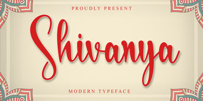 Shivanya is a lovely and delicate script font that exudes elegance and class. This font was particularly crafted for those who need a beautiful and refreshing look to their designs. Shivanya is PUA encoded which means you can access all of the amazing glyphs and ligatures with ease!
 - Alhirah by Aqeela Studio,
$20.00 Alhirah is a beautiful light handwritten font with a unique feel and a stunning impact. It will add a luxury spark to any design project that you wish to create! This font is PUA encoded which means you can access all of the amazing glyphs and ligatures with ease!