10,000 search results
(0.089 seconds)
- Honesty Sans by Océane Moutot,
$32.90 Honesty was the first font published by the Studio in 2020. It was a typeface with flared stems. 2 years later, we are now publishing Honesty Sans. It is inspired by the original design but is revisited as a sans serif this time. Honesty Sans keeps the inspiration from the incise genre and font such as Albertus or the Trajan but with softness, thanks to its low contrast and smooth curves. Honesty Sans is highly lisible, which offers a variety for use, from titles, edition of texts, branding, magazines and so on. Its large variety of glyphs, including accents, old-style numbers and ligatures will give uniqueness to your designs. Honesty Sans is available in 16 styles, from thin to heavy in roman and italic.
 - Bender Script by Dear Alison,
$29.00 Would you hire one of the top hand lettering artists that worked for companies like Max Factor for your designs? Of course you would! Chas Bluemlein passed away many years back, and you couldn't have afforded his services anyway, but his lettering prowess which graced many advertisements, primarily cosmetic ads, has been pulled together from numerous samples to make this font. Bender Script comes with BONUS Swash alternates to mix up the flavor a bit, and exudes passion and confidence! Now you can own not only a piece of his lettering legacy, but you can also put it to work for you! This beauty is a sure fit into any font collection, so what are you waiting for, buy it today!
 - Single Binghod by Liartgraphic,
$14.00 The latest font from liartgraphic studio. With the name single binghod which means single (one) in English and binghod means (damaging) in Hindi. Our fonts are multilingual, and our alternate glyphs are suitable for creating handwritten logos and posters.
 - Vernacular Sans by jpFonts,
$19.95 The Vernacular trilogy was designed by Swiss designer Hans-Jürg Hunziker, who had worked for Adrian Frutiger in Paris for many years. Based on the concept of a transitional Linear Antiqua, he has developed a colorful bouquet of typefaces that contain the entire spectrum of typefaces for book design and corporate identity. Thanks to his "Swiss school" and his outstanding skills, he has succeeded in giving the typefaces a particularly noble and sympathetic expression. In addition to the Sans family, there is a Serif family and a Clarendon family, each of which, including the separately drawn italics, is equipped with 12 font weights that are finely tuned to one another. Each of the 3 font styles develops its own character, but thanks to a concept that brings the different font styles closer together, they also work well together and complement each other perfectly. Sans and Clarendon have a vertical axis and similar endings in contrast to the Serif, which has a traditional diagonal axis and horizontal endings. The straight stems and the proportions are used as an element to stress the closeness of the typeface-trilogy. They thus share a comon feature. All fonts contain tabular and proportional figures as well as old style figures. Small caps and small cap figures are also available in all fonts. In addition, some fonts have alternative characters available via style set, such as «g», which can be used to further vary the typeface. Vernacular offers all the options for well-kept typesetting for print and web - for small and large orders.
 - Vernacular Serif by jpFonts,
$19.95 The Vernacular trilogy was designed by Swiss designer Hans-Jürg Hunziker, who had worked for Adrian Frutiger in Paris for many years. Based on the concept of a transitional Linear Antiqua, he has developed a colorful bouquet of typefaces that contain the entire spectrum of typefaces for book design and corporate identity. Thanks to his "Swiss school" and his outstanding skills, he has succeeded in giving the typefaces a particularly noble and sympathetic expression. In addition to the Sans family, there is a Serif family and a Clarendon family, each of which, including the separately drawn italics, is equipped with 12 font weights that are finely tuned to one another. Each of the 3 font styles develops its own character, but thanks to a concept that brings the different font styles closer together, they also work well together and complement each other perfectly. Sans and Clarendon have a vertical axis and similar endings in contrast to the Serif, which has a traditional diagonal axis and horizontal endings. The straight stems and the proportions are used as an element to stress the closeness of the typeface-trilogy. They thus share a comon feature. All fonts contain tabular and proportional figures as well as old style figures. Small caps and small cap figures are also available in all fonts. In addition, some fonts have alternative characters available via style set, such as «g», which can be used to further vary the typeface. Vernacular offers all the options for well-kept typesetting for print and web - for small and large orders.
 - Vernacular Clarendon by jpFonts,
$19.95 The Vernacular trilogy was designed by Swiss designer Hans-Jürg Hunziker, who had worked for Adrian Frutiger in Paris for many years. Based on the concept of a transitional Linear Antiqua, he has developed a colorful bouquet of typefaces that contain the entire spectrum of typefaces for book design and corporate identity. Thanks to his "Swiss school" and his outstanding skills, he has succeeded in giving the typefaces a particularly noble and sympathetic expression. In addition to the Sans family, there is a Serif family and a Clarendon family, each of which, including the separately drawn italics, is equipped with 12 font weights that are finely tuned to one another. Each of the 3 font styles develops its own character, but thanks to a concept that brings the different font styles closer together, they also work well together and complement each other perfectly. Sans and Clarendon have a vertical axis and similar endings in contrast to the Serif, which has a traditional diagonal axis and horizontal endings. The straight stems and the proportions are used as an element to stress the closeness of the typeface-trilogy. They thus share a comon feature. All fonts contain tabular and proportional figures as well as old style figures. Small caps and small cap figures are also available in all fonts. In addition, some fonts have alternative characters available via style set, such as «g», which can be used to further vary the typeface. Vernacular offers all the options for well-kept typesetting for print and web - for small and large orders.
 - Ongunkan France Glozel Runic by Runic World Tamgacı,
$100.00 In March 2010, Émile Fradin, a modest peasant farmer from central France, died at the age of 103. To his grave he took the secret behind one of the most controversial archaeological discoveries of the 20th century. A discovery which put into question the very origins of the written word and the paternity of European culture. It was the uncovering of peculiar artefacts would come to be known as the Glozel runes. The discovery of the Glozel runes On the first day of March 1924, a not yet 18-year-old Fradin was ploughing his family’s field in the hamlet of Glozel, when his cow stumbled into a hole. When he and his grandfather, Claude, looked closer, they discovered a mass of broken stone, under which lay an underground chamber. Within, they discovered pottery fragments, carved bones, and a peculiar clay tablet covered in bizarre characters that neither of the two could decipher. The family requested a subsidy for excavation works to be carried out, but were refused by the regional authority. With that disappointment, it seemed as though the discovery would fade into obscurity. However, the following year, news of Fradin’s unusual clay tablet reached the ears of the physician and amateur archeologist, Antonin Morlet. By the end of May 1925, Morlet began the first of his excavations.4 Within the first two years alone, he had amassed some 3,000 finds.
 - Amphibia by Storm Type Foundry,
$53.00 On a sans-serif basis it contains trapezoid ascenders, balls & rounded ears, which may resemble the serif feel in smaller sizes, thus long reading is surprisingly easy. Amphibia is suitable for everything from contemporary poetry to branding and informational systems.
 - Kadonk by Typodermic,
$11.95 Listen to the rumbling roar of the mighty Kadonk! This barbaric typeface will strike fear into the hearts of your enemies with its brutal and spiky design. Its sharp edges and aggressive curves are as merciless as a battle cry. With Kadonk, you’ll never be held back by plain and repetitive characters. This savage typeface features unique letter pair ligatures that break up the monotony and give your words a ferocious edge. Incorporate Kadonk’s primordial, savage war cry into your messaging and let your audience know that you mean business. With its powerful presence and fierce spirit, Kadonk will help you dominate the battlefield of design. So, sound the drums of war and unleash the fury of Kadonk! Most Latin-based European writing systems are supported, including the following languages. Afaan Oromo, Afar, Afrikaans, Albanian, Alsatian, Aromanian, Aymara, Bashkir (Latin), Basque, Belarusian (Latin), Bemba, Bikol, Bosnian, Breton, Cape Verdean, Creole, Catalan, Cebuano, Chamorro, Chavacano, Chichewa, Crimean Tatar (Latin), Croatian, Czech, Danish, Dawan, Dholuo, Dutch, English, Estonian, Faroese, Fijian, Filipino, Finnish, French, Frisian, Friulian, Gagauz (Latin), Galician, Ganda, Genoese, German, Greenlandic, Guadeloupean Creole, Haitian Creole, Hawaiian, Hiligaynon, Hungarian, Icelandic, Ilocano, Indonesian, Irish, Italian, Jamaican, Kaqchikel, Karakalpak (Latin), Kashubian, Kikongo, Kinyarwanda, Kirundi, Kurdish (Latin), Latvian, Lithuanian, Lombard, Low Saxon, Luxembourgish, Maasai, Makhuwa, Malay, Maltese, Māori, Moldovan, Montenegrin, Ndebele, Neapolitan, Norwegian, Novial, Occitan, Ossetian (Latin), Papiamento, Piedmontese, Polish, Portuguese, Quechua, Rarotongan, Romanian, Romansh, Sami, Sango, Saramaccan, Sardinian, Scottish Gaelic, Serbian (Latin), Shona, Sicilian, Silesian, Slovak, Slovenian, Somali, Sorbian, Sotho, Spanish, Swahili, Swazi, Swedish, Tagalog, Tahitian, Tetum, Tongan, Tshiluba, Tsonga, Tswana, Tumbuka, Turkish, Turkmen (Latin), Tuvaluan, Uzbek (Latin), Venetian, Vepsian, Võro, Walloon, Waray-Waray, Wayuu, Welsh, Wolof, Xhosa, Yapese, Zapotec Zulu and Zuni.
 - Sweet Cupcake by MlkWsn,
$15.00 Sweet Cupcake fun fonts with 4 styles and can be applied to many of your precious moments, this font is specially designed in layered style, equipped with multi-language and OpenType, don't forget there are also alternative letters and ligature that make this font so fun. There are more additions dashed line that you can enter manually to look different styles and there are dozens of additional doodle & badges completing this font. You can make as posters, titles, games, packaging, invitations and more.
 - Arthur Cabinet by SIAS,
$49.90 The Arthur Cabinet font family offers a most particular range of seven fancy ornamental fonts in the spirit of the Art Deco era. These fonts celebrate the age of elegance, stylishness and refinement to its very best. They give you a unique tool for exquisite designs. The fonts of this family are derivatives from the Arthur Sans series, which you may also want to have a look at. Use this unique typefaces for distinctive personal stationary, outstanding headlines, captivating brochures and invitations; for marvellous logotypes, wonderful menus, hotel leaflets, exciting ads … for brillant designs. Each Arthur Cabinet font features the same comprehensive Euro-Latin encoding for full language support. Additionally, every font includes a small supplementary set of fine ornaments. – For an even more comprehensive range of Arthur embellishments check out the font Arthur Sans Regular or Arthur Ornaments! Have also a look at the sister fonts of the gorgeous Arthur Sans Family, which will offer you yet another wonderful scope of fascinating typographic possibilities. ________________________________________________________________________________ Tip: Set Sample text (see below) manually to [ABCDE…] to view effectively the fonts most relevant parts! ________________________________________________________________________________
 - DigiBo by Volcano Type,
$29.00 Inspired by a scoreboard of the public transport in London our best selling font family is the basic font for the german magazine Starshot and even earned feedback from Sports Illustrated. The technical look of the entire DigiBo family is making the font a worthy member of the Eurostile / DIN -league.
 - Love West by Sulthan Studio,
$14.00 Love West is a sweet and delicate handwritten font. Dainty and joyful, this font will be ideal for writing wedding invitations, cards, or any other design that may need a romantic, personalized touch! This font is PUA encoded which means you can access all the glyphs and ligatures with ease!
 - Easter Nice by Sakha Design,
$14.00 Easter Nice is a sweet and delicate handwritten font. Dainty and joyful, this font will be ideal for writing wedding invitations, cards or any other design that may need a romantic, personalized touch! This font is PUA encoded which means you can access all of the glyphs and swashes with ease!
 - Gorgeous Angels by ErlosDesign,
$19.00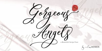 Gorgeous Angels - A Beautiful Script Font by erlosDESIGN Gorgeous Angels is a beautiful and magical modern calligraphy font, with characters that dance along the baseline. It has a casual, yet elegant touch. This font is PUA encoded which means you can access all of the glyphs and swashes with ease!
 - Rathya by Andrey Font Design,
$14.00 Rathya is a sweet and delicate handwritten font. Dainty and joyful, this font will be ideal for writing wedding invitations, cards or any other design that may need a romantic, personalized touch! This font is PUA encoded which means you can access all of the glyphs and swashes with ease!
 - Valentine Soul by Sakha Design,
$14.00 Valentine Soul is a romantic and delicate handwritten font. Dainty and joyful, this font will be ideal for writing wedding invitations, cards or any other design that may need a dreamy, personalized touch! This font is PUA encoded which means you can access all of the glyphs and swashes with ease!
 - Catchy Bellonia by Fargun Studio,
$12.00 Catchy Bellonia is a relaxed and cursive script font. Not too thin and not too thick, balanced and varied, this font was designed to enhance the beauty of your projects. Included Mono-line version. This font is PUA encoded which means you can access all of the glyphs with ease!
 - Youth Line by Sakha Design,
$14.00 Youth Line is a sweet and delicate handwritten font. Dainty and joyful, this font will be ideal for writing wedding invitations, cards, or any other design that may need a romantic, personalized touch! This font is PUA encoded which means you can access all of the glyphs and swashes with ease!
 - Scary Blood by Sakha Design,
$12.00 Scary Blood is a spooky and assertive decorative font. No matter the topic, this font will be an incredibly asset to your fonts’ library, as it has the potential to elevate any creation. Scary Blood is PUA encoded which means you can access all of the glyphs and swashes with ease!
 - Michaello by Letterara,
$14.00 Michaello is a casual natural handwritten font with an incredibly friendly feel and a stunning brush texture with a bold vibe. It is the perfect font for making original and outstanding designs. This font is PUA encoded which means you can access all of the glyphs and swashes with ease!
 - Bownjax by BonjourType,
$15.00 Bownjax is a modern, handwritten, brush script font that is both versatile and unique! This font is perfect for modern projects, headings, blogs, logos, branding, business cards, websites, invitations, shirts, mugs, and more. This font is PUA encoded which means you can access the available glyphs and swashes with ease!
 - Biblia Serif by Hackberry Font Foundry,
$24.95 This all started with a love for Minister. This is a font designed by Carl Albert Fahrenwaldt in 1929. In the specimen booklet there’s a scan from Linotype’s page many years ago. They no longer carry the font. I’ve gone quite a ways from the original. It was dark and a bit heavy. But I loved the look and the readability. This came to a head when I started my first book on all-digital printing written from 1994-1995, and published early in 1996. I needed fonts to show the typography I was talking about. At that point oldstyle figures, true small caps, and discretionary ligatures were rare. More than that text fonts for book design had lining OR oldstyle figures, lowercase OR small caps—never both. So, I designed the Diaconia family using the Greek word for minister. It was fairly rough. I knew very little. I later redesigned and updated Diaconia into Bergsland Pro—released in 2004. It was still rough (though I impressed myself). Now, with 4-font Biblia Serif family 13 years later, I’ve cleaned up, made the fonts more consistent internally, added more functional OpenType features, and brought the fonts into the 21st century. I used the 2017 set of features: small caps, small cap figures, oldstyle figures, fractions, lining figures, ligatures and discretionary ligatures. These are fonts designed for book production and work well for text or heads. Finally, in 2021, I went over the fonts entirely and remade them in Glyphs.
 - Bird Script by Lián Types,
$24.95 Characterized by quickness, lightness, and ease of movement, Bird Script is a font which challenges many aspects of type-design: every single stroke, comes directly from the author’s hand and tries to reflect not only the tool used, but also his feelings at the moment of writing. Bird Script is a font filled up with the energic gestures of what it’s called gestural calligraphy, a not very explored field in typography, where hardly ever a letter comes the same way two times: When manipulating the pen, the letterer seeks for the beauty of the differences and the grace of a confident execution. Originally done with a flat speedball pen nib nº5 and retouched with pencil for the bolder elements, it turned into a very pleasant to the eyes font which dances between the formal rules of typography and the artistic look of calligraphy. Bird Script Pro and Bird Script Light Pro come with many ligatures, alternates and ornaments. Into the standard ligatures we find lots of pairs of two and three ligated letters so when they are activated the font seems alive. However if none of them are activated, the font gives a really particular text pattern, specially in smaller sizes. Get Bird Script, add rhythm to your work.
 - Rail Travel JNL by Jeff Levine,
$29.00 Here’s yet another interpretation of the classic “thick and thin” sans serif lettering most popular during the Art Deco era. This particular design comes to you through the courtesy of a hand lettered 1930s travel poster from the Pennsylvania Railroad. Some capitals are much wider than others, while the lower case ‘i’ is somewhat truncated. Rail Travel JNL is available in both regular and oblique versions.
 - Wuxtry Wuxtry by Comicraft,
$29.00 Oyez! Oyez! Oyez! All citizens having business before the Honorable, the Supreme Court of the Comicraft Authority, are admonished to draw near and give their attention, for Wuxtry! Wuxtry! is now kerning. Tempered and tested to tackle typography in troubled times, this companion to Extra! Extra! affords each and every proclamation, declaration and attestation with the air and veracity of New England Newsies in the 1900s!
 - Sanchez Condensed by Latinotype,
$- Sánchez, designed by Daniel Hernández, is a serif typeface belonging to the classification slab serif, or Egyptian, that bears a strong resemblance to the iconic Rockwell, but with rounded edges— offering contrast and balance to the square structure. Sánchez & Sánchez Condensed comprises 12 variants, ranging from extra light to black, each of the same x-height. Regular and Italic variants are available for free.
 - Juke Joint JNL by Jeff Levine,
$29.00 Although many pieces of sheet music used standardized backgrounds and metal type for their titles and information, there are hundreds of songs with innovative illustrations and clever typography beckoning potential buyers with their cover art. Whether the era was Post-Victorian, Art Nouveau or Art Deco, the sheer variety of eye-catching images offered visual enticement to the potential customer whilst browsing the local music shop.
 - Golem by Comicraft,
$19.00 Trolls are lurking under each and every river crossing. The earth is shaking as Ogres stomp across the land, spiked clubs in hand. Swordsmen and Sorcerers are waging war on one another even as the pure and young and stout of heart search for the talisman which will restore harmony once more. Are you under the spell of some wizard's magickal incantation or are you just looking for exactly the right typestyle for your J.R.R. Tolkien Convention newsletter? Regardless, an ancient curse has been lifted and the Talmudic Legend of the Clay Beast they call GOLEM has been restored to his former majesty. The shapeless mass is no longer one of unfinished substance, no longer a body without a soul. The Homunculus that was once Comicraft's Golem has had a spiritual awakening and is now available with the crinkly bits smoothed off.
 - Nautilus Text by Linotype,
$29.99Hellmut G. Bomm first released his Linotype Nautilus typeface in 1999. Ten years later, he updated and expanded the design. Now users have two additional families at their disposal: Nautilus Text and Nautilus Monoline. Nautilus Text bears more similarities to the original Linotype Nautilus. The letters shows a high degree of contrast in their stroke modulation. Bomm's intention was to create a clear, highly legible face. While the even strokes of most sans serif types eventually tire the eyes in long texts, the marked stroke contrast of Nautilus Text lends the face its legibility. The characters were drawn with a broad tipped pen. Like serif typefaces, the forms of Nautilus Text display a variety of elements. Its characters are narrow, with relatively large spaces between them. This helps create an overall open appearance, and allows a large quantity of text to fit into a small space. Nautilus Monoline's letters share the same overall proportions as Nautilus Text's. But as their name implies, they are monolinear. Their strokes do not have the calligraphic modulation that Nautilus Text features. This allows them to set another sort of headline, making Nautilus Monoline a refreshing display type choice to pair with body text set in Nautilus Text. - Nautilus Monoline by Linotype,
$29.99Hellmut G. Bomm first released his Linotype Nautilus typeface in 1999. Ten years later, he updated and expanded the design. Now users have two additional families at their disposal: Nautilus Text and Nautilus Monoline. Nautilus Text bears more similarities to the original Linotype Nautilus. The letters shows a high degree of contrast in their stroke modulation. Bomm's intention was to create a clear, highly legible face. While the even strokes of most sans serif types eventually tire the eyes in long texts, the marked stroke contrast of Nautilus Text lends the face its legibility. The characters were drawn with a broad tipped pen. Like serif typefaces, the forms of Nautilus Text display a variety of elements. Its characters are narrow, with relatively large spaces between them. This helps create an overall open appearance, and allows a large quantity of text to fit into a small space. Nautilus Monoline's letters share the same overall proportions as Nautilus Text's. But as their name implies, they are monolinear. Their strokes do not have the calligraphic modulation that Nautilus Text features. This allows them to set another sort of headline, making Nautilus Monoline a refreshing display type choice to pair with body text set in Nautilus Text. - Espresso by Calligraphics,
$30.00The two font families, DemiTasse and Espresso, are designed to work together. Espresso is related to DemiTasse in that it is an italic font. They are both based on my own calligraphy and were used as such both separately and together. - Baby Eskimo Kisses - Personal use only

- Parkitecture JNL by Jeff Levine,
$29.00Parkitecture JNL is the latest font to embrace the angles and lines of the Art Deco era. Bold and solid in look and feel, it gives nostalgic headlines a "solid" retro appearance. - Psychoart by Nirmana Visual,
$19.00 Psychoart Typeface , contemporary of Psychedelic Serif font, inspired by 1970’s era. Psychoart offers beautiful typographic harmony for a diversity of design projects, including logos & branding, social media posts, advertisements & product designs.
 - Maya Month Glyphs by Deniart Systems,
$15.00 Contains the 19 months of the Maya solar year (in outline and silhouette mode) as well as the 19 Maya numerals. NOTE: this font comes with an interpretation guide in pdf format.
 - Period Piece JNL by Jeff Levine,
$29.00 A period piece is something of or pertaining to a specific era or time. Anything evoking a knowledge or feeling of an era can be labeled as such. The aptly named type font Period Piece JNL reflects the hand lettering found on the cover of early 20th century vintage sheet music entitled "My Baby's Arms" (from the stage production of "Ziegfeld Follies of 1919"). Although strongly akin to the coming Art Deco movement in its lettering style, Period Piece JNL still contains a strong influence of the Art Nouveau era of the 1900s through the 1920s.
 - Night Scream by Ditatype,
$29.00 Night Scream is a spine-chilling display font that brings a horrifying twist to your designs. With its big letters and bold weight, this font commands attention and instills fear. The details of the letters are carefully crafted to resemble menacing plant roots, adding a nightmarish and eerie touch to the font. Each letter in this font is bold and impactful, demanding to be noticed. The large size of the letters adds to the font's imposing presence. The root-like details in Night Scream give the font an organic and otherworldly appearance, reminiscent of sinister, twisted plant life. These details add an element of the unknown and create an atmosphere of dread, immersing the viewer into a world of dark and chilling horrors. For the best legibility you can use this font in the bigger text sizes. Enjoy the available features here. Features: Multilingual Supports PUA Encoded Numerals and Punctuations Night Scream fits in headlines, logos, movie posters, flyers, invitations, branding materials, print media, editorial layouts, headers, and any project that requires a terrifying touch. Find out more ways to use this font by taking a look at the font preview. Thanks for purchasing our fonts. Hopefully, you have a great time using our font. Feel free to contact us anytime for further information or when you have trouble with the font. Thanks a lot and happy designing.
 - Nerut by Ergibi Studio,
$16.00 "SULTAN" is a serif font. It has a vintage form with the addition of modern decorative and minimalist shape. Fonts consist of special uppercase letters and alternate characters. fonts are multilingual support and are perfect for logos, branding, mockups, t-shirts, branding, and various needs that want this vintage form I hope you like our font Ergibi Studio
 - Architype Albers by The Foundry,
$50.00 Architype Konstrukt is a collection of avant-garde typefaces deriving mainly from the work of artists/designers of the inter-war years, whose ideals have helped to shape the design philosophies of the modernist movement in Europe. Due to their experimental nature character sets may be limited. Architype Albers draws on early grid-based attempts by Josef Albers, in 1926, to design an alphabet by reducing the forms to purely geometric elements – the square, triangle and parts of a circle – and in the process creating an unusual stencil effect typeface.
