10,000 search results
(0.048 seconds)
- TXT Modern Mom by Illustration Ink,
$3.00Find style and flair in this downloadable font. Its thin lines and handwritten look are perfect for scrapbook journaling, cards, and more. - Quilotoa by Rachel Kick,
$8.00 This font was originally hand drawn to include authentic brush texture. Works in all caps style and lowercase! The perfect casual font.
 - Forum II by ARTypes,
$35.00Forum II is transcribed from the Forum II initials designed by Prof. Georg Trump and issued by C. E. Weber in 1952. - Wood Font Five by Intellecta Design,
$22.90 A display and decorative font built upon the theme of wood. Great for display purposes in projects about nature and environmental topics.
 - Hebrew Modern by Samtype,
$49.00 This is a classic design from the beginning of the 20th century. This font can be used in many kinds of books
 - Refuse Pro by The Type Fetish,
$25.00 Refuse has an extended Latin, extended Cyrillic and Greek alphabet so it will work with most languages in Europe and the Americas.
 - Newsreel Text JNL by Jeff Levine,
$29.00 Intertitle cards from a 1942 newsreel inspired the like-named Newsreel Text JNL, which is available in both regular and oblique versions.
 - Bodoni Comedia by Wiescher Design,
$39.50 Bodoni Comedia is for the funny, happy things in life. I really enjoyed doing this one. - your funny type designer Gert Wiescher
 - OnepunchJim by JOEBOB graphics,
$9.00 OnepunchJim got its name from the way it was created; every character was made in one 'punch'. Very suitable for kids stuff.
 - Peterlon by Intellecta Design,
$17.90 Peterlon is an intricate and highly ornamental set of decorative initials, mixing Victorian style in the decorative boxes with classic chancery capitals.
 - Splashed by Trustha,
$15.00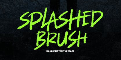 Splashed is a handwritten brush font with dynamic movement. Comes in 400+ glyphs. Splashed perfect for display, branding, advertising, and many more.
 - Priva Pro by DSType,
$26.00PrivaPro is available in four styles with italics. It includes Greek and Cyrillic characters, along with small caps, ligatures, alternates and swashes. - Spunkflakes by Chank,
$39.00Here's a cozy and cool little snowflake font for you. No letters in this font, just a whole bunch of snowflake icons. - Heart Spoken by Epiclinez,
$16.00 Heart Spoken is a fun handwritten font. A little bit quirky, this font looks incredibly playful in a wide variety of contexts.
 - Wood Tuscan JNL by Jeff Levine,
$29.00 Wood Tuscan JNL is a bold, compressed serif font in the Tuscan style and was re-drawn from vintage wood type examples.
 - Class Project JNL by Jeff Levine,
$29.00Another in the series of stencil fonts from Jeff Levine, Class Project JNL was inspired by a lettering guide from the 1940s. - Teterboro JNL by Jeff Levine,
$29.00Teterboro JNL is a bold, slab serif font built (in part) on the letter shapes from Jeff Levine's stencil font Interboro JNL. - Long And Thin Initials JNL by Jeff Levine,
$29.00 Based on some vintage metal type initial monograms, Long and Thin Initials JNL reproduces this condensed spur serif design in digital form.
 - Corvinus Skyline by GroupType,
$15.00 Corvinus Skyline is an elegant retro 1920/30's looking font great for headlines in magazines, posters, signage and other design projects.
 - Berstrom DT by DTP Types,
$49.00This design is based on custom design work by DTP Types Limited in 1990 with associated Small Capitals and Old Style Figures. - Apple Juice by Elemeno,
$25.00Apple Juice has a straightforward, childlike simplicity, but has been divided in the middle to create a bottom-heavy contrast. Kids welcome! - Sylar by The Northern Block,
$16.70 A linear modern typeface suited for branding & advertising projects. The variations in weight give great contrast when used across body copy & headlines.
 - Cheese And Crackers by Comicraft,
$19.00 Don't forget the Cheese! CHEESE AND CRACKERS is a delightfully light and creamy font created for lettering Wallace & Gromit in Nickelodeon Magazine.
 - Universal by Monotype,
$29.00A collection of Pi fonts containing Greek characters, mathematical signs and symbols, the Universal fonts are useful in newspapers and commercial typesetting. - 112 Hours by Device,
$9.00 Rian Hughes’ 15th collection of fonts, “112 Hours”, is entirely dedicated to numbers. Culled from a myriad of sources – clock faces, tickets, watches house numbers – it is an eclectic and wide-ranging set. Each font contains only numerals and related punctuation – no letters. A new book has been designed by Hughes to show the collection, and includes sample settings, complete character sets, source material and an introduction. This is available print-to-order on Blurb in paperback and hardback: http://www.blurb.com/b/5539073-112-hours-hardback http://www.blurb.com/b/5539045-112-hours-paperback From the introduction: The idea for this, the fifteenth Device Fonts collection, began when I came across an online auction site dedicated to antique clocks. I was mesmerized by the inventive and bizarre numerals on their faces. Shorn of the need to extend the internal logic of a typeface through the entire alphabet, the designers of these treasures were free to explore interesting forms and shapes that would otherwise be denied them. Given this horological starting point, I decided to produce 12 fonts, each featuring just the numbers from 1 to 12 and, where appropriate, a small set of supporting characters — in most cases, the international currency symbols, a colon, full stop, hyphen, slash and the number sign. 10, 11 and 12 I opted to place in the capital A, B and C slots. Each font is shown in its entirety here. I soon passed 12, so the next logical finish line was 24. Like a typographic Jack Bauer, I soon passed that too -— the more I researched, the more I came across interesting and unique examples that insisted on digitization, or that inspired me to explore some new design direction. The sources broadened to include tickets, numbering machines, ecclesiastical brass plates and more. Though not derived from clock faces, I opted to keep the 1-12 conceit for consistency, which allowed me to design what are effectively numerical ligatures. I finally concluded one hundred fonts over my original estimate at 112. Even though it’s not strictly divisible by 12, the number has a certain symmetry, I reasoned, and was as good a place as any to round off the project. An overview reveals a broad range that nonetheless fall into several loose categories. There are fairly faithful revivals, only diverging from their source material to even out inconsistencies and regularize weighting or shape to make them more functional in a modern context; designs taken directly from the source material, preserving all the inky grit and character of the original; designs that are loosely based on a couple of numbers from the source material but diverge dramatically for reasons of improved aesthetics or mere whim; and entirely new designs with no historical precedent. As projects like this evolve (and, to be frank, get out of hand), they can take you in directions and to places you didn’t envisage when you first set out. Along the way, I corresponded with experts in railway livery, and now know about the history of cab side and smokebox plates; I travelled to the Musée de l’imprimerie in Nantes, France, to examine their numbering machines; I photographed house numbers in Paris, Florence, Venice, Amsterdam and here in the UK; I delved into my collection of tickets, passes and printed ephemera; I visited the Science Museum in London, the Royal Signals Museum in Dorset, and the Museum of London to source early adding machines, war-time telegraphs and post-war ration books. I photographed watches at Worthing Museum, weighing scales large enough to stand on in a Brick Lane pub, and digital station clocks at Baker Street tube station. I went to the London Under-ground archive at Acton Depot, where you can see all manner of vintage enamel signs and woodblock type; I photographed grocer’s stalls in East End street markets; I dug out old clocks I recalled from childhood at my parents’ place, examined old manual typewriters and cash tills, and crouched down with a torch to look at my electricity meter. I found out that Jane Fonda kicked a policeman, and unusually for someone with a lifelong aversion to sport, picked up some horse-racing jargon. I share some of that research here. In many cases I have not been slavish about staying close to the source material if I didn’t think it warranted it, so a close comparison will reveal differences. These changes could be made for aesthetic reasons, functional reasons (the originals didn’t need to be set in any combination, for example), or just reasons of personal taste. Where reference for the additional characters were not available — which was always the case with fonts derived from clock faces — I have endeavored to design them in a sympathetic style. I may even extend some of these to the full alphabet in the future. If I do, these number-only fonts could be considered as experimental design exercises: forays into form to probe interesting new graphic possibilities.
 - Douglas Adams Hand - Unknown license

- FF Child's Play by FontFont,
$62.99 British type designer John Critchley created this script FontFont in 1993. The family has 7 weights, and is ideally suited for advertising and packaging, editorial and publishing as well as poster and billboards. FF Child's Play provides advanced typographical support with features such as ligatures and alternate characters. It comes with a complete range of figure set options – oldstyle and lining figures, each in tabular and proportional widths.
 - Presidio by Woodside Graphics,
$19.95Presidio is a stylized version of the hand-lettered calligraphy typical of the Mission era of early California. This lettering was often unique to an individual hand, but the characters shared a common style, and had their roots in the Middle Ages when monks and scholars copied whole books one letter at a time. "Presidio" replicates this style with subtle variations in each character, giving the font its authentic charm. - Battle Ground by Arendxstudio,
$15.00 Battleground is a very characteristic Display Font with a strong Sports theme and is very suitable for the Esport Logo as well Battleground came with opentype features such stylistic alternates, stylistic sets & ligatures good for logotype, poster, badge, book cover, tshirt design, packaging and any more. Features : -Uppercase & Lowercase -Multilingual support -Number, -Symbol -Punctuation. -Support in Mac and Windows OS -Support in design application (photoshop, illustrator, and more)
 - Obcecada Sans & Serif by deFharo,
$15.00 Obcecada Sans & Serif are two geometric digital typefaces in regular and bold versions, very condensed and thin with a rounded finish on the horns and joints with a modern style. They include the Cyrillic and Greek alphabet. These fonts are the result of my obstinacy for very condensed fonts, in this case I have inclined to a very fine proportion with short ascending and descending that gives them elegance decó.
 - Cursivo Saxonio by Intellecta Design,
$21.90 Cursivo Saxonio is a typeface inspired in the famous book The Case of Charles Dexter Ward, by H P Lovecraft. It shows better than I get with my studies the authentic "Insularis" or "Cursivo Saxonio" handlettering of the VIII and XI centuries used by some people in Britain. The text on the accompanying poster reads: “Corwinus necandus est. Cadaver aq(ua) forti dissolvendum, nec aliq(ui)d retinendum. Tace ut potes”
 - DF Etalage Script by Dutchfonts,
$33.00 Etalage Script was drawn for the first time in the year 2000, based on a early 20th century lettering stencil with what farmer Boelema at Lalleweer stenciled his grainsacks. Eventually the script letter was developed as a typeface with a wink to the ‘lost’ display types for the ‘display window’ of graphic designer Ariënne Boelens, who in exchange made the website www.lalleweer.nl. What originated the Ariënne should be evident now.
 - Quite Something by Hanoded,
$15.00 I have always liked the word ‘quite’ - you can stick it in a sentence and all of a sudden that sentence looks quite sophisticated! Quite Something may not be all that sophisticated; in fact, it is a rather messy font. But that’s where the fun begins! Use it for your children’s book covers, toy packaging and posters. I am sure people will say that your designs are Quite Something!
 - Fletcher Typewriter by Ana's Fonts,
$15.00 Fletcher Typewriter font and extras is an authentic vintage typewriter font, perfect to add an extra retro look to your designs. Use it in long or short texts, in digital collages, branding and packaging, social media posts, logotypes, etc. What you’ll get: 1 font family with 3 weights (regular, bold, black - each weight drawn individually), 2 styles (regular and jumpy); an extra set of stamps, misprints, underlines and overlines.
 - Corton by Greater Albion Typefounders,
$14.00 Corton was inspired by the traditional lettering on a gravestone in an English village. While that might sound a rather solemn beginning, Corton has wonderfully lively air, with distinctive lively serifs and beautifully swashed downstrokes. Eight faces are offered: regular and titular each in three weights plus regular condensed. Between them they are ideal signage and display faces, merging 'olde-worlde' charm and fun character, but remaining clear and legible.
 - Gritalina Script by Soft Creative,
$18.00 Gritalina Modern Calligraphy is a new modern script font with an irregular baseline. Trendy and feminine style. Gritalina looks lovely on wedding invitations, thank you cards, quotes, greeting cards, logos, business cards and more. Perfect for using in ink or watercolour. Including initial and terminal letters, alternates and multiple language support. This font is available in several modern swirls that can make your work look elegant, sweet and perfect.
 - SK Clarke by Salih Kizilkaya,
$12.99 SK Clarke is a font designed in memory of the famous inventor and science fiction writer Arthur C. Clarke. Clarke is a geometric sans serif font family. It offers full support for the Latin, Greek and Cyrillic alphabets and supports many different languages. This font family includes a total of 20 fonts and 17,820 glyphs, so it contains all the typographic materials you will need in your designs.
 - Botija by Tipo,
$69.00With a gentle, modulating effect and very neat from a formal point of view, Botija is ideal for medium sized texts: it is a font family with a unique style. Created initially as a reinterpretation of Bodoni, it maintains a sharp vertical axis and a medium level of contrast, suitable to function in smaller bodies and featuring subtle details which stand out in medium-sized bodies of text. - Village Hall JNL by Jeff Levine,
$29.00 A 1918 poster issued during World War I from the YWCA encouraged women to pitch in to the war effort by joining the “United War Work Campaign”. The Art Nouveau hand lettering of that poster was a slight throwback to the “Western” or “Victorian” style of typography because of the characters having split serifs. This is now available as Village Hall JNL, in both regular and oblique versions
 - Overloaded by PizzaDude.dk,
$19.00 Overloaded is an excellent font for a wide variety of use - most likely something that needs a kind of worn look. Works well in both large and small sizes, that being headlines and/or display. Surprisingly versatile and will fit tons of different purposes. I put in 3 different versions of the lowercase letters for you to pick as you please, and play around with. Comes with multilingual support
