10,000 search results
(0.025 seconds)
- Inferno Corner by Sipanji21,
$15.00 "Inferno Corner" is a 3D layered graffiti font characterized by sharp corners. Fonts like this incorporate multiple layers to create a three-dimensional effect and emphasize angular or pointed edges, often enhancing the font's dynamism and visual impact. This font is particularly fitting for various street-related projects where a bold and edgy typographic style is desired. Whether used in posters, street art, or any design endeavor aimed at the urban environment, "Inferno Corner" can lend a striking and attention-grabbing aspect to your text, contributing to the overall street-style aesthetics of your project.
 - Linotype Alphabat by Linotype,
$29.99Jan Tomáš studied at the Universität der Künste, Berlin. He is a multi-talent – the author of many ideas, a font creator, designer, modeller, technician and web designer. In 2011, he founded Future Typo, the first web portal for advanced typography with original design typefaces and 3D typefaces. When you look closely to Linotype Alphabat, the figures start to change from letters into flying bats and scary faces. Linotype Alphabat can be used for very short texts however it is particularly effective for headlines in larger point sizes so that its details are emphasized. - Le Havre Sketch by insigne,
$22.00 Le Havre Rough, a letterpress variant of Le Havre is 72% off for a limited time! Le Havre Sketch is a hand-sketched geometric sans serif. The family contains three weights. All members of the family include Sixty-four OpenType ligatures that add a realistic, natural effect and ensure that no two letters in a word repeat, oldstyle figures and small caps. Please see the sample brochure to see these features in action. Le Havre Sketch is an excellent choice when you need a fun and interesting sans-serif.
 - Wonders Graf 3d Graffiti by Sipanji21,
$15.00 "Wonder Graff" is a graffiti font that features 3 different layers and multiple font styles. With these layers and font style variations, you can create intriguing effects in your design. The use of layers and font styles allows you to achieve more complex and creative looks. Fonts like "Wonder Graff" are often used in street art, posters, or designs that want to emphasize bold and energetic typography. With different layer and style options, you have greater control over the appearance of your text and can customize it to fit your design concept.
 - Hip Hopper by Pink Broccoli,
$19.00 An offbeat typeface inspired by the lettering on an art poster by Patrick Owsley for the cartoon character Hoppity Hooper. This typeface goes beyond the basic opentype features you've seen (i.e. extended language character sets, stylistic alternate character variations, etc) and offers not only a ligature feature that automatically alternates between the Capitals & Lowercase (Alt Capitals) sets, but also a unique Contextual Alternates feature that enables an automatic alternating BOUNCING effect. All this piled into a single typeface with loads of personality, just waiting to be played with!
 - MultiType Glitch by Cyanotype,
$- MultiType Glitch, an all caps typeface focused in display purposes. 9 styles with a glitchy look. This is the third release of an expanding multiverse of mixable fonts. The whole family of typefaces has been designed to work at big sizes and display purposes such as branding, headlines, thumbnails, posters and animations. You can swap between the three additional alternate sets through all the styles to add diversity to your composition, even in Cyrillic. MultiType Glitch is inspired glitch effects, errors and hacks. Have fun mixing all the styles in your projects.
 - Chester Font Layer by Storictype,
$10.00 Introducing new layered font family it's call Chester , inspired from combine old postcard stamp and rustic sign painting with have unique decorative shapes. This is collection of type with a layered type system, many possibilities combination and options with 5 font system that can be layered to create different effect ( Basic , Inline, Inner dot, Gradient Inline, Shadow outline & Drop Shade ). You can use this font for various purposes.such as logo, product packaging, labeling, logo, classic shop, badges, quote, sign ,movie title, t-shirt, posters, lable, greetingcard, letterhead, book cover, any artwork.
 - New Era by Authentic World,
$9.00 Decorative, eye-catching and extravagant font. It stands out for the depth of its lines. In addition, it has a three-dimensional effect, it is a typeface that represents the beginning of a new stage, showing the Renaissance change with human figures and parts of the face (eyes, mouths, noses, animal bodies). You can use it for web designs, brands, advertising campaigns, titles, covers, posters, and much more. "New era" is a typeface worked with many details hidden in its design, each character is a new world that tells a story.
 - The Stories by Struggle Studio,
$16.00 The Stories is a retro styled font with a stunning style that can make the most of your design projects. This font gives a touch of retro style that was famous in the 60-70s. This font has an alternative style for Uppercase and Lowercase, Ligature, which can be adapted to your design needs so you don't waste time creating extrusion effects. The total glyph for this Stories Script font is 454 and for Stories Display it is 185, so you can choose according to the right style.
 - Straight Angles by Celebrity Fontz,
$24.99Straight Angles is a precisely designed three-dimensional font with a clean and futuristic look. The predominant angles are 90 degrees and 180 degrees with parallel and perpendicular lines. Each character is surrounded by a crisp black border of even thickness throughout the font. Upper- and lower-case letters are the same, providing a constant maximum top height while the stems extending below are allowed to show off their distinct personalities in order to spice things up. The 3D extrusion effect makes text appear to stand out from the page. - Great Squater Graffiti by Sipanji21,
$10.00 "Great Squater" is a graffiti font with two layers: solid and shadow. By using both of these layers in your design, you can create a three-dimensional (3D) effect on your text. Fonts like this are often used in street art, posters, or other designs that aim to add depth and dimension to their typography. With "Great Squater," you have the flexibility to make your text appear more dynamic and three-dimensional by using different layers. This allows you to customize the text's appearance to fit your design concept.
 - Terrified AOE by Astigmatic,
$19.00 Terrified AOE was inspired by vintage horror movie poster titling from the 1960's. It is a Capitals and smallcaps typeface, that really feels like a mix of three typefaces in one. While the Capitals and Smallcaps typesetting works to the effect of the original inspirations, each case also works well amongst itself independently, and having very different vibes. I've always been a huge fan of horror movies, and some of the lettering from vintage horror movie posters are so cool and alive, I only wish there were more of them recreated as display fonts.
 - Fomtage by Ardyanatypes,
$10.00 Fomtage Script is a font with a retro style made to make your designs look more attractive. Fomtage has 2 styles, namely script and extrude, this makes it 2 layers that can be combined so that it gives a very interesting shadow effect to add a retro impression. It will be very easy to use and will save you time on designing. Fomtage also has many opentype features such as ligature, and alternate. This will be very suitable for use as a logo, poster, packaging, merchandise, social media & greeting cards.
 - Carot Display by Storm Type Foundry,
$45.00 Carot Display is made for book covers and posters, but will also shine in advertising and visual identity. The whole Carot system is built up from what has long been around; in any case, it was the intention: to evoke the already experienced visual reminiscences of today's spectacled people. We all have a tendency toward sentiment, which, with each new diopter, deepens to melancholy. Only good font can calm us down. I believe in the raw effect of “Carot” typefaces. The superfamily of 64 members offers a modern alternative for all types of design work.
 - HWT Aetna by Hamilton Wood Type Collection,
$24.95 HWT Aetna is a revival of the sturdy Roman style of wood type most often called simply Aetna. This new digital version by Aaron Bell features four widths all based on the various widths commonly offered by 19th Century wood type manufacturers. In addition, there is a four-layer all-caps version Aetna based on the the famous Wm. Page Chromatic Types, that allows the user the ability to easily create these chromatic streamer and shadow effects. Both the multiple width Aetnas and Streamer component fonts support full Western and Eastern European languages.
 - Racetrack by Type Innovations,
$39.00 Racetrack is the work of American type designer, Alex Kaczun, and was conceived as a result of developing a logo for a client. Alex was experimenting with a uniform grid pattern, outline and inline, connecting the dots which lead to this interesting typeface effect. Racetrack is a bold display font, which also works well at many point sizes. It has a futuristic appeal with straight lines and sharp corners. The uniform strokes, inline treatment and symmetry make for a powerful headline. The applications for this font design are endless.
 - Paneuropa Inline by ROHH,
$19.00 Paneuropa Inline is a retro display typeface inspired by a classic modernist design from Poland. It has a retro mood, but is reworked from the original to achieve a better consistency in letterforms and spacing. The set includes 3 versions of the font, each one featuring different worn/grunge effects to fit various sizes and design scenarios. Paneuropa Inline is designed for all kinds of retro, vintage, grunge, eco, bio, organic projects in mind and nicely fits to industries and purposes such as food & beverage, gardening, travel & hospitality, vintage-styled apparel, restaurants and pubs.
 - Breezy Pro by Reyrey Blue Std,
$18.00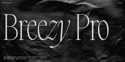 Introducing, Breezy Pro Typeface. A classical typeface with a complementary italic version. It's elegant, modern, and stylish. Mix and match them to create eye-catching effects and make every word a masterpiece. Breezy Pro is perfectly suited for fashion and magazine design, Inspirational quote designs, logo designs, simple and classy Logos, web font, branding, product packaging, and much more. This font is PUA-encoded, which means you can easily access all of the glyphs! Features : All Uppercase and Lowercase Number & Symbol Supported Languages Ligatures PUA Encoded Hope you enjoy our font!
 - Playmax by OhType!,
$16.00 It is difficult to classify a typography that is made from different line fragments but precisely that is what makes it stand out from the rest, a construction that took months and multiple corrections that now make up a set of glyphs with is own identity based on the game between blacks and whites, standing out especially in large formats, posters, headlines, logos and titles. Playmax is a typeface with which you can find endless forms of customization, from its basic structure to the number of effects it supports.
 - Bend by Juri Zaech,
$30.00 Bend is a contemporary ribbon type family. Unlike most typefaces of that genre Bend is a sans serif. It is the top view angle and the characteristic stripes that create an elegant illusion of volume. A prominent feature of Bend is the ascending baseline. Simply rotating the text element by 14 degrees reveals the 3D effect and Bend's full potential. Bend comes in two widths and with three different layers for chromatic results. As a display typeface Bend likes to be set in big sizes and short sentences.
 - Monodia by Posterizer KG,
$19.00 In few words, Monodia is a small but widely applicable slab serif (nearly monoweight) font family with only two weight and one cut effect version. To those who agree with the fact that less is actually more, three fonts should be sufficient for branding, headlines and other display uses. With that reason regular and bold weights are designed with huge contrast. In order to avoid clogging of certain (especially Cyrillic) letters in the text, some serifs are atypically modified or allowed. Unlike uppercase letters and numbers, lowercase letters don’t have forked serifs. Еnjoy!
 - Holicya by Dumadi,
$35.00 Holicya is a retro-style font with a stunning style that can make the most of your design projects. This font gives a touch of the retro style that the 60-70s was famous for. This font has alternative styles for Uppercase and Lowercase, Ligature, ss01, ss02, ss03 to ss04 which can be customized to suit your design needs so you don't waste time creating extrusion effects. The total glyphs for this font is 356 so you can choose according to the right style. Sincerely, Toni Dzulham - Dumadistyle
 - Fisionada by Graviton,
$24.00 Fisionada font family has been designed for Graviton Font Foundry by Pablo Balcells in 2023. It is a condensed sans serif typeface with sharp edges and a very technical aesthetics. Its condensed design makes it very effective for space economizing and its geometric features make it a very attractive choice for display usages such as futuristics logos, video games and sci-fi content. It has been conceived to be most suitable for headlines and short length text blocks. Fisionada consists of 8 styles. Each containing small caps and glyph coverage for several languages.
 - Bredston by Uncurve,
$30.00 Bredston is an aesthetic vintage typography font, inspired from the past, elegant signage, gold leaf , sign painting and old label product. Bredston comes with tons of alternates characters to make more eye cacthy . It is suitable for authentic logos, headings, sign painting, posters, letterhead, branding, magazines, album covers, book covers, movies, apparel design, flyers, greeting cards, product packaging, and more. You just combine with the another font like script , serif or san serif font and adding some effect finally BOOM..!! you get a great design for your project.
 - Haverj by ParaType,
$30.00 An original typeface designed for ParaType in 2004 by Armenian designer Manvel Shmavonyan. Based on the lettering created in 1970s by outstanding Armenian type designer Henrik Mnatsakanyan (1923-2001) of the same name. In Armenian ‘Haverj’ means ‘Eternally’. The face resembles many regular text serif fonts but elements like serifs and terminals make it eccentric and a little bit funny. The shape of diagonal legs in capital K and R resembles book lettering of the 1950s—60s. Using it in text, advertising and display typography may lead to surprising effects.
 - Gaisma by Lamatas un Slazdi,
$59.00 Art Nouveau typeface "Gaisma" ("Light" in Latvian) contains characters for all the European languages, Cyrillic and modern Greek as well as a huge set of contextual and stylistic alternates and historical characters to replicate the texts of the era. It draws inspiration from Vienna Secession movement and Nordic National Romanticism. The work on the design started as drawings of several characters for the graphic standard for the Jugendstil museum in Riga. To use it more effectively and to get acquainted with the possible stylistic sets download the Gaisma specimen in pdf format.
 - Antiquarian Scribe by Three Islands Press,
$39.00 Henri Abraham Chatelain was a cartographer and publisher of the famous Atlas Historique, ou Nouvelle Introduction a L'Histoire, a world atlas released between 1705 and 1732 in Amsterdam. A few years ago, at an antique book shop in London, I bought a page from Chatelain's atlas—a page covering the Near East, India, the Indian Ocean—that had a particularly alluring, oblique handlettering style. The text is in French, which gave me plenty of samples of diacritics and accented characters. The overall effect is neat and legible, with a distinctly historical flair.
 - Crazy Fever by PizzaDude.dk,
$18.00 Is it snow? Is it water? Is it slime? Is it from this earth? The questions are many - one thing is certain - with this font you can create cool effects by mixing the layers - and in the end, you decide whether the result is going to be scary, delicious or somewhere in between! Use the different layers and your favourite color scheme and just type ahead - the contextual alternates (with 4 different versions of each letter) automatically cycles the letters and make your text look more lively - or maybe even scary!
 - Dirty Bakers Dozen by Typodermic,
$- Dirty Baker’s Dozen, was released in 1998 and has since become the gold standard in raunchy stencil fonts. This version of Dirty Baker’s Dozen is pants-full of handy symbols, fractions, accents and what not. Need numeric ordinals? Probably not, but if you do, Dirty Baker’s Dozen will be there with boots on and numeric ordinals a-blazing. Two new styles were introduced in 2009: Scorch & Spraypaint. When you're using Scorch or Spraypaint styles in an OpenType savvy application, common letter pairs will be automatically replaced by custom pairs for a more realistic, filthy effect.
 - SkinArt by Graffiti Fonts,
$14.99SkinArt has a hand-made appearance. The style is similar to vintage Tattoo lettering. The caps are in an outline style and the lowercase keys give you a flat, solid style, numbers, punctuation and flourishes are included in this typeface. This typeface includes 2 full tattoo style alphabets that can each be used alone or you can combine the 2 fonts to create fill and gradient effects. Add the included banner pieces or use this font along with your own banner and flag graphics to create realistic body art and classic tattoo style lettering. - Hesperides by Scriptorium,
$18.00Hesperides is based on samples of Colonial period calligraphy. Rather than being directly derived from any one sample, some common characteristics have been emphasized to give it a more coherent and distinctive look, with the accentuated single-looped strokes on many of the characters suggesting a fully flourished style, but showing a bit of restraint. The ultimate effect is really striking, in the tradition of our Queensland and Allegheny fonts, but even more distinctive. The full version includes alternate versions of many of the key characters designed to reduce loop interference and add variety. - Ashtronaut by Chank,
$20.00 Like a phoenix rising from the ashes, the new Ashtronaut font is on fire and blasting off into outer space. This futuristic new font combines basic geometric forms like circles and dashes to form uppercase shapes that are softer and more traditional and lowercase letters with sharp and abstract characteristics. The result is a minimalist style that creates distinct and innovative new glyphs and letter combinations. The basic Bold variety is the strongest of the bunch. Try overlapping it with the other styles — Inlines, Outlines, and Bulbs — in different colors for dramatic and exciting effects.
 - Urban Maxim 3d Graffiti by Sipanji21,
$15.00 Urban Maxim" is a graffiti font that features three different layers: solid, shadow, and inner shadow. By using this combination of layers in your design, you can create a three-dimensional (3D) effect on your text. Fonts like this are often used in street art, posters, or other designs that aim to add depth and dimension to their typography. With "Urban Maxim," you have the flexibility to create text that looks distinct and more pronounced by using the various layers. This allows you to customize the appearance of your text to fit your design aesthetics.
 - Pritchard by ITC,
$29.99Pritchard is the work of British designer Martin Wait, a capital, condensed sans serif font inspired by the geometric styles of the 1920s Soviet Constructivist movement. Despite unusual letterforms, Pritchard remains legible and effective in large display sizes. Two fonts make up the Pritchard family: Pritchard Regular and Pritchard Line Out. Pritchard Regular is a caps-only font, but Pritchard Line -- a bold, open font suitable for a wide variety of headline applications -- does include lowercase letters. A similar font from Linotype is Linotype Reducta. Unlike Pritchard Regular, Linotype Reducta's character set contains lowercase letters." - Shicken Zoop JNL by Jeff Levine,
$29.00Shicken Zoop JNL is based on an old lettering stencil from the early 1950s. The A-Z and a-z keystrokes contain the bulk of the Hebrew alphabet. Additional letters are found on the exclamation point, quote and apostrophe keystrokes. Vowels are positioned on the period, comma, hyphen, colon and semicolon. Please note that this is not a normal Hebrew font; it is in effect a latin font with Hebrew letters appearing in place of latin letters. It will not allow you to copy and paste with other samples of Hebrew text. - Grand Guignol by Comicraft,
$19.00 A gruesome operatic drama is about to unfold, a tragic performance of the macabre! We offer for your entertainment a series of unfortunate events full of shocks and lugubrious revelations which will chill you to the bone! We also offer you this font, which may have similar effects, including nausea, migraine, heart palpitations and stomach upset. Pretty, though, isn't it? Art Deco & Art Nouveau posters, this font pair defined the look of John's MARVEL'S FINEST book designs in the early 2000s, and Richard's comic ASK FOR MERCY in the 2020s!
 - Litza by Marianna Orsho,
$35.00 Litza is a layered, condensed, all-caps cross stitch display type family. It is made up of 10 layers that show different stages of stitching and can be stacked, moved around, and coloured separately in order to create interesting effects. The ten layers come in 3 weights; Light, Medium, and Bold. The 3 weights can also be mixed with one another to create a vast range of combinations when stacking the layers. Litza has multilingual support and includes glyphs for a wide range of Latin and Cyrillic languages. The family also contains a set of ornamental borders and over 80 decorative symbols in the shape of various animals and objects. Combining the various Litza layers allows you to create eye-popping, intricate, experimental typographic compositions that are rich in detail - with ease. The condensed, geometrics sans-serif letterforms and playful nature of the Litza layering system give a contemporary feel - while at the same time retaining a nostalgic and tactile quality due to its reference to traditional needlework techniques and patterns. Ideal for use at larger point sizes where the unique, stylish effects can be best expressed - Litza will add a touch of intrigue and work best in headings and emphasised text for poster design, editorial design, packaging design, and motion design.
 - Disassembler by Typodermic,
$11.95 Introducing Disassembler—the ultimate simulated bitmap typeface that will transport your message straight back to the 8-bit era. With its distinctive letterforms and retro computer theme, Disassembler will add an extra level of authenticity to your designs, giving them that low-resolution voice that was so iconic of the time. The unique effects available with Disassembler mean that your text will stand out like never before. Whether you want to create a glitch effect, add a bit of distortion, or just give your letters a more vibrant color scheme, Disassembler has you covered. But it’s not just the effects that make Disassembler so special—it’s the attention to detail. To achieve the original pixel font look, kerning is limited to full pixel increments. This means that each letter is placed perfectly to give your text that authentic, vintage feel. So if you’re looking to take your design projects back to the good old days of low-res graphics and 8-bit soundtracks, Disassembler is the typeface for you. Don’t settle for ordinary—make your designs extraordinary with Disassembler. Most Latin-based European writing systems are supported, including the following languages. Afaan Oromo, Afar, Afrikaans, Albanian, Alsatian, Aromanian, Aymara, Bashkir (Latin), Basque, Belarusian (Latin), Bemba, Bikol, Bosnian, Breton, Cape Verdean, Creole, Catalan, Cebuano, Chamorro, Chavacano, Chichewa, Crimean Tatar (Latin), Croatian, Czech, Danish, Dawan, Dholuo, Dutch, English, Estonian, Faroese, Fijian, Filipino, Finnish, French, Frisian, Friulian, Gagauz (Latin), Galician, Ganda, Genoese, German, Greenlandic, Guadeloupean Creole, Haitian Creole, Hawaiian, Hiligaynon, Hungarian, Icelandic, Ilocano, Indonesian, Irish, Italian, Jamaican, Kaqchikel, Karakalpak (Latin), Kashubian, Kikongo, Kinyarwanda, Kirundi, Kurdish (Latin), Latvian, Lithuanian, Lombard, Low Saxon, Luxembourgish, Maasai, Makhuwa, Malay, Maltese, Māori, Moldovan, Montenegrin, Ndebele, Neapolitan, Norwegian, Novial, Occitan, Ossetian (Latin), Papiamento, Piedmontese, Polish, Portuguese, Quechua, Rarotongan, Romanian, Romansh, Sami, Sango, Saramaccan, Sardinian, Scottish Gaelic, Serbian (Latin), Shona, Sicilian, Silesian, Slovak, Slovenian, Somali, Sorbian, Sotho, Spanish, Swahili, Swazi, Swedish, Tagalog, Tahitian, Tetum, Tongan, Tshiluba, Tsonga, Tswana, Tumbuka, Turkish, Turkmen (Latin), Tuvaluan, Uzbek (Latin), Venetian, Vepsian, Võro, Walloon, Waray-Waray, Wayuu, Welsh, Wolof, Xhosa, Yapese, Zapotec Zulu and Zuni.
 - Etruria by Dima Pole,
$34.00 Font Etruria is based on a real Etruscan inscriptions and realistic accurately simulates the writing of the Etruscans. The idea of the font Etruria is to give an opportunity for anyone to touch the past of mankind! The character of the Etruscan alphabet involves the creation of a font with only uppercase letters. However, I did not limit this font by that. Etruria has not only a lowercase is different from uppercase, but an additional sets of alternative characters. In General, the main characteristic of Etruscan writing is randomness and diversity of characters. Differs from lowercase to uppercase is only the first step on the road to make randomness effect. Next to the aid of the OT features. To recreate the randomness effect, in Etruria there are several OT features (Contextual Alternates, Stylistic Alternates and Stylistic Sets), which built a script to simulate randomness. Additionally, another script creates the effect of random positioning. Together they create incredibly realistic Etruscan inscription. Thus, any of these features can be disabled at will. I also used a small line spacing, because it is characteristic of the Etruscan writing. Actually the Etruscan writings is a mirror of the writings compared with the current European alphabets. I didn't use this feature all the letters, because this would make the font difficult to perceive, but to make the font characteristic of the Etruscan style, Etruria has a few letters in mirror image. However, if for someone it may seem unusual, mirrored letters can be disabled instead of them will appear more familiar to them. Another feature of Etruscan writing is the use instead of a space dotacentered. Font Etruria has this feature, there is a OT feature Stylistic set ss03. Naturally, it also can optionally be disabled. All these features can be used together, separately, or turn it off. The main goal achieved! The text typed in Etruria, creates full impression of these Etruscan inscriptions.
 - Phoenica Std by preussTYPE,
$29.00 PHOENICA is a contemporary humanistic typeface family suitable for traditional high-resolution print purposes, office application and multi-media use. Of the creation formed the basis an idea which was developed for the first time by Lucian Bernhard approx in 1930 with the Berhard Gotic and was taken up in the last time by different written creators repeatedly: the repeated elimination anyway (in comparison to a Antiqua, e.g. Garamond) already very much diminished form Grotesque (as for example Helvetica) by systematic leaving out of the serifs. The horizontal direction of the writing is thereby stressed remarkably by which so-called »Rail effect« originates. The eyes can grasp the line to be read very well what is ordinarily left to a Serif-stressed font. By this desired effect is suited PHOENICA also for big text amounts. In numerous test runs Stems and tracking was compared to experienced fonts and was adapted. The experienced was taken over without renouncing, nevertheless, the modern and independent character PHOENICA. PHOENICA offers to you as a welcome alternative to the contemporary humanistic Sansserif. It is a very adaptable family for text and Corporate design uses. Several companies have discovered PHOENICA meanwhile as a Corporate font for themselves and use them very successfully. She provides a respectable typeface combined with refinement and elegance. Every PHOENICA family has at least six weights in each case in regular and italic. In addition more than three fine Haarline weights (Hairline 15, 25, 35). These are a total of 27 possibilities. Phoenica as well as Phoenica Condensed are excellently readable fonts, because they were optimised especially for amount sentence. Both basic styles (Regular and Condensed) are tuned on each other and follow the same form principle. The family is neither exclusively geometrical nor is constructed humanistically, the forms were sketched on quick and light Recognition effect of every single letter. The PHOENICA family design and logo is suited for all only conceivable uses like newspapers and magazines, for the book typography and Corporate Design.