9,804 search results
(0.053 seconds)
- KlingonBlade - Unknown license
- TypewriterScribbled - 100% free
- Quick End Jerk - Unknown license
- Ben-Zion - Personal use only
- Electrofied - 100% free
- War Eagle - Personal use only
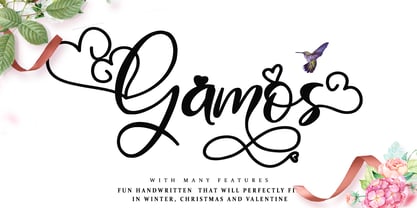
- Gamos by Letterara,
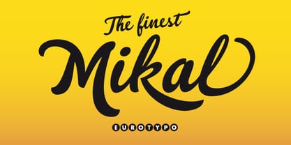
$12.00 - Mikal by Eurotypo,
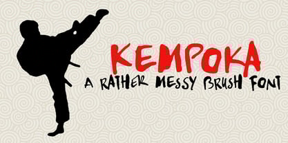
$88.00 - Kempoka by Hanoded,
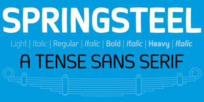
$15.00 - Springsteel by Paragraph,
$21.00 - ZiGzAgEo - Personal use only
- Red October - Personal use only
- Edo - Unknown license
- Turmoil (BRK) - Unknown license
- Illuminati - Personal use only
- Utusi Star - 100% free
- It Lives In The Swamp BRK - 100% free
- Spike - Unknown license
- Clementine Sketch - Unknown license
- Talvez assim - Personal use only
- Sheldon by PintassilgoPrints,
$24.00 - Ida by ParaType,
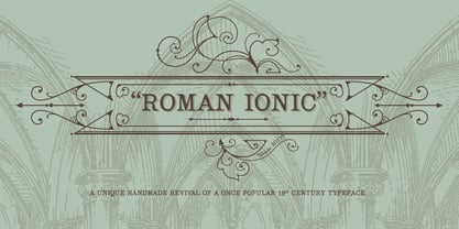
$30.00 - Roman Ionic by Jawher Matmati,
$25.00 - Hilton Serif by Juraj Chrastina,
$39.00 - Hilton Sans by Juraj Chrastina,
$39.00 - Arts And Crafts Hand BA by Bannigan Artworks,
$19.95 - Journal Sans New by ParaType,
$40.00 - SBB Power Grid by Sketchbook B,
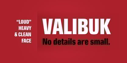
$9.00 - Valibuk by Juraj Chrastina,
$39.00 - SEISDEDOS DEAD - Personal use only
- Black Metal Logos - Unknown license
- Wildcard - Personal use only
- Broken Toys - Unknown license
- Bifurk - Unknown license
- DrunkenSailor - 100% free
- Abscissa - Unknown license
- Zig Zag ML - Personal use only
- Ganz Egal - Personal use only
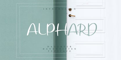
- Alphard by BonjourType,
$12.00 - Hollywood 69 by Fonts of Chaos,
$10.00


