9,804 search results
(0.048 seconds)
- Coral Candy Regular Slant by Letterhend,
$17.00 - Martians spacewarped my dad - Unknown license
- Futurex Variation Alpha Hollow - Unknown license
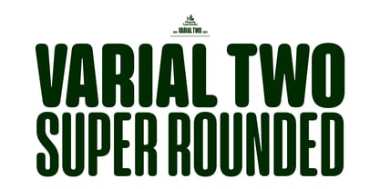
- Varial Two Super Rounded by Paavola Type Studio,
$21.00 - Regulators Outline - Unknown license
- Regulators Italic - Unknown license
- Regulators Condensed - Personal use only
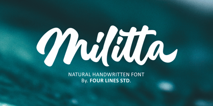
- Militta Reguler by Four Lines Std,
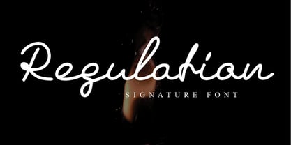
$12.00 - Regulation Signature by Shape Studio,
$9.00 - Regulator Nova by Device,
$39.00 - Geometron Pro Angular by Marius Mitran,
$39.00 - Anha Queen VMF - Personal use only
- DIN Schablonierschrift - Unknown license
- Sailor '87 - Unknown license
- Faktos - Unknown license
- Wobble - Unknown license
- HardTalk - Unknown license
- Single Gyrl - Unknown license
- Mimi's Hand Connected by Corradine Fonts,
$19.95 - Wild Sewerage - Unknown license
- Bionic Type Italic - Unknown license
- Binary X BRK - Unknown license
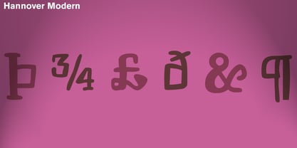
- Hannover Modern by Type-Ø-Tones,
$40.00 - Bree - Personal use only
- Blumen by Kaer,
$21.00 - Bad Coma - Personal use only
- Disparador - Personal use only
- Gunship Italic - Personal use only
- TPF Senseless Strokes - Unknown license
- UglyQua - 100% free
- Scrawl - Unknown license
- Yukon Tech Italic - Personal use only
- Bandwidth BRK - Unknown license
- EDGE - 100% free
- Xirod - Unknown license
- digi - Unknown license
- Hexa - Personal use only
- ChickenScratch AOE - Unknown license
- Sunspots AOE - Unknown license
- !Y2KBUG - Unknown license


