10,000 search results
(0.049 seconds)
- SteinAntik - 100% free
- Mosuna - Unknown license
- Tragedia - Unknown license
- Typewrong - Unknown license
- Copycat - Unknown license
- Holitter Forge - 100% free
- Breitkopf Fraktur - Personal use only
- Bitstorm - Unknown license
- Mirisch - Personal use only
- Spylord - Unknown license
- Mediaeval Caps - Unknown license
- Steepidien - Unknown license
- Gothenburg Fraktur - Personal use only
- Powell Antique - Personal use only
- DornspitzGrotesk - 100% free
- Kahless - Unknown license
- Trebble - Unknown license
- Nervous - Unknown license
- SirQuitry - Unknown license
- Phrixus - Unknown license
- Carolus - Unknown license
- Theuerdank Fraktur - Personal use only
- Melon - Unknown license
- sB Cross - Unknown license
- Butterfly Letters - 100% free
- XperimentypoThree-C-Square - Unknown license
- Gebetbuch Fraktur - Unknown license
- Extenda by Zetafonts,
$39.00Extenda is a variable width sans serif type family designed by Francesco Canovaro with Andrea Tartarelli and Cosimo Lorenzo Pancini.It been created to provide designers with a powerful but flexible tool to create strong headlines, logos, and display text with tight spacing and maximum space coverage. Rather than providing a family of weights, it gives you a fine-grained range of widths to choose from, allowing maximum control in display editorial uses, and proportional size variation in logo design, keeping consistent appearance and readability. From the vertical, ultra-condensed and thin Pica, Nano and Micro weights to the wide and ultra-bold Peta, Exa and Yotta weights, all Extenda fonts include an extended character set covering Latin languages as well as ones using Cyrillic and Greek for a coverage of 200+ languages. Full Open Type features are included, from small caps to stylistic alternates, positional number forms and discretionary & standard ligatures. The 11-weights family is complemented by the Extendable special weight, that uses Open Type scripts to create a dynamically scaling typeface where each letter becomes automatically tighter or wider than the previous one. - Halcyon by Studio Buchanan,
$12.00Halcyon is a post-geometric typeface made up of 16 fonts across 8 weights. Each weight contains an upright with a corresponding true italic. Halcyon's design builds on the foundations of classic typefaces such as Futura, Gill Sans and ITC Avant Garde Gothic, by mixing their geometric structure with more modern humanist qualities and attributes. The result is a friendly and approachable personality with a sophisticated and serious edge. Halcyon feels familiar, but unique, playful but not asinine. The versatility of its character makes Halcyon a reliable choice for any design decision. With a large variety of weights, and a whole host of Open Type features, Halcyon can adapt to fit the tone of your communications. The lighter weights present a more refined and formal voice, while the heavier, oversized weights grow more exuberant. It's large x-height and open apertures increase it's legibility, making it perfect for setting large display headlines or small sized, long form text. Halcyon is a multilingual family with hundreds of accented characters, and allows for customisable characters through diacritic combinations. All European languages are already covered, alongside many more within the Latin alphabet. - SS Vortax by Sharkshock,
$100.00SS Vortax is a space-age themed display sans featuring broad strokes and tight spacing. This close relative of Galaxus features imposing Capitals with some sharp slants in the Italic version. It’s designed to cover horizontal blocks effortlessly. Most characters have curves on the exterior with right angles on the interior. This dynamic contrast makes it a great choice for a video game/app, toy packaging, or sports logo. SS Vortax is equipped with European accents for international support. Please check glyph maps for all supported characters. - Epitet by Tour De Force,
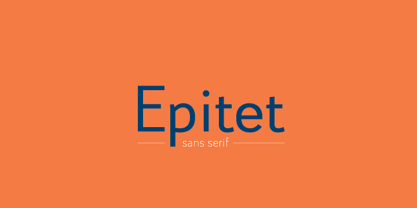
$25.00Epitet, a subtle compact type family with a modern mixture of geometrical and simple shapes, comes in 6 weights, from Thin to Bold. It is a clean elegant sans serif typeface, with a small x-height. Epitet is highly legible in all sizes. Very versatile and easy to use, Epitet can be used in a wide range of corporate and editorial applications. I'm sure Epitet could get even more epitets, but the appropriate use of Epitet would be the biggest one it could get. - HS Almaha by Hiba Studio,
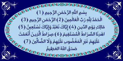
$50.00HS Almaha is a modern OpenType Arabic Typeface. It combines the features of linear Naskh and modern Kufi. Segments of its letters are curvy and sharp. They are refinement more readable and present in extended texts in magazines, newspapers, books and other publications. This typeface supports Arabic, Persian, Urdu and Kurdish languages and it contains four weights; light, regular, medium and bold which can add to the library of Arabic fonts contemporary models that meet with the purposes of various designs for all tastes. - Rotis Serif by Monotype,
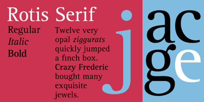
$40.99Rotis is a large typeface family consisting of, Serif, Semi Serif, Semi Serif and Sans Serif font styles. Agfa Rotis was created for Agfa Compugraphic. The font styles are matched for weight and height to give consistency when mixed. Certain round characters have a distinctive calligraphic treatment which is apparent in all styles. A versatile family which can be used for text as well as display setting. Designed by Otl Aicher at Druckhaus Maack, Agfa Rotis is very readable and good for use in any contemporary texts. - Pinatas Marks by Piñata,
$12.00Original Foundry: TypeType Original name: TT Marks The typeface Pinatas Marks is made in the style of the traditional American sign painting, which is the traditional art of painting on buildings, billboards and signage for the purpose of announcing or advertising of products, services, and activities. Font family Pinatas Marks consists of 32 fonts and has 8 different weights: Thin, ExtraLight, Light, Regular, Medium, Bold, ExtraBold, Black. Pinatas Marks is looking great on all the modern information media, ranging from small labels to entire text blocks. - Rotis Serif Paneuropean by Monotype,
$92.99Rotis is a large typeface family consisting of, Serif, Semi Serif, Semi Serif and Sans Serif font styles. Agfa Rotis was created for Agfa Compugraphic. The font styles are matched for weight and height to give consistency when mixed. Certain round characters have a distinctive calligraphic treatment which is apparent in all styles. A versatile family which can be used for text as well as display setting. Designed by Otl Aicher at Druckhaus Maack, Agfa Rotis is very readable and good for use in any contemporary texts. - Tabac Big Slab by Suitcase Type Foundry,
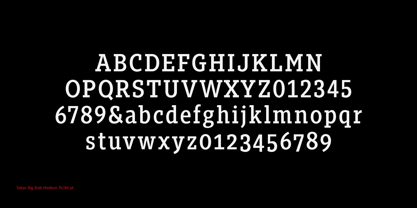
$39.00Eleven out of ten typographers have confirmed that Tabac Big Slab can be used both on the facades of majestic villas and on the most ordinary typesetting of labels and medication package inserts, where it saves both space and tired eyes. Even width compression doesn’t take away from the typeface’s well-distinguished characters, while its huge x-height optically enlarges typesetting in small sizes. Aside from the lightest weights, we can recommend Tabac Big Slab for all applications where there is a lack of space or paper. - Klaklak by Fontroll,
$20.00Oh no, not another typewriter font! But Klaklak is different. Not only has Klaklak four weights from worn out ink (light) to typing twice (bold), an Italic (which is Regular with authentic underlines as there is no Italic on typewriters) and an x-through font called Klaxxx (no need to erase your typos – just x them out (just kidding 😊)). It also does a lot to avoid repeating letterforms by first replacing about 320 common letter combinations by ligatures and then mixing them up with 4 style sets which results in about 1300 ligatures and more than 2600 glyphs in total per font. The result is a very realistic appearance of a mechanical typewriter. All you have to do is turn on Ligatures and Contextual Alternates in your favourite layout app. Of course Klaklak is multilingual, supports a lot of Latin based languages and has all glyphs for even demanding layout tasks. Enjoy! - Bonkard by Twinletter,
$15.00Bonkard is a font created with great care to meet all of your requirements. Your project will be more flawless if you use this font; everyone will think it’s attractive and charming. We completed this font with standard and thick-thin families, so you may use it for subtitles and text titles because we made it with ease and flexibility in mind for you to use in all types of special projects. Not only that, but the unique shape of each letter is something we pay close attention to so that your customers fall in love at first sight. This graffiti font is great for product logos, poster titles, headlines, packaging, film titles, logotypes, gorgeous writing, and trendy graffiti designs, among other things. Of course, if you utilize this font in your numerous creative projects, they will be perfect and outstanding. Use this typeface right away for your one-of-a-kind and remarkable projects. - Quarca by insigne,
$24.75Quarca's masculine power runs strong across the page with bold self-assurance and a raw energy that courses through its thick veins. Don't think the continuous, smooth geometry of this semi-modular face is captively chained to the grid, though. Quarca has been cautiously optimized to engage the reader's eye. Achieving an attractive balance to its sturdy design, the open forms of this "rounded square" geometric sans -together with a tall x-height- make the font legible even when using the compact widths. This high-impact typeface definitely doesn't sacrifice versatility for style. These compact widths, with their raw heart and strength, are perfect for callouts, while the extended widths provide you with the platform for a punchy and extremely efficient headline. The font has a thinner weight and transcends to an intense bold. The face's geometric or technological construction also tends to make it right at home on the web. The family consists of 36 fonts -six weights plus italics. Where Quarca truly stands out, though, is its wide number of OpenType typographic choices and optional glyphs, allowing you to design your piece with a personal, one-of-a-kind variant touch. These variations consist of Experimental Capitals, Angled Capital Terminals, and "Future Stencil". In all, you can find more than one hundred of these alternate glyphs. Quarca is well-suited for anything you are able to throw at it. Devised for today's multi-disciplined designer, this clear and infinitely versatile family provides tremendous value to your toolbox. - Chilly Medium - Personal use only


