5,357 search results
(0.014 seconds)
- FG Lana by YOFF,
$13.95 FG Lana is a teenager with big visions and a bit naive kind of writing.
 - Lunda Modern by MAC Rhino Fonts,
$36.00 Based on the typeface Lunda originally made by Karl Erik Forsberg , (1914–1998) in 1941. The name Lunda was a tribute to Berlingska Stilgjuteriet in Lund, a Swedish type foundry (1837–1980) which supported him from the start. The design is close to the original but some significant details have been changed. Several signs are designed from scratch. An additional bold weight has been added.
 - FS Lucas by Fontsmith,
$80.00 Pure and not-so-simple Maybe it’s the air of purity, openness and transparency that they transmit, but geometric typefaces are more popular than ever among leading brands. Based on near-perfect circles, triangles and squares, geometric letterforms look uncomplicated, even though making them readable is anything but – something the designers of the first wave of geometric fonts discovered nearly a century ago. Many of the world’s most recognisable brands in technology, retail, travel, food, manufacturing and other industries continue to be drawn to the straightforward, honest character that geometric fonts convey. Fontsmith set out in 2015 to develop a typeface in the same tradition, but optimised for the demands of modern brands – online and offline usage, readability and accessibility. And, of course, with the all-important Fontsmith x-factor built in. FS Lucas is the bold and deceptively simple result. Handle with care The letterforms of FS Lucas are round and generous, along the lines of Trajan Column lettering stripped of its serifs. But beware their thorns. Their designer, Stuart de Rozario, who also crafted the award-winning FS Millbank, wanted a contrast between spiky and soft, giving sharp apexes to the more angular letterforms, such as A, M, N, v, w and z. Among his inspirations were the colourful, geometric compositions of Frank Stella, the 1920s art deco poster designs of AM Cassandre, and the triangular cosmic element symbol, which led him to tackle the capital A first, instead of the usual H. The proportions and angles of the triangular form would set the template for many of the other characters. It was this form, and the light-scattering effects of triangular prisms, that lit the path to a name for the typeface: Lucas is derived from lux, the Latin word for light. Recommended reading Early geometric typefaces were accused of putting mathematical integrity before readability. FS Lucas achieves the trick of appearing geometric, while taking the edge off elements that make reading difficult. Perfectly circlular shapes don’t read well. The way around that is to slightly thicken the vertical strokes, and pull out the curves at the corners to compensate; the O and o of FS Lucas are optical illusions. Pointed apexes aren’t as sharp as they look; the flattened tips are an essential design feature. And distinctive details such as the open terminals of the c, e, f, g, j, r and s, and the x-height bar on the i and j, aid legibility, especially on-screen. These and many other features, the product of sketching the letterforms in the first instance by hand rather than mapping them out mechanically by computer, give FS Lucas the built-in humanity and character that make it a better, easier read all-round. Marks of distinction Unlike some of its more buttoned-up geometric bedfellows, FS Lucas can’t contain its natural personality and quirks: the flick of the foot of the l, for example, and the flattish tail on the g and j. The unusual bar on the J improves character recognition, and the G is circular, without a straight stem. There’s a touch of Fontsmith about the t, too, with the curve across the left cross section in the lighter weights, and the ampersand is one of a kind. There’s a lot to like about Lucas. With its 9 weights, perfect proportions and soft but spiky take on the classic geometric font, it’s a typeface that could light up any brand.
 - Luba Luft by Julia Bausenhardt,
$29.00 Luba Luft is a semi-connected script font that has an airy and casual look to it. Smooth letters with upright curves flow effortlessly over the page, the letterforms vary slightly to emphasize the light, flowing characteristics of the typeface. One of the unique features of Luba Luft are these subtle variations, letterforms flowing and curling around each other as if written by hand - contextual alternates. Dress your designs up with over 200 swashes, ligatures and alternates in just a few clicks in the OpenType menu. When used in longer texts you?ll get a very readable script typeface that’s very natural looking due to the inbuilt OT functionality. Luba Luft comes in two variants (Regular and Bold) and is the ideal typeface for packaging, menus, labels, cards and invitations.
 - Kuna Kuni by Javanice Studio,
$16.00 Introducing Kuna Kuni by Javanice Studio Kuna Kuni is A All Caps Handwritten Typeface Font Kuna Kuni is perfect for branding project, apparel, labels, magazines, books, greeting / wedding cards, packaging, fashion, make up, stationery, and any type of advertising purpose or just used to express words above the background. This font includes OTF&TTF&Woff, Kuna Kuni also multilingual support. Enjoy the font, feel free to comment or feedback, send me PM or email.
 - Lunar Outline by RagamKata,
$12.00 Lunar - Retro Serif Font Introducing Lunar, a charismatic font that seamlessly fuses playfulness with a touch of nostalgia. This unique typeface falls under the playful retro serif display category, offering not just one, but two distinctive personalities in its regular and outline versions. Features : - Regular & Outline - Ligatures & Alternates - Letters, numbers, symbols, and punctuation - No special software is required to use this typeface even work in Canva - Multilingual Support
 - Tuna Salad by Blythe Green,
$14.00 Tuna Salad is a handcrafted, multi-weight, ALL CAPS font with a playful, authentic feel. Type in lowercase to explore alternate characters for each letter! It's perfect for: logos, branding, greeting cards, posters, quotes, magazines, social media, planners, shirts, prints, and more. FEATURES: Alternate characters for each letter to give an authentic, handwritten feel for each word Light and bold to create emphasis and hierarchy in your work Multilingual accents + characters for the global designer
 - Donna Lena by Eurotypo,
$39.00 Donna Lena is a chancery cursive, feminine in character. Elegant and timeless, this font marks the return of the classical canons of the Renaissance thanks to its open forms and the clear-cut ends, while recalls the graceful ways and the intense gaze of the ladies that populate the Florentine paintings in the sixteenth century. Donna Lena is soft and slightly inclined, with a fast ductus and marked contrasts in thickness to highlight the gesture. Different stylistic variations and ligatures are considered to make the most of the many OpenType features.
 - Lunar Modular by Comicraft,
$19.00 TOUCHDOWN! This is not a Hoax, not a What If, not an Imaginary Font! The Eagle has Landed... Comicraft's latest manned mission: Space Age Faces for Space Age Spaces! Our Apollo Modules have settled in the moondust and our Astronauts are buckled up in the Rover collecting little rocks and looking for suitable spots to play golf. We invested billions and billions of dollars to send these fonts into space using the largest and most powerful rockets ever built, and rest assured, our Orbiter is coated with a phenolic epoxy resin ablative heatshield to protect you for your journey back to Earth. Features: Six fonts (Modular, Modular-Bold, Orbiter, Orbiter-Bold, Rover, Rover-Bold) with upper and lower case characters. Opentype version of Orbiter also includes 52 auto-ligatures.
 - Lunar Pop by Prioritype,
$19.00 Lunar Pop - Display Font. Bold and fun fonts are here to accompany your design projects. Consists of 2 styles, namely Regular & Outline which further adds to the creative value of this font. Perfect for poster design, branding, crafting, merchandise and more. Features: Uppercase, Lowercase, Numeral, Punctuation & Multilingual. Multilingual contained: Afrikaans, Albanian, Asu, Basque, Bemba, Bena, Breton, Catalan, Chiga, Cornish, Danish, Dutch, English, Estonian, Filipino, Finnish, French, Friulian, Galician, German, Gusii, Indonesian, Irish, Italian, Kabuverdianu, Kalenjin, Kinyarwanda, Luo, Luxembourgish, Luyia, Machame, Makhuwa-Meetto, Makonde, Malagasy, Manx, Morisyen, North Ndebele, Norwegian Bokmål, Norwegian Nynorsk, Nyankole, Oromo, Portuguese, Quechua, Romansh, Rombo, Rundi, Rwa, Samburu, Sango, Sangu, Scottish Gaelic, Sena, Shambala, Shona, Soga, Somali, Spanish, Swahili, Swedish, Swiss German, Taita, Teso, Uzbek (Latin), Volapük, Vunjo, Zulu. Thanks!
 - Runa Serif by Monotype,
$29.99Swedish designer Lennart Hansson began designing letterforms at the age of 20, and since then his exceptional calligraphic artwork has been on exhibit throughout the world. Hansson won the Nordic Typeface Competition in Copenhagen for his typeface Runa Serif, inspired by the forms of ancient Viking runes. - Los Lana by T-26,
$19.00 - Lina Round by Zaza type,
$25.00 Lina round is an Arabic typeface from Lina type family, it has an expressive character with its round and friendly shapes. It's Round, legible, Clear, Flexible, Simple, Modern. With a handful set of OpenType features and alternatives. Lina type family consists of Lina soft, Lina sans, Lina round. the design is inspired by the Kufic calligraphic style and influenced by the Naskh style. Lina round was highly crafted in order to perform well both on screen and in print. The large x-height and open counters make it function well even on small font sizes. It has a wide range of use possibilities headlines, logotypes, branding, books, magazines, motion graphics, and use on the web and Tv. Lina round consists of 7-weight versions from thin to bold.
 - Lunar Twits by T-26,
$29.00 - Mark - 100% free

- Parts - Unknown license

- Paris - Unknown license

- Darkness by BaronWNM,
$14.00 Blackletters have a long history and appeal to the world of lettering. "Darkness" is a blackletter font, but with a contemporary style with a simple form. Darkness is very suitable for use on product labels, logos, ads, brochures, invitations, etc.
 - Varking by Runsell Type,
$16.00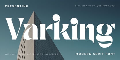 Varking font is perfect for many of your projects like logos & branding, photography, invitations, watermarks, advertisements, product designs, stationery, wedding designs, labels, product packaging, special events and much more.
 - Garked by Linecreative,
$16.00 Garked is a font typeface inspired by ancient nordic runes, you want to customize a logo, brand or other design with ethnic or tribal style, this font is perfect for your choice. What you get, you will get: 1. Garked – Clean San serif font including Uppercase & Lowercase (ALL CAPS) characters, 2. Numbers and Punctuation 3. Support Multi language (Western Europe Latin)
 - Paris by kapitza,
$99.00 Walking around Paris looking for inspiration for our latest people font, we encountered chic Parisians, yummy food markets, and bakeries on virtually every street corner with delicious baguettes and pastries. We were surprised how many people were cycling, motorcycling and rollerblading along the vast boulevards and side streets of Paris. We spotted classic French cars like the 2CV and Citroën CX and watched the world go by in one of the many sidewalk cafes whilst enjoying a 1664 or a café crème. With our latest people font, Paris, we tried to capture this unique Parisian atmosphere and hope we succeeded. All 64 illustrations are based on photographs taken on location over a period of time. The photographs are then hand traced to create high quality, detailed silhouettes.
 - Lark by Shana Hu,
$20.00 Lark is a modern calligraphic sans inspired by a rich history of broad-edge and translation contrast calligraphy. By combining its sharp geometry with flared curves, Lark exhibits a nice warmth as a display face. Lark was initially conceived as a final project as part of the Type@Cooper West Extended Program's post-graduate certificate program in typeface design, so its journey has benefitted from routine feedback from experienced typeface designers. Comes in Bold, Medium, Regular, and Light weights for both roman and italic, and supports multiple languages including Danish, Dutch, English, French, German, Italian, Portuguese, Spanish, Swedish, and more.
 - Parus by VladB,
$20.00 Parus is a impacted modern sans serif geometric font, includes upper and lower case characters, Latin, Cyrillic, Latin Eastern Europe, Turkish, Baltic and other. The Parus family consists of 8 fonts, divided into 2 subgroups (according to the type of style - St, Obl), and have the 4 types of thickness in each subgroup. Parus fonts will be useful in a word processing, developing a brand, creating posters and other graphic products.
 - Pask by Valentino Vergan,
$16.00 Pask is a retro inspired variable font family. Pask has a high-contrast and a thin hairline, this gives the typeface a bold and retro look. Pask comes with standalone fonts and a variable version, the variable version allows you to adjust the width and slant. Pask can cover a wide range of project such as: branding, mastheads, magazines, logos, blog posts, quotes, product packaging, advertisements and much more. WHAT YOU GET: Pask - Condensed Pask - Condensed Oblique Pask - Semi Condensed Pask - Semi Condensed Oblique Pask - Regular Pask - Oblique Pask - Semi Expanded Pask - Semi Expanded Oblique Pask - Expanded Pask - Expanded Oblique I hope you enjoy using the Pask typeface.
 - Ark by Fenotype,
$25.00 Let Ark, an Art Nouveau-infused high-contrast serif, transport your designs into the realm of elegant psychedelia. Ark draws deep inspiration from Heinz Keune's Edda, a remarkable design from 1900. While its vibe might evoke the groovy 70s and the mesmerizing world of trippy album covers, Ark transcends any assumed historical shabbiness. It trims the style into a refined and neatly cut serif, suitable for gallery-worthy presentations, all while maintaining a strong and unmistakable connection to its original roots. The standard letters of Ark maintain a respectable demeanor, only scratching the surface of the font's psychedelic potential. To truly unlock its full potency, try the Swash or Stylistic Alternates, or dig for even more Alternates from the Character palette. Needless to say, that Ark is a natural match for anything trendy, artsy, wierd and fun.
 - Parks Department JNL by Jeff Levine,
$29.00 A WPA (Works Progress Administration) sponsored Water Carnival taking place in Central Park in the 1930s had "Department of Parks, City of New York" in the thin Art Deco hand lettering which is now available as Parks Department JNL.
 - Park Avenue Script by Linotype,
$29.99Park Avenue is a lighthearted contemporary script designed by Robert E. Smith in 1933 for American Type Founders. This unique design has small x-height lowercase letters with very long ribbon-like ascenders. Park Avenue is a good design for occasional pieces such as invitations and menus. - Fenway Park JF by Jukebox Collection,
$32.99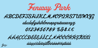
- Echinos Park Script by Mans Greback,
$59.00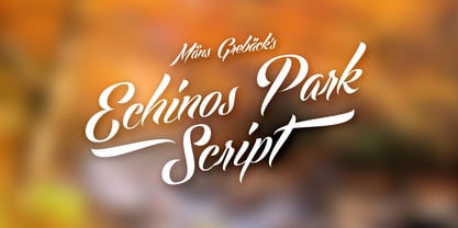
- Borough Park JNL by Jeff Levine,
$29.00 Borough Park JNL is named for a neighborhood in the southwestern part of the borough of Brooklyn, NY and was modeled from hand lettering found on vintage sheet music.
 - Central Park JNL by Jeff Levine,
$29.00 The beautiful Art Deco monoline pen lettering on the cover of a 1940s piece of sheet music inspired Central Park JNL. The 1940s was an era when couples took romantic walks along the pathways of Manhattan's Central Park or rode around it in hansom cabs. Big bands played at the major clubs and ballrooms and "uptown" meant the well-to-do. Men dressed in their tuxedos and top hats and the ladies were in their jewels and evening gowns.
 - National Parks JNL by Jeff Levine,
$29.00 National Parks JNL was based on a 1930s WPA (Works Progress Administration) poster where the word "National Parks" was hand lettered in an unusual and eclectic Art Deco style. Bold and non-conformist, the typeface is available in both regular and oblique versions.
 - Jackson Park NF by Nick's Fonts,
$10.00Handlettering in an ad from the 1920s for a Chicago engraving company provided the inspiration for this fine, fat, flowing face, full of fun and antique charm. Both versions of this font include the complete Unicode 1252 Latin and Unicode 1250 Central European character sets. - No Parking JNL by Jeff Levine,
$29.00 No Parking JNL was inspired by a hand-cut stencil of those words painted in an area of a department store's parking lot.
 - Park Slope JNL by Jeff Levine,
$29.00 The free-form geometric shapes of the lettering on a vintage piece of sheet music entitled "Four Pictures" is the basis for Park Slope JNL, named for a neighborhood in Brooklyn, New York.
 - Waite Park JNL by Jeff Levine,
$29.00Waite Park JNL is based on the smallest of the die-cut letters and numbers contained in the Webway Sign Cabinet - once manufactured by the Holes-Webway Company of Minneapolis, Minnesota. The largest of the set's sizes (2 inch) was the model for Sign Kit JNL, the medium size (1-1/8 inch) was used to make Sign Production JNL and this font is a version from the 3/4 inch size. Each size of alphabet and numerals have their own unique characteristics, although they all follow the same basic font style, which is reminiscent of classic Art Deco-era sanserif typefaces. The name Waite Park JNL was derived from a division of Holes-Webway that (for some reason lost to time) distributed their sign kits under the name Waite Park Sign Company, located in the Minnesota city of the same name. - Park West JNL by Jeff Levine,
$29.00 The thin, stylish Art Deco slab serif lettering featured on the cover of the 1934 sheet music for “Then I’ll be Tired of You” inspired the digital type face Park West JNL, which is available in both regular and oblique versions. Central Park West has always been the upscale area for affluent New Yorkers, but in the Great Depression years of the 1930s the mystique of the well-to-do held an even stronger significance.
 - Prospect Park JNL by Jeff Levine,
$29.00 Prospect Park JNL was inspired by inline lettering found on some vintage sheet music from the Art Deco era entitled "By My Side". The font's namesake is located in the Crown Heights section of Brooklyn, NY. Prospect Park is famous for its zoo as well as its tree lined paths, historic carousel and the expansive park area.
 - Trailer Park Numerals by Coniglio Type,
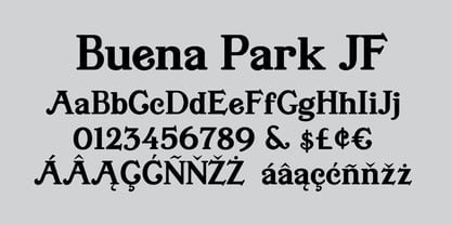
$9.95Trailerpark numbers 0-9 were rather old fashioned 1950's cut aluminum numbers, you've seen digitized nowhere else but here! Part of Market LTD, a collection of limited faces, mostly alpha-numeric and some just plain numeric, used primarily in retail and display situations and titling. - Buena Park JF by Jukebox Collection,
$32.99