4,136 search results
(0.021 seconds)
- Bhiver by Maculinc,
$14.00 Bhiver is a san serif font with an angled and curved style in every corner, we made it with a display style that is perfect for making product packaging such as: Coffee Packaging, Ice Cream Packaging, Beauty Packaging, and for Brochures, Templates, Social Media Post, and etc. Bhiver is also equipped with Swash which you can access according to what we have provided, form sentences as you like by combining Swashes to make it look more attractive like the example that I have previewed.
 - SS Vortax by Sharkshock,
$100.00 SS Vortax is a space-age themed display sans featuring broad strokes and tight spacing. This close relative of Galaxus features imposing Capitals with some sharp slants in the Italic version. It’s designed to cover horizontal blocks effortlessly. Most characters have curves on the exterior with right angles on the interior. This dynamic contrast makes it a great choice for a video game/app, toy packaging, or sports logo. SS Vortax is equipped with European accents for international support. Please check glyph maps for all supported characters.
 - Hildegard by Linotype,
$29.99Hildegard is a sans serif text face that works well in both larger and smaller point sizes. On close inspection, one will discover a world of subtle angle variation within the letters' structure that is loosely inspired the stroke movements one uses in calligraphy. These built-up strokes create visible ink traps at many joints, which in smaller sizes play a functional as well as an aesthetic role. The Hildegard typefaces received one of several awards in the 2003 International Type Design Contest, sponsored by Linotype GmbH. - Tabac Big Glam by Suitcase Type Foundry,
$39.00 Tabac Big Glam probably stretches the Tabac super-family’s boundaries the furthest. While it’s based on the serif version, it achieves an especially surgical cleanliness and extremely sharp typesetting by completely letting the serifs go. Despite this, the text isn’t boring for a moment — the angled cut of the stems on b, d, h, k, l, the open loop on g or the rounded variant of the italic y, which can be called by turning on the stylistic set, reliably banishes any suspicions of the letters’ monotony.
 - Black Damon by Zeptonn,
$5.00 Looking for a big, bold and curvy font? Here’s Black Damon! She is a hand-drawn typeface with explicit curves and angles that still retains softness and has a handcrafted feel. All glyphs are handcrafted by illustrative designer Zeptonn. She might not be your best friend for body text, but still, she won't hesitate to perform well under pressure. She will make an interesting yet unusual partner for headlines. Awesome and distinctive in use for titles, displays and fresh illustrations. Prepare to make a statement!
 - Tecnica by Graviton,
$20.00 Tecnica font family has been designed for Graviton Font Foundry by Pablo Balcells. It is a modular, geometric, sans serif typeface with a slightly condensed design and subtle rounded angles. It has been conceived to be most suitable for all sized headlines, as well as short and middle length text blocks. The standard styles give texts a classic appearence while alternate styles give texts a playfull one. Tecnica consists of 4 styles, 2 weights plus alternates, each containing small caps and glyph coverage for several languages.
 - Tapa by Eurotypo,
$18.00 Tapa is a classical old roman typeface family which has been cut with sharp serif; Its stems, proportions, serif and elegant angles, may induce into a new view of the "Old roman faces" by our contemporary digital age. The kerning pairs were carefully controlled to ensure a good readability and nice page tone contrast. The Tapa font family is completed with true italics (without compression). And enriched with a full set of OpenType features containing ligatures, discretional ligatures, old style numerals and swashed letters.
 - Super Drift by Mevstory Studio,
$15.00 Super Drift consists of a racing style with sharp lines with a verified tilt angle that will emphasize a modern and sporty style. Super Drift very suitable for automotive magazine covers, racing game covers, logos & branding, product design, labels and so on. What’s Included Super Drift 3D Super Drift Ragular Super Drift Line Standard glyphs Works on PC / Mac Simple installations Accessible in the Adobe Illustrator, Adobe Photoshop, Adobe InDesign, even work on Microsoft Word. Thank you for your purchase! Hope you enjoy with our font!
 - Bong God by Loaded Fonts,
$7.50Following rules, perhaps too closely. The first full font created by Ray Mullin who strongly believes a font need not be pretty to be valid. Each capital shares similar angles, as does each lowercase, making for a typeface only a mother could love. The rounded style was the true inspiration for the original, but logically it had to come second. Based entirely around Bong God but losing the harsh edges to become a usable futuristic type. Legible, but not readable, recommended in small doses. - Submariner by Type Fleet,
$- Submariner waterproof sans serif technology Submariner is a waterproof type family that displays the right amount of power and character on every depth level. Thanks to its strong and humanistic construction, it can endure great information pressure. It is a marvelous typographic experience. The letter construction is more open and endings are slightly wider. It is suitable for longer texts, information graphics, annual reports and signalization. The typeface’s x-height is exactly 70% of its capitals. The italics are designed at a 9° angle.
 - Lauderdale JNL by Jeff Levine,
$29.00 It was a series of three different forts on various spots on the New River built during the Second Seminole War [in Florida] named for Major William Lauderdale. It was launched as the college students' spring break destination for many years thanks to the film "Where the Boys Are". It's the major city 23 miles North of Miami. But wait! There's more! Now it's an eclectic Art Deco-inspired typeface. Lauderdale JNL is based on vintage source material with many unusual letter shapes and angles.
 - Square Slabserif 711 by Bitstream,
$39.00A contemporary revival of early 20th century fonts, the Square Slabserif 711™ typeface family from the Bitstream library is perfect for contemporary print and interactive design projects. Its geometric structure of right angles and opposing round corners are ideally suited to current imaging devices. An added benefit is that they also give the design an enduring industrial strength demeanor. Available as three weights with relatively condensed proportions, the Square Slabserif 711 family will surely be a valuable addition to any professional collection of fonts. - Drakalligro Sans by G3 Typefaces,
$- This typeface was inspired in my dragon drawings, I like dragons and I thought in designing a special font with that inspiration. As the picture tells it, I gave a beveled shape to its terminals, looking like brush traces. Some characters are intentionally opened to give it a distinctive appearance. The number "3" has a different form, combining a wide angle and an opened circle, variating the way to make it. This font is special for some titles and it can even be used in comic dialogues.
 - Submariner R24 by Type Fleet,
$- Submariner R24 diving sans serif experience Submariner R24 is a modification of the Submariner type family. It still holds pleasant humanistic construction, but now the letters are easier. Rounded corners enhance the typeface’s sophistication and broaden its usability. It is a remarkable typographic discovery. The letter construction is more open and the corners are rounded. It is suitable for longer texts, information graphics, signalization, headers and decoration. The typeface’s x-height is exactly 70% of its capitals. The italics are designed at a 9° angle.
 - Bankal by Hugo Kuder,
$10.00 After a few months my new typeface "Bankal" is here! To create it, I always tried to keep a 90 degree angle. In French when you say that something is "bancal" it means that it's not right. This is why I choose this as a name because despite the name she is right. And for the K it's just for the style here. Bankal is a sans-serif font with 3 variations (bold, regular, light) Check more on my website : https://www.hugokuder.com/ or my instagram : hugokuderdesign
 - Gastromond by James Todd,
$40.00 Gastromond began about five years ago with a question: why are fat faces always based on Didot or Bodoni models? Was there a reason that the stresses of these display faces was always vertical or horizontal and never angled? It was time to find out. Gastromond is meant to blend the Renaissance stylings of the Garamond types with the Victorian outlandishness of the fat faces. The result is an emphatic take on a classic genre. Loaded with swashes and alternates, Gastromond has enough character to go around.
 - Shallot by Eko Bimantara,
$24.00 Shallot is a serif font family with sharp and exquisite characteristic. The initial letterforms are made not completely based on calligraphic strokes, which make it more likely close to transitional serif style. The letterforms have high contrast strokes and sharp serif with curved brackets. The upright styles have a fairly wide proportion. The italic styles have 12 degree angle and redrawn lowercase letters. Shallot consist of 4 styles from regular to extrabold with each matching italics. It contains 462 glyphs that support broad latin languages.
 - Sierra by Linotype,
$29.99Sierra is an antiqua with a high x-height and generous, open counters. Many curves of the letters are almost right angles, which was particularly suited to the Digiset machines from Dr. Ing. Rudolf Hell, Kiel. The forms of Sierra with their flowing stroke contrast and half serifs have a calligraphic touch, which is especially highlighted in the italic weights. This is a graceful text type and its bold weights look almost like woodcuts. Sierra is an excellent choice for both texts and headlines. - BB Strata (Pro) by Bold Studio,
$49.00 BB Strata™ (Pro) is the first font with only octagon angles (±45°), polyspacing (same width in every weight), optical shape and monoline variants for any type of use. The ideographic system was created for an exhibition in 2015 to visualize the process and results of scientific investigations in a historical and contemporary context. ● 9 Variants (incl. SS19, SS20) ● 37 Opentype-Features/Style ● 60 Stylistic Sets (20/Variant) ● 90 Styles (incl. SS19, SS20) ● 40 OT-Features/Style ● 97 Languages Support ● 31,920 Glyphs (1064/Style)
 - Thrusters by Typodermic,
$11.95 Welcome to the world of Thrusters—the angular, twin-line display typeface inspired by the timeless classic, Space Duel. Thrusters is the perfect way to bring the retro, arcade vibes to your designs! This bold and futuristic typeface is the ultimate tribute to the iconic arcade legacy, and it’s available in four different forms that can be used as layers to create stunning multicolor effects. Whether you’re creating a high-energy video game title screen, a promotional poster for a local arcade, or even a custom t-shirt design, Thrusters has got you covered. With its sharp angles and sleek curves, Thrusters is sure to turn heads and capture attention. It’s the perfect way to add some excitement and nostalgia to any design project. So what are you waiting for? Blast off into the world of retro gaming with Thrusters today! Most Latin-based European writing systems are supported, including the following languages. Afaan Oromo, Afar, Afrikaans, Albanian, Alsatian, Aromanian, Aymara, Bashkir (Latin), Basque, Belarusian (Latin), Bemba, Bikol, Bosnian, Breton, Cape Verdean, Creole, Catalan, Cebuano, Chamorro, Chavacano, Chichewa, Crimean Tatar (Latin), Croatian, Czech, Danish, Dawan, Dholuo, Dutch, English, Estonian, Faroese, Fijian, Filipino, Finnish, French, Frisian, Friulian, Gagauz (Latin), Galician, Ganda, Genoese, German, Greenlandic, Guadeloupean Creole, Haitian Creole, Hawaiian, Hiligaynon, Hungarian, Icelandic, Ilocano, Indonesian, Irish, Italian, Jamaican, Kaqchikel, Karakalpak (Latin), Kashubian, Kikongo, Kinyarwanda, Kirundi, Kurdish (Latin), Latvian, Lithuanian, Lombard, Low Saxon, Luxembourgish, Maasai, Makhuwa, Malay, Maltese, Māori, Moldovan, Montenegrin, Ndebele, Neapolitan, Norwegian, Novial, Occitan, Ossetian (Latin), Papiamento, Piedmontese, Polish, Portuguese, Quechua, Rarotongan, Romanian, Romansh, Sami, Sango, Saramaccan, Sardinian, Scottish Gaelic, Serbian (Latin), Shona, Sicilian, Silesian, Slovak, Slovenian, Somali, Sorbian, Sotho, Spanish, Swahili, Swazi, Swedish, Tagalog, Tahitian, Tetum, Tongan, Tshiluba, Tsonga, Tswana, Tumbuka, Turkish, Turkmen (Latin), Tuvaluan, Uzbek (Latin), Venetian, Vepsian, Võro, Walloon, Waray-Waray, Wayuu, Welsh, Wolof, Xhosa, Yapese, Zapotec Zulu and Zuni.
 - Behrensschrift iF Plus by Ingo,
$29.00 Peter Behrens’ renowned art nouveau type from 1902 – with ornaments. Newly revised and neatly digitalized by Ingo Zimmermann In 1902, Peter Behrens (1869–1940), architect, designer and typographer, created a new ”German“ type which became very successful very quickly for the Rudhard’sche Gießerei (foundry which later became Gebr. Klingspor AG) in Offenbach am Main. It served, for example, as the official German type for the world expositions in 1904 and 1910. Behrens himself writes about the development of this type ”...For the actual form of my type, I took the technical principle of the Gothic script, the stroke of the quill feather. The proportions of height and width and the boldness of the strokes of the Gothic letters were also decisive for me in producing a German character. A cohesive character could be hoped for by avoiding all non-necessities and by strictly carrying out the design principle of holding the quill at an angle…“ By the way, when “long s” is activated, the typographically correct “round s” is automatically placed at the end of the word so that you need only pay attention to the correct s on syllable endings within words. When using “long s,” you must ensure the correct use of the rules for the Fraktur font: “round s” is always at the end of the word, also in compound words. For those of you who want to be even more correct, read the corresponding article in >> Wikipedia. Peter Behrens also drew matching ornaments for his typeface – we have likewise carefully revised these decorative touches and arranged them into a font. The "Behrens-Schrift" fits best on all topics that have something to do with art history or the time around 1900.
 - As of my last update in early 2023, "Tech Angels" is not a widely recognized or specific font within major font repositories or among popular design resources. However, the idea evoked by "Tech Angel...
- Irrlicht by Aarhaus,
$30.00 Irrlicht is based on C. H. Kleukens’ 1923 typeface Judith Type . Whilst Dunkle Irrlicht is a fairly faithful rendition and extension of Kleukens’ typeface, the Licht style was initially added as a stand-alone stencil version; yet, the two styles work perfectly together – for different nuances, for emphasis or simply stacked/layered. Irrlicht is equipped with upper- and lowercase ligatures, contextual and stylistic alternates, fractions, superior and inferior figures, extended language support and a few extra goodies. Additional information – How Irrlicht came to life Christian Heinrich Kleukens cut his Judith Type in 1923, at the peak of German expressionism, exclusively for publications with the Ernst-Ludwig-Press, such as a limited series of biblical prints – the first being the Book of Judith , hence the original’s name. I stumbled upon this typeface a couple of years ago in a nice little 1930 booklet of the Gutenberg-Gesellschaft and was struck by its forceful darkness on paper and its seemingly simple, crude letterforms. The lack of a long-ſ in the final version of Judith Type – quite unusual for a German typeface of that time – adds to this feel of crudeness and spontaneity*. Judith Type seemed to me like a semi-blackletter cousin of Rudolf Koch’s typeface Neuland (cast in the same year). Besides its apparent affinity with expressionism, it reflects a lot of that deeply spiritual craftsmanship of the era – much like Neuland. A few months later, when I was working on a stencil project and looking for a typeface that could be cut into thin wooden plates easily, I remembered those dark, sharp letters that seemed to be lacking any curves at all. After enlarging a few letters and tracing them by hand, the whole set was redrawn digitally, using only straight lines. As for spacing, the goal was to keep the letters tight but to avoid touching characters – without ironing out all the original’s tension and rhythm. Deliberate kerning, subtle contextual alternates and ligatures help to deal with critical glyph combinations. Two additional versions were developed: a stencil version with open counters and, in reference to a popular style of the 1920s and inspired by dry, cracked wood, an inline version. These two additional styles were later merged into one font – Lichte** Irrlicht was born. — AARHAUS * Consequently, the original typeface’s German eszett is simply a ligature of the “round s” and standard z . In some of his publications, Kleukens dispenses with using eszett altogether and sets double s instead. Irrlicht , however, does feature a more common eszett (ß); the original, among other more faithful letter forms, can be accessed via the stylistic sets feature ** licht – literally bright – being the German term for inline typefaces – not to be confused with leicht ( light )
 - Doublethink by Barnbrook Fonts,
$30.00 Doublethink was developed from lettering drawn in the 1960s by Vinko Ožić-Pajić and used on the shop fronts of Yugoslavian state-owned clothes company Standard Konfekcija. The original design has been reinterpreted and expanded and is offered as a two weight typeface—Doublethink Medium and Doublethink Bold Inline. Standard Konfekcija was established first as a military fabric company and later became the premier fashion brand outlet in the Communist state of Yugoslavia. It is famous for being the first shop in the country to offer plastic bags (Standard Konfekcija stores ceased trading after the fall of Communism).
 - Hometona Script by Lettersams,
$17.00 Hometona Script is an lovely script font that features alternative styles and ligatures that are very eye-catching and is perfect for branding, wedding invitations, and other romantic projects. To activate the OpenType Stylistic alternative, you support programs that support OpenType features such as Adobe Illustrator CS, Adobe Indesign & CorelDraw X6-X7, Microsoft Word 2010 or later. All the features and special characters of this font are included in one file. If you need help or have any questions please let me know or send an email "lettersams@gmail.com" I'm happy to help :) Thanks & Happy Designing!
 - Adelios by Ilham Herry,
$20.00 Adelios is a display typeface with 12 styles that can stand alone or with layering system. There are 6 styles that can stand alone: Outline, Base 01, Inline, Block, Wireframe, and Monoline, and also allows for mix and match to make this font more decorative by adding Outline, Extrude, Line, Cast, Light, Bottom. Traveling posters, movie theater sign, and Building art deco were the main inspiration for this font. Geometric and decorative shapes are the main characteristics of this font. This font is perfect for Headline, Poster, Signage, Menuboard, Greetingcard, etc. Hope you enjoy with this font.
 - Mini Honysa by Gatype,
$14.00 Mini Honysa, This Font is a modern look perfect for branding, invitations, stationery, wedding designs, social media posts, a dvertisements, product packaging, product designs, labels, photography, watermarks, special events and more. Mini Honysa is encoded with PUA Unicode, which allows full access to all additional characters without having to design any special software. Mac users can use Font Book, and Windows users can use Character Map to view and copy any additional characters to paste into your favorite text editor/app. You need a program that supports Adobe Illustrator CS, Adobe Indesign & CorelDraw X6-X7, Microsoft Word 2010 or later.
 - Bloody Ichor by Attype Studio,
$13.00 Bloody Ichor is a delicate and fun display dripping blood for Halloween layered display Font. Combine it with Bloody Ichor - Extrude to make an amazing 3D effect on your letter! Bloody Ichor perfect for halloween promotion, branding, logo, invitation, stationery, social media post, product packaging, merchandise, blog design, game titles, cute style design, Book/Cover Title and more. What's Included : - Multilingual Support - Made it into separated file to make it easier to use by beginner & separated file user can use the font with software which doesn't accept open type features. --- Hope you enjoy with our font! Attype Studio
 - Day And Collins Logotypes by Jeremia Adatte,
$20.00 Please Note: as this is a picture-only font, there are no latin alpha/numeric glyphs. Each wood type manufacturer had their own selection of original Logotypes or Catchwords designs. These are taken right from the original source material, an extremely rare 1910 catalog of an English wood type maker called Day & Collins in London. As the name says it, these words are intended to attract attention, to spice up posters, packaging or advertisement designs. I made these available for the digital age, leaving the original texture of printed wood type at the highest detail possible.
 - Sely Soliya by Gatype,
$12.00 Sely Soliya, This Font is a modern look perfect for branding, invitations, stationery, wedding designs, social media posts, advertisements, product packaging, product designs, labels, hotography, watermarks, special events and more. Sely Soliya is encoded with PUA Unicode, which allows full access to all additional characters without having to design any special software. Mac users can use Font Book, and Windows users can use Character Map to view and copy any additional characters to paste into your favorite text editor/app. You need a program that supports Adobe Illustrator CS, Adobe Indesign & CorelDraw X6-X7, Microsoft Word 2010 or later.
 - Yasminda by Attype Studio,
$16.00 Yasminda is a layered script font with versatile style and use it to create spectacular designs Combine it with Yasminda - Extrude to make an amazing 3D effect on your letter! Yasminda perfect for wedding promotion, branding, logo, invitation, stationery, social media post, product packaging, merchandise, blog design, game titles, cute style design, Book/Cover Title and more. What's Included : - Multilingual Support - Made it into separated file to make it easier to use by beginner & separated file user can use the font with software which doesn't accept open type features. --- Hope you enjoy with our font! Attype Studio
 - Taberna by Latinotype,
$49.00 Taberna is a type system that provides a wide range of choices for any design project. The typeface comes in Sans and Serif layered versions plus a monolinear Script font. Taberna is the result of having explored design trends in bar signage, liquor packaging and street wear. Taberna is a funny display font with a Sans version—that provides a more clean and simple design—and a Serif one, which gives text a more distinctive and sombre personality. The Script version matches perfectly with the heavy Caps of the typeface. Taberna is a very versatile font well-suited for headlines, posters, logotypes, etc.
 - Ceglosia by RCKY Studio,
$15.00 Ceglosia is a modern calligraphy design, including Regular. This font is casual and beautiful with swash. Carefully designed to work together in harmony making it perfect for wedding favors, book covers, greeting cards, logos, branding, business cards and certificates, even for any design work that requires formal or extravagant. Ceglosia includes changes in OpenType stylistics, binding, and international support for most Western languages. To enable the OpenType Stylistic alternative, you need a program that supports OpenType features such as Adobe Illustrator CS, Adobe Indesign & CorelDraw X6-X7, Microsoft Word 2010 or later. How to access all alternative characters using Adobe Illustrator:
 - Sumply by Martin Gnadt,
$14.99 Sumply is a multi-layered type family based on geometric forms. A monospace display typeface which comes as a family of four. It is equipped with OpenType features and contextual alternatives to create a versatile and fresh output. Sumply initially was designed to be used in personalization processes in digital printing. By choosing the basic geometric cut (FOUR), patterns and various graphic elements can be created just by importing text variables into the indesign data merge. If combined with the other cuts the possibilities are sheer endless. Sumply was selected to be in the 2016 edition of Typodarium.
 - Victorian Supremacy by Burntilldead,
$14.00 With over a year of design and development, Victorian Supremacy is ready to help you and your clients make a statement by adding elegance and unique flair to your next design project. Victorian Supremacy inspired by letterheads from the late 1800's and early 1900's. Set includes four major styles and layered version (gradient, outline & extrude). Victorian Supremacy offers an expansive set of options, making it the perfect choice for books, magazines, packaging, branding and signage. From period style and Victorian to modern and elegant, Victorian Supremacy is strong and stately, yet elegant and decorous.
 - WL Circuits Circuits by Writ Large,
$12.00 This decorative tech typeface is inspired by the printed circuits boards of the twentieth century. Its default character set suggests commercially manufactured circuits while the OpenType alternates give more of a home-brew feel. The font is ideal for technical decorative titles in subjects as diverse as computers, techno music, ham radio, or “maker”-culture communications. It works well in large-type posters, logotypes, video games, album covers, or advertising. The OpenType font contains nearly 100 discretionary ligatures to give a varied appearance, along with several alternate cuts of common characters and ten electrical components (accessible as OpenType stylistic alternates).
 - Hadhelia Script by Picatype,
$14.00 Hadhelia Script is modern calligraphy design. This font is casual and pretty with swashes. Can be used for various purposes. such as logo, product packaging, wedding invitations, branding, headlines, signage, labels, signature, book covers, posters, quotes and more. Hadhelia Script features OpenType stylistic alternates, ligatures and International support for most Western Languages. To enable the OpenType Stylistic alternates, you need a program that supports OpenType features such as Adobe Illustrator CS, Adobe Indesign & CorelDraw X6-X7, Microsoft Word 2010 or later versions. If you need help or have any questions, please let me know. I'm happy to help. Thanks & Happy Designing!
 - Better Hobby by Letterhend,
$17.00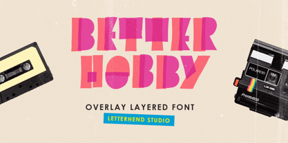 Introducing, Better Hobby - A unique overlay layered display font. This font has unique shape, very suitable for casual and playful theme design. This font also perfectly made to be applied especially in logo, and the other various formal forms such as invitations, labels, logos, magazines, books, greeting / wedding cards, packaging, fashion, make up, stationery, novels, labels or any type of advertising purpose. Features : numbers and punctuation multilingual PUA encoded We highly recommend using a program that supports OpenType features and Glyphs panels like many of Adobe apps and Corel Draw, so you can see and access all Glyph variations.
 - FeggoliteHatched by Ingrimayne Type,
$4.95 The name FeggoliteHatched comes from the fact that it was created with the help of an old font manipulation program called Incubator Pro. It was an attempt to create a more conventional typeface from the odd monospaced font, FeggoliteMono. As a monospaced font, FeggoliteHatched could be considered a typewriter face, but no typewriter ever produced letters like these. The original version from 1994 is now the italic style and it has a leftward or back slant. The upright or plain version was added much later, in 2018. There is also a choppy upright version included in this family.
 - LP Philharmonia by URW Type Foundry,
$35.99 Peter Schmidt, well-known designer from Hamburg, browsed in a fashion magazine on a return flight from the United States. At that time he was thinking about a logo for a philharmonic orchestra. In the magazine, he noticed some interesting typography. He removed the page from the magazine and sent it later to Peter Langpeter. That was the inspiration for the creation of the logo. Since Peter Langpeter really liked the classic aesthetics of the resulting letters, he developed a whole new alphabet of it. Initially, only capital letters. Now he has completed this exceptionally beautiful font.