10,000 search results
(0.085 seconds)
- Miarlem by Pen Culture,
$15.00 Miarlem is a modern calligraphy font that perfect for branding, wedding, apparel and many other. This font comes with gorgeous uppercase and lowercase, punctuation, multilingual language. This font also equipped with beautiful beginning and ending tail and ligature which will be perfect for your design project. I really hope you enjoy it - please do let me know what you think, comments & likes are always hugely welcomed and appreciated. More importantly, please don't hesitate to drop me a message if you have any issues or queries. Thank you
 - ITC Mister Chuckles by ITC,
$29.99Round, firm, and bursting at the seams with good humor, ITC Mister Chuckles is based on the premise that barrel shapes have pleasant associations. Think: beer-barrel polkas, a barrel of fun, or a barrel of laughs, and you'll get the idea. Designer Nick Curtis has combined sans serif sturdiness, a hint of 1930s deco and a handful of giggles in this remarkably versatile all-cap face. If the typographic occasion calls for mirth and merriment, invite Mister Chuckles to the party. You'll have more fun than a barrel of monkeys! - Arise by Monotype,
$30.00 Arise is a humanist typeface designed for both text and display purposes. Its an understated type family with enough subtle nuances and personality to add distinction to your own typographic compositions. As can be seen in the /a/c/f/g/r/y/ glyphs, hooked terminals are a key feature of this typeface. These terminals are blade-like in appearance, defining a distinctive character that is unusual, yet balanced and refined. Practical features include 38 capital swash alternates for intial and final forms that can be particularly effective when used in titling and branding situations. Small caps are also included (along with matching diacritics) – these are designed to harmonise with regular lowercase forms so that you may easily achieve unicase-style typography. There are 18 fonts altogether, with 9 weights from ExtraLight to Ultra in both roman and italic. Arise has an extensive character set that covers all Latin European languages. Key features: 9 Weights Roman & Italic Small Caps 38 Alternates Old Style Figures European Language Support (Latin) 700+ Glyphs per font.
 - Hamlet by Canada Type,
$24.95Based on a specimen of an obscure and uncredited old face called Kitterland, Hamlet is one of those curiosities hardly ever noticed in the world of modern fonts, the kind that infuses a variety of historic Blackletter and calligraphy traits in an otherwise Roman alphabet. Such typefaces, what few of them exist, are almost always classified by typophiles as traditional decorative Roman alphabets. We beg to differ. We think such hybrids are fascinating enough to deserve a classification of their own. And we think today's aspiring letterers and type designers would benefit from paying special attention to this kind of hybrid alphabet, not only because it has much more hand than machine in it, but also because it is a prime example of how to succeed in mixing different lettering techniques into one self-contained and distinctly functional alphabet. As in any efficient mixture of lettering methods, Hamlet ended up with characters that are uniquely its own, such as the cupped A, M, V, W and Y, the very luscious and inviting curves on the arms of E, F, L and T, both single- and double-story forms of the a, and the humblest, friendliest g and y ever. A dozen alternate characters are sprinkled throughout the character set, so check out the map for a few pleasant surprises. We also made the Handtooled and Headstone styles because we thought these friendly forms were just crying out for such treatments. The Handtooled version turned out quite lovely, if we may say so ourselves, perhaps even better than the main font. The Headstone version is available as a free bonus to those who purchase the complete Hamlet package. All Hamlet styles come with lining figures as well as old style ones. Hamlet comes in all popular font formats. The OpenType fonts contain push-button swapping alternates and figures, which come in handy in software programs that support this kind of thing. - Sogia by Kaer,
$19.00 Introducing my new modern Renaissance serif typeface Sogia. Vintage font with unique thin line decoration elements. Perfect to use in any fashion labels, glamour posters, luxury identity, etc. What's included? * Regular style * Uppercase and lowercase * Numbers * Symbols * Ligatures * Punctuation * Multilingual support I hope you enjoy this font. Follow my shop to receive updates of products and the very hottest news! If you have any question or issue, please contact me: kaer.pro@gmail.com Please request to add additional characters and glyphs if you need! Thank you!
 - Leakpaint by Andrew Tomson,
$10.00 Hello friends! Drawing is a great way to pass the time. Sometimes, clumsy people can spill paint on paper or on an already completed drawing. What do we end up with? A ruined drawing or a new work of art? I think the latter. After all, every drawing is unique and a unique thing. Even if you are drawing a stick man! This font presents the opportunity to see what happens if invisible ink is spilled on it. This font is great for your new and unique projects for social media, lettering and just for home use! A little sloppy, a little bouncy, so it's so lively and magical! I wish you good luck and love!
 - Covenante by Harvester Type,
$20.00 Covenante is an antique font that contains futuristic elements that give it an unusual look. Sharp serifs and unusual shapes of ovals, create a solid character and make the font fresh. More language support, ligatures, and alternative characters will increase the font's usability. 450 glyphs, 282 languages of the Latin group, 7 alternative characters, 21 ligatures, a capital set and more than one day spent for kerning-create a great potential for this font. Text, covers, posters, prints, titles, interfaces, web, book covers, packaging, logos, and much more where you can apply this font. If you find an error in the font, kerning, or just want to add something or suggest something, then write to me: bunineugene@gmail.com
 - Mauritius by Canada Type,
$29.95 Ten years or so after his unique treatment of Garalde design with Trump Mediaeval, Georg Trump took on the transitional genre with Mauritius, which was to be his last typeface. He started working on it in 1965. The Stuttgart-based Weber foundry published a pamphlet previewing it under the name Barock-Antiqua in 1967, then announced the availability of the metal types (a roman, a bold and an italic) a year later. The global printing industry was already in third gear with cold type technology, so there weren't that many takers, and Weber closed its doors after more than 140 years in business. Subsequently, Trump’s swan song was unfairly overlooked by typography historians and practitioners. It never made it to film technology or scalable fonts. Thus, one of the most original text faces ever made, done by one of the most influential German type designers of the 20th century, was buried under decades of multiple technology shifts and fading records. The metal cuts of Mauritius seem to have been rushed in Weber’s desperation to stay afloat. So the only impressions left of the metal type, the sole records remaining of this design, show substantial problems. Some can be attributed to technological limitations, but some issues in colour, precision and fitting are also quite apparent, particularly in Mauritius Kursiv, the italic metal cut. This digital version is the result of obsessing over a great designer’s final type design effort, and trying to understand the reasons behind its vanishing from typography’s collective mind. While that understanding remains for the most part elusive, the creative and technical work done on these fonts produced very concrete results. All the apparent issues in the metal types were resolved, the design was expanded into a larger family of three weights and two widths, and plenty of 21st century bells and whistles were added. For the full background story, design analysis, details, features, specimens and print tests, consult the PDF available in the Gallery section of this page.
 - Great Monday by Designova,
$23.00 Great Monday is unique, fresh and beautiful handwritten font for branding / logo design / logotypes / greeting cards / promotional graphics and anything in between. Great Monday is completely handmade with passion, perfection as well as aesthetics at it's level best. Unique Ligatures We have created 14 unique ligatures to make sure the font looks beautiful and professional. Extended Character Sets Along with the basic Latin character set, we have added Western European, Central European, South Eastern European character sets for your convenience. The font contains a total of 336 glyphs. Advanced Kerning We have performed advanced, in-depth kerning for all possible letter combinations. What You Get This font being a handmade typeface, comes with only single weight (Regular). CREDITS: Font designed by Lis at Fontastica, produced by Fontastica, distributed by Designova. Created with ProCreate and Fontself on iPad Pro.
 - Fabrizio by ARTypes,
$60.00 The new Fabrizio™ types, designed by Ari Rafaeli, have made their first appearance in Saggi di Letteratura Italiana: Da Dante per Pirandello a Orazio Costa, by Lucilla Bonavita, printed at Pisa in March 2016 by Fabrizio Serra Editore for whom the type was specially designed. The types are now offered for general sale. Each style (roman, small capitals, italic, semi-bold, bold) contains Cyrillic and ‘polytonic’ Greek letters and letters for many European languages (Czech, Hungarian, Icelandic, Lettish, Polish, Romanian, Serbian, Ukrainian, Welsh etc.), non-kerning fs, long ſ, ligatures and fractions. Alternative forms are supplied in ‘B’ versions of each style. A set of swash letters and sets of superiors, inferiors, fractions and phonetic letters are also offered. Two ‘Special’ fonts (roman and italic) containing special accents, letters for transliteration, Vietnamese letters, mathematics signs and symbols, arrows, commercial signs, pictograms, figures in circles, scansion marks, braces & benzene rings and the Rafaeli-Meruba Hebrew letters, as well as Latin, Cyrillic and Greek letters, are included in the Fabrizio family.
 - Lust by Positype,
$49.00 Lust’s original masters were completely redrawn, expanded, with a new optical size added based on customer requests. Lust now sports 6 fonts, instead of the original 4: Standard, Display, Fine, and complementing Italics. The character set has been expanded as well to include more OpenType features and more swashes. The Lust Collection is the culmination of 5 years of exploration and development, and I am very excited to share it with everyone. When the original Lust was first conceived in 2010 and released a year and half later, I had planned for a Script and a Sans to accompany it. The Script was released about a year later, but I paused the Sans. The primary reason was the amount of feedback and requests I was receiving for alternate versions, expansions, and ‘hey, have you considered making?’ and so on. I listen to my customers and what they are needing… and besides, I was stalling with the Sans. Like Optima and other earlier high-contrast sans, they are difficult to deliver responsibly without suffering from ill-conceived excess or timidity. The new Lust Collection aggregates all of that past customer feedback and distills it into 6 separate families, each adhering to the original Lust precept of exercises in indulgence and each based in large part on the original 2010 exemplars produced for Lust. I just hate that it took so long to deliver, but better right, than rushed, I imagine.
 - Burgues Script by Sudtipos,
$99.00 Burgues Script is an ode to the late 19th century American calligrapher Louis Madarasz, whose legendary pen has inspired schools of penmanship for over 100 years. His talent has caused some people to call him “the most skillful penman the world has ever known.” I use the word ‘ode’ in a colloquially ambitious manner. If I was an actual poet, my words would be about things I desire but cannot attain, objects of utter beauty that make me wallow in humility, or people of enormous talent who look down at me from the clouds of genius. But I don’t write poems. My work consists of letters drawn to fit together, that become an element of someone’s visual poetry. I am the poet’s assistant, so to speak. Once in a while, the assistant persists on what the subject of the poem will be. And occasionally, the poet gives in to the persistence. I hope you, visual poet, find my persistence justified in this case. The two main sources for Burgues were the calligraphy examples shown in Zaner Bloser’s The Secret of the Skill of Madarasz: His Philosophy and Penmanship Masterpieces, and C. W. Jones’s Lessons in Advanced Engraver’s Script Penmanship by L. Madarasz. These two references were the cornerstone for the concept I was trying to work with. I did have to change many of the letters in order to be able to produce digital calligraphy that can flow flexibly and offered the user a variety of options, while maintaining its attractive appearance. To this end, many ligatures and swashes were made, as well as full flourished sets of letters for use at the beginnings or endings of words and sentences. All of this has been tied together with OpenType and tested thoroughly within today’s standard design and desktop publishing software. After working with digital scripts for so long, at one point I thought that Burgues Script would become a bit of a chore to complete. I also thought that, like with most other scripts, the process would regularize itself after a while and be reduced to a mechanical habit. Surprisingly, and fortunately for me, this did not happen. The past holds as many surprises as the future. Madarasz’s method of penmanship was fascinating and challenging to translate into the strict, mathematically oriented language of the computer. It seems that the extremely high contrast of the forms, coupled with the required flow and connectivity of such lettering, will always be hard work for any visual artist to produce, even with the aide of a powerful machine. I can only imagine what steady nerves and discipline Madarasz must have had to be able to produce fully flourished and sublimely connected words and sentences on a whim. When I think of Madarasz producing a flourished calligraphic logotype in a few seconds, and try to reconcile that with the timelines of my or my colleagues’ work in identity and packaging design, the mind reels. Such blinding talent from over a hundred years ago. Burgues is the Spanish word for Bourgeois. In the end, I hope Burgues Script will serve you well when a flourished word or sentence is required for a design project. One of the wonders of the computer age is the ability to visually conjure up the past, serving both the present and the future. With Burgues, you have a piece of “the most skillful penman the world has ever known,” at your service. Burgues received important awards such as a Certificate of Excellence TDC2 2008 and a Certificate of Excellence at the Bienal Tipos Latinos 2008.
 - Replete Sans by Sudtipos,
$49.00 Sudtipos’ new sans serif font Replete is inspired by the mixture of aesthetics and philosophies found on the streets of metropolitan cities the world over. Buildings constructed throughout the twentieth century, including those made in the Art Deco style or influenced by the Bauhaus’s gospel, stand side-by-side as symbols of their time. Typography is one factor that bonds these vistas, and simultaneously further complexifies them. Art deco letters appear on storefronts and signage in Europe’s oldest cities and as remnants of the Golden Age of economic expansion for Latin America. Typography, like architecture, sometimes coexists in perfect harmony, and other times in ideological opposition. But it is these juxtapositions in places such as Shanghai, New York, London, Buenos Aires and Tokyo that shape each city’s identity. Replete is inspired by this mixture. We wanted to create a useful modern sans serif family – a set of 7 weights with playful geometric alternates – that allows you to combine characters including wide-width and filled letterforms. Replete is apt for long texts, and equally, for instances where letterforms can stand together like a cityscape. Replete means full, packed and abounding … it is a sans, it is grotesque, it is geometric and it is Deco. Replete is a new family that has a little of everything we like, equipped with everything you need to design anything you want.
 - Linotype Pisa by Linotype,
$29.99Linotype Pisa is part of the Take Type Library, selected from the contestants of Linotype’s International Digital Type Design Contests of 1994 and 1997. It was designed by Swedish artist Lutz Baar and is a modern text font based on the humanistic Old Face style. The dynamic lines and harmonious proportions make Linotype Pisa a pleasant and legible font. Distinguishing characteristics are the elongated cross strokes of the capital A, B, E, F and P and the slanted cross stroke of the lower case e, typical of Venecian Old Face characters of the 15th century. Linotype Pisa is well-suited to longer texts and headlines. - Aclonica Pro by Stiggy & Sands,
$29.00 Our Aclonica Pro is a strong and modern sans serif typeface with a slight deco/techno essence to it. Clean letterforms and a generous x-height lend to a friendlier feel and easily legible typestyle, while signature swoops and angular tapering stems exude a subtle sensual nature. The SmallCaps and extensive figure sets not only expand the usefulness of the typeface across a wider gamut, but also convey a more serious tone when needed. Opentype features include: - SmallCaps. - Full set of Inferiors and Superiors for limitless fractions. - Tabular, Proportional, and Oldstyle figure sets (along with SmallCaps versions of the figures). - Stylistic Alternates for Caps to SmallCaps conversion.
 - Gineso Soft by insigne,
$29.99 Handcrafted signs line the stoned walkways of old Italy. Some a century old, these often forgotten works of unknown artists remain etched across cities and villages. But now, they make their inviting impressions once again as the inspiration for insigne design’s Gineso Soft typeface. Gineso Soft absorbs the personality of northern Italian posters, headlines and logotypes, providing a type especially nice for signs and titling with its condensed qualities. The font contains matching italics for the the eight weights and three widths. We’ve also included small features along with fractions and superior / inferior characters to broaden your options. Even more, Gineso Soft is ready for all applications and features a large character set for the languages and literature of Europe. So add a soft touch the next time you’re in a tight spot. Add Gineso Soft and make your project a work to be remembered.
 - Rothorn by ROHH,
$35.00 Rothorn™ is a modern, minimalist geometric sans with its own personality derived for subtle design details, such as cut diagonal corners, pointed t, very small contrast and closed aperture. The letterforms give the typeface a lot of charisma, keeping a very minimal, clear and well balanced look at the same time. Its powerful and sharp shapes together with the variety of weights from Hairline to Black make it a perfect choice for headlines and branding. Generous x-height, careful spacing and distribution of weights give it a color and legibility great for long paragraphs of text. Rothorn is a geometric member of a large type system including such families as Montreux Grotesk (Swiss-style grotesk), Lütschine (narrow headline family) and Conthey (narrow headline unicase family). The Rothorn family consists of 10 weights with corresponding italic styles, giving a total of 20 styles. Italic styles were hand drawn to get sharp and fine letter shapes. It includes a 2-axis variable font letting you adjust the weight and italic slant to your exact needs. The family has extended latin language support, as well as broad number of OpenType features, such as, case sensitive forms, ligatures, contextual alternates, lining, oldstyle, tabular and circled figures, slashed zero, fractions, superscript and subscript, ordinals, currencies and symbols.
 - Pellegrie Signature by Krakenbox Studio,
$17.00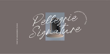 Pellegrie Signature is a fashionable sophisticated signature-style script with its own unique curves and an elegant inky flow.. Its elegant, classy, and modern look makes it a fantastic choice for fashion, signature, album covers logos, branding, magazines, social media posts, advertisement, and many more. Use this display font to add that special cool touch to any design idea you can think of!
 - Sunday Rain by Krakenbox Studio,
$17.00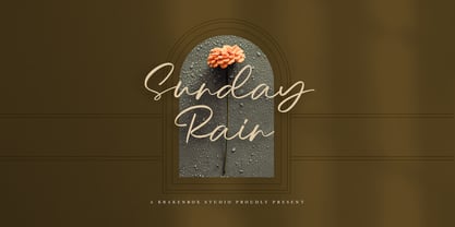 Sunday Rain is a fashionable sophisticated-style script with its own unique curves and an elegant inky flow.. Its elegant, classy, and modern look makes it a fantastic choice for fashion, signature, album covers logos, branding, magazines, social media posts, advertisement, and many more. Use this display font to add that special cool touch to any design idea you can think of!
 - Murs Gothic by Kobuzan,
$- Murs Gothic is a bold sans serif with sharp dynamic forms. It is a collective image of American Gothics from the 19th and early 20th centuries. It is quite massive, has tight letter spacing and increased contrast. Somewhere elongated, as well as asymmetric details give it a characteristic emotionality and playfulness. Especially against the backdrop of neutral geometric sans-serifs. The set comes with 694 glyphs. Among which are Latin and Cyrillic characters, a couple of ligatures, alternatives, geometric symbols, arrows and much more! Murs Gothic consists of 56 styles that are adjustable in weight and width + italics. Or one variable font with 3 axes. This allows it to be very flexible and adapt to many different designs. All styles include an extended set of Latin characters and a basic Cyrillic. A font style Murs Gothic Wide Dark is free for unlimited use. Murs Gothic was designed by Maksym Kobuzan in 2023.
 - Jatiny by Twinletter,
$15.00 Jatiny is a graffiti display that has been carefully developed so that each letter has a distinct personality, allowing you to create a unique impression when you use it. Because we give normal thin and thick variants of this font, your entire project will be simple to complete; also, the graphic presentation in your project will be amazing to all of your readers. Your project will be elegant, professional, and, of course, explosive. This graffiti font is great for product logos, poster titles, headlines, packaging, film titles, logotypes, gorgeous writing, and trendy graffiti designs, among other things. Of course, if you utilize this font in your numerous creative projects, they will be perfect and outstanding. Use this typeface right away for your one-of-a-kind and remarkable projects.
 - P22 Tai Chi by IHOF,
$24.95 Experimental lettering Stephen Rapp created in 1999 became the spark that Stephen's imagination transformed into the Tai Chi design. Tai Chi is a display face but it could also be used as a textured calligraphic script. Its delightful sense of movement distinguishes it from other scripts. Individual characters stand poised in a vertical Zen-like balance while at the same time displaying an inner rhythm that makes them appear to dance along the line. Rich in texture and variation, Tai Chi works very well at medium and large point sizes. The font contains several alternate letters that help maintain a hand-lettered look. Tai Chi includes both upper and lowercase letters but works well in all uppercase settings.
 - Senlot Sans by insigne,
$29.99 Senlot Sans defies convention. A follow-up to the elegant Senlot, Senlot Sans is anything but another sans serif font in search of character. This new member of the Senlot family, while slightly more traditional than its original cousin, confidently boasts more contrast than most sans serifs on the market and even strides smoothly ahead with some of the original Senlot’s calligraphic features. The rich appearance of Senlot Sans contains a complete set of small capitals and nine weights from thin to bold. Unlock its potential even more with titling capitals, superscripts and subscripts, and open style figures. With its broad palate of variables and options, the font covers over 72 Latin-based languages. Simple, elegant, and versatile, Senlot Sans now makes perfect more possible. Put the simplicity of this stunning font to work for you.
 - Athena Signature by Viswell,
$18.00 Athena Signature is an authentic and stylish script font. Not too thin and not too thick, balanced and varied, this font was designed to enhance the beauty of your projects.
 - PB Roman Uncial Vc by Paweł Burgiel,
$32.00 PB Roman Uncial Vc is a font face designed for imitate Roman uncial writing style found in manuscripts from 4th to 5th century. All characters are handwritten by use ink and reed pen (calamus), scanned, digitized and optimized for best quality without lost its handwritten visual appearance. Character set support codepages: 1250 Central (Eastern) European, 1252 Western (ANSI), 1254 Turkish, 1257 Baltic. Include also additional characters for Cornish, Danish, Dutch and Welsh language, spaces (M/1, M/2, M/3, M/4, M/6, thin, hair, zero width space etc.), historical characters (overlined Roman numerals, abbreviations, I-longa, historical ligatures for "nomina sacra" and "notae communes") and wide range of ancient punctuation. OpenType TrueType TTF (.ttf) font file include installed OpenType features: Access All Alternates, Localized Forms, Fractions, Alternative Fractions, Ordinals, Superscript, Tabular Figures, Proportional Figures, Stylistic Alternates, Stylistic Set 1, Historical Forms, Historical Ligatures. Include also kerning as single 'kern' table for maximum possible backwards compatibility with older software. Historical ligatures for "nomina sacra" and "notae communes" are mapped to Private Use Area codepoints.
 - Delik by Typefactory,
$14.00 Delik is an interesting display font inspired by the style and feel of Arabic. This font is suitable for branding logos, Islamic themes, Ramadhan themes, and any other projects you can think of.
 - Budinger Oldstyle by The Ampersand Forest,
$20.00 The Ampersand Forest has its first book family! Budinger Oldstyle is elegant and approachable at the same time, with five different weights, making it a perfect choice for text or display in situations that require a hint of scholarship, fine arts, craft, erudition, and clarity. Budinger Oldstyle has the legibility of a Garalde (like those of Garamond, Manutius, et al.), with a whiff of Venetian revival (after the fashion of Schneidler & Goudy). The letters are arbitrary, with conventions like cupped serifs and leftward stress. It also has a higher x-height than might be expected, to give it an upright posture and openness in the counters. The italic is more compact, with more clearly calligraphic letterforms and conventions like Swash Caps. Its many features include OpenType alternates (a one-story a and g, and a K, R, and Q with elongated descenders), full and true small caps, both standard and discretionary ligatures, oldstyle and lining numerals, and Swash letterforms in the Italic (all capitals and descenders, plus the ascender of the d). Plus, the most adorable pudge of an ampersand you've ever seen!
 - Natasha Walker by Hadiftype,
$16.00 Natasha Walker is Thin sans serif that gives it a high class appeal. Comes in 2 weights, Regular and Bold. The inspiration for this typeface comes from the Art Deco era, feels modern and contemporary. Thick and thin branches are done daintily. Giving this entire font a highly polished look. Perfectly in luxury designs. Also contains 150 discretionary ligatures uppercase characters, giving you a variety of layout options. It’s perfect for fashion and lifestyle themes and even for branding purposes.
 - PGF Now by PeGGO Fonts,
$24.00 Geometric Sans with Humanistic proportions Typeface (Roman a.k.a. ‘Capitalis Monumentalis’), Inspired on vintage minimalism, with a subtle Art Déco air, where the configuration of the basic and open shape (long ascenders/descenders and a moderate ‘x’ height) star a crisp and luminous look, manufactured under an analytical and handmade process as used to be in ancient times. Among its graphic virtues are a special focus on relaxed and fluid reading rhythm while looking clear and sophisticated, an upright version representing a formal voice paired with an Italic with a more expressive vocal tone, easily distinguished as a second quoted content in Editorial and Branding communicational contexts. Equipped with generous stylistic options controlled by OpenType features as: 17 glyphs variations stored as stylistic sets Standard and Discretionary Ligatures Lining and Old Style Numeral forms Tabular forms Superior and Inferior Scientific Numeric Notation Numerators and Denominators for fractional compositions Pre-Composed Fractions, ordinals Dotted Zero for alphanumeric contexts Circled numbers An Art Déco style Border Set Bullets set for multiple levels ordered list Arrow set Monetary Symbols Mathematical Operators Publishing and Social Media Markers Wide range of Diacritics allowing you to set contents in more than 200 Latin base languages. The access to all these options is also possible via character set panel. With no hesitation, PGF Now is a highly valuable publishing and Branding tool that deserves to flaunt in the more elegant contexts but also daily situations that need a clear and modern voice.
 - Mojacalo AH - Unknown license

- Rotis Semi Sans by Monotype,
$40.99 Rotis¿ is a comprehensive family group with Sans Serif, Semi Sans, Serif, and Semi Serif styles, for a total of 17 weights including italics. The four families have similar weights, heights and proportions; though the Sans is primarily monotone, the Semi Sans has swelling strokes, the Semi Serif has just a few serifs, and the Serif has serifs and strokes with mostly vertical axes. Designed by Otl Aicher for Agfa in 1989, Rotis has become something of a European zeitgeist. This highly rationalized yet intriguing type is seen everywhere, from book text to billboards. The blending of sans with serif was almost revolutionary when Aicher first started working on the idea. Traditionalists felt that discarding serifs from some forms and giving unusual curves and edges to others might be something new, but not something better. But Rotis was based on those principles, and has proven itself not only highly legible, but also remarkably successful on a wide scale. Rotis is easily identifiable in all its styles by the cap C and lowercase c and e: note the hooked tops, serifless bottoms, and underslung body curves. Aicher is a long-time teacher of design and has many years of practical experience as a graphic designer. He named Rotis after the small village in southern German where he lives. Rotis¿ is suitable for just about any use: book text, documentation, business reports, business correspondence, magazines, newspapers, posters, advertisements, multimedia, and corporate design.Today Rotis ia also available with pan european caracter set.
 - Rotis Semi Sans Paneuropean by Monotype,
$92.99Rotis¿ is a comprehensive family group with Sans Serif, Semi Sans, Serif, and Semi Serif styles, for a total of 17 weights including italics. The four families have similar weights, heights and proportions; though the Sans is primarily monotone, the Semi Sans has swelling strokes, the Semi Serif has just a few serifs, and the Serif has serifs and strokes with mostly vertical axes. Designed by Otl Aicher for Agfa in 1989, Rotis has become something of a European zeitgeist. This highly rationalized yet intriguing type is seen everywhere, from book text to billboards. The blending of sans with serif was almost revolutionary when Aicher first started working on the idea. Traditionalists felt that discarding serifs from some forms and giving unusual curves and edges to others might be something new, but not something better. But Rotis was based on those principles, and has proven itself not only highly legible, but also remarkably successful on a wide scale. Rotis is easily identifiable in all its styles by the cap C and lowercase c and e: note the hooked tops, serifless bottoms, and underslung body curves. Aicher is a long-time teacher of design and has many years of practical experience as a graphic designer. He named Rotis after the small village in southern German where he lives. Rotis¿ is suitable for just about any use: book text, documentation, business reports, business correspondence, magazines, newspapers, posters, advertisements, multimedia, and corporate design.Today Rotis ia also available with pan european caracter set. - Rotis Semi Serif Paneuropean by Monotype,
$92.99Rotis¿ is a comprehensive family group with Sans Serif, Semi Sans, Serif, and Semi Serif styles, for a total of 17 weights including italics. The four families have similar weights, heights and proportions; though the Sans is primarily monotone, the Semi Sans has swelling strokes, the Semi Serif has just a few serifs, and the Serif has serifs and strokes with mostly vertical axes. Designed by Otl Aicher for Agfa in 1989, Rotis has become something of a European zeitgeist. This highly rationalized yet intriguing type is seen everywhere, from book text to billboards. The blending of sans with serif was almost revolutionary when Aicher first started working on the idea. Traditionalists felt that discarding serifs from some forms and giving unusual curves and edges to others might be something new, but not something better. But Rotis was based on those principles, and has proven itself not only highly legible, but also remarkably successful on a wide scale. Rotis is easily identifiable in all its styles by the cap C and lowercase c and e: note the hooked tops, serifless bottoms, and underslung body curves. Aicher is a long-time teacher of design and has many years of practical experience as a graphic designer. He named Rotis after the small village in southern German where he lives. Rotis¿ is suitable for just about any use: book text, documentation, business reports, business correspondence, magazines, newspapers, posters, advertisements, multimedia, and corporate design. Today Rotis ia also available with paneuropean caracter set. - Rotis Semi Serif by Monotype,
$40.99 Rotis¿ is a comprehensive family group with Sans Serif, Semi Sans, Serif, and Semi Serif styles, for a total of 17 weights including italics. The four families have similar weights, heights and proportions; though the Sans is primarily monotone, the Semi Sans has swelling strokes, the Semi Serif has just a few serifs, and the Serif has serifs and strokes with mostly vertical axes. Designed by Otl Aicher for Agfa in 1989, Rotis has become something of a European zeitgeist. This highly rationalized yet intriguing type is seen everywhere, from book text to billboards. The blending of sans with serif was almost revolutionary when Aicher first started working on the idea. Traditionalists felt that discarding serifs from some forms and giving unusual curves and edges to others might be something new, but not something better. But Rotis was based on those principles, and has proven itself not only highly legible, but also remarkably successful on a wide scale. Rotis is easily identifiable in all its styles by the cap C and lowercase c and e: note the hooked tops, serifless bottoms, and underslung body curves. Aicher is a long-time teacher of design and has many years of practical experience as a graphic designer. He named Rotis after the small village in southern German where he lives. Rotis¿ is suitable for just about any use: book text, documentation, business reports, business correspondence, magazines, newspapers, posters, advertisements, multimedia, and corporate design. Today Rotis ia also available with paneuropean caracter set.
 - American Christmas by Mans Greback,
$79.00 American Christmas is a funky and decorative season's typeface. As a cozy winter script, it brings a festive touch to every word, with letters that seem to dance joyously across the page. Its bold flow is reminiscent of retro holiday signage, evoking a sense of nostalgia and warmth. This typeface is adorned with stars that twinkle like lights on a tree, adding a sparkle to your seasonal greetings. This typeface family is provided in three starry versions and one clean, and also comes with an extra symbol font for beautiful Xmas icons. Use parenthesis symbols () [] {} to make stars around any word. Example: {Xmas}[Songs] Use underscore _ after any word to make a swash. Example: Santa_ Multiple underscores make longer tails. Example: Yuletide____ The font is built with advanced OpenType functionality and guaranteed top-notch quality, containing stylistic and contextual alternates, ligatures and more automatic and manual features; all to give you full control and customizability. It has extensive lingual support, covering all Latin-based languages, from North Europa to South Africa, from America to South-East Asia. It contains all characters and symbols you'll ever need, including all punctuation and numbers. With American Christmas, Mans Greback has crafted a typeface that captures the essence of the holiday spirit. Each character is designed to convey the excitement and heartfelt connection of the season, making it an ideal choice for those moments when you want your message to be wrapped in the warmth of the holidays.
 - Mr Chalk by Thinkdust,
$10.00 Mr Chalk has a simple goal: being Mr Chalk. This font sets out to occupy a form indistinguishable from the real thing, and comes as close as ink will get. Looking at this font you can hear the scrabble of writing on a chalkboard, though the character is more of a mischievous child than a strict teacher. Round and free, Mr Chalk is a light and fluffy font ideal for an impersonal and friendly tone. If you're looking for another Chalk based font check out Lippy, a typeface for both lipstick and chalk based finishes!
 - Ribeye Pro by Stiggy & Sands,
$29.00 The Ribeye Pro Family is reminiscent of a cartoon tattoo style of lettering, but exhibits a playfulness that breaks traditional weight distribution across its letterforms. An edgy attitude, friendly syncopation, and highly legible letterforms makes these fonts a real pair of charmers. The SmallCaps and extensive figure sets give the Ribeye Pro Family a more diverse design voice, ranging from slightly serious to downright ludicrous. Opentype features include: - SmallCaps. - Full set of Inferiors and Superiors for limitless fractions. - Tabular, Proportional, and Oldstyle figure sets (along with SmallCaps versions of the figures). - Stylistic Alternates for Caps to SmallCaps conversion.
 - Portello by Greater Albion Typefounders,
$14.50 Portello is a display family in the tradition of Tuscan advertising and display faces. It's a family of three 'all capital' faces. A perpendicular regular form is offered, along with an italic form (a true italic - with purpose designed glyphs-NOT merely an oblique) and a basic form for small text - which dispenses with the family's characteristic outlined look. It offers the spirit of the Victorian era with ready and distinctive legibility. It's ideal for poster work, especially at large sizes, and for signage with a period flair. Why not give your work the flair of colorful 19th century commercial design today?
 - The Blackport by Ironbird Creative,
$15.00 The Blackport Font Pack! is a Hand Drawn Font Pack. This Fonts gives a feel of vintage, classic, old, handmade looked like. This font also already PUA Encoded and I think this font is perfect for people looking for vintage aesthetic or Hand Made font. Come with 2 font styles, Regular and Stamp (Except The Blackport hand-drawn). Suitable for any graphic designs such as branding materials, t-shirt, print, label, logo, poster, t-shirt, photography, quotes .etc NOTE : For all the characters are also available, accessible in the Adobe Illustrator Glyphs Panel, or in Adobe Photoshop Character Open Type Panel.
 - Carrol by Sarid Ezra,
$15.00 Introducing My first sans font. Carrol, a classic sans with alternates! Carrol is a classic and modern sans with alternates in each alphabets! Every alphabet have alternates up to 3 kinds! This font fits in any project. You can use it for a tittle, logo, quotes, or become a pairing in any script font. This font also support multi language! You can get 6 style with italic in every style. This font included: Thin Thin Italic Light Light Italic Regular Italic Medium Medium Italic SemiBold SemiBold Italic Bold Bold Italic ExtraBold ExtraBold Italic Heavy Heavy Italic Thank You!
