10,000 search results
(0.045 seconds)
- Zofiere by Reyrey Blue Std,
$16.00Proudly present, Zofiere. It is the new serif typeface with classy, elegant and modern look. It consisting of two styles Reguler and Italic version. Zofiere is perfect for an elegant & luxury logo, book or movie title design, fashion brand, magazine, clothes, lettering, quotes, poster designs, branding, magazines, merchandise, logos and so much more. Features : · All Uppercase and Lowercase · Number & Symbol · Supported Languages · Alternates and Ligatures · PUA Encoded - Stay ALive by Storictype,
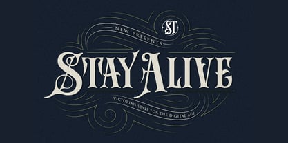
$17.00Stay Alive Typeface is Inspired by victorian style, poster, sign painter, 1800s bring classic touch on this decade, which is combining modern and classic typography with some awesome features that have a strong shapes so it will create more attention for people to look more closely. You can use this font for various purposes.such as logo, t-shirt, posters, lable, letterhead, book cover, and many more. - Mianga by Differentialtype,
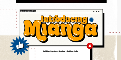
$10.00Mianga is a versatile, stylish, and fun retro look font that's perfect for any design you're creating such as book covers, greeting cards, news headlines, and more! Mianga comes in 4 styles, regular, bubble, outline, and shadow, with italics in each style. Mix each style for the perfect result. Add it to any of your creative projects, and it will give off a retro and vintage feel. - Listing Packs by Jehansyah,
$9.00Listing Packs family this is a font family with a bold and large appearance, this font is perfect for all types of displays that look unique and bold, there are several variants of the character you use, and make sure you don't miss it, very suitable for all types of design, crafts, social media , magazines, books, banners, and this design is very potential for you to have - Tiffany Laurence by Ronny Studio,
$24.00Tiffany Laurence Serif is a classy eighties magazine-inspired font - with complementary italic versions. Both come in two versions one with more contrast and sharper than the other. In true Eighties style. This font looks premium and is very suitable for your design needs such as invitations, labels, logos, magazines, books, greeting / wedding cards, packaging, fashion, make up, stationery, novels, labels or any type of advertising purpose. - Toyster by Sharkshock,
$115.00Toyster is an all caps display font designed with playfulness in mind. The childlike characters are defined by their rounded corners, low contrast, and pudgy weight. Smooth contours ensure this will look great for large print projects. Use it for a children's' book, toy packaging, cartoon, or store signage. With 3 different versions Toyster is sure to resonate with kids and the young at heart. - Ubik by Présence Typo,
$36.00Ubiquity: the possibility to be in several places at the same time; this could be the definition of a typeface like Ubik. Its applications are numerous and various: books, magazines, posters but also architecture and signs. Ubik is a grotesk sans serif with a “nordic taste”: shapes pure and somewhat square. The nonexistent contrast between thin and thick strokes gives it a discreet rustic look. - South East by Girinesia,
$17.00South East is stylish handwritten font. South East looks original and can be used for all your project needs. South East would perfect for Youtube Cover or Thumbnails, sports flyers, mockup , tote bags, kids books, scrapbooks, logos, icons, phrases or quotes for winter greeting cards (Halloween, Christmas or New Year holidays), photo overlay, short phrases, gift shops tags, presentation in social media Pinterest, Instagram, Facebook and more. - Habbly by Robert Corseanschi,
$25.00Habbly is a handwritten brush pen font with smooth ligatures and alternates which makes it look more realistic and natural. The font has a slight bold feeling. In order to get the most out of this typeface be sure to use a program that has opentype capabilities. Suitable for wedding invitations, coffee packages, badges, logos, apparel, stationery, magazines, letterpress, film, books and many others. - Gawain's Hand by Just My Type,
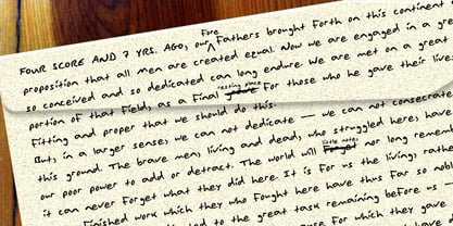
$25.00Gawain Douglas was my co-worker and eventually my boss when I worked for the Tucson Citizen. He’s director of production and design for a children’s book publisher now, a very talented and creative guy and Gawain’s Hand is what his writing looks like. A shame, isn’t it? Just kidding, Gawain; I wouldn’t have featured it, if I hadn’t liked it. Really. No, really. :-) - Auberjean by Abbyland,
$15.00Auberjean is a playful handmade display font, great for social posts, editorial design, posters, book covers, signs, and more! This font has a hip and contemporary feel. It works well for headlines as both uppercase and lowercase, as well as short blocks of text like quotes and info blurbs. The thick, rounded style means it looks great with an outside stroke or offset outline. - Gerald by Letterena Studios,
$10.00Proudly present Gerald Typeface, created by Story type, A serif modern and classic typeface that has its own unique style & modern look. This typeface is perfect for an elegant & luxury logo, book or movie title design, fashion brand, magazine, clothes, lettering, quotes, and so much more. This font is PUA encoded which means you can access all of the glyphs and swashes with ease! - Gravity Well by Hanoded,
$15.00I seem to be in my astronomical phase right now. I recently released several fonts with names relating to space! Don’t worry, it is just a phase and this too will pass… Gravity Well is a handmade brush font, ideally suited for product packaging or book covers. Gravity Well comes with all the diacritics you can ask for and a set of double letter ligatures to boot! - Pisang Manis by Hanoded,
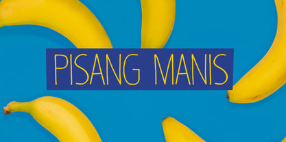
$16.00Pisang Manis means ‘sweet banana’ in Bahasa Indonesia. I don’t think this particular combination is used in everyday life, but it sounds nice. Pisang Manis is based on an older font of mine, called Pisang, which I created in 2013. It looks similar, but it is a different font altogether. Pisang Manis is a ‘Tall & Thin’ display font, ideally used for product packaging, websites and book covers. - Sunroof & Summer by Wildan Type,
$15.00Sunroof & Summer Font is a summer Style font by Wildan Type. It has simple, fun, and sweet look. Sunroof & Summer font is perfect used for; logos, greeting cards, a package design, a brand identity, craft design, any DIY project, book title, packaging, and more. Sunroof & Summer is also included full set of: uppercase and lowercase letters multilingual characters numerals ligature Wish you enjoy our font. :) - Threatening Letter by AineX,
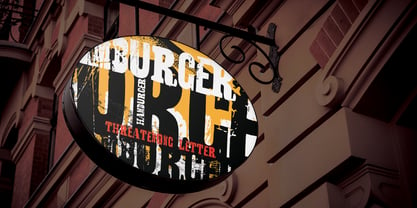
$14.00Threatening Letter is a decorative font, inspired by vintage looking newspaper letters with grunge effect added to it. It’s meant to resemble a ransom note and it allows the user to play with combinations of uppercase and lowercase to always get different effects and avoid letter repetition. This font can be used for various things such as posters, T-shirts, magazines, book covers and headlines. - Darrell Rolando by Grezline Studio,
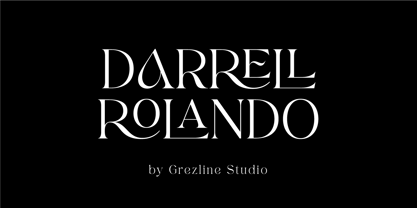
$15.00Darrell Rolando is a stylish display font with vintage and classic looks. This font comes with unique glyph ligature set. Very suitable for logo, headline, title, invitations, labels, magazines, books, greeting/wedding cards, packaging, fashion, makeup, stationery, novels, labels, or any type of advertising purpose. Feature : - Alternates and Ligatures - Multilingual Language - Works on PC & Mac - Simple installations Thank You! Grezline Studio – Akhmad Reza Fauzi - Cerlistine by Letterhend,
$19.00Cerlestine is a standout bold script with modern look and feel. This type of font perfectly made to be applied especially in logo, headline, signage and the other various formal forms such as invitations, labels, logos, magazines, books, greeting / wedding cards, packaging, fashion, make up, stationery, novels, labels or any type of advertising purpose. Features : uppercase & lowercase numbers and punctuation multilingual alternates / swashes and ligatures PUA encoded - Sensory Overload by Hanoded,
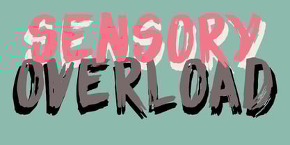
$15.00Whenever I create a font using a Chinese brush and ink, it almost always comes out scary-looking. Sensory Overload is not like that: it is quite a neat and tidy font, even if it is a little rough around the edges. Sensory Overload is an all caps typeface and would be ideally suited for book covers, headlines, packaging and posters. Comes with an overload of diacritics. - Garnet by Ksenia Belobrova,
$19.00Garnet as a modern font kit inspired by fonts and calligraphy of XX centure. It includes Capitals (6 Styles) and Script so you can combine them as you like. Geometric Sans + Handwritten Script is a modern and fresh looking combination which can be used for many tasks. Garnet is good for headlines, posters, packaging, book covers, cards and as a starting point for logotypes. - Challista by madeDeduk,
$15.00Challista is a luxurious handmade signature font. Challista Signature includes more than 30 ligatures to make everything look like a natural handmade signature.This font is perfect for poster design, book covers, merchandise, fashion campaigns, newsletters, branding, advertising, magazines, greeting cards, album covers, and quote designs and more. Features - Uppercase - lowercase - Numbers and Symbols - International Glyphs - Ligatures If you need anything else please contact me by dedukvic@gmail.com - SugarBoo by Inumocca,
$20.00SugarBoo is A Reverse-Contrast letterform , Modern look, Fresh, eyecatching, strong character and power full. The Typeface comes with Stylistic Set Combinations Exellent typeface to use for covering your Project, like Branding, Movie Title, Headline Letter, Bookcover or Book Content, Magazine cover, Poster, Quotes Lettering, Logos, and more your project design. - Unique glyphs - Multilingual Characters Support - UPPERCASE - Lowercase - Numeric - Symbol - Punctuation Character - Stylistic Set inumocca type Studio - The Kaluge by Alcode,
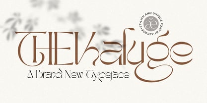
$23.00The Kaluge is a stylish and unique font that will bring a unique style and a trendy look to your designs. Comes with Serif Decorative and Women Abstract Illustrations with trending ligatures and special character, this will make The Kaluga and Women Abstract Illustrations usable in all design projects and work perfectly to pair with any other font. With a unique styles you can create design such as wedding media, book covers, greeting cards, logos, branding, business cards and certificates, even for any design work that requires a classic, formal or luxurious look. Try The Kaluge, Enjoy the richness of OpenType features and let her fun and elegant excitement make you happy and enhance your creativity! You can use this font very easily. • Multilingual Support If you do not have programs that support OpenType features like Adobe Illustrator and CorelDraw X Versions, you can access all alternative flying machines using Font Book (Mac) or Character Map (Windows) - Goldplay by Latinotype,
$26.00Goldplay is based on Isidora Sans design yet features rounded shapes. Its rounded, soft terminals give it a friendly and expressive look, and its modern and contemporary style as well as its classic proportions make it an excellent choice for headlines, logotypes, branding, books, magazines, motion graphics, and use on web and Tv. One of its key features is a large x-height which make it look elegant and classy. Goldplay comes in 2 versions—each in 7 weights, from Thin to Black, and matching italics, resulting in a total of 28 fonts. The standard sans serif version—fresh, clean and contemporary—is a perfect choice for editorial and corporate design, headlines, books, magazines or any other piece of graphic design. The Alt semi-serif display version—more expressive and modern—is ideal for logotypes, branding, packaging, and use on web and Tv. Goldplay contains a set of 540 characters that support over 200 Latin-based languages. - Blosta by Alcode,
$23.00Blosta Font Duo is a luxury and elegant font pair that will bring a unique style and a trendy look to your designs. Comes with Serif Decorative and Calligraphy Typeface with trending ligatures and special character, this will make Blosta Font Duo usable in all design projects and work perfectly to pair with any other font. With duo styles you can create design such as wedding media, book covers, greeting cards, logos, branding, business cards and certificates, even for any design work that requires a classic, formal or luxurious look. Try Blosta, Enjoy the richness of OpenType features and let her fun and elegant excitement make you happy and enhance your creativity! You can use this font very easily. • Multilingual Support If you do not have programs that support OpenType features like Adobe Illustrator and CorelDraw X Versions, you can access all alternative flying machines using Font Book (Mac) or Character Map (Windows) - Diablo by Monotype,
$29.99Jim Parkinson's Diablo typeface is a single weight display design. The look comes from samples found in early 20th century books on hand-lettering books, as well as general poster lettering styles from that same of the period. Diablo has a touch of the Arts and Crafts" movement in its appearance, and it also looks rather heavy. It is a unicase design, in that there is no real "lowercase." Some glyphs on the uppercase keys are alternates to the capital-style forms found on the lowercase keyboard, like A, E, F, H, J, K, M, N, Q, R, V, W, and Z. In fact, the uppercase itself is a bit more decorated and round than the lowercase. Nevertheless, the upper and lowercase letters may be freely interchanged with each other to create the best possible image for the text. The name of the typeface, Diablo, is another term for the devil, or Satan." - Halley by Eurotypo,
$24.00Halley is a modern, funny and casual script with an irregular base line that gives it a unique and modern look. All the glyphs have been carefully painted giving the texts a wonderful flow. A fat and thin blow in this font impresses the harmony. Halley family pack comes in three styles: regular, italic and Shadow. Each font contains 746 “regular or irregular" glyphs, including up to seven alternatives in upper case and six in lower case, standard and discretionary ligatures for a genuine handwriting effect. It also includes a Central European language support with its corresponding alternative characters to have more options in those languages. We have added some useful ornaments that will serve for the most demanding design project! Halley looks good in children's books, fashion, magazines, restaurant menus, book covers, wedding invitations, greeting cards, logos, business cards and is perfect for use in designs based on ink or watercolor, and more - Marvelan by Mega Type,
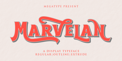
$15.00Marvelan is a display font with a touch of style that's cheerful, elegant and strong. So it is suitable for use in product design and appearance, both in modern or vintage designs. OpenType feature with several alternative characters that allow you to mix and match letter pairs to suit your design. Marvelan also includes 3 different styles, namely Regular, Outline and Extrude which are made with different styles but still have the same characters. Marvelan is included in a display font so it is very suitable for use in titles, poster products, logos, book menus, websites, books, t-shirts, posters, book covers, labels, business cards, branding, print templates and many other designs according to your needs. Marvelan includes a complete set of upper and lowercase letters, as well as multi-language support, punctuation, ligatures and alternatives. Thank you very much for looking and Enjoying it! - Capraia by CAST,
$45.00Capraia is a book typeface, with a heavily quirky look when shown at big sizes, and with an irregular but attractive rhythm at text sizes. Capraia Book and Regular are designed specifically for continuous texts: Book meets a current preference of Italian publishers for lighter faces, while the slightly heavier Regular is intended for the wider international market. True to its vocation for publishing, Capraia has a big x-height, medium contrast and wide bracketed serifs. Furthermore, its slightly flattened curves, some unconventional roman letterforms (a, G, Q) and the 'slanted roman' italics, along with design details such as ball terminals, give to the whole family a very contemporary appeal. Originally the design was intended as a tribute to Caslon's Great Primer but at a certain point the designer was enthralled by Baskerville. Capraia is the unpredicted and original result of that intense experience. - Identity Check by Hanoded,
$15.00Every time I bring my youngest son to his swimming lessons, I need to show my Covid Vaccination Pass; a QR code on my phone. I thought that I would be off the hook after I showed it the first time, but no, not at the swimming pool! It feels a bit like a bad comic book, so I decided to name this comic book style font Identity Check. Of course, I should have called it Covid Vaccination Check, but that is just too much and it probably won’t sell. Who wants a font called Covid?? ;-) Identity Check is a comic book style font. The glyphs are wider than I am used to (it seems I AM capable of learning new tricks), but the effect is rather nice. Identity Check comes with extensive language support, including Cyrillic and Vietnamese. Plus two sets of alternate glyphs, that cycle as you type. - Mogila Display by Letterfreshstudio,
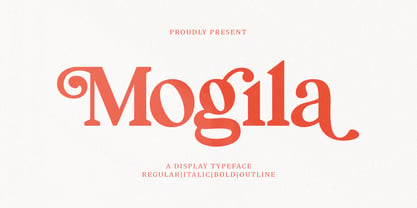
$15.00Mogila is a display font with a touch of style that's cheerful, elegant and strong. So it is suitable for use in product design and appearance, both in modern or vintage designs. OpenType feature with several alternative characters that allow you to mix and match letter pairs to suit your design. Mogila also includes 4 different styles, namely Regular,Italic, Bold and Outline which are made with different styles but still have the same characters. Mogila is included in a display font so it is very suitable for use in titles, poster products, logos, book menus, websites, books, t-shirts, posters, book covers, labels, business cards, branding, print templates and many other designs according to your needs. Mogila includes a complete set of upper and lowercase letters, as well as multi-language support, punctuation, ligatures and alternatives. Thank you very much for looking and Enjoying it! - Racers Energy by Din Studio,
$29.00Do you want energetic designs? Racer energy is a font created in capital letters with the racing theme producing courageous strong impressions in no time making it worth adding to your design list. Letters are made similar to firm rectangle blocks with sharp-angles. Enjoy other incredible features available on this font. Features: Multilingual Supports PUA Encoded Numerals and Punctuation This font looks great on any design projects such as posters, banners, logos, book covers, headings, printed products, merchandise, social media, etc. Find out more ways to use this font by taking a look at the font preview. Purchase it now. Happy designing. - Queen Sea by HansCo,
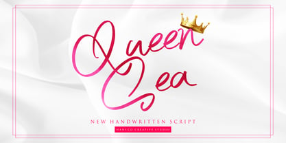
$12.00Queen Sea is a fun script font with a curly alternate and swash look that is perfect for multipurpose projects. This font looks feminine and will fit well in any design and very recommended for crafts, posters, books, branding, quotes, print templates, packaging, invitations, music labels, product labels, logos and more. This typeface comes in uppercase and lowercase, with punctuation, symbols, numerals, swashes, alternates and also has multilingual support. Swashes is alternate from numeral 0 - 9, You can access swashes from your OpenType panel in your design software. Tutorial how to Install & use Alternate / Special Character : https://hanscostudio.com/tutorial/ Enjoy ! - DEADman by Volcano Type,
$29.00The font family "DEADman" is mostly inspired by the weird style of the British illustrator Ralph Steadman. He had a long partnership with the American journalist Hunter S. Thompson, drawing pictures for several of his articles and books e.g. "Fear and Loathing in Las Vegas." Like Steadman's artwork all the letters are painted with ink. The best ones were selected out of hundreds of variations to get the whole character set complete and look uniform. By combining the regular weight with one (or both) of the additional weights "Blotting" and "Squirting" you can achieve a more freaky and psychadelic look. - Downstairs by Gassstype,
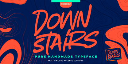
$25.00Introducing Downstairs is Pure Handmade Typeface Authentic that is written casually and quickly. Then scanned and carefully drawn into vector format. This handmade font will make your design has a beautiful natural touch for each details. It is perfect for any design project as Invitation,logo, book cover, craft or any design purposes. That is why Downstairs has charming, authentic and relaxed characteristic more natural look to your text with a more natural look to your text. You can activate Ligature OpenType panel design more interesting. Downstairs is perfect for homeware designs,branding projects, Logo design, Quotes product packaging. - Knucklebones by Hanoded,
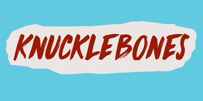
$15.00Knucklebones is a game that is played with the knucklebones of sheep. I bought a set in Mongolia, which I stumbled upon when I was cleaning out the attic. Knucklebones font is a rough brush font, which comes in three styles: Knucklebones Regular, a slightly slanted version, Knucklebones Italic, a very slanted style and Knucklebones Upright, which looks like the name implies. Knucklebones is a very useful all caps typeface, which would look great on posters, product packaging and book covers - but don’t take my word for it: just grab this font and get creative with it! - Giuconda by Sealoung,
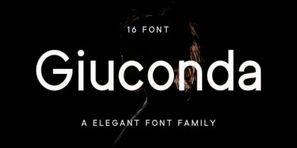
$25.00Giuconda is an elegant and modern sans font. This font provides a cleaner, more geometric look, preserving the essence and structure of an early 20th century sans classic font but with a fresh, clean and contemporary look. Giuconda consists of two subfamilies of 8 weights, ranging from Thin to Heavy, with matching italics, giving a total of 16 fonts. Giuconda is the perfect font for publishing, titles, books, magazines, and corporate designs. Its Alt version is ideal for logo types, branding, packaging, and use on the web and TV. The family contains a 355 character set that supports 207 different languages. - Berghan by Craft Supply Co,
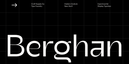
$15.00Berghan is a modern grotesk sans serif features thick and thin contrast details for contemporary nuances. It can be used to create almost all types of design projects like print materials. Just use your imagination and your project will become more alive and look great than ever with this typeface. You want to make a greeting card or a package design, or even a brand identity, craft design, any DIY project, book title, wedding font, pop vintage design, retro design or any purpose to make your art / design project look pretty and trendy? Feel free to play with this typeface! - Goolavin by Attype Studio,
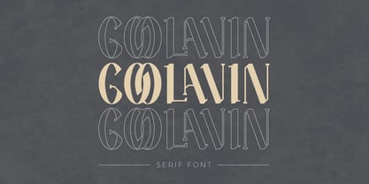
$25.00Goolavin is a Modern Minimal Serif typeface This font exudes a sense of power. It is elegant but strong and confident in appearance. Each letter has been carefully designed to create the best possible impression. It looks stunning on packaging, clothing, and any industry where elegance is needed without sacrificing boldness. that suitable for strong and modern looks on your works. Goolavin is perfect for sport product, branding, logo, invitation, stationery, product packaging, merchandise, monogram, blog design, game titles, cute style design, Book/Cover Title and more. Features : - Goolavin Font - Ligatures - Multilingual, US Roman, Latin 1 Support - Berghain by Scratch Design,
$15.00Introducing Berghain! Modern script handwriting with a beautiful, natural, and cursive style. This font has natural handwriting texture making this font look authentic but still readable and incredibly versatile. This font will look outstanding in any occasion design concept, whether it’s being used on colourful backgrounds or as a stand as a headline in a minimalist set! Berghain has multi-language support, swashes, alternate and beautiful ligature dan you can apply it in OpenType mode in adobe photoshop or adobe illustrator. This font will suit your design, especially in branding, wedding, advertising, headline, poster, book cover, and many more! Enjoy this beautiful font!

