10,000 search results
(0.156 seconds)
- Carrol by Sarid Ezra,
$15.00 Introducing My first sans font. Carrol, a classic sans with alternates! Carrol is a classic and modern sans with alternates in each alphabets! Every alphabet have alternates up to 3 kinds! This font fits in any project. You can use it for a tittle, logo, quotes, or become a pairing in any script font. This font also support multi language! You can get 6 style with italic in every style. This font included: Thin Thin Italic Light Light Italic Regular Italic Medium Medium Italic SemiBold SemiBold Italic Bold Bold Italic ExtraBold ExtraBold Italic Heavy Heavy Italic Thank You!
 - Temporal by Comicraft,
$19.00 You're trapped in an endless now... seconds seem to be stretching out interminably... There’s an eternity between every tick, every tock of the clock... Your consciousness is stretched to the limit as time is expanded to fill the void between each microsecond. There’s a signpost up ahead... the letters appear to stretch into infinity. Anyone know the name of the font it’s set in? See the families related to Temporal Shift & Gap Expanded: Temporal Shift & Gap & Temporal Shift & Gap Compressed Features Four fonts (Shift Regular, Shift Bold, Gap Regular & Gap Bold) with upper and lowercase characters.
 - The Eighty-Eight font crafted by Woodcutter Manero bursts with a distinct character that makes it stand out in the expansive universe of typography. Woodcutter Manero has a reputation for creating fo...
- White Rabbit - Unknown license

- Technical Signature by MMC-TypEngine,
$42.00 ‘Technical Signature’ 2015-2021. A Pixel labyrinthine Display Type System! Plus, Digital “Layer Game”, Futuristic & Sci-Fi Optical Texting for interfaces evolution Landmarks! Now with 3D Styles! 18 Styles total! Revised, Verified & Updated New Edition ! It was inspired also by antique juxtaposed zig-zag Greek mosaics ornaments “ancient times computer” which defined it into a Small Caps Font, while another pair font with same metrics was made to reminisce the manuscript look as a “sister” and Cursive symbiont. Searching for a technical language and perpetration, resulted in many combined styles by matching the primary ones so there’s plenty variations for multi-purpose texting like layered typesetting or simply monochromatic designs… Plus got accurate streaming resolution, therefore some sub-families like Stamp and Texture implicates greater points for minimum size as Regular and Light is appropriated to Small Optical Text reductions. *The New 3’s Upgraded Edition Improvements consisted of Correct ‘Font Info’ (verified data-debugging) rescaled glyphs, quick design review, better correspondent renamed fonts & style linking, addition of responsive OT features encoding and 3D Styles. Multilanguage Support: Western & Eastern European, Baltic, Turkish, Greek, and Cyrillic. This Type is ideal to Technician Designs, things like Footer Signage, Engineering & Crafts Logos, Op-Art Posters, Stamps, Labels, Printed & Digital Certificates, Plus Movies interfaces, Internet Headings and Text and of course Video Games!
 - Raw Street Wall by Volcano Type,
$25.00 The typeface Raw Street Wall is designed for the Typo Graphic Design font foundry from 2011–2017 by Manuel Viergutz. A playful display type for headlines with a street-art graffiti-style by hand. Rough-look plus state-of-the-art automatic generated OpenType-features (like contextual alternates (calt)). 567 glyphs with extras like emoticons/icons, arrows, dingbats, symbols, geomatric shapes, catchwords and many alternative letters. Multilingual support with 27 languages. Have fun with this font & try the DEMO-FONT (with reduced glyph-set) FOR FREE! Example of use It’s your turn … for example everywhere where it makes sense. Maybe for use in magazines, posters, headlines and advertisement, plus as webfont for decorative headlines. Technical Specifications ■ Font Name: Raw Street Wall ■ Font Weights: Regular + DEMO (with reduced glyph-set) ■ Font Category: Display for headline size ■ Font Format: .otf (OpenType Font for Mac + Win) + .ttf (TrueType Font) ■ Glyph Set: 567 glyphs ■ Language Support: 27: Afrikaans, Albanian, Catalan, Croatian, Czech, Danish, Dutch, English, Estonian, Finnish, French, German, Hungarian, Italian, Latvian, Lithuanian, Maltese, Norwegian, Polish, Portugese, Romanian, Slovak, Slovenian, Spanisch, Swedish, Turkish, Zulu ■ Specials: Extras like emoticons/icons, arrows, dingbats, symbols, geomatric shapes, catchwords and many alternative letters plus OpenType-Features. ■ Design Date: 2011–2017 ■ Type Designer: Manuel Viergutz ■ License: Desktop license, Web license, App license, eBook license, Server license
 - Mistress Benedict Brush by Joanne Marie,
$10.00 Introducing Mistress Benedict Font Duo - a pair of hand brushed fonts attentively designed to work together, helping to produce beautiful typography! This pack of two fonts works so well together and can be used for so many projects, from food packaging to a simple quote that you upload to Instagram. Use them on your t-shirts, mugs, cushions, handmade card designs, anything you like! What do you get? Benedict Font has a neat, handwritten style to it and it's tall ascenders gives that added elegance. With it also being hand brushed Benedict is perfect for all hand lettering typographic designs and works well for short advertising headlines and sub-headers. Benedict has a full set of uppercase and lowercase alternates giving you a different style - it's like two fonts in one! Mistress Benedict Brush includes ligatures, discretionary ligatures and a full set of alternate characters. It also has international character support. Mistress Benedict Caps was hand brushed with the same brush pen and is the perfect companion for Benedict. It's an all caps font where the alternates are actually the lowercase letters. It looks gorgeous on it's own too! Like the brush version, Mistress Benedict also supports international languages. Well, there it is! I really hope that you enjoy using this font duo and please ask if you have any questions. Jo
 - Replete Sans by Sudtipos,
$49.00 Sudtipos’ new sans serif font Replete is inspired by the mixture of aesthetics and philosophies found on the streets of metropolitan cities the world over. Buildings constructed throughout the twentieth century, including those made in the Art Deco style or influenced by the Bauhaus’s gospel, stand side-by-side as symbols of their time. Typography is one factor that bonds these vistas, and simultaneously further complexifies them. Art deco letters appear on storefronts and signage in Europe’s oldest cities and as remnants of the Golden Age of economic expansion for Latin America. Typography, like architecture, sometimes coexists in perfect harmony, and other times in ideological opposition. But it is these juxtapositions in places such as Shanghai, New York, London, Buenos Aires and Tokyo that shape each city’s identity. Replete is inspired by this mixture. We wanted to create a useful modern sans serif family – a set of 7 weights with playful geometric alternates – that allows you to combine characters including wide-width and filled letterforms. Replete is apt for long texts, and equally, for instances where letterforms can stand together like a cityscape. Replete means full, packed and abounding … it is a sans, it is grotesque, it is geometric and it is Deco. Replete is a new family that has a little of everything we like, equipped with everything you need to design anything you want.
 - VLNL Thueringer by VetteLetters,
$30.00 We cannot imagine anyone not liking beer. Especially on a warm summer night there is simply little that can top an ice cold brewski. And with the current wave of home-brewed ales and lagers, Vette Letters decided to not stay behind and brew its own brand. Just so we can design our own beer bottle label using our own font. VLNL Thueringer comes from the drawing board of Jacques Le Bailly (a.k.a. Baron von Fonthausen), the German-French specialist in the fields of both beer and type design. One day Jacques got inspired by Albrecht Dürers 15th century Fraktur (blackletter) alphabet, and decided to design a contemporary rounded version of it. Although the historic context is clearly visible, Thueringer definitely stands its own ground. It's a modern techno-style blackletter with a (beer)truckload of interesting design details. Thueringer contains a number of ligatures and an alternate set of numbers. Apart from the regular uses like logos, posters, flyers and headlines we definitely would like to see our Thueringer used on beer bottle labels and crates, but also cafés and hipster bars would do well with this modern-day blackletter. Hell, even wine or liquor labels, football team jerseys, Oktoberfest flyers, it's just too much to mention. As long as it is accompanied by a cold beer.
 - AW Conqueror Std Sans by Typofonderie,
$59.00 AW Conqueror Sans was born out of this desire to fuse geometric and humanistic sans. It remains a typeface fundamentally influenced by both Bauhaus spirit — with its simplified geometric forms — and Jan Tschichold’s attempts to link this modular spirit to Eric Gill’s humanist sans serif. AW Conqueror Sans is a claimed French synthesis of Germanic Modernism and English classical tradition. Spheres of influence The core set of capitals are based on the proportions of the Roman capitals like Futura, Erbar, Nobel, Johnston, Gill Sans. During the 1930s, the Futura was a true success. Since then, Monotype offered a geometric version of the Gill Sans, and Linotype added Futura-like variants to WA Dwiggins’ Metro. AW Conqueror Sans is kind of a “fusion” of this approach. The lower case “b, d, p, q” are also directly influenced by Eric Gill’s, while the “y” is influenced by some of Jan Tschichold’s alphabets. In italics, drawn narrower, AW Conqueror Sans reinterprets Gill’s idea: a rigorous italic like a roman but which sometimes reveals some aspects of a Renaissance italic. AW Conqueror Sans and its extensions AW Conqueror Sans is the initial reference point for an extended family, including AW Conqueror Inline, Slab, Carved, Didot. The potential of these mixed families is powerful. Because AW Conqueror typefaces are based on an identical structure, and compatible proportions.
 - Bemack by Dhan Studio,
$17.00 BEMACK is handwritten made with a brush pen, this font will tear through your text with unmistakable energy, dynamic and spontaneous flow. To help you create stunning custom handwriting displays. BEMACK comes with alternates character, ligature, punctuation, numerals. Also included is a bonus extras swashes, handmade designed to perfectly for headlines and short texts. Use it for magazines, t-shirt, packaging, logos, advertising, quotes, branding, posters, editorials, cover artwork, movies, websites, etc BEMACK is coded with Unicode PUA, Allows full access to all the extra characters without having special software designing. Mac users can use Font Book, and Windows users can use Character Map to view and copy any of the extra characters to paste into your favorite text editor / app. Thanks so much for looking and Enjoy it!
 - Lucida Handwriting by Monotype,
$40.99 Lucida Handwriting is a casual, connected script designed for smooth and fun reading on screens and in print. Its relaxed personality and vigorous energy sends a distinctive message. Lucida Handwriting was originally released in one weight. It is now available in five weights, from Thin to Black. Lucida Handwriting was designed by Kris Holmes and Charles Bigelow based on historic blackletter style cursives. As with other joining script typefaces, all capital letters usage is not recommended: it is best to use upper and lowercase for optimal legibility. Lucida Handwriting is part of the Lucida superfamily of fonts from Bigelow & Holmes. Lucida is highly regarded for legibility and its extensive range of type styles. The Lucida Handwriting typeface family has a Standard character set with 255 glyphs supporting the basic range of Latin languages.
 - Linotype Notec by Linotype,
$29.99Franciszek Otto of Poland designed Linotype Notec in 1999. Linotype Notec is a low-tech" (or even "no tech!") typeface. By embracing handwriting's spontaneity, it has gotten as far away from technology as it can. Classified as an "inky"-style script face, for lack of a better term, Linotype Notec's informal design seems immediately artful and full of expression. Its irregularity and unexpectedness enlivens any composition, similar to how jazz or modern dance animate a room. Quite full of "ink," Linotype Notec's "strokes" are written in a sort of short-note-handwriting-style, which a slow-writing, thoughtful humanist might theoretically scribble to himself late at night. Yet Linotype Notec's character still maintains a jolt of energy; try Linotype Notec in small applications, in any size from 12-point on up." - Bambe by Gian Studio,
$10.00 INTRODUCING BAMBE is handwritten, made with a brush, this font will rip your text with unmistakable energy, a dynamic and spontaneous flow. To help you create a stunning custom handwritten look, Bambe is perfect for magazines, t-shirts, packaging, logos, advertisements, quotes, branding, posters, editorials, cover artwork, films, websites, etc. BAMBE contains uppercase letters and some alternative characters, punctuation marks, numbers. Also includes the added bonus of a handcrafted, perfectly designed swash for headlines and short text. BAMBE encoded with Unicode PUA, Allows full access to all additional characters without designing any special software. Mac users can use Font Book, and Windows users can use Character Map to view and copy any additional characters for pasting into your favorite text editor / application. Thank you very much for viewing and Enjoying it!
 - Aracne Ultra Condensed by Antipixel,
$15.00 The all-caps Aracne collection features tall, slightly scrawled letterforms, and is available in regular, condensed and ultra condensed styles for maximun functionality. With a spiritted quality and casual character, it will add a personal style to your work. Aracne Ultra Condensed was created as an extended version of the font Aracne, a regular full of energy handwritten font, with light and regular styles, including italics. It provides a wide range of possibilities, including the Aracne Soft and Stamp, which offer softer and cleaner edges. Its glyph coverage supports languages such as English, Spanish, French, German, Polish, Czech, among many others. It’s recommended usage is for display titles, and small ammount of text, because of its good legibility and quality of glyphs. Check out her sisters Aracne and Aracne Condensed!
 - Coigum by Keristyper Studio,
$14.00 Coigum is a modern display font that is perfect for creating attention-grabbing headlines, titles, and logos. Its bold and fat lettering style is sure to make a statement and capture the viewer's attention. This font is ideal for projects that require a bold, strong, and impactful appearance, such as posters, advertisements, packaging, and branding materials. With its unique and modern design, Coigum is a great choice for designers who want to add a touch of boldness and energy to their projects. Featured: Standard, Uppercase & Lowercase Numeral & Punctuation Multilingual : ä ö ü Ä Ö Ü ß ¿ ¡ Alternate & Ligature PUA encoded We recommend programs that support the OpenType feature and the Glyphs panel such as Adobe applications or Corel Draw, so you can use all the variations of the glyphs. Hope you enjoy our fonts!
 - Aracne Condensed by Antipixel,
$15.00 The all-caps Aracne collection features tall, slightly scrawled letterforms, and is available in regular, condensed and ultra condensed styles for maximun functionality. With a spiritted quality and casual character, it will add a personal style to your work. Aracne Condensed was created as an extended version of the font Aracne, a regular full of energy handwritten font, with light and regular styles, including italics. It provides a wide range of possibilities, including the Aracne Soft and Stamp, which offer softer and cleaner edges. Its glyph coverage supports languages such as English, Spanish, French, German, Polish, Czech, among many others. It’s recommended usage is for display titles, and small ammount of text, because of its good legibility and quality of glyphs. Check out her sisters Aracne and Aracne Ultra Condensed!
 - Maribor by Dima Pole,
$30.00 Maribor is a slab serif font with nice shapes, they are both soft and angular. It is perceived calmly and with a twist. Maribor means "Mara`s pinery". The energy of the Universe, reflecting the modification, renewal and change for the better is called Mara; Ancient wise ancestors called it so. Today it is known as the goddess Mara in the Vedic worldview of the Slavic-Aryan peoples. Maribor is a multilingual font, it contains characters for 104 Latin languages and all Slavic, including all capitals for them. There are all major currency signs, including the ruble and the Euro. Many OpenType features allow you to make a variety of compositions; as well as to see the font from the new side thanks to the stylistic sets for the Slavic alphabets.
 - Chastalia Script by Hrz Studio,
$14.00 Thanks for checking out Chastalia Script A very fun yet elegant script font with lots of energy, allowing you to create beautiful handcrafted typography in an instant. With extra curves & twists, Chastalia Script is guaranteed to make your text stand out - perfect for logos, printed quotes, invitations, cards, product packaging, headers and anything else you can imagine. What's really awesome is that Chastalia Script comes with a full set of lowercase alternatives, which allow you to create more authentic custom-feel texts. This type has become the work of true love, making it as easy and fun as possible. I can't wait to see what you do with Chastalia Script Feel free to use the #Hasrizal tag and the #Chastalia Script font to show what you've done, I really hope you enjoy it! Thank You!
 - Volterra by Blank Is The New Black,
$25.00 In today's typographic landscape, few would still consider Bodoni to have a "modern" feel, but there was once a time when it's vertical axis and thinned horizontal strokes were considered radical. Volterra—inspired by the forms of Bodoni—finishes what Bodoni started and eliminates the horizontal stroke altogether, breathing an elegant new energy into a 200-year-old classic. Named for the artist hired to paint loincloths over Michelangelo's "Last Judgement" when nudity in religious art was condemned, Volterra acknowledges that it is no easy feat picking up where a master left off. Volterra takes what has grown to feel traditional and transforms it into a delicate mixture of classic and modern, with razor-edged serifs and ultra-sharp strokes. Strictly a display face, the larger Volterra is used, the better it looks.
 - Roc Grotesk by Kostic,
$40.00 Roc is a sans serif grotesk inspired by American wood types from the end of the 19th century. With nine weights in five widths, this family contains 45 fonts in total. The character set supports Western and Central European languages, as well as Turkish. Roc Grotesk comes in a range of five widths: Compressed, Condensed, Normal, Wide and ExtraWide, in order to cover a wide scope of applications. Although the styles at both ends of each range are made in their most pronounced form in terms of width and weight, they are not taken to such extremes as to become absurd, and are quite usable in display settings. The Normal width keeps all its nine styles in proportionally similar widths. The Compressed width, however, is deliberately made to be disproportionate, so that every style takes the least possible horizontal space. That is why the contrast between Compressed Thin and Compressed Heavy style is substantial. As the weights progress from Thin to Heavy, the stroke contrast becomes more prominent. It is intentionally exaggerated in heavier weights, which is particularly apparent in the uppercase E and R of the Black and Heavy style. Roc has a large x-height and relatively short descenders and ascenders. No uppercase letter descends below the baseline, so the lines of an all-caps text can be packed tightly on a poster or a headline. The Regular style is somewhat generously spaced, as it is most likely to be used for setting longer passages of text. Its Bold counterpart is spaced in such a way that the width of the text column will be similar to the text set in Regular. Tabular figures in these two styles have exact matching widths, so for example, you could emphasize one row of numbers in a data column without visually disrupting the vertical order of the table. The lowercase g and r have alternatives to accommodate what most designers expect from a typical Grotesk typeface. The single-story g and the cut-off r are accessible via the OpenType feature.
 - FS Sinclair by Fontsmith,
$80.00 ZX Spectrum In 1982, a home computer came on the market that would launch the UK IT industry. The ZX Spectrum sold five million units and spawned thousands of software titles. It was the must-have gadget for every teen. FS Sinclair is inspired by the memory of Sir Clive Sinclair’s greatest creation: the experience of entering its clunky command codes and reading its simple, grid-placed type. Smart, switched-on, great in text and display, FS Sinclair is a modern grid-based font, drawn with the Spectrum in mind and brought to life by well thought-out design. Formula Having completed the font for Channel 4’s brand update, the Fontsmith team defined the formula for its next font: the creative essence of the C4 work but with more structural discipline, more rigid form and a little more seriousness. The new font wouldn’t look self-consciously retro but it would reference the past and, it was hoped, influence the future. Readability Like the ZX Spectrum, it took a while for the new font to do exactly what it was meant to do. Many of the early concepts by Phil Garnham and Jason Smith were too jagged – the result of an awareness of getting too close to existing fonts of the same ilk, such as Wim Crouwel’s Gridnik. Eventually, FS Sinclair evolved into a more readable, functional grid-based type design that answered Phil and Jason’s original, self-set brief. Idiosyncratic There’s a technological, systems feel to FS Sinclair but ultimately, humans are in charge. The lowercase “a”, “n”, “m” and “r” have clean-cut “ears”, and the square-ish design is softened by round joins on the inside of the letterforms. The idiosyncratic design of letters such as “g”, “j”, “k”, “v”, “w” and “y” bring the design up to date. This is a modular font with character, and a range of weights that allow varied application.
 - Recons by Almarkha Type,
$25.00 Our new product Rekons - Sport Display, inspired by the title of the sports poster and We make it very energetically. Rekons font with strong and challenging nuances. very suitable for the title, typography, clothes, Poster, magazines, brochures, packaging,Websites and much more for your design needs, making your designs more modern and professional.
 - Jokerman by ITC,
$40.99Jokerman is the work of British designer Andrew Smith. It is a wild and energetic font that is effective when set in all caps, or as mixture of caps and lowercase. Included are a number of alternate letters and funky forms. Jokerman is a fanciful display font that exudes excitement and vitality. - Sugary Pancake by Hanoded,
$15.00 Sugary Pancakes - ahh, my kids love them. We don't make them too often, as they are 'energetic' enough as it is. This calorie-rich font is ideal for Children's Books and posters: it is fun, bouncy, very legible and full of character. Comes with a topping of diacritics and a stack of happiness.
 - Buddies by Sudtipos,
$59.00 Buddies, designed by Guille Vizzari, is a script font that was initially born as a piece of lettering. It is the result of an experiment between brush pen and pencil, and in this way, Buddies takes the imprint of the brush, the freshness of sign painting, and some (or a lot) of quirks by the author. The font at times enjoys dancing in titles and short lines of text, pouring rhythm and movements through its lowercase various x-height sets. Buddies also has a vast uppercase set with daring and atypical shapes that surprisingly function beautifully for composing short all-caps texts; messages are brought to life with awesome personality, ideal for packaging, fashion or even editorial. Buddies is a friendly font, a humble invitation to the brush letters universe, but from an unpredictable point of view.
 - Rekita by Twinletter,
$13.00 Introducing “Rekita Font” – Your Gateway to Playful Typography! Rekita Font is a captivating typeface designed to infuse playfulness and creativity into your projects. With its whimsical and charming characters, this font is your perfect companion for any design that seeks a touch of lightheartedness. Whether you’re crafting children’s books, eye-catching posters, or engaging social media graphics, Rekita Font effortlessly adds a fun and youthful vibe to your work. It’s a versatile choice that breathes life into your designs and sparks joy in your audience. Embrace the lively spirit of Rekita Font and unlock a world of creative possibilities. Elevate your design game, grab attention, and leave a lasting impression with this delightful typeface. Discover the magic of Rekita Font and let your creativity run wild with playful typography today! – PUA Encoded Characters – Fully accessible without additional design software.
 - Zulu-Ndebele Pattern by Scholtz Fonts,
$19.00Zulu-Ndebele Pattern is the first ever font to be based solely on the traditional decorative patterns of the Zulu and Ndebele tribes of Southern Africa. The designer has lived in KwaZulu (Place of the Zulu), for over 50 years and has made a life-long study of traditional Zulu beadwork and carving, and of Ndebele wall decoration. There are 52 pattern units that may be combined in many ways to create borders, backgrounds and an unlimited number of designs. The pattern units correspond to the upper and lower case letters. The reason that the Zulu and Ndebele patterns have been grouped together is that the true tribal areas are contiguous and the there has been much artistic cross-fertilization between the two cultures. Many of the patterns that are used by the two tribes are identical. - Kuryin by Twinletter,
$13.00 Introducing “Kuryin Font” – Where Playful Typography Meets Creativity! Unleash your design’s full potential with Kuryin Font, a lively and whimsical typeface that adds a touch of playfulness to your projects. Kuryin Font is your go-to choice for designs that need a fun and vibrant personality. Its unique, playful characters are perfect for children’s books, captivating posters, and standout branding that grabs attention. With Kuryin Font, your designs will instantly exude a sense of joy and creativity, drawing your audience in. Whether you’re crafting a cheerful invitation or crafting a memorable logo, this font infuses a playful spirit into your work. Elevate your creative projects and let your imagination run wild with Kuryin Font. Embrace the whimsical charm of this typeface today and watch your designs come to life! – PUA Encoded Characters – Fully accessible without additional design software.
 - Bleeker by Typodermic,
$11.95 Are you ready to infuse some laid-back vibes into your design game? Look no further than Bleeker! This hand-lettered typeface is like a breath of fresh air, with casual letterforms and relaxed line-treatment that make your message feel effortlessly conversational. But don’t let the carefree nature of Bleeker fool you—this font is also smart and sophisticated. Thanks to custom letter pairings, it looks totally natural in OpenType-savvy applications. And let’s be honest—who doesn’t want to look natural and effortless while still being totally cool? So if you’re yearning for a typeface that feels like a sunny day and a good conversation rolled into one, give Bleeker a try. It’s the perfect blend of whimsy and sincerity that your designs have been craving. Most Latin-based European writing systems are supported, including the following languages. Afaan Oromo, Afar, Afrikaans, Albanian, Alsatian, Aromanian, Aymara, Bashkir (Latin), Basque, Belarusian (Latin), Bemba, Bikol, Bosnian, Breton, Cape Verdean, Creole, Catalan, Cebuano, Chamorro, Chavacano, Chichewa, Crimean Tatar (Latin), Croatian, Czech, Danish, Dawan, Dholuo, Dutch, English, Estonian, Faroese, Fijian, Filipino, Finnish, French, Frisian, Friulian, Gagauz (Latin), Galician, Ganda, Genoese, German, Greenlandic, Guadeloupean Creole, Haitian Creole, Hawaiian, Hiligaynon, Hungarian, Icelandic, Ilocano, Indonesian, Irish, Italian, Jamaican, Kaqchikel, Karakalpak (Latin), Kashubian, Kikongo, Kinyarwanda, Kirundi, Kurdish (Latin), Latvian, Lithuanian, Lombard, Low Saxon, Luxembourgish, Maasai, Makhuwa, Malay, Maltese, Māori, Moldovan, Montenegrin, Ndebele, Neapolitan, Norwegian, Novial, Occitan, Ossetian (Latin), Papiamento, Piedmontese, Polish, Portuguese, Quechua, Rarotongan, Romanian, Romansh, Sami, Sango, Saramaccan, Sardinian, Scottish Gaelic, Serbian (Latin), Shona, Sicilian, Silesian, Slovak, Slovenian, Somali, Sorbian, Sotho, Spanish, Swahili, Swazi, Swedish, Tagalog, Tahitian, Tetum, Tongan, Tshiluba, Tsonga, Tswana, Tumbuka, Turkish, Turkmen (Latin), Tuvaluan, Uzbek (Latin), Venetian, Vepsian, Võro, Walloon, Waray-Waray, Wayuu, Welsh, Wolof, Xhosa, Yapese, Zapotec Zulu and Zuni.
 - Jantar Flow by CAST,
$45.00 Jantar Flow is a humanist sanserif type family tailored for continuous reading for both printing and screen. With its large x-height and low contrast it also performs very well in captions, side notes, and short paragraphs set in small sizes. Jantar Flow Italic is distinct and readable. Following a proper italic construction, it shows the fun side of the family yet keeps the features of the upright. Jantar Flow – as well as its teammate Jantar Sharp – comes in seven weights from ExtraLight to Heavy, each with accompanying italics. It has a tabular and proportional set of figures in both old style and lining options, and also a special set of hybrid figures sitting between x-height and capitals. Superscripts and subscripts are provided together with a vast collection of diacritics covering all European languages as well as a set of case-sensitive characters. Jantar, the pairing superfamily. ‘Jantar’ is an old Polish name for ‘amber’, a fossilised resin – a substance that is robust and organic at the same time. These qualities somehow reflect the feeling behind the Jantar families, ‘Flow’ and ‘Sharp’. Jantar Flow was designed along with Jantar Sharp. As part of the Jantar superfamily these two faces are perfectly paired: though not based on the same skeleton, they share the same design parameters and the same character set, but each one works independently with its peculiar features. Designed for publishing for print and web, as well as for branding, the Jantar superfamily was inspired by common font pairings of the digital age like Helvetica/Times or Verdana/Georgia. Jantar Flow and Jantar Sharp communicate with individual yet complementing voices, just like two trained acrobats can perform alone but also know well how to perform together.
 - Picture this: "Teen Spirit" by Steven J. Lundeen is not just a font; it's the embodiment of youth rebellion, a visual shout that echoes through the halls of high school, sticking it to the man with e...
- Thoughtful Pathways by Letterhanna Studio,
$19.00 "Introducing 'Thoughtful Pathways,' a captivating handwritten font that captures the essence of introspection and mindful exploration. With every stroke, it whispers the wisdom of a thousand quiet moments, guiding you through the intricate trails of your thoughts.
 - Milena Juliette by Aestherica Studio,
$12.00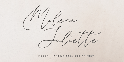 Milena Juliette is a lovely and timeless handwritten font. It is the best choice for creating eye-catching logos, branding, and quotes. Every letter has a unique and beautiful touch, which will make your design come alive!
 - Smitta Bali by Beary,
$14.00 Smitta Bali is an amazing hand lettering, looking attractive and natural! Every single letter has been carefully crafted to make your text look beautiful. This font is suitable for invitation, branding, advertising, classic design, poster design etc.
 - Giselle by Nissa Nana,
$18.00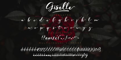 Giselle is a beautiful script font. It has a classy, elegant, and modern look which can be used for logos, branding, invitations, stationary, wedding designs, social media posts, and every other design that needs a handwritten touch.
 - Stereoxoid by PizzaDude.dk,
$20.00Stereoxoid comes with ligatures for double letters and numbers, unique accented characters and alternate versions of every letter...enough to grunge up your next project! You will need to use OpenType supporting applications to use the ligatures. - Wilson wells by Stringlabs Creative Studio,
$25.00 The Wilson Wells is an unique blackletter decorative font. It’s suitable for use in various projects such as gothic lettering, tattoo, headlines, posters, magazines, newspapers, t-shirts, labels, and every other design which needs a striking typeface.
 - Sisterhood by Din Studio,
$29.00 Sisterhood is a beautiful brush signature font. Made for any professional project branding. Every letter has a unique and beautiful touch. Made from our talented font designer. Features: 52 Stylistic set 52 Ligatures Multilingual Support PUA encoded
 - Peachy Sun by Carpiola Studio,
$12.00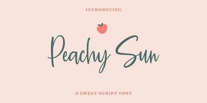 Peachy Sun is a lovely and timeless handwritten font. It is the best choice for creating eye catching logos, branding and quotes. Every letter has a unique and beautiful touch, which will make your design come alive!
