10,000 search results
(0.058 seconds)
- Quarz 974 by Domenico Ruffo,
$40.00 - Beautiful Things by Brittney Murphy Design,
$8.00 - Mushmellow by Ingrimayne Type,
$10.95 - Blackmate by BonjourType,
$15.00 - Backstay by Ali Hamidi,
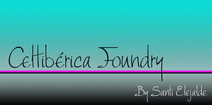
$14.00 - Celtiberica by Celtibérica,
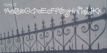
$24.00 - Curly Q by Outside the Line,
$19.00 - Longwood JNL by Jeff Levine,
$29.00 - Amberlight by Get Studio,
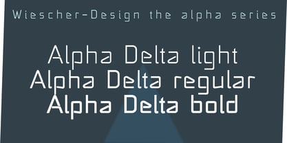
$25.00 - Alpha Delta by Wiescher Design,
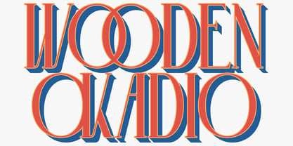
$39.50 - Wooden Okadio by Maulana Creative,
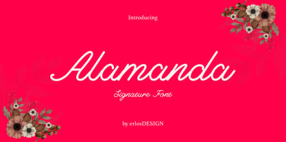
$16.00 - Alamanda by ErlosDesign,
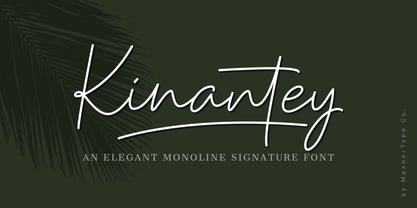
$19.00 - Kinantey by MaxnorType,
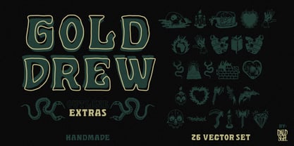
$12.00 - Golddrew by Daldsgh,
$15.00 - PIXymbols Signet Oldstyle by Page Studio Graphics,
$29.00Create old style initials, evoking traditional printers' marks for stylish business or personal stationery. Includes 37 borders, each accessed by a single keystroke, which will automatically line up with the letters in the monogram. - Section by Monotype,
$29.99The Section Bold Condensed font is patterned with lines dividing each letter into small sections. Section Bold Condensed is a headline face with uses ranging from book titles on technological subjects to embroidery books. - Guilloche B by Wiescher Design,
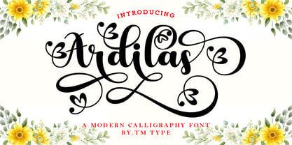
$24.00 - Ardilas by TM Type,
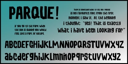
$12.00 - Parque by Celtibérica,
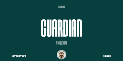
$24.00 - Guardian by OtterType,
$20.00 - Pretty Berelly by MJB Letters,
$17.00 - KG Primary Dots by Kimberly Geswein,
$5.00 - Bame by Typebae,
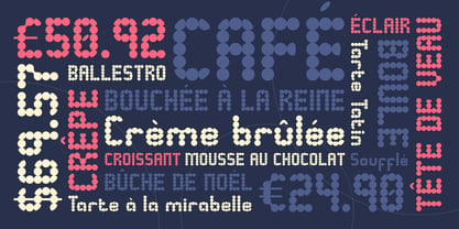
$15.00 - Ballestro by Rex Face,
$19.99 - Fringio by Rex Face,
$19.99 - Madyra by Forberas Club,
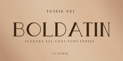
$16.00 - Boldatin by Patria Ari,
$10.00 - Mackay by René Bieder,
$39.00Mackay is a powerful transitional serif in 6 weights plus matching italics, designed for screen and print. The eccentric serifs on uppercase letters like E, F, L and T are inspired by Alexander Kay’s “Ronaldson” from 1884, working as the starting point for the family. The lowercase letters follow the traditional Antiqua model with attributes tracing back to drawings from the early 20th century. The “grotesk” lowercase a, as well as the sharp lowercase s, derived from the closed shapes of uppercase letters like C, G or S, create a compact and bold appearance while a large x-height and small descenders add a modern look. In favor of a dynamic and elegant impression, the design of the italic cuts come with a strong calligraphic influence. This results in completely new shapes for letters like lowercase a or g, ensuring a smooth integration into their surrounding letters while maintaining a distinctive appearance when combining with romans. The family comes with a variety of opentype features like case sensitive shapes, old style figures, fractions, ordinals and many more. Additional attention was given to the standard and discretionary ligatures, extending the structure of the basic glyphs with elegantly designed letter combinations for g/i, i/t or s/t. According to their dynamic architecture, the italic weights are equipped with additional initial swash characters to subtle accentuate the calligraphic roots. As a result of a high stroke contrast the family works great in paragraphs with medium to large font sizes like headlines, short paragraphs or logos. With its 12 cuts, the family meets all requirements on high quality typography. - Jean Paul Fraktur by RMU,
$25.00A typographic treasure, originated at the end of the 18th and the beginning of the 19th century, had been brought back to life. With its charming touch it makes a wonderful font for poems, bookcovers, reprints and other historically relevant projects. To get access to all ligatures, it is recommended to activate both Standard and Discretionary Ligatures; the round s you find on the # key, and typing the combination N-o-period and activating the OT feature Ordinals gets you the numero sign. - New Beginnings by Hanoded,
$15.00A new year has begun, new resolutions have been made. Fresh ideas are popping up and a new life is about to begin. All in all, I figured New Beginnings was the perfect name for my first font in 2016. It is a very happy, very original typeface. All caps, but upper and lower glyphs differ and can be interchanged. New Beginnings font can be used virtually anywhere, but children’s books and product packaging spring to mind. Comes with an abundance of diacritics. - Blue Sky by Senekaligrafika,
$12.00“Blue Sky” is a playful handwriting font special for summer display, that puts a smile on your project and will inspire you to create something fun and memorable. “Blue Sky” will help you to create special and touching typographical design for vacation projects, for every day or the happiest day in life, happy birthday cards, baby shower, greeting card, headings, flyer, product packaging, book cover, printed quotes, logos, and many more. It is really universal and modern font. The owner of endless possibilities! - Ending Scene by Senekaligrafika,
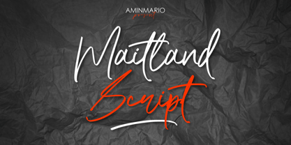
$12.00“Ending Scene” is a playful handwriting font special for summer display, that puts a smile on your project and will inspire you to create something fun and memorable. “Ending Scene” will help you to create special and touching typographical design for vacation projects, for every day or the happiest day in life, happy birthday cards, baby shower, greeting card, headings, flyer, product packaging, book cover, printed quotes, logos, and many more. It is really universal and modern font. The owner of endless possibilities! - Maitland Script by Aminmario Studio,
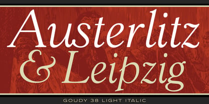
$20.00This font was created to look as close to a natural handwritten script, as possible by including alternates lowercase, swash lowercase, ligature and underlines. Built in Opentype features, this script comes to life as if you were writing it yourself. Comes with regular and italic. Also support multilingual.Perfect for any awesome projects that need hand writing taste. This is suitable for branding, quotes, invitations, stationery, wedding design, logos, watermarks on photography, signatures, advertisement, album covers, business cards, clothing, magazines, posters, and more! - Goudy 38 by Red Rooster Collection,
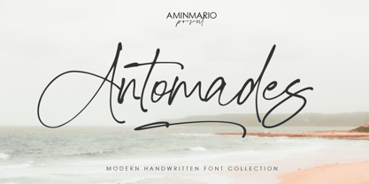
$45.00Designed by Les Usherwood. Digitally engineered by Steve Jackaman. Originally designed by Frederick Goudy for the original Life magazine, circa 1908. Because of delays in production, the face was never used by the magazine. However, Gimbel Brothers, the famous New York department store, opened in 1910, around the time of the release of the typeface, which was used almost exclusively for its advertising and was often known as Goudy Gimbel, but the typeface was better known by the Monotype series number Goudy 38. - Antomades by Aminmario Studio,
$20.00Introducing Antomades font is a modern and elegant handwritten font with varying thickness and a charming gesture. This font was created to look as close to a natural handwritten script. Perfect for any awesome projects that need hand writing taste. Comes with regular and italic. With built in Opentype features, this script comes to life as if you were writing it yourself. Don't hesitate if you have any questions. Thanks for checking out this font. I hope you enjoy it! AminMario - Au Revoir by Hanoded,
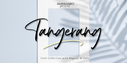
$20.00Au Revoir - saying goodbye is one of the hardest things in life, but in a sense it is also beautiful: there is a promise of seeing each other again, as 'Au revoir' literally means: 'to the next time we see one another'. Au Revoir font is slightly cursive, elegant without being posh, simple and legible. You could write a poem or a farewell letter with it, but I guess its simplicity lets you use it in various other, less dramatic, designs. - Tangerang by Aminmario Studio,
$20.00This font was created to look as close to a natural handwritten script as possible by including alternates lowercase, swash lowercase, ligature and underlines. Built in Opentype features, this script comes to life as if you were writing it yourself. Comes with regular and italic. Also support multilingual.Perfect for any awesome projects that need hand writing taste. This is suitable for branding, quotes, invitations, stationery, wedding design, logos, watermarks on photography, signatures, advertisement, album covers, business cards, clothing, magazines, posters, and more! - Red Top by Studio K,
$45.00Red Top is the UK name for the tabloid press, the scandal sheets of journalism, scourge of royalty, errant politicians and public figures, and celebrants of sex, celebrity and astrology: all human life is there as they used to say in the now defunct News of the World. For the budding media moguls amongst you – or for designers who want to make their headlines shout a little louder – here at last is Red Top the font. Splash it all over! - FRIESKA by Unitype Studio,
$19.00FRIESKA is a modern serif typeface. It is consist two styles : Regular and Slant. This gorgeous font will engage your audience and make your promotions and projects stand out. Bring your branding to life and add a touch of modernity and style with this font. It’s the perfect fit for all luxury projects, such as wedding invitation, signatures, luxury logos, printed quotes, grettings cards, social media headers, product packaging and many more! Thanks for downloading, and I hope you enjoy it! - Amatya Signature by Aminmario Studio,
$20.00This font was created to look as close to a natural handwritten script as possible by including alternates lowercase, swash lowercase, ligature and underlines. Built in Opentype features, this script comes to life as if you were writing it yourself. Comes with regular and italic. Also support multilingual.Perfect for any awesome projects that need hand writing taste. This is suitable for branding, quotes, invitations, stationery, wedding design, logos, watermarks on photography, signatures, advertisement, album covers, business cards, clothing, magazines, posters, and more!


