10,000 search results
(0.02 seconds)
- Linotype Dinosaures by Linotype,
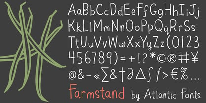
$29.99This font is a must for dinosaur lovers, as it brings back to life a variety of these huge reptiles. Besides figures of complete dinosaurs there are also a number of 'portraits' and poses. A creative combination of dinosaur figures allows the depiction of various situations, fighting, eating, etc. Have fun! - Farmstand by Atlantic Fonts,
$26.00Farmstand is a fresh and joyful font with the same kind-hearted feeling and naiveté of your local farmstand. Paired with Farmstand Goodies, 52 hand-drawn images of funky farmers' fare, you can celebrate and have some pickles, savor sweet strawberries, or get creative with Cosmos. Sometimes life can be simple. - Cutout by Adobe,
$29.00Matisse's paper cutouts inspired Gail Blumberg, Adobe art director, to create a typeface of figures. Her biggest challenge: keeping each Cutout design in scale. It's not easy to make a standing figure, like 'Y,' to be the same size as a curled up figure, like 'G,'" Gail says." - SP Jean by Remote Inc,
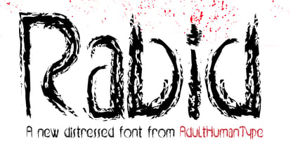
$39.00I met her in a saloon called Little Texas. I was drinking mescal like it was vodka. She, tossing midgets like they were lawn darts. When the betting was closed, she launched an extra from The Wizard of Oz an impressive five meters, grabbed her margaritta and sat down. - Rabid by AdultHumanMale,
$15.00 - Cross Stitch Gothic by Gerald Gallo,
$20.00 - Miometry by HakanPolatovic,
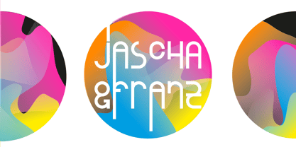
$20.00 - Regular Bien by JASCHA&FRANZ,
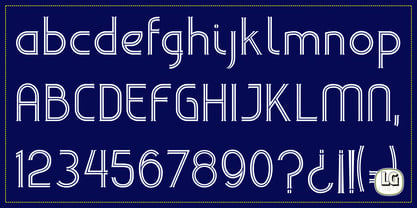
$15.00 - LGF Avadar by LGF Fonts,
$9.00 - Basquiat Irregular by Cuda Wianki,
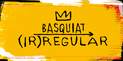
$29.00Basquiat Irregular is a font inspired by graffitti and children's writing. Contains 3 alternative characters for each letter, multilanguage support including cyryllic. It's perfect for creating artistic publications, writing quotes and many other designs. The family also has two fonts with frames, lines and ornaments. Its apperance is rough, hand painted and casual. Perfect for music and street art designs. Frames and lines are created by typing uppercase letters for starting or ending frame or creating an arrow and lowercase letters for typing lines. - Cardillac Text by Hoftype,
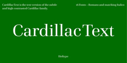
$49.00Cardillac Text is the down to earth version of the subtle and high contrasted Cardillac family. More suitable for longer text and for strong headline applications. The Cardillac Text Family consists of 16 styles, provides many features which allow its application for ambitious typography. It comes in OpenType format with extended language support. All weights contain small caps, ligatures, superior characters, proportional lining figures, tabular lining figures, proportional old style figures, lining old style figures, matching currency symbols, fraction- and scientific numerals, matching arrows and alternate characters. - Orgon by Hoftype,
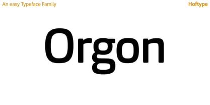
$49.00Orgon, a new linear typeface family, fresh and easy but with a warm touch. It appears uncomplicated, unpretentious, but still distinctive. Its quiet text flow allows smooth reading even for longer texts. The Orgon family comprises 16 styles and is well suited for ambitious typography. It comes in OpenType format with extended language support. All weights contain ligatures, small caps, superior characters, proportional lining figures, tabular lining figures, proportional old style figures, lining old style figures, matching currency symbols, fraction- and scientific numerals and matching arrows. - Sina Nova by Hoftype,
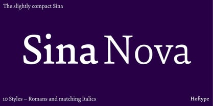
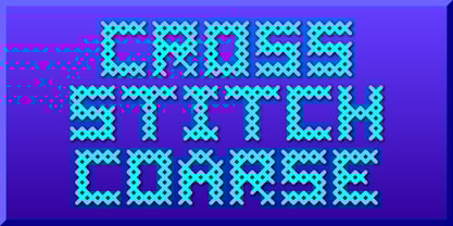
$-Sina Nova is the slimmer sister of Sina. It has a slightly vertical tendency, a higher x-height which makes it more open in small text sizes. Its economical proportions allow an even more universal application. Sina comes in 12 styles and in OpenType format. All styles contain standard and discretional ligatures, small caps, proportional lining figures, tabular lining figures, proportional old style figures, lining old style figures, matching currency symbols, fraction- and scientific numerals. Sina supports Western European, Central and Eastern European languages. - Cross Stitch Coarse by Gerald Gallo,
$20.00Cross Stitch Coarse is based on upper case characters 5 stitches tall and contains the upper case characters A-Z, numbers 0-9, ampersand, exclamation and question marks, comma, and period. Also, under the character set are all possible combinations of stitches 5 high from 1 through 5, which allows for the creation of custom glyphs. If the font is set at solid leading, lines following will align and mesh with stitches above. When setting lines of copy, extra leading is required to separate individual lines. - Equip by Hoftype,
$49.00Equip, a new versatile geometric sans face in 16 styles, designed on a geometric base, forms together with EquipCondensed and EquipExtended a superfamily of 48 styles. Low contrasted lines and a sturdy ductus give it a strong appearance. It looks open, generous and unsentimental. A large selection of weights and many useful OpenType features allow an easy adjustment for a wide range of applications, in print and on the web. Equip is very well suited for ambitious typography. The Equip family comes in OpenType format with extended language support. All weights contain semi-ligatures (design optimized single characters), proportional lining figures, tabular lining figures, proportional old style figures, lining old style figures, matching currency symbols, fraction- and scientific numerals and arrows. - Almond Script by Sudtipos,
$79.00With ascenders and descenders gone tall and wind-bent just the right way and capitals of enough weathered artistry to touch off waves of mystique and experience, Almond Script is calligraphy gone rusty and textured like only Angel Koziupa and Alejandro Paul can make it. Scarred and wavy like an exhausted warrior, slim and delicate like a tango dancer, this typeface is a unique convergence of the rough ancient brush and the modern Latin elegance. Nine out of ten packaging design experts agree: Almond Script has nothing to do with whitening your teeth, but it certainly can brand your product like no other script can. Designed by Koziupa and digitized by Ale Paul this font cover all your packaging needs! - Busted by Canada Type,
$24.95Busted is the very strange and out-of-character outburst of Bill Troop, a guy who was classically trained in everything, from classical piano and literature to classical photography and type design. As far as we could tell, Bill Troop is the kind of guy whose appearance and voice instantly trigger thoughts of black and white photos, fedoras, and pre-industrial age Europe. A few years ago, he even moved from the United States to England, where it took him less than a week to feel at home and start sounding like a Norwich native. Then something happened and the poor dude just snapped. Busted is the controversial result of the blood rushing to his head. If you know what exactly happened to him, please let us know. Concern, consideration and human interest story aside, Busted is a fascinating thing. It is a set of four interchangeable thick outline fonts where the same letter forms turn from wild to wilder to broken to somewhat clean. Mix them up in a setting and you have words that snarl with a sneer. Life's too short. Take it all with a grain of salt. Scream whenever you feel like it. Busted Pro is a single font combining all four character sets, and rigged with an OpenType pseudo-randomizer in the contextual alternates feature, which you can disable or enable anywhere in your setting for maximum visual shock just the way you like it. Works just as well in PAL or SECAM. Don't be fooled by imitations, and don't get caught with your drawers down. - Kreme De Fresh by PizzaDude.dk,
$20.00Kreme de Fresh is most likely the lacking ingredient for your next project! - Juline by URW Type Foundry,
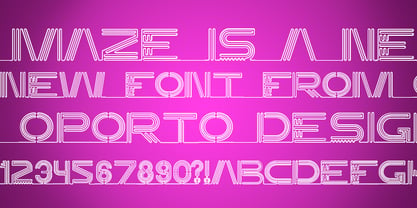
$35.99 - Maze by Oporto Design,
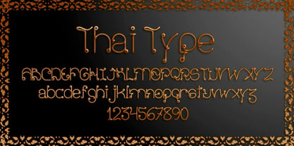
$79.90 - ThaiType by Oporto Design,
$39.90 - Matthew's Text by Matthias Luh,
$16.00 - Angoli by Mashiu,
$12.99ANGOLI is characterized by line geometric and simple. This font is ideal for titles and text in large sizes. The font has two uppercase versions. To realize this character I was inspired by angular shapes of the buildings. Each character has the characteristic of being formed by a single continuous line. - Montage by ITC,
$29.00Montage was designed by Alan Dempsey. Like the name suggests, the design was inspired by the arrangement of elements such as torn paper, cut-outs, scratch board and stencilled letters. Montage is a creative, eye-catching alphabet of casually drawn letterforms set on a background of daub-like brush strokes. - Axteroid by PizzaDude.dk,
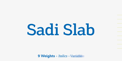
$20.00Axteroid was made to look like something that was teleported from a computergame from way-back in the 80s. To make it more 21st century-like, I have spiced the font up with some OpenType alternate letters and ligatures! You will need to use OpenType supporting applications to use the autoligatures. - Sadi Slab by Koray Özbey,
$19.00 - Classica Pro by URW Type Foundry,
$35.99Classica Pro by Bernd Möllenstädt A real alternative for letterpress printing A masterpiece It was only after many years, shortly before the end of his life, Bernd Möllenstädt brought out these early drafts of his Classica Light and Light Italic from his drawer, and asked me to produce for him on the computer a Bold and Bold Italic, from which we later wanted to interpolate further cuts like Regular and so on. The boldening of letters with an oblique axis and with hairlines which should not grow to the same extent as the general line widths, is hard to cope with perfectly, even for the smartest computer program, and even more so, when it concerns an as complicated set of data as those conceived by Bernd. The automatically generated result could therefore only be a first step that had to be improved manually later. This was about the stage that we had reached when Bernd died in March 2013, leaving me behind with comprehensive corrections on proofs of this automatically generated Bold. Although I was aware that it would mean a lot of work to complete the project, I did not want to leave it unfinished and decided to finalize and publish the Classica, also in Bernd‘s honor. In the course of the two years that I worked on this font family it somewhat naturally became also my own. New details were added and some of the existing changed. A book typeface requires the supreme and forgives rarely, it represents a true masterpiece. My intention and my ambition were to create a real alternative for letterpress printing, with a font family that contains all the typographic options for an excellent typesetting, and is better readable and has a better appearance than other existing typefaces. Whether this was achieved, the reader may decide. Volker Schnebel, Hamburg, december 2014 - Rafaella by Lián Types,
$37.00To Rafaella, a menina dos cachos. We, designers, have grown accustomed to seeing that lowercase letters—not only in calligraphy but also in typography (1)—may be very playful and decorative. Almost every part of them can become a potential swash, ligature or decorative accolade (2) if the designer has some expertise regarding this matter. However, since we are living in an era that elevates the status of handcrafts, lettering has gained a lot of ground in different kinds of mediums, and with it there’s a sort of overuse of capitals. This may be due to the reason that lettering pieces need a high impact to convey their messages and many times why big capitals are the only solution. With this in mind, I started Rafaella: A font consisting entirely of capitals which go from unadorned to very decorative. Rafaella has ductus and forms vaguely based on the 1970s Bookman-like styled fonts. The presence and behaviour of serifs and ball terminals in this style were the perfect excuse to make really attractive aternates which the user can choose from the glyphs panel. The result is a font full of life. Able to be both very playful and formal due to its roman style which can be combined with (and between) a wide range of other styles of expressive scripts or geometric fonts with nice results (3). Also try Rafaella Shade Solo combined with Rafaella or Rafaella Bold for a layer effect to emphasize any given word or phrase. NOTES (1) See my fonts Erotica from 2013 or Dream from 2014. (2) Accolades is a wonderful word that refers to the ornaments made around the words in the spencerian style of calligraphy (3) Combinations often seen in different pieces of lettering were usually a contrast of style is wanted. - Pargrid by Linotype,
$29.99Pargrid is a grid-based typographic experiment from the young Swiss designer Michael Parson. In the Pargrid family, which contains three separate weights, Parson has created an intriguing system of small circles-similar to LED's or light bulbs-that live separately on a grid, creating unique letterforms. In small sizes, these circles blend together to create seemingly fluid lines, giving Pargrid's letters a wide, rectangular appearance. In larger sizes, the letterforms transform themselves into objects d'art-virtual and ordered communities populated by various points. Fantastic in both display settings as well as short strings of text, Pargrid may offer the exact look that your next project is looking for. Pargrid and nine other constructed type designs from Parson are included in Take Type 5 collection, from Linotype GmbH." - Nautical Fabulous by Letterhend,
$14.00The Nautical Fabulous font features a perfect blend of boldness and condensed letterforms. Its clean lines and sharp edges give it a catchy look that is ideal for modern branding, striking headlines, and impactful displays. With its commanding presence, this font effortlessly stands out in any design composition. This font perfectly made to be applied especially in logo, and the other various formal forms such as invitations, labels, logos, magazines, books, greeting / wedding cards, packaging, fashion, make up, stationery, novels, labels or any type of advertising purpose. Features : Uppercase & lowercase Numbers and punctuation Alternates & Ligatures Multilingual PUA encoded We highly recommend using a program that supports OpenType features and Glyphs panels like many of Adobe apps and Corel Draw, so you can see and access all Glyph variations. - 1512 Initials by GLC,
$20.00This set of initial decorated letters is an entirely original creation, drawn inspired by Italian renaissance patterns. It contains two roman alphabets : one drawn in white on black background and the other in black on white. We have included a few fleurons and decorative elements. It can be used as variously as web-site titles, posters and flyers design, publishing texts looking like ancient ones, or greeting cards, all various sorts of presentations, as a very decorative, elegant and luxurious additional font... This font supports strong enlargements remaining very smart and fine. It's prefered height is about one inch equivalent to about four lines of characters. This font may be used with all blackletter fonts, but works especially well with 1543 Humane Jenson, 1557 Italique and 1742 Civilite, without any anachronism. - Divine Beauty by Letterhend,
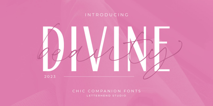
$12.00The Devine Beauty font is characterized by its simplicity and modernity. The clean lines and balanced proportions of the sans-serif font complement the elegant curves and flourishes of the serif font, creating a harmonious and visually appealing pairing. Overall, Devine Beauty is a stylish and refined font that is perfect for adding a touch of sophistication to any design, especially in logo, and the other various formal forms such as invitations, labels, logos, magazines, books, greeting / wedding cards, packaging, fashion, make up, stationery, novels, labels or any type of advertising purpose. Features : Uppercase & lowercase Numbers and punctuation Alternates & Ligatures Multilingual PUA encoded We highly recommend using a program that supports OpenType features and Glyphs panels like many of Adobe apps and Corel Draw, so you can see and access all Glyph variations. - Grenoble by Letterhend,
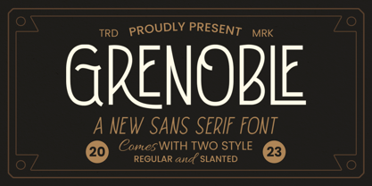
$14.00Say hello to Grenoble, the sans-serif font that combines the best of modern design with the elegance of vintage feels. With its monoline strokes and clean lines, Grenoble is both simple and sophisticated. Choose between the regular and slant styles to give your designs the perfect balance of classic and contemporary style. This font perfectly made to be applied especially in logo, and the other various formal forms such as invitations, labels, logos, magazines, books, greeting / wedding cards, packaging, fashion, make up, stationery, novels, labels or any type of advertising purpose. Features : Uppercase & lowercase Numbers and punctuation Alternates & Ligatures Multilingual PUA encoded We highly recommend using a program that supports OpenType features and Glyphs panels like many of Adobe apps and Corel Draw, so you can see and access all Glyph variations. - ITC Cinderella by ITC,
$29.99Some typefaces are staid, somber design tools. Then again, there's ITC Cinderella from Patricia Lillie: a typeface that's light-footed as a ballerina and joyful as a child at play. “There is a group of display faces that I simply love. Type that just seems to dance, type that makes me smile, designs that, when I see them, I say, "Boy, do I wish that was one of mine" says Lillie. “Although I never wanted to imitate these designs, when Cinderella started to emerge, I felt like it was the closest I've come to that quality.” ITC Cinderella projects gaiety and freedom. Capitals harmonize with a lowercase that bounces along with a lively, carefree attitude. Stroke weight stress is, well, all over the place. Curlicues abound. This delightful design is just that: brimming with delight. - Galiba by Juraj Chrastina,
$29.00Give your voice an eye-catching hand-drawn look thanks to this playful font family. You'll get three styles, along with OpenType features including alternates, ligatures and stylistic sets. Galiba Regular works very well with his small brothers Light and Thin. In addition Galiba Light can be used at smaller size along with the other styles to keep the same line thickness. To achieve a random-like effect, the regular style is packed with 4 different variants of each glyph, that automatically cycle if stylistic alternates are turned on. Also you can choose from 5 stylistic sets to easily change the look of a given string, or pick alternates by hand. Not to mention that we've attentively fine-tuned the kerning that’s crucial for this kind of typeface. - Hello Kindess Brush by Lucky Type,
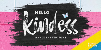
$18.00Hi designer, let me introduce my newest font Hello Kindess. Hello Kindess is my newest font brush that I made using a simple brush with a modern style and irregular base line. contemporary approach to design, natural handmade, suitable for use in title designs such as clothing, invitations, book titles, stationery designs, quotes, branding, logos, greeting cards, T-shirts, packaging designs, posters, and more. Hello kindess Font consists of 2 kinds of styles namely upright and italic style so that designers are free to choose the desired style. Hello Kindess Font Also has 20 Extras made by hand which are very suitable for various purposes in design. Extras that I made with full detail so it looks very unique. Thank you for seeing I hope you like it. - Mastro by Ndiscover,
$49.00Mastro is a contemporary design comprising 72 styles. With 9 weights and 4 optical sizes: Caption, Text, Sub-head and Display. A super versatile font family ideal for editorial, graphic design, branding and web. Filled with iconic unusual shapes, yet with a super rigorous professional look this design will stand out and work efficiently. Caption styles are meant for very small text like footnotes; Text styles are meant for long strings of text; Subhead styles are meant for sub-headlines; Display styles are meant for large size type setting. Mastro has many OpenType features such as Small Caps, Standard and Discretionary Ligatures, Superscript Letters, Case Sensitive Forms, Lining Figures, Old Style Figures, Tabular and Proportional Numbers, and more. If you want to enlarge this font family make sure you get its sans counterpart: Mastro Sans. - Rock Painting by Morganismi,
$9.00Rock Painting is based on ancient Northern rock paintings and I edited the glyphs to resemble latin letters, runelike. So it's quite writable and the characters can also be used separately in bigger shape. Some of the glyphs are idols of old Finnish gods and spirits: A - Ahti, god of (usually) water element or a spirit that lives in a pond, a lake or a river etc. I - Ilmarinen, god of the air K - Kaleva, ancient giant blacksmith, the great ancestor of Finns L - Luonnotar, the spirit of all nature, gives birth to creatures T - Tapio, god of the forest or the forest itself N - Nyyrikki/Nyrki, son of Tapio, a great hunter and so on. The font also includes glyphs resembling animals and things like moose, beaver, swan, fish, sickle, boat and more. - Nutshell Crew by IKIIKOWRK,
$19.00Proudly present Nutshell Crew - Street Brush Type, created by ikiiko. Nutshell Crew is a rough handwriting type inspired by hand-drawn street brushes. A type of decorative font that features bold, brush-like strokes, often resembling calligraphy, graffiti, or hand-painted lettering. This font features a rough and edgy style, making it ideal for any urban-inspired design project with a blend of grungy and hand-drawn lines will give your words a distinctive and rebellious character, setting you apart from the crowd. The perfect one for the modern-day hipster! This type is very suitable for making a streetwear brand, poster or magazine layout, posters, album covers, quotes, or simply as a stylish text overlay to any background image. What's Included? Uppercase & Lowercase Numbers & Punctuation Alternates Multilingual Support Works on PC & Mac - Canapé by FDI,
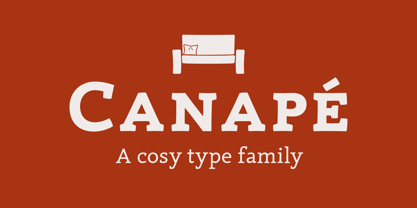
$25.00Canapé is based on the idea of letters with a subtly curved and slightly modulated line. Through this, the typeface has a warm and friendly, almost haptical appearance which brings some kind of cosiness to your communication with type. Designed and crafted with great attention to detail, the type family is usable for copy texts as well as corporate design or display purposes. Canapé (Serif) with its 4 fonts and more than 4,200 characters contains a large amount of features like small capitals, swashes, 10 different figure sets, automated fractions, ordinals, standard and discretionary ligatures, language support for Central and Western Europe and a small sofa building kit. All features are conveniently accessible through OpenType features. Check out the type specimen PDF for more details and a closer look.
