10,000 search results
(0.045 seconds)
- Stand Alone by Gassstype,
$25.00 Introducing Standalone is a handwritten brush font that written casually and quickly. Letters are made with brushes on Procreate. Then crafted carefully drawn into vector format and make it into a font. That is why Standalone has charming, authentic and relaxed characteristic more natural look to your text with a more natural look to your text. You can activate Ligature OpenType panel to make these two styles. It also has many alternatives and ligatures that make your text and design more interesting. Standalone is perfect for homeware designs,branding projects, Logo design, Quotes product packaging
 - Gazeta by Vanarchiv,
$21.00 This typeface was designed for editorial purposes (text sizes), where the letterforms contain short serifs (more economical). This font family contains different weights (from Extra Light until to Extra Bold) to create an simple and sequential typographic hierarchy scale. There are two different weights and options designed specifically for text sizes (Regular and Text). The design is classical but contain some contemporary details, which are not distractive for reading, it's simple and clean at small sizes. This font family include italics, small caps, ligatures, old style and tabular figures.
 - Eddieth Brush by Keristyper Studio,
$12.00 Eddieth Handbrush is a best-handwritten brush that is written casually and quickly. This font is good for logo design, Social media, Movie Titles, Books Titles, short text even long text letters, and good for your secondary text font with sans or serif. Featured: Standard Uppercase & Lowercase Numeral & Punctuation Multilingual : ä ö ü Ä Ö Ü ß ¿ ¡ Alternate & Ligature PUA encoded We recommend programs that support the OpenType feature and the Glyphs panel such as Adobe applications or Corel Draw. so you can use all the variations of the glyphs. Hope you enjoy our fonts!
 - Scotch by Positype,
$29.00 Clean, crisp, rational, familiar, modern… serifed. Positype Scotch reaches back to history just enough to produce something warm and easy on the eyes. No corners were cut, no quick tricks… this type suite was drawn for specificity: Text, Display, and Deck… ALL in 3 widths that now include Condensed and Compressed. Each unique, each inter-connected, each part of the whole. Scotch Text is offered in 6 weights with matching true italics. Drawn for economy and an easy read, the family is a workhorse for long-passage text settings. 4 sets of numerals, well-proportioned small caps, and a plethora of extras round out each font. Scotch Display is not just a thinner version of Scotch Text wrapped in a higher contrast. Display sports shorter ascenders and descenders, a unique footprint, great contrast, and a more folded, calligraphic italics. Display subtly oozes sophistication and provides an attractive, exhuberant companion to Scotch Text. Scotch Deck rounds out the offering by choosing to be specific to its offering. Deck utlitizes traits and proportions shared between Text and Display, but alters its overall mass to balance out the needs for settings that require subheadlines, callouts and other similar uses. Essentially, something not so high-contrast and not so stress dense that works great for middle-sizes.
 - HS Safa by Hiba Studio,
$50.00 HS Safa, an elegant Arabic display typeface carefully crafted for book titles, creative graphic projects, and modern logos. Categorized under "titles," it draws inspiration from the rules of Fatmic Kufi calligraphy, infusing a beautiful idea and special dimensions that preserve the allure of the Arabic font and its fixed rates. HS Safa is built upon the foundation of HS Sama font, but with a fresh and stunning molding (ornament) for the vertical strokes, adding a new dimension to its charm. This intricate detail enhances the overall visual appeal, making HS Safa a captivating choice for any design project. With comprehensive support for Arabic, Persian, and English languages, this typeface is versatile and accommodating. Available in two weights, Regular and Bold, it effortlessly integrates into the collection of contemporary Arabic Kufic fonts, catering to diverse design preferences. Whether seeking a modern Arabic font with a touch of uniqueness, HS Safa is a perfect addition to elevate any creative endeavor.
 - InSign by Konst.ru,
$- Geometric font for paradoxical or short texts. Also maybe use for headlines, logos etc.
 - Ravenwood by BA Graphics,
$45.00A strange design very mysterious and bizarre but sets extremely well even in text. - Lazy Fox by Pixel Colours,
$18.00 Lazy Fox is a handwritten font that has an imperfect look, great for texts!
 - Alons Antique by BA Graphics,
$45.00Created as a Headline Face Alons Antique works amazingly well as a text face. - Hebrew Julit by Samtype,
$39.00 Beautiful and elegant typeface, excelent using in wedding invitations, arts, posters and small texts.
 - Hebrew Provence Std by Samtype,
$39.00 Beautiful and elegant typeface, excelent using in wedding invitations, arts, posters and small texts.
 - Hebrew Juless by Samtype,
$39.00 Beautiful and elegant typeface, excelent using in wedding invitations, arts, posters and small texts.
 - Hebrew Rose Pro by Samtype,
$39.00 This beautiful hebrew swash font is for book covers, poster, titles and small texts.
 - Kauhuaatos by Morganismi,
$12.00 Kauhuaatos is a writable picture font, ideal for scaring anybody by text or prints.
 - Monica by Weknow,
$25.00 Give a groovy fun simple rounded, fancy, a cute looks to any text project
 - Pixa Circle by Ayi Studio,
$10.00 Font family designed for screen texts with eight variants and a variant of dingbats.
 - Pixa Square by Ayi Studio,
$10.00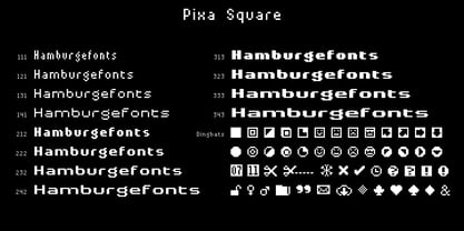 Font family designed for screen texts with twelve variants and a variant of dingbats.
 - AleKoteret MF by Masterfont,
$59.00 This high readable font family is highly suitable for headlines as well as text.
 - Italia by ITC,
$29.00Italia is the work of Colin Brignall, a refreshingly different serif typeface. At first glance, Italia might seem comparable to any other square serif typeface, but it has a distinctive pattern all its own. Italia can be used as either a display or text typeface and will give any text a unique look. - Fictionalism by Haiku Monkey,
$10.00 Fictionalism is carefully handcrafted slab serif, slightly condensed to fit lots of beautiful text wherever you need. It's handwritten, but neat as a pin; it's tidy, but has a lively character that grabs attention in a friendly way. Use it for branding, posters, text, or a million and one other design applications.
 - Jam Adega by JAM Type Design,
$20.00 Jam Adega is a humanist sans-serif typeface, intended to be clear and highly legible at a distance or at small text sizes. Jam Adega is extremely legible at a glance. This typeface can be used in large blocks of small text or as signage because of its instant and clear legibility.
 - Jilkyway by PizzaDude.dk,
$20.00Jilkyway is a truly weird font. Here and there you might spot some sanity in the weird font curves. But as you type, your text becomes more and more weird! The font is also suitable for text written in ALL CAPS! You will need to use OpenType supporting applications to use the autoligatures. - Pragma ND by Neufville Digital,
$45.25 Pragma ND is a sans serif typeface with calligraphic features. Its vital rhythm facilitates the reading of long texts. It also has an “authentic” italic imitating the movement of handwriting. Its high legibility makes it an ideal typeface for long texts in analog and digital contexts. Pragma is a Trademark of BauerTypes SL
 - Linotype Sallwey Script by Linotype,
$29.99Linotype Sallwey Script was designed by Friedrich K. Sallwey in 1980. This typeface has a handwritten character due in part to its slight lean to the right. Sallwey Script is both lively and harmonious and lends texts a private, personal touch. Sallwey Script is best suited to middle length texts and headlines. - HU Mobydick by Heummdesign,
$15.00 HU mobydick is a body font with square modules and a wide space composition. Sharp right-angled joints and strong endings. And thin strokes are combined to complete a harmonious typeface for body text. The gray level of the body text is set low, so it can be used for light work.
 - Mastro by Ndiscover,
$49.00 Mastro is a contemporary design comprising 72 styles. With 9 weights and 4 optical sizes: Caption, Text, Sub-head and Display. A super versatile font family ideal for editorial, graphic design, branding and web. Filled with iconic unusual shapes, yet with a super rigorous professional look this design will stand out and work efficiently. Caption styles are meant for very small text like footnotes; Text styles are meant for long strings of text; Subhead styles are meant for sub-headlines; Display styles are meant for large size type setting. Mastro has many OpenType features such as Small Caps, Standard and Discretionary Ligatures, Superscript Letters, Case Sensitive Forms, Lining Figures, Old Style Figures, Tabular and Proportional Numbers, and more. If you want to enlarge this font family make sure you get its sans counterpart: Mastro Sans.
 - TessieSpinners by Ingrimayne Type,
$13.95 A tessellation is a shape that can be used to completely fill the plane—simple examples are isosceles triangles, squares, and hexagons. Tessellation patterns are eye-catching and visually appealing, which is the reason that they have long been popular in a variety of decorative situations, such as quilting. Most of the shapes in TessieSpinners suggest a spinning motion. Most do not resemble real world objects. The TessieSpinners fonts contain shapes that can be used to construct tessellation patterns. It has two styles, an outline style and a filled or black style. The black style can be used to construct colored patterns. To see how patterns can be constructed, see the “Samples” file here. Most or all of these shapes were discovered/created by the font designer during the past twenty years in the process of designing maze books, coloring books, and a book about tessellations.(Earlier tessellation fonts from IngrimayneType, the TessieDingies fonts, lack a black or filled version so cannot do colored patterns. Make sure the leading is the same as font size or the rows will not line up.)
 - P22 Glaser Houdini by P22 Type Foundry,
$24.95 Milton Glaser commented about this type family: “The typeface is called Houdini after the famous American magician. I wanted to produce a letterform that would gradually disappear as one line after another was removed.” The various versions of Houdini presented by P22 include those originally offered as phototypesetting fonts, plus a solid and an outline version—a variation of which was used for Sesame Place children’s park in 1980. These Houdini variations can all be layered on top of each other for a range of chromatic effects. Each of the Houdini fonts contains over 375 characters for full European language coverage. The family is taken to its logical conclusion with the bonus font “P22 Glaser Houdini Vanished.” This font shares the same spacing and kerning as all of the Houdini font but lacks all visible outlines. Over the years there have been many typefaces that borrowed heavily from the Glaser designs, but these are the only official fonts approved by Milton Glaser Studio and the Estate of Milton Glaser.
 - Sitcom by GroupType,
$19.00 If there was an American Typeface Hall of Fame, Bank Gothic, designed by the great Morris Fuller Benton would hold a place of special distinction considering this design has survived so many trends in typographic fashion since being introduced in 1930. It's just as desirable today as it was over eighty years ago; arguably more. Today, Bank Gothic is a very popular choice as a titling face for science fiction books, posters and countless television and movie titles. It is also a popular typeface for use in computer games and digital graphics. GroupType’s 2010 revival of this American classic is true to the design, the period, and Benton’s aesthetic. GroupType worked with some of the most talented and experienced type designers that were historically grounded and sensitive to this design project. Fortunately, Mr. Benton has left us a large selection of other great typefaces for insight and guidance. GroupType’s new revival includes the original three weights in regular and condensed style but also a new small cap and lowercase in each font necessary for 21st century typography.
 - Trendy by Estudio Calderon,
$69.90 Welcome fashionistas, we have designed a type family based on fashion and current trends. Trendy, the new font of our studio follows the same design line that represents us, processes with brush lettering, variety of characters, OpenType programming and a special touch that reflects a boho chic style. The soul of Trendy is inspired in the logotype of one of the most influential type foundries around the world. Because of its great contribution in graphic design we have decided to pay tribute by expressing our gratitude for being an icon in the design world, the most recognized type designers of the last years have been part of that type foundry and for being source of inspiration for new designers. Trendy represents a fashion house, a place that breathes fashion, there are inside 5 determining variables for designing time: Regular, Bold, Black, Display & Stencil. Discover this new way to see the glamour world all include in a type family. To know more about our new project, Trendy, visit our web site www.estudiocalderon.co and our portafolio in Behance.
 - Bank Gothic by GroupType,
$29.00 If there was an American Typeface Hall of Fame, Bank Gothic, designed by the great Morris Fuller Benton would hold a place of special distinction considering this design has survived so many trends in typographic fashion since being introduced in 1930. Its just as desirable today as it was over eighty years ago; arguably more. Today, Bank Gothic is a very popular choice as a titling face for science fiction books, posters and countless television and movie titles. It is also a popular typeface for use in computer games and digital graphics. GroupType’s 2010 revival of this American classic is true to the design, the period, and Benton’s aesthetic. GroupType worked with some of the most talented and experienced type designers that were historically grounded and sensitive to this design project. Fortunately, Mr. Benton has left us a large selection of other great typefaces for insight and guidance. GroupType’s new revival includes the original three weights in regular and condensed style plus two new distressed fonts. All have a new small cap and lowercase in each font necessary for 21st century typography.
 - Switched On by Type Innovations,
$39.00 Switched On and Switched Off where two fonts developed by placing points on a pre-defined square grid template. The experiment was to explore all the variations possible by just using straight connecting lines on a grid. I stumbled on the final concept, almost accidentally, and was amazed by the numerous possibilities. Both designs where created to work together. By adjusting the stroke and inline proportions between the two fonts, I was able to achieve a good overall color balance between 'Switched On' (dark letters on a light background), and the 'Switched Off' design as a knockout treatment (light letters on a dark background). Used in this way, both fonts visually appear similar in overall weight and proportion. They harmonize well together. Used separately, they make for some interesting visual effects and headline treatments. The fonts are best used at large point sizes, but they are still legible in a variety of smaller sizes. I think that by experimenting with these two fonts one can achieve some stunning visual effects. Explore and have fun.
 - Moviemania by Artisticandunique,
$40.00 Moviemania - Sans Serif font Family - Multilingual - 12 STYLE Moviemania font family is a modern sans serif typeface with its sharp lines and soft turns that form its characteristic structure. It offers you two alternative concepts in your preferences with its sharp lines in upper cases and soft lines in lower cases. It has an ideal modern structure in your preferences for branding and identity creation in today's modern world. Absolutely perfect for movie titles, magazines, branding, branding identity, posters, logo designs, packaging designs, websites - all digital platforms and more! This font can meet your needs in all modern and classic creative projects. CHARACTER RANGES : Basic Latin, Latin-1 Supplement, Latin Extended-A, Latin Extended-B, General Punctuation, Currency Symbols, Letter like Symbols,Arrows, Mathematical Operators, Miscellaneous Technical, Geometric Shapes, Miscellaneous Symbols, CJK Symbols And Punctuation, Private Use Area (plane 0), Alphabetic Presentation Forms GLYPH COUNT : (543) Uppercase typeface Lowercase typeface Numbers Symbols Multilingual With this font you can create your unique designs. If you have a question, please contact me. Have a good time.
 - Jazmo by URW Type Foundry,
$49.99 Jazmo is an offspring of an assignment I did for a Dutch architect. A classic building and coincidently the place of my studio in my hometown Zwolle, Netherlands, needed to be renovated. My job was to design the house numbers and signs for this building. This building I refer to was built in 1932 and designed according to the ‘New objectivity’ architecture. Now it accommodates several artist and craftsmen and also houses students. In my design I used elements of the Art Nouveau, which is related to the ‘New Objectivity’. Words as stately, angular, linear, stylish, artful, playful and frolic came to mind. It should be a design with a hint of the past and a flirt with the future. This house numbering is the root wherefrom Jazmo arises. The name Jazmo cites to the Jazz scene, which was a new and very popular artistic influence that time and age and is still a vibrant source of musical renewal. Mo stands for my Name Marit Otto. Together with my intern Arie Blok I created the missing characters and completed the font. Welcome Jazmo!
 - Steel Grrrder Script by ULGA Type,
$9.00 Steel Grrrder is an industrial-style joining script with a stencil effect, available in six weights ranging from Light to Black. Great for all kinds of display purposes including posters, film titles, book covers, magazines, advertising, signage, packaging, logos and tanks, this is a script with a sharp personality and a steely presence. However, if you’re searching for a “nice” script - sorry, bud - you’re looking in the wrong place. Steel Grrrder Script doesn’t entice the reader with voluptuous curves, flowing swashes or frisky letterforms, instead its sharp chiselled features compel the reader to pay attention. Characters muscle their way along like robotic bulldogs in steel-toe cap boots. Steel Grrrder Script is a veritable slab fest, best categorised as a constructivist joining script. Forged from carbon steel and wrapped in a layer of Graphene, this is a robust display typeface family able to withstand even the most demanding typographical situations. The Steel Grrrrder extended family also includes a six-weight sans-serif with corresponding italics and two display fonts, Groove & Nutjob - all designed to work with each other.
 - Achtung by Mikołaj Grabowski,
$39.00 This is an extension of Mikolaj's Grabowski first typeface. Formerly known as EPILEPSJA, now coming as ACHTUNG. Adding lowercase and small caps, as well as additional language support including Cyrillic script and some dingbats. ACHTUNG Color Type Family has a range of application from warnings and safety signage to propaganda posters and anarchist graffiti. Every place where you need an indisputable message, be it in headlines or titles, this font comes in handy. It’s a stencil, it’s layered and impossibly dimensional. Download the specimen HERE. I advise you to do so in order to being aware of how the layers work and how to use color fonts. Total of 1020 glyphs. Languages: Afrikaans, Albanian, Bosnian, Bulgarian, Catalan, Croatian, Czech, Danish, Dutch, English, Estonian, Finnish, French, German, Hungarian, Icelandic, Italian, Latvian, Lithuanian, Macedonian, Maltese, Norwegian, Polish, Portuguese, Romanian, Russian, Serbian, Slovak, Slovenian, Spanish, Swedish, Turkish, Ukrainian, Vietnamese, Zulu. OpenType features: small caps, localizations, superscript, fractions, ordinals, proportional and tabular figures, case sensitive forms, stylistic alternates, contextual alternates, and proper mark attachment.
 - HD Anomie by HyperDeluxe,
$40.00 HD Anomie is a modern geometric sans built in 18 styles with variable support and is brought to you by HyperDeluxe®. Its subtle forms and nuanced curves create a simple structure that could be perceived as mundane, but our goal was to create a typeface that is both mechanical and organic in its forms so it seamlessly fits within the environment it is placed. It's clean, minimal approach gives it a wide array of offline uses such as branding, editorial & print, but its modern design and detailed build makes it perfect for UI & digital applications. The clean visual structure of the letter forms give it great readability at smaller sizes, while also being happy to be shown off at larger sizes. Built to be robust and as versatile as possible we have around 1150 Glyphs per weight including extended Latin & Cyrillic support as well as basic Greek. Anomie also features extras such as 2 arrow sets, circled numbers as well as stylistic alternates and case sensitive forms. Find beauty in the Mundane. Meet HD Anomie.
 - Lilium Star by Krafted,
$10.00 “The modest Rose puts forth a Thorn. The humble Sheep a threat’ning Horn. While Lily white shall in love delight. Nor a Thorn nor a threat stain her beauty bright.” ― William Blake Are you looking for a way to enhance your copy? Introducing Lilium Star - A Modern Handwritten Font. With every hand-drawn stroke and curve, Lilium Star will delight and add brightness, modernity and elegance to wherever it is placed. Impress your wedding guests with gorgeous invitations using Lilium Star. Why not create more engaging content and inspire your audience and clients? This Modern Handwritten font is also perfect for headings, logos, business cards, printed quotes, cards, packaging, and your website or social media branding. What you’ll get: Multilingual & Ligature Support Full sets of Punctuation and Numerals Compatible with: Adobe Suite Microsoft Office KeyNote Pages Software Requirements: The fonts that you’ll receive in the pack are widely supported by most software. In order to get the full functionality of the selection of standard ligatures (custom created letters) in the script font, any software that can read OpenType fonts will work.
 - Guilloche A by Wiescher Design,
$80.00 Guilloches were – in the old days – used to make the falsification of banknotes more difficult. The engraving of these intricate lines was done by a highly specialized mechanical machine, which was operated by an equally highly specialized engraving artist. Once the settings for a specific curve were changed back to zero it was very difficult, if not impossible to set them back to the old design. I have designed a useful set of Guilloches that join to form ribbons that create a kind of op-art 3d effect. Under the keys A-U and a-u you find joining pieces. Under the keys V-Z and v-z I placed start- and endpieces. 0-4 are different lenght straight extensions and 5-9 are not quite so straight extensions. All other keys are corner pieces that can be used as stand-alones or put in rows to make for superb decoration. With a little bit of experimentation and maybe colored overlays you can achieve super-phantastic designs. Your elegant type designer Gert Wiescher.
 - ITC Arecibo by ITC,
$29.99 In ITC Arecibo, Argentinean type designer Luis Siquot has created a typeface of subtle typographic turns. At first glance, ITC Arecibo has a sturdy 19th century wood type flavor, yet the delicate hairline shadow is decidedly Art Deco. Its condensed proportions and character shapes have been carefully modeled to ensure legibility. Siquot added uniqueness and versatility to the face by drawing two sets of small caps: one in which the central horizontal strokes share the same plane (ITC Arecibo) as those in the full-size letters, and another where the horizontal strokes are proportional with the small caps(ITC Arecibo Too). Another intriguing subtlety is what Siquot calls the “soul of the face,” the distinctive highlight/shadow. “This ambiguous line is an effect I have wanted to incorporate into a design for some time,” says Siquot. “Is it a black hairline that surrounds the letters, or a white line incised into the left and bottom of strokes?” ITC Arecibo and ITC Arecibo Too: distinctive, powerful and economical of space. What more could you ask from a headline face?