10,000 search results
(0.038 seconds)
- 1565 Renaissance by GLC,
$20.00 This set of initial letters was inspired from French renaissance decorated letters. It is a typical pattern, one among dozen quite similar, but this one was in use in Paris, unchanged, for centuries, and was still in use in the beginning of 1900s. This explains the difference between I and J, U and V. These characters were engraved years after the original set. Our font was inspired from a late 1800s publication. It can be used as well with Humane fonts (like our 1543 Humane Janson or 1592 GLC Garamond) as with modern fonts like our 1820 Modern or 1906 French News.
 - Arterium by Burntilldead,
$14.00 Proudly prensent “Arterium” the classic Victorian typeface. Inspired by letterheads from the late 1800's and early 1900's. Set includes three major styles (Arterium Regular, Arterium Alternate & Arterium Side) and four sub styles version (slant, gradient, outline & extrude). The font really bring a good statement for your logo design and can be the image of a design. Arterium font is very unique and easy to apply to any media; t-shirts, posters, sign boards, letterhead and social media needs. Powered with opentype features that allow you to play full with hundreds of alternate characters, ligature, fraction & discretionary ligature.
 - Nightclubber by Device,
$29.00 The late 70s and early 80s is sometimes considered to be the period when headline typography went off the rails. Growing up in that period, some designers may beg to differ. Many geometric designs were available in dry-transfer and for the typositor, and were used everywhere a youth-culture look was appropriate - annuals, comics, club flyers, high-street boutiques, TV-advertised compila tion albums. Nightclubber is a fond homage to the excesses of the period, and should be used back-lit in pink neon or at a rakish 45 degree slant across a blurred photograph of a glitter ball.
 - Quartz by ITC,
$29.99The figures of Quartz font are based on those on digital clocks and LCD displays. All strokes are set at right angles to one another to create abstract characters. Fonts created for electronic displays gained in popularity at the same time as the computer became an everyday object. The standard is still around today and is the model for numerous interpretations. Fonts like Quartz have already won a firm position in trend typography. They embody the spirit of the late 20th century. Quartz font is a good choice whenever a marked contrast to everyday alphabets is the goal. - Weiss Modern Gothic by Jvne77 Studio,
$25.00 Weiss Modern Gothic is the first digital re-creation with a lot of improvements of a late seventies well-known edited typeface by Bauer. At the time known as Weiss Initials Extra Bold or Weiß Modern Gothik, the design was inspired by the famous Weiß Initialen N°2 drawn by Emil Rudolf Weiß (1875-1942); also father of the non-less famous "Neuland" typeface. Strangely, this beauty seemed abandoned while sister-flared faces like Friz Quadrata, Flange, Serif Gothic or Romic are in a new wave of revival. Hoping this one will not again disappear... Happy new life.
 - Reardon AOE by Astigmatic,
$19.95 Disco lives on in the alphabet stylings of Reardon AOE. From its uber-fat letterforms to its hole punched counters, Reardon AOE started as a digitization of a film typeface called Joyce Black by LetterGraphics. This flashback typestyle was taken from its limited A-Z and numerals set and fleshed out to include an expanded language glyph set. Reardon AOE finds itself thrown into a late 70’s-early 80’s flashback frame of mind, appealing to all of the disco and video game typography of that time, ready to throw down the vibe for your designs.
 - Brimley by Chank,
$49.00This slinky number will seduce you with its linking letters and special ligatures. Brimley's strokes are tight and sharp, and its characters are tied together with slender, whispy hooks. Although its elegance is timeless, this is a style that typifies lettering of last century's late '50s and early '60s. Chank Co. intern Tim Drabandt created Brimley with inspiration from antique type books. He named the font after Wilford Brimley. You know... the chubby old guy who tells you to check your blood sugar and eat your Grape Nuts and Quaker Oats. Haven't you ever seen Cocoon? - Chromosome by Three Islands Press,
$19.00 It hit me one day that the '60s-vintage labelmaker I had lying around might make an interesting display face. I began playing with it -- clicking out letters at various pressures, scanning the results, going over the scans in a vector-graphics program. Looked pretty good. To my chagrin, however, I soon afterward got a glimpse of someone else's label-tape font. Though modeled after a more modern device, its rocketing popularity prompted me to set Chromosome aside for a year or so. Finally finished it up in late-1995. Full release has light and heavy weights, regular and reversed styles.
 - Archiva by CozyFonts,
$25.00 Archiva Regular - Archiva Italic - Archiva Bold - Archiva Bold Rounded - Archiva Wide Rounded - Archiva Dropline - Archiva Stencil - Archiva Worn - Archiva Outline is the eighth font family created by American Graphic Designer Tom Nikosey. Tom specializes in lettering, typographic design & illustration for branding and trademarks. New from CozyFonts Foundry. Archiva was designed to maximize limited horizontal space reserved for text, type, or headlines, titles and label wording. The Archiva Family is perfect for Labels, headlines, ads and especially signage. The 9 members of the Archiva Font Family maintain a consistency and likeness to each other in form and dynamics but yet each member of the family has it’s own individual personality. Archiva derived from the word archival or place where records are kept. Archiva is the Greek word for Archive. The x-height and organized glyph consistency enables the user to keep files organized and clean much like an archive. Caps and numbers work extremely well together also. There are over 300 glyphs contained in each of the 9 variations of Archiva© by CozyFonts and they work in over 70 Languages. Please visit my website or Google Tom Nikosey for more info on his illustrious career. CozyFonts is Tom's intro into the world of font design.
 - Scholz Secession by HiH,
$8.00 We named this font Scholz Secession. Fin-de-siecle Vienna, Austria is the source of this Jugendstil design from Schriftgiesserei Eduard Scholz. The original release was under the name Reklameschrift Secession. Most of the curve strokes look like commas to me. The letters are as soft and plump as the comforter on the bed I slept on in a Salzburg B&B many years ago. I was traveling with a college buddy and our next stop was Vienna. There a kind, young student named Hanna and her boyfriend took us under their wing. One of the places Hanna proudly showed us was Otto Wagner’s Majolika Haus, built in 1898, and only about 8 blocks from Secession Hall. Hanna explained to us that the style was called Jugendstil and represented Art Nouveau as interpreted within the framework of their culture. I even took a picture. After all, memories are part of who we are. Figures are old-style for text use. This font would not be my first choice for a spread sheet. Included are German ligatures ch (alt-0123) & ck (125), two period ornaments (135, 175) and lower case o and u with Hungarian long umlaut (215, 247)). A very likeable and easy-to-use font.
 - Echo Soul by Set Sail Studios,
$14.00 Introducing Echo Soul; a free-flowing and carefree brush font duo, hand painted with love. Echo Soul speaks from the heart and doesn't hold back. With elongated brush strokes and a natural flow, it's the perfect choice for handwritten quotes, product packaging, and logo designs with a personal and affectionate touch. The Echo Soul family consists of; 1. Echo Soul • A handwritten script font containing upper & lowercase characters, numerals and a large range of punctuation. 2. Echo Soul Alt • This is a second version of Echo Soul, with a completely new set of lowercase characters. If you wanted to avoid letters looking the same each time to recreate a custom-made style, or try a different word shape, simply switch to this font for an additional layout option. 3. Echo Soul Sans • An all-caps font containing uppercase-only characters, perfect for supporting text to compliment the Echo Soul Script font. Also includes numerals and a large range of punctuation. Stylistic Alternates • Are also available for several lowercase characters - these have elongated tails and look great when placed at the end of a word. These can be used by turning on 'Stylistic Alternates' in OpenType capable software, or accessing via a Glyphs panel.
 - Phoenix - Unknown license

- Ver Army - Unknown license

- Hello Pirates - Personal Use - Personal use only

- ENYO Serif Light - Personal use only

- Aracne Regular - Personal use only

- HavingWrit - Unknown license

- Half SunBurst-w4-02 - Unknown license

- Marvina by Flawlessandco,
$9.00 Marvina is a handwritten Script Font that made with a classy style in each character, this style gives a feel of elegant font type. There's some connected letters and some alternates that suitable for any graphic designs such as branding materials, t-shirt, print, business cards, logo, poster, t-shirt, photography, quotes .etc This font support for some multilingual. Also contains uppercase A-Z and lowercase a-z, alternate character, numbers 0-9, and some punctuation. for more license, you can check in flawlessand.co If you need help, just write me! Thanks so much for checking out my shop!
 - Chekos by Authentype,
$11.00 Chekos is a feminine type face designed to be elegant and modern. Its clean, simple style makes it perfect for any project. Chekos comes in 9 weights: Light, Regular, and Bold. Each weight has five different styles. Chekos was created by designer Ekayasa. She wanted to create something that would be both beautiful and functional. Her goal was to make a typeface that could be used for everything from headlines to logos. Chekos is available in OpenType format and includes stylistic alternates, ligatures, and swashes. It is free for personal use and commercial licensing options are available upon request.
 - Qebram by Sealoung,
$25.00 Qebram is a custom font for your logo & branding. This font is a very strong and excellent branding font that can be used in any company that wants to make its image look modern and high-tech because every character is designed for a good logo. So let's create your own logo with this font. You can easily create & use your quality logo with just a Desktop License. Qebram Font is ready with: Ligatures Support multilingual Ready with Lowercase and Uppercase characters Numbers Punctuation Hope you enjoy our fonts and if you have any questions feel free to message & I'm happy to help :)
 - Eclectic Three by Altered Ego,
$45.00STF Eclectic Three contains dingbats and a special set of glyphs which make it simple and easy to create registration and fill-in forms for print materials. Create rules with hash lines, fill-in boxes and many other variations. Also includes handicapped, recycled and arrow right/left symbols. The Eclectic family is legendary, with a cult-like following among the inititated. With over 100 characters in the complete set, you'll find yourself using Eclectic Three almost daily to add spice to your otherwise san-serif typographic existence. Available in Mac and PC formats. License it today! - Konstans by Flawlessandco,
$9.00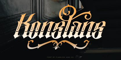 Konstan is a Blackletter font with an authentic and unique style on each character that gives a bold touch to any design you create. There's some connected letters and some alternates that suitable for any graphic designs such as branding materials, t-shirt, print, business cards, logo, poster, t-shirt, photography, quotes .etc This font support for some multilingual. Also contains uppercase A-Z and lowercase a-z, alternate character, numbers 0-9, and some punctuation. for more license, you can check in flawlessand.co If you need help, just write me! Thanks so much for checking out my shop!
 - Stencil Decor JNL by Jeff Levine,
$29.00 Stencil Decor JNL is loaded with all kinds of antique designs, embellishments and borders to work well alongside your favorite stencil lettering to create a totally retro look. Of course, these designs also make beautiful additions to many other kinds of print and craft projects. PLEASE NOTE: The purchase of this font does not include the right to reproduce the images for resale as stand-alone products (including, but not limited to stencils, ink stamps, stickers, wallpaper, etc.). For this kind of use, contact Jeff Levine Fonts through the email address provided in the EULA to discuss special licensing options and fees.
 - P22 Cusp by IHOF,
$24.95 This typeface was originally inspired by Art Deco lettering. During the development of the letterforms a strick DeStijl grid was imposed. The lowercase letterforms were created with the influences of rave/techno design styles. The result is a distinctly contemporary display font. The P22 Cusp Family contains 4 fonts: P22 Cusp Round, P22 Cusp Round Slant, P22 Cusp Square, P22 Cusp Square Slant. This font was designed as a display font and may be a bit taxing on the eye at smaller point sizes. The P22 Cusp family is licensed exclusively to P22 type foundry/International House of Fonts.
 - Mallona by MC Creative,
$10.00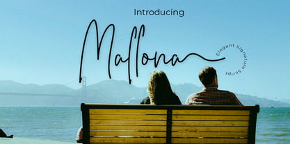 Mallona is monoline script font which natural movement and elegant for signature style. is perfect for branding projects, logo, wedding designs, social media posts, advertisements, product packaging, product designs, label, photography, watermark, invitation, stationery and any projects that need handwriting taste. What’s Included : Standard glyphs Ligature Works on PC & Mac Simple installations Accessible in the Adobe Illustrator, Adobe Photoshop, Adobe InDesign, even work on Microsoft Word. PUA Encoded Characters – Fully accessible without additional design software. Fonts include multilingual support for; ä ö ü Ä Ö Ü ß ¿ ¡ for questions and usage license please contact us Mohamadcandirah@gmail.com
 - Elongated Roman by Red Rooster Collection,
$45.00 Elongated Roman is a Didone-style serif typeface. It was originally designed in 1950 by typographers at Stephenson Blake. After International TypeFounders, Inc. acquired exclusive licensing rights to the Stephenson Blake Collection, Steve Jackaman (ITF) digitally revived the typeface in 1997 for the Red Rooster Collection. Much like other Didone typefaces, Elongated Roman’s strong contrast between thick and thin strokes and hairline serif design strengthen its elegance as a “modern face.” Unlike other Didone typefaces in the Red Rooster Collection, Elongated Roman was designed with display size in mind thanks to its strong variance in stroke weight.
 - Qitt Chesta by MC Creative,
$10.00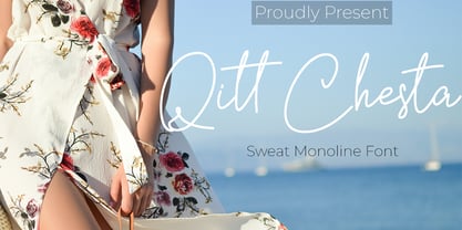 Qitt Chesta is monoline script font which natural movement and cute style. is perfect for branding projects, logo, wedding designs, social media posts, advertisements, product packaging, product designs, label, photography, watermark, invitation, stationery and any projects that need handwriting taste. What’s Included : Standard glyphs Ligature Works on PC & Mac Simple installations Accessible in the Adobe Illustrator, Adobe Photoshop, Adobe InDesign, even work on Microsoft Word. PUA Encoded Characters – Fully accessible without additional design software. Fonts include multilingual support for; ä ö ü Ä Ö Ü ß ¿ ¡ for questions and usage license please contact us Mohamadcandirah@gmail.com
 - Keyboard by Red Rooster Collection,
$45.00 Keyboard is a condensed and elongated Egyptian font family with thin serifs and a large x-height. Its original design was created in 1951 by Stephenson Blake. International TypeFounders, Inc. gained exclusive licensing rights to the Stephenson Blake Collection, and then Paul Hickson (P&P Hickson) and Steve Jackaman (ITF) created its digital form in 1994. Keyboard excels in display and subhead sizes, and brings a formal feel to any project. Its condensed nature gives it great visual density in the bolder weights, and the lighter weights allow it to retain legibility at both small and massive sizes.
 - Allin Priska by MC Creative,
$10.00 Allin Priska is monoline script font which natural movement and romance style. is perfect for branding projects, logo, wedding designs, social media posts, advertisements, product packaging, product designs, label, photography, watermark, invitation, stationery and any projects that need handwriting taste. What’s Included : Standard glyphs Ligature Works on PC & Mac Simple installations Accessible in the Adobe Illustrator, Adobe Photoshop, Adobe InDesign, even work on Microsoft Word. PUA Encoded Characters – Fully accessible without additional design software. Fonts include multilingual support for; ä ö ü Ä Ö Ü ß ¿ ¡ for questions and usage license please contact us Mohamadcandirah@gmail.com
 - LTC Pabst Oldstyle by Lanston Type Co.,
$24.95 Frederic W. Goudy originally designed Pabst in 1902. This lettering was used by the Pabst Brewing Company for their promotional materials. It was later developed into type for ATF. Goudy later licensed Pabst Oldstyle to the Lanston Type Library. Lanston Pabst Oldstyle features several differences from the more familiar ATF version. Some caps are narrower while some lower case characters are wider than the ATF version. The descenders are also shorter in the Lanston version. Logotypes of italic words and, of, and the are included as originally designed as well as ligatures including the unusual tt ligature.
 - Vorlesta by Flawlessandco,
$9.00 Vorlesta is a Serif Retrotype that made with modern and unique style in each character, so it's fitted for some retro project. There's some connected letters and some alternates that suitable for any graphic designs such as branding materials, t-shirt, print, business cards, logo, poster, t-shirt, photography, quotes .etc This font support for some multilingual. Also contains uppercase A-Z and lowercase a-z, alternate character, numbers 0-9, and some punctuation. for more license, you can check in flawlessand.co If you need help, just write me! Thanks so much for checking out my shop!
 - Fluster by Flawlessandco,
$9.00 Fluster is a Blackletter font with an authentic and unique style on each character that gives a bold touch to any design you create. There's some connected letters and some alternates that suitable for any graphic designs such as branding materials, t-shirt, print, business cards, logo, poster, t-shirt, photography, quotes .etc This font support for some multilingual. Also contains uppercase A-Z and lowercase a-z, alternate character, numbers 0-9, and some punctuation. for more license, you can check in flawlessand.co If you need help, just write me! Thanks so much for checking out my shop!
 - FS Pele by Fontsmith,
$50.00 Iconic Conjuring memories of chunky typefaces from the late-60s and early-70s, and named after the world’s greatest footballer of that and probably any other era, FS Pele is one of a set of Fontsmith fonts designed specifically for headlines and other prominent applications. “We wanted to create fonts that could be integral to the design of posters, album covers and magazines,” says Jason Smith. Welcome to FS Pele, iconic, like its namesake (though, perhaps, a little less nimble). Big Pele, little Pele There was only one Pele. But there are two sizes of FS Pele. FS Pele One, with the finer counters and details, adds considerable weight and style at large sizes, especially in big block headlines on posters. FS Pele Two’s thicker “slots” make it a better choice for smaller-sized text. A load of blocks FS Pele began as an exercise by Phil Garnham in turning squares into legible letters, via the least means necessary. The idea extended his ideas about logo-making, and the search for a stamp-like brand mark that lends authority, stability and instant identification. “The thought that the type was a 2D/3D jigsaw of slotted, architectural pieces was almost an after-thought. I wanted to create a strong, stacking, block aesthetic for the most contemporary poster design. “At the time there were a lot of designers creating their own versions of the same thing but I wanted to take the blocker forms to the next step, and infer a more legible text without sacrificing the idea.”
 - FS Pele Variable by Fontsmith,
$199.99Iconic Conjuring memories of chunky typefaces from the late-60s and early-70s, and named after the world’s greatest footballer of that and probably any other era, FS Pele is one of a set of Fontsmith fonts designed specifically for headlines and other prominent applications. “We wanted to create fonts that could be integral to the design of posters, album covers and magazines,” says Jason Smith. Welcome to FS Pele, iconic, like its namesake (though, perhaps, a little less nimble). Big Pele, little Pele There was only one Pele. But there are two sizes of FS Pele. FS Pele One, with the finer counters and details, adds considerable weight and style at large sizes, especially in big block headlines on posters. FS Pele Two’s thicker “slots” make it a better choice for smaller-sized text. A load of blocks FS Pele began as an exercise by Phil Garnham in turning squares into legible letters, via the least means necessary. The idea extended his ideas about logo-making, and the search for a stamp-like brand mark that lends authority, stability and instant identification. “The thought that the type was a 2D/3D jigsaw of slotted, architectural pieces was almost an after-thought. I wanted to create a strong, stacking, block aesthetic for the most contemporary poster design. “At the time there were a lot of designers creating their own versions of the same thing but I wanted to take the blocker forms to the next step, and infer a more legible text without sacrificing the idea.” - Ellida by Wiescher Design,
$49.50 Ellida is a very elaborate and elegant script in the tradition of the 18th-century English calligrapher George Bickham and the 19th-century American calligrapher Platt Rogers Spencer. I really enjoyed designing this script and maybe one day I will add starting and ending letters. Doing this script was extremely time- and brain-consuming, it is a huge challenge to make calligraphic letters work on computers so that they join perfectly. That's also the reason that this has become my most expensive font so far, but I think the price is fair for the incredible amount of work I put into the script. I really need a break from scripts now! Yours very exhausted Gert Wiescher.
 - Goodwater by Fenotype,
$19.00 Goodwater is an original collection of a Brush, three weights of a monoline Script and four weights of condensed Sans typeface. Goodwater also has a “Print” version with rugged outline and worn-out texture of each font. Goodwater is a great pack for any display use from online to logo and from headline to packaging. All the styles are designed using the same proportions and soft corners so that they’ll place nice together. All Print versions have the same texture style and size too so that they’ll fit smooth together. Goodwater Script and Brush fonts are equipped with automatic Standard Ligatures and Contextual Alternates to keep the flow smooth and it’s best to keep those features on.
 - Choplin by René Bieder,
$25.00 Choplin is a modern and clear geometric slab serif with a sturdy heart. It was designed based on the Campton Family, with the same principles in mind: geometry, simplicity and neutrality. As a consequence, Choplin could be seen as an immediate companion to the Campton Family. However, during the process lots of details were changed in order to sharpen the slab serif character which resulted in a slightly different interpretation. Similar to Campton, it is perfectly suited for graphic design applications ranging from editorial, corporate, web, interaction to product design. In addition, it has an extended range of alternative glyphs, ligatures and opentype features which provide flexibility and uniqueness wherever it is placed.
 - ocr-t by FaceType,
$7.00 Being a geometric sanserif ocr-t comes in eleven weights from ultrawhite to infrablack (brightwhite, white, silver, lightgrey, grey, darkgrey, anthracite, black, jetblack). With more than 600 glyphs it covers all your typographic needs and manages to stay at the same place no matter which width you’re using. Its readability and legibility is more than fine although it needs no kerning. The infrablack is really black, in order to achieve this, the form of letters change from darkgrey to anthracite from upright to some kind of upright italic. This also gives opportunity to mix two weights with same colour but different architecture. Find also stylistic sets, alternate letters, lots of bullets, different arrows, hands and well: kind of hearts.
 - Pumpkinseed by Three Islands Press,
$19.00 The tale of Pumpkinseed began with a bit of hand-printing I noticed on the dinner menu at a local restaurant. I took a menu home for future reference. Several months later, some similar hand-lettering on another dinner menu caught my eye. I became a sort of connoisseur of hand-done menu lettering. After tweaking and adjusting a few of these menu-inspired (uppercase) characters, I placed them -- along with some other designs -- in an online Type in Progress survey. They won. So I finished the caps, drew out the lower case from scratch, created three weights and oblique styles. The result: Pumpkinseed, a full-featured casual hand-lettering face. Comes in Light, Medium, and Heavy.


