10,000 search results
(0.029 seconds)
- Scriptage by Wiescher Design,
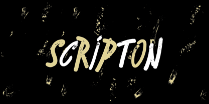
$39.50 - Scripton by Tour De Force,
$25.00 - Stripes by profonts,
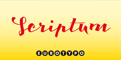
$41.99 - Scriptum by Eurotypo,
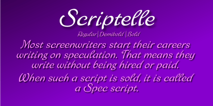
$34.00 - Scriptelle by Jonahfonts,
$39.95 - Scriba by ITC,
$29.99 - Inscription by ITC,
$29.99 - Strikt by NaumType,
$25.00 - Stripated by Aah Yes,
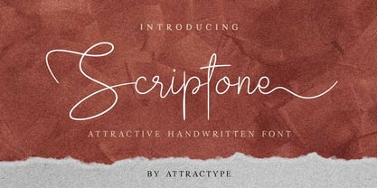
$6.95 - Scriptone by Attractype,
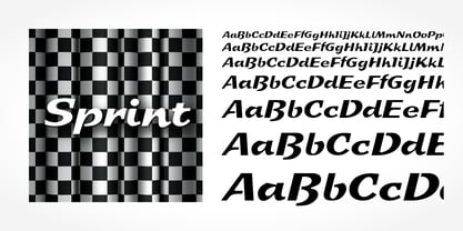
$19.00 - Sprint by SoftMaker,
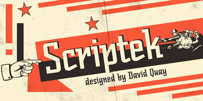
$9.99 - Scriptek by ITC,
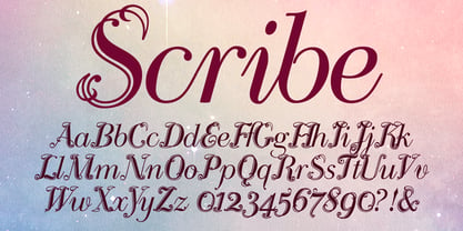
$29.99 - Scribe by Wiescher Design,
$49.50 - De Scripto by Prototype Fonts,
$20.00 - Sans Skript by Felitasari Rekso,
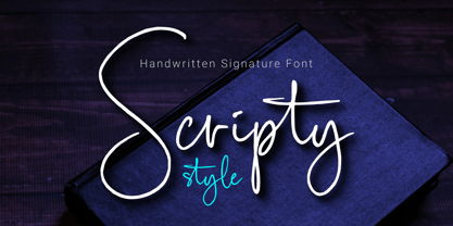
$25.00 - Scripty Style by MaxnorType,
$15.00 - Secret Scrypt by Canada Type,
$29.95 - Scripta Pro by John Moore Type Foundry,
$54.00 - One Mith Script - Personal use only
- Growing Script free - Personal use only
- Walt Disney Script - Personal use only
- Janda Celebration Script - Personal use only
- Shorelines Script Bold - Personal use only
- Janda Stylish Script - Personal use only
- Janda Cheerful Script - Personal use only
- Snippet Script SSi - Unknown license
- York Script ES - Unknown license
- Corps-Script-Shadow - Unknown license
- SF Comic Script - Unknown license
- Pea Jean Script - Personal use only
- Jayne Script YOFF - Personal use only
- Freebooter Script - Alts - Unknown license
- SF Burlington Script - Unknown license
- Pea Carrie Script - Unknown license
- Pea Johanna Script - Unknown license
- pee pants script - Personal use only
- SF Foxboro Script - Unknown license
- Pea Sara Script - Unknown license
- Pea Jeannie Script - Unknown license
- SF Foxboro Script - Unknown license
