10,000 search results
(0.041 seconds)
- Monisha by Rotterlab Studio,
$12.00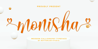 Monisha is a beautiful script font with perfectly perfect alternates. This font will exude a romantic and elegant feeling of your design. Monisha can be used for various applications, such as wedding designs, logos, invitations, posters, social media posts, and others. Features: - Additional characters encoded by PUA with a love accent - Can be used in any software, such as Adobe Photoshop, Illustrator, even Microsoft Word, PowerPoint, and others. - multilingual glyphs
 - Beliber by Ridtype,
$15.00 Beliber is a Serif Font Family, this font is specially designed to get the best feel and high quality to get the touch of a high end product This font supports Opentype Features, such as Alternate and Ligatures, as well as other forms of support symbols, numeric, mathematical symbols and others characters to be used. Thank you for your support of our product and using it in your project.
 - Bladis Night by Scoothtype,
$10.00 Bladis Night is a font duo between a serif and modern script fonts. Bladis Night is good for logo branding, wedding invitation, typography wedding, quotes text, magazine, or anything you want to do. Bladis Sans Serif includes numbers punctuation, alternates, and it also supports other languages. Bladis Night was built with OpenType features and includes ligatures, beginning and ending swashes , numbers, punctuation, and it also supports other languages. Thank you!
 - Lokko by VladB,
$20.00 Lokko is a modern sans serif geometric font, includes upper and lower case characters, Latin, Cyrillic, Latin Extended symbols and other. The Lokko family consists of 8 fonts, divided into 2 subgroups (according to the type of style - St, Cut), and have the 4 types of thickness in each subgroup. Lokko fonts will be useful in developing a brand, creating posters and other graphic products, and for word processing.
 - Farm Girl by Open Window,
$19.95 From the lab of Open Window comes Farm Girl. Farm Girl was inspired by old Art Nouveau posters from Toulouse Lautrec and others. Farm Girl utilizes the same 'loosey-goosey' quality as those posters. Farm Girl consists of 3 different styles which are designed to be used in combination with each other. Many different variations are possible. It's fresh cut and contemporary. It's ideal use is as a display font.
 - Urbancat by VladB,
$20.00 Urbancat is a modern sans serif geometric font, includes upper and lower case characters, Latin, Cyrillic, Latin Eastern Europe, Turkish, Baltic and other. The Urbancat family consists of 8 fonts, divided into 4 subgroups (according to the type of style - St, Rg), and have the 4 types of thickness in each subgroup. Urbancat fonts will be useful in developing a brand, creating posters and other graphic products, and for word processing.
 - Fozzy by VladB,
$24.00 Fozzy is a modern sans serif geometric font, includes upper and lower case characters, Latin, Cyrillic, Latin Eastern Europe, Turkish, Baltic and other. Fozzy family consists of 9 fonts, divided into 3 subgroups (according to the type of style - St, Rg, Op), and have the 3 types of thickness in each subgroup. Fozzy fonts will be useful in developing a brand, creating posters and other graphic products, and for word processing.
 - Quirky Notes by Insan Perkasya,
$12.00 Introducing the "Quirky Notes" font, which is a handwriting font made specifically for notes, but even though it is specifically for notes, this font is also very suitable for other things, such as quotes, lesson schedules, branding, logos and others. Quirky Notes font is made by handwriting so it produces natural strokes but is still beautiful to use. If you have any questions, don't hesitate to contact us. Thank You
 - Gettalk by Zamjump,
$17.00 Gettalk is a simple but unique brush font, there are standard ligatures and various lines that you can use for your design purposes, just by writing a__ (a underscore underscore) to n__ (n underscore underscore). Gettalk is perfect for Headlines, social media, invitations, business cards, photography, quotes, and any other needs you want. Because Gettalk is a font that is easy to pair with other fonts or stand alone.
 - Parus by VladB,
$20.00 Parus is a impacted modern sans serif geometric font, includes upper and lower case characters, Latin, Cyrillic, Latin Eastern Europe, Turkish, Baltic and other. The Parus family consists of 8 fonts, divided into 2 subgroups (according to the type of style - St, Obl), and have the 4 types of thickness in each subgroup. Parus fonts will be useful in a word processing, developing a brand, creating posters and other graphic products.
 - CYRON by Tadiar,
$27.00 CYRON Tech Serif is unique serif font combines hi-tech cyberpunk and futuristic atmosphere and classic serif's style. There are Uppercase and Lowercase letters done the way they ideally connect with each other. Multilingual support (Latin extended). It is designed for header and text both. Use it in your projects in such areas as robots & androids, cyberpunk, hi-tech, future, virtual reality, space, army, games and many others.
 - Neosim by Smartfont,
$20.00 A striking modern display font in three styles. Neosim is for any kind of design work. Every single letters have been carefully crafted to make your text looks beautiful. Created with creativity, passion and imagination. PERFECT FOR Titles, greeting cards (Christmas, Birthday, Helloween, other holidays), logos, posters, phrases, cover album, gift shops, books, comics, presentation, Pinterest or Instagram, other. Have fun with Neosim and expand your creativity in all areas.
 - Molliquam by Garisman Studio,
$20.00 Molliquam font starts from a brush stroke with a script style and also follows the times. Molliquam is very suitable for use in various media such as; packaging, logos, labels, posters, shirt design, quote of wisdom, hand-lettering, typography and many other media. - Ligature - Natural brush touch - PUA Encoded open - Support for MAC or PC - Simple installation for Adobe Illustrator, Corel Draw, Photoshop, or other software design Thanks Garisman Studio
 - Sidewalker by FSD,
$50.00In Sidewalker we can see pieces of OCR-A, letters and of other fonts; letters pressed over metallic supports with too much ink and then redesigned on a computer. Reminiscent of how different materials in Burri or Rauchenberg's paintings are used. Some numbers have the same shape of some letters (J=2, 6=G=9, I=1=l ...) and many pieces of letters are copied into others. Very experimental... - Beppo Brush by Lindstrom Design,
$20.00 Beppo is a bold upright casual script with a condensed character width and a full palette of ordindals, small caps, and diacritics. Beppo flavors things up with old style figures and quirky, contextual alternate connections. Legible, compact and smothered in typographic cheese - it just smells good!
 - Greedy Goose by Wilton Foundry,
$29.00Greedy Goose is a fresh new font that's full of character and unexpected surprises. Its thin, condensed strokes are ideal for elegant presentations that include Invitations, Brochures and Menus. So next time you need a fun, creative font with ATTITUDE, stick your neck out with Greedy Goose! - Abang Fashion by Nirmana Visual,
$19.00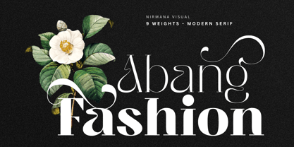 Abang Fashion is a luxury typeface with 9 Weights, full set of lowercase and uppercase letters, numerals and punctuation, multilingual symbols. Very suitable for the title, logo, typography, clothes, magazines, brochures, packaging and much more for your design needs, making your designs more modern and professional.
 - KD Bombarda by Kassymkulov Design,
$9.95 KD Bombarda is a piano-key, stencil and display face that will make your projects stand out from the crowd by introducing some interesting letter shapes. Originally designed in 2013, it's now been edited to provide smoother curves with broader character and feature support including Cyrillic.
 - Kurye by Arodora Type,
$30.00 Kurye, is an extremely elegant and emotional font. You can choose its large family for your magazine, brochure, catalog designs, furniture and architectural presentations. In this way, you can add a more aesthetic and unique atmosphere to your designs. Kurye, ligatures, alternative glpyhs and multilingual support.
 - RBNo2.1 by René Bieder,
$25.00 RBNo2.1 is a condensed sans serif typeface with a technical and geometric appearance. The family includes 2 versions (RBNo2.1a and RBNo2.1b) and has 7 weights with matching italics. RBNo2.1 feels comfortable in technical surroundings with short text passages, in brochures, catalogs, magazines, posters, websites headlines and logos.
 - Jutta by Spirit & Bones,
$9.00 As the basis for this new font artist and designer Lena Schmidt used an old font design by her mother Jutta. At a young age, her mother drew and illustrated a lot with pen and ink. She made beautiful illustrations and many font designs. Schmidt chose one of these drafts - delicately drawn Donovan lyrics - as the basis for this digital handwritten stencil font. What emerged from it is a stencil text and display typeface that relates to Auriol's art nouveau typefaces and the era of impressionism. More weights will be published in soon. Published by Spirit & Bones www.spiritandbonesdesign.com Designed by Lena Schmidt www.lenaschmidt.com
 - Amasis by Monotype,
$40.99 Amasis is a slab serif design which has been drawn with a humanist approach, rather than the traditional geometric construction associated with this style of letter. The result is a typeface that has an affinity with the Ionics, although in character it belongs to the latter decades of the twentieth century. The Amasis italic fonts, rather than being sloped roman or cursive in nature, are related more to the Old Style italics. Amasis works particularly well in small sizes where readability is important. Amasis has proved excellent for use on low resolution printers and for facsimile transmissions.
 - Marianne by bb-bureau,
$60.00 Marianne is a headline lineal designed by Benoît Bodhuin Protest writing (Caps only) made of tape modules joined by drawing a typical notch. 3 styles – Inline, Outline and Solid – each with variants Opentype, many original ligatures (including ‘HTTP’…) and alternative ‘A’ leaning on his right leg, allow many combinations and uses.
 - Runic by Monotype,
$29.99 This 1935 design from Monotype is an extremely condensed display font that has a slight flavor of nineteenth-century wood type. Runic Condensed font is tall and lean with a huge x-height and hairline serifs. It is an ideal display type for eccentric pieces where space is at a premium.
 - Stylized Deco JNL by Jeff Levine,
$29.00 In their book "Lettering of Today" by W. Ben and Ed C. Hunt, an Art Deco "thick and thin" alphabet with some stylized characters (which leaned a lot toward a calligraphic style) stood out from the rest. This is now available as Stylized Deco JNL, in both regular and oblique versions.
 - Chalulai by Jipatype,
$17.00 Chalulai, a serif typeface, seamlessly merges the aesthetics of stencil letters with a meticulously crafted high-contrast letter structure. Emanating a sense of beauty and delicacy, it offers 18 styles to choose from, supporting both Latin 1 and Thai letters. Ideal for diverse publications that prioritize headlines or a distinctive tagline.
 - Prillwitz Pro by preussTYPE,
$49.00 Johann Carl Ludwig Prillwitz, the German punch cutter and type founder, cut the first classic Didot letters even earlier than Walbaum. The earliest proof of so-called Prillwitz letters is dated 12 April 1790. Inspired by the big discoveries of archaeology and through the translations of classical authors, the bourgeoisie was enthused about the Greek and Roman ideal of aesthetics. The enthusiasm for the Greek and Roman experienced a revival and was also shared by Goethe and contemporaries. »Seeking the country of Greece with one’s soul«. All Literates who are considered nowadays as German Classics of that time kept coming back to the Greek topics, thinking of Schiller and Wieland. The works of Wieland were published in Leipzig by Göschen. Göschen used typefaces which had been produced by until then unknown punch cutter. This punch cutter from Jena created with these typefaces master works of classicist German typography. They can stand without any exaggeration on the same level as that of Didot and Bodoni. This unknown gentleman was known as Johann Carl Ludwig Prillwitz. Prillwitz published his typefaces on 12th April 1790 for the first time. This date is significant because this happened ten years before Walbaum. Prillwitz was an owner of a very successful foundry. When the last of his 7 children died shortly before reaching adulthood his hope of his works was destroyed, Prillwitz lost his will to live. He died six months later. His wife followed him shortly after. The typeface Prillwitz as a digital font was created in three optical styles (Normal, Book and Display). The typeface Prillwitz Press was created especially for a printing in small sizes for newspapers. »Prillwitz Press« combines aesthetic and functional attributes which make written text highly readable. It was originally designed for a newspaper with medium contrast to withstand harsh printing conditions. Its structure is quite narrow which makes this typeface ideal for body text and headlines where space is at premium. For the Normal – even more for the Book – a soft and reader-friendly outline was created through a so-called »Schmitz« and optimized in numerous test prints. The arris character and the common maximal stroke width contrast of the known classicist typefaces (Didot/Bodoni) were edited by the study of the original prints. This was also done in order to reach a very good readability in small type sizes. This typeface is perfectly suited to scientific and belletristic works. Accordingly it has three styles: Regular, Bold and Italic as Highlighting (1). The typeface Prillwitz is a complete new interpretation and continuing development of the conservated originals from 1790. They have been kept in the German Library in Leipzig. It was always given the priority to keep the strong roughness and at the same time optimizing the readability of this striking font. The type family has all important characters for an efficient and typographic high quality work. ----------- (1) Accentuation of particular words or word orders (e.g. proper names, terms etc.). Typographic means for Highlighting could be Italic, SmallCaps or semi-bold.
 - Chalk Hand Lettering by Fontscafe,
$39.00 If you are into the vintage feel, you will love this one. This is as vintage as it probably gets. There are probably only a handful of places in the world where schools still use blackboards and chalk – they’ve given way to their white board and marker counterparts for decades now. White boards are definitely more practical and less messy when compared to chalk, but then if you are creatively inclined you will agree that a little bit of mess is worth it if you are going to get the effects that you desired! Well, we can give you the effects minus the mess with our chalk hand lettering fonts! As the name suggests, this font gives you that distinctly unique chalk on slate feel, and if you are wondering what’s distinct about it; writing on slate or blackboard was a slow process which required deliberated and concentrated efforts resulting in a handwriting which was usually quite different to a person’s handwriting on paper. Typography of chalk on slate was an everyday event in the classrooms of yesterday, and today we hardly ever get to see one of these if it all. Writing on a black board with chalk was quite an interesting achievement in its own right, if you ended up with anything legible and if your writing remained focused and ‘in-line’! But of course like everything else, his took time to master and when you did get it right, chalk hand lettering was quite an enjoyable experience! For semi-permanent designs, say for example an eventful day at school; students of the day would create beautiful typography on the boards, and add a solidarity to it sometimes by shading one side of the lettering – usual y the right side towards which the lettering leaned. This is the effect our chalk hands lettering shaded variation gives you. You could get this font individually, but we strongly advise you check out the “chalk hand lettering pack” font. It includes the simple “chalk hand lettering” (minus the shading effect) and also a “chalk hand elements” bag of tricks. The elements is a collection of graphic art which resemble shapes and designs that used to be added to chalk art, to beautify the typography. If you enjoyed seeing the effects of our Chalk Hands font, and the shaded variant – you are simply going to go gaga over Chalk Hand Elements! The chalk hand font of course enables you to make typographic art similar to the effect of chalks on slates and black boards. This was quite the art form in the days gone by! The shaded variation added a bit of solidarity and the technique was commonly used to make semi-permanent designs say for example a welcome note when somebody important was to visit. Classic chalk hand designs, especially the semi permanent ones often had little pieces of art to help beautify the creation as a whole. It could simply be symmetrical graphics appearing before and after the title and headings, maybe just an interesting shape to fill in an empty area on the board, and such…our Chalk Hand Elements offers you a ton of such graphics. The two chalk hand variations and the elements are all included in the Chalk Hand Family, and this is strongly recommended if you want to make designs that are truly reminiscent of the days of chalk on slate.
 - Ciseaux by Wilton Foundry,
$29.00 Ciseaux was inspired and is dedicated to the art of paper cutting. Early paper cutting artists were often royalty, but it soon became a folk art practiced by commoners whose cutouts decorated their homes. By the seventeenth century it had spread throughout the world. The Japanese called it Mon-kiri, the German's Scherenschnitte and Turkey even boasted a guild devoted to the art form. In Poland the designs were traditionally symmetrical and often used layers of colors to form pictorial collages. When Russian invaders confiscated scissors, villagers were found to cut their intricate designs with sheep shears! The art form later developed into cutting out elaborate designs of nature scenes and people, celebrating special occasions and even decorating legal documents. Ciseaux letterforms mimic paper cutting art in its shapes with a rather loose and almost joyous rhythm. The overall effect is somewhat earthy and natural yet it has an element of sophistication that cannot be ignored. Just like paper cutting, Ciseaux can be used for special occasions like invitations, brochures, identities, restaurant menus, and if you dare, some awesome looking paper graffiti. Available in TT, PS and Opentype for Mac and Windows.
 - GemFont One - Personal use only

- Mattby Display by Paavola Type Studio,
$28.00 Stocky, beefy, dumpy, heavyset, husky, rotund, stubby, thick-bodied, thickset and fun display font with lots of ligatures, stylistic alternates and other features.
 - LD Eleanor Rae by Illustration Ink,
$3.00Use elegant LD Eleanor Rae to add formal or shabby chic accents to your scrapbook layouts, handmade greeting cards and other creative projects. - Xesy by Dharma Type,
$19.99 Odd and funny script for happy, fun time. There are two other fonts designed by in the same concept. -Ekistra -Deluta Black -Xesy
 - Pocket Initials JNL by Jeff Levine,
$29.00Pocket Initials JNL contains twenty-six initials inside of a white-into-black pattern for monograms, page headers, stationery and other creative projects. - Ecuador by WAP Type,
$15.00 This font has a unique character and can be used for your logos, business cards and other projects for a unique vintage look.
 - Diskus by URW Type Foundry,
$35.99 Diskus is a trademark of Linotype GmbH registered in the U.S. Patent and Trademark Office and may be registered in certain other jurisdictions.
 - Peanut Butter Man by PizzaDude.dk,
$20.00Forget everything about Times New Roman and all the other classic typefaces! Forget all that and take a bite of Peanut Butter Man! - Lowndes by Greater Albion Typefounders,
$8.50 Lowndes is designed as a Blackletter display face with a spirit of fun rather than historical accuracy, and with an emphasis on legibility and clarity. It's ideal for festive design such as cards, posters etc... Have fun!
 - Dangerfield by Solotype,
$19.95The Barnhart Bros. & Spindler foundry put out a caps-only face called Dante. We liked it, but felt it needed a lowercase. The result here is a rather nice square design, which has become a personal favorite. - Camelopard NF by Nick's Fonts,
$10.00 A wooden face, rather prosaically named Gothic Bold, from Hamilton's 1889 specimen book provided the pattern for this bold and brassy face. Both versions support the Latin 1252, Central European 1250, Turkish 1254 and Baltic 1257 codepages.
