1,414 search results
(0.056 seconds)
- Naerya by IbraCreative,
$17.00Naerya, a modern stylish serif font, effortlessly blends sophistication with contemporary design elements. With its sleek and clean lines, Naerya exudes a sense of timeless elegance, making it an ideal choice for projects that demand a touch of class. The font’s well-crafted serifs add a distinctive flair, striking a perfect balance between tradition and modernity. Naerya’s letterforms showcase a harmonious interplay of curves and straight lines, resulting in a balanced and refined aesthetic. Whether used for editorial design, branding, or digital applications, Naerya stands out as a versatile and visually pleasing serif font that lends a touch of sophistication to any project. - Franklin Gothic Raw Semi Serif by Wiescher Design,
$19.50When drawing a new font, there is a time when the final form is found – almost – but the curves are not slick and clean yet, that's what I call the "raw" form. Raw – no sweeteners added! In this family I redefined this moment in type development for the eternally beautiful "Franklin Gothic". I call the design "Franklin Gothic Raw". This packet is the semi-serif addition. There never was a Franklin-Gothic with serifs but actually the font lends itself perfectly to a slab-serif. I started with adding a half serif and eventually add a full slab-serif later on. - Data Error Vert AOE Pro by Astigmatic,
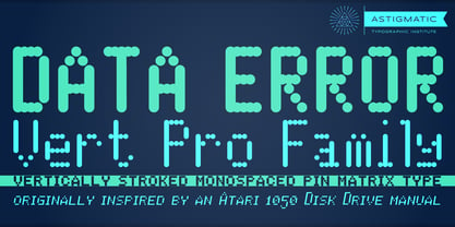
$24.00The Data Error Vert AOE Pro family is another spinoff of my Data Error AOE Pro family. Quite simply, it takes on a slightly different feel than the original pin matrix grid by stroking across all vertical glyph lines. The vertical lines break up the readability somewhat of the original grid and lend a more tech vibe to the family. Check out the range of posters created to see the various Capitals, Lowercase, smallcaps and varying styles that the family has to offer and how it both differs from and compliments the original Data Error AOE Pro family. - Meguro Sans by GT&CANARY,
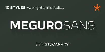
$27.00Meguro Sans has a modern-styled boxy shape that achieves clean, industrial yet friendly style lends itself well to brand building. Its mono-line oriented and very high X-height ensure that it is extremely legible and creates a strong impression. Meguro Sans is Sans serif version of Meguro Serif. The Meguro sans font family is comprised of 10 styles with 5 different weights from light to black, along with matching italics offering possibilities for use in web, print, package and sign design, all with the goal of building an established look for brands in wide range of industries. - Reywak by Product Type,
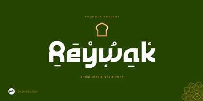
$15.00Reywak is an impactful new font that merges the clean look of sans-serif fonts with the powerful symbolism of Arabic characters. Its readability makes it the perfect choice for headlines and long reads, while the unique allure of its arabesque design lends itself beautifully to posters and greetings. Reywak: use it to make your content a cut above the rest. of course, your various design projects will be perfect and extraordinary if you use this font because this font is equipped with a font family, both for titles and subtitles and sentence text, start using our fonts for your extraordinary projects. - P22 Pooper Black Pro by IHOF,
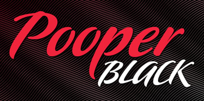
$39.95Pooper Black Pro is based on a brush ethic and has an extreme axis that lends a certain amount of speed to the font while the lack of connectors slows it down. The pro version expands on the original and popular Pooper Black with the addition of full Central and Eastern European character sets and plenty of alternate characters for those who have applications that support Opentype features. Almost all of the lower case characters now include an in stroke and out stroke version for greater design flexibility. A wonderful face for packaging, titling, and short bursts of text. - Mexborough by Greater Albion Typefounders,
$11.50Tradition meets tomorrow in Mexborough. Mexborough owes its origins to a challenge from a client of ours- they wanted a clear and easily readable typeface to use for signage in public spaces, but with enough flair and style to be suitable for use in heritage precincts. The result is a family of six Roman faces in a single weight, encompassing Regular, Text, Flamboyant, Small Capitals, Capitals and Title forms. These faces combine legibilty with traditional character, ideal for signage and poster work, where dignity and character are required. Mexborough's simple clean lines also lend themselves readily to web and online use. - Fehlian by SIAS,
$39.90In Fehlian I blended features of my earlier Arthur and Lindau releases. Fehlian is a sturdy yet sophisticated Art Deco style Roman semi-serif. It is an excellent choice for titlings, headlines, labels, shopfronts and any other display usage which needs to be typographically furnished with something special. Moreover, besides the plain Fehlian font you have the option of yet another two wonderfully decorated versions which lend even more beauty to your designs. Note that Fehlian is a capitals-only product. It has no lowercase but the uppercase is completed for multilingual usage and supports every Euro-Latin language. - Gate Keeper AOE by Astigmatic,
$19.95The GateKeeper typeface was inspired by old horror movies, and the various poster typography that went with some of them. A loose and pointy typestyle, GateKeeper embodies the dark side of typography and life, with a creepy and on edge feeling. With large and small capitals, it is easy to exchange cases in events of double characters, which can lend for a very interesting offbeat quality. Usable for any ocassion, but most suitable for dark matter. Learn about the GateKeeper, study his methods, and pass his test. Get the GateKeeper typeface today, and you are on your way! - Burgstaedt Antiqua by Linotype,
$29.99At first glance, Burgstaedt Antiqua looks like an old typewriter face, or rather like a typeface from a typewriter that has gone hopelessly wrong! Only after your second glance will you see this font for what it really is - a thoroughly new text face. Several features of Burgstaedt Antiqua, and its companion italic face, are worth special attention: First, the terminal styles of the letters vary throughout the alphabet. This gives text set in Burgstaedt Antiqua a slightly jittery feeling. A second interesting feature is the lowercase q", which takes the form of a shrunken-down uppercase "Q". Burgstaedt Antiqua Regular and Burgstaedt Antiqua Italic may be used in both text and headlines. For use in text, we recommend employing a slightly larger point size (12 pt or 14 pt and above). British designer Richard Yeend designed this family in 2002. - Moho Condensed by John Moore Type Foundry,
$40.00Moho is inspired by the Victorian sans shapes, movements and expressions of modernism art deco and constructivism, conceiving a decorative and elegant font, modern and readable display. This provides a retro look style of elegance of the 30s. Moho Condensed font family is straight, vertical, with joints and links or curvilinear or angular. Moho provides an innovation in the form of letters, to replace traditional forms of curves by straight or vice versa. Condensed Moho is a category of square letter, has an efficient OpenType programming for Moho OT Condensed, and basic for Moho Std families to compose texts in European languages of East and West, having wide set of over 610 glyphs. Designed to hold and typesetting over 14 pts or less increasing readability depending on the tracking. Moho Condensed is ideal for publishing newspaper and magazine design, convenient for the design covers and labels due to its space saving. Moho Condensed typefaces are closely related to the arts and fashion are very useful in creating logos and brands. - Moho Style by John Moore Type Foundry,
$45.00Moho is inspired by the Victorian sans shapes, movements and expressions of modernism art deco and constructivism, conceiving a decorative and elegant font, modern and readable display. This provides a retro look style of elegance of the 30s. Moho Condensed font family is straight, vertical, with joints and links or curvilinear or angular. Moho provides an innovation in the form of letters, to replace traditional forms of curves by straight or vice versa. Condensed Moho is a category of inline square letter, has an efficient OpenType programming for all Moho family, and basic for Moho Std Style family to compose texts in European languages of East and West, having im Pro a wide set up to 610 glyphs. Designed to hold and typesetting over 14 pts or less increasing readability depending on the tracking. Moho Condensed is ideal for publishing newspaper and magazine design, convenient for the design covers and labels due to its space saving. Moho Condensed typefaces are closely related to the arts and fashion are very useful in creating logos and brands. - Alecko by Evolutionfonts,
$-Alecko is a distinctive didone-style typeface, which is strongly influenced by calligraphy, but is at the same time drawn with mathematical precision. Its advantages are summarized in its slogan: “One typeface, many possibilities”. Once you decide to use it, you can alter its look in a variety of ways: Should the contrast between the horizontal and vertical strokes of the glyphs be high or low? Is it appropriate to apply engraving to the letters (and what color?). Should the glyphs be connected to one another? Alecko is equipped with a lot of alternative characters, which are automatically inserted as you type, in order to achieve a “handwritten” look, however, it can also work without them. Each of these options is appropriate depending on the design context and we want to encourage you to explore every one of them, which is why we sell the whole family for a considerably smaller price, than the combined price of all weights. And If you don't feel like spending money at all, just download the free weight. Have fun. - Mr Tiger by Hipopotam Studio,
$30.00After the success of our best-selling Mr Black, we decided to once more use my grandfather’s dry transfer lettering sheets. My grandfather was a Polish military cartographer and he left us some used-up sheets. The letters didn't transfer so well but we liked the way they were damaged. Mr Tiger has upper- and lowercase characters with up to four alternate glyphs. First three variations are only slightly damaged but the fourth one is usually more distorted. All of the glyphs have a very high resolution so they can be used in a large scale and they will still look great. One of the best things in Mr Tiger is the OpenType Contextual Alternates feature. It will automatically set alternate glyphs depending on frequency of appearance of the same character. The script doesn’t throw random glyphs. For example in the word “HIPPOPOTAMUS” you will automatically get three different “P” glyphs and two “O” glyphs. It really works great but of course you can always fine tune it by hand. - Compita by Studio Buchanan,
$12.00Compita is a Neo-Grotesk(ish) typeface that started life as a love-letter to Berthold's classic. But for every rigid, Neue-Haasism, there exists an equal and opposite amount of humanist attributes – along with a deliberate dose of creative license. It has some over-emphasised features and terminal endings which help to create its friendly personality, but sits them on a slightly condensed overall width. Together they help balance each other out, creating a face that feels both affable and professional. Aff-essional perhaps? The character set contains everything the modern day designer needs, including diacritic support for over 30 languages. And It’s packed full of the usual opentype features (that most will probably ignore) – Small caps, multiple number sets, and discretionary ligatures, to name just a few. Whether it’s deployed as a display face, or as the dependable choice for text, Compita is useable across multiple disciplines. Set in online, on screen or in print – it’s proof that not everything has to be Montserrat or Raleway... - Acuta by Anatoletype,
$27.00Acuta is a new all-purpose text serif with a good readability and a contemporary, robust look thanks to its low-medium contrast. The differences between thicks and thins are less strongly marked than in oldstyle text faces; yet the diagonal stress needed to facilitate reading is partly provided by the letter shape itself: sharp angles and italic construction give the right dynamism to the text. Acuta becomes very distinctive as a headline, while its big x-height makes it suitable for texts at rather small sizes too. The family consists of seven weights & correspondent italics, with a large character set. The Book and Medium weights, relatively close to each other, can both be used as “plain” weight depending on the size of the text, background color or backlighting. Small caps, oldstyle and tabular figure alternates, superiors and inferiors and ligatures are available in all styles through OpenType features. The real italics include unobtrusive swash alternates to emphasise the written feeling. Please find a specimen of Acuta (PDF) in the Gallery section. - PF Adamant Sans Pro by Parachute,
$45.00Adamant Sans on Behance. Adamant Sans: Specimen Manual PDF. Adamant Sans is a contemporary and very functional typeface. It stands out from the crowd with its uniquely designed rounded corners and beautiful italics. This carefully designed family consists of 18 fonts, including true italics. Its extreme weights, such as hairline and black are ideal for setting big and powerful headlines, while intermediate weights work very well in long texts at small point sizes. Weights are finely balanced so that they can be easily combined, depending on the type of paper and other conditions. Thanks to its proportions, high x-height and wide apertures, this typeface is very legible and suitable for setting books, magazines, newspapers, but is also valuable for use in large sizes, as well as for complex corporate projects. It supports advanced typographic features such as small caps, lining and oldstyle figures in proportional and tabular widths, fractions, ligatures, etc., and provides simultaneous support for Latin and Cyrillic as well as kerning for these languages. Adamant Sans is the ideal companion of the Adamant serif version. - Rubber B by TwelveTimesTwo,
$40.00Rubber B is a heavy display typeface with very tight open counters & character spacing and non-existent closed counters. It is an amalgam of styles and influences that demands attention. It is comparable with the highly geometric experimental fonts of the '90s and early '00s, but also heavily inspired by decorative fonts of the '60s and the psychedelic poster art of the '70s. Bold and loud, yet delicate, almost calligraphic in some cases. It works with Latin & Extended Latin, Cyrillic & Extended Cyrillic and Greek. It comes with 1,500+ glyphs, with more than half of them being ligatures. It also contains several Stylistic Alternates as well as Localised forms (available through the Open Type Features and also as ligatures). All these features are available in order to not only make sure that it works with as many languages as possible, but also that depending on the specific glyph or ligature one chooses to use, they have the ability to alter the emotional character of the word(s) they’re setting. Ideal for titles and logos, as it works best in medium and large sizes. - Operetta by Synthview,
$34.00Operetta is a neo-didone display font family inspired on Bodoni, Didot (early 18th century) and Walbaum (19th century). Despite of this heritage, Operetta’s design meets contemporary taste and typesetting needs. With five optical sizes, masterfully navigate between contrast and legibility across various dimensions. The range of eight weights, from the weightless Extralight to the robust Extrabold, let you set your tone: from delicate to exuberant. Operetta's generous character set and opentype features let you meet the most demanding layout needs. And don’t forget swashes, arrows and other extra glyphs, seldom included in a didonesque font. The number displayed in the font family name signifies the recommended minimal print size in points. In web design you should double the minimum value for a retina screen, multiply by 4 for a 72dpi screen. Of course its rendering depends on the printing support, screen resolution etc. Therefore, take it as a suggestion or a starting point; make your own trials. And now, the pièce de résistance: Operetta unveils its italics, adding yet another layer of allure and sophistication. - Mono To Go by buero bauer,
$20.00Mono To Go is a monospace typeface with a constructed, grid-based body and a playful and quirky spirit. Built from circles and other simple geometric shapes, it sees itself as a contemporary interpretation of the early, consistently reduced typefaces of modernism. With its modular concept, the typeface invites you to "build" individually combined word pictures. Depending on your preference for the type of composition, stylistic alternatives and open typeface features offer you a wide range of possibilities. The rhythm of the glyphs and their distinctive ascenders and descenders give the typeface a confident character for bold designs. The typeface works best in larger sizes, e.g. for brands, poster and cover designs, film titles, exhibition displays or generally for striking headlines. The character set contains 600 glyphs, including full language support for Western, Central and Eastern Europe, digits and oldstyle figures, punctuation, currency and mathematical symbols, and the entire set as small caps. mono to go was designed by buero bauer (2019–2021). Special thanks to Franziska Weitgruber for her support. - Toma Sans by JAM Type Design,
$-Toma Sans is a sans serif type family of seven weights plus matching italics. Influenced by the geometric-style sans serif faces that were popular during the 1920s and 30s, the fonts are based on geometric forms that have been optically corrected for better legibility. Toma Sans has a functional look with a friendly open touch. While the ExtraLight and the black weights are great performers in display sizes the light, regular and medium weights are well suited to longer texts. The small x-height and the restrained forms lend it a distinctive elegance. The typeface has an extended character set to support most European languages. - Memoire by Reserves,
$49.00Memoire is an elegant linear hairline contemporary sans. It is based on the underlying form of Vanitas, yet is rendered in a nearly monolinear hairline weight. Memoire is intended to be used selectively for headline use starting at 60pt and above. Stylistically, Memoire retains Vanitas’ alluring, sophisticated sensibility that is directly inspired by high fashion. The delicate linear form creates a sense of cohesiveness and lends the typeface an intriguing lightness of character. The upright styles are complimented by a pairing of optically adjusted true italics, which were purposefully adapted to retain the sharpness of their counterparts. Abandoning traditionally executed cursive italic letterforms retains Memoire’s sharp characteristic through each style. - Delphine by Hipfonts,
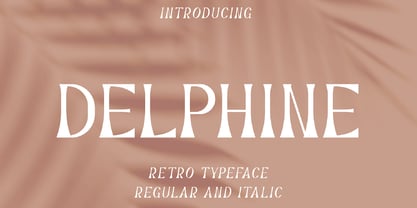
$9.00Delphine is a modern and elegant font that exudes sophistication and timeless charm. With its sleek and refined letterforms, this typeface effortlessly combines classic elements with a contemporary twist. Its clean lines and graceful curves lend a sense of luxury and refinement to any design. Delphine is perfect for adding a touch of elegance to wedding invitations, high-end branding, fashion editorials, and other upscale projects. Its versatility allows it to shine in both display and body text, while its attention to detail ensures legibility and readability at any size. Elevate your designs with Delphine and let its understated beauty and refined aesthetics captivate your audience. - ITC Underscript by ITC,
$29.99Underscript, from designer Claudio Rocha, is an alphabet of capital letters in handwritten style. Each letter has a corresponding alternative form and using both randomly in a text can give it the look of real handwriting. One constant element in the font is its stroke width. The strong figures are even and have rounded corners, lending them a cheerful appearance. All other attributes vary from letter to letter. Wide and narrow, high and low, the figures line themselves up unevenly on the base line. So can Underscript create a dynamic overall image with contrast. Underscript is perfect for cartoons, comics and anything light and carefree. - Rondawe by Luhop Creative,
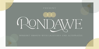
$18.00If you've got style and love all the luxuries in life, you're Rondawe! Add a touch of luxury and style to your projects too, with the new Rondawe Font Collection. It's highly recommended to turn your Opentype features on while using the Rondawe font, to make use of it's best features - the multitude of OpenType ligatures and alternates. This font is designed to pair harmoniously, and lend themselves to high end branding, logo designs, product packaging & invitation designs.Creates a perfect pairing contrast with combining Rondawe Serif and all Script font. and one more font recommendation that you should apply in your work,(Kelimajaroe Display) Get Discont 45% Use Code [ KLMJR45 ] - HS Hadeel by Hiba Studio,
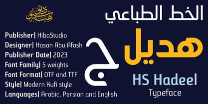
$50.00HS Hadeel is a versatile display typeface designed for use in titles and graphic projects that require both Arabic, Persian and English characters. It draws inspiration from the modern kufi style and boasts a unique blend of sharp and curved lines that lend a beautiful and geometric structure to each character. The sharp endings at the bottom of each character add an additional aesthetic touch. With five weights available, ranging from Light to Black, HS Hadeel offers a diverse range of options for designers seeking to elevate their Arabic typography. Overall, HS Hadeel is a great choice for those seeking a visually striking and flexible typeface for their projects. - HS Hadeel Serif by Hiba Studio,
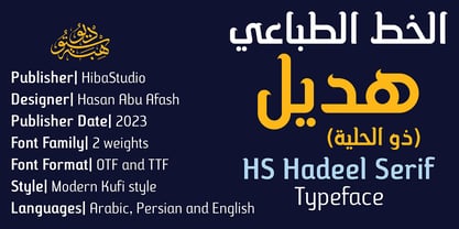
$50.00HS Hadeel Serif is a versatile display typeface designed for use in titles and graphic projects that support Arabic, Persian and English. It draws inspiration from the modern kufi style and features a unique blend of sharp and curved lines that lend a beautiful and geometric structure to each character. Based on the original HS Hadeel typeface, HS Hadeel Serif includes a serif on some of its characters to provide a more traditional look. Two weights are available for this typeface: Regular and Bold. HS Hadeel Serif represents a valuable addition to Arabic typography, offering designers a visually striking and flexible option for their projects. - Reservation Wide by TypeTrust,
$30.00Reservation Wide is intended for headlines with its relatively snug letterspacing and extended forms. Its simplicity will accommodate smaller sizes and lower resolution displays. OpenType Stylistic Alternates for characters 'a', 'g' and 't' lend an even simpler finish. The hand-drawn curves and angled stroke endings temper the otherwise rigid proportions of the family. This painterly tendency becomes more apparent in the heavier weights keeping them from looking too imposing. The design first took shape as a custom font named Majestos for the cable channel The Food Network . It can be found in their growing online and printed presence in addition to their broadcast identity for which it was developed. - Cullion by Greater Albion Typefounders,
$9.95Cullion is a new departure for Greater Albion, being a modern Fraktur, embodying future trends sch as highly stylised glyphs, a single case of lettering and highly evolved letterforms. At the same time it can trace its inspiration back to blackletter traditions, and is inspired by the sort of ironwork to be found in a medieval portcullis. The resulting typeface can sit happily in traditional, modern or futuristic design work. As the gallery images suggest, it does rather lend itself to work with a 'horror' theme, but it could have many other uses too-even in religious work. Cullion is particularly effective in poster headings. - Mortice by ArtyType,
$24.00I set out to create a solid, bold, strong, rugged font, one that would lend itself to any industrial type of use, and by that I mean industry in general, but probably sectors that would still be considered male preserves such as carpentry or metalwork. I thought specifically of mortice & tenon joints, whilst toying with shape and form for this self imposed challenge. I was also visualizing a router tool used for producing most wood joints nowadays. I think the general premise worked out well; in the end I settled on the name Mortice, referring to the slots or negative spaces that the matching part, or tenon would fit into. - Magnetik by Hanken Design Co.,
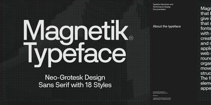
$40.00Magnetik is a versatile geometric typeface that boasts slightly rounded corners, which give it a modern and unique appearance that sets it apart from traditional geometric fonts. The font’s design is bold and striking, with sharp angles and precise lines that create a sleek and futuristic look. Its clean and minimalist style is ideal for a variety of applications, from logos and branding to web design and print materials. The slightly rounded corners of Magnetik lend it an organic, dynamic feel, suggesting movement and energy, while the geometric structure conveys stability and strength. The fusion of these seemingly contrasting elements results in a design that is visually appealing and attention-grabbing. - Ultravision by Great Scott,
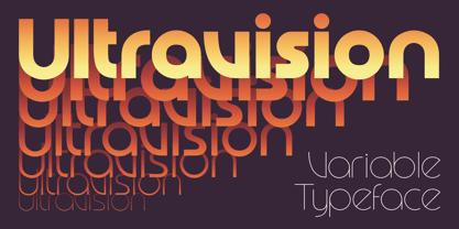
$18.00Introducing "Ultravision," a geometric sans serif font that artfully fuses the charm of the past with the clarity of the future. This typeface draws inspiration from timeless classics such as ITC Busorama, Herbus, and Marvin, yet it distinguishes featuring both uppercase and lowercase characters. A harmonious blend of vintage allure and modern sophistication, Ultravision embodies a retro aesthetic. Its geometric structure lends an unambiguous and clean feel, making it perfect for a wide range of applications, from bold headlines to subtle captions. Ultravision is also available as a variable font with variable weight support. Ultravision includes over 300 glyphs for lots of languages support. - Rifleman by Open Window,
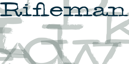
$19.95What a nice tranquil feeling you get from the wide forms of this font. The air of spontaneity was the most important thing about developing Rifleman. The forms were carefully and slowly constructed and then loosely traced with a paintbrush. Maybe the original drawings will become a font someday but i like to think that they won't for some reason. Surprisingly Rifleman is left to only the bare essential elements, anything that wasn't necessary was left out or removed. The goal was to make it as lightweight as possible to make up for the intricate detail. Rifleman is a surprisingly lightweight font offering lends itself to speedy typesetting! - Henry VII by Greater Albion Typefounders,
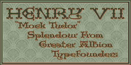
$15.00Henry VII draws it's inspiration from an inscription in Westminster Abbey dedicated to the memory of His Late Majesty of the same appellation. However, it is also in large part in the best tradition of 19th and 20th century Tudor revival. The inscription consisted wholly and completely of Capital Letter forms and we have 'imagined' all the rest in similar style, so Henry VII is very much a Mock Tudor work. Never the less, we feel it is great fun and ideal for lending an aire of 'Olde England' to any piece of design. Best used with 'Greensleeves' playing ever so softly in the background! - Sommet Serif by insigne,
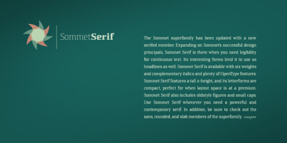
$22.00The Sommet superfamily has been updated with a new serifed member. Expanding on Sommet’s successful design principles, Sommet Serif is there when you need legibility for continuous text. Its interesting forms lend it to use as headlines as well. Sommet Serif is available with six weights and complementary italics and plenty of OpenType features. Sommet Serif features a tall x-height, and its letterforms are compact, perfect for when layout space is at a premium. Sommet Serif also includes oldstyle figures and small caps. Use Sommet Serif whenever you need a powerful and contemporary serif. In addition, be sure to check out the sans, rounded, and slab members of the superfamily. - Setisa by IbraCreative,
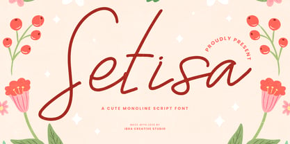
$17.00Setisa, a delightful monoline script font, enchants with its inherent cuteness and graceful simplicity. Each stroke is meticulously crafted, forming a seamless dance of letters that exude a charming, handwritten aesthetic. The monoline design lends a uniform and contemporary feel, while the script nature adds a touch of whimsy. Setisa effortlessly blends a sense of playfulness with a clean, modern edge, making it perfect for a myriad of creative endeavors. Whether used in branding, invitations, or any design project seeking a sweet and approachable tone, Setisa stands as a testament to the beauty found in simplicity, making every word written a joyful expression of charm and elegance. - P22 Yule by IHOF,
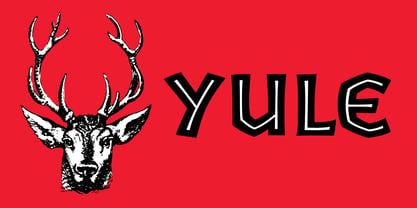
$24.95P22 Yule is a series of display fonts inspired by a mélange of ancient inscriptional writing, with visual references to Anglo-Saxon, Celtic, medieval and even a bit of ancient Greek and roman letterforms. Yule is exotic yet familiar and evocative of winter holidays. It has an Alpine look, lending itself to the thoughts of chalets and fondue. Yule Heavy Snow is blanketed in the white stuff, while Yule Light Flurries is dusted with snowflakes. With the addition of the Klein style, which includes a lowercase, Yule becomes infinitely more usable. The Klein variations can work well as an alternative to Neuland when you need the versatility of a lowercase. - Aclonica Pro by Stiggy & Sands,
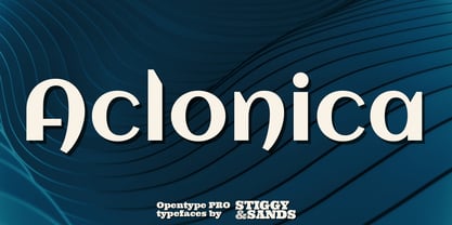
$29.00Our Aclonica Pro is a strong and modern sans serif typeface with a slight deco/techno essence to it. Clean letterforms and a generous x-height lend to a friendlier feel and easily legible typestyle, while signature swoops and angular tapering stems exude a subtle sensual nature. The SmallCaps and extensive figure sets not only expand the usefulness of the typeface across a wider gamut, but also convey a more serious tone when needed. Opentype features include: - SmallCaps. - Full set of Inferiors and Superiors for limitless fractions. - Tabular, Proportional, and Oldstyle figure sets (along with SmallCaps versions of the figures). - Stylistic Alternates for Caps to SmallCaps conversion. - Soerina by IbraCreative,
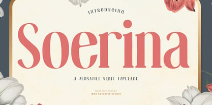
$17.00Soerina, a versatile serif typeface, embodies a harmonious blend of classic elegance and contemporary functionality. With its meticulously crafted letterforms, Soerina strikes a balance between sophistication and readability, making it suitable for a diverse range of design applications. The typeface exhibits a timeless aesthetic, featuring subtly modulated serifs that lend a touch of refinement to each character. Whether used for editorial design, branding, or digital interfaces, Soerina exudes a versatile charm, adapting seamlessly to various contexts while maintaining a distinct personality. Its balanced proportions and thoughtful details make it an excellent choice for conveying a sense of professionalism and aesthetic nuance across a spectrum of visual communication projects. - Abyssal Gothic by Abyssal Graphics,
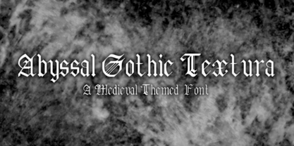
$25.00Introducing "Abyssal Gothic Textura," a hauntingly elegant blackletter font that reimagines medieval dark-fantasy with a modern twist. This font captures the allure of ancient calligraphy while preserving its historical aura. Meticulously crafted, each character exudes gothic grandeur, appealing to both traditionalists and forward-thinking designers. Ideal for sophisticated projects, it lends enigmatic allure to book covers, posters, and invitations. With support for multiple languages and stylistic alternates, "Abyssal Gothic Textura" empowers creativity in diverse designs. Let it guide you into the dark-fantasy realm, where it unveils hidden depths, bridging ancient charm and contemporary allure. Embrace the enigma of history with this captivating typographic gem.


