8,004 search results
(0.03 seconds)
- Kozuka Mincho by Adobe,
$125.00 - Kozuka Mincho Pr6N by Adobe,
$125.00 - ViabellaT H Pro by Elsner+Flake,
$40.00 The script version of the typeface Viabella introduces us to the calligraphic side of the Berlin type designer and typographer Karl-Heinz Lange. The sketches for this script typeface, which resulted from the close cooperation with Veronika Elsner and Günther Flake, found their roots in sketch drawings which Karl-Heinz Lange had already drawn in the 1980’s. For the Viabella design, Karl-Heinz Lange drew the basic letterforms of the Black and Regular cuts with a brush. He then re-worked the drawings and transferred them on to tracing paper. The design studio Elsner+Flake in Hamburg cut these typeface extensions and later digitized them manually with the help of the IKARUS Sustem. With the Regular cut as a basis, Elsner+Flake extended the family with the Light version and interpolated and re-worked the Medium weight. The completion of the family was taken over by the type designer Björn Gogalla who had done the same kind of work on Rotola, a design which Karl-Heinz Lange had also created for Elsner+Flake. While Viabella was originally conceived as a headline typeface, its lighter weights can certainly be used for shorter text applications. The Black version creates powerful headlines with highly effective accents. With the help of swashes, which are available for all weights, the user can lighten up longer texts and add special character to titles. In contrast to pure headline fonts, Viabella has been enriched by an extensive complement of special characters. In addition to the Europa-Plus character set which allows setting type in over 70 latin-based languages, the user will find multiple versions of numerals as well as oldstyle figures, tabular and proportional lining figures, diagonal fractions, and a complete set of superior and inferior figures and fractions (60%). With such a rich character set, Viabella is not only ideal for many different uses in the areas of newspaper, magazine and advertising but it will surely be chosen for the design of greeting cards, invitations and other design projects within the privat sphere.
 - Iwata Mincho Pro by IWATA,
$199.00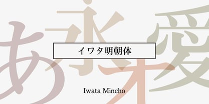 ??????????????????????????????????????????????????????????????????????
 - HG Mincho PRO by RICOH,
$199.00 HG明朝は、リョービの「本明朝」を字母とする明朝体です。現代的なイメージにするため、仮名文字の一部は変更されています。クラシックでシャープな書体ですが、ふところは大きく、読みやすい書体です。縦、横線の始筆部のふくらみをカットすることで、初期のPCディスプレイでの表示品位向上を実現しています。また、線幅補正ヒンティングのため、線幅の種類を抑制しています。HG明朝Lは、MS明朝と同じデザインです。
 - Iwata GMincho Pro by IWATA,
$199.00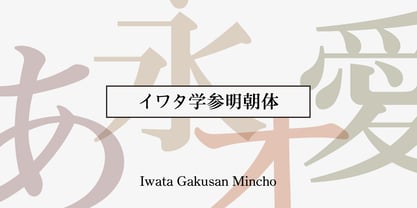 教科書や参考書、問題集などの教育教材作成のために開発された明朝体です。 筆やペンの入り、押さえ、ハネ、トメ、筆順などを理解しやすいようデザインしています。
 - Kristall H MfD Pro by Elsner+Flake,
$99.00 The design of Kristall Grotesk is based on a cut by Wagner & Schmidt, Leipzig, from the 30s of the last century. The basis for the digital version of the Stiftung Werkstattmuseum für Druckkunst , Leipzig was the standard font (28p) of the manual cuts as offered by the font foundry Johannes Wagner, Ingolstadt. The implementation was deliberately created as a replica to create a faithful reproduction as a starting point for the design of other design sizes. The present Kristall Grotesk is therefore a headline design. The appearance of the typeface can be varied by a number of alternative forms of capitals, which, according to the taste of the time, contain either pointed or flat formations. Designer: Hausschnitt Johannes Wagner, Leipzig, Redesign Elsner+Flake, Hamburg Designdate: 1937, 2009 Publisher: Elsner+Flake Design Owner: Stiftung Werkstattmuseum für Druckkunst , Leipzig Original Foundry: Wagner & Schmidt, Leipzig
 - Mancho by Ahmet Altun,
$-The Mancho Font was completely created by graphic tablet. This font family comes in two weights; regular and bold. They're all capital but lowercase and capital letters are different from each other. The name “Mancho” comes from Turkish Rock Music Singer "Barış Manço". The Mancho font can be a part of your stylish designs with its free and powerful outlook. - Rincho by Inumocca,
$25.00 Rincho Modern Futuristic Font Minimalist typeface with feels Futuristic Letterforms and eyecatching. Inspiration by neon lights,Synthwave, Mecha, Modern Technology, Sci-fi Movie Poster, science and Space Theme. Really great font to covering your Project, like Lettering, Website Interface, Magazine, Branding, Poster, wedding invitations, Quotes Lettering, Logos, and more your project design. - Unique glyphs - Multilingual Characters - UPPERCASE - Lowercase - Numeric - Symbol - Punctuation Character - Stylistic Alternates (SS01,SS02,SS03,SS04) inumoccatype
 - Iwata Mincho Old Pro by IWATA,
$199.00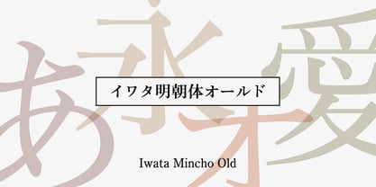 ?????????????????????????????????????????????????????????????????????????????????????
 - Iwata News Mincho Pro by IWATA,
$309.00 ????????????????????????????????????????????????????????????????????????????
 - Department H - Unknown license

- Antelope H - Unknown license

- H Central by MacCampus,
$30.00 - Kontext H by Elster Fonts,
$20.00 Imagine a font that is easier to read the smaller it is – or the further away the text is. There are already many line screen fonts, I wanted to take it to the extreme and use as few lines as possible, while keeping the grid of the fonts metrics. The result is a typeface that lives up to its name. Each individual line makes no sense on its own; individual letters are only recognisable in the context of all associated lines, individual letters are most likely to be recognised in the context of whole words. Attached to a building wall, text would be readable from a great distance and become increasingly difficult to decipher the closer you get to the building. Placed on the ground or on a large flat roof, text would only be readable from an aeroplane or - depending on the size - in Google Earth. Kontext has old style figures, superscript numerals, case-sensitive questiondown and exclamdown and an alternative ampersand, 390 glyphs at all. Use the same value for font size and line spacing to keep the lines in the grid, or change the line spacing in 10% steps. Change the spacing in 100-unit or 25-percent increments increments to keep the grid. The »H« in the font name stands for horizontal (lines). The numbers in the font name refer to the brightness of the background and letters themselves, with the first number describing the background and the second the letters. Starting with »00« (white) to »200« (dark) See also my Family Kontext Dot
 - Heisei Mincho by Adobe,
$39.00 - MS Mincho by Microsoft,
$39.00MS Mincho™ Japanese font features serifs at the end of its strokes, and can be used for a variety of uses from screen display to publications. This font file is 5.3 MB in size. MS Mincho Japanese font is a trademark of Microsoft Corporation. MS Mincho font Character Set: Latin-1, Japanese (code page 932). MS Mincho is available in both TrueType and OpenType font formats. - Ten Mincho by Adobe,
$69.00Ten Mincho is a Japanese typeface design from Adobe Originals, designed by Ryoko Nishizuka and useful for a broad range of settings, such as advertising copy, book titles, and headings. As a traditional Mincho-style design the strokes are slightly heavy and rounded, and exhibit smaller counter spaces. Ten Mincho also features a full set of Latin glyphs, collectively known as Ten Oldstyle and designed by Robert Slimbach. This relatively feature-rich Latin subset includes OpenType features such as small caps and old-style figures. Finally, look for a small number of color emoji in an SVG table, some of which are accessible as alternates. - HG Mincho by RICOH,
$199.00 - MS-Mincho by Microsoft Corporation,
$39.00 - Motoya Mincho by Motoya,
$229.00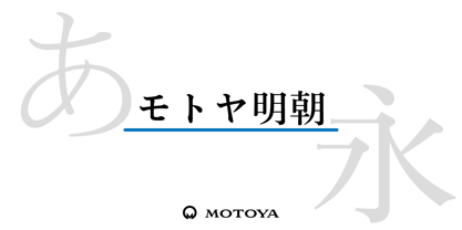 ????????????????????????????????????????????????????????????????????????????????????????????? ???????????????????????????????????????????????????????????????????????????????????????????????????????????????????????????????????
 - Pincoya Black Pro by Latinotype,
$49.00 Pincoya Black Pro is a font based on lettering found on a poster from the Spanish Civil War, complemented with graphics developed in “La Unidad Popular” (Chilean political coalition) during the seventies. Pincoya has many alternate characters in Opentype format that provide multiple options when composing a text. It is an ideal font for high impact sentences, logotypes, magazine layouts, poster designs, etc. Languages include: Basic Latin, Western European, Euro, Catalan, Baltic, Turkish, Central European, Romanian and Pan Africa Latin.
 - Black Jack Pro by CheapProFonts,
$10.00 The talented Ronna Penner has created many beautiful script fonts, and Black Jack’s quality was very good so only a few spacing issues had to be addressed. I've added some kerning pairs, and then added all the glyphs needed for the CheapProFonts language coverage. This font was an absolute joy to rework, and with its extended character set I hope it now finds many more users! ALL fonts from CheapProFonts have very extensive language support: They contain some unusual diacritic letters (some of which are contained in the Latin Extended-B Unicode block) supporting: Cornish, Filipino (Tagalog), Guarani, Luxembourgian, Malagasy, Romanian, Ulithian and Welsh. They also contain all glyphs in the Latin Extended-A Unicode block (which among others cover the Central European and Baltic areas) supporting: Afrikaans, Belarusian (Lacinka), Bosnian, Catalan, Chichewa, Croatian, Czech, Dutch, Esperanto, Greenlandic, Hungarian, Kashubian, Kurdish (Kurmanji), Latvian, Lithuanian, Maltese, Maori, Polish, Saami (Inari), Saami (North), Serbian (latin), Slovak(ian), Slovene, Sorbian (Lower), Sorbian (Upper), Turkish and Turkmen. And they of course contain all the usual “western” glyphs supporting: Albanian, Basque, Breton, Chamorro, Danish, Estonian, Faroese, Finnish, French, Frisian, Galican, German, Icelandic, Indonesian, Irish (Gaelic), Italian, Northern Sotho, Norwegian, Occitan, Portuguese, Rhaeto-Romance, Sami (Lule), Sami (South), Scots (Gaelic), Spanish, Swedish, Tswana, Walloon and Yapese. There is no yen currency symbol is this font.
 - Black Sansa Pro by Authentype,
$14.00 Black Sansa - Retro display font with a full set of uppercase and lowercase letters, multilingual symbols, numbers, punctuation, stylistic set, and ligatures. Black Sansa retro display font style for retro poster, magazine, retro beauty branding design in vintage style suitable for your retro design concept. Features: Simple installations, accessible in Adobe Illustrator, Adobe Photoshop, Adobe InDesign, even work on Microsoft Word. PUA Encoded Characters – Fully accessible without additional design software. Fonts include multilingual support for; ä ö ü Ä Ö Ü ß ¿ ¡ ____ PLEASE NOTE Most of the fonts require advanced graphic software that supports Open Type Features like Adobe (Illustrator, InDesign, Photoshop), Affinity (Photo, Designer, Publisher), Corel Draw, or similar software. Image used: All photographs/pictures/logo/vector used in the preview are not included, they are intended for illustration purposes only. Thank you Hope you enjoy our font!
 - Cooper Black Pro by SoftMaker,
$15.99 SoftMaker’s Cooper Black Pro is a friendly, chubby typefaces with rounded serifs and tilted back ovals. It is perfect whenever an informal, friendly character is desired in your designs. Oswald Cooper designed Cooper Black in 1919 for Barnhart Brothers & Spindler; later it was popularized by ATF. This release adds variations not present in the original design: In addition to a true italic and a condensed version, you can also experiment with a “poster” variant (tighter spacing, integral umlauts and accents) and a “stencil” variant. SoftMaker’s Cooper Black Pro typeface family contains OpenType layout tables for sophisticated typography. It also comes with a huge character set that covers not only Western European languages, but also includes Central European, Baltic, Croatian, Slovene, Romanian, and Turkish characters. Case-sensitive punctuation signs for all-caps titles are included as well as many fractions, an extensive set of ligatures, and separate sets of tabular and proportional digits.
 - Carolyna Pro Black by Emily Lime,
$89.00 Carolyna Pro Black is the bolder sibling of Carolyna Pro. It is an elegant, yet whimsically handwritten calligraphy font that was created with readability in mind. It uses open-type features to assist with letter flow and to give each creation that modern, hand-lettered touch. With over 1000 characters, there are many stylistic alternatives from which choose, tons of foreign characters so you can write in other languages, and fun swashes to give headings a little something extra. Note: This font works best with open-type friendly applications.
 - Boister Black Pro by CheapProFonts,
$10.00 I loved the look of this font so much that I couldn't resist reworking it - although it probably had the most basic character set I've ever used as a starting point. But here it is in its complete, professional, multilingual state. I hope this wonderful swashbuckling font now finds many new users and uses. Celebrate! ALL fonts from CheapProFonts have very extensive language support: They contain some unusual diacritic letters (some of which are contained in the Latin Extended-B Unicode block) supporting: Cornish, Filipino (Tagalog), Guarani, Luxembourgian, Malagasy, Romanian, Ulithian and Welsh. They also contain all glyphs in the Latin Extended-A Unicode block (which among others cover the Central European and Baltic areas) supporting: Afrikaans, Belarusian (Lacinka), Bosnian, Catalan, Chichewa, Croatian, Czech, Dutch, Esperanto, Greenlandic, Hungarian, Kashubian, Kurdish (Kurmanji), Latvian, Lithuanian, Maltese, Maori, Polish, Saami (Inari), Saami (North), Serbian (latin), Slovak(ian), Slovene, Sorbian (Lower), Sorbian (Upper), Turkish and Turkmen. And they of course contain all the usual "western" glyphs supporting: Albanian, Basque, Breton, Chamorro, Danish, Estonian, Faroese, Finnish, French, Frisian, Galican, German, Icelandic, Indonesian, Irish (Gaelic), Italian, Northern Sotho, Norwegian, Occitan, Portuguese, Rhaeto-Romance, Sami (Lule), Sami (South), Scots (Gaelic), Spanish, Swedish, Tswana, Walloon and Yapese.
 - Kozuka Gothic by Adobe,
$125.00 - Freight Micro Pro by Freight Collection,
$39.00 Created for captions and similar serif situations where small type is required, Freight Micro is amazingly illustrative for large type too. This half-wedge, half-slab design provides the firmest of foundations to build your design on. The abruptness of the sharply carved italics take emphasis to a higher form. Freight Micro is an exercise in whispering very loudly.
 - Iwata News Mincho NK Pro by IWATA,
$309.00 数多くの新聞社で使われてきた伝統ある「岩田新聞明朝体」を再現した「イワタ新聞明朝体」と、かなを現代風にアレンジした「イワタ新聞明朝体新がな」があります。
 - XXII BLACK-BLOCK by Doubletwo Studios,
$22.22
- Back In Black by IKIIKOWRK,
$17.00 Proudly present Back In Black - Hand Brush Type, created by ikiiko. Back in Black is a hand-drawn brush font that attempts to reflect the urban vibe of suburban walls. The expressive stroke style of this typeface mimics the look of graffiti and other street art with bold strokes that produce striking, eye-catching graphics. Large-scale text elements work very well with this font. They can be used to produce a wide variety of designs, from playful and whimsical to edgy and rebellious. Additionally, a level of artistic expression unattainable with more conventional fonts is made possible by the strong strokes and asymmetrical shapes. This type is very suitable for making a poster, magazine layout, book cover, quotes, or simply as a stylish text overlay to any background image. What's Included? Uppercase & Lowercase Numbers & Punctuation Stylistic Ligature Multilingual Support Works on PC & Mac
 - Munchies by W Type Foundry,
$25.00 Munchies is a reverse contrast slab-serif font family. Inspired by the volume and size of 19th century wood letterpress blocks and the Italian Caslon language. Munchies has 12 variants, from Heavy to Thin, with opentype options in a set consisting of uppercase, lowercase, small caps, ligatures, and alternate letters (A, M, N, V, W, &, Arrows, *). Munchies is divided into two subfamilies: Normal and Display. The Normal style has an appearance reminiscent of Western posters with a “measured” contrast. While the Display style takes the contrast to the extreme. Both styles are also available in Variable version. The inverted contrast makes it an interesting and striking looking typeface that stands out in any context. Perfect for headlines, bold branding, or animation like kinetic typeface.
 - Micholate by Letteralle,
$18.00 Introducing Micholate Font! Micholate is elegant and warm handwritten font. This font is suitable for handwriting logos, T-shirts, merchandise, quotes, social media posts, advertising, and a lot more! To Access underline swash just type _1, _2, etc. Micholate comes with an accent language and ligatures. Thank You!
 - Zyncho by Emboss,
$14.00 Inspired by fortune tellers and tarot cards.
 - Minimo by Ahmet Altun,
$19.00 Minimo Font Family comes in 4 weights; Normals and Obliques. To have an eye-pleasing view, the corners are rounded and the lowercases are made smaller than the standard. With its soft structure, it is aimed to be legible even in the small sizes and also to be suitable for usage as webfont and application font. Moreover, with this font family, you can create eye-pleasing, cute and also nice works such as posters, printings, t-shirts, adds, magazines etc.
 - Poncho by Jonahfonts,
$39.00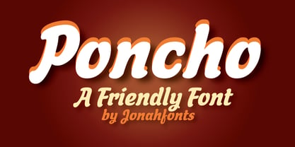
- Honcho by Jonahfonts,
$29.95 A bold-face font with interesting lower case letter forms.
 - genotype H BRK - Unknown license

- H-AND-S by AND,
$89.00 A common creation: (to pass from one hand to the other): For the first time, various hand-signs from diverse sources are unified into one single visual style. This compendium is the result of 15 years of incubation and 7 years of creation. In his travels throughout the world, graphic designer Jean-Benoit Levy, principal of the visual studio AND, has collected pictures of multiple hand signage. Uncertain what to do with those signs, he kept them year after year until the idea came to unify almost 200 handsigns into one single family. In accordance with this entire collection, the name of the typeface is a mix: "h-and-s". A global collection: (To put in good hands): We all have one thing in common: Hand-signs are an international language, they are meant to be understood by all of us. Each of us regularly comes in contact with modern hieroglyphs such as the hand-sign-codes that are so prevalent in our daily life. This way of communication belongs to no one in particular and to all of us in general. Even if the sense of certain signs varies from one culture to the other, there is a common hand-sign language. We are surrounded by this language of handsigns each time we step in a store, we eat, open a container of milk, we clean up, use package of wash-powder, by shaving, when we work, use tools, at home, by tearing the envelope of a condom, by traveling, etc. When we encounter these signs, we all understand them easily. A visual connection: (To go hand in hand): This typeface is a global visual statement. Collecting, ordering, redrawing, unifying. Reconstructed and assembled into one original alphabet, H-AND-S is a unique and complex signs program. Our choice is based on daily gestures and global hand-codes. Logically this typeface starts with the "American Sign Language" and expands on two type-variations, each on two levels of keyboard. The international team of H-AND-S would like to send his special thanks to all of the anonymous graphic designers throughout the world who designed different hand-signage and who influenced and inspired to create such a sign collection into one unified family. We, the global nomad team of AND, hope that you will enjoy our H-AND-S. Additional Credits Production: Studio AND. www.and.ch. Concept, Idea & Creative Direction: Jean-Benoît Lévy, Switzerland / USA. Research & Sketches: Eva Schubert, Germany. Illustration, Graphic Design & Visual Fusion: Diana Stoen, USA. Transfer, Adaptation & Refining: Moonkyung Choi, Korea. Finalization & Checking: Sylvestre Lucia, Switzerland. Coaching & Technical Advice: Mike Kohnke, USA. Creative Energy & Implementation: Joachim Müller-Lancé, Germany / USA.


Page 1 of 201Next page