10,000 search results
(0.079 seconds)
- Starkido by Forberas Club,
$16.00 Introducing Starkido by Forberas Club Starkido is a handwritten script font that will make your designs look classic, Farmhouse, and Boho. It is a great font for events, wedding invitations, fashion, apparel, signature, album covers, logos, branding, magazines, social media posts, advertisements, but will also work great with any other project. Add it to your fonts’ library to enhance your creativity! Starkido is best for: - logos, branding & signatures - Flyers, album cover, magazine & advertisement - Website design, design blogs & fashion - Quote graphics for social media - Also works great with any other project Whats included : - Font provided in OTF format - Numerals and Punctuation - Accents (Multilingual characters) If you have any questions, before or after purchase, please feel free to get in touch.
 - Hug Shack by Yumna Type,
$12.00 A beautiful and easy-to-style font duo to elevate your design. Hug Shack expresses a feeling of joy and cute overall. Through the script font, Hug Shack brings your design to delve deep into the world of cuteness, while the display font creates modern look. You can mix and match this harmonious font duo to make gorgeous result in your design. This font become more special with awesome clipart as bonus. Features: Stylistic Sets Ligatures Multilingual Supports Numerals and Punctuation It can be used for branding, logos, social media quotes, stickers, posters, vintage designs, wall art, merchandise, social media, and many more. Get more inspiration by seeing the preview. Thank you for purchasing our premium fonts! Happy Designing!
 - Armchair Modern by PSY/OPS,
$36.00 “Growing up in Iceland, I was exposed to Scandinavian modernism from an early age. My parents had Arne Jacobsen furniture around the house and I was always enticed by the fun shapes and colors...."—SK Armchair Modern is derived from the logo created for Armchair Media Group by Stefan Kjartansson. The design is unabashedly ultra-modern, reminiscent of work by Mark Newson and the aforementioned Jacobsen. Armchair Media is a consulting company, working with clients from the Web and interactive TV, so the super-elliptical letterforms are also intended to evoke a traditional TV screen or CRT display. The complete family of five weights was co-produced by PSY/OPS in 2001.
 - Signation by Garisman Studio,
$20.00 Signation comes from hand scratches to get natural and natural writing. With the main style of the hand-lettering script, it will be very interesting if it is added with a variety of Alternates (Capital letters) and also Stylistic Sets that are very suitable. Signation is very suitable for use in various media such as; packaging, logos, labels, posters, shirt designs, wisdom quotes, bulletins, typography, and many other media. - Ligature - Stylistic Alternates, Stylistic Sets (SS01-SS06) & Contextual Alternates - PUA Encoded open - Support for MAC or PC - Simple installation for Adobe Illustrator, Corel Draw, Photoshop, or Procreate (New Updated) - Support Multilanguage (for 14 languages): Afrikaans Albanian Danish Dutch English Estonian Finnish French Italian Norwegian Portuguese Spanish Swedish Zulu
 - Percance Fatal - Personal use only

- PAG Smoke by Prop-a-ganda,
$19.99Prop-a-ganda offers retro-flavored fonts inspired by lettering on retro propaganda posters, retro advertising posters, retro packages all the world over. This is perfect font for your retrospective project. PAG Smoke is very heavy geometric font. Its unique shape is like a monster for your design project. - Pekin by Solotype,
$19.95Designed by Ernst Lauschke in 1888 and issued by Barnhart Bros. & Spindler foundry in Chicago under the name Dormer. It was revived in 1923 by the foundry with a new name, Pekin. We have "regularized" the face for modern use, but have included the changed characters as alternates. - Blitzplakat by FaceType,
$12.00 Unearthed by our friend Dimitris Karaiskos in an antique shop in Vienna, we digitized it and added more glyphs. Blitzplakat is the name of this pre-Letraset system, where you could make your own little advertising posters by cutting out these letters and sticking them on paper like stamps.
 - Neues Bauen by Hanoded,
$10.00 Neues Bauen is a Bauhaus inspired font with some interesting glyphs. It is slightly rounded in places, but sharp in others and it will most certainly make your designs stand out. Neues Bauen in other words, like the style that emerged in pre-war Germany, is a statement.
 - Plinc Goliath by House Industries,
$33.00 Vincent Pacella was a true giant of hand-lettering and typeface design. Of the dozens of styles he designed for Photo-Lettering and International Typeface Corporation, his dominant Goliath towers above the rest. The font is perhaps best known from Herb Lubalin’s American flag that the design legend created for Print magazine’s 40th anniversary cover. Pacella takes “slab” serif to heart with this colossally-proportioned font, using brawny stroke endings and minimal curves to create a powerful figure for maximum visual impact. Take advantage of Goliath’s superior stature to make viewers take notice in industrial settings, sports branding, and oversized outdoor media applications. For comparatively modest musings in accompanying running text, consider partnering it with a comparatively spartan slab serif like Municipal. Or, team up Goliath with a faceted fellow heavyweight like United Sans. Originally drawn in 1970, Goliath was digitized by Ben Kiel with Adam Cruz in 2011. GOLIATH CREDITS: Typeface Design: Vincent Pacella Typeface Digitization: Ben Kiel, Adam Cruz Typeface Production: Ben Kiel Like all good subversives, House Industries hides in plain sight while amplifying the look, feel and style of the world’s most interesting brands, products and people. Based in Delaware, visually influencing the world.
 - SF Proverbial Gothic, created by ShyFoundry, is a distinctive typeface that seamlessly marries the essence of traditional gothic design with contemporary flair, thus creating a versatile font suitabl...
- Ming - Unknown license

- Max - Unknown license

- Happy Summer by Creaditive Design,
$14.00 Happy Summer is a cute display font, featuring well rounded characters. It will add an incredibly joyful touch to your designs. Add this beautiful font to each of your creative ideas and notice how it makes them stand out!
 - Ranch Hand JNL by Jeff Levine,
$29.00 Ranch Hand JNL is a tall, condensed wood type with slab serifs. The font is somewhat bolder in weight than Nostrand JNL, but like its counterpart, fully captures the spirit and flavor of Nineteenth Century advertising, fliers and notices.
 - Sekek by Gholib Tammami,
$14.00 Sekek is a cute display font. It embodies playfulness and authenticity and is the perfect choice for any children’s activity or school project. Add this chunky lettered font to your designs and notice how it makes them come alive.
 - Sreilack by Brithos Type,
$11.00 Sreilack is a cute, flowing and thick lettered display font. It will add an incredibly joyful touch to your designs. Add this beautiful display font to each of your creative ideas and notice how it makes them stand out!
 - Behila by Letterena Studios,
$9.00 Behila is a classic serif font. Add it to your most creative ideas and notice how it makes them come alive! This font is PUA encoded which means you can access all of the glyphs and swashes with ease!
 - Ausion by Andfonts,
$14.00 Ausion is a minimal and neat sans serif font. It can easily be matched to an incredibly large set of projects, so add it to your creative ideas and notice how it makes them stand out! Caps only fonts.
 - Ringo by typoland,
$9.00 Whassup y’all! Me and my bros got this li’l gang together: we is Ringo, and we got da bling, yo! We is da typeface family for ya all! We got some real sweet stuff for ya, some nice characters. We got all ’em OpenType features like fractions and proportional figgers, we even got da cubic root, man! And check out da question mark, man, is real sweet. And the ampersand, yeah! I luv ’em ampersands. Now my brothers over here got some light action for ya, and they got some real bold action for ya. We got some nice foxy curves goin’ on, some nice tension, and some nice relaxation. My bro Light over here is kind of like the subtle guy, ya know. He’s in for the female fans, ya know. Heh! Hell, yeah! And man, we speak like 84 languages: we speak the German, and the French, and the Spanish, and we speak the Polish, and the Czech, and the Hungarian, and we even speak Shambala and Swahili and Rundi, and we got some Esperanto thing as well for ya. And check out my bro Black right over here, he’s like the action superhero, man! He’s got impact, man! Yeah yeah, but you know, my bros Regular and Bold are the real deal. Them is like da word of da street, man! Like da word of you, and you. And we got a message for y’all: life is hard, life is real, but you should work your mojo, be smooth, be nice, chill. We got all them kerning pairs, and all them weights, and we got ’em alternate letters. So check us out, yo!
 - Core Sans A by S-Core,
$19.00 Core Sans A Family from S-Core is a modern sans-serif typeface that is clean, simple and highly readable. It is a part of the Core Sans Series (Core Sans N SC, Core Sans N, Core Sans NR, Core Sans M and Core Sans G). Letters in this type family are designed with genuine neo-grotesque and neutral shapes without any decorative distractions. The spaces between individual letter forms are precisely adjusted to create the perfect typesetting. Core Sans A family consists of 8 weights (Thin, Extra Light, Light, Regular, Medium, Bold, Extra Bold, Heavy) with their corresponding italics. Core Sans A contains complete Basic Latin, Cyrillic, Central European, Turkish, Baltic character sets. Each font includes proportional figures, tabular figures, numerators, denominators, superscript, scientific inferiors, subscript, fractions and case features. We highly recommend it for use in books, web pages, screen displays, and so on.
 - Bologna by David Turner,
$35.00 Inspired by pointed pen calligraphy and modulated sans serif typefaces used for advertising in the 1920´s, Bologna is a high contrasted sans serif with a modern and fashionable look. Bologna comes in three weights: Regular, Bold and Black. The Regular and Bold weights are, despite of their high contrast, also build for body texts. Whereas Bologna Black, with a more expressive look and sharp angles, is specially designed for large and striking headlines, packaging or identities. Overview: 3 weights - Regular, Bold, Black Regular/Bold: 657 Glyphs Black: 871 Glyphs Lining, tabular and old style figures Ligatures: fl, fi, ff, ffi ffl, Unicase Letters: a, e, m, n, r Alternative Guillemets Case Sensitive Arrows Bologna Black: hairline accents and interpunctations Fractions Extended Language Support Stylistic Sets: ss01 = Alternative Guillemets / Alternative y ss02 = Unicase glyphs ss03 = Numerals in circle ss04 = Numerals in black circle ss05 = Hairline Accents and Interpunctations (Bologna Black)
 - HG Marugothic by RICOH,
$199.00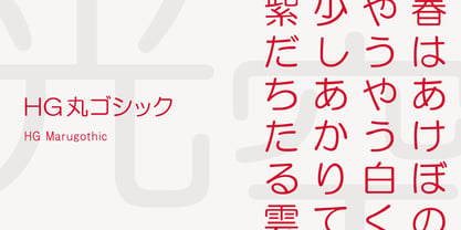 HG丸ゴシックは、リョービの書体「シリウス」を字母とする丸ゴシック体です。L、M、Bと、3つの太さがあります。線はやわらかで、全体的に明るく、あたたかさがあります。ふところは大きくとられていて、かつ、仮名も大きめに作られていて、判別もしやすくなっています。また、それらの特徴から、カジュアルな印象を強く与えますが、ややコントラストがあるため、すっきりとしていて、優しい印象も与えます。
 - Mont Rose by Eurotypo,
$24.00 Rose fonts are based on examples published in the book "Script Lettering" written by M. Meijer in 1957. These kind of handmade lettering were served as a point of departure or inspiration for many other designers along the time. These writings had flowing lines, elegant curves and flourishes, which gave him a lot of rhythm and unique personality. Mont Rose is thin, feminine, friendly and sexy, each font contain 637 glyphs with many stylistic variations, swashes and ligatures in all its letters, and a set of interesting catchwords that you can mix and match to achieve a more interesting effect in your design project. They support also, Central, Eastern and Western European languages. Mont Rose are very versatile fonts, ideal for high-end logos, magazines and book covers, fashion, headlines, cards, posters, websites, packaging. Using these fonts you will achieve a very elegant and warm work.
 - Ergonomique by Monotype,
$31.99 Ergonomique is a humanist sans serif typeface that has been designed to be efficient and comfortable to use across all applications. Ergonomique’s personality is defined by its spurless lowercase glyphs – the stems are truncated and blend into their adjoining arcs, as can be seen in the a/b/d/m/n/p/q/r/u characters. Ergonomique is ideal for branding and display purposes, but also performs well as body copy if you’re seeking a unique style for your text. With its nine weights and complementing italics, Ergonomique is highly versatile, especially when you consider that there are small caps and old style figures included, along with a Latin Extended character set. Key Features: • 18 font family – 9 weights in Roman and Italic • Small Caps, Ligatures, with Proportional, Old Style, and Small Cap figures, plus Fractions, Numerators, Denominators, Superiors, and Inferiors • Full European character set (Latin Extended) • 800+ glyphs per font.
 - Nami by Linotype,
$29.99Nami, the Japanese word for wave," is the latest collaboration between Adrian Frutiger and Linotype's Type Director, Akira Kobayashi. This typeface family is the most humanistic sans serif design ever to come from Adrian Frutiger, and it has an interesting twist: lapidar alternates that may be surfed through with the help of OpenType-savy applications. Adrian Frutiger began the design that would blossom into Nami during the 1980s. Although it would not be produced during the 20th century, it was quite forward thinking. The typeface included several seemingly avant garde alternates; these were "lapidary" versions of common letterforms. Revisiting the project in 2006, Akira Kobayashi reworked the concept into a working family of three typefaces. Each font contains 483 glyphs, including 11 alternates-two extra forms of the lowercase g, as well as new forms for a, e, h, l, m, n, r, t, and u." - Chord Symbols by Tijs Krammer,
$24.00 Chord Symbols is a font for musicians. With this font, you can quickly write beautiful chords, using only simple keyboard characters as input. Musicians tend to write chords with regular characters. They use # instead of a genuine sharp, b instead of a genuine flat, dim instead of a small circle, etc. With Chord Symbols, your chords will be better looking, more easily readable and more efficiently notated. Chord Symbols helps you to write the chords the way you like it. Whether you prefer ‘maj7’ or ‘m7’ or a small triangle for a major seventh, whether you want ‘m’, ‘mi’, ‘min’ or a horizontal line for a minor chord, this font will suit you. Chord Symbols is originally created out of the need to write chords above pop song lyrics. It is designed to also work smoothly in music notation software, like Sibelius, Finale and Encore.
 - Core Sans C by S-Core,
$20.00 Core Sans C family is a part of the Core Sans Series, such as N, M, E, A, D, G, R and B. Core Sans C is inspired by classic geometric sans (Futura, Avenir, Avant Garde etc.). It is based on geometric shapes, like near-perfect circle and square. It has a much higher x-height (height of lowercase letters), an effect which promotes readability especially at small print sizes. The Core Sans C Family consists of 9 weights (Thin, Extra Light, Light, Regular, Medium, Bold, Extra Bold, Heavy, Black) and Italics for each format. Core Sans C supports complete Basic Latin, Cyrillic, Greek, Central European, Turkish, Baltic character sets. Each font includes proportional figures, tabular figures, oldstyle figures, numerators, denominators, superscript, scientific inferiors, subscript, fractions and case features. Core Sans C is an ideal font family for use in magazines, web pages, screens, displays, and so on.
 - ITC Scram Gravy by ITC,
$29.99The 1928 logotype for Sertal Toiletries consisted of a stylized woman's head, a very snaky S, and five fine, fat deco caps spelling out the rest of the brand name. From these five clues, designer Nick Curtis divined the rules" of the typeface and drew a complete alphabet, including a lower case. The result: ITC Scram Gravy. The finished product could be described as Bodoni on steroids. Tight curls in characters like the 'm,' 'r' and 'y' soften the lower case and give the design a light-hearted flavor. ITC Scram Gravy takes its name from one of many running gags in the screwball comic strip "Smokey Stover," which had folks alternately splitting their sides and scratching their heads from 1935 to 1973. Those familiar with Bill Holman's strip will recall Smokey's car, the Foomobile, and one of his famous nonsense declarations: "No foo-ling, that scram gravy ain't wavy."" - Regulator Nova by Device,
$39.00 A high lower-case x-height geometric sans with open counters, Regulator Nova is extremely legible at text sizes and in extended settings while the range of weights also make it suitable for headlines. The stoke terminals are all cut at close to 90 degrees, lending a sharp precision to the characters. Alternate versions of the g, j, r, w, K, R, W, # and ampersand are available in both upright and italic, and can be toggled on and off in the Opentype panel or the Glyphs palette. Clean, elegant and legible, Regulator Nova has a classical proportions based on a circumscribed circle and square, and shares structural similarities to early sans serifs such as Rudolf Koch’s Kabel, while adopting more British forms for the M and R. Regulator Nova is an extension and reworking of Regulator, now with extra weights, reweighed italics, Opentype-savvy alternates and a full European character set.
 - Core Sans E by S-Core,
$29.00 The Core Sans E family is part of the Core Sans series, such as Core Sans N, Core Sans M, Core Sans A, Core Sans G and Core Sans D. This is a modernized, grotesque font family with horizontal terminals, low-stroke contrast, enclosed apertures and little-line-width variation. Its tall x-height makes the text legible; and the spaces between individual letter forms are precisely adjusted to create the perfect typesetting. The Core Sans E family consists of 9 weights, from Thin to Black with italics. It supports WGL4, which provides a wide range of character sets—Greek, Cyrillic, and Central and Eastern European characters. Each font includes support for tabular numbers, arrows, mathematical operators, and OpenType features (such as proportional figures, numerators, denominators, subscript, superscript, scientific inferiors, fractions, case features, and standard ligatures). We highly recommend it for use in books, web pages, screen displays, and so on.
 - Fletcher-Gothic is a typeface designed by Alan Carr, showcasing a unique balance between historical gravitas and a contemporary twist. The design of Fletcher-Gothic draws its inspiration from the tra...
- Generis Slab by Linotype,
$29.00The idea for the Generis type system came to Erik Faulhaber while he was traveling in the USA. Seeing typefaces mixed together in a business district motivated him to create a new type system with interrelated forms. The first design scheme came about in 1997, following the space saving model of these American Gothics. Faulhaber then examined the demands of legibility and various communications media before finally developing the plan behind this type system. Generis’s design includes two individually designed styles; each of with is available with and without serifs, giving the type system four separate families. Each includes at least four basic weights: Light, Regular, Medium, and Bold. Further weights, small caps, old style figures, and true italics were added to each family where needed. The Generis type system is designed to meet both optical criteria and the highest possible measure of technical precision. Harmony, rhythm, legibility, and formal restraint make up the foreground. Generis combines aesthetic, technical, and economic advantages, which purposefully and efficiently cover the whole range of corporate communication needs. The unified basic form and the individual peculiarity of the styles lead to Generis’ systematic, total-package concept. The clear formal language of the Generis type system resides beneath the information, bringing appropriate typographic expression to high-level corporate identity systems, both in print and on screen. The condensed and aspiring nature of the letterforms allows for the efficient setting of body copy, and the economic use of the page. A range of accented characters allows text to be set in 48 Latin-based languages, offering maximal typographic free range. This previously unknown level of technical and design execution helps create higher quality typography in all areas of corporate communication. Optimal combinations within the type system: Generis Serif or Generis Slab with Generis Sans or Generis Simple. - Generis Serif by Linotype,
$29.00The idea for the Generis type system came to Erik Faulhaber while he was traveling in the USA. Seeing typefaces mixed together in a business district motivated him to create a new type system with interrelated forms. The first design scheme came about in 1997, following the space saving model of these American Gothics. Faulhaber then examined the demands of legibility and various communications media before finally developing the plan behind this type system. Generis’s design includes two individually designed styles; each of with is available with and without serifs, giving the type system four separate families. Each includes at least four basic weights: Light, Regular, Medium, and Bold. Further weights, small caps, old style figures, and true italics were added to each family where needed. The Generis type system is designed to meet both optical criteria and the highest possible measure of technical precision. Harmony, rhythm, legibility, and formal restraint make up the foreground. Generis combines aesthetic, technical, and economic advantages, which purposefully and efficiently cover the whole range of corporate communication needs. The unified basic form and the individual peculiarity of the styles lead to Generis’ systematic, total-package concept. The clear formal language of the Generis type system resides beneath the information, bringing appropriate typographic expression to high-level corporate identity systems, both in print and on screen. The condensed and aspiring nature of the letterforms allows for the efficient setting of body copy, and the economic use of the page. A range of accented characters allows text to be set in 48 Latin-based languages, offering maximal typographic free range. This previously unknown level of technical and design execution helps create higher quality typography in all areas of corporate communication. Optimal combinations within the type system: Generis Serif or Generis Slab with Generis Sans or Generis Simple. - Leroy by Andinistas,
$39.95 Leroy is a font family of 5 members designed from geometrizing Roman and Gothic skeletons. Its purpose is to provide optimal reading of titles and paragraphs with strong mechanical flavor. Because of this, its variables are designed to sort information in media such as labels, signs and industrial atmosphere packaging related with the Soviet Union’s fonts in 1920. This idea matured white horizontal lines superimposed on alphabets drawn with an ancient architectural team known as “Leroy K & E Controlled Lettering System”. Then that evolved into a family concept unifying its proportion to the same X height for its members, resulting in a versatile type system. Therefore, Regular and Bold variables have low contrast between thick and thin strokes. Its upstream and downstream are extremely short, generating a suitable interline that clogs the vertical area. Its overall width equal to its X height, supports its tight spacing that compacts the horizontal area. Therefore, the variant with black caliber has plenty of contrast between thick and thin strokes. The light variable has a “blind” effect radiating light halos, ideal to propose hierarchies and combinations with orthogonal projection. In that sense, Leroy’s modular character reminds constructivist ideology merged with typographical variants suitable for graphic design with geometric look. To achieve this, I studied the softening of forms and counter blocks into a typographical system specially designed for composing useful information to attract attention. In that sense, the dingbats were obtained through a careful process of research and testings done with drawings that provided full and empty visual strategies that with the passage of time helped to forge the major decisions of a metamorphosis from industrial tools, birds and humans from pictogram mixing various genres.
 - Generis Simple by Linotype,
$39.00The idea for the Generis type system came to Erik Faulhaber while he was traveling in the USA. Seeing typefaces mixed together in a business district motivated him to create a new type system with interrelated forms. The first design scheme came about in 1997, following the space saving model of these American Gothics. Faulhaber then examined the demands of legibility and various communications media before finally developing the plan behind this type system. Generis’s design includes two individually designed styles; each of with is available with and without serifs, giving the type system four separate families. Each includes at least four basic weights: Light, Regular, Medium, and Bold. Further weights, small caps, old style figures, and true italics were added to each family where needed. The Generis type system is designed to meet both optical criteria and the highest possible measure of technical precision. Harmony, rhythm, legibility, and formal restraint make up the foreground. Generis combines aesthetic, technical, and economic advantages, which purposefully and efficiently cover the whole range of corporate communication needs. The unified basic form and the individual peculiarity of the styles lead to Generis’ systematic, total-package concept. The clear formal language of the Generis type system resides beneath the information, bringing appropriate typographic expression to high-level corporate identity systems, both in print and on screen. The condensed and aspiring nature of the letterforms allows for the efficient setting of body copy, and the economic use of the page. A range of accented characters allows text to be set in 48 Latin-based languages, offering maximal typographic free range. This previously unknown level of technical and design execution helps create higher quality typography in all areas of corporate communication. Optimal combinations within the type system: Generis Serif or Generis Slab with Generis Sans or Generis Simple. - Generis Sans by Linotype,
$29.00The idea for the Generis type system came to Erik Faulhaber while he was traveling in the USA. Seeing typefaces mixed together in a business district motivated him to create a new type system with interrelated forms. The first design scheme came about in 1997, following the space saving model of these American Gothics. Faulhaber then examined the demands of legibility and various communications media before finally developing the plan behind this type system. Generis’s design includes two individually designed styles; each of with is available with and without serifs, giving the type system four separate families. Each includes at least four basic weights: Light, Regular, Medium, and Bold. Further weights, small caps, old style figures, and true italics were added to each family where needed. The Generis type system is designed to meet both optical criteria and the highest possible measure of technical precision. Harmony, rhythm, legibility, and formal restraint make up the foreground. Generis combines aesthetic, technical, and economic advantages, which purposefully and efficiently cover the whole range of corporate communication needs. The unified basic form and the individual peculiarity of the styles lead to Generis’ systematic, total-package concept. The clear formal language of the Generis type system resides beneath the information, bringing appropriate typographic expression to high-level corporate identity systems, both in print and on screen. The condensed and aspiring nature of the letterforms allows for the efficient setting of body copy, and the economic use of the page. A range of accented characters allows text to be set in 48 Latin-based languages, offering maximal typographic free range. This previously unknown level of technical and design execution helps create higher quality typography in all areas of corporate communication. Optimal combinations within the type system: Generis Serif or Generis Slab with Generis Sans or Generis Simple. - Haunted Brick by LetterStock,
$20.00 Introducing “Haunted Brick” – The Spooky Halloween Decorative Font Dive into the eerie world of “Haunted Brick,” a spellbinding decorative Halloween font that will send shivers down your spine. Perfect for crafting captivating Halloween posters, invitations, and chilling social media posts, this font boasts a unique hand-drawn style adorned with intricate spider webs in every glyph. Key Features: Spine-Chilling Elegance: “Haunted Brick” strikes the perfect balance between elegance and the macabre, adding a spine-chilling touch to your Halloween designs. Creepy Creativity: Whether you’re conjuring up posters, eerie invitations, or haunting social media content, “Haunted Brick” lends an air of mystery and excitement to your projects. Intricate Spider Webs: Every character in “Haunted Brick” is intricately adorned with spider webs, ensuring that your text is truly one-of-a-kind and perfect for all things Halloween. Why Choose “Haunted Brick”: – Elevate your Halloween designs with a font that’s both spooky and stylish. – Craft invitations that send shivers down the spines of your guests. – Create captivating posters that will haunt the memories of those who see them. – Perfect for adding a dose of horror to your social media posts. Embrace the Spookiness – Download “Haunted Brick” Now!
 - F25 Bank Printer - 100% free

- Feuerfeste - Unknown license


