10,000 search results
(0.09 seconds)
- Buddy jim - Unknown license

- Sweetie Autumn by Balpirick,
$15.00 Sweetie Autumn is a Beautiful Calligraphy Font. Sweetie Autumn is an elegant script font with a contemporary atmosphere and impeccable form, inspired by timeless classic calligraphy. Not too thin and not too thick, balanced and varied, this font was designed to enhance the beauty of your projects. Sweetie Autumn also multilingual support. Thank you!
 - Girlia by TM Type,
$15.00 Girlia is an elegant script font with a contemporary atmosphere and impeccable form, inspired by timeless classic calligraphy. Not too thin and not too thick, balanced and varied, this font was designed to enhance the beauty of your projects. This font is PUA encoded which means you can access all glyphs and swashes with ease!
 - Beach Holiday by Gian Studio,
$12.00 Beace Holiday is an elegant calligraphy luxury font that comes with a very beautiful character change, a kind of classic decorative script with a modern touch, designed with high detail to present an elegant style. Beace Holiday is attractive because the typeface is pleasing to the eye, clean, feminine, sensual, glamorous, simple and very easy to read, thanks to its many extravagant letter relationships. I also offer a decent number of stylistic alternatives for some of the letters. Classic style is very suitable to be applied in various formal forms such as invitations, labels, restaurant menus, logos, fashion, make up, stationery, novels, magazines, books, greeting/wedding cards, packaging, labels or all kinds of advertising purposes. and much more. .. Thanks & Happy Designing!
 - Kevin Keyla by Bosstypestudio,
$13.00 Kevin Keyla is an cute calligraphy luxury font that comes with a very beautiful character change, a kind of classic decorative script with a modern touch, designed with high detail to present an elegant style. Kevin Keyla is attractive because the typeface is pleasing to the eye, clean, feminine, sensual, glamorous, simple and very easy to read, thanks to its many extravagant letter relationships. I also offer a decent number of stylistic alternatives for some of the letters. Classic style is very suitable to be applied in various formal forms such as invitations, labels, restaurant menus, logos, fashion, make up, stationery, novels, magazines, books, greeting/wedding cards, packaging, labels or all kinds of advertising purposes. and much more. .. Thanks & Happy Designing!
 - Ringtail by Din Studio,
$25.00 Every font designer has their own favorite font type, which you do not need to find as it takes too much time to figure it out for you until you can match it with a perfect font. Ringtail has the best answer to your needs. Ringtail is a font containing two font types to use together or separately: sans serif and script fonts. Sans serif font has firm, modern, simple looking lines without curvy edges. Meanwhile, the script font has curvy lines in water paint or ink textures. The textures are extra lines added to each letter and to the background letter patterns. A textured script font looks more artistic and more detailed than the other ordinary script fonts to show elegant, romantic impressions in your designs. Additionally, script font can be applied for adding extra visual contrasts to designs with sans serif font. Features: Stylistic Sets Ligatures Multilingual Supports PUA Encoded Numerals and Punctuations Ringtail fits best for various design projects, such as brandings, posters, banners, logos, magazine covers, quotes, headings, printed products, invitations, name cards, merchandise, social media, etc. Find out more ways to use this font by taking a look at the font preview. Thanks for purchasing our fonts. Hopefully, you have a great time using our font. Feel free to contact us anytime for further information or when you have trouble with the font. Thanks a lot and happy designing.
 - Beriot by Boyanurd,
$19.00 Beriot is a sans serif whose basics are condensed in Regular (Normal) weight, getting a lot of form inspiration from the topic also known as Steile Futura which is a letterform that Paul Renner himself explored in the mid-1950s, where shapes are constructed with little stress on modular squares but there are changes in certain parts so they become less modular. The Beriot family is available in 42 weights with matching slanted cuts, divided into 3 subfamilies: Condensed, Normal and Expanded. Each has been designed for a range of text sizes each, and already variable, allowing you to choose and make your own type of weight you like. OpenType Features are available in each of these font styles, including alternative characters, different numbers set and case-sensitive and there are additional symbols that make it the perfect choice for professional types of branding, digital design and editorial.
 - Indecise by Tipo Pèpel,
$22.00 Even though the name seems not to tell much, Indecise shows a clean and coherent design. The shapes of the characters reference the Latin typefaces that were promoted by great figures like Enric Crous-Vidal and José Mendoza y Almeida in the 50s. Indecise uses the body of incise typefaces and gets rid of the subtle terminals for the strokes. It is a high-contrast sans divided into 5 elegant subfamilies, which use different widths. From the condensed version to the extended one, the family includes 50 fonts counting upright and italic. This collection of widths make for many possible combinations of styles. Indecise is a humanist typeface, it puts geometry apart and embraces the calligraphic gesture. This helps to suggest the movement of the strokes while avoiding to create text with a static appearance. Thin and thick strokes come together and define a smooth rhythm for reading.
 - Dancin' by ITC,
$29.00Dancin' is yet another unusual typeface from American designer David Sagorski. Based on his own style of handwriting, Dancin' is an inventive, carefree typeface ornamented with dots and unusual strokes. - Al Seg45 by Nihar Mazumdar,
$0.50 Al Seg45 is a very dense alphanumeric display with 45 segments. Thirty-two inner segments, the outer segments have been split as well, making twelve segments, and a central dot.
 - CA El Amor by Cape Arcona Type Foundry,
$19.00 This typeface has the most important ingredient of all: love. So it’s not surprising that the font is called El Amor. It is a reversed oblique all-caps headline font that consists of two styles, “Regular” and “Fill”. Feel free to experiment with them, together or alone. Write something with “Regular”, copy paste it to another layer and switch to “Fill”. Give it a little offset if you like or place it straight on top, both works fine. You can also use the “Fill”. style for body text, but do so at your own risk, spacing and kerning is optimized for the use with the “Regular” style, so be generous if the result looks not as even as text-font. Maybe you’ll discover the charm of a more dynamic spacing that fit perfectly with the vivid and crispy outlines. Unlike other display fonts CA El Amor features a huge character set covering most languages that you can write with a Latin alphabet.
 - Atria by AVP,
$29.00 A modern sans-serif, Atria is pinched at the junction of certain strokes, providing a distinctive appearance and aiding screen definition at small sizes. The glyphs cover Baltic languages and Cyrillic.
 - Harleyquin by Letterara,
$12.00 Sweet, charming and full of authenticity: Harleyquin is a one-of-a-kind typeface with a personal feel. Use titling to give different letter effects, making your project even more elegant!
 - Ornery Polecat JNL by Jeff Levine,
$29.00 In January of 2006, Jeff Levine fonts debuted with ten releases. Many of those first fonts were based on vintage lettering stencils, which were the "school years" catalyst for Jeff's interest in lettering and type design. Eight years later, his collection of fonts has become a giant catalog of display type ranging from Wood Type revivals to Art Nouveau, Art Deco to stencil, reinterpretations of old favorites, experimental fonts, dingbat fonts and typefaces reflecting a particular decade's styles of cultural popularity. Designs from old lettering books, type catalogs and advertising have also been fodder for many alphabets not previously available in a digital format. Along the way, many unusual lettering sources were also mined for type ideas. Vintage packaging, hand-lettered signage, sign making kits, rubber stamp type, water applied decals and at times just a singular letter example inspired many of the releases within this collection. It was a source of pride for Jeff Levine Fonts to reach 500 releases and a determined goal to grow the type library as far as possible. With this in mind, February 2014 brings forth many new releases. This one in particular, Ornery Polecat JNL, is the 800th typeface release from Jeff.
 - Collage BB by Posterizer KG,
$24.00 Collage BB font was created for visual imitating of cuted paper Serif letters. The idea was to imitate kid’s clumsiness and irregular shape of letters. Good readability allows using this font for making some long texts. The font contains all the Latin and Cyrillic glyphs. BB - Bajina Bašta (Bašta in English means Garden) is the name of the small town where I spent my carefree childhood. That’s why I was inspired by Peter Pan.
 - Apple Peach by Jafar07,
$18.00 Apple Peach is a font that is designed cubby and childish but can also be easily used in the modern era who want to have a fat and smooth design that has a high level of legibility. The advantage of this font is that it can be used for various product designs according to your needs. What did you get? Regular font Uppercase & Lowercase Numbers & Punctuation Multilingual Support Works on PC & Mac Simple Installations
 - Atlantic Time by Dierstudio,
$16.00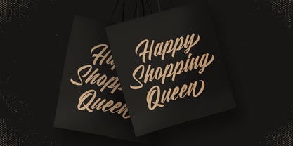 Introducing Atlantic Time is a Script font with a which gives a strong and vintage touch to your projects. with 6 sets of styles that will make this font more Interesting Atlantic Time font is to use for any kind of design such as branding projects, logos, social media posts, advertisements, product packaging, product designs, labels, poster, photography, t-shirt, watermarks, paper bag, stationery, and any projects. Features: - Swash - 6 Stylistic Set - ligature - Multilingual Support
 - Brisko Sans by Tour De Force,
$30.00 Brisko Sans is a simple sans serif font family that comes in 5 weights with matching italics. It is suitable for longer texts, while all weights are good for any other typographic use. The whole font family contains characterful elements to distinguish it from the old standards. Brisko Sans is a fully applicable, legible and discrete font family with unique attributes. It is a good recommendation for different kinds of web and print projects.
 - Caliente by Imprimatvr,
$28.00 This font is shaped to exhibit a very compact and characterized design, clearly distinguishable from the mainstream condensed sans-serif fonts. That is why Caliente has a conspicuous modulation and a medium-to-high contrast. Both features are seldom observed among ordinary fonts of its kind. However, Caliente is designed to suit perfectly well in a number of applications—from advertising to business letters—while accurately preserving its strong personality even in very small sizes.
 - Gromlaith Classic by Sipanji21,
$16.00 This blackletter font is inspired by the classical Gaelic script that was used from the 16th until mid 18th Century. Featured with beautiful lines and bold accents, this font is good for decorative type settings such as headlines, traditional newspapers, pub signs, greetings cards, and advertising purposes. You can even use this typeface for your unique logotype. With your amazing creative idea, you can use this font to make it even more outstanding and cool!
 - Rainclouds by Hanoded,
$15.00 I was doodling away with a sharpie pen on a rainy day. Hey… wait a minute. A rainy day, a font called Rainclouds… Yep, that’s right, it is called Rainclouds for that reason! ;-) Rainclouds is a fat marker font with a lot of texture and a lot of mouth.
 - Cigar Label by Solotype,
$19.95This font was inspired by the embossed lettering on cigar boxes. The letters, or entire words, are often surrounded by raised dots, and that was our idea here. We drew this about 1997, and have been refining it ever since. All letters are on the lowercase keyboard; the end pieces and spaces are on the caps. - Next Stop by Kenneth Woodruff,
$15.00Every possible character in the standard encoding set has been designed, using a block system which is based on varying shapes, rather than the more common grid or dot-based signage systems. Each font contains 188 glyphs. Next Stop was designed for contiguous flow, and can be made pseudo-monospaced by using spacers in the fi and fl ligatures. - ITC Legacy Sans by ITC,
$40.99 ITC Legacy¿ was designed by American Ronald Arnholm, who was first inspired to develop the typeface when he was a graduate student at Yale. In a type history class, he studied the 1470 book by Eusebius that was printed in the roman type of Nicolas Jenson. Arnholm worked for years to create his own interpretation of the Jenson roman, and he succeeded in capturing much of its beauty and character. As Jenson did not include a companion italic, Arnholm turned to the sixteenth-century types of Claude Garamond for inspiration for the italics of ITC Legacy. Arnholm was so taken by the strength and integrity of these oldstyle seriffed forms that he used their essential skeletal structures to develop a full set of sans serif faces. ITC Legacy includes a complete family of weights from book to ultra, with Old style Figures and small caps, making this a good choice for detailed book typography or multi-faceted graphic design projects. In 1458, Charles VII sent the Frenchman Nicolas Jenson to learn the craft of movable type in Mainz, the city where Gutenberg was working. Jenson was supposed to return to France with his newly learned skills, but instead he traveled to Italy, as did other itinerant printers of the time. From 1468 on, he was in Venice, where he flourished as a punchcutter, printer and publisher. He was probably the first non-German printer of movable type, and he produced about 150 editions. Though his punches have vanished, his books have not, and those produced from about 1470 until his death in 1480 have served as a source of inspiration for type designers over centuries. His Roman type is often called the first true Roman." Notable in almost all Jensonian Romans is the angled crossbar on the lowercase e, which is known as the "Venetian Oldstyle e."" ITC Legacy® Sans font field guide including best practices, font pairings and alternatives.
 - Lubaline by Lián Types,
$39.00 Who haven't heard the phrase that ‘any past time was better’?. Although I sometimes find this phrase a little too pessimistic (because I try to think that the best is yet to come), it may be true regarding my passion, typography. I'm too young (29) unfortunately, and this means I did not have the pleasure of being contemporary with maybe the man who has influenced my work the most (1). The man that showed that letters are more than just letters to be read. Herb Lubalin (1918-1981), also called sometimes as ‘the rule basher’ (2), smashed the taboos and sacred rules of type design and gave it personality. He rejected the functionalist philosophy of europeans in favor of an eclectic and exuberant style. To him, letters were not merely vessels of form, they were objects of meaning. (3). Nowadays, when looking at his portfolio, who dares to deny that the term ‘typography’ and ‘beauty’ may go hand-in-hand without any problem? Ed Benguiat, one of Herb’s partners, still likes making jokes with the phrase “screw legibility, type should be beautiful” and what I understand of this is not to forget the rules, but to know and break them carefully. In an era of pure eclecticism, we, the lovers of flourishes and swashes, can't do nothing but admire all the legacy that Lubalin, this wonderful type-guru, left. My font Lubaline read as “the line of Lubalin” is my humble tribute to him. Those who know his work, may see the influences easily like in his ‘Beards’ (1976) and ‘The Sound of Music’ (1965) posters; the art-deco forms in many of his amazing logos and practically in all his creations where letters seem to be alive just like you and me. I really hope that the future finds me still learning more and more about type-design and letterforms, and like him, always willing to make innovations in my field: Because letters are not just letters to be read. NOTES (1) These are some of my fonts in which some of Lubalin’s influences can be seen (in order of creation): Reina, Aire, Erotica, String, Beatle, Heroe, Selfie, Model, Seventies, and many others that are still in progress. (2) (3) Steven Heller. Herb Lubalin: Rule Basher. U&lc (1998) http://www.printmag.com/imprint/my-favorite-lubalin/
 - Boundary by Larin Type Co,
$15.00 Boundary This is a vintage display font inspired by signage, logos in the style of the old time. This is a great find for creating logos, various kinds of designs in vintage style. This font includes 2 font styles: regular and rough style, also it includes alternates for uppercase and lowercase. Try changing them and see how diverse it can be. Font includes: Full alphabet A-z Numbers, fractions Punctuation and symbols Alternates for Uppercase Alternates for Lowercase
 - Glance Sans by Identity Letters,
$29.00 Geometric, stylish, and not quite a stencil face: Glance Sans is the urban alter ego of Glance Slab—a strong-willed sans-serif with no frills but a few unique character traits. Glance Sans follows the design principle of nonjoining parts that made Glance Slab successful. Some strokes may not connect to their stems, creating visible gaps and thus, a dynamic impression of balance and movement. However, Glance Sans has a calmer appearance due to the lack of detached serifs. If Glance Slab’s home territory are large, crowded stadiums and massive sports events, Glance Sans prefers streetball courts, well-used skate parks, and underground clubs. It also adapts to urban work environments from finance to high-tech. Whenever a more toned-down look is called for while retaining the elegance of an athlete, Glance Sans is ready to roll. In the city environment, versatility is key. That’s why Glance Sans sports 7 weights as well as a complete set of italics. These are not just sloped romans but individually drawn letterforms, subtly referencing classic italic construction for more effective emphasis. Among the 600+ glyphs of Glance Sans, you’ll find goodies such as six sets of figures, circled numbers, circled arrows, and all kinds of currency symbols in two stylistic versions. Glance Sans is a great tool for industrial and high-tech branding, for wayfinding systems in contemporary or modernist architecture, for corporate identities in arts, crafts, medicine, culture, and education, and for all kinds of sports-themed design. Both members of the Glance superfamily are easily and effectively combinable; both are able to stand on their own feet. With its powerful italics, you might opt for Glance Sans as your text typeface and use Glance Slab for headlines. Or you set large, clean, display-sized lines in Glance Sans and spice them up with a bit of sportive Glance Slab. It’s up to you to decide how to bring out the best in both of them.
 - Arkham77 by Jvne77 Studio,
$20.00 Inspired by the works of Howard Philips Lovecraft (1890-1936), and the city of Arkham lying abroad the Miskatonic River... witth all those witchcrafts secrecy and the infamous Necronomicon. The Elder Ones and the mighty Cthulhu, who lies and not dies within the dephts of the ocean in R'lyeh he's awaiting... arf, anyway this font will well set for posters, detective stories or horror books, pulps and others... *Full western latin language with most diacritics and numbers* Included in this set: - ARKHAM77 Black (More formal display) 560 glyphes - ARKHAM77 Elegante (for a creepiest rendition) 590 glyphes - ARKHAM77 Titles (as its name do not tells, for credits, or simple text) 560 glyphes - ARKHAM77 Extras (Embellish your work with this cool collection of frames and ornaments) +100 glyphes
 - Boldye by Logofonts,
$10.00 Boldye Font Inspired by the Reebok Logo and Sport typeface style. Boldye are strong on the curves and sharp on the edges of some of the letters suitable for logo projects, branding, posters with sports themes. Easily creates your own logo type with fonts. Boldye has an Open Type feature to access a large selection of unique alternative letters and many ligatures to make it easier for you to create. Boldye can be accessed perfectly on design applications such as Adobe Illustrator, Adobe Photoshop, Corel Draw, Affinity Designer but does not rule out the possibility that it can also be accessed using web-based applications such as kittl, canva, artboard studio and others.
 - Catherova by Mokatype Studio,
$25.00 Hello Introducing, Catherova - Elegant and luxurious serif display inspired by the famous Elegant Luxury logo, suitable for designing logos, templates, brochures, videos, advertising branding, and more. Perfect for adding a unique touch to word mark logos, the monogram comes with 31 ligatures that create lots of choice and uniqueness for your designs. What's Included: + Standard glyphs + Ligatures + Web Font + International Accent + Works on PC and Mac + Simple installations accessible in Adobe Illustrator, Adobe Photoshop, Adobe InDesign, and even works on Microsoft Word. PUA Encoded Characters: Fully accessible without additional design software. Fonts include multilingual support. + Image used : All photographs/pictures/vector used in the preview are not included, they are intended for illustration purpose only. Thank you
 - Meta Link by Logofonts,
$10.00 Meta Link is Sans Serif inspired by future techno and sport great for product logo, poster, headline, card logo, web, magazine, packaging, stationery and much more. Easily creates your own logo types with font. Meta Link have 4 weight fonts with italic style also has an Open Type feature to access a large selection of unique alternative letters and many ligatures to make it easier for you to create. Meta Link can be accessed perfectly on design applications such as Adobe Illustrator, Adobe Photoshop, Corel Draw, Affinity Designer but does not rule out the possibility that it can also be accessed using web-based applications such as kittl, canva, artboard studio and others.
 - Billgates by Hrz Studio,
$15.00 Billgates Script including alternative characters, ligatures and various language support. With the OpenType feature with an alternative style and elegant binder. The OpenType feature does not function automatically, but you can access it manually and for the best results needed for your creativity in combining these Glyph variations. and also a touch of ornament makes this font look elegant. Files include: To enable the OpenType Stylistic alternates, you need a program that supports OpenType features such as Adobe Illustrator CS, Adobe Indesign & CorelDraw X6-X7, Microsoft Word 2010 or later versions. (Windows), Font Book (Mac) or a software program such as PopChar (for Windows and Mac). If you need help or advice, please contact me Thank you for watching!
 - Everleigh Script by Hrz Studio,
$17.00 Everleigh Script including alternative characters, ligatures and various language support. With the OpenType feature with an alternative style and elegant binder. The OpenType feature does not function automatically, but you can access it manually and for the best results needed for your creativity in combining these Glyph variations. and also a touch of ornament makes this font look elegant. Files include: To enable the OpenType Stylistic alternates, you need a program that supports OpenType features such as Adobe Illustrator CS, Adobe Indesign & CorelDraw X6-X7, Microsoft Word 2010 or later versions. (Windows), Font Book (Mac) or a software program such as PopChar (for Windows and Mac). If you need help or advice, please contact me Thank you for watching!
 - Face Your Fears II by Hanoded,
$15.00 When I created Face Your Fears some years ago, it was an instant hit. I have seen it on Gangsta Rap albums, metal albums, books and on movie posters. It has been used for T-shirts, websites and, believe it or not, for a beer label as well. I have always toyed with the idea of redoing the original font, as some of the glyphs were a bit off. Face Your Fears II is similar in nature to the original font, but comes with a lot of improvements, has slightly altered glyphs and (probably) better kerning. But maybe, just maybe, it isn't your cup o' tea. In that case, you can always just go for the original!
 - PuffedRice - Unknown license

- MGN Kinetic by Morgana Studio,
$18.00 MGN Kinetic is an innovative font iconography type product released by Morgana Studio in 2023. This unique font set offers a fresh and dynamic approach to incorporating icons into your designs. MGN Kinetic features a one-of-a-kind design that sets it apart from other font sets, making it an ideal choice for designers who want to create eye-catching and memorable designs. One of the standout features of MGN Kinetic is its ability to bring movement and energy to your designs through its dynamic icons. These icons are designed to convey a sense of motion and fluidity, adding a new dimension of interest to your work. With MGN Kinetic, you can create designs that are not only aesthetically pleasing but also convey a sense of action and movement, making your work more engaging and memorable. Whether you're designing for a website, app, or other digital media, MGN Kinetic is the perfect choice for designers who want to elevate their work and stand out from the crowd
 - Scribonius GTSLB by Intellecta Design,
$30.00 Blackletter typefaces, also known as Gothic, Fraktur, or Old English, have been used in the headings and initial chapters of books. This style of typeface is recognizable by its dramatic thin and thick strokes, and in some fonts, the elaborate swirls on the serifs. Blackletter typefaces are based on early manuscript lettering and evolved in Western Europe from the mid twelfth century. They are best used for headings, logos, posters, and signs, as they are not easy to read in body texts. Blackletter was type that emulated the most common handwritten scripts of the era and was used for books of hours and initial chapters of books Brazilian type designer Paulo W created this font ideally suited for advertising and packaging, festive occasions, editorial and publishing, logo, branding and creative industries as well as poster and billboards. An elegant and clean typeface, with two harmonic blackletters styles, the bold lowercases with beaufitul ornamented initials. A classic decorative design around an antique theme: The headings of gothic texts, this font works great in display purposes. ENJOY
 - Nadhiratil Mahira by MonoLIne Calligraphy,
$21.00 Nadhiratil Mahira is interesting because the typeface is pleasing to the eye, clean, feminine, sensual, glamorous, simple and very easy to read, because there are many fancy letter connections. I also offer a number of decent stylistic alternatives for multiple letters. Classic styles are very suitable to be applied in various formal forms such as invitations, labels, restaurant menus, logos, fashion, make up, stationery, novels, magazines, books, greeting / wedding cards, packaging, labels or all kinds of advertising purposes. . . Nadhiratil Mahira has alternative characters, including support for multiple languages. With OpenType features with an alternative style and elegant binding. The OpenType feature does not work automatically, but you can access it manually and for the best results required for your creativity in combining these Glyph / Character variations. Font Features : * Lowercase beginning and ending swash * Uppercase beginning swash * Initials * International Language I heavily use programs that support OpenType features and the Glyphs panel such as Adobe Illustrator, Adobe Photoshop CC, Adobe InDesign, or CorelDraw, so that you can view and access all the variations of the Glyph. Nadhiratil Mahira is coded with Unicode PUA, which allows full access to all additional characters without having any special design software. Mac users Mac users, and Windows users can use Character Map to view and copy any of the additional characters to paste into your favorite editor / application. Please send a message if you have questions or problems, and don't hesitate to say hello on Instagram : @monolinecalligraphy Thank you & Happy Designing!
 - Komikaze - 100% free

- LT Chickenhawk - Personal use only


