10,000 search results
(0.026 seconds)
- Dizzy Fence by Putracetol,
$22.00 Introducing Dizzy Fence, a quirky and blocky display font. This font is perfect for your projects related to kids, which is playful and fun. This font also has 2 versions, clean and rough. Dizzy Fence also perfect for branding design, posters, apparel, logotype, header, quote, invitation, greeting card, cover, poster, fashion design and any more. Come with lot of ligatures character, its help you to make great lettering. This font is also support multi language.
 - Z3non by SB type,
$35.00 A bold retro-future font ~ cosmic, weighty & groovy. Each letterform began with a rounded edge box as the base and ovals as a way to create negative space. In instances where the oval was not enough, a series of simple additional arced or straight cuts were made. What resulted is a unique and original font with a lot of personality. Stylistically, the font has a space-age vibe while possessing sleek, futuristic characteristics that ultimately make it feel fresh. It is not meant to be a go-to font for articles with a lot of text, but meant to expand ones library and in the right moment it will bring a lot of energy and major impact. Please note that this family has a limited character set and does not contain €, $, ¢, £, ¥ and other punctuation marks. Please check the glyphs tab to ensure this font will work for you!
 - Bogeyman by Hanoded,
$15.00 I haven’t been sleeping well lately: I wake up every night around 5 and I don’t know why. Maybe it’s the Bogeyman! Wait… Bogeyman? Excellent name for a new font! Bogeyman is a handmade display font. It comes in two varieties: regular and eroded, both with their Italics. Use it for your posters, book covers and packaging, but you’ll have to promise not to scare your kids with it!
 - Astoria by Alan Meeks,
$45.00 Based heavily on Gill especially in the mid weights, Astoria has a subtle top left serif which makes it not quite a Roman and not quite a Sans. Designed specifically as a text face it still works very well as a headline font.
 - TA Bankslab by Tural Alisoy,
$33.00 The building of the Northern Bank of St. Petersburg's Baku branch was built in 1903-1905. It was the first Art Nouveau-style building in Baku, Azerbaijan. Later the bank was transformed into the Russian-Asian Bank. After the oil boom in Baku in the 19th century, branches of many banks and new banks were opened in the city. The branch of the Northern Bank of St. Petersburg was among the first banks that was opened in Baku. N.Bayev was the architect of the building for the branch of the Northern Bank of St. Petersburg located at Gorchakovskaya 3 in 1903-1905. The building currently houses the Central Branch of the International Bank of Azerbaijan. My purpose in writing this is not to copy and paste the information from Wikipedia. What attracted me to the building was the word "Банкъ" (Bank) written in Cyrillic letters, which was also used in Azerbaijan during the Soviet era. The exact date of the writing is not known. Every time I pass by this building, I always thought of creating a font of this writing someday. I had taken a photo of the building and saved it on my phone. I did a lot of research on the font and asked a lot of people. However, some did not provide information at all and some said they did not have any information. I was interested in the history of this font but I do not know if this font really existed or it was created by the architect out of nowhere. If there was such a history of this font, I wanted to recreate this font and make it available. If not, I had to create it from scratch in the same way, using only existing letters on the building. Finally, I made up my mind and decided to develop the font with all letters I have got. It was difficult to create a font based on the word, Банкъ. Because in the appearance of the letters, the midline of the letters on A, H, K was very distinct, both in the form of inclination and in more precise degrees. The serif part of the letters, the height of the upper and lower sides, differed from each other. I don't know whether it was done this way when the building was constructed or it happened over time. I prepared and kept the initial version of the font. I took a break for a while. I started digging on the story of the font again. Meanwhile, I was researching and got inspired by similar fonts. Unfortunately, my research on the font's history did not yield any results. I decided to continue finishing up the font. After developing the demo, I created the font by keeping certain parts of these differences in the letters. In addition, I had to consider the development of letters in the Cyrillic, as well as the Latin alphabet, over the past period. Thus, I began to look at the appearance of slab-serif or serif fonts of that time. In general, as I gain more experience in developing fonts, I try to focus on the precision of the design for each font. In recent years, I specifically paid attention to this matter. YouTube channel and articles by Alexandra K.'s of ParaType, as well as, information and samples from TypeType and Fontfabric studios on the Cyrillic alphabet were quite useful. I gathered data regarding the Latin alphabet from various credible sources. I do not know if I could accomplish what I aimed at but I know one thing that I could develop the font. Maybe someday I'll have to revise this font. For now, I share it with you. I created the font in 10 styles. 7 weight from Thin to Extra Black, an Outline, Shadow, and Art Nouveau. The Art Nouveau style was inspired by the texture in the background used for the text on the building. The texture I applied to capital letters adds beauty to the font. If you like the font feel free to use it or simply let me know if your current alphabet doesn't support this font.
 - TA Bankslab Art Nouveau by Tural Alisoy,
$40.00 TA Bankslab graphic presentation at Behance The building of the Northern Bank of St. Petersburg's Baku branch was built in 1903-1905. It was the first Art Nouveau-style building in Baku, Azerbaijan. Later the bank was transformed into the Russian-Asian Bank. After the oil boom in Baku in the 19th century, branches of many banks and new banks were opened in the city. The branch of the Northern Bank of St. Petersburg was among the first banks that was opened in Baku. N.Bayev was the architect of the building for the branch of the Northern Bank of St. Petersburg located at Gorchakovskaya 3 in 1903-1905. The building currently houses the Central Branch of the International Bank of Azerbaijan. My purpose in writing this is not to copy and paste the information from Wikipedia. What attracted me to the building was the word "Банкъ" (Bank) written in Cyrillic letters, which was also used in Azerbaijan during the Soviet era. The exact date of the writing is not known. Every time I pass by this building, I always thought of creating a font of this writing someday. I had taken a photo of the building and saved it on my phone. I did a lot of research on the font and asked a lot of people. However, some did not provide information at all and some said they did not have any information. I was interested in the history of this font but I do not know if this font really existed or it was created by the architect out of nowhere. If there was such a history of this font, I wanted to recreate this font and make it available. If not, I had to create it from scratch in the same way, using only existing letters on the building. Finally, I made up my mind and decided to develop the font with all letters I have got. It was difficult to create a font based on the word, Банкъ. Because in the appearance of the letters, the midline of the letters on A, H, K was very distinct, both in the form of inclination and in more precise degrees. The serif part of the letters, the height of the upper and lower sides, differed from each other. I don't know whether it was done this way when the building was constructed or it happened over time. I prepared and kept the initial version of the font. I took a break for a while. I started digging on the story of the font again. Meanwhile, I was researching and got inspired by similar fonts. Unfortunately, my research on the font's history did not yield any results. I decided to continue finishing up the font. After developing the demo, I created the font by keeping certain parts of these differences in the letters. In addition, I had to consider the development of letters in the Cyrillic, as well as the Latin alphabet, over the past period. Thus, I began to look at the appearance of slab-serif or serif fonts of that time. In general, as I gain more experience in developing fonts, I try to focus on the precision of the design for each font. In recent years, I specifically paid attention to this matter. YouTube channel and articles by Alexandra K.'s of ParaType, as well as, information and samples from TypeType and Fontfabric studios on the Cyrillic alphabet were quite useful. I gathered data regarding the Latin alphabet from various credible sources. I do not know if I could accomplish what I aimed at but I know one thing that I could develop the font. Maybe someday I'll have to revise this font. For now, I share it with you. I created the font in 10 styles. 7 weight from Thin to Extra Black, an Outline, Shadow, and Art Nouveau. The Art Nouveau style was inspired by the texture in the background used for the text on the building. The texture I applied to capital letters adds beauty to the font. If you like the font feel free to use it or simply let me know if your current alphabet doesn't support this font.
 - Frank Flowers by Wiescher Design,
$15.00 Frank Flowers are fonts with flowery embellishments. They are useful for all kinds of celebrations, but they also have lots of impact. There are only uppercase letters even on the lowercase keys. Uppercase and lowercase look different, so you can mix them. You can even mix the two sets, it'll look great. I had a lot of fun doing these fonts and I want you to have some fun as well. That's why I sell them very, very cheap, even cheaper if you buy the pair! -Your typedesigner for unusual solutions Gert Wiescher
 - Ogenblik by Hanoded,
$15.00 The other day, I was thinking how time flies and how my kids grow up so fast. In the blink of an eye, they had turned from babies into almost-teenagers. They're not teenagers yet, but given their tantrums, it does feel like I have three teenagers in the house... ;-) Ogenblik, in Dutch, means: ‘in the blink of an eye’, ‘lightning fast’, or ‘for a brief moment’. It’s similar to the German ‘Augenblick’, which means exactly the same. Ogenblik was made with the same dried out marker pen that helped me create my font Castlerigg. I guess it had more than one extra font in it! Ogenblik is a bit of a grungy, yet quite legible and neat font. Comes with multilingual support.
 - Cry Wolf by Hanoded,
$20.00 When I was a kid, I loved the story of The Boy Who Cried Wolf. I thought it was pretty stupid of the boy to trick the villagers into believing wolves are attacking his flock of sheep. But I also thought it was a bit sad that the sheep are eaten by a wolf in the end. I didn’t really feel sorry for the boy (he really was stupid), nor the wolf (he just does what he is supposed to do in life), but I did feel sorry for those poor sheep. I guess this is what disinformation leads to in the end. Cry Wolf is a bit of a scary font: it was made with a really old and battered brush, using Chinese ink and some quality French paper. It has a slight tilt to the right and I added some inky splatter for dramatic effect. Use Cry Wolf for your book covers, product packaging and headlines; use if to spice up you invitations and your halloween posters. Comes in a slightly tilted Regular style and an outright Italic style.
 - Porcelain - 100% free

- FS Albert by Fontsmith,
$80.00 The x factor How do you make a font like FS Albert unique, distinctive? “When designing a font I try to question every letter,” says Jason Smith, “but all you need is a few that have an x factor. With FS Albert, they’re the lowercase ‘a’ and ‘g’ and the uppercase ‘I’ and ‘J’. “I remember a friend saying, ‘Why on earth have you designed the ‘a’ like that? Isn’t it too friendly for this kind of font?’ And, in a way, that’s what I wanted – honesty and warmth, because a lot of big brands at the time really needed to show a more human side.” Range of weights and styles FS Albert is a charismatic type: a warm, friendly sans serif face with a big personality. Open, strong and amenable, and available in a wide range of weights and styles, FS Albert suits almost every task you put it to. Fontsmith has crafted five finely-tuned upright Roman weights and four italic weights, as well as a special Narrow version to provide the best coverage and give headlines and text an easy-going character. The chunky kid “FS Albert was inspired by – and named after – my son, who was a bit of a chunky kid,” says Jason Smith. “I designed an extra bold weight because I always felt that the really big font heavy weights had the most personality. “I recently told Albert this story. He laughed, and forgave me for thinking he was a fat baby. He liked the big personality bit, though.” 1000s of glyphs Not content with a character set that covered Europe and the whole of the Western world, the studio decided to go further afield. There are now FS Albert character sets that cover western and eastern European languages, including those of Russia, as well as Cyrillic, Arabic and Greek scripts. In fact, the font now covers more than 100 languages, making it ideal for bringing a consistent typographic style to the communications of global brands.
 - FS Albert Paneuropean by Fontsmith,
$90.00The x factor How do you make a font like FS Albert unique, distinctive? “When designing a font I try to question every letter,” says Jason Smith, “but all you need is a few that have an x factor. With FS Albert, they’re the lowercase ‘a’ and ‘g’ and the uppercase ‘I’ and ‘J’. “I remember a friend saying, ‘Why on earth have you designed the ‘a’ like that? Isn’t it too friendly for this kind of font?’ And, in a way, that’s what I wanted – honesty and warmth, because a lot of big brands at the time really needed to show a more human side.” Range of weights and styles FS Albert is a charismatic type: a warm, friendly sans serif face with a big personality. Open, strong and amenable, and available in a wide range of weights and styles, FS Albert suits almost every task you put it to. Fontsmith has crafted five finely-tuned upright Roman weights and four italic weights, as well as a special Narrow version to provide the best coverage and give headlines and text an easy-going character. The chunky kid “FS Albert was inspired by – and named after – my son, who was a bit of a chunky kid,” says Jason Smith. “I designed an extra bold weight because I always felt that the really big font heavy weights had the most personality. “I recently told Albert this story. He laughed, and forgave me for thinking he was a fat baby. He liked the big personality bit, though.” 1000s of glyphs Not content with a character set that covered Europe and the whole of the Western world, the studio decided to go further afield. There are now FS Albert character sets that cover western and eastern European languages, including those of Russia, as well as Cyrillic, Arabic and Greek scripts. In fact, the font now covers more than 100 languages, making it ideal for bringing a consistent typographic style to the communications of global brands. - Bodoni Classic Deco Two by Wiescher Design,
$39.50 Bodoni Classic Deco Two, like the original Bodoni Classic Deco, breaks all rules. Giambattista Bodoni himself would probably hate me for doing it; he was a real purist. The whole idea of the Bodoni typeface is no embellishments and here I go and decorate those nice clear letters. Shame on me! But I find this is a very nice and useful typeface for all kinds of cards and certificates. So I just did it for all of you out there that are not born purists, and want a little embellishment to their lives. And to make things worse, I added a small caps cut. I even decorated the numbers. This Bodoni is the condensed version!!! Enjoy! Yours, still breaking all the rules, Gert Wiescher
 - Chizcake by Tigade Std,
$35.00 Chizcake. Do you love random shape thick font? This font is cuteness overload. It is for everyone, for various design purpose. This font is suitable for happy theme, cute, party, holiday, kids and many more. It is also suitable for Logo, Cards, Branding, Social Media, Youtube Thumbnail, Advertisement, Posters, any many others. Features: – Standard Characters (Uppercase and Lowercase) – Numerals – Punctuation – International Characters
 - Abesif by Twinletter,
$12.00 Introducing Abesif sans serif font. This font is stretched from the normal theme, it is boring, while different, it seems strange. from there we design the appearance of this font that is not normal so that it is not boring and we display it differently but not look strange. so if you use this font it will look different from the others but it doesn't look strange because it has a normal design. so that it creates an impression that is easy for each of your audience to remember when they first see your project. This font is very suitable as text with displays for various kinds of branding, advertisements, posters, banners, packaging, news headlines, magazines, websites, logo design, banners, social media design and of course you can use a lot more.
 - Republica Banana by Hanoded,
$15.00 At home we love bananas: the kids take them to school for ‘snack time’, they’re healthy and they look pretty as well! Republica Banana is a pun on the term Banana Republic, which was coined by American author O. Henry in 1901. In economics, a Banana Republic is a country that is run as a private commercial enterprise for the exclusive profit of the ruling class. Of course I can point out a few countries that fit this description, but let’s not get into that. Republica Banana is a very nice, hand painted brush font. It comes with double letter ligatures for the lower case and a lot of diacritics for you to play with.
 - Musty Scoot by Bogstav,
$15.00 Got a pair of jeans that goes well with both party and casual living? A shirt that would fit well to a Hollywood movie premiere and would be suitable to pick up the kids from the kindergarten? If so, you know exactly what I mean, when I say that the Musty Scoot font is suitable for anything! Well, almost anything...maybe not that highway sign, or that security sign at the airport!!! But suitable for anything for children, toys, adventures, handcraft, invitation, restaurants, playgrounds, libraries...etc etc Each letter has 7 slightly different versions, which automatically cycles as you type. There is even a version of right/left sided arrow to choose from!
 - Always Busy by Bogstav,
$15.00 Always busy is. my easy-to-read and simple kids comic font. You can tell that it is handmade, because I really didn't do much about the inkblobs and the lines that are a bit off here and there. I added 4 different versions of each lowercase letter, and they automatically cycle as you type!
 - Scrap Twiggy by Illustration Ink,
$3.00Squiggly and branchy describes this artfully jumbled font. You'll find it useful for all of your cute kids stuff. - Craft by Alfareaniy,
$200.00 Craft is a unique and cool kids font model. The horror and sharp shape makes your design very stunning
 - New Comer Sans by ave,
$12.00 New Comer Sans is a combination of two ideas. First is my speed writing with flat acrylic marker on boards. And second is to make new bold font something like puffy «comic sans» font. Unstable stems (vertical main lines) give it some playful unserious character. The result is cute funny font. You can use it in short text blocks in huge and medium sizes. For example, for comic books or kids applications. NewComerSans includes: uppercase lowercase more than 480 glyphs which support Latin, Western European, Central European languages (Cyrillic is also included) Hope you are enjoying using New Comer Sans. Please do not hesitate to ask me any questions about the product. (c) Photo credit - Unsplash
 - Finoteca by Tour De Force,
$30.00 Finoteca (on English would be Niceteca) is display font for nice people. Why so? Well, by it's design, it's one happy, bouncy font with a lot of charm and positive feeling. Use it on product label, in books for kids, movie posters or as indoor graphic for your restaurant – if will fit anywhere. Available as single weight only – Regular, contains set of stylistic dingbats with interesting faces and persons made out from letter shapes.
 - KG Part Of Me by Kimberly Geswein,
$5.00 Very neat kid-friendly handwritten lettering.
 - LD Soccer Mom by Illustration Ink,
$3.00LD Soccer Mom is a font made after the many moms supporting their kids in sports and other extracurricular activities. - VANILA by Zamjump,
$15.00 VANILA is a cute outline and very cheerful display font. Filled with ALL CAPS with cute and funny shapes, Inspired by freestyle graffiti writing, Add this lovely and dynamic font to any of your creative ideas related to school or kids, snacks and events. You will love the results. VANILA is perfect for birthday cards, kids invitations, quotes, branding, or just for fun for your art.
 - KG Tribeca Stamp by Kimberly Geswein,
$5.00 A chunky stamped font with lots of texture. Best used at large sizes for detail. "This font is heavy to load and may freeze or crash in some programs. Windows Users: You should avoid previewing it before installing it (do not double-click on the font file, but right-click > Install)"
 - Gretoon Highlight - Personal use only

- JFJungleRock - Unknown license

- Alba Super - Personal use only

- Pigeon Post by Hanoded,
$15.00 I have no particular love for pigeons, but I read an interesting article about war pigeons being used to send messages to an fro. One pigeon (called William of Orange) even saved more than 2000 soldiers during the Battle of Arnhem. Pigeon Post is a lovely cartoon and kids font. It comes in a sans and a serif style, so there’s really no excuse for not using it!
 - Quite Delicious by Bogstav,
$17.00 "It is quite delicious" - a quote by an English speaking kid, aged 3 in the kindergarten in which I work. Not only is that a very fine way of expressing your self (and remarkable at the age of 3!) But "Quite Delicious" also appear in the song "Why can't I be you" by The Cure.
 - Hyperloopa2104 by Andrew Tomson,
$10.00 Hello, friends! I recently bought myself an old game console, the SEGA Mega Drive 2. For a long time I couldn't understand why, when I was a kid, it seemed incredible to play it. Nowadays there are a lot of games with stunning graphics and realism, but still there is something warm and light in old games. Maybe it's just a memory of a carefree childhood. After playing it, I decided to create this font so that everyone could do something in the style of old games that an army of designers and programmers hadn't worked on yet. Good luck and love to you!
 - Concertina by Hanoded,
$15.00 A concertina is a kind of musical instrument, not unlike an accordeon. I just liked the name; I have to admit I’m not a particular fan of accordeon music… Concertina is a beautiful handmade script font. A little rough, but elegant as well. It was made with a small Japanese brush pen on coarse paper. Concertina comes with double letter ligatures and end-letter alternates. To access the end-letter alternates, type the letter you want + space (and make sure to tick the ‘ligatures’ box in your OT environment).
 - Jocham by Hubert Jocham Type,
$39.00 Since I have my new logotype people are asking me about the typeface it is based on. But it did not exist and I did not believe that it would actually work. I still love my logotype and so I went on to try to make it work as a font. After many different versions and some doubts I am glad to present Jocham. It is the first typeface with my name. For an obvious reason. There is only one weight with an italic. I tried different weight, but they were all not as strong as the final.
 - ZP Monsterz More by Illustration Ink,
$3.00 This adorable, blocky font features monster elements and fur on each letter. Great for Halloween or just fun projects for kids.
 - Cheerful Hilarious by ahweproject,
$14.00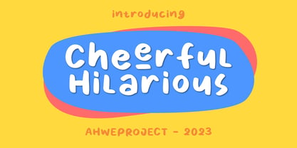 Cheerful Hilarious is a fun and quirky handwritten display font. Its whimsical vibe is perfect for creating unique, kid-friendly designs.
 - Chendolle by Rometheme,
$6.00 Chendolle is a bold display font, it has a fun and cute style and is perfect for creating playful kids designs.
 - My Home by Typefactory,
$14.00 My Home is a Fun Handwritten Font, Perfectly suitable for creating quotes, kids book, t-shirts, poster, mockup, and many more.
 - Antoni Bokir by Forberas Club,
$16.00 Antoni Bokir is brush font with clean and simple font. This font can apply to kids tees, banner, wallpaper, cover and party moment with brush style.
 - XPointed Desert by Ingrimayne Type,
$9.00 XPointedDesert and XSimpleHands do not have as much variety in the hands as XPhyngern, but their hands point in a lot more directions--up, down, and at 45-degree angles.


