10,000 search results
(0.036 seconds)
- Bayview JNL by Jeff Levine,
$29.00Around the turn of the 20th Century, the Inland Type Foundry produced a display face named Studley. It was a variation on a design by another foundry called Florentine. A condensed face with a bold, clean look, the design resembled the warmth and feel of a classic wood type. Best applied to headlines and titles, the font reads amazingly well at even 18 point renderings. Jeff Levine had added his own personal touch to his digital version of this old favorite and renamed it Bayview JNL. - DM Unarmed by DM Founts,
$12.50 Unarmed began life as a series of rectangles in Fireworks. The task was designing my own business card for the first time in years, and the perfect lettering couldn't be found in either free or commercial fonts. While there were some good choices, none of them really communicated who I was. Initially only the lowercase letters in my name were created, with each being designed around a 7 x 4 grid of squares. I liked the result so much that I wanted to use the same typeface in different projects - and to save time in future, I decided to create this font. In creating DM Unarmed, the intention was to avoid diagonal lines, and to keep all the lines horizontal, vertical and grid-like. This made creating some of the characters - particularly the rounded ones and the letters X and Z - challenging. Coming from both worlds, I wanted to achieve a blend of technicality and creativeness, without trying to pretend one was the other. For best results this font should be used for large and prominent text, although it works at smaller sizes up to 12pt. I've spent a lot of time trying to hint a few characters that wouldn't play ball, such as 2, 7 and 8. In case you're wondering: DM Unarmed got its name from my philosophy of facing challenges without reliance on tools and weapons.
 - EFCO Osbert by Ilham Herry,
$19.00 Meet Osbert, the font that effortlessly marries vintage charm with a contemporary flair. Imagine the nostalgic allure of old tin labels, now reimagined with a fresh twist. With its playful flared serifs and diagonal bars, Osbert brings a touch of modern to classic aesthetics. Boasting a whopping 15 static styles and a variable font, Osbert offers a playground of possibilities for designers. And with three distinct sub-families - text, regular, and display - finding that perfect balance in your designs has never been easier, whether you're crafting some typographic badges, editorial, logo, branding, poster, print, signage, etc. So go ahead, let Osbert add a touch of timeless coolness to your next project!
 - Royalana by Kufic Studio,
$15.00 Royalana is a modern royal font with a minimalist factor. A complete font set containing all the important glyphs. Royalana has been inspired by the very minimalist and compact designs in trend to deliver a new look and yet keeping the professional outlook of any design or print. Royalana font set includes; Royalana Light, Royalana Light Italic, Royalana Regular, Royalana Italic, Royalana Bold, Royalana Bold Italic, Royalana Extra Bold & Royalana Extra Bold Italic. Kufic Studio is a platform that provides professional and high-quality designs & fonts to fill the gap that has been missing in the market.
 - Endgame by Hanoded,
$15.00 Endgame font was made using a very, VERY bad brush and Chinese ink. I had bought a bunch of brushes some time ago and I discovered that the hairs had been treated with some goo to keep them from sticking out. The goo didn’t really come off, so when I started to draw the glyphs for this font, the brush strokes were kind of wild. In the end, I really liked it (even though I will never again buy that particular brand of brushes). Endgame is a wild brush font. Comes with the works: diacritics, ligatures and alternates.
 - Dorkihand by Aah Yes,
$4.95Dorkihand is left-handed handwriting. Julie is left-handed - which condition is variously called a caggie or a dorker - hence the name of this font. It is more grunge handwriting than a formal and elegant script. - Western Americana by Celebrity Fontz,
$24.99Western Americana is a unique collection of signatures of 72 famous American frontiersmen, gunslingers, Wild West personalities, outlaws, and Indians in a high-quality font. A must-have for autograph collectors, desktop publishers, lovers of history, or anyone who has ever dreamed of sending a letter, card, or e-mail "signed" as if by one of these famous Western celebrities. This font includes signatures from the following American West personalities: William Frederick Cody ("Buffalo Bill"), George Armstrong Custer, Meriwether Lewis, William Clark, Kit Carson, Joseph Brant, David Crockett, Wyatt Earp, Geronimo, James Bowie, Daniel Boone, Sam Houston, Calamity Jane, Sitting Bull, William H. Bonney ("Billy the Kid"), Cole Younger, Bob Younger, Jim Younger, Pat Floyd Garrett, James Butler "Wild Bill" Hickok, Squire Boone, Samuel Colt, Gordon William Lillie ("Pawnee Bill"), Annie Oakley, William Barret Travis, Allan Pinkerton, Jose de Galvez, George Rogers Clark, George Crook, John Charles Fremont, George Croghan, Simon Kenton, Maj. Frederick Benteen, James Wilkinson, Nelson Appleton Miles, Philip Kearny, Chief G.H.M. Johnson, William George Fargo, William Barclay "Bat" Masterson, King Philip, Frank James, Eleazer Williams, Henry Wells, Junipero Serra, John Sevier, John Ross, Joseph Virgo, Chief Joseph, Red Jacket, Manuel Lisa, Julian Dubuque, John Augustus Sutter, Manuel Lisa, Jesse James, Jesse James alias Thomas Howard, Manasseh Cutler, Robert Newton Ford, Emmett Dalton, Henry McCarty alias Greenville Mellen Dodge, Edward Zane Carroll Judson ("Ned Buntline"), Rain-in-the-Face, James Robertson, Zebulon Pike, Chief Two Guns White Calf, Pierre Chouteau Jr., Frank Butler, Isaac Shelby, Moses Austin, Moses Cleveland, Rufus Putnam, Pierre Chouteau Sr., Father Pierre Jean De Smet, and Auguste Chouteau. This font behaves exactly like any other font. Each signature is mapped to a regular character on your keyboard. Open any Windows application, select the installed font, and type a letter, and the signature will appear at that point on the page. Painstaking craftsmanship and an incredible collection of hard-to-find signatures go into this one-of-a-kind font. Comes with a character map. - TXT Antique Italic by Illustration Ink,
$3.00Bring your scrapbook page to life with unique journaling and titles made possible with this cool italic font. It'll add instant flavor to posters, signs, bulletin boards, and word art that call for an old-fashioned, antiqued flair. - SF Buttacup Lettering - Unknown license

- SF Buttacup Lettering - Unknown license

- SF Buttacup Lettering Shaded - 100% free

- SF Buttacup - Unknown license

- Halewyn by Hanoded,
$15.00 Heer Halewijn (The Song of Lord Halewijn) is a 13th century Dutch folk tale which survives in folk ballad. The story tells of a man called Halewijn, who lives in the woods and who lures pretty women with his songs (whom he then kills). One day a princess visits Halewijn, but when he wants to kill her, she requests he remove his robe, so as not to stain it with her blood. He obliges and when he is undressing, the princess seizes his sword and chops off his head. Halewyn is a handmade font, which was loosely based on my Languedoc font and Garamond. Use it for product packaging, books and posters. Comes in 4 weights (with italics) and a ballad full of diacritics.
 - Late Frost by Gleb Guralnyk,
$13.00 This calligraphic script font is called Late Frost. It's an elegant decorative font with lots of ligatures and multilingual support.
 - Melandria by Akrtype Studio,
$19.00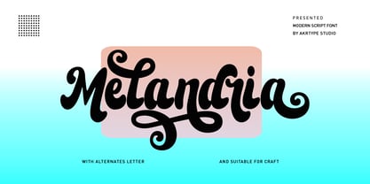 Melandria script is a magical script font carefully created with a touch of elegance. This is a beautiful combination of timeless elegance and authentic calligraphy. It features an incredibly classic style, while still keeping a friendly feel. Melandria script is the perfect font for making original and outstanding designs. This script supports multilingual and many alternative lowercase and uppercase characters, allowing you to make your design truly unique. The Melandria script is a beautiful, classic calligraphic font which will add a sweet, elegant, and perfect feel to your design. It’s perfect for logo projects, wedding invitation cards, branding, home designs, product packaging, and every other design that needs an elegant typeface.
 - Coo Coo by chicken,
$23.00 So I made five rather odd characters for a logo for a friend… Then I thought I'd fill a couple of spare hours expanding it to a single alphabet… And some considerable time later I ended up with a whole font with full punctuation, a bunch of alternates, pretty broad international support and some OpenType features to keep things varied… There are elements of Art Deco, Art Nouveau, Lego, circuit boards and Ceefax, Memphis lamps and lab clamps, hieroglyphs, googly eyes and who knows what else… Intricate, insane, highly irregular, but somehow it hangs together… Throw down a few letters nice and big when the fancy takes you…
 - Round Nib Deco JNL by Jeff Levine,
$29.00 Great type font inspirations can come from any time period and any location in the world. A Febuary, 1932 issue of an Estonian woman’s magazine called “Eesti Naine” had its name hand lettered using a round nib lettering pen. This extra-wide Art Deco design is now available as Round Nib Deco JNL, and is available in both regular and oblique versions.
 - Masche by Epiclinez,
$18.00 Add a touch of whimsy and charm to your designs with Masche, the ultimate fun handwritten font. With its quirky and playful style, this font is bursting with a personality that will instantly bring your designs to life. Whether you're crafting eye-catching quotes, captivating posters, or eye-popping headlines, Masche has got you covered. Its versatility knows no bounds - perfect for product packaging that needs that extra pop or any design project that calls for a dose of creativity. With Masche, unleashing your inner artist has never been so effortless! Masche features : Standard Latin Numbers, symbols, and punctuations Multilingual Support. Fully accessible without additional design software Simple Installations Works on PC & Mac Thank You.
 - Arpona Sans by Floodfonts,
$49.00 Arpona Sans is a contemporary sans serif family inspired by the work of Edward Johnston and Eric Gill for London Underground. As well as its serif companion Arpona it is a symbiosis of different design concepts. Arpona Sans combines the esthetics of a geometric Sans with the usefulness of the humanist concept and the calm of the modernist proportions. Arpona Sans is a good choice for editorial design, branding, app design and web design – a workhorse well readable even in running text on screen. The family has nine weights, ranging from Thin to Black plus corresponding italics. Each style includes 590 glyphs supporting all western-, eastern- and central-european languages including four sets of figures and various currency symbols. If you want to go into details visit the microsite: https://www.floodfonts.com/arponasans
 - Rhythmic Revue JNL by Jeff Levine,
$29.00 The vintage sheet music for "Between the Devil and the Deep Blue Sea" yielded another bit of Art Deco-era lettering perfect for developing into a digital font. This time it wasn't the song title, but rather the name of the show it was from serving as the type inspiration - the Cotton Club's 1931 revue "Rhythm-Mania". Harlem's Cotton Club was an "exclusive, whites only" club; both famous for its talent and shows, yet infamous for hiring black acts but not allowing black patronage. On the sheet music, the show title was hand lettered in a bold, slightly stylized fashion which became the basis for Rhythmic Revue JNL; available in both regular and oblique versions.
 - TT Fellows by TypeType,
$39.00 TT Fellows useful links: Specimen | Graphic presentation | Customization options There can't be too many universal fonts! Meet TT Fellows, a new workhorse whose functionality allows you to comfortably use the font in a variety of projects. Calm and neutral at first glance, the mood of TT Fellows can change. Working with the typeface, you can reveal its soft and friendly nature, or even the brutal one, for example, by typing the text exclusively in capital letters in the bold style. TT Fellows is easy to use and perfect for setting large text arrays. Thanks to the font's uniwidth and versatility, the font is ideal for use on websites or in periodicals. Bold styles will work harmoniously in headlines or as accents in print or on packaging. TT Fellows is a humanist sans serif with a mechanical touch. With its open shapes, the friendly neutral character of thin weights and an even softer character in bold weights, the new typeface differs in character from the classic TT Norms® and TT Commons sans serifs, while still offering the same functionality. Calm regular styles differ from bold, deliberately display and more expressive ones. By the way, TT Fellows is a unwidth typeface. It was important for us that the user could change the styles, knowing that the layout will not suffer. The typeface features equal width proportions, open apertures, and slightly squared ovals, which associatively brings it closer to other popular modern fonts. Since the idea of the typeface was focused on it being a uniwidth typeface, we needed to fit the bold styles into the regular em squares, which led to interesting graphic solutions that are noticeable, for example, in the k and ж characters, in which the branches are cut directly into the stems. TT Fellows consists of 19 styles: 9 upright, 9 italic and 1 variable, each with over 700 glyphs. The font has 26 useful OpenType features. For example, there is a switch to single-part versions of letters a and y, fractions, tabular characters, case versions of punctuation, and localized versions of characters for different languages. There is a ligature for a combination of two characters of a complex design fl. TT Fellows font field guide including best practices, font pairings and alternatives.
 - Potus Uncial by Jonahfonts,
$40.00 The Uncial alphabet is a majuscule script with unjoined letters which is found in European manuscripts of the 4th to 8th centuries and from which modern capital letters are derived. Potus Uncial is designed with lowercase letters reflecting the Uncial style while keeping them as close to the original majuscule script Uncials and making it a useful modern day font. I have found it to be appropriate for historic, medical and spatial topics and may be used in packaging designs, medical journals, declarations, greeting cards and prehistoric articles.
 - Magic Daisy by Supfonts,
$10.00 Hello, friends. I keep experimenting with handwritten fonts, shapes and lines. I want the font to set the tone, the atmosphere, look defiant, and read well. Try my new font, I think it combines all these qualities. Simple and clear, looks at ease. It is perfect for decoration or design where you don't need strict style :) Test it out below to see how it could look for your next project! Includes: Uppercase and lowercase Numbers and punctuation Foreign language support Ligatures Check out my blog: https://www.instagram.com/zloillev pinterest.com/dmitriychirkov7 Enjoy
 - ITC Johnston by ITC,
$29.00ITC Johnston is the result of the combined talents of Dave Farey and Richard Dawson, based on the work of Edward Johnston. In developing ITC Johnston, says London type designer Dave Farey, he did “lots of research on not only the face but the man.” Edward Johnston was something of an eccentric, “famous for sitting in a deck chair and carrying toast in his pockets.” (The deck chair was his preferred furniture in his own living room; the toast was so that he’d always have sustenance near at hand.) Johnston was also almost single-handedly responsible, early in this century, for the revival in Britain of the Renaissance calligraphic tradition of the chancery italic. His book Writing & Illuminating, & Lettering (with its peculiar extraneous comma in the title) is a classic on its subject, and his influence on his contemporaries was tremendous. He is perhaps best remembered, however, for the alphabet that he designed in 1916 for the London Underground Railway (now London Transport), which was based on his original “block letter” model. Johnston’s letters were constructed very carefully, based on his study of historical writing techniques at the British Museum. His capital letters took their form from the best classical Roman inscriptions. “He had serious rules for his sans serif style,” says Farey, “particularly the height-to-weight ratio of 1:7 for the construction of line weight, and therefore horizontals and verticals were to be the same thickness. Johnston’s O’s and C’s and G’s and even his S’s were constructions of perfect circles. This was a bit of a problem as far as text sizes were concerned, or in reality sizes smaller than half an inch. It also precluded any other weight but medium ‘ any weight lighter or heavier than his 1:7 relationship.” Johnston was famously slow at any project he undertook, says Farey. “He did eventually, under protest, create a bolder weight, in capitals only ‘ which took twenty years to complete.” Farey and his colleague Richard Dawson have based ITC Johnston on Edward Johnston’s original block letters, expanding them into a three-weight type family. Johnston himself never called his Underground lettering a typeface, according to Farey. It was an alphabet meant for signage and other display purposes, designed to be legible at a glance rather than readable in passages of text. Farey and Dawson’s adaptation retains the sparkling starkness of Johnston’s letters while combining comfortably into text. Johnston’s block letter bears an obvious resemblance to Gill Sans, the highly successful type family developed by Monotype in the 1920s. The young Eric Gill had studied under Johnston at the London College of Printing, worked on the Underground project with him, and followed many of the same principles in developing his own sans serif typeface. The Johnston letters gave a characteristic look to London’s transport system after the First World War, but it was Gill Sans that became the emblematic letter form of British graphic design for decades. (Johnston’s sans serif continued in use in the Underground until the early ‘80s, when a revised and modernized version, with a tighter fit and a larger x-height, was designed by the London design firm Banks and Miles.) Farey and Dawson, working from their studio in London’s Clerkenwell, wanted to create a type family that was neither a museum piece nor a bastardization, and that would “provide an alternative of the same school” to the omnipresent Gill Sans. “These alphabets,” says Farey, referring to the Johnston letters, “have never been developed as contemporary styles.” He and Dawson not only devised three weights of ITC Johnston but gave it a full set of small capitals in each weight ‘ something that neither the original Johnston face nor the Gill faces have ‘ as well as old-style figures and several alternate characters. - Winkle Picker JNL by Jeff Levine,
$29.00 A 1963 movie poster for an Italian documentary called “Sexy Nudo” had its title lettering in a free form spur serif design reminiscent of cut paper. This inspired Winkle Picker JNL, which is available in both regular and oblique versions. Despite the subject matter of the film documentary, the lettering on the poster is fun and playful, which meant the digital font deserved a fun name as well. It was named for a shoes and boots with sharp and long pointed toes which first gained popularity in the 1950s.
 - Xavier by CastleType,
$29.00 The Xavier family of typefaces is based on the delightful deco typeface called Ashley Crawford, originally designed in 1930 by Ashley Havinden. After designing Xavier Black (Serif) and Xavier Sans Black, I added Bold Sans, Medium and Medium Sans and finally added lowercase to the medium weights. Although more manageable than Ashley Crawford, Xavier, due to its very playful nature (splayed A, M, etc.) needs to be used with care, especially in terms of spacing. Xavier is a playful typeface and I have been particularly pleased to see it used in children's books.
 - Delighted Atmosphere by Java Pep,
$15.00 Proudly present a pretty bouncy font called Delighted. As the name suggests, this font will make your project more enjoyable because it will make your project more beautiful and stand out. Delighted font comes with several alternates, so you can switch on for the alternate, stylistic alternate, and terminal form. This font is perfect for logo font, branding, greeting cards, cut files for quotes, silhouette font design, monogram font, etc. The packages and features Delighted font PUA encoded Multilingual support in more than 30 languages Thanks, and have a nice day
 - Rolling Pen by Sudtipos,
$79.00 After doing this for so many years, one would think my fascination with the old history of writing would have mellowed out by now. The truth is that alongside being a calligraphy history buff, I'm a pop technology freak. Maybe even keener on the tech thing, since I just can't seem to get enough new gadgets. And after working with type technologies for so many years, I'm starting to think that writing and design technologies as we now know them, being about 2.5 post-computer generations, keep becoming more and more detached from what the very old humanity arts/tasks they essentially want to facilitate. In a world where command-z is a frequently used key combination, it’s difficult to justify expecting a Morris-made book or a Zaner-drawn sentence, but accidental artistic “mutations” become welcome, marketable features. When fluid pens were introduced, their liquid saturation influenced type design to a great extent almost overnight an influence professional designers tend to play down. Now round stroke endings are a common sight, and the saturation is so clean and measured, unlike any liquid-paper relationship possible in reality. Some designers even illustrate their work by overlaying perfect circles at stroke ends, in order to illustrate how “geometric” their work was. Because if it’s measured with precise geometry, it’s got to be meaningful design. And once in a while, by a total freak accident, the now-cherished mutations prove to have existed long before the technology that caused them. Rolling Pen was cued by just such a thing: A rounded, circular, roll-flowing calligraphy from the late nineteenth century seemingly one of those experimental takes on what inspired Business Penmanship, another font of mine. Looking at it now it certainly seems to be friendlier, more legible, and maybe even more practical and easier to execute than the standard business penmanship of those days, but I guess friendliness and simplicity were at odds with the stiff manner business liked to present itself back then, so that kind of thing remained buried in the professional penman’s oddities drawer. It would be quite a few years before all this curviness and rounding were thought of as symbolic of graceful movement, which brought such a flow closer to the idea of fine art. Even though in this case the accidental mutation just happens to not be a mutation after all, the whole technology-transforms-application argument still applies here. I'm almost sure “business” will be the last thing on people’s minds when they use this font today. One extreme example of that level of disconnect between origin and current application is shown here, with the so-called business penmanship strutting around in gloss and neon. Rolling Pen is another cup of mine that runneth over with alternates, swashes, ligatures, and other techy perks. To explore its full potential, please use it in a program that supports OpenType features for advanced typography. Enjoy the new Rolling Pen designed by Ale Paul with Neon’s visual poetry by Tomás García.
 - Blacker Mono by Zetafonts,
$39.00 Blacker mono was developed out of a brief by Isabella Ahmadzadeh, by Cosimo Lorenzo Pancini and Francesco Canovaro for the editorial project "A beautiful mistake" by OFFF Tlv in 2022. It is a monospaced version of our typeface Blacker, bringing its "evil serif" aesthetics in the realm of typewriter and coding typefaces. In designing these, usually the letterforms are deformed to better fill the space, but in Blacker Mono only the serifs are modified to balance letters, while letter skeletons are kept consistent with the ones of the original Blacker family. This gives the typeface an uneven, unexpected rhythm, underlined by the unusual choice of providing three optical sizes and some extreme display weights - both uncommon choices in monospaced fonts. The resulting typefamily is thought for use in editorial situations where readability must be married by a strong personality, and is complemented by all the wide array of Open Type features that are present in all Blacker variants, from positional numerals to small case letters and alternates.
 - Vododeo JNL by Jeff Levine,
$29.00 Vododeo JNL is directly named for the free-form sheet music title lettering from Jack Yellen and Milton Ager's "Vo-Do-De-O". The term itself was a catchphrase made popular during the era known as the "Roaring 20s". Yellen and Ager were responsible for such hits as "Ain't She Sweet" (1927) and "Happy Days Are Here Again" (1930) along with countless others. During his career, Jack Yellen provided lyrics to over 200 songs. As a side note, Yellen was married to a distant cousin of type designer Jeff Levine's late mother.
 - Netherland Perpendicular by Greater Albion Typefounders,
$16.00 Netherland Perpendicular, a family of five typefaces, is Greater Albion’s end of year Blackletter release for 2015. It is designed in the fine traditions of Victorian Revival Blackletter, where historical veracity is ever sacrificed to aesthetic calm. The five typefaces share uniform metrics, making for charming colour overlay effects.
 - Widy by Pasternak,
$12.00 Wide font family is a geometric sans serif font, which features 9 styles. It’s based on the Futura developed by Paul Renner and neo sans-serif fonts. At the same time, it has significant stylistic differences. Massive lengthy letters are among the unique features of this font. They will help you come up with the perfect composition. The letters have optical compensation, while a circle is the main figure of the fonts. Due to wide fonts, your project will have modern and fresh design. The composition will keep its contrast regardless of a background you’ve chosen. The Widy family includes 9 styles: Thin, Extra Light, Light, Semi Light, Regular, Medium, Semi Bold, Bold and Extra Bold. Each of them also has Italic variation. The fonts are perfect for both graphic design projects (posters, brand identities, logotypes) and simple interface design, which needs the necessary style.
 - Eurobrush by profonts,
$41.99 Eurobrush Pro is a new handwriting script designed by German type designer Ralph M. Unger. He produced not only the standard Western character complement, but added all of the Eastern European Latin glyphs and, on top of that, even the complete Cyrillic characters. Born and grown up in Th�ringen, former East Germany, Unger has a fair knowledge of Polish and also Russian (Cyrillic). Eurobrush Pro is a very beautiful, casual, informal and modern handwriting in `brush-style of a contemporary type designer. Even though a digitized handwriting, it keeps a very natural and pleasant look, at the same time being generous and well-readable. The individual characters combine quite easily and perfectly with no need for extra variants (although Unger included a number of ligatures). Eurobrush Pro is well-suited for plenty of applications, e.g. personal correspondence, invitations, greeting cards, headlines etc. Eurobrush Pro is supplied in the complete Latin character set (West + East) including ligatures, plus Cyrillic.
 - Lotter by Kaer,
$19.00 Lotter blackletter with Drop caps One fine day I found a vintage book, it called “A treatise by the Dominican friar-writer Marcus von Weida on the Brotherhood of the Holy Rosary”. It was printed in 1515 by Melchior Lotter in Leipzig. The text was illustrated by hand-colored engravings on religious and liturgical themes and beautiful initials I like. Lotter was the last name of a family of German printers, intimately connected with the Reformation. An innovation by the elder Lotter was his use of Roman types for Latin, reserving the Gothic types for German. I'm happy to present to you my new font family. Lotter font family has Drop cap and Regular styles. It's all you need to precisely imitate medieval style text. Use Drop cap style as a decorative element at the beginning of a paragraph or section, other part of the paragraph should be in Regular style. You’ll get: * Drop cap & Regular styles * Uppercase and lowercase * Multilingual support * Numbers * Symbols * Punctuation * Ligatures Please feel free to request any help you need: kaer.pro@gmail.com Best, Roman.
 - Malista by Genesislab,
$5.00 Malista is a large yet elegant Family display font. The unique and creative character according to today's style will be very interesting for you to create any design work with a classy model while still maintaining a calm and classy style to look at. You're sure to have inspiration to match your creativity! Multilingual Support. Ligature Pounding . Malista . Malista Italic . Malista Italic Outline . Malista Outline . Malista Rounde . Malista Rounde Italic Don't delay any longer to download quality goods only here. Thank You
 - ITC Jiggery Pokery by ITC,
$29.99ITC Jiggery Pokery is the work of British freelance designer Carol Kemp. ITC Jiggery Pokery evolved from lettering for a project which needed to be quirky, wacky and fun," says Kemp. "The name came to me as the letters appear to jig along - it just seemed to fit. 'Jiggery Pokery' is London Cockney slang which has a variety of meanings. It's used to describe behavior such as 'ducking and diving', trickery, juggling (especially of financial matters!), or 'hanky panky'. My grandparents were Cockneys, and my uncle would use colourful rhyming slang which I loved to hear as a child."" - Durham Abbey NF by Nick's Fonts,
$10.00 This graceful charmer is based on a Victorian-era typeface called "Romanesque". It takes its name from a cathedral in England considered by many to be the finest example of Romanesque architecture in the British Isles. The Opentype version of this font supports Unicode 1250 (Central European) languages, as well as Unicode 1252 (Latin) languages.
 - Megaphone by Red Rooster Collection,
$60.00 It was our initial intention to develop a suitable lowercase for Les Usherwood's Elston typeface, based on a few characters from an old German typeface called Hermes Grotesque (Woellmer, Berlin). The new design became Creighton. Then, for good measure we decided to experiment with a 'crisper version' of this design; the result is 'Megaphone'.
 - Mirantz by insigne,
$32.00 Y’all ready for this? Now starting for Insigne: the new serif Mirantz. This rookie all-star plays a precise game every game, cutting at all the right angles to leave your reader impressed and ready to see more. You can always count on Mirantz to lead with solid mechanics and a clean style, but don’t be surprised when the face keeps it real with a little individual flare and creativity. This personal touch is nothing short of elegance in every appearance. So what makes us love this rookie above the other great players in the field? Contrast, for one. Mirantz brings more contrast to the game than most serifs out there. The serifs on this face have a crisp, sharp wedge that naturally draws the reader’s eye. You can’t help but fall in love with its clean, natural style. Mirantz also features a tall x-height and regular proportions that can play a number of positions on the page and still stay strong through the last half of the copy or even the final period. Mirantz is a solid powerhouse player, containing a complete set of small capitals and nine weights from thin to bold. It can play well both down low and up top with its subscripts and superscripts and can move your reader’s eye easily across the copy with its titling capitals, condensed and extended variants, and open style figures. With its options covering more than 72 Latin-based languages, look for this newcomer to have international success in the near future. It you haven’t set your draft picks for this next round of projects, think hard before passing up Mirantz. A capable serif like this one is a guaranteed asset to any team of fonts. Production assistance from Lucas Azevedo.
 - Broadside by Device,
$39.00 Broadside is a versatile, authoritative and functional family inspired by the sans serifs seen on ’40s and ’50s patriotic posters and period advertising. It is available in seven weights across condensed, normal and extended widths, each with reweighed italics. The type from this period was very often hand-drawn, and so differs considerably from poster to poster. Many American examples of this period use a Photo-Lettering style called Murray Hill and its derivatives, although their UK counterparts, designed by such luminaries as Abram Games or Tom Eckersley, are more stylistically diverse. Even though no single model is available to base a digitisation on, there are certain recurring stylistic quirks that give the type its unique flavour, and so the most interesting examples from several sources were be combined for the final family. Alternate short descenders, allowing for tighter line spacing, can be toggled on or off in the Opentype panel of Indesign or Illustrator. Tabular and lining numerals and a single-story ‘a’ are also available in all weights and styles.


