10,000 search results
(0.053 seconds)
- Meriwether Circular NF by Nick's Fonts,
$10.00 The face exudes Edwardian elegance, based on a 1905 release from American Type Founders called Meriontype. It's evocative of simpler times. Both versions of this font support the Latin 1252, Central European 1250, Turkish 1254 and Baltic 1257 codepages.
 - Vintage Poster JNL by Jeff Levine,
$29.00 Modeled from an example in the book “Lettering” by Harry B. Wright (1950), the poster alphabet shown was reminiscent of the kind of style used in the early 1900s by sign painters and show card artists. Vintage Poster JNL is available in both regular and oblique versions.
 - MPI Sardis by mpressInteractive,
$5.00 Sardis is based on a family of wood type called "Lydian," designed for American Type Founders Company by Warren Chappell in 1938. The strokes have angled ends, referencing the use of a calligraphy nib.
 - Monstroula Shadow TT - Unknown license

- Technoda by Figuree Studio,
$18.00 Technoda is a futuristic font that carries uppercase and lowercase characters with a set of numbers that showcase a futuristic unique design in addition to galactic alternates and a cyberpunk theme. Take a trip through time and use it for movie posters set in space or in the future. Very suitable for sci-fi enthusiasts, create cards and personalized artwork, but don’t let the adventure stop with you. Use Technos for UX /UI, and techno projects and allow the rest of the world to get a glimpse of what the future may hold.
 - Beatrix Antiqua by Zetafonts,
$39.00 Beatrix Antiqua is a humanist sans-serif typeface designed by Francesco Canovaro. Beatrix Antiqua is part of the Beatrix Family that takes its inspiration from the classic Roman monumental capital model: its capitals are directly derived from the stone carvings in Florence Santa Croce Cathedral - where the serifs are often removed while keeping the variable width strokes. So, even if it’s basically a sans-serif, Beatrix keeps a subtle swelling at the terminals suggesting a glyphic serif - in the same vein as Herman Zapf classic Optima typeface. In the lowercase design, Beatrix references early humanist typefaces, keeping small calligraphic details (as the prolongation of the e nose) that are especially visible in the italics. While Beatrix Antiqua, the companion typeface to Florentia , slightly exaggerates its antique stylistical features, Florentia tries to mix those influence with a more robust & digital age ready design, featuring bigger X-height and an extended character set that covers over forty languages using the latin alphabet, as well as Greek and Russian Cyrillic.
 - Brush Marker by Fenotype,
$18.00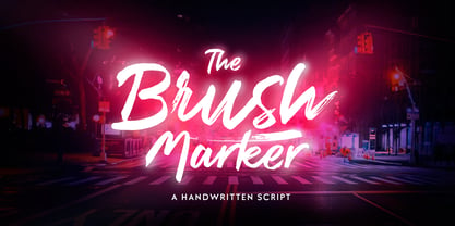 Brush Marker is a strong hand drawn dry brush font. Brush Marker is great for headlines and logotype use. Brush Marker is packed with automatic Contextual Alternates and Standard Ligatures that keep the text vivid. Brush Marker has a wide language support and it is PUA encoded so you can access extra glyphs in most graphic design softwares.
 - Cailyn Bloom by Balpirick,
$15.00 Cailyn Bloom is a magical script font carefully created with a touch of elegance. It features an incredibly classic style, while still keeping a friendly feel. This font is the perfect font for making original and outstanding designs.
 - Gambler by Fenotype,
$25.00 Gambler is a characteristic display type collection of 7 font styles with both clean and textured -making it total 14 fonts designed to play together. Gambler strikes with witty and elegant appeal combining vintage and modern elements. Gambler is an effective set for creating identities for branding, posters, book covers, headlines, logotypes, prints on garments, restaurant menus, beer labels and so on, both offline and online. Gambler Script is a smooth contrasted script that comes in two weights and it is packed with plenty of OpenType features: Standard Ligatures and Contextual Alternates are automatically on and they help to keep the flow and connections smooth. From Stylistic Alternates you’ll find characters with pointed endings and some other small variations. For extra flair try Swash or Titling Alternates. Gambler Script is PUA encoded so you can access the extra characters in most graphic design softwares. Gambler Brush is a soft brush script with low contrast and large x-height. Gambler Brush comes with following OpenType features: Standard Ligatures and Contextual Alternates that are automatically on and that keep the connections smooth. For less uneven word picture try Stylistic or Swash Alternates. Gambler Brush is PUA encoded so you can access the extra characters in most graphic design softwares. Gambler Flare is a flared serif with sharp edges and wide characters Gambler Flare comes in two weights. Gambler Gothic is a rigid condensed sans serif that comes in two styles: Regular and Shadow. Gambler Gothic Shadow has a narrow lining giving a three dimensional expression to the font. Gambler fonts are designed to play together, in pairs, or all together but they also work great as themselves or combined with other Fenotype Fonts.
 - Therhoernen by Proportional Lime,
$9.99 Arnold Therhoernen. (Arnoldus ther Hornen, Drucker des Dictys , Arnold ter Hoernen, Arnold ther Hoernen, Arnoldus TherHornen.) Who was this guy? He was a printer active in the city of Cologne, having graduating from the university there. He learned his craft under Ulrich Zell. He printed books from 1470 to 1482 when the plague carried him off. Was he just another printer of the era? No, he brought out the first edition of the "Fasciculus temporum'' (The most popular work by a living author at that time.) And he was the first to use both a title page and page numbers. His page numbers, an idea probably suggested to him by Werner Rolevinck, were interesting in that they were centered half way down the page on the outer margin and were set in Roman Numerals.
 - Abigail Adams by Three Islands Press,
$39.00 “My Dearest Friend” is how she began nearly all her letters to her husband, John. I refer, of course, to Abigail Smith Adams, first Second Lady and second First Lady of the United States. Her famous correspondence with John Adams produced nearly 1,200 letters over a span of some 40 years, leaving us with a priceless record of early American life — from household routines to war and politics to expressions of personal worry and devotion. Although Abigail’s was not the loveliest hand, I found it sure and expressive, as befitting her extraordinary sway and intelligence; it also carries a genuine flavor of the period. In making the font I focused chiefly on her handwriting from the 1780s and ’90s, when she’d taken to using a disconnected cursive, which struck me as distinctive and alluring. The OpenType release of Abigail Adams has scores of ligatures, standard and contextual alternates, lining and old-style figures, cross-outs, ink blots, and full Latin language support.
 - Gothic Grotesk JNL by Jeff Levine,
$29.00 In a specimen book from Stevens, Shanks & Sons, Ltd. of London (circa1930s) “Royal Gothic” was their version of a classic grotesk sans that had been in use as far back as 1899 when the Keystone Foundry called it “Charter Oak”. The terms "gothic" and "grotesk" were equally applied to early sans serif typefaces – at first not well embraced by printers as being too ugly (grotesque) for use. One familiar characteristic of early grotesk fonts (such as this one) is the numerous variations of character widths and shapes. By combining those two terms into a font name, the digital version of this design is called Gothic Grotesk JNL, and is available in both regular and oblique versions.
 - Ollie by Eclectotype,
$40.00 Meet Ollie, a casual signage script whose friendly, bouncy exterior belies a heart of sophisticated OpenType programming. This font is designed to make the most of OpenType savvy applications, and as such is recommended for professional design use. Or to put it another way: Make sure that contextual alternates and ligatures are always turned on! Ollie includes about 900 glyphs, many of which are automagical substitutions to keep the text flowing smoothly, and to pseudo-randomly pick different glyphs to avoid repetition. With contextual alternates turned on (as they should be by default), most lowercase letters will alternate between at least two different forms. The powerful OpenType programming makes the font itself ‘look back’ (up to eight characters) on previously used letters; typing “banana” will give you three different a’s and two different n’s (the last a is a special ‘end form’ character). The calt feature controls many other ‘special effects’ which all add together to give a smooth-flowing, hand-lettered look. These effects include start and end forms (and indeed, ‘loner’ forms) of many letters, which are automatically substituted in at beginnings or ends of words, or when the previous or next letter doesn't connect. Another special feature tests to see if there is room for the crossbar of t (or tt ligature) to extend further over the previous or next letter, or both, as is often the case. The last main effect of the calt feature is to substitute certain letters typed before any ‘e’ character, to make for a more natural connection (see the pe combination in ‘Eclectotype’ in the first poster). Ligatures should be on by default, for a much nicer looking tt combination, and a few others besides. The swash feature should be used sparingly (one glyph at a time, really) to apply a more extravagant look to g,j and y in the lower case, and quite a few of the upper case too. Oldstyle figures are included, as well as the lining defaults. Now to delve into the stylistic alternates... These are all included in the salt feature, or for uses of applications that support them, separated into stylistic sets thus: ss01 - (with swash feature on) L and G swashes get even swashier. ss02 - standard s changes to a connected script s form. ss03 - r takes on a script form. ss04 - z also gets a scriptier look. [the previous three sets also change any versions of s, r or z with diacritics] ss05 - a useful underline function. When enabled, typing two or more underscores will extend a cool underline under the previous letters. More underscores = longer underline. ss06 - the Polish script lslash changes to its more standard form. ss07 - E, S and B change to a more top-heavy alternate form. ss08 - An alternate form for A characters. ss09 - Alterative rounder forms of M and N. ss10 - An alternate ampersand. That about wraps up the features. Now all that’s left is for you to license the font and get experimenting!
 - Art Class JNL by Jeff Levine,
$29.00 Art Class JNL was re-created from the titling of a lettering booklet called "Drawlet Portfolio", published by the Esterbrook Pen Company in the 1930s. Drawlet pens were Esterbrook's answer to the popular Speedball lettering pens, and the booklet was an instructional manual on hand lettering with the pen nibs.
 - Plathorn by insigne,
$24.00 Vast and untamed, the American West once stretched as free and wild as imagination itself. Still beautiful, the Wild West of long ago and the new West of today is now to be found in insigne’s new face, Plathorn. That’s right, folks. When the West called, Jeremy Dooley reached up like Pecos Bill, grabbed it by the reins and pulled it in, then using its wide, roaming elements to design this functional font that still has an unbroken spirit burning deep inside. This down right, no-nonsense, orthodox face leaves off any of that extra fancy stuff that doesn't belong on a ride. Plathorn comes with a family of cowhands as wide as the Rockies, bringing specifically tailored condensed and extended sub-families along with it too. By design, it’s not very obtrusive like its unorthodox reversed tension brethren. Leave those for the next font rodeo. This mount features barely a hint of a serif that hearkens back a hundred years or so to sign painters and package lettering artists of early twentieth century. They're sure to put the sharpness, gumption and grit you need into your copy. So grab a tall glass of Plathorn and drink in the deep taste of America’s big country. Put it in your next magazine. Put it in your brand. This typeface’s offbeat appeal is bound to bring a bit of wild U.S. to your free-spirited work.
 - Arthur Keith by DLetters Studio,
$35.00 Arthur Keith Signature Style Font Is A Great Font For any project! This font is made with an awesome taste and classy with natural touch, lots of ligatures, SAlt, and Swash. We keep this font looking Natural, easy to read, elegant, stylish, attractive and very easy to use. Arthur Keith Signature Style Font is a great choice for Projects you like branding, design, wedding, photography, signature, logo designs, album covers, business cards, quotes, and tons of projects other designs. What’s Included : – Arthur Keith (OTF/TTF/WOFF) – S-Alt, SS01, Ligature, and Swash – Works on Win, Mac – Simple installations – Accessible in Adobe Illustrator, Adobe Photoshop, Adobe InDesign, even work on Microsoft Word. – PUA Encoded Characters – Fully accessible without additional design software. Thanks for your support, please kindly send us a message for any question about our product. Hope you like it.
 - Packing Heat by Hanoded,
$16.00 I came across a photo of Al Capone and some of his henchmen when searching the internet for something completely unrelated. We don’t have a history of notorious gangsters in Holland, so I was intrigued by Capone all of my life. Packing Heat is 1930’s slang for ‘carrying a gun’, which I thought befitted this handmade font with an early 20th century look. Packing Heat comes with multilingual support and a set of alternates for the lower case glyphs.
 - Geminian by Sudtipos,
$49.00 Geminian is a set of fonts that started as a simple idea based on a theoretical level and developed during a long time, to be able to take shape under a creative impulse inspired by the need to communicate, today more than ever. From an astrological point of view, it celebrates and contributes to this practice, the study of stars position and movement and their influence on people's destiny. As a good Gemini, this set revives the main features of the opposite twins sign. Gemini is associated with thoughts, creativity, and communication. Its ruler Mercury (Hermes for the ancient Greeks), messenger of the Gods, and spokesman of the divine word, gives the natives of this sign intelligence, wit, eloquence and poetry. Geminian aims to be a medium to carry different messages from one end to the other. And this is because when using words, Geminis always surprise. Thanks to this gitf (and language and communication), they are able to bring up the most ingenious ideas, to solve any problem and to contribute new perspectives. These qualities may be the secret of its magnetism. The Geminian set comes in 5 styles including a script with multiple ligatures and alternates, 3 sets of caps and dingbats. In addition the complete font family supports a wide variety of Latin alphabet-based languages.
 - Mrs. Santhi by Abo Daniel,
$15.00 Proudly present Mrs. Santhi, a fancy Signature Font. This font is very unique. I designed it for you who want something different from the others. It is perfect for branding, photography, invitations, quotes, watermarks, advertisements, product designs, labels, and much more! I created 194 ligatures to keep this font look natural: aa ab ah ak al am an at ant all amm ann att bh bt cc ch ct dd eb ee ek em en et enn ent ett ff gh hh ii ib ik in it inn int itt ix ixx kh ll mm mt nt nn oo oh on ob ok ol oll om ot ont ott oot onn ox oxx ph pt and more as you can see on the presentation pictures. Mrs. Santhi also features punctuations and multilingual support. Hope you love it!
 - MPI Headline Modified by mpressInteractive,
$5.00 Headline Modified, also called "Modified Gothic" by some type manufacturers, has a large stroke contrast and very small, pointed serifs. Curved characters feature a brushstroke appearance. Our version is based on a typeface designed by the Hamilton Manufacturing Company around 1897.
 - Embryo by HVD Fonts,
$30.00 Typedesigner Hannes von Döhren created a display typeface called "Embryo". A superblack, sweet font with filled counters. Perfect for use in big sizes on posters or flyers. Embryo has an extended character set to support Western, Central and Eastern European languages.
 - Sonrisa by CastleType,
$59.00 Sonrisa is a design that evolved from my sketches of the skeletal structure of Jakob Erbar’s Koloss, trying to discover its underlying essence without all the contrast and bulkiness of the original design. Sonrisa Thin was the resulting font, from which the other weights of the family were developed. Gentle curves, open counters, generous x-height, and sleekly tapered terminals give Sonrisa a very legible, modern, elegant appearance. When she saw the first draft of this typeface, the smile on my friend Jennifer’s face gave me the idea to call it “Sonrisa” (Spanish for “smile”). Jennifer, a clinical psychologist, described Sonrisa’s personality as: "happy, clean, clear, open, joyful, spacious, playful, calm. I can see it being used for body product lines such as oils and lotions. Can see it being used in home/travel magazines or even Architectural Digest. Yoga magazine, definitely." Sonrisa is what some foundries call a “Pro” typeface family with all the bells and whistles that provide typographic versatility: true small caps, oldstyle numerals, arbitrary fractions, discretionary ligatures, and other powerful OpenType features. All fonts in the family, except Sonrisa Titling, support most European languages, including modern Greek and languages that use the Cyrillic Alphabet. (Cyrillic glyphs designed in consultation with Ukrainian type designer, Sergiy S. Tkachenko.) Sonrisa is available in the original Thin, monoline version as well as six weights (Light, Regular, Medium, Bold, Extra Bold, Black), and a Titling font that is essentially a display font construction kit. If you enjoy using Sonrisa even half as much as I enjoyed creating it, then I know you will have a “sonrisa” (smile) on your face!
 - Chilona by Siratype,
$19.00 Chilona: A modern serif font that seamlessly marries classic elegance with contemporary design. Its timeless serifs and sleek lines bring sophistication to any project. Chilona maintains both readability and beauty, making it suitable for headlines and body text. It supports multiple languages and ensures consistent aesthetics in print and digital media. WHAT’S INCLUDED? Chilona Regular (uppercase & lowercase) Numbers & punctuation Ligature & Huge Stylistic alternate Multilingual support.
 - MGN Marcelino by Morgana Studio,
$18.00 MGN Marcelino, crafted by Morgana Studio in 2024, is a captivating serif font that exudes timeless elegance. The distinctive serifs, characterized by their generous and slightly rounded contours, lend a unique charm to the typeface. This vintage-inspired font carries a sense of sophistication and nostalgia, making it a perfect choice for projects that seek to evoke a classic and refined aesthetic. MGN Marcelino seamlessly combines modern design sensibilities with a touch of the past, creating a versatile and visually appealing typeface that stands out with its bold and gracefully rounded serifs.
 - Neue Latein by Spirit & Bones,
$33.00 This sans serif font carries the flair and mood our Schneidler Latein font family. The calligraphic appearance and the human sound are evident thanks to the preservation of some significant broad edged pen elements. The forms are reduced to the subtle level where they are simplified, but the essence still remains. The expressive and artistic expression of the Schneidler Latein continues to work like a background melody. Together they build a superfamily that works perfectly in combination with each other. More weights will follow soon.
 - Savage Sword by Comicraft,
$29.00 Mother of Mitra, Crom’s Devils and other Savage WORDS! The only thing better than one dead Pict is TWO! Or THREE! Or FOUR! And what better than this SAVAGE font to sound the sword strokes of a BARBARIAN BORN?! Hack! Slice! Cut your fiendish foes into pieces with Comicraft’s SAVAGE SWORD and tell your SAVAGE TALES to all and sundry and even those you’ve sundered! BE AWARE! Handle with care and keep some neosporin or other antibacterial cream at hand -- being Savage and filled with Berserker Rage may result in unintended wounds to yourself and your kinsmen. Savage Sword features two sets of automatically alternating uppercase characters, plus support for Western & Central Europe and Vietnamese.
 - Azteria by ARToni,
$17.00 Azteria is a modern display font with a dashing appearance, bold, strong and powerfull. the luxury can be seen from each point. with a retro and classic style to keep it dashing all the time. This font is perfect for logos, t-shirts, decals, stickers and more
 - Charlemagne Bold - Unknown license

- Asturias by insigne,
$21.99Asturias is a contemporary take on script fonts. Its characters are wider than most scripts, and the letterforms are somewhat geometric, giving it a modern and refined feel. The font is well suited for any occasion that calls for a sophisticated air and appearance. As with all insigne releases, Asturias comes with a wide range of OpenType features; a full complement of artistic alternates, ligatures and old style figures to add a touch of sophistication. - Presser by Konstantine Studio,
$9.00 80s. , 90s, y2k, sometimes we just wonder, "what year is it today?" everything looks like we're going backward (in a good way though, calm down). Since luck is a form of preparation that meets a chance, again, we came up prepared. Introducing PRESSER. A new sans-serif family with the diverse vibes of nostalgia and modernism in one shot. ps: it's WIDE, like seriously wide, extended. We warned you.
 - Thibero by Liartgraphic,
$20.00 Hello guys! Introducing our newest product, we call this product the Thibero font Thibero font is a regular font with a retro style With a unique and firm touch Thibero fonts are great to use on: fashion magazines, logos, and photography, landing pages, flyers, What's included - multilingual support - ligatures -alternate Thank you, best regards Ali Sifak Muftari
 - Art Magazine JNL by Jeff Levine,
$29.00 A 1920 art magazine from Great Britain entitled “Pan” had its three letter name hand lettered on the cover in a style that had elements of Art Nouveau, Art Deco and what would eventually be called Techno in the 1980s. This inspired the typeface Art Magazine JNL, which is available in both regular and oblique versions.
 - Runaround Kid by Hanoded,
$15.00 I was listening to some old Smashing Pumpkins albums when I created this font. The name comes from a song called *** You (An Ode To No One). Runaround Kid is a hand painted typeface. I used Chinese ink and a cheap Chinese brush to create the inky look. Comes with double-letter ligatures and a whole bunch of diacritics.
 - Yellow Cute by Sakha Design,
$10.00 Yellow Cute is a lovely and modern script font that exudes elegance and sophistication. Each letter is delicately crafted with fluid and graceful strokes, creating a timeless look that’s perfect for everything from wedding invitations to branding projects. Its sleek and chic style will add a touch of class to any design. Keep in mind that the font is PUA encoded, meaning that you can access all delightful glyphs and swashes effortlessly.
 - Euphoria by Comicraft,
$29.00If you're searching for the perfect beat, let us guide your soul deep into the abyss. Reach higher ground with the ambient textures and boomboy shredder baseline of this funky dope font created by our digital chemist and cerebral craftsman, John "JG" Roshell. Rave un2 the joy fontastic. Rain or shine, you are covered, see you on the dancefloor. - Secret Agent NF by Nick's Fonts,
$10.00This typeface was suggested by a 1930s ad for a product called Plantol, designer unknown. It can be either graceful or playful, depending on context. - Tabac Big Glam by Suitcase Type Foundry,
$39.00 Tabac Big Glam probably stretches the Tabac super-family’s boundaries the furthest. While it’s based on the serif version, it achieves an especially surgical cleanliness and extremely sharp typesetting by completely letting the serifs go. Despite this, the text isn’t boring for a moment — the angled cut of the stems on b, d, h, k, l, the open loop on g or the rounded variant of the italic y, which can be called by turning on the stylistic set, reliably banishes any suspicions of the letters’ monotony.
 - Stay Drips by Ditatype,
$29.00 Stay Drips is an interesting, unique font in capital letters with uneven edge lines and ink drop details to give lovely, dynamic visual effects. The letters have soft brush wipes, and the ink drop details on some letter parts show a unique nuance of organic and artistic touch. The font’s unique, flexible characteristics can carry on various design styles such as formal, creative, and experimental ones. Designs with this font will express strong, amazing, unique impressions. In addition, bright and contrast colors will outstand this dynamic font that is more applicable for big text sizes to be greatly legible. You can also enjoy the available features here. Features: Multilingual Supports PUA Encoded Numerals and Punctuations Stay Drips fits best for various design projects, such as brandings, quotes, printed products, merchandise, social media, etc. Find out more ways to use this font by taking a look at the font preview. Thanks for purchasing our fonts. Hopefully, you have a great time using our font. Feel free to contact us anytime for further information or when you have trouble with the font. Thanks a lot and happy designing.
 - Maengame by Product Type,
$17.00 Meet Maengame Font Display, Bring Fun and Power to Your Designs! Maengame is not just a font; it's a gateway to a world of joy and power in your designs. With eye-catching display themes and a strong game style, Maengame brings a unique touch to your projects. Inject a fun twist into each character with a bubble-filled design, adding a fun element to each letter. Maengame also brings a sense of courage and resilience, making your projects stand out with passion. Maengame is the perfect solution for projects that require a unique touch. Whether you're working on a bold display, a lively game, or an entertaining event, this font ensures that every design carries unforgettable charm. Do not miss this opportunity! Get Maengame Display Font now and turn every design into an unforgettable game!
 - Melango by IbraCreative,
$27.00 Melango is a captivating and artistic brush signature font that exudes a sense of flair and personality. With its handcrafted and expressive strokes, Melango captures the essence of a genuine signature, as if written with a brush. Each letter carries a unique and fluid charm, adding an element of authenticity to any design. The brush-like texture and varying thicknesses create a natural and dynamic appearance, making Melango an ideal choice for logos, branding, and creative projects seeking a touch of artistic elegance. Whether used for invitations, greeting cards, or social media graphics, Melango effortlessly infuses designs with a sense of warmth and creativity, making it a standout brush signature font.

