10,000 search results
(0.089 seconds)
- Jannon Pro by Storm Type Foundry,
$55.00 The engraver Jean Jannon ranks among the significant representatives of French typography of the first half of the 17th century. From 1610 he worked in the printing office of the Calvinist Academy in Sedan, where he was awarded the title "Imprimeur de son Excellence et de l'Academie Sédanoise". He began working on his own alphabet in 1615, so that he would not have to order type for his printing office from Paris, Holland and Germany, which at that time was rather difficult. The other reason was that not only the existing type faces, but also the respective punches were rapidly wearing out. Their restoration was extremely painstaking, not to mention the fact that the result would have been just a poor shadow of the original elegance. Thus a new type face came into existence, standing on a traditional basis, but with a life-giving sparkle from its creator. In 1621 Jannon published a Roman type face and italics, derived from the shapes of Garamond's type faces. As late as the start of the 20th century Jannon's type face was mistakenly called Garamond, because it looked like that type face at first sight. Jannon's Early Baroque Roman type face, however, differs from Garamond in contrast and in having grander forms. Jannon's italics rank among the most successful italics of all time – they are brilliantly cut and elegant.
 - Desk Job JNL by Jeff Levine,
$29.00 Desk Job JNL is an Art Deco-influenced typeface based on hand lettering found on the packaging of a vintage Hotchkiss No. 52 stapling pliers. The typeface is available in both regular and oblique versions.
 - TT Milks by TypeType,
$29.00 TT Milks useful links: Specimen | Graphic presentation | Customization options About TT Milks: The collection of scripts and wonderful decorative typefaces. Initially the idea for TT Milks was to create a collection of fonts to be used for packaging and branding of dairy products. While working on the initial idea, we've tested all possible glyph variations, which resulted in a large decorative designer font family. Thanks to a variety of elements, TT Milks collection has exceeded its initial idea and now offers an unlimited application range. TT Milks type collection includes several subfamilies and consists of 26 typefaces: TT Milks Script subfamily is a satellite to the basic typefaces and features 5 weights. Every typeface of the TT Milks Script subfamily consists of 801 glyphs and supports a lot of OT features: ordn, frac, case, sups, sinf, numr, dnom, tnum, onum, pnum, liga, calt. TT Milks Casual Script consists of two script faces with a different degree of roughness. In TT Milks Casual we've collected 6 typefaces—the unique Black called 900 in three degrees of roughness, and the Bold called 700 featuring three degrees of roughness as well. TT Milks Casual Shadow is a version with broader letter setting and shadow effects. There's a clean shadowed version, three variants of rough typefaces with shadows, and a rough shadowed inline typeface—5 typefaces in total. TT Milks Casual Pie is a special set of typefaces which can be easily combined with each other using different layers. The set of the subfamily includes two basic typefaces—black and inline, and also features a typeface with a clean shadow, a shadowed inline typeface and line typeface. TT Milks Outline completes the collection. It consists of a total of 3 amusing super-display typefaces—outline, outline shadow, and a cow pelt patterned typeface. All typefaces belonging to TT Milks Casual and TT Milks Outline subfamilies contain uppercase letters only, and support tabular numbers and case sensitivity. TT Milks language support: Acehnese, Afar, Albanian, Alsatian, Aragonese, Arumanian, Asu, Aymara, Banjar, Basque, Belarusian (cyr), Bemba, Bena, Betawi, Bislama, Boholano, Bosnian (cyr), Bosnian (lat), Breton, Bulgarian (cyr), Cebuano, Chamorro, Chiga, Colognian, Cornish, Corsican, Cree, Croatian, Czech, Danish, Embu, English, Erzya, Estonian, Faroese, Fijian, Filipino, Finnish, French, Friulian, Gaelic, Gagauz (lat), Galician, German, Gusii, Haitian Creole, Hawaiian, Hiri Motu, Hungarian, Icelandic, Ilocano, Indonesian, Innu-aimun, Interlingua, Irish, Italian, Javanese, Judaeo-Spanish, Judaeo-Spanish, Kalenjin, Karachay-Balkar (lat), Karaim (lat), Karakalpak (lat), Kashubian, Khasi, Khvarshi, Kinyarwanda, Kirundi, Kongo, Kumyk, Kurdish (lat), Ladin, Latvian, Laz, Leonese, Lithuanian, Luganda, Luo, Luxembourgish, Luyia, Macedonian, Machame, Makhuwa-Meetto, Makonde, Malay, Manx, Maori, Mauritian Creole, Minangkabau, Moldavian (lat), Montenegrin (lat), Mordvin-moksha, Morisyen, Nahuatl, Nauruan, Ndebele, Nias, Nogai, Norwegian, Nyankole, Occitan, Oromo, Palauan, Polish, Portuguese, Quechua, Rheto-Romance, Rohingya, Romanian, Romansh, Rombo, Rundi, Russian, Rusyn, Rwa, Salar, Samburu, Samoan, Sango, Sangu, Scots, Sena, Serbian (cyr), Serbian (lat), Seychellois Creole, Shambala, Shona, Slovak, Slovenian, Soga, Somali, Sorbian, Sotho, Spanish, Sundanese, Swahili, Swazi, Swedish, Swiss German, Swiss German, Tagalog, Tahitian, Taita, Tatar, Tetum, Tok Pisin, Tongan, Tsonga, Tswana, Turkish, Turkmen (lat), Ukrainian, Uyghur, Vepsian, Volapük, Võro, Vunjo, Xhosa, Zaza, Zulu.
 - Goneon by Ditatype,
$29.00 Goneon is a vibrant and eye-catching display font designed to bring the electrifying energy of neon lights to your designs. With its big, bold uppercase letterforms and mesmerizing neon style, this typeface captures the essence of a lively and dynamic atmosphere.. Each letter is meticulously crafted to emanate a radiant and electrifying glow, just like the vibrant neon signs that illuminate city streets at night. This neon style adds a touch of excitement and energy, instantly drawing the viewer's attention. Inspired by the pulsating rhythm of city nightlife, Goneon exudes a sense of modernity and vibrancy. The font captures the essence of an urban atmosphere, casting a dazzling neon glow that creates a lively and captivating visual impact. Each letter radiates with an unmistakable charm, bringing your designs to life with its electrifying vibes. Features: Alternates Multilingual Supports PUA Encoded Numerals and Punctuations Goneon perfect for headlines, banners, posters, and any design that requires a bold statement. The neon style adds an extra layer of excitement, making your text shine with a dynamic and eye-catching appeal. Whether you're working on advertising campaigns, event promotions, digital artwork, or any creative project that calls for a lively aesthetic, this font will instantly infuse your designs with an electrifying energy. It particularly shines in applications related to nightlife, entertainment, music, and urban-themed designs. Find out more ways to use this font by taking a look at the font preview. Thanks for purchasing our fonts. Hopefully, you have a great time using our font. Feel free to contact us anytime for further information or when you have trouble with the font. Thanks a lot and happy designing.
 - Arbour Soft by TypeUnion,
$35.00 Arbour Soft is the cheeky version of it's big brother, Arbour. The soft version creates a smooth finish that flows perfectly across screens and print. Arbour Soft comes in 7 weights, from a delicate extra-light to a soft, strong black, with matching soft italics for each upright. The soft black weights are perfect for your new brand or article headlines, and the light weights are great for calling out text. The mid weights are perfect for longer texts.
 - Uncanny Cat PB by Pink Broccoli,
$16.00 Inspired by the 1977 anthology horror film called "Uncanny", Uncanny Cat PB captures all the awkward fun of the film's titling sequence. Feline revenge has never looked so good. This typeface was oodles of fun to flesh out, and is true to that purposefully awkward appeal that a lot of Pink Broccoli fonts are imbued with. Loaded with a collection of ligatures that combine and nest letters against each other, lending to the unique typesetting of this "uncanny" font.
 - Biscuit Kids by PizzaDude.dk,
$19.00 The other day, a couple of kids at work (I work as a kindergarten teacher!) played this game where they were detectives. Not the usual detective, but someone who worked for cookies and biscuits! They called themselves The Biscuit Kids, and I knew instantly that I had to make a font with that name! My Biscuit Kids font is a playful comic book font, but also suitable for anything that needs a fresh extra spicy attention!
 - Rutland AOE by Astigmatic,
$19.95 80’s technotronic meets out of this world style in Rutland AOE. From its beefy weight to its narrow counters, Rutland AOE started as a digitization of a film typeface called Maccaro by LetterGraphics. This bulky technotastic typeface was taken from its limited character set and fleshed out to include an expanded language glyph set. This interstellar alphabet funhouse screams electronica/house flyers, space games, alien invasions and more. Rutland AOE is ready to abduct your designs.
 - Leftfield by Fenotype,
$35.00 Leftfield - stylish vintage font collection. Leftfield collection includes following: •Leftfield Brush -a bold baseball style script with Clean and Rough version •Leftfield Swoosh -a set of swooshes designed to go with Leftfield Brush. Clean and Rough version. •Leftfield Sans -a sturdy all caps sans serif with Regular and Bold weight and Clean and Rough version of both •Leftfield Serif -a sturdy all caps serif with Regular and Bold weight and Clean and Rough version of both Leftfield Brush is a bold and strong sports team style vintage connected script. It’s great for any kind of display use from impressive logos to packaging and headlines. Brush is equipped with automatic Contextual Alternates that keep the connections smooth. In addition there is Swash, Titling and Stylistic alternates for standard characters. Try combining Leftfield Swoosh to make stunning compositions. Leftfield Sans and Serif work great as themselves, they make striking word blocks and they are designed to go with the Brush. Try Leftfield Serif in large sizes to make the best out of the subtle serif’s. Leftfield Rough versions simulate a printed version of the font for authentic vintage look. They’re otherwise the same font but with a rugged outline and print texture inside the characters. Leftfield has a wide language support including West European, Central European, Baltic, Turkish and Romanian character sets.
 - PaperCutAlmond by PineStreet,
$25.00 PaperCutAlmond breathes just the hands-on self-made authentic happy feeling you may be looking for. Each and every glyph is based on a paper letter cut by hand with a pair of scissors by me in my studio. Ideal for packaging for organic products, illustrated goods, book covers, editorial illustrations and other freestyle projects.
 - Complete In Him Pro by CheapProFonts,
$10.00 A bold and beautiful handwriting - perfect for setting personal and meaningful messages. Some glyph shapes and stroke thicknesses has been normalized (to make the text more even), and I have added some kerning - not too much though, I wanted to keep the liveliness of it. ALL fonts from CheapProFonts have very extensive language support: They contain some unusual diacritic letters (some of which are contained in the Latin Extended-B Unicode block) supporting: Cornish, Filipino (Tagalog), Guarani, Luxembourgian, Malagasy, Romanian, Ulithian and Welsh. They also contain all glyphs in the Latin Extended-A Unicode block (which among others cover the Central European and Baltic areas) supporting: Afrikaans, Belarusian (Lacinka), Bosnian, Catalan, Chichewa, Croatian, Czech, Dutch, Esperanto, Greenlandic, Hungarian, Kashubian, Kurdish (Kurmanji), Latvian, Lithuanian, Maltese, Maori, Polish, Saami (Inari), Saami (North), Serbian (latin), Slovak(ian), Slovene, Sorbian (Lower), Sorbian (Upper), Turkish and Turkmen. And they of course contain all the usual "western" glyphs supporting: Albanian, Basque, Breton, Chamorro, Danish, Estonian, Faroese, Finnish, French, Frisian, Galican, German, Icelandic, Indonesian, Irish (Gaelic), Italian, Northern Sotho, Norwegian, Occitan, Portuguese, Rhaeto-Romance, Sami (Lule), Sami (South), Scots (Gaelic), Spanish, Swedish, Tswana, Walloon and Yapese.
 - Yorkten by insigne,
$- Clean and welcoming, the distinct look of Yorkten is remarkably satisfying to the eye. Straight to the point, Yorkton features a fashionable, geometric composition with angled main stems. There are no fewer than fifty-four fonts in the family, all of which are characterized by one of three widths – extended, normal or condensed. Each individual subfamily is equipped with eight weights from Thin to Black with respective Italics, giving Yorkten a breathtaking range of fonts to boast. The greater value for you, though, is its members’ ability to work well together. With a deep toolbox of weights and widths to choose from, this family provides you with significant value and a broad number of design solutions, making sure you have the tools you need for each challenge. So where should you use the font? Jeremy Dooley designed Yorkten’s underpinning structure to be compact. Combined with its superior features and terrific legibility, this versatile font can be used effectively for many jobs, whether in print or on screen. Use it freely for e-books and apps. Yorkten is particularly great for headlines, banners, posters, and websites. As with all insigne fonts, fonts that are well received by the market are expanded into future variants such as rounded or slab serif types. Yorkten’s later expansions will increase the versatility and functionality of the family. There’s no need to wait for these future releases, though. This new face already complements a number of other insigne faces, such as Grayfel, Look, or the Cabrito Superfamily. So what are you waiting for? Get Yorkten today and bask in the rich potential it offers! Get Yorkten and luxuriate in its straightforward multifunctionality!
 - Etrusco Now by Italiantype,
$39.00 Etrusco Now is the revival of a lead typeface originally cast in lead by Italian foundry Nebiolo in the early 1920s. Heavily inspired by the design of the Medium weight of Schelter & Giesecke's Grotesk, Etrusco was, like Cairoli, an early precursor of the modernist grotesque superfamilies: a solid, multi-purpose "work-horse" typeface family that could solve a wide range of design problems with its range of widths and weights. When designing the new incarnation of Nebiolo's Etrusco, the Italiantype team directed by Cosimo Lorenzo Pancini and Mario de Libero decided to extend the original weight and width range to keep this "superfamily" approach. Etrusco Now has twenty-one styles widths in three widths of seven weights each, with matching italics; the original weights for the typeface have been collected in the Etrusco Classic subfamily. Etrusco Now new widths allowed the team to include in the design many nods and homages to other vintage classics of Nebiolo. The lighter weights of the normal width have been heavily influenced by the modernist look of Recta, while the heavy condensed and compressed widths refer to the black vertical texture of Aldo Novarese's Metropol. This infuses the typeface with a slightly vintage mood, making Etrusco at the same time warmly familiar and unexpected to eyes accustomed to the formal and cold look of late modernist grotesques like Helvetica. Contemporary but rich in slight historical quirks, Etrusco Now is perfect for any editorial and branding project that aims to be different in a subtle way. Etrusco Now's deviations from the norm are small enough to give it personality without affecting readability, while its wide range of open type features (alternates, stylistic sets, positional numbers) and language coverage make it a problem solver for any situation. Like its cousin Cairoli, Etrusco is born out of love for lost letterforms and stands like its lead ancestor from a century ago, at the crossroads between artsy craftsmanship and industrial needs.
 - Vindeco by Andrew Footit,
$24.00 Vindeco is a classic typeface, vintage with a mix of decorative. It looks stylish and elegant in any layout with it’s slick lines, use it for your magazines, brochures and editorial layouts. Vindeco is designed to make eye-catching headings and typographic designs, use it on invites and in magazines, Vindeco looks beautiful on its own or with imagery.
 - Cohen by TripleHely,
$16.00 Hello! Let me introduce Cohen – a handwritten font named in memory of the great poet and singer Leonard Cohen. On the day he passed away I did my routine calligraphy practice and wrote a part of his song 'Night Comes On'. You may see this work in presentation pictures, and after time I designed a font based on this calligraphy. Cohen signature font is perfect for logos, branding, web, blog headlines, invitations, magazine and book design, product packaging – or for any text on postcards and on your favorite photos. Cohen includes: a standard set of characters with wide multilingual support: Western-, Central- and Eastern-European, Baltic, Turkish, Latin-type Africans, and Asian (94 languages in total) two additional character sets: lowercase letters with alternates shapes and lowercase letters with a little end-swash - for the position at the end of a word 39 ligatures for double letters and frequent combinations Cohen has a large number of embedded context-dependent auto-replacement features that give the text a natural, handwritten look and correct inharmonious combinations of letters. These features work well in many apps (even simple ones like Notepad/TextEdit), and if you need to customize their application – you could use programs that support OpenType features (for example, Adobe apps or CorelDraw). All these additional glyphs are PUA-encoded, so if your software does not support OpenType — you could access them through Character Map (Windows) or Font Book (Mac). I hope you will like Cohen and create great designs with it! And if you have any questions, feel free to contact me via e-mail: triple.hely@gmail.com
 - Muscle Cars by Vozzy,
$10.00 Introducing vintage label font duo named Muscle Cars. These two fonts has an additional characters and multilungual support (check out all available characters on previews). Bold and Script fonts has two styles: Clean and Aged. This font will look good on any vintage styled designs like a poster, T-shirt, label, logo, etc.
 - Gazpacho by Monotype,
$29.00 Gazpacho is inspired by the serif typefaces used in editorial media in the 70s and 80s. The morphology of the letterforms makes this typeface ideal for display purposes like logos and big, bold headlines. Also, thanks to its large x-height it works perfectly on headlines with tight leading. On the other hand, its high contrast and very simple and recognisable shapes makes it highly readable, so it works on small, long texts as well. It comes in 7 different weights and 2 styles (Standard & Italic).
 - Beachfront Hotel JNL by Jeff Levine,
$29.00 The Raleigh Hotel at 18th Street and Collins Avenue on Miami Beach is an Art Deco landmark and part of the city's popular tourist district. A vintage matchbook from the hotel had its name hand lettered in what is now Beachfront Hotel JNL; available in both regular and oblique versions. The lower case letters have been made more traditional, eliminating the Deco-influenced "overhangs" present on the capital letters, and an alternate "E" from the original matchbook design is available on the bar and broken bar keys.
 - Grafex by Mysterylab,
$22.00 Grafek is a unique reverse-contrast font with tapered vertical strokes and heavier horizontals on the top and bottom. This typeface is loaded with individual character, bolstering its excellent legibility with a moderately extended width. It’s a strong choice for large headlines, web banner graphics, and branding/logo usages. It’s got a high-end and elegant flair on shorter words, especially when choosing an all lowercase lettering design, for example on a logo treatment. It has a whiff of a nautical, antique map vibe, and even conjures up a hint of Oceania and Tiki-style graphics. Grafek will prove to be a great choice on book and magazine titles, and its width lends itself easily to wide mega-scaled outdoor marquee graphics and billboards.
 - Honeybutter by Zansari,
$12.00 Honeybutter is a modern-vintage inspired hand lettered font. This refreshing take on a the vintage sans serif style is perfect just on its own or for pairing with other similar vintage inspired fonts. Highly recommended for digital lettering, logos, marketing material, print, branding material, quotes, overlaying on photography, and much more. This font was carefully designed by hand in Auckland, New Zealand
 - Seluas Handmade by Siwox Studios,
$10.00 Seluas Handmade is a bold and beautiful brush lettered font. It's perfect for using in ink or watercolour based designs or on its own as bold hand brushed lettering. Use it for websites, branding, weddings, social media, product design, stationery and advertising, etc. Seluas Handmade is versatile enough to add that natural nuance to any project where you need that to look real.
 - Marseillette NB by No Bodoni,
$39.00 These four typefaces, Berlinette NB, Lyonette NB, Marseillette NB and Parisette NB, were designed from the same basic shape, a fanciful geometric form that avoids strict horizontals and uses more offbeat triangular shapes. Marseillette is the nasty one, with sharp hook terminations that require careful use. Don�t slip and accidentally stick one in your hand � it will hurt pretty bad and make you blubber like a baby. It�s good for surreal warning signs on dark, forbidding docks where gooey monsters live.
 - Times Eighteen by Linotype,
$29.00In 1931, The Times of London commissioned a new text type design from Stanley Morison and the Monotype Corporation, after Morison had written an article criticizing The Times for being badly printed and typographically behind the times. The new design was supervised by Stanley Morison and drawn by Victor Lardent, an artist from the advertising department of The Times. Morison used an older typeface, Plantin, as the basis for his design, but made revisions for legibility and economy of space (always important concerns for newspapers). As the old type used by the newspaper had been called Times Old Roman," Morison's revision became "Times New Roman." The Times of London debuted the new typeface in October 1932, and after one year the design was released for commercial sale. The Linotype version, called simply "Times," was optimized for line-casting technology, though the differences in the basic design are subtle. The typeface was very successful for the Times of London, which used a higher grade of newsprint than most newspapers. The better, whiter paper enhanced the new typeface's high degree of contrast and sharp serifs, and created a sparkling, modern look. In 1972, Walter Tracy designed Times Europa for The Times of London. This was a sturdier version, and it was needed to hold up to the newest demands of newspaper printing: faster presses and cheaper paper. In the United States, the Times font family has enjoyed popularity as a magazine and book type since the 1940s. Times continues to be very popular around the world because of its versatility and readability. And because it is a standard font on most computers and digital printers, it has become universally familiar as the office workhorse. Times™, Times™ Europa, and Times New Roman™ are sure bets for proposals, annual reports, office correspondence, magazines, and newspapers. Linotype offers many versions of this font: Times™ is the universal version of Times, used formerly as the matrices for the Linotype hot metal line-casting machines. The basic four weights of roman, italic, bold and bold italic are standard fonts on most printers. There are also small caps, Old style Figures, phonetic characters, and Central European characters. Times™ Ten is the version specially designed for smaller text (12 point and below); its characters are wider and the hairlines are a little stronger. Times Ten has many weights for Latin typography, as well as several weights for Central European, Cyrillic, and Greek typesetting. Times™ Eighteen is the headline version, ideal for point sizes of 18 and larger. The characters are subtly condensed and the hairlines are finer. Times™ Europa is the Walter Tracy re-design of 1972, its sturdier characters and open counterspaces maintain readability in rougher printing conditions. Times New Roman™ is the historic font version first drawn by Victor Lardent and Stanley Morison for the Monotype hot metal caster." - Times Europa LT by Linotype,
$29.99In 1931, The Times of London commissioned a new text type design from Stanley Morison and the Monotype Corporation, after Morison had written an article criticizing The Times for being badly printed and typographically behind the times. The new design was supervised by Stanley Morison and drawn by Victor Lardent, an artist from the advertising department of The Times. Morison used an older typeface, Plantin, as the basis for his design, but made revisions for legibility and economy of space (always important concerns for newspapers). As the old type used by the newspaper had been called Times Old Roman," Morison's revision became "Times New Roman." The Times of London debuted the new typeface in October 1932, and after one year the design was released for commercial sale. The Linotype version, called simply "Times," was optimized for line-casting technology, though the differences in the basic design are subtle. The typeface was very successful for the Times of London, which used a higher grade of newsprint than most newspapers. The better, whiter paper enhanced the new typeface's high degree of contrast and sharp serifs, and created a sparkling, modern look. In 1972, Walter Tracy designed Times Europa for The Times of London. This was a sturdier version, and it was needed to hold up to the newest demands of newspaper printing: faster presses and cheaper paper. In the United States, the Times font family has enjoyed popularity as a magazine and book type since the 1940s. Times continues to be very popular around the world because of its versatility and readability. And because it is a standard font on most computers and digital printers, it has become universally familiar as the office workhorse. Times™, Times™ Europa, and Times New Roman™ are sure bets for proposals, annual reports, office correspondence, magazines, and newspapers. Linotype offers many versions of this font: Times™ is the universal version of Times, used formerly as the matrices for the Linotype hot metal line-casting machines. The basic four weights of roman, italic, bold and bold italic are standard fonts on most printers. There are also small caps, Old style Figures, phonetic characters, and Central European characters. Times™ Ten is the version specially designed for smaller text (12 point and below); its characters are wider and the hairlines are a little stronger. Times Ten has many weights for Latin typography, as well as several weights for Central European, Cyrillic, and Greek typesetting. Times™ Eighteen is the headline version, ideal for point sizes of 18 and larger. The characters are subtly condensed and the hairlines are finer. Times™ Europa is the Walter Tracy re-design of 1972, its sturdier characters and open counterspaces maintain readability in rougher printing conditions. Times New Roman™ is the historic font version first drawn by Victor Lardent and Stanley Morison for the Monotype hot metal caster." - Times Ten by Linotype,
$40.99In 1931, The Times of London commissioned a new text type design from Stanley Morison and the Monotype Corporation, after Morison had written an article criticizing The Times for being badly printed and typographically behind the times. The new design was supervised by Stanley Morison and drawn by Victor Lardent, an artist from the advertising department of The Times. Morison used an older typeface, Plantin, as the basis for his design, but made revisions for legibility and economy of space (always important concerns for newspapers). As the old type used by the newspaper had been called Times Old Roman," Morison's revision became "Times New Roman." The Times of London debuted the new typeface in October 1932, and after one year the design was released for commercial sale. The Linotype version, called simply "Times," was optimized for line-casting technology, though the differences in the basic design are subtle. The typeface was very successful for the Times of London, which used a higher grade of newsprint than most newspapers. The better, whiter paper enhanced the new typeface's high degree of contrast and sharp serifs, and created a sparkling, modern look. In 1972, Walter Tracy designed Times Europa for The Times of London. This was a sturdier version, and it was needed to hold up to the newest demands of newspaper printing: faster presses and cheaper paper. In the United States, the Times font family has enjoyed popularity as a magazine and book type since the 1940s. Times continues to be very popular around the world because of its versatility and readability. And because it is a standard font on most computers and digital printers, it has become universally familiar as the office workhorse. Times™, Times™ Europa, and Times New Roman™ are sure bets for proposals, annual reports, office correspondence, magazines, and newspapers. Linotype offers many versions of this font: Times™ is the universal version of Times, used formerly as the matrices for the Linotype hot metal line-casting machines. The basic four weights of roman, italic, bold and bold italic are standard fonts on most printers. There are also small caps, Old style Figures, phonetic characters, and Central European characters. Times™ Ten is the version specially designed for smaller text (12 point and below); its characters are wider and the hairlines are a little stronger. Times Ten has many weights for Latin typography, as well as several weights for Central European, Cyrillic, and Greek typesetting. Times™ Eighteen is the headline version, ideal for point sizes of 18 and larger. The characters are subtly condensed and the hairlines are finer. Times™ Europa is the Walter Tracy re-design of 1972, its sturdier characters and open counterspaces maintain readability in rougher printing conditions. Times New Roman™ is the historic font version first drawn by Victor Lardent and Stanley Morison for the Monotype hot metal caster." - Times Ten Paneuropean by Linotype,
$92.99In 1931, The Times of London commissioned a new text type design from Stanley Morison and the Monotype Corporation, after Morison had written an article criticizing The Times for being badly printed and typographically behind the times. The new design was supervised by Stanley Morison and drawn by Victor Lardent, an artist from the advertising department of The Times. Morison used an older typeface, Plantin, as the basis for his design, but made revisions for legibility and economy of space (always important concerns for newspapers). As the old type used by the newspaper had been called Times Old Roman," Morison's revision became "Times New Roman." The Times of London debuted the new typeface in October 1932, and after one year the design was released for commercial sale. The Linotype version, called simply "Times," was optimized for line-casting technology, though the differences in the basic design are subtle. The typeface was very successful for the Times of London, which used a higher grade of newsprint than most newspapers. The better, whiter paper enhanced the new typeface's high degree of contrast and sharp serifs, and created a sparkling, modern look. In 1972, Walter Tracy designed Times Europa for The Times of London. This was a sturdier version, and it was needed to hold up to the newest demands of newspaper printing: faster presses and cheaper paper. In the United States, the Times font family has enjoyed popularity as a magazine and book type since the 1940s. Times continues to be very popular around the world because of its versatility and readability. And because it is a standard font on most computers and digital printers, it has become universally familiar as the office workhorse. Times™, Times™ Europa, and Times New Roman™ are sure bets for proposals, annual reports, office correspondence, magazines, and newspapers. Linotype offers many versions of this font: Times™ is the universal version of Times, used formerly as the matrices for the Linotype hot metal line-casting machines. The basic four weights of roman, italic, bold and bold italic are standard fonts on most printers. There are also small caps, Old style Figures, phonetic characters, and Central European characters. Times™ Ten is the version specially designed for smaller text (12 point and below); its characters are wider and the hairlines are a little stronger. Times Ten has many weights for Latin typography, as well as several weights for Central European, Cyrillic, and Greek typesetting. Times™ Eighteen is the headline version, ideal for point sizes of 18 and larger. The characters are subtly condensed and the hairlines are finer. Times™ Europa is the Walter Tracy re-design of 1972, its sturdier characters and open counterspaces maintain readability in rougher printing conditions. Times New Roman™ is the historic font version first drawn by Victor Lardent and Stanley Morison for the Monotype hot metal caster." - Times by Linotype,
$40.99In 1931, The Times of London commissioned a new text type design from Stanley Morison and the Monotype Corporation, after Morison had written an article criticizing The Times for being badly printed and typographically behind the times. The new design was supervised by Stanley Morison and drawn by Victor Lardent, an artist from the advertising department of The Times. Morison used an older typeface, Plantin, as the basis for his design, but made revisions for legibility and economy of space (always important concerns for newspapers). As the old type used by the newspaper had been called Times Old Roman," Morison's revision became "Times New Roman." The Times of London debuted the new typeface in October 1932, and after one year the design was released for commercial sale. The Linotype version, called simply "Times," was optimized for line-casting technology, though the differences in the basic design are subtle. The typeface was very successful for the Times of London, which used a higher grade of newsprint than most newspapers. The better, whiter paper enhanced the new typeface's high degree of contrast and sharp serifs, and created a sparkling, modern look. In 1972, Walter Tracy designed Times Europa for The Times of London. This was a sturdier version, and it was needed to hold up to the newest demands of newspaper printing: faster presses and cheaper paper. In the United States, the Times font family has enjoyed popularity as a magazine and book type since the 1940s. Times continues to be very popular around the world because of its versatility and readability. And because it is a standard font on most computers and digital printers, it has become universally familiar as the office workhorse. Times™, Times™ Europa, and Times New Roman™ are sure bets for proposals, annual reports, office correspondence, magazines, and newspapers. Linotype offers many versions of this font: Times™ is the universal version of Times, used formerly as the matrices for the Linotype hot metal line-casting machines. The basic four weights of roman, italic, bold and bold italic are standard fonts on most printers. There are also small caps, Old style Figures, phonetic characters, and Central European characters. Times™ Ten is the version specially designed for smaller text (12 point and below); its characters are wider and the hairlines are a little stronger. Times Ten has many weights for Latin typography, as well as several weights for Central European, Cyrillic, and Greek typesetting. Times™ Eighteen is the headline version, ideal for point sizes of 18 and larger. The characters are subtly condensed and the hairlines are finer. Times™ Europa is the Walter Tracy re-design of 1972, its sturdier characters and open counterspaces maintain readability in rougher printing conditions. Times New Roman™ is the historic font version first drawn by Victor Lardent and Stanley Morison for the Monotype hot metal caster." - Tanesha by Keristyper Studio,
$14.00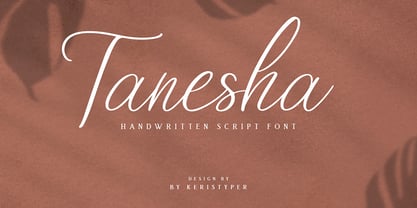 Tanesha is a handwritten script font. Work great for any design needs: logo, branding, modern advertising design, logos, poster quote, book/cover Title, editorial design, website/blog, card, custom mug, pillow, t-shirts, and any hand-lettered needs. Tanesha Font multilingual support: Afrikaans, Albanian, Catalan, Danish, Dutch, English, Estonian, French, Finnish, German, Icelandic, Indonesian, Italian, Malay, Norwegian, Portuguese, Spanish, Swedish, Zulu, and many more. What’s Included : Standard & Multilingual glyphs Ligature Works on PC & Mac Simple installations Accessible in Adobe Illustrator, Adobe Photoshop, Adobe InDesign, and even work on Microsoft Word. Hope you enjoy our font!
 - Mawur by Twinletter,
$18.00 Introducing the Groovy font called Mawur. This font is the perfect way to add style and flair to your designs! The unique, sophisticated shapes and amazing mix of shapes in this font will automatically add a touch of class and sophistication. ideal for use in greeting cards, posters, product packaging, or just to add a little flair to your designs. Its simplicity will make it easy to read and you can use it anywhere you like. Grab your copy now and start making the most of it today! What’s Included : Standard glyphs Iso Latin 1 Simple installations We highly recommend using a program that supports OpenType features and Glyphs panels like many Adobe apps and Corel Draw, so you can see and access all Glyph variations. PUA Encoded Characters – Fully accessible without additional design software. Fonts include Multilingual support
 - Doggie Doodie - Unknown license

- Wanax Demo - Unknown license

- Homebound by Crumphand,
$19.00 Hello, introducing the new abstract & random fonts. It's called Homebound. Homebound is abstract font. comes with different shape. Good for your graphic, easy to read. What's Included Fonts ? Uppercase Lowercase Numerals Symbols European Multilingual Stylistic Set PUA Encoded Thank You, Regards!
 - Oracle Bone by Okaycat,
$29.95 Oracle Bone is a font showing ancient glyphs which were used long ago for divination in China. In Chinese this oracle bone script is called "pinyin". Oracle Bone is a latin font with a pinyin glyph in place of each letter.
 - Elise Dafisa by Great Studio,
$15.00 Elise Dafisa is a modern calligraphy font with classic, sophisticated accents. It is perfect for branding, wedding invites and cards. Elise Dafisa includes a full set of lovely uppercase and lowercase letters, multilingual symbols, numerals, punctuation, and ligatures. All lowercase letters include beautiful and unique beginning and ending swashes (each letter has own "unpatterned" ending) . Also includes many multilingual symbols. WHAT'S INCLUDED : Elise Dafisa.otf SOFTWARE REQUIREMENTS : The fonts can be opened and used in any software that can read standard fonts - even MS Word. No special software is required , and a friendly little help file is included to get you started :) For folks who DO have OpenType capable software : The alternates are accessible by turning on 'Stylistic Alternates' and 'Ligatures' buttons on in Photoshop's Character panel, or via any software with a glyphs panel, e.g. Adobe Illustrator, Photoshop CC, Inkscape. How to access alternate glyphs? you can see it on this link ( http://goo.gl/1vy2fv ) If you have any questions, please don't hesitate to contact me by email: Greatstudio92@gmail.com
 - Pixel Retro by JK Creative,
$16.00 Introducing Pixel Retro - Display Typeface Font Pixel Retro is a bitmap font base on the from Namco Arcade Games. This Font is Perfect for Movie, Game, Film, Logo Brand and T shirt Design FEATURES - Uppercase and Lowercase letters - Numbering and Punctuations and Multilingual Support - Works on PC or Mac - Simple Installation - Support Adobe Illustrator, Adobe Photoshop, Adobe InDesign, also works on Microsoft Word Hope you Like it. **Note: All images on the demo is just for preview purpose only and not actually included on the files**
 - Fabrica by Fenotype,
$40.00 Fábrica is an exquisite display letter with flair. Its delicate curves have been carefully honed; yet its beauty is seemingly effortless. To add to its appeal, Fábrica is equipped with several handy features such as ligatures (there are plenty of them), old style figures and fractions. Its true crown jewel, however, is the finely tuned hairline accents – no longer will a diacritical mark ruin your heading. Find those under a feature called Thin accents. Use Fábrica to turn your communication into statements of divine elegance.
 - Sunbathe by Java Pep,
$13.00 Introducing an elegant script font called Sunbathe, every shape of this font is made by the natural strike. To customize, Sunbathe comes with some features like alternate and ligature. It's perfect for branding, magazines, greeting card, wedding invitation, social media stories, etc. What you will get : - Opentype features - Multilingual, support 16 languages ( Afrikaans, Albanian, Catalan, Danish, Dutch, English, Estonian, Finnish, French, German, Icelandic, Italian, Norwegian, Portuguese, Spanisch, Swedish, Zulu ) If you have any questions or need technical support, don't hesitate to comment, message or contact java.indonesian@yahoo.com.
 - French Pastry JNL by Jeff Levine,
$29.00 A little ditty from France circa the 1940s called "J'ai Rêvé Dans Tes Bras" (which loosely translated means "I've Dreamed in Your Arms") offered up its title hand lettered in an interesting Art Deco sans. This formed the basis for French Pastry JNL, a tasty typographical tidbit further preserving the wide choice of lettering styles hand-crafted for popular sheet music of past decades.
 - Huruvida by Cercurius,
$19.95 A decorative font with descending tails on the capital letters. The design is based on a popular typeface from the 1880s, mainly used for personal names on title-pages, advertisements and stationery. Today, you can use it e.g. on book and album covers, invitation cards, restaurant menus and concert programs to give a fin-de-siècle impression.
 - Willydope by Keristyper Studio,
$14.00 Introducing a new font from our Script Collection called Willydope. This hand-drawn typeface is made in a digital hand-drawn style with a classy scripted look. This font is good for logo design, Social media, Movie Titles, Books Titles, short text even long text letters, and good for your secondary text font with sans or serif. **Featured:** * Standard Uppercase & Lowercase * Numeral & Punctuation * Multilingual : ä ö ü Ä Ö Ü ß ¿ ¡ * Alternate & Ligature * PUA encoded We recommend programs that support the OpenType feature and the Glyphs panel such as Adobe applications or Corel Draw. so you can use all the variations of the glyphs. Hope you enjoy our fonts!

