10,000 search results
(0.028 seconds)
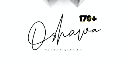
- Oshawa by Fauzistudio,
$15.00 - Majer by Sensatype Studio,
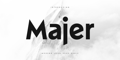
$15.00Majer is a sans serif font with modern, luxury, elegant, unique and classy-look. This font crafted specials for logo design projects, ready to use on Logo, Branding, Magazine, Social Media, and Many more that needs modern touches. Majer is also included full set of: uppercase and lowercase letters multilingual characters numerals punctuation Wish you enjoy our font. :) - Satiga by Sensatype Studio,
$15.00Helovatica is a sans serif font with modern, corporate, elegant, unique and classy-look. This font crafted specials for logo design projects, ready to use on Logo, Branding, Magazine, Social Media, and Many more that needs modern touches. Helovatica is also included full set of: uppercase and lowercase letters multilingual characters numerals punctuation Wish you enjoy our font. :) - Hollandia by Typehead Studio,
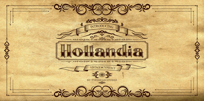
$20.00Introducing our new exploration Hollandia, another vintage-inspired font . Collected from many references such as vintage signage, logo, badges, and old fashioned graphics. Hollandia font made carefully crafted with a high ornamental taste. Hollandia is perfect for many display purposes. You can use this font for poster, label, logo, signboard, t-shirt, book cover, decoration, merchandise, and more. - Grecian Empire by Elemeno,
$25.00The designer's father, Philip Grecian drew a logo for his business, Grecian Creative Services and asked Alex Grecian to expand on the logo. Alex extrapolated from the existing letters, creating a font to compliment his father's logo. Naming it was the easy part. Grecian Empire has since become one of the most popular fonts offered by Elemeno. The Strikes Back and Engraved styles have limited character sets and are far less versatile than the regular version. - Masbrushy by Sesa Grafika,
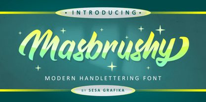
$69.00Masbrushy is a bold and Modern handwritten Lettering font. Clean and a little bit quirky, this font is the perfect fit for all of your logos, branding, social media, and crafty DIY projects. This font especially design for awesome logo project. You can use this font for Logomark Project. This font is PUA encoded which means you can access all of the glyphs and swashes with ease! - Lestina by Larin Type Co,
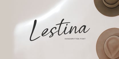
$14.00Lestina This is a beautiful and elegant hand drawn font, will emphasize your individuality in any project. You can also use them to create a logo or templates, invitations, blog, branding, marketing, book covers, magazines, advertising, stationery, logo design and much more. This font is easy to use has OpenType features. - Sweet Candy Pink Script by Mindtype Co.,
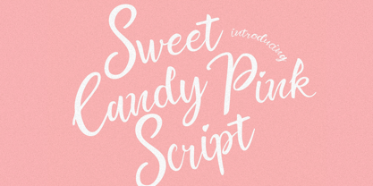
$19.00Sweet Candy Pink Script a beautiful modern calligraphy font with Extrude Shadow Style. Comes with 2 layered font handwritten, sophisticated flows. Sweet Candy Pink Script offers beautiful typographic harmony for a diversity of design projects, signature, stationery, logo, typography quotes, including logos & branding, wedding designs, social media posts, advertisements & product designs. - The Old Navy by Larin Type Co,
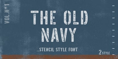
$12.00The Old Navy - a new stencil style font collection. These fonts are ideal for military-style branding and will decorate any of your projects. You can also use them to create a logo or use for small businesses, t-shirts, hoody, book covers, stationery, logo creation, marketing, blogs, magazines, and more. - Chilok by Dhan Studio,
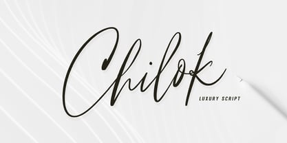
$19.00Chilok is a cool handwritten font that is also elegant and fashionable, which looks like a signature or logo, this font also has an alternative to beautify your design. Chilok is perfect for branding, logos, business cards, posters, invitations, greeting cards, news, product packaging, blog posters, all including personal charm, etc. - Agave Azul by Fat Hamster,
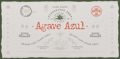
$25.00Agave Azul - Hand made old typewriter font Agave Azul Artisan font is perfect for tequila & mezcal label and packaging design, social media quotes, logo & branding design, apparel design, whiskey, beer label and packaging design, heading, scrapbooking, calendars, book covers. Don't forget to use bonus logos, marks and labels for your designs. - Single Tangelo by Putracetol,
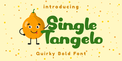
$25.00Single Tangelo - Quirky Script Bold Font. This font is a quirky and script font with a playful style and style for children. This font has a lot of character ligatures, as many as 151 ligatures. With that much ligature will make this font more unique and interesting. This font is perfect for projects related to children. This font is perfect for logos, greeting cards, quotes, svg, clothes, posters, logos, krafting, stickers, toys, and more. This font can be installed on MAC OS and Windows OS, it can also be installed in the procreate and cricut applications. Come with lot of ligatures character, its help you to make great lettering, quote, logos and. This font is also support multi language. - Williesh by Almarkha Type,
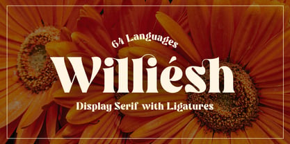
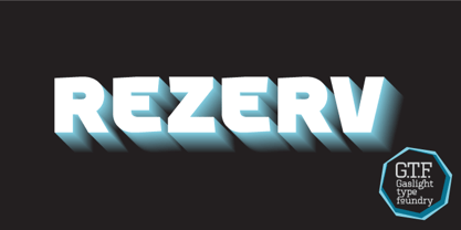
$25.00Introducing Williesh - Unique font that uses ligatures to smoothly link letters. inspired by the famous minimalist logo, perfect for the purposes of designing templates, brochures, videos, advertising branding, logos and more. Perfect for adding a unique twist to word-mark logos, monograms or pull quotes. Kavaloora has 18 unique ligatures and Alternate Glyphs as well as numbers and punctuation making it super fantastic. - Rezerv by Gaslight,
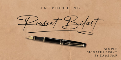
$25.00 - Rousset Bilast by Zamjump,
$19.00 - Simple Home by Goodigital13,
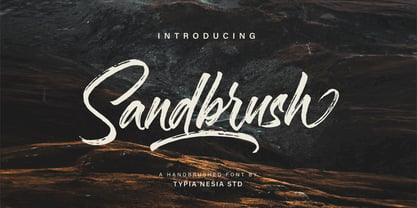
$20.00 - Sandbrush by Typia Nesia,
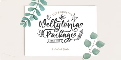
$20.00 - Wellytonia Package by Letterhend,
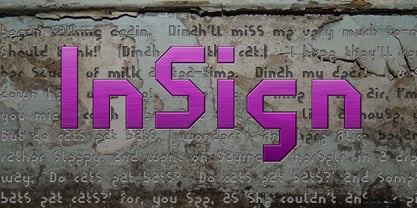
$17.00Wellytonia package is a package consist of script font, sans serif font, illustration, ready-made logos and dingbats! All made by manual hand drawing to make sure the natural looks and feel. This type of font perfectly made to be applied especially in logo, and the other various formal forms such as invitations, labels, logos, magazines, books, greeting / wedding cards, packaging, fashion, make up, stationery, novels, labels or any type of advertising purpose. Features : Wellytonia Script, Sans & Dingbats uppercase & lowercase numbers and punctuation multilingual alternates & ligatures PUA encoded - InSign by Konst.ru,
$- - Maxim MF by Masterfont,
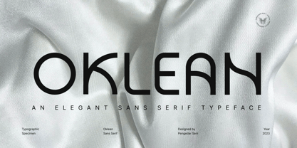
$59.00 - Oklean by Pengedar Seni,
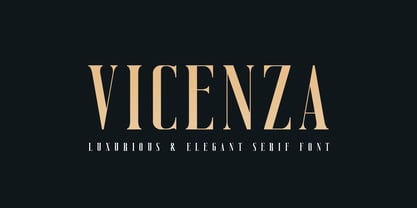
$15.00 - Vicenza by Almarkha Type,
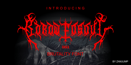
$29.00 - Borowedsoul by Zamjump,
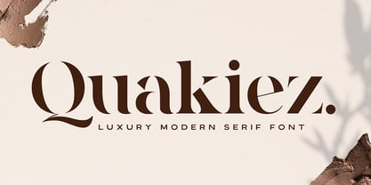
$35.00 - Quakiez by Almarkha Type,
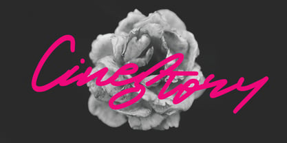
$20.00 - Cinestory by Goodigital13,
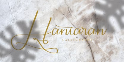
$20.00 - Hantaran by Goodigital13,
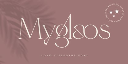
$20.00 - Myglaos by Sealoung,
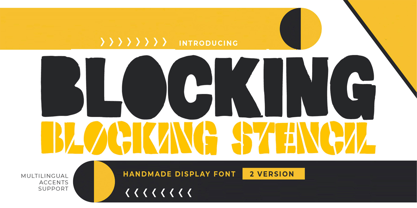
$25.00 - Blocking by Gassstype,
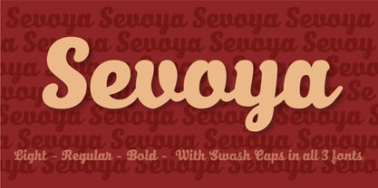
$27.00 - Sevoya by Jonahfonts,
$42.00 - Diallome by MJB Letters,
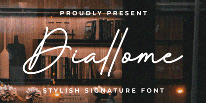
$16.00Diallome is a stylish signature font that has an elegant flow, this font will look very luxurious on wedding invitations, fashion logos, brand logos, thank you cards, business cards, watermarks, and any other design that wants to have a handwritten touch. Diallome Features - Uppercase and Lowercase - Numerical and Punctuation - PUA Encoded - Multilingual Language - Bigotedly by Ali Hamidi,
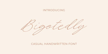
$12.00Bigotedly is a casual script and handwritten font. Bigotedly have a chic and simple curves to add charm impression for your design. This Font is perfect for many design needs such as merch, branding, T-shirts, fashion logo, cosmetic, signature logo, wedding invitation, book covers, social media posts, websites, events, and many more. - Brand SS by Sensatype Studio,
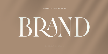
$15.00Brand is a lovely elegant font for branding and logo design. Based on our experience as a graphic designer who works for a lot of companies, we often are requested to design a logo in a unique style but with an elegant shape. So, we try to brainstorming and create this font to make the idea is going out. This is perfect for BRANDING and LOGO DESIGN. You will get classy, elegant, and certainly unique logos with this font. Brand is also included full set of: All uppercase letters multilingual characters numerals punctuation ligatures collection *) ALL LIGATURE CHARACTERS CAN BE ACCESS USING LOWERCASE TYPE (for example: r+a) Wish you enjoy our font and if you have a question, don't hesitate to drop message & I'm happy to help :) - Vintage Galore by Letterhend,
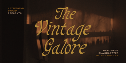
$12.00Vintage Galore is a handmade blackletter font font with casual & classic feels. This font will bring you back to 90s feel.This font perfectly made to be applied especially in logo, and the other various formal forms such as invitations, labels, logos, magazines, make up, stationery, novels, labels or any type of advertising purpose. Features : Uppercase & lowercase, Numbers and punctuation, Alternates & Ligatures, Multilingual & PUA encoded - Blackpast by Sarid Ezra,
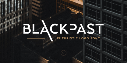
$15.00Introducing, Blackpast, a futuristic logo font with alternates! Blackpast is a sans based font with unique lowercase that will make your design looks futuristic and modern. You can use this font for any purpose, especially to make logotype. You can mix and match the uppercase and lowercase to make your logo more readable. This font also have special alternates that will make your design more stand-out! - Milla Grace by LABFcreations,
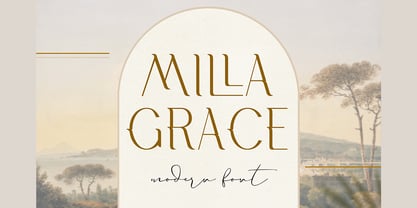
$12.00Milla Grace is a modern & classic font. This font is ideal for creating logos and branding. With original ligatures. It works perfect for creating sites, logos, striking editorials, invitations, graphic quotes, and more. Uppercase Characters & Discretionary Ligatures. Multilingual support for various languages. For presentation image, pairing script font: Carphe | Modern Luxury Duo font Follow me by Instagram: @labfcreations Made in France with LOVE. © LABFcreations - Agatized Formal by ULGA Type,
$25.00Agatized Formal is a chunky stencil typeface with slightly condensed letterforms and tight spacing. Designed primarily for display use, it’s ideal for posters, logos, advertising, book cover designs or small chunks of text such as pull-out quotes. It exudes authority without taking itself seriously, like a plump jolly uncle in charge of a brass band. Agatized Formal is a big, bold typeface with a charismatic presence that commands attention – in a friendly way, of course. But what really makes this typeface come alive is its arsenal of alternative characters and ligatures. There is a saying: Use sparingly. Whoa! Not here, no, no, no. Make your Glyphs palette earn its money. Flex your OpenType muscles: get stylized, contextualized, indulge in some ligaddiction. This typeface is a peacock that likes to put on a show, spread its plumage and strut around in all its blazing glory. Agatized, according to Wiktionary, means: A living thing converted into the form of agate; fossilized. I felt the name suited the solid, almost rock-like letterforms, but most of all I just wanted a typeface name that began with the letter A. Although Agatized Formal is a single-weight typeface it has a sibling, Agatized Informal, an older, more casual brother, rougher round the edges with craggy good looks and an altogether more jaunty style. - Brave Brothers by Strong,
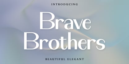
$20.00Brave Brothers is a stylish modern font that's perfect for use in fashion-related design projects. Its elegant thin font makes it ideal for branding and logo design, while low legibility height makes it perfect for use in websites, advertising, and other types of communications. Brave Brothers Modern Font is perfect for adding a touch of luxury and elegance to your designs. This stylish font was created with care to be perfect for use in modern fashion logos, websites, and marketing materials. Brave Brothers is a stylish modern font that's perfect for use in fashion-related design projects. Its elegant thin font makes it ideal for branding and logo design, while low legibility height makes it perfect for use in websites, advertising, and other types of communications. Brave Brothers Modern Font is perfect for adding a touch of luxury and elegance to your designs. This stylish font was created with care to be perfect for use in modern fashion logos, websites, and marketing materials. - Dezzy by Ronny Studio,
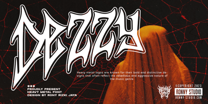
$29.00Dezzy Font is a cool alternative for you to create Underground band logos or anything else easily. Using effects in the font will liven up the font and it will look cooler and fiercer. This font has a strong, aggressive and bold look, reflecting the aesthetics of the metal music genre itself. This font is very suitable for band logos, poster designs, t-shirt designs, jackets, hats, beanies, etc - Byrning Bridgez by Cyberian Khatru,
$20.00This font is created specifically for the purpose of creating logos for Progressive Rock bands. Such bands oftentimes have their logos designed by Fantasy artists such as Roger Dean and Rodney Matthews. The capitals and lower case are distinct enough from each other to be completely separate fonts. I decided, however, to combined them as one font. http://homepage.mac.com/baronvoncruzer/cyberiankhatru/byrningbridgez.htm - Hurson by Garisman Studio,
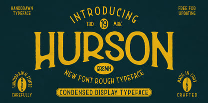
$20.00HURSON is born from original and hand-drawn style font. This font gives a feel of vintage, classic, old, handmade looked like. Already PUA Encoded and I think this font is perfect for people looking for vintage aesthetic or hand-drawn logo. Suitable for any graphic designs such as branding materials, t-shirts, prints, business cards, logos, posters, photography, quotes, and more.
