1,473 search results (0.043 seconds)
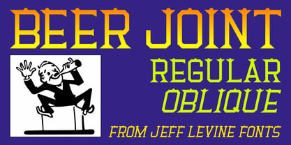
  1. Beer Joint JNL by Jeff Levine, $29.00
    A vintage photograph of the Man at the Wheel Saloon in San Pedro, CA [circa 1895] provided an excellent type design source with the unusual lettering on the bar’s sign. Basically a spurred serif design, the unusual characteristic of the type style is the ‘bumps’ or ‘dots’ on the tops of each letter. This has been redrawn digitally as Beer Joint JNL, and is available in both regular and oblique versions.
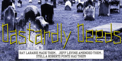
  2. Dastardly Deeds SRF by Stella Roberts Fonts, $25.00
    This design from Ray Larabie (and adapted by Jeff Levine) is so unusual. The lettering lends itself to messages of sinister intent or horror movie titles. The net profits from my font sales help defer medical expenses for my siblings, who both suffer with Cystic Fibrosis and diabetes. Thank you.
  3. Birch Beer JNL by Jeff Levine, $29.00
    Birch Beer JNL comes from lettering spotted on a European business sign found in some stock footage that was used for an old black and white film about World War II. The name is derived from a popular root beer-like soda sold by the Royal Castle Restaurants that were popular in Florida from the 1930s through the 1970s.
  4. Draft Beer Classic by FontMesa, $25.00
    Inspired by the old fashioned Miller Beer logo.
  5. Dear And Fans by Anaya Studio, $8.00
    Dear and Fans is all class. A stylish modern font that is a mix of serif and sans serif. It's soft curves mixed with high contrast glyphs lend it self to both feminine and masculine qualities. With a contrasting light italic, Dear and Fans works great in layout design for quotes or body copy. The Elegant curves also make for a unique logo or masthead. Dear and Fans comes with multilingual support also. Full upper/lower case, numbers, punctuation and multilingual support. Full italic style included also.
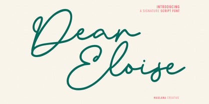
  6. MC Dear Eloise by Maulana Creative, $13.00
    Dear Eloise is an unique fancy signature script font. With regular mon-line stroke, fun character with a bit of ligatures and alternates. To give you an extra creative work. Dear Eloise font support multilingual more than 100+ language. This font is good for logo design, Social media, Movie Titles, Books Titles, a short text even a long text letter and good for your secondary text font with sans or serif. Make a stunning work with Dear Eloise font. Cheers, Maulana Creative
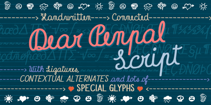
  7. Dear Penpal Script by Giaimefontz, $6.00
    This is a fully connected script font, not calligraphic, but entirely designed to follow handwritten cursive ligatures rules as teached in schools. In order to correctly visualize it, you have to enable OpenType features (Contextual Alternates, Discretionary Ligatures, Standard Ligatues and Kerning). Trying to write All Capitals will generate Block Letters writings, since cursive style doesn't allow more than the first uppercase per word, however this font is not meant to be a Block Letters font. Using specific type combinations will generate special glyphs. All of these features are intended to reproduce a classic schoolboy or schoolgirl notebook.
  8. Two Beers Free by SynFonts, $39.00
  9. LDJ Dear Santa by Illustration Ink, $3.00
    Letters to Santa are a highly anticipated holiday tradition. Use this fun font to add pizzaz and an endearing childish style to that letter or any creative lettering project.
  10. My Dear Watson NF by Nick's Fonts, $10.00
    This simple, charming script is based on the handlettering of Carl Holmes, from Walter T. Foster art book entitled ABC of Lettering. Elementary! Both versions of this font include the complete Latin 1252 and CE 1250 character sets, with localization for Romanian and Moldovan.
  11. Summer Dear Font Duo by Lucky Type, $12.00
    Let me introduce the latest beautiful combination of handwritten font Summer Dier Font Duo + Extras. The Summer Dier Font typeface is designed to make your next great project look more natural and stand out. The Summer Dier Font includes several Opentype Ligatures included to make the typeface look more natural and lastly, it has over 30 handcrafted additions to help your future designs look prettier. Thank you very much for viewing.
  12. LD Dear Miss Rose by Illustration Ink, $3.00
    LD Dear Miss Rose is a casual font with a handwritten style.
  13. Skittles N Beer NF by Nick's Fonts, $10.00
    Handlettering on a 1929 brochure for the P&O British-India Steamship Line inspired this tiddly typeface. Art Deco sensibilities combine with a playful attitude to yield a delightful and amusing headline font. The PC PostScript, TrueType and OpenType versions contain the complete Latin language character set (Unicode 1252) plus support for Central European (Unicode 1250) languages as well.
  14. Dear Rae, Love Dad by Outside the Line, $19.00
    Dear Rae, Love Dad is a modern calligraphy font drawn by hand using ink and a folded nib dip pen on rough watercolor paper. Best used in Open Type apps, it has automatically changing alternates. It is upright, dramatic, and personal. It is named Dear Rae, Love Dad because who wouldn't like to get a letter signed, Love Dad. There is also a freebie font of several blobs and some hearts. Because it just seems right.
  15. MTF Dear Santa Pro by Miss Tiina Fonts, $9.00
    If you’re writing Santa a letter, use this adorable, handwritten childlike font! Dear Santa PRO not only gives you inspiration on how to start the letter, but it also has neat and original characters. This typeface duo also comes with some cute Christmas doodles to complement your writing. Have fun, and create something spectacular this Christmas!
  16. Van Der Hoef Capitals by Monotype, $29.99
  17. Architype Van der Leck by The Foundry, $50.00
    Architype Konstrukt is a collection of avant-garde typefaces deriving mainly from the work of artists/designers of the inter-war years, whose ideals have helped to shape the design philosophies of the modernist movement in Europe. Due to their experimental nature character sets may be limited. Architype Van der Leck originates from the lettering that Bart Van der Leck created for ‘Flax’ magazine in 1941. The letterforms‘ restricted shapes and abstract, stencil-like forms reflect the strong geometric language of De Stijl and show influence from his abstract paintings.
  18. F2F El Dee Cons by Linotype, $29.99
    The Face2Face (F2F) series was inspired by the techno sound of the mid-1990s, personal computers and new font creation software. For years, Thomas Nagel and his friends formed a unique type design collective, which churned out a substantial amount of fresh, new fonts, none of which complied with the traditional rules of typography. Many of these typefaces were used to create layouts for the leading German techno magazine of the 1990s, Frontpage. Nagel and his fellows would even set in type at 6 points, in order to make it nearly unreadable. It was a pleasure for the kids to read and decrypt these messages! F2F EI Dee Cons one of 41 Face2Face fonts included in the Take Type 5 collection from Linotype. Nagel designed nine of these himself."
  19. Enochian Writing by Deniart Systems, $10.00
    Based on the magical writing system originated by Dr. John Dee and Edward Kelly in Elizabethan England.
  20. Flexion Pro by Red Rooster Collection, $60.00
    Flexion developed out of design philosophy and ambigramatic artwork of John Langdon. Based on the contents in John’s book Wordplay, author Dan Brown hired John to create ambigrams for his forthcoming novel Angels & Demons. Mr. Brown was so impressed with his work he even named the main character Robert Langdon after John. After the success of Angels & Demons, Dan Brown wrote The Da Vinci Code. When the movie adaptation of that book was in the works, Dan suggested that John create titles for the movie based on ambigrams. John contacted Hal Taylor to create a font based on the lettering treatment to be used for the credits at the end of the movie. Unfortunately, it was decided that the film was running long and the original title concept was scrapped. By this time, Hal was well into developing a full type family, including small caps, alternate characters, lining and ranging figures. John was impressed with the way the design was turning out and decided that it had enough merit to be released as Flexion.
  21. Euphoria by Comicraft, $29.00
    If you're searching for the perfect beat, let us guide your soul deep into the abyss. Reach higher ground with the ambient textures and boomboy shredder baseline of this funky dope font created by our digital chemist and cerebral craftsman, John "JG" Roshell. Rave un2 the joy fontastic. Rain or shine, you are covered, see you on the dancefloor.
  22. Baskerville by Bitstream, $29.99
    John Baskerville spared no effort to create the ultimate typographic book. He prepared deep black inks and smoothed paper to show to full effect the letters that he had John Handy cut from his own brilliant designs, based on a lifetime of calligraphy and stonecutting. Punches and matrices survive at the Cambridge University Press. The present design is an accurate recutting, with particular attention to George W. Jones’ revision from the metal of Baskerville’s English (14pt) roman and italic in 1929 for Linotype & Machinery Ltd; Mergenthaler Linotype imported this design to the USA two years later.
  23. Ongunkan Enochian Script by Runic World Tamgacı, $60.00
    I drew this font staying true to the original design. The letter table in the relevant book was taken as reference. Enochian (/ɪˈnoʊkiən/ ə-NOH-kee-ən) is an occult constructed language[3] — said by its originators to have been received from angels — recorded in the private journals of John Dee and his colleague Edward Kelley in late 16th-century England.[4] Kelley was a scryer who worked with Dee in his magical investigations. The language is integral to the practice of Enochian magic.
  24. Lunatic - Unknown license
  25. Uneasy - Unknown license
  26. Almanac of the Apprentice - Unknown license
  27. ITC Peter's Miro by ITC, $29.99
    ITC Peter's Miro is the work of New York designer John Peter. It was inspired by the letters used by Joan Miro in his paintings. No one used letterforms more frequently in his work than Joan Miro," says Peter. For his typeface, however, "considerable liberty has been taken with his [Miro's] original letters and missing characters have been added." The letters are a simple script, irregularly and almost crudely written, but bursting with energy. To give designers free rein with their creativity, Peter designed two complete versions of the alphabet in both upper- and lowercase, Peter's Miro and Peter's Miro Too."
  28. Nicotine Stains - Unknown license
  29. Gravel - Unknown license
  30. Hultog - Unknown license
  31. Blunted - Unknown license
  32. Nameless Harbor - Unknown license
  33. Roddy - Unknown license
  34. Dispute - Unknown license
  35. Temphis Sampler - Unknown license
  36. Unity Dances - Personal use only
  37. Risus LCB Dingbats - Unknown license
  38. Karnac - 100% free
  39. Rutherford - Unknown license
  40. Arvigo - Unknown license
Looking for more fonts? Check out our New, Sans, Script, Handwriting fonts or Categories
abstract fontscontact usprivacy policyweb font generator
Processing