4,159 search results
(0.018 seconds)
- 1467 Pannartz Latin by GLC,
$38.00 This family was inspired by the edition De Civitate Dei (by Sanctus Augustinus) printed in 1467 in Sobiano (Italy, Roma) by Konrad Sweynheym and Arnold Pannartz who was the Punchcutter. It is one of the first few “Roman style” fonts, just before the birth of Jenson’s pattern (look at 1470 Jenson Latin). The present font contains all of the specific latin abbreviations and ligatures used in the original (about 54). Added are the accented characters and a few others not in use in this early period of printing. Decorated letters such as 1512 Initials, 1550 Arabesques, 1565 Venetian, or 1584 Rinceau can be used with this family without anachronism. If Italic style is required (not yet existing in early time of printing), we recommend using 1557 Italique.
 - Binario by Tarallo Design,
$14.99 Binario is a simple and friendly font with three weights and matching obliques. The geometric and modular characteristics of this typeface subtly reference the Art Deco and early modernist periods. It is an ideal choice for achieving a clean, distinctive, and contemporary aesthetic, making it suitable for branding, posters, and screen-based designs. The light weight of Binario is good for body text. The regular weight exudes confidence, making it suitable for both body and heading text. For impactful headlines, the bold weight is superb. The clear weight distinction of this family make it easy to create organized text. Binario was designed in Siena, Italy taking some inspiration from train stations and shop signage. The name Binario means train platform in Italian. Other aspects that informed the design of this font are modularity and efficiency. The interior rounded forms of the letters (counterforms) are based on shape of the Roman arch. Binario has a sibling, Binario Soft. This version has gently rounded stroke ends, which make a softer impression on the page.
 - Vendetta by Emigre,
$69.00 The famous roman type cut in Venice by Nicolas Jenson, and used in 1470 for his printing of the tract, De Evangelica Praeparatione, Eusebius, has usually been declared the seminal and definitive representative of a class of types known as Venetian Old Style. The Jenson type is thought to have been the primary model for types that immediately followed. Subsequent 15th-century Venetian Old Style types, cut by other punchcutters in Venice and elsewhere in Italy, are also worthy of study, but have been largely neglected by 20th-century type designers. There were many versions of Venetian Old Style types produced in the final quarter of the quattrocento. The exact number is unknown, but numerous printed examples survive, though the actual types, matrices, and punches are long gone. All these types are not, however, conspicuously Jensonian in character. Each shows a liberal amount of individuality, inconsistency, and eccentricity. My fascination with these historical types began in the 1970s and eventually led to the production of my first text typeface, Iowan Old Style (Bitstream, 1991). Sometime in the early 1990s, I started doodling letters for another Venetian typeface. The letters were pieced together from sections of circles and squares. The n, a standard lowercase control character in a text typeface, came first. Its most unusual feature was its head serif, a bisected quadrant of a circle. My aim was to see if its sharp beak would work with blunt, rectangular, foot serifs. Next, I wanted to see if I could construct a set of capital letters by following a similar design system. Rectangular serifs, or what we today call "slab serifs," were common in early roman printing types, particularly text types cut in Italy before 1500. Slab serifs are evident on both lowercase and uppercase characters in roman types of the Incunabula period, but they are seen mainly at the feet of the lowercase letters. The head serifs on lowercase letters of early roman types were usually angled. They were not arched, like mine. Oddly, there seems to be no actual historical precedent for my approach. Another characteristic of my arched serif is that the side opposite the arch is flat, not concave. Arched, concave serifs were used extensively in early italic types, a genre which first appeared more than a quarter century after roman types. Their forms followed humanistic cursive writing, common in Italy since before movable type was used there. Initially, italic characters were all lowercase, set with upright capitals (a practice I much admire and would like to see revived). Sloped italic capitals were not introduced until the middle of the sixteenth century, and they have very little to do with the evolution of humanist scripts. In contrast to the cursive writing on which italic types were based, formal book hands used by humanist scholars to transcribe classical texts served as a source of inspiration for the lowercase letters of the first roman types cut in Italy. While book hands were not as informal as cursive scripts, they still had features which could be said to be more calligraphic than geometric in detail. Over time, though, the copied vestiges of calligraphy virtually disappeared from roman fonts, and type became more rational. This profound change in the way type developed was also due in part to popular interest in the classical inscriptions of Roman antiquity. Imperial Roman letters, or majuscules, became models for the capital letters in nearly all early roman printing types. So it was, that the first letters in my typeface arose from pondering how shapes of lowercase letters and capital letters relate to one another in terms of classical ideals and geometric proportions, two pinnacles in a range of artistic notions which emerged during the Italian Renaissance. Indeed, such ideas are interesting to explore, but in the field of type design they often lead to dead ends. It is generally acknowledged, for instance, that pure geometry, as a strict approach to type design, has limitations. No roman alphabet, based solely on the circle and square, has ever been ideal for continuous reading. This much, I knew from the start. In the course of developing my typeface for text, innumerable compromises were made. Even though the finished letterforms retain a measure of geometric structure, they were modified again and again to improve their performance en masse. Each modification caused further deviation from my original scheme, and gave every font a slightly different direction. In the lower case letters especially, I made countless variations, and diverged significantly from my original plan. For example, not all the arcs remained radial, and they were designed to vary from font to font. Such variety added to the individuality of each style. The counters of many letters are described by intersecting arcs or angled facets, and the bowls are not round. In the capitals, angular bracketing was used practically everywhere stems and serifs meet, accentuating the terseness of the characters. As a result of all my tinkering, the entire family took on a kind of rich, familiar, coarseness - akin to roman types of the late 1400s. In his book, Printing Types D. B. Updike wrote: "Almost all Italian roman fonts in the last half of the fifteenth century had an air of "security" and generous ease extremely agreeable to the eye. Indeed, there is nothing better than fine Italian roman type in the whole history of typography." It does seem a shame that only in the 20th century have revivals of these beautiful types found acceptance in the English language. For four centuries (circa 1500 - circa 1900) Venetian Old Style faces were definitely not in favor in any living language. Recently, though, reinterpretations of early Italian printing types have been returning with a vengeance. The name Vendetta, which as an Italian sound I like, struck me as being a word that could be taken to signifiy a comeback of types designed in the Venetian style. In closing, I should add that a large measure of Vendetta's overall character comes from a synthesis of ideas, old and new. Hallmarks of roman type design from the Incunabula period are blended with contemporary concerns for the optimal display of letterforms on computer screens. Vendetta is thus not a historical revival. It is instead an indirect but personal digital homage to the roman types of punchcutters whose work was influenced by the example Jenson set in 1470. John Downer.
 - Tieban by WNGSTD,
$10.00 Tieban font family is composed of 14 styles that perfectly complement each other. You can use them to create a logo or use for your business, branding, t-shirts, book covers, stationery, marketing, blogs, magazines, and more. Language support 29 languages: Afrikaans, Albanian, Basque, Belarusian, Danish, Dutch, English, Estonian, Faroese, Filipino, Finnish, French, Galician, German, Icelandic, Indonesian, Irish, Italian, Macedonian, Malay, Mongolian, Norwegian Bokmål, Portuguese, Russian, Serbian, Spanish, Swahili, Swedish, Zulu
 - Gestia Decorative by Struvictory.art,
$18.00 GESTIA is a modern sans serif font with mystical motives. The font is created in classic proportions and decorated with candle inspired elements. GESTIA is represented by sans serif lowercase and ornate uppercase. The font is suitable for the design on the theme of candle design, astrology, mysticism, spirituality, witchcraft, magic, esotericism. GESTIA has extensive language support, it includes English, French, German, Italian, Spanish, Portuguese, Danish, Norwegian, Swedish, Finnish, Estonian, Turkish.
 - P22 Cigno by IHOF,
$24.95 P22 Cigno is a new digitization of the 1950s Italian typeface by Aldo Novarese for the Nebiolo foundry. This semi-formal script has a definite mid-century European flavor suitable for menus, invitations and poster work. Along with the accurate rendition of the regular weight, designer Colin Kahn has added a lighter companion font for another variation on Cigno. Both fonts feature a full Western European character set.
 - Didot LP by LetterPerfect,
$39.00 Didot LP is a very elegant rendition of the 18th-century French typeface -- Didot. This design took the earlier Italian neo-classical model (Bodoni) to a new level of refinement, with fully rationalized shapes and delicate hairlines. Didot LP accentuates these qualities, providing a classical text face with a clear and modern voice. The companion face -- Didot LP Display -- optimizes the proportions, spacing and hairlines for use at very large sizes.
 - Painted Sky by Olivetype,
$18.00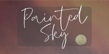 Painted Sky is a signature script font. This elegant script font is ideal for logos, posters, headlines, branding, apparel and so much more. This script font is also supporting Multi-Languages, which include: Afrikaans Albanian Catalan Danish Dutch English Estonian Finnish French German Italian Norwegian Portuguese Spanish Swedish Zulu. So what's included: Basic Latin A-Z & a-z. Numbers, symbols, and punctuations. Multilingual Support. Accented Characters : ÀÁÂÃÄÅÆÇÈÉÊËÌÍÎÏÑÒÓÔÕÖØŒŠÙÚÛÜŸÝŽàáâãäåæçèéêëìíîïñòóôõöøœšùúûüýÿžß Thank You.
 - Fresty by Blankids,
$22.00 Fresty is awesome for branding and logotype, Fresty has the impression of modern, trendy and elegant. Fresty has 376 Glyphs with PUA encoded and many alternative character & OpenType features so you can mix and match to create the look you want. Fresty includes 22 Multilingual Support (Afrikaans , Albanian , Catalan , Czech , Danish , Dutch , English , Estonian , Finnish , French , German , Hungarian , Icelandic , Italian , Norwegian , Polish , Portugese , Slovak , Slovenian , Spanish , Swedish , Zulu)
 - Strongly by Olivetype,
$18.00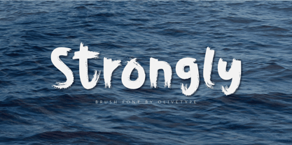 Strongly is a simple brush textured display font. This font is the perfect fit for all of your logos, branding, social media, and crafty DIY projects. Strongly is supporting Multi-Languages, which include: Afrikaans Albanian Catalan Danish Dutch English Estonian Finnish French German Italian Norwegian Portuguese Spanish Swedish Zulu. You’ll get : Basic Latin A-Z & a-z. Numbers, symbols, and punctuations. Multilingual Support. Accented Characters : ÀÁÂÃÄÅÆÇÈÉÊËÌÍÎÏÑÒÓÔÕÖØŒŠÙÚÛÜŸÝŽàáâãäåæçèéêëìíîïñòóôõöøœšùúûüýÿžß Thank You.
 - Orchestra BT by Bitstream,
$50.99Created by Italian graphic designer and illustrator Lorenzo Lalatta, Orchestra brings a whimsical yet elegant spin to Latin typography. Every letterform is cleverly adapted from the shape of a musical instrument or musician. Mr. Lalatta has even disguised himself as the bullet glyph. Perfect for use as initial letters or in special invitations, these caricatures allow for delightful color embellishment as well. Don't be shy about wielding this baton! - ST Saturn by ShimanovTypes,
$9.00 SATURN is a retro futuristic modern editorial font with vintage vibes, inspirated by Soviet sci-fi book's headers and posters. It has a spirit of Space race, brave hearts and cosmic dreams. It's good for social media, headlines, large-format print, branding, posters, fashion designs and websites. Language Support: Latin: English, French, German, Dutch, Italian, Spanish, Danish, Norwegian, Portuguese, Croatian, Swedish, Hungarian, Estonian. Cyrillic: Russian, Belorussian, Ukrainian, Serbian, Kazakh, Bulgarian.
 - Stay Together by Epiclinez,
$18.00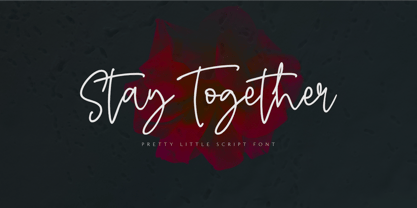 Stay Together is a pretty and lovely script font. It is a nice choice for creating eye-catching logos, branding, and quotes. This script font is supporting more than 66 languages, which include: Afrikaans Albanian Catalan Danish Dutch English Estonian Finnish French German Italian Norwegian Portuguese Spanish Swedish Zulu, and more. So what's included : Basic Latin A-Z & a-z. Numbers, symbols, punctuations, and ligatures Accented Characters : ÀÁÂÃÄÅÆÇÈÉÊËÌÍÎÏÑÒÓÔÕÖØŒŠÙÚÛÜŸÝŽàáâãäåæçèéêëìíîïñòóôõöøœšùúûüýÿžß Thank you
 - Salty Feathers by Sans And Sons,
$19.00 Salty Feathers includes full set of uppercase and lowercase letters, multilingual symbols, numerals, punctuation, alternates, swash and ligatures. The font has organic smooth wet ink texture with Modern Elegant Style this is perfect for branding, logos, invitation, masterheads and more. Salty Feathers Features : Multilanguange Ligatures Alternates Swash PUA Encoded Language Support: All fonts support English, French, Italian, Spanish, Portuguese, German, Swedish, Norwegian, Danish, Dutch, Finnish, Indonesian, Malay, Hungarian, Polish, Turkish, Slovenian.
 - Lazurski by ParaType,
$30.00 Designed at Polygraphmash type design bureau in 1984 by Vladimir Yefimov, with the addition of demi and demi italic. Based on a hot-metal typeface (1962) by Moscow book designer Vadim Lazurski (1909–1994), inspired by the early 16th century typefaces of Italian Renaissance. The typeface is useful for text and display composition, in fiction and art books. An 'expert set' was added by ParaType (ParaGraph) in 1997.
 - Big Black Scar by Olivetype,
$18.00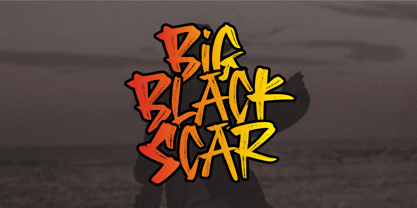 Black Big Scar is a cool hand brush font with a graffiti style. This kind of font is suitable for poster, apparel, product branding, etc. This font is also supporting multi-Languages, which include: Afrikaans Albanian Catalan Danish Dutch English Estonian Finnish French German Italian Norwegian Portuguese Spanish Swedish Zulu. So what's included: Basic Latin A-Z & a-z. Numbers, symbols, and punctuations. Multilingual Support. Accented Characters : ÀÁÂÃÄÅÆÇÈÉÊËÌÍÎÏÑÒÓÔÕÖØŒŠÙÚÛÜŸÝŽàáâãäåæçèéêëìíîïñòóôõöøœšùúûüýÿžß Thank You.
 - Warm Vanilla by The Gelato,
$9.00 The warm Vanilla font is a very neat handwritten font that gives a cute and tidy note-taking style! It conveys relaxation and high readability. It offers support for all the characters in English, Italian, Spanish, French, and German as well as standard punctuation glyphs. It is perfectly suitable for numerous use such as quotations, banners, logos, product packaging, titles, headers, menu lists, and even for digital note-taking!
 - PolkaDot Wrench by Deniart Systems,
$20.00 An eye-catching modern, angular design with a little dottiness to add a wee bit of naughtiness to your designs. This font is a partner to PocketWrench and both can be used to complement each other in your designs. This typeface features over 90 extended characters for setting European languages such as Czech, Danish, Dutch, Esperanto, Finnish, French, German, Italian, Hungarian, Polish, Portuguese, Romanian, Spanish, Swedish, Turkish & Welsh.
 - Oho Julie by PaulaType,
$10.00 Introducing Oho Julie - A Chic Brush Stylist font perfect for high impact headlines This font is a perfect script designed for making your set of invitations, Brand, blog posts, and more completely beautiful Multilingual support for the following languages: Cornish, Danish, Dutch, English, Estonian, Faroese, Filipino, Finnish, French, Galician, German, Icelandic, Indonesian, Irish, Italian, Norwegian Bokmål, Norwegian Nynorsk, Portuguese, Spanish, Swahili, Swedish, Swiss German. Thank you Nursery Art
 - AT Move PiPi by André Toet Design,
$39.95 PiPi is named after a happy Italian cat with a remarkable pattern, color and attitude. Designed by Andre Toet in 2011. Every letter is a different expression in itself although it has an identical base. It gives a joyful feeling to use this font in all your designs whether they be graphic or digital. M E O O O W ! Concept/Art Direction/Design: André Toet © 2017
 - Suerte by Resistenza,
$39.00 Say hello to Suerte. This new typeface with inverted contrast and bifurcated serifs was inspired by Caslon’s Italian type and by Aldo Novarese’s Estro, published by the turinese foundry Nebiolo. Our aim was to develop a wood type typeface adding a new personality incorporating Tuscan serifs. The complete alphabet was designed with a flat long brush and Indian ink and then vectorized. Suerte contains a big set of icons and dingbats.
 - Sunbreak by Olivetype,
$18.00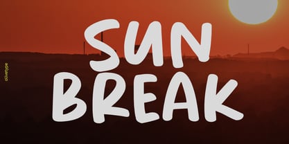 Sunbreak is a bold handwritten font, carefully handcrafted to become a true favorite. Its casual charm makes it appear wonderfully down-to-earth, readable, and ultimately, incredibly versatile. Sunbreak will look outstanding in any context, whether it’s being used on busy backgrounds or as a standalone headline! This font is supporting Multi-Languages, which includes: Afrikaans Albanian Catalan Danish Dutch English Estonian Finnish French German Italian Norwegian Portuguese Spanish Swedish Zulu.
 - Main Event by FontMesa,
$29.00 Main Event is a revival of a very old Italian font that you may have seen in the past under the original name of Tuscan Ornate or Bracelet. Dating back to 1860 or earlier it has never been known to have a lower case set of letters. Previously only in upper case, this font comes alive again with the addition of a newly designed lower case set of letters.
 - Space Walk by Olivetype,
$18.00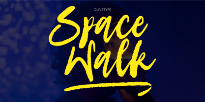 Space Walk is a dry brush handwritten script font. It is a nice choice for creating eye-catching logos, branding, and quotes. The font is supporting 66 languages, which include: Afrikaans Albanian Catalan Danish Dutch English Estonian Finnish French German Italian Norwegian Portuguese Spanish Swedish Zulu, and more. So what’s included: Basic Latin A-Z & a-z. Numbers, symbols, and punctuations. Ligatures . Multilingual Support. Accented Characters : ÀÁÂÃÄÅÆÇÈÉÊËÌÍÎÏÑÒÓÔÕÖØŒŠÙÚÛÜŸÝŽàáâãäåæçèéêëìíîïñòóôõöøœšùúûüýÿžß Thank You.
 - Garloise by Ergibi Studio,
$14.00 Garloise of script and sans will match perfectly. This font is perfect for logotype, apparel, branding, packaging, advertising and more. It comes with uppercase, lowercase, punctuation, symbols, numerals, stylistic alternates, ligatures, and several different swashes are included as well. Includes multi-lingual support for; Afrikaans, Albanian, Catalan, Danish, Dutch, English, Icelandic, Italian, Spanish, Portuguese, German, Swedish, Norwegian, Polish, Indonesian, Zulu. Hope you enjoy with our font! Big Thaks, Ergibi Studio
 - Rough Stone by Epiclinez,
$18.00 Rough Stone is a lovely and trendy hand brush font. It is a good choice for creating eye-catching logos, brandings, and quotes. This Font is supporting more than 66 languages, which include: Afrikaans Albanian Catalan Danish Dutch English Estonian Finnish French German Italian Norwegian Portuguese Spanish Swedish Zulu, and more. You will get : Basic Latin A-Z & a-z. Numbers, symbols, and punctuations Multilingual Support. Accented Characters : ÀÁÂÃÄÅÆÇÈÉÊËÌÍÎÏÑÒÓÔÕÖØŒŠÙÚÛÜŸÝŽàáâãäåæçèéêëìíîïñòóôõöøœšùúûüýÿžß Thank you
 - Melancholie by Anmark,
$18.00 I’m pleased to introduce my handwritten font Melancholie. Melancholie is a calm and elegant font. It is perfect for invitations, cards, branding projects, packaging, magazines, social media, logos, signatures, quotes, headers and many more... You can use it for long texts or short phrases. The modern calligraphy uppercase letters are ideal for monograms and logos. Melancholie supports Spanish, German, French, Italian, Portuguese, Swedish, Norwegian, Danish, Finnish and others.
 - Foxglove by Set Sail Studios,
$14.00 Foxglove is a playful, minimal brush font designed to add a personal, charming quality to quotes, branding, promotional images and product designs. Foxglove contains two sets of uppercase characters, you can switch between these simply by turning your caps-lock on & off. Contains language support for; English, French, Italian, Spanish, Portuguese, German, Swedish, Norwegian, Danish, Dutch, Finnish, Indonesian, Malay, Hungarian, Polish, Croatian, Turkish, Romanian, Czech, Latvian, Lithuanian, Slovak, Slovenian.
 - Summer Square by Attype Studio,
$10.00 Summer Square is vintage all caps font with 2 styles clean & rough. Summer Square is a strong font, this font is perfect for branding, logo, invitation, stationery, social media post, product packaging, merchandise, blog design, game titles, retro style design, Book/Cover Title and more. This font features Multilingual Support (Afrikaans, Albanian, Catalan, Danish, Dutch, English, Estonian, Finnish, French, German, Icelandic, Italian, Norwegian, Portugese, Spanisch, Swedish, Zulu) and includes 62 ligatures.
 - North Shore by Bruised Goods,
$18.00 NORTH SHORE – The ultimate Hawaiian surf spot typeface, both groovy and mid century inspired. Designed by Lauren Kilbane (on the other coast!) in sunny South Florida, USA. USE THIS FONT FOR: ads, album covers, apparel, cards, flyers, invitations, logos, menus, merchandise, packaging, signage, web, and more. 204 Glyphs Total: Uppercase ONLY, Numbers, Symbols, Punctuation, Emojis, & Language Support. Language Support: Danish, English, French, German, Irish, Italian, Portuguese, Spanish, Swedish, & Swiss German.
 - Sweet Farm Story by Epiclinez,
$15.00 Sweet Farm Story is an informal and friendly handwritten font that can be used for all chalkboard quotes or teaching material! Its authentic look and feel will add a personal and realistic feel to your designs. This font supports Multi-Languages, including Afrikaans Albanian Catalan Danish Dutch English Estonian Finnish French German Italian Norwegian Portuguese Spanish Swedish Zulu. Features : Basic Latin All Caps Numbers, symbols, and punctuations Thank you
 - Pikolo by Ideabuk,
$16.00 Pikolo font family is inspired by vintage woodblock printing. It is a bold and playful slightly rounded display typeface, perfect for headings, logos and so much more! The font comes with full upper & lower case characters, numbers, symbols and includes the most common stylistic ligatures. Multilingual support, languages include: Dutch, Danish, Norwegian, Finish, Swedish, Icelandic, Estonian, Latvian, Lithuanian, German, Hungarian, French, Portuguese, Spanish, Italian, Bosnian, Croatian, Czech, Slovak.
 - Domosed Slab Serif by Etewut,
$29.00 Domosed Slab Serif typeface was build during lockdown. As a result of home sitting it appears in two weights. It refers to Italian futurism when all generation understand global changes of industrial revolution. The forth industrial revolution appears with new rules but the main idea is the same – simplifying the processes. Causing the vibe of a bright phenomenon I want you to use my font to match to zeitgeist.
 - Delm by Typesketchbook,
$39.00 Delm font family is one of those large and useful families that you really can’t miss if you are looking for typeface combining originality and legibility. Delm is one of these – a sans serif with geometric modern look designed very smart with soft round look and very specific inktraps that complement its uniqueness. It is developed in 9 separate weights ranging from Hairline to Black, each coming with corresponding slanted version (called ‘Oblicua’). The light weights look more elegant, gentle and with more sensible feeling for geometry while the black versions are more soft, friendly even puffy and the geometric skeleton of the family is dominated by the overall roundness. The mid-weights are strong and prominent setting right the middle point in the contrast range of the family. Delm is a font with dedication – with so many options for different character contrast combined with slanted styles, it is perfect for editorial design where it could be easily used either for text or display font. Editorial is not of course the only application – you could successfully rely on this typeface if create brand or corporate identity, typographic posters, signboards, instruction plates, etc. Very diverse and original, this font will not leave you unsatisfied – moreover – it will surely make you try it in more and different designs be it printed or designed for screen. Web sites, banners, applications and e-books are places where Delm will show its best because of its originality, finely tuned contrast and its enhanced legibility. Fully equipped with OpenType features like ligatures and multilingual support, Fontmatters highly recommends to get the whole Delm font family for maximum results and satisfaction.
 - Auldroon by Ingrimayne Type,
$12.00 Auldroon was inspired by the pseudo-medieval fonts that were fairly popular in the late 19th century. Auldroon comes in two variants. Auldroon-Eld was designed first and is a bit more compact than the regular version. Both are decorative and distinctive and neither was created with a specific use in mind.
 - Midnight Workers by Figuree Studio,
$18.00 Midnight Workers is a Modern Sans-serif typeface inspired by freelancers who work late into the night to make a living for their beloved families. The simple and dynamic shape makes it very suitable to be used as headlines, logos, or other design needs that require a formal touch but still seem dynamic.
 - Becket by Linotype,
$29.99Gustav Jaeger's Becket typeface embodies a retro-medieval aesthetic. Base letterforms that might have been at home with a writer of Irish uncials have been streamlined according to late 20th century tastes to create a timeless effect. Becket is the perfect font to set headlines and logos for clients in the music industry. - Harpsichord by Jonahfonts,
$35.00 Harpsichord (as I have named it) is from the late 1940s and was designed at Lucian Bernhard Studios in New York for Bernhard's Magnetype Collection. It was originally published as 'Community Low' along with 'Community Condensed'. Many of his Magnetype Fonts have been dormant which I hope to revive in the near future.
 - Dainty Lady by Solotype,
$19.95You will see this in the old type catalogs as Dainty. Late in the nineteenth century, type founders developed a number of fonts with a "pen-drawn" look. They wanted to complete with the work of the hand lettering artists who were coming into their own, thanks to the new art of photoengraving - Hexide JNL by Jeff Levine,
$29.00 Hexide JNL was modeled and modified from an original design created by the late sign artist Alf R. Becker for Signs of the Times® Magazine. Thanks to Tod Swormstedt of ST Publications, Inc. and the American Sign Museum of Cincinnati, Ohio for providing the reference material used to make this font.