8,808 search results
(0.025 seconds)
- Pea Cara in TX - Unknown license
- Radios in Motion Hard - Unknown license
- Three the Hard way - Unknown license
- 101 In My Yard - Unknown license
- ITC Avant Garde Gothic by ITC,
$42.99 - AW Conqueror Std Carved by Typofonderie,
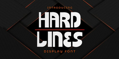
$59.00 - Hard Lines Display Font by Sipanji21,
$16.00 - New Car Tag JNL by Jeff Levine,
$29.00 - Patrol Car Stencil JNL by Jeff Levine,
$29.00 - btd Cart-O-Grapher (bitmap) - Unknown license
- KR Careful What You Say! - Unknown license
- Three the Hard way shadowed - Unknown license
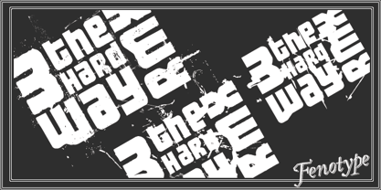
- 3 The Hard Way RMX by Fenotype,
$29.95 - ITC Avant Garde Gothic Paneuropean by ITC,
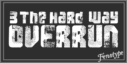
$49.00 - 3 The Hard Way Overrun by Fenotype,
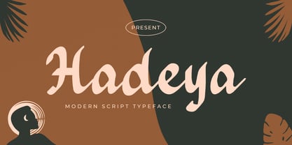
$29.95 - Hadeya by Typefactory,
$14.00 - kirschbaum - Unknown license
- Vehicular - Unknown license
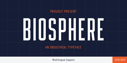
- Biosphere by Fype Co,
$16.00 - Besign - 100% free
- Ethnocentric - Unknown license
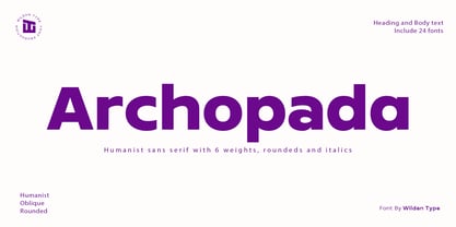
- Archopada by Wildan Type,
$17.00 - Impossible - Unknown license
- BOODAS DREIECKE - Unknown license
- TrajanusBricks - Unknown license
- Quark Outline - 100% free
- Movement - Personal use only
- New Alphabet - Unknown license
- Deco Slice - Personal use only
- Crop©Bats AOE - Unknown license
- Bestlady by Dhan Studio,
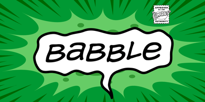
$19.00 - Babble by Comicraft,
$19.00 - AB Exp - 100% free
- Cienfuegos - Personal use only
- D3 Labyrinthism katakana - Unknown license
- Frederick YOFF - Personal use only
- Jayne Print YOFF - Personal use only
- Aaron YOFF - Personal use only
- Jayne Script YOFF - Personal use only
- Bunnigrrrls handwriting YOFF - Personal use only


