10,000 search results
(0.023 seconds)
- dT Jakob by dooType,
$30.00 - Engravers DT by DTP Types,
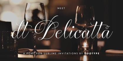
$49.00 - dT Delicatta by dooType,
$40.00 - Birac DT by DTP Types,
$49.00 - DT Lythmore by Dragon Tongue Foundry,
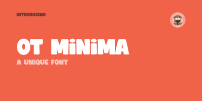
$9.00 - OT Minima by OtterType,
$15.00 - Triest DT by DTP Types,
$49.00 - DT Skiart by Dragon Tongue Foundry,
$30.00 - Berstrom DT by DTP Types,
$49.00 - DT Partel by Dragon Tongue Foundry,
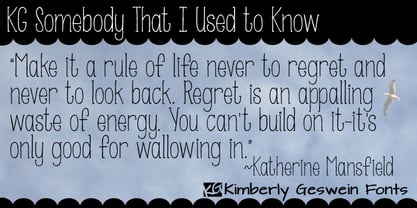
$9.00 - KG Somebody That I Used to Know - Personal use only
- KG Somebody That I Used To Know by Kimberly Geswein,
$5.00 - Saturdays Girl - 100% free
- bell doraemon by OUBYC - Unknown license
- Katy Berry - Personal use only
- Guifx v2 Transports - Personal use only
- KG Ray of Sunshine - Personal use only
- Grouser - Unknown license
- Charms BV - Unknown license
- Valentine Ribbon - Unknown license
- Tenbitesch - Personal use only
- Angel - Unknown license
- Not Quite Right BRK - Unknown license
- Old Dog, New Tricks - Unknown license
- Hot Rod Gang BV - Unknown license
- AW_Siam English not Thai - Unknown license
- Don Giovonni Makin Enemies - Unknown license
- KR Lots Of Holly - Unknown license
- Oo Boodlio Doo NF by Nick's Fonts,
$10.00 - KG Sorry Not Sorry by Kimberly Geswein,
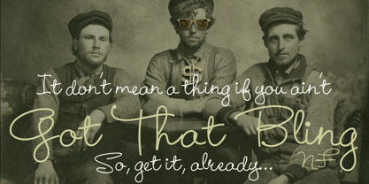
$5.00 - Got That Bling NF by Nick's Fonts,
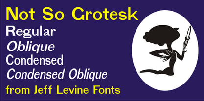
$10.00 - Not So Grotesk JNL by Jeff Levine,
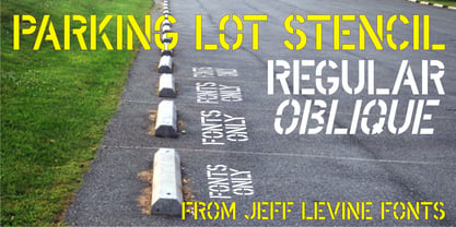
$29.00 - Parking Lot Stencil JNL by Jeff Levine,
$29.00 - Red Hot Mama NF by Nick's Fonts,
$10.00 - Jeu De Mots NF by Nick's Fonts,
$10.00 - Parking Lot Sale JNL by Jeff Levine,
$29.00 - Dont Bug Me JNL by Jeff Levine,
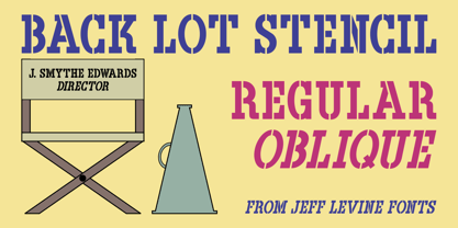
$29.00 - Back Lot Stencil JNL by Jeff Levine,
$29.00 - You Wish You Were a Shirley - Unknown license
- KR Home Is Where The Heart Is - Unknown license

