10,000 search results
(0.024 seconds)
- Occidental - Unknown license
- Folkard™ - Unknown license
- Crown Title - Unknown license
- Peake - Unknown license
- KelmscottRoman - 100% free
- Berylium - Unknown license
- BARNACLE - Unknown license
- Middle Ages - Unknown license
- Devroye - Unknown license
- AidaSerif - Unknown license
- Bustamante1.0 - Unknown license
- Rowling Stone Semi Bold - Unknown license
- MarlonBookDB - Unknown license
- Immortal - Unknown license
- Should've Known Shaded - Unknown license
- ShangriLaNF - 100% free
- Menaion Medieval - Unknown license
- BeinetCondensed - Unknown license
- Elphinstone™ - Unknown license
- Muffy - 100% free
- GriffosFont - 100% free
- Lilith - Unknown license
- LT Sip - 100% free
- LT Cushion Light - 100% free
- Bright Gesture DEMO - Personal use only
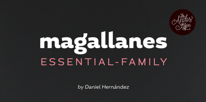
- Magallanes Essential by Los Andes,
$18.00 - Hypatia by Adobe,
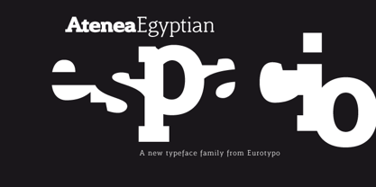
$35.00 - Atenea Egyptian by Eurotypo,
$28.00 - Shinn by Red Rooster Collection,
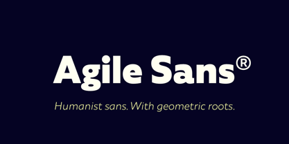
$45.00 - Agile Sans by Fenotype,
$25.00 - Averia Sans - Unknown license
- Avenue by Hackberry Font Foundry,
$24.95 - Carter Sans by ITC,
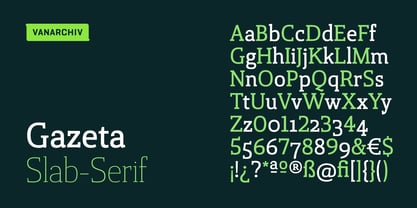
$40.99 - Gazeta Slab by Vanarchiv,
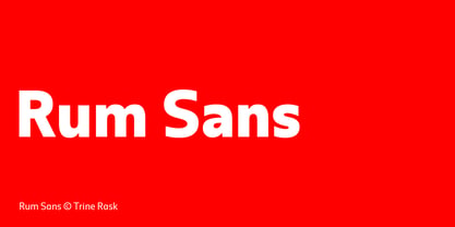
$35.00 - Rum Sans by Trine Rask,
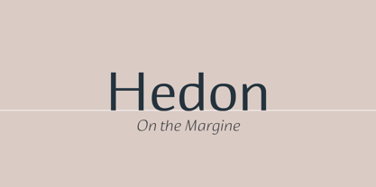
$30.00 - Hedon by Tour De Force,
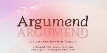
$25.00 - Argumend by Ayca Atalay,
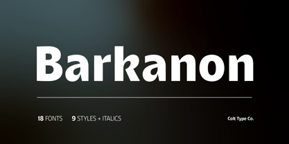
$29.00 - Barkanon by wearecolt,
$29.00 - Clear Prairie Dawn by Quadrat,
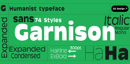
$25.00 - Garnison by OzType.,
$15.00


