10,000 search results
(0.059 seconds)
- Gusto by Device,
$39.00Gusto comes in three related variants that go from hot-dog to melted chocolate, a gastronomic combination not to be passed up (or thrown up). - Flyover by Ronnie Boy,
$19.00 When a formation of jets flies over the top of a stadium before a big game, there is an unparalleled sense of excitement in the crowd. Flyover, a display typeface, captures that moment with an italic base, left-facing serifs, hollowed notches and a change in angle representing the instant the jets pass overhead.
 - Amster by PampaType,
$60.00 Amster is an energetic & refined type created by Francisco Gálvez, with a sharp idea on how elegance & legibility can meet harmoniously. Amster can build a text that is highly readable as well as friendly. It has five weights of roman & cursive both with smallcaps and fully-equipped with all OT sorts and even a wonderful set of illuminated initials. Amster is a very versatile typeface, allowing for a wide range of uses: screen to print, small text to display, science to poetry. Amster speaks more than 200 languages.
 - Custer RE by Font Bureau,
$40.00 A book in the library of University of Wisconsin caught David Berlow’s attention. It was set in a clear text face - a predecessor of Bookman, cast by the Western Type Foundry who called it Custer. Upon noting how well the typeface worked in 6 and 7 points, he developed it into a member of the Reading Edge series specifically designed for small text on screen. Custer RE was a broad and approachable typeface drawn large on the body with a tall x-height to maximize its size when set very small.
 - Narrow Minded JNL by Jeff Levine,
$29.00 In the days of hand lettering, a common philosophy was "the problem creates the solution". Often times the layout artist would have to adapt the lettering style to fit the amount of copy on a line. A perfect example is during the early 1900s, when popular sheet music of the time almost seemed to be competing for how many words could be used within a song's a title. One such piece of sheet music offered up the tall, condensed and variable-width lettering found within Narrow Minded JNL.
 - Larosa by Kaligra.co,
$29.00 Introducing Larosa Sans - An elegant modern sans serif with a ton of stylistic alternates to choose from. Its clean and minimalistic, works wonderfully on its own for logos, headlines, posters, packaging and many more! And with seven different weights to choose from, your option to create more unique and versatile designs is a lot wider. Have fun and create more. Your imagination is your only limit!! HOW TO ACCESS ALTERNATIVE CHARACTERS Open glyphs panel: In Adobe Photoshop go to Window - glyphs In Adobe Illustrator go to Type - glyphs
 - Foundry Fabriek by The Foundry,
$99.00 Foundry Fabriek was inspired by the concepts behind industrial fabrication, where and how parts of materials or structures are united. The systematic grid, formed by stencil shapes, is indicative of the work of Wim Crouwel, consultant on the development of this typeface. The compact character widths of Foundry Fabriek are consistent over the five weight progression, giving flexibility for a variety of applications. The characteristic letterforms have an extra dynamic in large scale, perhaps in cast concrete or laser cut metal, to form integrated components in architectural or signage projects.
 - Alaya Roza by Supfonts,
$15.00 Alaya Roza supports both Cyrillic and Latin layout. You can write an attractive invitation or issue menu. It is of a classic style that will fit perfectly into any project. Шрифт поддерживает как кириллическую так и латинскую раскладку. Вы можете писать привлекательные приглашения или оформлять меню. Классическое начертание идеально впишется в любой проект :) Test it out below to see how it could look for your next project! Includes: Regular Script Latin languages support Cyrillic languages support Uppercase and lowercase Numbers and punctuation Ligatures Check out my blog: https://www.instagram.com/di.zigner pinterest.com/dmitriychirkov7 Enjoy
 - Coloria Muergad by Letterhend,
$17.00 Coloria Muergad is a typeface which is inspired by art deco style. Very suitable for for headline, logotype, apparel, invitation, branding, packaging, advertising etc with old school / vintage as well as modern theme. It comes with few bonus illustrations. Features : uppercase and lowercase numbers and punctuation multilingual alternates and ligatures PUA encoded We highly recommend using a program that supports OpenType features and Glyphs panels like many of Adobe apps and Corel Draw, so you can see and access all Glyph variations. How to access opentype feature : letterhend.com/tutorials/using-opentype-feature-in-any-software/
 - Slam Bang Theater NF by Nick's Fonts,
$10.00This ultrabold headline font is basically patterned after the font Nubian Black, designed by Willard T. Sniffin for American Type Founders in the 1920s, but includes an unusual inline treatment of the caps. Named for the local television show on KFJZ-TV (later KTVT) in Fort Worth, Texas, that introduced a whole new generation of kids to the Three Stooges, and hosted by the erstwhile Icky Twerp. Both versions of this font contain the Unicode 1252 (Latin) and Unicode 1250 (Central European) character sets, with localization for Romanian and Moldovan. - Beret by Linotype,
$29.99Brazilian designer Eduardo Omine designed his Beret family of typefaces in an attempt to create a warm counterpart to the clean, minimalist sans serif of the 20th Century. The most individual characteristics of Beret are the terminals at the ends of its vertical strokes. They are slightly bent", simulating a subtle flare. Like many classic sans-serif typefaces (e.g., the original Syntax and Univers), this family does not include true (calligraphic) italics. Instead, a masterful set of obliques has been created. As Stanley Morison articulated in the early 1920s and 30s, these slanted versions of the regular "roman" faces may even work better when one wishes to emphasize certain words or passages within a text. The Beret family of typefaces is suitable for numerous applications, in both text and display sizes. The following nine fonts make up the family's design: Beret Light, Beret Light Italic, Beret Book, Beret Book Italic, Beret Regular, Beret Medium, Beret Medium Italic, Beret Bold, and Beret Bold Italic. Beret was awarded an Honorable Mention in the 2003 International Type Design Contest, sponsored by the Linotype GmbH." - Magelove One by Garisman Studio,
$15.00 Magelove a handlettering font is a natural & beautyful handwritten font to get natural and natural writing. I'ts Perfect for logo, invitation, stationery, wedding designs, social media posts, advertisements, product packaging, product designs, label, photography, watermark, special events or anything INCLUDED FEATURE: - Stylistic Sets (SS01-SS08) & Ligature - PUA Encoded open - Support for MAC or PC - Simple installation for Adobe Illustrator, Corel Draw, Photoshop, or Procreate (New Updated) Thanks and Regards Garisman Studio
 - Mivron by Aah Yes,
$4.95Mivron is a stand-out type of sans-serif block text especially suited for headlines and display work. There's a wide range of accented characters making this font appropriate for a wide variety of languages. The zip contains OTF and TTF versions - only install one version of a font on the same machine, either the OTF or TTF, but not both as that could cause various conflicts and erratic behaviour. - Bridney Signature by Typestory,
$15.00 Bridney Signature is an enchanting handwritten font. This versatile script font has a wide spectrum of applications ranging from greeting cards to headlines and is guaranteed to add a romantic feel to your next project. What’s Included : Ligature, Alternate & Swashes Works on PC & Mac Simple installations Accessible in the Adobe Illustrator, Adobe Photoshop, Adobe InDesign, even work on Microsoft Word. PUA Encoded Characters – Fully accessible without additional design software.
 - Canger staong by ryan creative,
$10.00 Introducing the Canger staong font which has a unique looking design. This font has curved joints like pipes. You can use Canger staong in modern and contemporary designs, and are suitable for use in various media such as stickers, posters, covers, typography and other digital media. -Uppercase. -Foreign Support, Numbers and Punctuation. -Alternates & ligatures -Simple installation. -Accessible in Adobe Illustrator, Adobe Photoshop. Adobe InDesign, it even works in Microsoft Word.
 - Thalia Kendrick by Grezline Studio,
$13.00 Thalia Kendrick is beautiful and assertive script font, crafted to give your headlines and logotype projects a stylish touch. This font reads as strong, confident, and dynamic and can add tons of nostalgic character to your designs. Feature : - A lot of Alternates ( With a Total of 450 Glyphs ) - Multilingual Language - Works on PC & Mac - Simple installations - Accessible in the Adobe Illustrator, Adobe Photoshop, Adobe InDesign, even works on Microsoft Word.
 - Kiyosace by Olivetype,
$23.00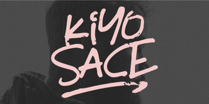 Kiyosace is an authentic brush font with very cool textures and a natural feel. It's perfect for posters, headlines, and logotypes. Its rough and tough style gives it a unique authenticity that sets it apart from the rest. Kiyosace font includes : Standard Latin Uppercase and Lowercase Numbers, symbols, and punctuations Swashes Multilingual Support. PUA Encoded and fully accessible without additional design software Simple Installations Works on PC & Mac Thank You.
 - Child Island by HIRO.std,
$14.00 Child Island a Playful Font This font describes about funny, childish, happy, excitement, easy going, and very easy to use. Child Island inspired from Children's World. FEATURES - Uppercase and Lowercase letters - Numbering and Punctuations - PUA Encoded Characters - Multilingual Support - Works on PC or Mac - Simple Installation USE Child Island perfect for headings, flyer, body text, product packaging, book or magazine cover, logotype, apparel design, album covers, etc. Enjoy using! Thanks. HIRO.std
 - Cubby Brush by Letterara,
$10.00 Cubby brush Font is a brush font with a natural flow to help you make designs that are fun and stand out. Features: - Uppercase - Numerals - Punctuations (OpenType Standard) - Accents (Multilingual characters) - Works on PC & Mac - Simple installations - Accessible in the Adobe Illustrator, Adobe Photoshop, Adobe InDesign, even works on Microsoft Word. don't wait anymore, put it in your shopping basket :) and follow me, because there will be many promos!
 - Karmany by Scratch Design,
$8.00 Karmany is a hand drew font made with original brush shapes which make this font look beautiful and will match for your logo designs, flyers, brochures, signature, quote texts and also menu design for food and beverage. Karmany contains Uppercase & Lowercase, Numbers, Punctuation. It offers Multilingual Support, works on Mac and Windows OS and is easy to install. We hope you like it and thank you so much for your purchase.
 - DT Skiart Lexiconic by Dragon Tongue Foundry,
$10.00 Apparently, Lexicon is the most expensive font in the world. ‘Skiart Lexiconic’ has been on a long growing path getting to where it is now. This font family was originally inspired by the san serif font ‘Skia’, by Mathew Carter for Apple. ‘Skiart’ was designed to feel more like a serifed font, but without any actual serifs. It took a small step between sans serif and serif fonts. Next on the path towards a serif font came Skiart Serif Mini, with tiny serifs added. This was a true serif font, although they were subtle. Then came ‘Skiart Serif Leaf’. and now... We present to you... DT Skiart Lexiconic. Having evolved from the Skiart family, we chose to give it the serifed styling of Lexicon. This is no way a copy or clone of Lexicon. It still has the basic bones of the original Skiart font, but the position, shape and size of the serifs were very much influenced by the world famous Lexicon font. DT Skiart Lexiconic is not the most expensive font in the world.
 - Yorkson by Letterhend,
$19.00 Introducing, Yorkson - A Script Logotype Font. Beside it has more than 230+ glyphs, this type of font perfectly made to be applied especially in logo. Just play around with the swashes and ligatures, then you can have your logo design. This font is also perfect for various formal forms such as invitations, labels, logos, magazines, books, greeting / wedding cards, packaging, fashion, make up, stationery, novels, labels or any type of advertising purpose. Features : uppercase & lowercase numbers and punctuation multilingual swash and ligature alternates PUA encoded We highly recommend using a program that supports OpenType features and Glyphs panels like many of Adobe apps and Corel Draw, so you can see and access all Glyph variations. How to access opentype feature : letterhend.com/tutorials/using-opentype-feature-in-any-software/ Email us to letterhend@gmail.com if you need something! Happy Designing!
 - Sassoon Sans by Sassoon-Williams,
$48.00 A more mature font retaining the clarity of the Sassoon typefaces that accentuate word shape, while omitting the exit strokes. A more legible alternative to standard Sans serif typefaces - superb on the screen. Many alternative letters are included in each font. A typeface designed with the computer screen in mind. It retains maximum legibility even in the most unusual layout - ideal for multi media uses and giving unimagined clarity to menus and navigational aids. Avoid eyestrain with a typeface that accentuates word shape as well as the identity of individual letters. Legible in print at tiny point sizes so ideal for captions. Ideal for older pupils, perhaps at Secondary school, or adults, who no longer require ‘exit strokes’ to clump the letters together. Free to download resources: How to access Stylistic Sets of alternative letters in these fonts
 - Victorian Orchid by Dharma Type,
$19.99 Victorian Orchid is a gorgeous vintage flower. Victorian Orchid is a beautiful, organic serif font family available for both text and display. Its bizarre serifs for A and other diagonal letterforms came from decorative types and letterings in old Victorian era. These unusual serifs support and enhance the horizontal flow of the eyes and vertical alignments. Very eye-catching lowercase g also came from the Victorian era and this is one of the most dramatic letterform of this font. Lowercase such like n and d also have horizontal serifs which designed in the same theory. Victorian Orchid is somewhat organic, humanistic and soft-impression font like Transitional Serif as typified by Times New Roman. But at the same time, this font has horizontal serif and vertical stressed letterform like Modern Serif. They make this font sharp, handsome and neat. In addition, Victorian Orchid has low contrast and the serifs are not too flat and not too coved. By them, Victorian Orchid create strong and casual impression like Slab Serif fonts. Victorian Orchid family consist of 5 weights from Light to Bold including about 500 glyphs, international accented letters, some OpenType features. Italics are "True" italics which designed very carefully to match Romans.
 - TT Bricks by TypeType,
$29.00 TT Bricks useful links: Graphic presentation | Customization options Do you love the early Soviet visual culture as much as we do? We’ve tried going back a hundred years and rethinking the constructivist era. We’ve created an extensive font family that consists of the simplest triangle and rectangle forms. TT Bricks font family includes 16 typefaces: Hairline, Thin, Light, Regular, Medium, Bold, ExtraBold, Black and Italics. Regardless of its Soviet past, TT Bricks is a very fresh and visually powerful font family that perfectly fits the contemporary media landscape. TT Bricks is perfect for mobile apps and corporate websites, as well as for printed press layout. Thanks to the exaggeratedly simple forms of all signs, TT Bricks looks great in very small type sizes. FOLLOW US: Instagram | Facebook | Website TT Bricks language support: Acehnese, Afar, Albanian, Alsatian, Aragonese, Arumanian, Asu, Aymara, Banjar, Basque, Belarusian (cyr), Bemba, Bena, Betawi, Bislama, Boholano, Bosnian (cyr), Bosnian (lat), Breton, Bulgarian (cyr), Cebuano, Chamorro, Chiga, Colognian, Cornish, Corsican, Cree, Croatian, Czech, Danish, Embu, English, Erzya, Estonian, Faroese, Fijian, Filipino, Finnish, French, Friulian, Gaelic, Gagauz (lat), Galician, German, Gusii, Haitian Creole, Hawaiian, Hiri Motu, Hungarian, Icelandic, Ilocano, Indonesian, Innu-aimun, Interlingua, Irish, Italian, Javanese, Judaeo-Spanish, Kalenjin, Karachay-Balkar (lat), Karaim (lat), Karakalpak (lat), Kashubian, Khasi, Khvarshi, Kinyarwanda, Kirundi, Kongo, Kumyk, Kurdish (lat), Ladin, Latvian, Laz, Leonese, Lithuanian, Luganda, Luo, Luxembourgish, Luyia, Macedonian, Machame, Makhuwa-Meetto, Makonde, Malay, Manx, Maori, Mauritian Creole, Minangkabau, Moldavian (lat), Montenegrin (lat), Mordvin-moksha, Morisyen, Nahuatl, Nauruan, Ndebele, Nias, Nogai, Norwegian, Nyankole, Occitan, Oromo, Palauan, Polish, Portuguese, Quechua, Rheto-Romance, Rohingya, Romanian, Romansh, Rombo, Rundi, Russian, Rusyn, Rwa, Salar, Samburu, Samoan, Sango, Sangu, Scots, Sena, Serbian (cyr), Serbian (lat), Seychellois Creole, Shambala, Shona, Slovak, Slovenian, Soga, Somali, Sorbian, Sotho, Spanish, Sundanese, Swahili, Swazi, Swedish, Swiss German, Tagalog, Tahitian, Taita, Tatar, Tetum, Tok Pisin, Tongan, Tsonga, Tswana, Turkish, Turkmen (lat), Ukrainian, Uyghur, Vepsian, Volapük, Võro, Vunjo, Xhosa, Zaza, Zulu.
 - Pantoufle by Kitchen Table Type Foundry,
$16.00 Pantoufle is French for slipper. Not the flipflop variety (or thongs if you’re from Australia), but the one you wear indoors when it’s cold. I have some too; Spanish ones, made from recycled PET bottles. Here in Holland, we call them ‘Pantoffels’ and you don’t have to be a language expert to see the resemblance between the French and the Dutch word. That is because the French are probably more savvy when it comes to keeping your feet warm and the Dutch just borrowed the word, pronunciation and all! Pantoufle is a font I made with a big fat marker pen. My kids had used it to decorate some gifts for Sinterklaas (if you want to know what Sinterklaas is, look it up). Pantoufle comes with extensive language support and a full set of alternates for the lower case glyphs. Enjoy!
 - Old Man Eloquent by Three Islands Press,
$29.00 John Quincy Adams, sixth President of the United States, didn't hit his stride until he'd left that lofty office. It was during his many years in Congress that he assured his legacy, not least because of his long, masterful oratory opposing slavery. His speeches, in fact, won him the nickname "Old Man Eloquent." So when I decided to simulate Adams's penmanship in his legendary diary (which he kept for nearly 70 years), it seemed fitting to call the font by that name. I focused on his handwriting from about 1810, when he was Ambassador to Russia, but also consulted pages from later years. Old Man Eloquent has both regular and bold weights. The OpenType version has more than 450 glyphs, including alternate uppercase characters, old-style and lining figures, and numerous ligatures; all formats contain several common (English) words.
 - Dionisio by CastleType,
$49.00 Dionisio, a CastleType original, takes its inspiration from one of the overlooked treasures of the CastleType library: Ransahoff. The latter is extremely condensed and very elegant. I particularly like its hairline slab serifs and cross-bars. I decided to use it as a starting point for a new design, but to make the proportions more classic and to make it more sensuous with gentler curves and bracketed cross-bar serifs. The result is very Bodoni-like, but less extreme and more contemporary looking. Meanwhile, Dionisio maintains a hint of Ransahoff with condensed letterforms and very fine serifs. Dionisio brings together the best of both, making it the perfect choice where a slender, sophisticated typeface is needed. Dionisio is available in two widths: normal and condensed, five fonts each. Includes an extensive character set and OpenType features.
 - Corleone by FontMesa,
$- Corleone was originally designed as a two font family in 2001 and offered for free. This year we've expanded the font family to twelve fonts including small caps and italics. While the new Corleone has been greatly refined and is a much more professional quality font we've decided to still offer the original two fonts for free. Corleone is the perfect font for t-shirts and other merch, the new small caps make this font stand out and bring attention to whatever you use it on. Corleone is the font you can't refuse. Tech notes: Corleone was designed after a famous movie logo in the 1970's with a title name that sounds a lot like The Grandfather if you know what I mean. The movies had three installments, my original font was patterned after the logo for the third movie, the new Corleone Primo and Secondo versions are patterned after the logos of the first two movies. The differences are noticed mostly in the lowercase letters. One thing you will not find in this font family is the puppeteer or puppet master hand because it's been registered as a separate trademark of Paramount Pictures. If you're using an application that works in layers then you'll be interested in the four extra over score glyphs included in some of the versions of this font. Sorry, MS Word does not work in layers so this feature will not work in MS Word. When you open up the glyph map in Adobe Creative Suite you should see the over score glyphs when you scroll down to the bottom. These extra over score glyphs allow you to extend the top line of a single capital letter, with four different lengths you should be able to mix and match to achieve the length that you desire. When using the over score glyphs it's best to divide your word or headline into separate text objects, the cap being one object and the remaining letters being the second. If you try using the over score glyphs on a single text object then with each over score that you add the text after it will get pushed down the line.
 - Fontleroy NF Pro by CheapProFonts,
$10.00 I have completely redone the spacing in this font, making the sidebearings more conventional. And after replacing the kerning with fresh pairs working together with the new spacing the font looks like a real gem. I love it! The inline version has a wider spacing after the letters CEK = no connecting words. Otherwise just as lovely and retro! Nick Curtis says: "Here’s a strange hybrid: I took the lower case from the formal script font Stuyvesant, straightened out its rather extreme 22° slant, and combined them with caps from the font Bellevue, again making them upright, and adding an inline effect. The result is a font that flows very nicely, with a nice balance between clean lowercase characters and swashy caps. Thanks to Deb Dunbar for naming this font. Fontleroy Brown is the solid version, produced at the request of the King of Ding, Jeff Levine." ALL fonts from CheapProFonts have very extensive language support: They contain some unusual diacritic letters (some of which are contained in the Latin Extended-B Unicode block) supporting: Cornish, Filipino (Tagalog), Guarani, Luxembourgian, Malagasy, Romanian, Ulithian and Welsh. They also contain all glyphs in the Latin Extended-A Unicode block (which among others cover the Central European and Baltic areas) supporting: Afrikaans, Belarusian (Lacinka), Bosnian, Catalan, Chichewa, Croatian, Czech, Dutch, Esperanto, Greenlandic, Hungarian, Kashubian, Kurdish (Kurmanji), Latvian, Lithuanian, Maltese, Maori, Polish, Saami (Inari), Saami (North), Serbian (latin), Slovak(ian), Slovene, Sorbian (Lower), Sorbian (Upper), Turkish and Turkmen. And they of course contain all the usual “western” glyphs supporting: Albanian, Basque, Breton, Chamorro, Danish, Estonian, Faroese, Finnish, French, Frisian, Galican, German, Icelandic, Indonesian, Irish (Gaelic), Italian, Northern Sotho, Norwegian, Occitan, Portuguese, Rhaeto-Romance, Sami (Lule), Sami (South), Scots (Gaelic), Spanish, Swedish, Tswana, Walloon and Yapese.
 - Prismatic Interlaces by MMC-TypEngine,
$93.00 PRISMATIC INTERLACES TYPEFACE! Prismatic Interlaces is a decorative system and ‘Assembling Game’, itself. Settled in squared pieces modules or tiles, embedded by unprecedented Intertwined Prismatic Structures Design, or intricate interlaced bars that may seem quite “impossible” to shape. Although it originated from the ‘Penrose Square’, it may not look totally as an Impossible Figures Type of Optical Illusions. More an “improbable” Effect in its intertwined Design, that even static can seem like a source of Kinetical Sculptures, or drive eyes into a kind of hypnosis. Prismatic Interlaces has two related families, both as a kind of lighter weight versions Prismatic Spirals Default & Pro. While Default is simpler or easier to use, same way as Prismatic Interlaces, Pro provides a more complex intricate Design that requires typing alternating caps. Instructions: Use the Map Font Reference PDF as a guide to learn the 'tiles' position on the keyboard, then easily type and compose puzzle designs with this font! All alphanumeric keys are intuitive or easy to induce, you may easily memorize it all! Plus, often also need to consult it! *Find the Prismatic Interlaces Font Map Reference Interactive PDF Here! (!) Is recommended to Print it to have the Reference in handy or just open the PDF while composing a design with this typeface to also copy and paste, when consulting is required or when it may be difficult to access, depending on the keyboard script or language. As a Tiles Type-System, the line gap space value is 0, this means that tiles line gaps are invisibly grouted, so the user can compose designs, row by row, descending to each following row by clicking Enter, same as line break, while advances on assembling characters. Background History: The first sketches of my Prismatic Knots or Spirals Designs dates back then from 2010, while started developing hand-drawn Celtic Knots and Geometric Drawings in grid paper, while engage to Typography, Sacred Geometry and the “Impossible Figures” genre… I started doing modulation tests from 2013, until around 2018, I got to unravel it in square modules or tiles from the grid, then idealized it as fonts, along with other Type projects. This took 13 years to come out since the first sketches and 6 months in edition. During the production process some additional tiles or missing pieces were thought of and added to the basic set, which firstly had only the borders, corners, crossings, nets, Trivets connectors or T parts and ends, then added with nets and borders integrations. Usage Suggestions: This type-system enables the user to ornate and generate endless decorative patterns, borders, labyrinthine designs, Mosaics, motifs, etc. It can seem just like a puzzle, but a much greater tool instead for higher purposes as to compose Enigmas and use seriously. As like also to write Real Text by assembling the key characters or pieces, this way you can literarily reproduce any Pixel Design or font to its Prismatic Spirals correspondent form, as Kufic Arabic script and further languages and compose messages easily… This Typeface was made to be contemplated, applied, and manufactured on Infinite Decorative Designs as Pavements, Tapestry, Frames, Prints, Fabrics, Bookplates, Coloring Books, Cards, covers or architectonic frontispieces, storefronts, and Jewelry, for example. Usage Tips: Notice that the line-height must be fixed to 100% or 1,0. In some cases, as on Microsoft Word for example, the line-height default is set to 1,15. So you’ll need to change to 1,0 plus remove space after paragraph, in the same dropdown menu on Paragraph section. Considering Word files too, since the text used for mapping the Designs, won't make any literal orthographical sense, the user must select to ignore the Spellcheck underlined in red, by clicking over each misspelled error or in revision, so it can be better appreciated. Also unfolding environments as Adobe Software’s, the Designer will use the character menu to set body size and line gap to same value, as a calculator to fit a layout for example of 1,000 pts high with 9 tiles high, both body size and line gap will be 111.1111 pts. Further Tips: Whenever an architect picks this decorative system to design pavements floor or walls, a printed instruction version of the layout using the ‘map’ font may be helpful and required to the masons that will lay the tiles, to place the pieces and its directions in the right way. Regarding to export PNGs images in Software’s for layered Typesetting as Adobe Illustrator a final procedure may be required, once the designs are done and can be backup it, expanding and applying merge filter, will remove a few possible line glitches and be perfected. Technical Specifications: With 8 styles and 4 subfamilies with 2 complementary weights each (Regular and Bold) therefore, Original Contour, Filled, Decor, with reticle’s decorations and 2 Map fonts with key captions. *All fonts match perfectly when central pasted for layered typesetting. All fonts have 106 glyphs, in which 49 are different keys repeated twice in both caps and shift, plus few more that were repeated for facilitating. It was settled this way in order for exchanging with Prismatic Spirals Pro font which has 96 different keys or 2 versions of each. Concerning tiles manufacturing and Printed Products as stickers or Stencils, any of its repeated pieces was measured and just rotated in different directions in each key, so when sided by other pieces in any direction will fit perfectly without mispatching errors. Copyright Disclaimer: The Font Software’s are protected by Copyright and its licenses grant the user the right to design, apply contours, plus print and manufacture in flat 2D planes only. In case of the advent of the same structures and set of pieces built in 3D Solid form, Font licenses will not be valid or authorized for casting it. © 2023 André T. A. Corrêa “Dr. Andréground” & MMC-TypEngine.
 - "Zamolxis I" is a distinctive font that captures the essence of ancient mystique and modernity in its design. This unique typeface is named after Zamolxis, who is often regarded as a god or a revered...
- FoxScript - Unknown license

- Langó - Unknown license

- Antaviana - Unknown license

- Langó - Unknown license

- Antaviana - Unknown license

- Grazia by Autographis,
$39.50 Grazia is a joining script with zero contrast. That means that I designed the line of the letters so, that they look equally thick all the time. The script is almost upright and has this 1930s look to it.
 - Midnight Sun by Hanoded,
$15.00 Midnight Sun, despite its rough look, was carefully painted. I used a very cheap brush with stuck-together bristles to get that ‘eroded’ look. Midnight Sun comes with double letter ligatures and some really cool stylistic alternates as well.
 - SP Reka by Remote Inc,
$39.00It was an unlikely union. Reka was a Maori maiden who made her home on the shores of Piha. I was a struggling actor who had spent the last six months in Bangkok, working as a cross-eyed prostitute.


