10,000 search results
(0.272 seconds)
- Jonathan by Supfonts,
$10.00 Hi everyone. This is my new signature style script. Any inscription will look like a natural stroke. This will give a unique look to your projects. Try my new font, it is lined with all the distances and it looks professional and at ease. It is ideal for signature or design, postcards and greetings, websites or blogs. Test it out below to see how it could look for your next project! Includes: Uppercase and lowercase Numbers and punctuation Foreign language support Ligatures Check out my blog: https://www.instagram.com/zloillev pinterest.com/dmitriychirkov7 Enjoy
 - MB Narrow by Ben Burford Fonts,
$20.00 MB Narrow is a very compressed display font that comes in three weights. with is full use of the 20 stylistic sets it gives the user a lot of scope to how it look. without using them it has a very rounded and geometric look but with alternates for the Capital A, M, N, V, W, X, Y and the lowercase a, f, g, v, w, x & y you can create a more traditional 'movie poster' look. with standard & discretional ligatures and oldstyle figures there are plenty of opentype features.
 - Helia Core by Nootype,
$35.00 Helia Core is a semi-squared font with very low contrast. It was designed to be as clear as possible. This font has a soft and friendly aspect and is perfect for variety of use. Helia Core consists in a 16 styles family, from Hairline to Black with their italics. Each font includes Small Caps, OpenType Features such as Proportional Figure, Tabular Figures, Numerators, Superscript, Denominators, Scientific Inferiors, Subscript, Ordinals, Fractions and many ligatures. The ligatures are a good feature to make an original and creative layout. The fonts have an extended characters set to support Central, Eastern and Western European languages. The range of styles provides flexibility for text and title.
 - MB Vinatage by Ben Burford Fonts,
$25.00 MB Vinatage is a 6 weight font family with italics that has its roots based firmly in the type and font design of the early 20th Century. With some art deco touches in the standard caps like the N and the low bars on the E, F & H, by using the stylistic alternates these can be changed to give the font a more contemporary look. The same applies to the lower case letters, with an alternate a and g and a stylistic lowercase t. The family works great as a display font using the thin and heavy weights and just as well for smaller & bulk text. Stay traditional or go contemporary or mix it up.
 - Orbi by ParaType,
$30.00 The Orbi type system is a low contrast antiqua of elegant design with a well developed set of members. It consists of 10 roman and italic faces of different proportions and weights and 3 decorative calligraphic fonts. It also contains 3 additional fonts with various decorated initials. The roman includes small capitals. Thanks to its variety of styles the font is suitable for a wide range of applications - the basic styles are good for books and periodicals; the narrow styles work well in the columns and tables of business papers; the decorative styles are ideal for ceremonial typography where swashes, calligraphy and initials are usual. The fonts were designed by Natalia Vasilyeva. Released by ParaType in 2010.
 - Catseye by Device,
$39.00 A casual sans that harks back to the very English style of book jacket and poster art of the late 50's and early 60's. The turned-in terminals are reminicent of Stephenson Blake's Grotesque 9, and the italic provides unique cursive versions of the lowercase characters. Available in a "narrow" version as well as two standard weights, this face lends itself to the wider letterspacing that evokes hot metal.
 - Argent by Device,
$39.00 An elegant sans with a low lower-case x-height, diamond-shaped dots and a reweighed complimentary italic with subtle calligraphic touches. With its generous spacing and leading, Argent is very readable in extended text settings, appearing warm and open. The wide range of weights, from thin to heavy, provide all the necessary options for headline and text, the basis of any comprehensive design system. Perfect for brochures and magazines.
 - Novaletra Serif CF by Connary Fagen,
$35.00 Legibility. Flexibility. Personality. No need to pick two; Novaletra Serif CF has it all. Liven up body text, captions, and headlines with Novaletra’s smooth, low-contrast design set across seven weights with italics. Versatile and easy to read at any size, Novaletra includes useful features like wide language support across Latin and Cyrillic scripts, international currency symbols, fractions, tabular numbers, and more. Includes lifetime updates, technical support and feature additions.
 - Double Pivot by Trequartista Studio,
$25.00 Double Pivot , a condensed sport inspired Regular, Low, & Mix typeface. Double Pivot has six Style with sans serif and matching italics. This typeface has a clean and athletic look, glyphs and extensive Latin script support. Double Pivot is bold, vibrant with sharp sans serifs and competitive appearance, therefore excellent to use for headers, logos, captions and posters, especially for the sports branding industry, but just as good for any other projects.
 - Lazurski by ParaType,
$30.00 Designed at Polygraphmash type design bureau in 1984 by Vladimir Yefimov, with the addition of demi and demi italic. Based on a hot-metal typeface (1962) by Moscow book designer Vadim Lazurski (1909–1994), inspired by the early 16th century typefaces of Italian Renaissance. The typeface is useful for text and display composition, in fiction and art books. An 'expert set' was added by ParaType (ParaGraph) in 1997.
 - Selina by ParaType,
$30.00 A universal text type was designed by Natalia Vasilyeva for ParaType in 2007. The type family is consist of 8 styles. Also corresponding decorative italic with calligraphic swash capitals was developed. The type has low contrast characters and narrow proportion. It is rather space-saved but very legible even in small sizes. For use in text and display typography. The upgraded version with extended character set was released in 2010.
 - Fair Sans Text by District,
$20.00 Fair Sans Text is the natural follow-up to the popular Fair Sans - now a text family based on the calligraphic structure and casual construction of its predecessor. As the name implies, Fair Sans Text has proportions for longer text settings, strong headlines, and everything in between. Lively and casual, FST is four weights with true italics. Also included are small caps, old style and tabular numerals, and multi-language glyphs.
 - Mareline Script by Mega Type,
$10.00 Introducing Mareline Script Font Duo, a sweet handlettered font, casual and dynamic with a bold and irregular baseline. Contains a complete set of lowercase, uppercase, alternates, ligatures, punctuation, numbers, and multilingual support. And additional Mareline Sans, working in harmony with Mareline script to create awesome typographic creations. Get some inspiration from the preview above. This font ideal for use in watercolor design or bold hand lettering style, such as posters, wedding elements, t-shirt, apparel, cover books, business cards, greeting cards, branding, merchandise, invitations and handmade quotes and more. Mareline Script Font Duo features OpenType stylistic alternates, ligatures and International support for most Western Languages. To enable the OpenType Stylistic alternates, you need a program that supports OpenType features such as Adobe Illustrator CS, Adobe Indesign & CorelDraw X6-X7, Microsoft Word 2010 or later versions. How to access all alternative characters using Adobe Illustrator: https://www.youtube.com/watch?v=XzwjMkbB-wQ Mareline Script Font Duo is coded with PUA Unicode, which allows full access to all the extra characters without having special designing software. Mac users can use Font Book , and Windows users can use Character Map to view and copy any of the extra characters to paste into your favorite text editor/app. How to access all alternative characters, using Windows Character Map with Photoshop: https://www.youtube.com/watch?v=Go9vacoYmBw If you need help or have any questions, please let me know. I'm happy to help. Thanks & Happy Designing!
 - Sardo by SD Fonts,
$34.00 Not serif, nor sans, partly soft, partly crude, but highly individual. Sardo comes with a vivid slanted look resulting from the contrast of its common classic stroke difference and straight thin serifs, adding a rigid component to its appearance. Thus Sardo shows a strong character projecting a huge amount of individuality. A new display font made to draw attention where classic serifs and sans serifs appear just dull. So please meet Sardo, a cosy wild cat showing Sharpe claws.
 - Fernolester by Maculinc,
$10.00 Fernolester is a classic themed font with a unique edge and above all; packed with different styles and ligatures - making it easy to create unique characteristics for your project. This typeface has a classic taste, very suitable as a design choice for books, magazines, packaging, branding, signage and many other creative projects. To activate the OpenType Stylistic alternative, you need a program that supports OpenType features such as Adobe Illustrator CS, Adobe Photoshop, Adobe Indesign & CorelDraw X6-X7. and much more This package includes 4 files; Fernolester Regular, Fernolester Italic, Fernolester Regular In Style & Fernolester Italic Instyle as OTF & TTF. Mail support : maculinc@gmail.com Thank you! Maculinc
 - Farwell by Balevgraph Studio,
$14.00 Farwell is a stylish and light script font, that exudes elegance and class. This font was particularly crafted for those who need a beautiful and refreshing look to their designs. Included uppercase, lowercase, numerals, punctuations, ligature, alternate, works on PC & mac, simple installations, multilingual support, PUA encoded.
 - Emberclaws by Zamjump,
$13.00 Emberclaw is a futuristic diplay font designed with uppercase characters. This font is perfect for logos, posters, product labels, or anything else. This logo is available in OTF formats. Features: Standard multi language characters, Uppercase Punctuation & Numbers, Support on Mac and Windows OS Easy to install
 - Kanttelaz by Balevgraph Studio,
$14.00 Kanttelaz is a bold and elegant handwritten font. Its flexibility and neat style will brighten up each of your designs. Have fun with this cool font and explore its endless variations. What's Included : Uppercase, Lowercase, Numerals & Punctuations Ligature & Alternate Works on PC & Mac Simple installations Multilingual support
 - Entog by Twinletter,
$12.00 This font offers beautiful abstract typographic harmony for a wide variety of design projects, including natural handwriting in digital form for designs, quote designs, for social media business designs, advertisements, trademarks, promotional banners, posts, posters, signatures, and all. the design requires handwriting or whatever design you want. This font is equipped with uppercase, lowercase, numbers, punctuation marks, swhases and several variations on each character including multi-language. This font is best suited for open type friendly applications. How to get alternative glyphs from open type fonts: http://adobe.ly/1m1fn4Y PUA Character Code - Fully accessible without additional design software. We hope you enjoy this font. Feel free to send whatever message you want to convey. Thank you Regards Twinletter
 - Protagonice by Invasi Studio,
$17.00 Designed by hand-drawn slab serif style font, Protagonice font comes in two varieties of regular and dotted textures. You can enhance your project with a retro-style using Protagonice Font. Ensuring carefully crafted styles result from the use of this font. Its imperfections keep it casual but allow it to still be legible. There is an incredibly wide range of uses for it, so give it a try and see how it inspires your creativity! It's ideal for headlines, flyers, posters, greeting cards, product packaging, book covers, printed quotes, logotype, and album covers, among other applications. Because this font is PUA encoded, you can easily access all of the glyphs and swashes!
 - Kazuwa by Scratch Design,
$9.00 It introduces a cute display font "Kazuwa". This font is complete with all punctuation and multi-languages support. Kazuwa also has a unique casual shape and looks like a natural kid handwritten, so this font will be perfect when applied to the fun concept design. This font will be useful for posters, name cards, books, comics, presentations, or packaging designs. Enjoy this font, it also supports multi-languages. In some features like stylistic alternates, we put some cute illustrations to make your design more cheerful. Features: Stylistic Alternates & Ligatures Numerals & Punctuation Accented characters Multiple Languages Supported HOW TO ACCESS ALTERNATE CHARACTERS Open glyphs panel: In Adobe Photoshop go to Window - glyphs In Adobe Illustrator go to Type - glyphs
 - Aston Script Pro by TRF,
$25.00 Aston Script is a calligraphy script font that comes with very beautiful changing characters, a kind of classic decorative copper script with a modern touch, designed with high detail to bring stylish elegance. Aston Script is attractive as a typeface that is smooth, clean, feminine, sensual, glamorous, simple and very easy to read, because there are many fancy letter connections. I also offer a number of viable style alternatives for many letters. The classic style is perfect to be applied in various formal forms such as invitations, labels, restaurant menus, logos, fashion, make up, stationery, novels, magazines, books, greeting / wedding cards, packaging, labels or any type of advertising purpose. Aston Script has 1330+ glyphs and 1039 alternative characters, including various language support. With OpenType features with alternative styles and elegant ligatures. The OpenType feature does not work automatically, but you can access it manually and for the best results needed for your creativity in combining this Glyph variation. ? New Update, Now the Aston Script font has been updated or has two styles with the Aston Script Bold version.
 - BenderHead AEF by Altered Ego,
$45.00Now, more than ever, the world needs BenderHead. Why? – Because... it just does. Don't ask why, just take our word for it. BenderHead has its thicks and thins all mixed up. For you typographic aficionados, stroke weights and hairline weights aren't consistent, and many rules of typographic design were broken to make this font. We're sure there's a use for it... we've used it on CD covers and posters - and have seen it on a poster for the Zelda video game at Babbages. It's offered here for the first time through Altered Ego Fonts. I don't think we need to explain its history, its inspiration, or its historical reference to you... (we're not certain there is any.) Just accept it as it is, and use it profusely. Benderhead AEF features a full character set, including the Euro. It supports the following codepages: -Latin 1 -Latin 2 (Eastern Europe) -Western Baltic -Turkish AEF highly recommends the OpenType version for compatibility with future Macintosh and Windows operating systems. Not to mention they work better in Adobe InDesign. - Yorka by Huruforia,
$5.00 Yorka is a mecha style display sans serif font, this font only consists of Uppercase Letters & multilingual support. Yorka is perfect for Logotype, Print Design, Label, Product, and more. OTF format fonts are also easy to install and support for Mac or Windows. Hopefully, our work is useful for you.
 - Freekick by Girinesia,
$11.00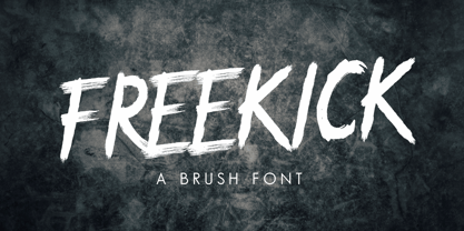 FREEKICK - Brush Font would perfect for sports, music festival, special events or anything What Included this font : PUA Encoded Characters Fully accessible without additional design software. Fonts include multilingual support for; Afrikaans, Albanian, Catalan, Danish, Dutch, English, Icelandic, Italian, Spanish, Portuguese, German, Swedish, Norweigen, Polish, Indonesian, Zulu and etc Simple installations
 - Marithan by Twinletter,
$17.00 With Marithan, every character is a hunk of hero inspiration. This superhero-style display font is the answer for projects that need great visual flair. What’s Included : File font All glyphs Iso Latin 1 Alternate, Ligature Simple installations PUA Encoded Characters – Fully accessible without additional design software. Fonts include Multilingual support
 - Bonfires by Ditatype,
$29.00 Bonfires is an elegant font in beautiful handwriting styles interconnected to each other to create smooth, continuous flows. The letters are shaped in curvy, smooth pen lines and the low letter contrasts can express smooth nuances. Details of this font are crucial as each curve and connection must look equal and proportional to create visually balanced, solid displays. Furthermore, its smooth, connected texts are able to let readers’ eyes stay warm and comfortable. In addition, you may enjoy the available features here. Features: Ligatures Multilingual Supports PUA Encoded Numerals and Punctuations Bonfires fits best for any design projects requiring casual, personal displays such as greeting cards, merchandise designs, and any casual-related designs. In web designs, this script font is perfectly applicable for blogs and sites to show intimate and personal nuances to the contents. Find out more ways to use this font by taking a look at the font preview. Thanks for purchasing our fonts. Hopefully, you have a great time using our font. Feel free to contact us anytime for further information or when you have trouble with the font. Thanks a lot and happy designing.
 - Mantika Sans Paneuropean by Linotype,
$67.99With its well-defined characters that are readily legible even in the small font sizes, Mantika Sans by Jürgen Weltin is ideal for typesetting. The elaborately designed and highly individual set of italics enhances the attractiveness of the font.Jürgen Weltin developed the Mantika™ Sans sans serif font using older designs for an serif font as his inspiration. Nothing more than the merest suggestion of the original serifs has survived. Bevelled line endings and the slight variation in thickness of verticals, in particular, provide Mantika Sans with a very dynamic character that evokes manuscript. Short ascenders and descenders give the font a compact appearance that is also underscored by its condensed proportions. Weltin has achieved his aim of producing a typeface with excellent legibility even in small sizes not just by means of the x-height, which is tall in comparison with the capital letters, but also by using clearly defined and well differentiated designs for critical letters, such as i", "I" and "l". Lower case "i", for example, has a serif while the "l" has a curved base.In addition to uppercase numerals, Mantika Sans also has lowercase or old style numerals that have been designed so that they can be used in both tabular and proportional settings. The uppercase numerals are slightly shorter than the uppercase letters, ensuring that the latter can be sympathetically incorporated within continuous text.The Mantika Sans italics are very unusual. They are inclined at only 4.5° (the usual angle for italics is 10 - 12°) and so appear to be almost upright. In addition, they also have quite distinctive forms. The overall effect calls attention to their curvilinear, manuscript character, enhances contrasts and further emphasizes the terminals. Weltin explains: "Within the variety of forms of the italics there are many contrasting terminal elements that create dynamism. The result is a diversity of interaction between the rounded and angular forms". Mantika Sans Italic thus has all the features of a display typeface, but can also be happily used on its own to set longer text passages. Mantika Sans is available in two weights; Regular and Bold, both of which have corresponding italics sets. Mantika Sans has been designed so that the widths of the four related cuts are identical, meaning that a change of font within a single layout will have no effect on justification. In addition, the members of the Mantika Informal font family, designed by Jürgen Weltin in 2010, also have the same thickness. Other font families having weights with equal thickness can be found in the "Linotype Office Alliance series".The Mantika Sans character sets are paneuropean. There are characters for setting texts in Eastern European languages, Greek and Cyrillic. There is also a range of special symbols, including right-angled brackets, subscript and superscript lower case letters, together with numerals, arrows and many different bullet points.As a vibrant and highly legible text font, Mantika Sans has a broad spectrum of potential applications. Its unusual italics are not just perfect for use in display text. The fact that it has only four cuts means that Mantika Sans is particularly suitable for office use or for the setting of business reports. Its excellent legibility even in the small font sizes also makes it ideal as a text for electronic reading devices; this also applies to Mantika Informal.At the 3rd International Eastern Type Design Competition Granshan 2010, Mantika Sans was awarded in the category Greek text typefaces." - Mantika Sans by Linotype,
$50.99 With its well-defined characters that are readily legible even in the small font sizes, Mantika Sans by Jürgen Weltin is ideal for typesetting. The elaborately designed and highly individual set of italics enhances the attractiveness of the font.Jürgen Weltin developed the Mantika™ Sans sans serif font using older designs for an serif font as his inspiration. Nothing more than the merest suggestion of the original serifs has survived. Bevelled line endings and the slight variation in thickness of verticals, in particular, provide Mantika Sans with a very dynamic character that evokes manuscript. Short ascenders and descenders give the font a compact appearance that is also underscored by its condensed proportions. Weltin has achieved his aim of producing a typeface with excellent legibility even in small sizes not just by means of the x-height, which is tall in comparison with the capital letters, but also by using clearly defined and well differentiated designs for critical letters, such as i", "I" and "l". Lower case "i", for example, has a serif while the "l" has a curved base.In addition to uppercase numerals, Mantika Sans also has lowercase or old style numerals that have been designed so that they can be used in both tabular and proportional settings. The uppercase numerals are slightly shorter than the uppercase letters, ensuring that the latter can be sympathetically incorporated within continuous text.The Mantika Sans italics are very unusual. They are inclined at only 4.5° (the usual angle for italics is 10 - 12°) and so appear to be almost upright. In addition, they also have quite distinctive forms. The overall effect calls attention to their curvilinear, manuscript character, enhances contrasts and further emphasizes the terminals. Weltin explains: "Within the variety of forms of the italics there are many contrasting terminal elements that create dynamism. The result is a diversity of interaction between the rounded and angular forms". Mantika Sans Italic thus has all the features of a display typeface, but can also be happily used on its own to set longer text passages. Mantika Sans is available in two weights; Regular and Bold, both of which have corresponding italics sets. Mantika Sans has been designed so that the widths of the four related cuts are identical, meaning that a change of font within a single layout will have no effect on justification. In addition, the members of the Mantika Informal font family, designed by Jürgen Weltin in 2010, also have the same thickness. Other font families having weights with equal thickness can be found in the "Linotype Office Alliance series".The Mantika Sans character sets are paneuropean. There are characters for setting texts in Eastern European languages, Greek and Cyrillic. There is also a range of special symbols, including right-angled brackets, subscript and superscript lower case letters, together with numerals, arrows and many different bullet points.As a vibrant and highly legible text font, Mantika Sans has a broad spectrum of potential applications. Its unusual italics are not just perfect for use in display text. The fact that it has only four cuts means that Mantika Sans is particularly suitable for office use or for the setting of business reports. Its excellent legibility even in the small font sizes also makes it ideal as a text for electronic reading devices; this also applies to Mantika Informal.At the 3rd International Eastern Type Design Competition Granshan 2010, Mantika Sans was awarded in the category Greek text typefaces."
 - Interdimensional - 100% free

- Display Inline JNL by Jeff Levine,
$29.00Display Inline JNL is a companion design to Jeff Levine's Signboard JNL font - both derived from die-cut display letters and numbers popular during the 1950s and 1960s for signs and show cards. - Werble JNL by Jeff Levine,
$29.00 Werble JNL is a wiggly, wavy, novelty font that can be used for anything that needs to show movement. It also lends itself well to spooky themes such as Halloween or horror films.
 - Boardwalk Avenue Rough by Fenotype,
$30.00 Boardwalk Avenue Rough is a textured version of Boardwalk Avenue. It’s a robust type collection of three styles and two weights of each. It’s divided into Boardwalk Pen, Boardwalk Antiqua and Boardwalk Serif. Boardwalk Avenue’s core is a connected mono linear script that works fantastic when paired with either of the impressive serif styles. All the fonts work great on their own but try putting them all together for a complete display font setup for a project. Here’s a short introduction on what’s included: Boardwalk Avenue Rough Pen is a connected Script. It’s great for headlines, quotes or in packaging. It has a casual hand drawn vibe to it but it’s clean and legible. It’s equipped with automatic Contextual Alternates that keep the connections smooth and versatile. For instance when you type double letter another of them will automatically change to add variation. Or if you type “i” for example, as a first letter after space or after capital letter the code will add starting point to the letter to keep the letterforms more balanced. If you need more ambitious letterforms you can try Swash or Titling Alternates -there’s alternates for every standard letter and seek for even more alternates from the glyph palette. Boardwalk Avenue Rough Antiqua is a high contrast serif with strong character. It’s great for glamorous headlines or as a logotype. Boardwalk Avenue Rough Serif is a low contrast serif with bulky character. It’s great for strong and sturdy headlines or as a logotype.
 - Helostar Script by Mega Type,
$12.00 Helostar Script is a modern calligraphy font that features a varying baseline, smooth lines, a classic and elegant touch. Can be used for various purposes such as headings, signature, logos, wedding invitation, t-shirt, letterhead, signage, labels, news, posters, badges etc. Helostar Script features 400+ glyphs characters. Including 150+ ligatures, alternates and multiple language support. It has OpenType stylistic alternates, ligatures and International support for most Western Languages. To enable the OpenType Stylistic alternates, you need a program that supports OpenType features such as Adobe Illustrator CS, Adobe Indesign & CorelDraw X6-X7, Microsoft Word 2010 or later versions. How to access all alternative characters using Adobe Illustrator: https://www.youtube.com/watch?v=XzwjMkbB-wQ Helostar Script is coded with PUA Unicode, which allows full access to all the extra characters without having special designing software. Mac users can use Font Book , and Windows users can use Character Map to view and copy any of the extra characters to paste into your favorite text editor/app. How to access all alternative characters, using Windows Character Map with Photoshop: https://www.youtube.com/watch?v=Go9vacoYmBw If you have any question, don't hesitate to contact me by email : megatype04@gmail.com Thanks so much for looking and enjoy it!
 - The Red Devil Script by Bal Studio,
$12.00 The Red Devil is a handmade script font with clear style and creative projects such as logos, printed quotes, invitations, cards, product packaging, headers, logos, letterhead, posters, clothing designs, labels, as you can use the illustrative qualities of the shapes to create an art piece. The Red Devil Script come with uppercase letters, lowercase letters, numbers, punctuation, and so many variations on each character including alternative opentype, general binder. It's fun to use because each word can be transformed to you like. To enable the OpenType Stylistic alternates, you need a program that supports OpenType features such as Adobe Illustrator CS, Adobe Indesign & CorelDraw X6-X7, Microsoft Word 2010 or later versions. How to access all alternative characters, using Windows Character Map with Photoshop: https://www.youtube.com/watch?v=Go9vacoYmBw How to access all alternative characters using Adobe Illustrator: https://www.youtube.com/watch?v=XzwjMkbB-wQ The Red Devil Script is coded with PUA Unicode, which allows full access to all the extra characters without having special designing software. Mac users can use Font Book , and Windows users can use Character Map to view and copy any of the extra characters to paste into your favourite text editor/app. Thanks so much for looking and please let me know if you have any questions.
 - Kropotkin Std by sugargliderz,
$30.00 This typeface design was influenced by the British Rail corporate type introduced in an old lettering instruction book published in Japan. Of course, the only clue to this typeface is the lettering instruction book at hand. Therefore, this typeface is based on the British Rail corporate type introduced in an old lettering instruction book published in Japan, and I have expanded the design variations. I started with the Bold design first. Then I designed Light, Regular, and Black in that order. Light and Regular are intended to be used as the text type, while Bold and Black are intended to be used as the base for logotypes, headlines, and other eye-catchers.
 - Argyle Rough by Type Associates,
$24.95 Argyle Rough was originally developed for a packaging campaign in the late 80s in my studio and sat around in various stages of completion until I decided to autotrace my original drawings. I liked the quirky roughness and decided that it did not detract from the charm of the original, in fact it improved it and saved me a whole lot of work. The original campaign called for a few additional alternate characters for use at either end and double in the middle of words, ee, ff, ll, ss etc and a stylized Th, always useful. I hope you enjoy Argyle Rough, named after the world’s largest diamond mine – a rough diamond, get it?
 - Sztos by Borutta Group,
$39.00 Sztos (2018-2022) is a remix of one of the most famous grotesques used in Poland – Baccarat (published by Jan Idźkowski i S-ka in 1922). My version loosely refers to the original. On the one hand, I wanted to modernize the drawing and proportions, on the other hand, I did’t want to lose the historical flavour and details in which you can still feel traditional printing. In addition to the fairly wide version of the normal style, there is also a narrow version. Thanks to this contrast, Sztos gives the possibility of expressive combinations of different styles. The whole family consists of 10 weights, two widths and an additional slant version. Design Support: Małgorzata Bartosik, Karol Mularczyk
 - Scriptonah Pro by Jonahfonts,
$45.00 Scriptonah-Pro now with Central European Diacritics and Improved kerning.
 - Dioksiany by sizimon,
$20.00 Introducing our new font the Dioksiany! Inspired by Sophisticated Fashion Style. Classy, contemporary paired font. It is free-flowing, fashionable, feminine, and friendly. Use the fonts for: logos, branding, wedding invitations, farmhouse decor, farmhouse signs, mugs, shirts, pantry labels, stickers, business cards, greeting cards, posters, social media, planner prints and websites. Dioksiany Includes: Uppercase, lowercase, numeral, punctuation & Symbol Multilingual support Stylistic alternates 55 Discretionary ligatures 10 swash (numeral keys) PUA Encoded Characters Fully accessible without additional design software. If you have any question please do not hesitate to contact me: sizimon.id@gmail.com
