10,000 search results
(0.021 seconds)
- Bonnet Grotesque Nr by astype,
$42.00 Since the release of Wood Bonnet Grotesque No.4 the font became popular for packaging and adverts. But the font styles were limited to one worn and one clean font in a medium weight only. Bonnet Grotesque Nr [Narrow] will fill this gap. It’s based on Wood Bonnet Grotesque No.4 but slightly modernized with sharp corners. Some letters need more space now – so tracking is not the same. The Medium family style shares the same weight as the wood font version.
 - Clarina Sans by Asritype,
$24.00 As the name, Clarina Sans is sans serif type family with two weight plus matching italics. Clarina Sans was desinged in 2018/19, influenced by geometrics typeface from handbook and newspapers in 80's during studying that have a good legibility. Clarina sans with medium to high x-heigh and geometric correction and smoothed corner has more elegant visibility, readable, and save space altogether. Its perfect for book, newspaper, web, logos, magazines, posters, and most other design. Equiped with more than 700 glyphs for eachs cut (latin plus, greek, cyrillic), ligatures, kerning, case sensitive for diacritical mark modifier, Clarina Sans has wide range languages coverage.
 - BrushType Longhand by Brush Art Design Office,
$52.00My name is Teruyoshi Matsui. I live in Japan. I am a Brush Artist. I artistically write the letters of the alphabet with a Japanese brush. I have created the font “ BrushType Longhand”. It was originally named "BrushType Alternative". But I changed my mind before it was completed. At first I aimed at an alternative font. But while I was trying to make it alternative, I realized that it was not. Of course there are many alternative letters that you have never seen before among them, so you have to be careful using the font. If you are a progressive and defiant designer trying to discriminate against others' designs, you should own my font "BrushType Longhand". Be ambitious! This is the word I will give you. I am ambitious ,too. No one in the world creates brush fonts like me. I am the only one as a Brush Artist though no one knows. I will be a world artist some day. So you should buy the font that is one of my favorite works. Thank you. - Grenale by insigne,
$24.00 The elegant Grenale brings a new look to the classic didone. This shimmering sans-serif family with its mild deco shades alters the typical serifs and terminals of the classic style to form a gracefully eye-catching, high-contrast font. While high-contrast, sans serif forms tend to disappear in the copy, Grenale's meticulously designed features exhibit proper balance in the spacing and in the thorough improvements of its contours. The rigorous consideration given these details leaves a delicate typeface that doesn't get washed out in certain applications. Its pure, polished, geometric structure has a glamorous sensitivity, drawing heavily from the inspiration of the haute couture influence. Grenale's thin weights are simple but vibrant--elegant forms that naturally lend themselves to high fashion journals, high-end branding, and other five star applications. With added energy and power, the thicker weights with their ink traps and optical compensation intensify the gravitas for a statelier look to the graceful forms. Grenale's upright versions are also matched by optically adjusted italics, intentionally tailored to maintain their counterparts' sharp edge, causing the font's fierce characteristics to shine through the refined face. The typeface also includes a wide variety of alternates that can be accessed in any OpenType-enabled application. The stylish features include a large group of alternates, swashes, and meticulously precise details with teardrop terminals and alternate titling caps to accessorize the font. Also included are capital swash alternates, old style figures, and small caps. Take a look at the informative PDF brochure to see these features in action. OpenType enabled applications such as the Adobe suite or Quark can take full advantage of the automatic replacing ligatures and alternates. This family also offers the glyphs to support a wide range of languages. It's time to think high-class. Graceful and confident, Grenale's carefully crafted features transfer pleasantly to each page with elegant charm. With its variety of alternate glyphs and its high, classy contrast, this five star font is a great option for bringing a more refined look to your work. Production assistance for Grenale provided from Lucas Azevedo and iKern.
 - Vanage by Katatrad,
$29.00 Vanage is is an elegant high contrast contemporary sans-serif stencil typeface provides advanced typographical support with features such as ligatures and alternate characters. It is rooted in the style of a classic high contest typeface, excluding the typical serifs and ball terminals. Vanage is made for display use, Available in 5 weights and their Italics.
 - Hello Paris Sans by Sans And Sons,
$19.00 Hello Paris Sans, a Modern Sans with Elegant Style. Hello Paris Sans is a high contrast typeface so delicate, legible and lend themselves to high end branding, logo designs, product packaging, invitation & masterhead designs. Language Support: All fonts support English, French, Italian, Spanish, Portuguese, German, Swedish, Norwegian, Danish, Dutch, Finnish, Indonesian, Malay, Hungarian, Polish, Turkish, Slovenian.
 - Corpo Serif by Borutta Group,
$19.00 Corpo Serif is REFRESHED version of my old font Korpo Serif. Corpo Serif, designed by Mateusz Machalski, is a serif type family with a friendly feel. This type comprises 12 variants with 6 weights. The high contrast and high x height is perfect for headlines and display uses. Corpo Serif is a great complement for Corpo Sans.
 - Frunchy Sage by Sans And Sons,
$19.00 Frunchy Sage, a Modern Stylish Serif Family with Elegant Style. Frunchy Sage is a high contrast typeface so delicate, legible and lend themselves to high end branding, logo designs, product packaging, invitation & masterhead designs. Language Support: All fonts support English, French, Italian, Spanish, Portuguese, German, Swedish, Norwegian, Danish, Dutch, Finnish, Indonesian, Malay, Hungarian, Polish, Turkish, Slovenian.
 - Cogenta by SRS Type,
$25.00 Cogenta is a contemporary sans-serif typefaces. It offers excellent legibility with high contrast in the joint of lowercase letters. Its low cap height makes it an ideal choice for mobile and web applications. Its precise kerning enhances satisfaction. Cogenta seamlessly complements various design applications such as branding, posters, editorial design, websites, etc., consistently producing high-quality results.
 - AT Move Holborn by André Toet Design,
$39.95 HOLBORN Aptly named after ‘High Holborn’, a high-street in London where the Central School of Art & Design was based. A font, just in capitals, based on the original design and the earlier sketches (1976) by André Toet. The strong optical illusion in this alphabet makes it an outstanding typeface. Concept/Art Direction/Design: André Toet © 2017
 - Hello Branch by Sans And Sons,
$19.00 meet Hello Branch, a Modern Ligature Serif with Elegant Style. Hello Branch is a high contrast typeface so delicate, legible and lend themselves to high end branding, logo designs, product packaging, invitation &masterhead designs. Language Support: All fonts support English, French, Italian, Spanish, Portuguese, German, Swedish, Norwegian, Danish, Dutch, Finnish, Indonesian, Malay, Hungarian, Polish, Turkish, Slovenian.
 - Arlequin by TipografiaRamis,
$29.00 Arlequin is a high-contrast sans serif decorative font. The most distinguished characteristic of this typeface is its lowercase letters. Their shapes, a high-contrast clash of bold angular fragments with arched thin counterparts, make for a dramatic impact on entire font visual impression. Arlequin is recommended for use as a headline or short-text font.
 - Bakson Marinel by TypeClassHeroes,
$15.00 Bakson Marinel is a modern display sans, simplistic, high-contrast sans that is at home in high-end fashion and cultural environments that you can explore and combine. use this font for any branding, product packaging, invitation, fashion, label, poster, logo etc. Feature Uppercase & Lowercase Number & Symbol International Glyphs Multilingual support Alternative Ligature Hope you enjoy it.
 - Shelpay by Keristyper Studio,
$14.00 Salzburg Script Inspired by Retro Vintage style and combination with Brush Hand Lettering. I'm made with a personality that touch every single curve. I hope this can make inspire you with your work. and a very bouncy baseline It has a perfectly paired complimentary marker font. Good for logos, handwritten quotes, product packaging, header, poster, merchandise, social media & greeting cards. Salzburg Font multilingual support: Afrikaans, Albanian, Catalan, Danish, Dutch, English, Estonian, French, Finnish, German, Icelandic, Indonesian, Italian, Malay, Norwegian, Portuguese, Spanish, Swedish, Zulu, and many more. What’s Included : Web Fonts Standard & Multilingual glyphs Ligature Works on PC & Mac Simple installations Accessible in Adobe Illustrator, Adobe Photoshop, Adobe InDesign, and even work on Microsoft Word. Hope you enjoy our font!
 - Bahella Script by Juncreative,
$15.00 Introducing Bahella Script, a bold and vintage-inspired script font that evokes a sense of nostalgia. This typeface is well-suited for a wide range of design projects, such as creating logos and logotypes, designing t-shirts, vintage badges, and retro quotes, as well as branding, packaging, and poster design. Additionally, Bahella Script is PUA encoded, providing easy access to all of its glyphs and ligatures, making it a convenient choice for designers looking to add a touch of vintage elegance to their work. FEATURES Alternate Characters Uppercase and Lowercase letters Numbering and Punctuations Multilingual Support Works on PC or Mac Simple Installation Support Adobe Illustrator, Adobe Photoshop, Adobe InDesign, also works on Microsoft Word
 - Camilla Jennifer by Grezline Studio,
$19.00 Hello creative people! Let me introduce you my latest font creation called Camilla Jennifer! Camilla Jennifer is a playful groovy font with a lot of alternate glyphs. This font is designed to captivate attention and delivers a funky and psychedelic vibe. Camilla Jennifer font is also usable in a wide range of works such as logos, covers, posters, quotes, product packaging, merchandise, social media and much more! Use this font to add a touch of groovy style to your designs. Feature : - Ligature & Alternate glyphs - Multilingual Language - Works on PC & Mac - Simple installations - Accessible in the Adobe Illustrator, Adobe Photoshop, Adobe InDesign, even works on Microsoft Word. Thank you Akhmad Reza Fauzi - Grezline Studio
 - Aphrodite Slim by Typesenses,
$57.00 Aphrodite Slim Pro is not just a lighter version of its sister Aphrodite Pro. Aphrodite Slim Pro has duplicated the quantity of characters of its partner, and that means more than 500 new glyphs, reaching a total of more than 1000. More delicate and meticulous, Aphrodite Slim Pro is once more a new typography with deep calligraphic ideals: We immersed ourselves into the world of each calligraphy ductus and each calligraphy masters by studying from decoration to lettering books. This was the key for the logic of Aphrodite Slim’s behavior. The new concept of Aphrodite Slim Pro was to join diverse styles of calligraphy in one in order to achieve an autonomous expressiveness, in fact, this is what calligraphy aims to, and we agreed to bring those ideals to the world of typography: It is justifiable to be inspired in hundred-year-old calligraphies, but it is even better if the results you obtain have a plus. A personal plus. During the creation process we were wondering whether it was possible to mix certain strokes of such rigid styles as uncial, (Li·n’s favourite style), with strokes of the copperplate, (Sav’s favourite style), and also to take and mix cualities of cancelleresca cursiva, formata and moderna; finally giving our creation a roman-transition italic look. So Aphrodite Slim takes ideals and aspects from those formal styles, following its own logic though, and emphasizing the fact of being a decorative typography. Calligraphy masters of our past are who we are in debt with. They are the cause we have lovely letters now. They have been spontaneous at the moment of creation, what differs from the type-designers of nowadays, whose spontaneity is more limited. Digital faces that we are used to see these days are a result of long hours of optical adjustments, grids, macros and inspirations of other existing typography, but without personal contributions. Aphrodite Slim wants to refute this. Its mission is to rescue de spontaneity of the artesanal lettering in order to obtain unique words; those which only calligraphy masters of our past or lettering artists of our present could give us. We have worked hard to achieve this, making Aphrodite the most universal font we could: It was necessary to study the most common words, focalizing more in the ones referring to “sensitivity”, of four of the most spoken languages in the world. Aphrodite Slim has an enormous quantity of decorative characters and special ligatures for phrases and words in English, French, Spanish and German. (See English, Français, Español, Deutsch PDF in the gallery section). We promise there is no existing type that decorates/ligates glyphs and words like Aphrodite Slim does: It is the first time a font like this really considers its purpose. -The way glyphs are ligated is insane- : Aphrodite Slim rescues some ideals of persons like Jan van den Velde (Italian cancilleresca writing of XVI Century) who understands ascenders and descenders as possibilities to beautify the lines of writing with curved strokes that seem to be dancing above and below of the words. This master also creates ascenders and descenders even where they are not necessary, on letters that do not actually need them: Aphrodite Slim takes this ideal. The font counts with a wide range of glyphs that seem not to be satisfied with its more primitive form and prefer to extreme their parts to be decorative. It also existed masters of calligraphy like José de Casanova of XVII Century, who, with a magnificant skill and a really personal mark, had the particularity of ligating words that were actually separated with spaces. This is another innovative feature in Aphrodite Slim. An investigation of the most common beginnings and endings words of the English language was done. Having that feature activated (discretionary ligatures), common words will start to ligate or to be decorated even when they are separated by spaces. Impossible to forget Francesco Periccioli of XVII Century and our experience us designers to face with works of him: His letters, that today are included in the group of cancellerescas modernas, have been a direct inspiration to the oldstyle figures and historical forms variables in Aphrodite Slim. Giovanni Antonio Tagliente (XVI Century) and his particular way of making tails and diagonals longer than usual, qualities that our creation reflects too. Finally, our adventures in Biblioteca Nacional and Barrio San Telmo, Buenos Aires, were essential for us to make Aphrodite Slim more complete and interesting: Sav did an excellent work when studying how the decorative miscellanea and swirls of early XX century were. She also investigated what particularities made those roman titling characters look antique so she could rescue some ideals for the oldstyle figures and historical forms variables. This also leaded her to create the ornaments variable in Aphrodite Slim. We are really proud of presenting Aphrodite Slim Pro, a typography that was the result of days and nights of working hard, because we do love what we do; and we are glad we are living in a present that gives us the possibility to spread this kind of art, because that is the way we consider our job: Aphrodite Slim Pro is Art. Hope you can appreciate the enormous work this type has. Features. Aphrodite Slim Pro is the most complete variable. It includes more than 1000 glyphs. Thanks to the Open-Type programming, it counts with a easy way to change/alternate glyphs if the application in which the font is used supports this. The variables contained in Aphrodite Slim Pro are also offered separately. Aphrodite Slim Text: It is the variable for lines and paragraphs. Thus it is the least ornamental and the most accurate to achieve a satisfying legibility. It has the Standard Ligatures feature in order to improve the possible conflicts some glyphs could have by others. Aphrodite Slim Contextual: It is the one that makes emphasis in decorating. It has the particularity of ligating/decorating words of common use in English, French, Spanish and German. It also has the quality of ligating common beginnings and endings of the common words in English. Aphrodite Slim Stylistic: With similar features of Slim Contextual. It includes a set of decorative numbers for a display use. Aphrodite Slim Swash: This one has special beginnings and endings to decorate words. Aphrodite Slim Endings: It makes words look as a signature. Aphrodite Slim Historical: It adds an antique look to the written word. It also has the special historical ligature function. Aphrodite Slim Titling: This one is the most decorative. Its copperplate inspired ornaments give words a special color, in order to handle the quantity of decoration, it comes with the standard ligature feature, which has the most common ligatures plus others that make decorative swirls not to be conflictive. Aphrodite Slim Ornaments: A set of 52 ornaments. Aphrodite Slim Pro includes all this features plus the Stylistic Set 1; Stylistic Set 2 and the possibility of Slashed Zero. We recommend you to check out the gallery in order to see all these features in action.
 - My Darling by Type Innovations,
$39.00 ‘My Darling’ is a stunning new typeface by Alex Kaczun. Inspired by the Didone shapes, ‘My Darling’ incorporates some Didot, a little Caslon, a splash of Scotch and a pinch of old Times. This unique display, with its high-contrast strokes is playful, formal and just a bit ‘sexy’. The swash capital terminals and lively curves, give this design a unique and distinctive look. It works well as a headline font, and because it was designed with generous counters, proportions and spacing—works equally well over a large range of text point sizes. My Darlings' character set supports most Central European and many Eastern European languages. Alex hopes to add many style variations, along with alternate glyph sets and weights to further enhance this offering. Stay tuned!
 - Edo - Unknown license

- Adrenaline : Zero - Unknown license

- Pokopen - Unknown license

- Xerography - Unknown license

- Acryle Script by Mans Greback,
$59.00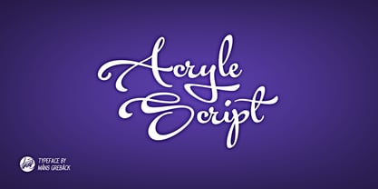 Clean high quality script font with multiple ligatures and alternate glyphs. Gives your project a creative touch.
 - Semantica MF by Masterfont,
$59.00 Formal, yet with very high legibility even in small point sizes. Many weights gives you design alternatives
 - Sonata by Adobe,
$29.00The Sonata font contains 170 music notation symbols and is used for setting high quality sheet music. - Mea Culpa by TypeSETit,
$24.95 One of the most elegant script styles found. This beautifully formal font is perfect for high society.
 - Tzoba MF by Masterfont,
$59.00 Inspired by old manuscript serif font, this low contrast font makes it high legible for long texts.
 - Clique by Device,
$29.00 A clean elegant subtly flared serif in three weights suitable for high-fashion and luxury brand use.
 - Kelpt by Typesketchbook,
$55.00 Kelpt font is an extra large super family of 54 fonts! Kelpt has such a big abundance of contrast, styles, weights, X-Hight. Typesketchbook consists of a very usable, clean and modern sans typeface with rounded corner. The font looks clean and geometric but it’s designed with unusual stylistic features to give the Kelpt font a special and unique touch. The complete Kelpt type family includes 9 weights with italic and X-Hight (A1-A3) versions for each of them all in all 54 fonts for a multifunctional usage, especially for cooperative work, such as website, magazine, editorial, publishing , as well as packaging.
 - Magicher by Mokatype Studio,
$18.00 Hello Introducing Magicher - Ligatures Connected Serif is an elegant, unique font that uses ligatures to smoothly link letters. Perfect for adding a unique twist to word-mark logos, monograms or pull quotes. Magicher has 52 ligatures as well as numbers and punctuation making it super fantastic.Ligature can be turned off if required standard writing needs. Accessible in the Adobe Illustrator, Adobe Photoshop, Adobe InDesign, even work on Microsoft Word. PUA Encoded Characters - Fully accessible without additional design software. Fonts include multilingual support Image used : All photographs/pictures/vector used in the preview are not included, they are intended for illustration purpose only. Thank You
 - Bobotta Icons by Linotype,
$29.99German designer Roberto Mannella first sketched out the idea for Bobotta Icons during a vacation in 1999. Recently, he fleshed these sketches out into a full-fledged symbol font, which was awarded with an Honorable Mention in the 2003 International Type Design Contest, sponsored by Linotype GmbH. Bobotta Icons presents a lively, spontaneous style of drawing, guaranteed to bring a new voice to your funkiest typographic work. The characters contained in this font are a wide array of comic symbols, word shapes, and fantastical creatures. This font contains both symbols that resemble happy crocodiles, and symbols that resemble a neon sign flashing the word love."" - Winter Garden JNL by Jeff Levine,
$29.00 Winter Garden JNL was modeled from the eccentric sans serif hand lettering with varying line widths found on the sheet music of 1917's "When the Girl You'd Give the World to Win Gives Her Heart to You". (It seems that sheet music from the early 1900s often had song titles that were more than just a few choice words. This particular ditty's title took up fourteen words to make its point.) The font is available in regular and oblique versions and gets its name from both the famed theater in New York and the city located 14 miles West of downtown Orlando, Florida.
 - Garden Collection by Cultivated Mind,
$25.00 Introducing the Garden Collection. A new Garden Grown font family by Cultivated Mind Type. This hand-painted collection includes four scripts, two caps fonts, plant art, extras art and free words. Garden Grown Pro scripts includes 260 alternates and 46 ligatures. Ligatures are programmed to pop up when specific letter pairs are typed. Try the alternates and ligatures together to give your designs a realistic hand-painted look. The all caps fonts and basic scripts do not include alternates or ligatures. Use the free words font for keyword and hashtag ideas. Garden Grown works great for cookbook covers, product design, packaging design, restaurant marketing, magazines and film.
 - Bluebell by Fenotype,
$35.00 Bluebell is a modern script type family in the style of copperplate calligraphy. It comes with six weights from extra light to extra bold, all of them maintaining the distinct high contrast. Rich with Open Type features, Bluebell includes Swash & Stylistic alternates, automatic ligatures, old style figures and small caps that work as stand-alone font as well. Each font also comes with a set of ornaments that are found in the glyph palette. Bluebell makes for an elegant, iconic display letter for packaging, books, posters and the like.
 - Addressotype by Midwest Type,
$19.00 Addressotype is based on lettering from a vintage ad for the Addressograph-Multigraph Corporation, manufacturers of the Addressograph addressing machine. In days when the U.S. postal service delivered everything, mailing addresses were as important as email addresses are today. The Addressograph machines stamped out dog-tag-like plates that were used to print mailing labels at high volume. Embodying the company’s work ethic and durability, Addressotype recalls the gaspipe form of lettering popular in the 30s and 40s, updated to reflect the “streamlining” trend popular during the period.
 - Bagoni Type by Attract Studio,
$17.00 Bagoni Type is a very versatile, clean and visually elegant font inspired by the serif typography used in editorial media in the 80s. Bagoni Type with its high contrast and very simple and easily recognizable shape makes it very easy to read, so it also works with small and long text. Great for magazine pictures, for wedding invitations, for branding, poster design and more. Bagoni Type comes in bold and italics that is complemented by various features of open type. Check out Gradia which is a great pair for Bagoni Type.
 - Chuck Noon Script by Fontdation,
$20.00 After long time no script, finally we released our new Chuck Noon Script. A clean and bold script fonts that offers you a natural hand-lettering experience. Handcrafted and digitally checked with high attention to the details, we're a sucker for clean lines and crispy edges too, just like you. Available in two styles; Script and Brush, their dynamic letterforms work like magic, whether you go all caps or using it normally as a script. Suits best for logotype, poster/t-shirt designs, food/beverage labels, hipster quotes, greeting cards, wedding invitations, and many more.
 - Hondo Grunge by Fontasmic,
$16.99 The Hondo Grunge fonts are a collection of ultrabold eroded slab serif typefaces with a dynamic look and extended functionality. Accented with decorative and functional inktraps and complete with Slant and Backslant styles, this heavyweight has a high performance hardcore edge to it. Ideal for titling, poster work, logos, and small bits of copy. For the Opentype savvy, the Opentype version contains a complete alternate set of base characters, which by enabling contextual alternates option will force the typeface to continually alternate between the original & alternate character sets for a more spontaneous look.
 - Informational Gothic JNL by Jeff Levine,
$29.00 The Wood-Regan Instruments Company (Wrico) of New Jersey manufactured for decades a line of lettering kits called the Wrico Sign Maker. With only special ink pens, plastic templates and a template guide anyone could letter clean, clear signs, posters and notices. Based on the same principles of architectural templates, the lettering was [for the most part] utilitarian and functional. Few templates were of stylized or decorative lettering. Informational Gothic JNL and its oblique version are based on the four inch high lettering templates from one of those kits.
 - Reed by ParaType,
$30.00 Reed is a refined calligraphic font based on humanist italic. It contains two weights and a high-contrast Display style for extra large point sizes. Two unusual stencil styles add zest to the type family. The character set includes lots of swashes and contextual alternates. This makes text set in Reed look very close to live calligraphy. Reed works perfectly in labels and packaging of confectionery, cosmetics, perfumery and sparkling wines, as well as greeting cards and event design. Reed was designed by Isabella Chaeva and released by Paratype in 2020.


